As you’re learning data science, you ultimately need to learn several different toolkits.
You need to learn the tools of data visualization. You need to learn the tools of data manipulation. You also need a variety of other tools for specialized tasks, like geospatial visualization, machine learning, and others.
Here at Sharp Sight, we have a particular philosophy about how to learn these things.
I recommend that you first learn these skills in isolation.
For example, in the past, I’ve recommended that you learn a topic like simple geospatial visualization in a highly isolated way. In particular, I’ve recommended that you drill the syntax for very simple operations, like retrieving a map using ggmap().
More recently, I recommended learning (and mastering) the 2-density plot.
Why master these tools in isolation?
Because they are easier to practice (i.e., drill), when you practice them in small, isolated pieces.
Learning data tools in isolation seems simplistic to people, but it has a dramatic payoff.
Once you master small pieces of syntax in isolation, they become like Lego building blocks. You can start to combine the small, simple tools into more complicated structures.
One example of this is creating maps.
Creating a crime heatmap in R
We’ve done quite a bit of geospatial mapping here at Sharp Sight, and part of the reason is that maps are good intermediate projects that allow you to combine simpler tools.
In the case of a geospatial heatmap, you’re basically combining a 2-dimensional density plot with an underlying geospatial map of some kind.
Let me show you an example. Here, we’re going to create a heatmap of San Francisco crime.
Creating a crime heatmap in R like this is easy, once you know the right “building blocks.” Critically, this will be a combination of two skills: the 2-dimentional density plot and a simple Google map.
Let’s walk through it, and I’ll explain as we go.
Install the packages
First, we’ll install the packages that we will use.
# INSTALL PACKAGES
library(tidyverse)
library(ggmap)
library(stringr)
library(viridis)
Read in the data
Next, we will import our csv dataset using read_csv() from the readr package.
# IMPORT CSV DATA
sf_crime <- read_csv('https://www.sharpsightlabs.com/datasets/sf_crime-data-2017.csv'
,col_names = c('incident_number'
,'crime_category'
,'crime_description'
,'day_of_week'
,'date'
,'time'
,'police_district'
,'resolution'
,'address'
,'lon'
,'lat'
,'location'
,'PdId'
)
,skip = 1
)
# INSPECT
sf_crime %>% glimpse()
# Observations: 154,724
# Variables: 13
# $ incident_number 170533616, 170527017, 170514133, 170465285, 170451814, 17045110...
# $ crime_category "FRAUD", "SEX OFFENSES, FORCIBLE", "SUSPICIOUS OCC", "NON-CRIMI...
# $ crime_description "CREDIT CARD, THEFT BY USE OF", "SEXUAL BATTERY", "SUSPICIOUS O...
# $ day_of_week "Sunday", "Sunday", "Sunday", "Sunday", "Sunday", "Sunday", "Su...
# $ date "01/01/2017", "01/01/2017", "01/01/2017", "01/01/2017", "01/01/...
# $ time
By the way, loading in a csv file using readr::read_csv() is another one of those “building block” skills that you should memorize. You should be able to write the code to import a csv file quickly. Reading in data is one of those critical “get things done” skills that you need to know.
Check the data with a scatterplot
Ok, now that we have our dataset, let’s quickly visualize it using a ggplot scatterplot.
# PLOT SCATTERPLOT
# - we'll do this as a quick data-check
ggplot() +
  geom_point(data = sf_crime, aes(x = lon, y = lat), alpha = .05)
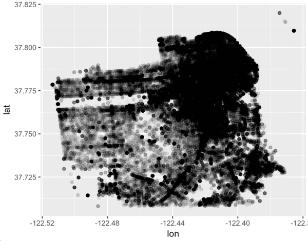
This is an extremely simple use of the scatterplot, but it’s important. Here, we’re actually using the scatterplot to check the data.
Once again, I’ll point out that I’ve told you many, many times that the scatterplot is a critical skill that you need to master. It is one of those critical “building block” skills.
This is one of the reasons why.
Not only can you use the scatterplot as a tool to analyze data and storytell with data, but you can also use it as a tool for checking your data. It is a multipurpose tool that you can use for a variety of tasks at a variety of stages of the data workflow. The scatterplot is something that you should master. If you don’t understand the code that I just showed you above, or you can’t write it fluently (and from memory), go back and practice it.
Based on the scatterplot we just created, the data appear to be okay.
Create a quick “first draft” heatmap
In the next step, let’s very quickly create a “heatmap” of the data, which is essentially a 2-dimentional density plot.
# SIMPLE HEATMAP
ggplot() +
  stat_density2d(data = sf_crime, aes(x = lon, y = lat, fill = ..density..), geom = 'tile', contour = F)
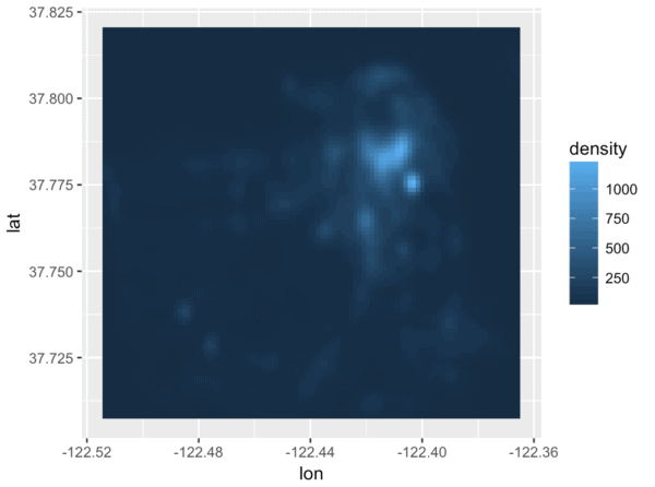
From the looks of it, there are some modifications that we could make here. The color scale is not particularly sensitive to differences in the data, so we may need to make some minor adjustments to the color scale later.
At a quick glance, however, this basic density plot looks okay.
Get a google map
Next, let’s switch gears. We’re going to retrieve a Google map.
Up until this point, we’ve been working exclusively with the crime data. But ultimately, we want to overlay the crime data over a map of some type.
To do this, we need to get a map that we can work with. Let’s retrieve and plot a simple map from Google.
To get this Google map, we will use the get_map() function from ggmap. We’ll use get_map() to retrieve a simple map of San Francisco.
# GET MAP
map_sf <- get_map('San Francisco', zoom = 12, maptype = 'satellite')
This is a relatively simple use of ggmap::get_map().
Keep in mind though, that you need to know the function it self, but also a little bit about how to use it. For example, you need to know the syntax for get_map(), but you also need to know the zoom parameter.
When learning a small function like this, I recommend breaking it down into small pieces. For example, you can learn and drill get_map() all by itself. Once you've memorized get_map(), you can drill more complicated examples where you adjust the zoom using the zoom parameter. Start simple and then increase the complexity.
Plot the Google map
Ok, moving on.
We have the map, let's plot it using the ggmap() function from the ggmap package.
# PLOT BASIC SF MAP
ggmap(map_sf)
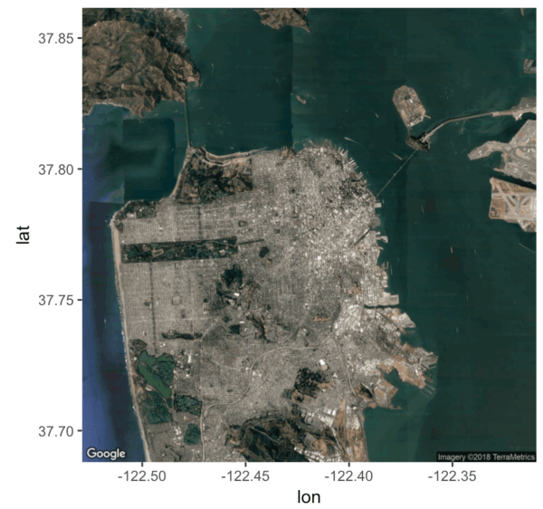
This is a very simple example of how to use ggmap(). Again though, this is one of our "building blocks." When we combine it with the crime-data, it will be more complex.
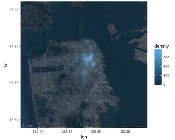
Create a simple crime heatmap
Now that we have both "building blocks" in place, let's combine them together.
To do this we will use ggmap(map_sf) to plot the underlying map, and then we will use stat_density2d() to plot a heatmap of the crime data on top of the underlying geographic map.
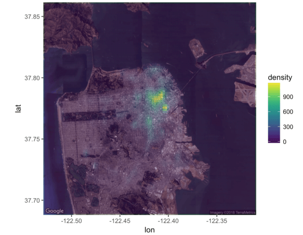
# MAP WITH HEATMAP OVERLAY
ggmap(map_sf) +
  stat_density2d(data = sf_crime, aes(x = lon, y = lat, fill = ..density..), geom = 'tile', contour = F, alpha = .5)
Change color palette of heatmap
Ok ... we're almost there.
There's more that we will need to do to "polish" this visualization, but understand what we've done here. We've taken two different building blocks – the geographic map from ggmap() and the 2-d density plot from stat_density2d() – to create a more complicated visualization.
Again, this is why I recommend learning and mastering simple tools: because you can combine them together into more complicated structures.
Also, keep in mind that we are able to do this because the ggplot2 syntax enables you to build plots in layers. ggmap() itself is an extention of ggplot2 and it follows the ggplot2 convention of building plots in layers using the + sign. In some sense, the ggplot2 system is structured for this layer-by-layer "building block" strategy.
Ok, finally, let's start to polish the chart.
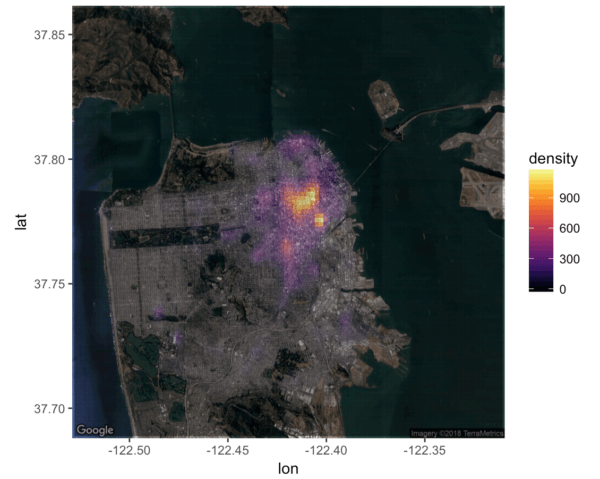
The first thing that we can do is use a different color scale. Personally, I think that the color scales from the viridis package are excellent. Let's change the color scale by using scale_fill_viridis().
# SIMPLE HEATMAP WITH VIRIDIS COLORING
ggmap(map_sf) +
  stat_density2d(data = sf_crime, aes(x = lon, y = lat, fill = ..density..), geom = 'tile', contour = F, alpha = .5) +
  scale_fill_viridis()
Let's also try the "inferno" color palette that comes with the viridis package.
# VIRIDIS (inferno), alpha = .5
ggmap(map_sf) +
  stat_density2d(data = sf_crime, aes(x = lon, y = lat, fill = ..density..), geom = 'tile', contour = F, alpha = .5) +
  scale_fill_viridis(option = 'inferno')
Yeah ... that's it. I like this one better.
Create finalized "polished" crime heatmap
Ok, let's clean it up a little.
We'll add a title, remove the extra text on the x and y axes, and do some formatting on the legend and other parts of the plot.
# CREATE "POLISHED" CRIME HEATMAP IN R

ggmap(map_sf) +
  stat_density2d(data = sf_crime, aes(x = lon, y = lat, fill = ..density..), geom = 'tile', contour = F, alpha = .5) +
  scale_fill_viridis(option = 'inferno') +
  labs(title = str_c('SF has largest concentration of crime\n'
                     ,'near Downtown & Tenderloin'
                     )
       ,subtitle = 'There are also moderate pockets of crime in SOMA & the Mission'
       ,fill = str_c('Number of', '\ncrime incidents')
       ) +
  theme(text = element_text(color = "#444444")
        ,plot.title = element_text(size = 22, face = 'bold')
        ,plot.subtitle = element_text(size = 12)
        ,axis.text = element_blank()
        ,axis.title = element_blank()
        ,axis.ticks = element_blank()
        ) +
  guides(fill = guide_legend(override.aes= list(alpha = 1)))
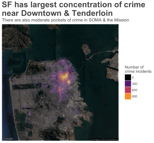
I'll admit: there's more we could do here. In particular, we might be able to play with the color scale a little bit to make the low-crime areas more apparent; they sort of wash out right now.
Having said that, I think this looks pretty damn good, and it's enough to show you how you can combine tools together to create more advanced visualizations.
Learn the basics, then put them together
As I've said many times, you need to master the basics before you move on to advanced topics.
Before attempting something like this map on your own, learn the individual pieces.
Learn how to retrieve a simple Google map using ggmap. Practice it! Practice the syntax until you remember it.
Learn how to create a 2-d density plot.
Learn how to do some basic ggplot formatting.
Study, learn, and practice these skills independently. Once you know them backwards and forwards, you can use them like building blocks to create more advanced charts and visualizations.
I love the example above, the way you’ve broken down the different blocks. This is one sure way of learning and understanding code. From now I’ll remember to break it down
I’m going to write more about this in the future, but it’s critical:
If you want to master data science very quickly, you need to break everything down into very simple units that you can practice and drill repeatedly until you have them memorized.
One you know simple techniques, you can combine them like building blocks into much more complicated syntactical structures.
Did the crime data and Google map use the same coordinate reference system? Is that why CRS didn’t come up?
Both the Google map and the crime data have latitude and longitude coordinates.
Notice for example the variable mapping in several of the visualizations:
aes(x = lon, y = lat)With this code, we’re basically mapping longitude (‘
lon‘) to the x-axis and latitude (‘lat‘) to the y-axis.This is one of the great things about using maps from ggmap and using ggplot() to plot it all … we don’t have to specify a coordinate reference system because lat and long are “baked in” to the Google maps. It’s just a matter of establishing the correct variable mapping with ggplot::aes().
When running the last bit of code I get the error message:
#Error: Don’t know how to add o to a plot
Any suggestions on how to resolve this error?
I can’t replicate your error … it runs OK on my side.
Are you sure that the code is 100% the same as in the tutorial?
Please ignore my query -I resolved it.
Thanks for the great article. -I learned a lot!
When trying to overlay the heatmap to the geographical map I get an error that removes all data rows and produces a blank geographical map. This is the code I am using:
ggmap(map_ssontario) + stat_density2d(data = data, aes(x = Longitude, y = Latitude, fill = ..density..), geom = ’tile’, contour = F).
could you please advise on how to fix this issue?
Thanks
I keep getting this error at the exact same spot:
ggplot() +
+ geom_point(data = sf_crime, aes(x = Longitude, y = Latitude), alpha = .05)
>
> ggplot() +
+ stat_density2d(data = sf_crime, aes(x = Longitude, y = Latitude, fill = ..density..), geom = ’tile’, contour = F)
> map_ssontario ggmap(map_ssontario) +
+ stat_density2d(data = sf_crime, aes(x = Longitude, y = Latitude, fill = ..density..), geom = ’tile’, contour = F, alpha = .5)
Warning message:
Removed 46 rows containing non-finite values (stat_density2d).
Could you please clarify how I can fix this issue?