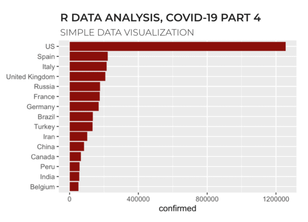
R data analysis, covid19: finding successful countries

A small multiple chart of covid19 data, showing line charts of different countries, where the line is colored red/yellow/green according to the success in reducing new covid19 cases.

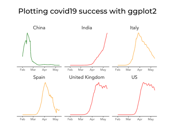
In this blog post, we’ll create a data visualization to analyze covid19 data and visualize successful vs. unsuccessful countries. You’ll see exactly what I mean by that in a minute. Our covid19 analysis series: a quick review This tutorial is actually part of a series of tutorials that show how to analyze data with R. … Read more

R Data Exploration: covid-19 [part 3]

An image of R code analyzing covid19 data, with a sars-cov-2 virus in the background.

This tutorial is part of a series of R tutorials analyzing covid-19 data. For parts 1 and 2, see the following posts: https://www.sharpsightlabs.com/blog/r-data-analysis-covid-19-part1-data-wrangling/ https://www.sharpsightlabs.com/blog/r-data-analysis-covid-19-part-2-merge-datasets/ Covid19 analysis, part 3: initial data exploration So far in our R data analysis series, we’ve spent some time getting and wrangling our data. In part1, we retrieved a single covid19 … Read more

R Data Analysis: covid-19, part 2 [merge datasets]

This tutorial is part of a series of R tutorials analyzing covid-19 data. For part 1, see the following post: https://www.sharpsightlabs.com/blog/r-data-analysis-covid-19-part1-data-wrangling/ Covid19 analysis, part 2: merge datasets In this tutorial, we’re going to set up a process that will enable us to retrieve and wrangle some necessary covid19 datasets … data that we’ll need for … Read more

R Data Analysis: covid-19, part 1 [data wrangling]

An image of R data manipulation code, with an image of the covid19, sars-cov-2 virus in the background.

In this tutorial, we’re going to analyze covid19 data using R and the Tidyverse. Recently, we started a data analysis series, where we analyzed covid19 data. The first set of these tutorials was performed with Python. That tutorial series was well received, and many people commented that it was very helpful for seeing exactly how … Read more

Python Data Visualization: covid-19, new cases [small multiple chart]

An image of a small multiple chart made with Seaborn.

In the last several tutorials, we’ve been analyzing and working with covid-19 data. This is the second week of April, and the covid-19 epidemic has become a worldwide crisis. In any crisis … in any environment where you need to make decisions, you need good information. Data science can help. So in this series of … Read more

Python data manipulation, covid19: how to calculate new cases

An image of a covid-19 dataset with a "new cases" variable added to the end.

This is a new installment in a series of tutorials showing you how to analyze covid-19 data with Python. In the last few tutorials, we’ve done quite a bit of work. For part 1, we retrieved the dataset for “confirmed” cases, and “wrangled” it into shape. In part 2, we retrieved the files for confirmed, … Read more

Python Data Analysis: covid-19, part 4 [visual data exploration]

An image of a bar chart with the top 15 countries with the most covid-19 cases.

This tutorial is part of a series of tutorials analyzing covid-19 data. For parts 1, 2, and 3, see the following posts: https://www.sharpsightlabs.com/blog/python-data-analysis-covid19-part1/ https://www.sharpsightlabs.com/blog/python-data-analysis-covid19-part2/ https://www.sharpsightlabs.com/blog/analyzing-covid-19-with-python-part-3-eda/ Covid19 analysis, part 4: visual data exploration So far in this tutorial series, we’ve focused mostly on getting data, particularly in parts 1 and 2. Most recently, in part 3, … Read more