
This tutorial is part of a series of tutorials analyzing covid-19 data.
For parts 1 and 2, see the following posts:
https://www.sharpsightlabs.com/blog/python-data-analysis-covid19-part1/
https://www.sharpsightlabs.com/blog/python-data-analysis-covid19-part2/
Covid19 analysis, part 3: initial data exploration
If you’ve been following along with this tutorial series, you’ll know that in the most recent tutorial, we defined a process for getting and cleaning the covid19 data that we’re going to use.
Now that we have a merged dataset, we’re going to do some initial data exploration.
I’ll explain more in the tutorial, but if you want to jump to a specific section, you can use one of the following links.
Table of Contents:
As always though, it’s best if you read through everything, step by step.
Get Data and Packages
First, I want to make sure that you have the data.
Ideally, it’s best if you go back to part 2 and run the code there. That will enable you to get the most up-to-date data.
But if you’re pressed for time, you can download a dataset with the following code.
First, you’ll need to import Pandas and datetime:
import pandas as pd
import datetime
And then you can import the data:
covid_data = pd.read_csv('https://learn.sharpsightlabs.com/datasets/covid19/covid_data_2020-03-22.csv'
                         ,sep = ";"
                         )
covid_data = covid_data.assign(date = pd.to_datetime(covid_data.date, format='%Y-%m-%d'))
Keep in mind, this dataset only has data up to March 22, 2020, so it will not be completely up to date.
If you want completely up-to-date data, you can go back to part 2 and run the code there.
Basic Data Inspection
Now that we have the data, we need to do some simple inspection.
Remember: whenever you start working on a data science project, your first task is to simply understand what is in the data.
And you need to sort of “check” to make sure the data look clean.
So the simplest thing that we can do is simply print a few rows and retrieve the column names.
Print rows
We can print a few rows with the head method.
# PRINT ROWS
covid_data.head()
OUT:
       country subregion       date   lat  long  confirmed  dead  recovered
0  Afghanistan       NaN 2020-01-22  33.0  65.0          0     0          0
1  Afghanistan       NaN 2020-01-23  33.0  65.0          0     0          0
2  Afghanistan       NaN 2020-01-24  33.0  65.0          0     0          0
3  Afghanistan       NaN 2020-01-25  33.0  65.0          0     0          0
4  Afghanistan       NaN 2020-01-26  33.0  65.0          0     0          0
Now when I do this, I’m just looking and trying to spot anything unusual.
Do the values look “typical”? Do they look like what I expect?
In this case, they do. The country column has the name of a country (Afghanistan), the date variable has something that looks like a date. The lat and long variables look like latitude and longitude values, Etcetera.
The one unusual thing is the NaN values. But if you print out a large number of rows, you’ll find that this is just used for cities or sub-regions where they are available.
So, the data largely matches my expectations.
That’s good … if there was anything unusual, we might need to investigate further or do more data cleaning.
Print column names
Now, let’s just print out the column names.
covid_data.columns
OUT:
Index(['country', 'subregion', 'date', 'lat', 'long'
      ,'confirmed', 'dead','recovered'],
      dtype='object')
Commonly, I’ll examine the column names to make sure that the columns are well named. In this case – since we did some data cleaning in part 2 – the variables are well named.
If they weren’t, you could use the Pandas rename method to rename them.
Keep in mind, it’s sometimes useful to paste the names of the columns into a text file or paste them into your script (and comment them out). This is useful so you have them close at hand when you’re working with the data. If you forget the exact column names, you can look at your text file to remember them.
Examine variables
Now, we’ll examine some of the variables.
In particular, we want to look at the values of the variables to see if they look “appropriate.”
For string or “categorical” variables, we want to look at the unique values.
For numerics, we want to look at summary statistics like the mean, median, min, max. Again, we’re trying to check if things look “OK”.
Get unique values: country
First, let’s examine the country variable.
From our print of records earlier, it looks like the country variable contains country names.
Here, we want to actually check that.
In particular, when we examine the variable, I want to think about a few things:
- Are they all actually country names?
- Are any of them unusual?
- Does anything need to be changed or cleaned?
Again, as I said earlier, in this first pass through the data, we’re just exploring. We want to check the data and make sure that things are acceptable.
To do that in this case, we’re going to use a couple of Pandas techniques “chained” together.
We’ll start with the dataframe, covid_data, and then call the filter method to select the country variable.
After that, we call the drop_duplicates method to drop duplicate rows and ultimately get the unique values of country.
pd.set_option('display.max_rows', 180)
(covid_data
    .filter(['country'])
    .drop_duplicates()
)
OUT:
                                country
0                           Afghanistan
61                              Albania
122                             Algeria
183                             Andorra
244                              Angola
305                 Antigua and Barbuda
366                           Argentina
...                                 ...
13664                                US
28731                            Uganda
28792                           Ukraine
28853              United Arab Emirates
28914                    United Kingdom
29341                           Uruguay
29402                        Uzbekistan
29463                         Venezuela
29524                           Vietnam
29585                            Zambia
29646                          Zimbabwe
For the sake of space, I didn’t actually show all of the values.
But you can print them out yourself and check them.
When I looked, they looked okay, for the most part. Some of the names were a little long, and some were formatted with commas in the country name. But for the most part, there was nothing terribly out of place. This variable looks clean.
Get unique values: date
Next, we’ll do something similar with the date variable.
Again, we want to check and make sure that the values are appropriate.
Based on what we know about the data (that the covid-19 outbreak began in China sometime in January) we would expect the dates to start sometime in January of 2020.
I pulled this dataset on March 22, 2020, so we expect the data to end around that date.
Let’s check and try to confirm that.
To do this, we’ll use the Pandas chaining methodology again. Just like with the country variable, we’ll chain the filter method, and then drop_duplicates.
(covid_data
  .filter(['date'])
  .drop_duplicates()
)
OUT:
         date
0  2020-01-22
1  2020-01-23
2  2020-01-24
3  2020-01-25
4  2020-01-26
5  2020-01-27
...
55 2020-03-17
56 2020-03-18
57 2020-03-19
58 2020-03-20
59 2020-03-21
60 2020-03-22
Again, here, I’ve only shown a few of the first and last rows. But if you print out all of them and look you’ll see that the dates look clean.
That’s exactly what we’re trying to verify.
Check variables: lat and long
Next, we’ll look at lat and long.
Again, we want to check to make sure that the values are appropriate.
I recommend that you print out a few dozen rows, just to take a look. In the interest of brevity, I won’t do that here.
But I will how you how to aggregate the data, so we can take a look at the range of values.
Here, we’ll again use the Pandas “chaining” methodology to retrieve the minimum and maximum values for both lat and long.
(covid_data
  .filter(['long','lat'])
  .agg(['min','max'])
)
OUT:
         long      lat
min -157.8584 -41.4545
max  178.0650  71.7069
If you look at these, they look appropriate. Based on this quick analysis, it looks like lat and long are within an appropriate range of values for latitude and longitude (you can check this yourself with a quick google search).
Check variables: confirmed, dead, recovered
Now, let’ take a look at the confirmed, dead, and recovered columns.
These are numeric variables, so we can use the describe method on them.
In order to do these all at once, we can again use the Pandas chaining methodology. We’ll use filter to retrieve the confirmed, dead, and recovered columns, and then we’ll use describe to calculate summary statistics.
#-----------------------------------------------
# EXAMINE VARIABLES: confirmed, dead, recovered
#-----------------------------------------------
(covid_data
 .filter(['confirmed','dead','recovered'])
 .describe()
)
OUT:
          confirmed          dead     recovered
count  29707.000000  29707.000000  29707.000000
mean     174.919615      6.134345     63.373919
std     2587.520759    118.943550   1400.678631
min        0.000000      0.000000      0.000000
25%        0.000000      0.000000      0.000000
50%        0.000000      0.000000      0.000000
75%        1.000000      0.000000      0.000000
max    67800.000000   5476.000000  59433.000000
When looking at these summary statistics, remember that the data are at the country and city level.
From our print of the data earlier, we saw that some rows had zero confirmed, dead, or recovered … meaning that there weren’t any cases for those location. So when we look at the min values in this table and see all of the zeros, that looks appropriate.
In the row that shows the max statistic, we see a maximum confirmed cases of 67800. That looks about right as of March 22. I think that is Italy, but we can confirm in a moment.
Ultimately, we’ve just looked at confirmed, dead, and recovered columns and they appear to be okay.
Count missing values
Now, let’s count missing values.
We can do this by using isnull and sum on our DataFrame. This will give us a count of the null values by column.
(covid_data
 .isnull()
 .sum()
)
OUT:
country         0
subregion    9882
date            0
lat             0
long            0
confirmed       0
dead            0
recovered       0
dtype: int64
This looks pretty good, actually.
There are no missing values in any of the columns except subregion. When we printed out our data, it looked like most of the data was at country level, but when there was specific data for a city, the city name was recorded in subregion.
A quick note about the data analysis process
Now here, I want to briefly mention something about the process of data analysis.
When you work with a new dataset as a data scientist, you’ll often work hand-in-hand with a subject matter expert (SME). An SME will be able to help you and answer questions about the data that you have. They will also help frame an analysis by helping generate hypotheses and questions.
In this case, I don’t have an SME available, so it’s a little harder to answer questions about the dataset. I’m not terribly concerned about that, because I’m really just “playing” with this dataset for fun and to show you how to do an analysis.
Just remember, when you start exploring your data, it is okay to have some unanswered questions about the data. In a real-world business setting, you’ll work with your partners to answer those questions and fix any data problems that you might find.
The good news though is that this dataset is really very clean and I don’t have too many concerns right now.
Spot check records
Finally, let’s get the records for a few countries.
Once again, to do this, we’ll use the Pandas chaining methodology.
We’ll use filter to retrieve a few specific columns.
Then we’re using groupby to group the data on country and date. This will enable us to aggregate the data and summarise by country/date.
After groupby, we execute the aggregation with the agg method. Here, we’re using sum to sum up the confirmed, dead, and recovered.
Then we’re using query to retrieve data for a few countries: the United States, Italy, France, and China. (I chose these because as of March 23, they are the most discussed right now in the media.)
We’re also using query to subset down to a specific date: March 21, 2020.
#-------------------------------
# SPOT CHECK IMPORTANT COUNTRIES
#-------------------------------
pd.set_option('display.max_rows', 300)
(covid_data
   .filter(['country','date','confirmed','dead','recovered'])
   .groupby(['country','date'])
   .agg('sum')
   .query('date == datetime.date(2020, 3, 21)')
   .query('country in ["US","Italy","France","China"]')
)
OUT:
                    confirmed  dead  recovered
country date
China   2020-03-21      81305  3259      71857
France  2020-03-21      14431   562         12
Italy   2020-03-21      53578  4825       6072
US      2020-03-21      25489   307          0
Ultimately, our code has given us a quick summary of the confirmed, dead, and recovered for China, France, Italy, and the US, for the date of March 21, 2020.
We can compare these numbers with the Johns Hopkins Covid-19 Dashboard.
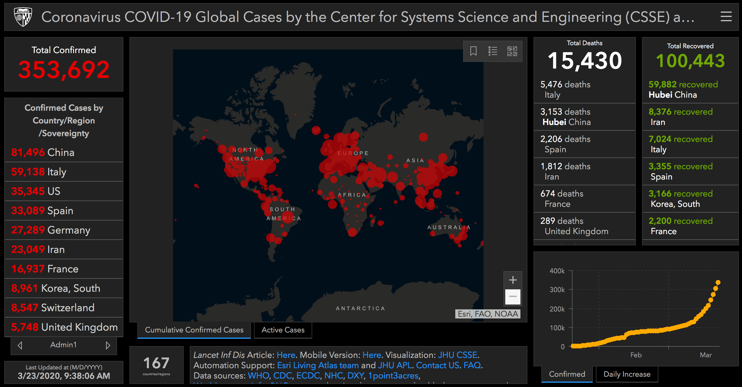
At this point, I’ll note that our numbers are pretty close to the numbers in the dashboard, but not exactly the same. That’s because I pulled this dataset on March 22, and on March 22, the data were only fully updated up to the date of March 21.
The image above from the Johns Hopkins dashboard is from the morning of March 23. So there’s a bit of a time difference between the data that I’m working with currently and the data in the dashboard.
Another note about the process of data exploration
This is a good time to make another comment about the process of data exploration.
When you get a new dataset, you’ll often need to validate the data in some way. You want to check the numbers in your dataset verses another source.
When you do this, it’s pretty common to find discrepancies. In fact, very common.
Sometimes, the discrepancies are explainable. For example, in our dataset, this is just a difference in timing. We could re-pull the data and check again. Our numbers would probably be closer to the dashboard. (I’m not doing that, because if I did, I’d have to go back and change several things in this tutorial.)
Other times, the discrepancies are not explainable, and you end up with “two versions of the truth.” Many times in my career at Apple, and at large banks and consulting firms, we’d sometimes end up with two different sets of numbers.
Get used to this. It’s common, and it’s one of the issues that you just have to work through as a data scientist.
If the discrepancy is small, sometimes you just push forward. In our case above, the discrepancies are relatively small and explainable, so I’m not terribly concerned. Furthermore, this is just a tutorial. I’m playing with the data. It’s not mission critical.
Other times though, the discrepancies can be large or unacceptable in some other way. In that case, you’ll just have to go down the rabbit hole and try to check your numbers again, or otherwise try to reconcile them.
It’s a tradeoff between accuracy and productivity, and it changes from project to project.
The data look pretty good
Having said all of that, after exploring a little bit, I think that the data look good, so we’re going to move forward.
Keep in mind though that data analysis is iterative.
As we move forward, we might find out new things about the data.
This is particularly true once we start visualizing the data.
Sometimes, when you visualize your data, you start finding anomalies or unexplained items.
In these cases, sometimes that means that you need to go back and clean your data a little more.
In other cases it means that there’s something that you need to “drill into” with more analysis.
Ultimately, I want you to understand that the process of data analysis is not a perfect straight line. The process of data cleaning and data analysis in the real world is almost always iterative, and sometimes leads to obstacles, dead-ends, or revisions of your earlier work.
With that in mind, we’ll find out more about our data when we start to visualize it.
Next steps
In the next installment of this tutorial series, we’ll probably start to explore the data with data visualization.
In some sense, that will be an extension of this tutorial. In this tutorial, we did some data exploration strictly with Pandas.
But in the next tutorial, we’ll start to use data visualization techniques to visualize and further explore the data. When we do this, we’ll probably need to aggregate or otherwise subset our data, so we’ll be using our data visualization techniques hand-in-hand with Pandas.
All that said, you need to remember: to really master data analysis and data science, you need a full toolkit. You need to be able to do data wrangling and data visualization … often in combination with one another.
Sign up to learn more
Do you want to see part 4 and the other tutorials in this series?
Sign up for our email list now.
When you sign up, you’ll get our tutorials delivered directly to your inbox.
This tutorial may not have been exciting as the last two but I recognize the importance of analyzing the data now. I have overlooked this step many times after being satisfied when I was able to wrangle the data and merge dataframes in earlier projects. It looked pretty and I thought everything was okay but many times NAs were introduced and data were in the wrong columns.
If I had not overlooked this step in the process I would have saved so much time nipping it in the bud rather than at the end of the process cycle. I look forward to the next tutorials Josh!
For the beginners following this tutorial, don’t forget to “import datetime” when you spot check the important countries.
I have always had same problem as you always overlooking the step of analyzing the data
Yes … doing initial data inspection after you have a data file is one of the least interesting parts of the process.
But, you need to do it, so get it done.
Nice series of tutorials. I look forward to the one about visualization. Question: the last example produces a table of confirmed, dead, and recovered for four countries. I’d like to add a step in the chain that adds, say, “pct_survived” as the quotient of “recovered” / “confirmed”. I’ve found ways to do something like this, but they all seem to be working at the top level, where the name of the dataframe is accessible, rather than in a chain. Do you know a way to do this? Thanks
I think I’ve figured this out:
(covid_data
.filter([‘country’, ‘date’, ‘confirmed’, ‘dead’, ‘recovered’])
.groupby([‘country’, ‘date’])
.agg(‘sum’)
.query(‘date == datetime.date(2020, 3, 23)’)
.query(‘country in [“US”, “Italy”, “France”, “China”]’)
.assign(pct_surviving = lambda x: x[‘recovered’] / x[‘confirmed’])
)
The thing I was looking for was the `assign` method with the `lambda` function, as shown in my previous note, but I realized that the math is wrong in that note. Here’s a better version in that respect:
(covid_data
.filter([‘country’, ‘date’, ‘confirmed’, ‘dead’, ‘recovered’])
.groupby([‘country’, ‘date’])
.agg(‘sum’)
.query(‘date == datetime.date(2020, 3, 23)’)
.query(‘country in [“US”, “Italy”, “France”, “China”]’)
.assign(pct_surviving = lambda x: (1.0 – (x[‘dead’] / x[‘confirmed’])) * 100.0)
)
You should be able to add a new variable with the
assign()method.But be careful … calculating the percent survived this way will not be quite accurate. While the pandemic is currently in process, there is a certain percent of the “confirmed” cases that are still active, so have not officially died or survived from a statistical point of view.
While the pandemic is in progress, calculating an actual death rate will be more difficult, and will require different data.
Thanks. Point well-taken. To be honest I was just trying to figure out how to add columns to a dataframe using values from existing columns, a la R’d dplyr::mutate
Yeah … I suspect that many people understand the caveats, but just wanted to point it out.
To reiterate and answer your question:
The Pandas analog to
dplyr::mutateis the Pandasassign()method.I’m no longer able to download the CSV files that I’ve been using for this exercise.
There are other sources of similar data, e.g.,
https://www.ecdc.europa.eu/sites/default/files/documents/COVID-19-geographic-disbtribution-worldwide-2020-03-26.xlsx
but the fields are different, of course.
See also the Johns Hopkins files:
git clone https://github.com/CSSEGISandData/COVID-19.git
See the files located in:
…/csse_covid_19_data/csse_covid_19_time_series
in that (cloned) directory tree.
Note that the files are updated daily, and you should be able to get the latest simply by doing:
git pull
The Hopkins CSSE team changed the file location.
I updated the location in the tutorial … everything should work now.