This tutorial will show you how to create a barplot in R with geom_bar (i.e., a ggplot barplot).
I’ll explain the syntax, and also show you several step-by-step examples.
Table of Contents:
Let’s get into it.
A Quick Introduction to Barplots
Let’s quickly do a review of barplots and barplots in R.
Barplots
The barplot (AKA, the bar chart) is a simple but extremely useful data visualization tool.
In particular, barplots (AKA, bar charts) are very useful for plotting the relationship between a categorical variable and a numeric variable.
So typically, when we create a barplot, we have a categorical variable on one axis and a numeric variable on the other axis.
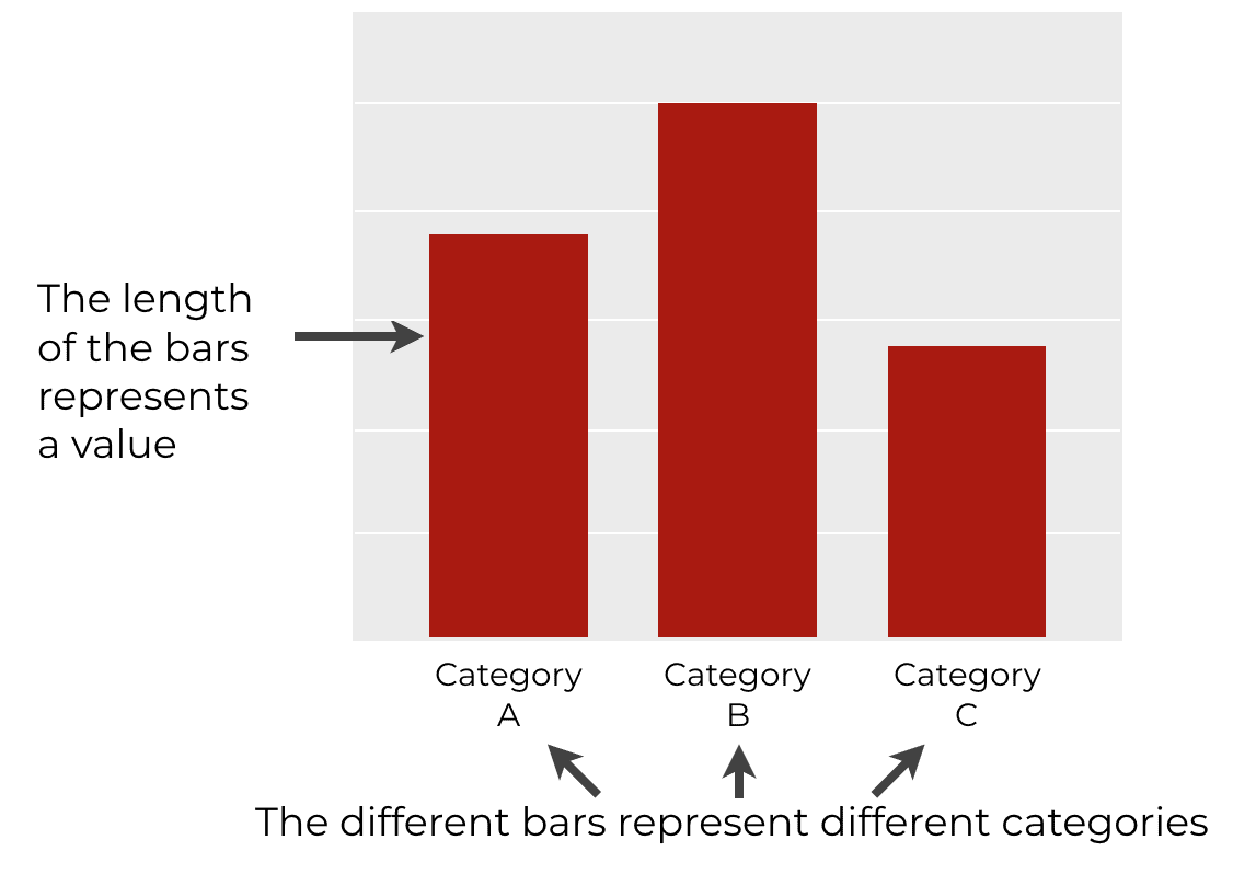
The length of the bar represents a value.
Sometimes this value will be a statistical computation, like the mean value for each category or the count of the number of records. In other cases, the value encoded by the length will be a specific value.
Ultimately, a bar chart enables us to make comparisons between categorical values on the basis of a numeric value.
Barplots in R
If you’re doing data science in R, then there will be several different ways to create bar charts.
The simplest way is with “base R”. Using traditional base R, you can create fairly simple bar charts. Having said that, the barcharts from base R are ugly and hard to modify. I avoid base R visualizations as much as possible.
Instead of using base R, I strongly recommend using ggplot2 to create your bar charts.
Bar chart with ggplot2
I prefer ggplot barplots for a few reasons.
One of the biggest reasons is that by default (or with a few simple modifications), ggplot2 barplots look professional and well designed.
They’re also relatively easy to create and modify.
Having said that, to create a bar charts with ggplot2, you need to understand the syntax.
Therefore, let’s look at the syntax for geom_bar, and how we use it in conjunction with ggplot to create our bar charts.
geom_bar Syntax
Here, I’ll walk you through the syntax for how to create a bar char with geom_bar.
I’m going to try to explain everything piece-by-piece, but it will require some knowledge of the ggplot2 visualization system. With that in mind, if you need a quick review of ggplot2, you can read our ggplot2 tutorial for beginners.
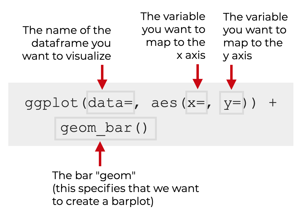
The syntax of a ggplot barplot
To create a barplot with ggplot2, you need to call the ggplot() function along with geom_bar().
Let me break this down:
ggplot
The ggplot() function initializes the ggplot2 data visualization system. Essentially, it tells R that we’re going to draw a visualization with ggplot.
The data parameter
The data = parameter indicates the data that we’re going to visualize.
The ggplot function is designed to work with dataframes, so you’ll specify a dataframe as an argument to this parameter.
So for example, if your dataframe is named mydata, you’ll set data = mydata.
The aes function
The aes() function enables you to map variables in your dataframe to the aesthetic attributes of your plot.
When we create a barplot, we always need to map a categorical variable to the x or y axis. So if the variable you want to plot is named my_categorical_var, you might set x = my_categorical_var. This will put the categories of your categorical variable on the x axis.
To be clear, it might be difficult to understand “variable mappings” if you’re new to ggplot2. If you’re confused about this, I strongly recommend that you review our introductory ggplot tutorial.
Additional parameters of geom_bar
There are also a set of additional parameters that we can use to modify our bar plot.
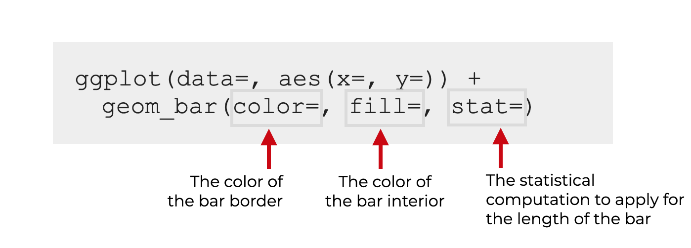
Specifically, you should know about the following:
fillcolorstat
Let’s briefly review these.
fill (required)
The fill parameter modifies the color of the interior of the bars.
R has a variety of “named” colors like red, green, and blue.
You can also use hexidecimal colors.
I’ll show you an example of how to change the fill color in the examples section.
color
The color parameter modifies the color of the border of the bars. (Be careful. Many people get confused about this. The color parameter modifies the border, and the fill parameter modifies the interior.)
Again, in R, you can use a variety of “named” colors like red, green, and blue.
You can also use hexidecimal colors.
I’ll show you an example of how to change the border color in the examples section.
stat
The stat parameter controls the statistic that’s applied to the data to plot the length of the bar.
By default, this is set to stat = 'bin'. This sums up the number of records by category, and plots the length of the bar as the count of records.
You can also set stat = 'identity'. This will enable you to plot bars that where the bar length is set by your variable mappings.
(This can be confusing, so I’ll show you examples in the examples section.)
Examples of how create barcharts with geom_bar
Ok. Let’s look at some examples.
Examples:
- Simple bar chart
- Change border color of the bars
- Change interior color of the bars
- Create a horizontal bar chart
- Set the bar length to a variable
Run this code first
Before you run any examples, you need to run some preliminary code to import the tidyverse package.
We’ll also look at our dataset.
Import ggplot2
First, you can import the tidyverse package as follows:
library(tidyverse)
Just so you’re aware: the tidyverse package contains ggplot2 as well as several other important data science R packages like dplyr and tidyr.
Examine data
We’re going to be working with the starwars dataset. The starwars dataset is actually included in the tidyverse package, so it should be available once you load the Tidyverse package as shown above.
Let’s take a quick look at this data with the glimpse() function.
starwars %>% glimpse()
OUT:
Rows: 87 Columns: 14 $ name"Luke Skywalker", "C-3PO", "R2-D2", "Darth Vader", "Leia Organa", "… $ height 172, 167, 96, 202, 150, 178, 165, 97, 183, 182, 188, 180, 228, 180,… $ mass 77.0, 75.0, 32.0, 136.0, 49.0, 120.0, 75.0, 32.0, 84.0, 77.0, 84.0,… $ hair_color "blond", NA, NA, "none", "brown", "brown, grey", "brown", NA, "blac… $ skin_color "fair", "gold", "white, blue", "white", "light", "light", "light", … $ eye_color "blue", "yellow", "red", "yellow", "brown", "blue", "blue", "red", … $ birth_year 19.0, 112.0, 33.0, 41.9, 19.0, 52.0, 47.0, NA, 24.0, 57.0, 41.9, 64… $ sex "male", "none", "none", "male", "female", "male", "female", "none",… $ gender "masculine", "masculine", "masculine", "masculine", "feminine", "ma… $ homeworld "Tatooine", "Tatooine", "Naboo", "Tatooine", "Alderaan", "Tatooine"… $ species "Human", "Droid", "Droid", "Human", "Human", "Human", "Human", "Dro… $ films [<"The Empire Strikes Back", "Revenge of the Sith", "Return of the… $ vehicles
[<"Snowspeeder", "Imperial Speeder Bike">, <>, <>, <>, "Imperial S… $ starships
[<"X-wing", "Imperial shuttle">, <>, <>, "TIE Advanced x1", <>, <>…
The dataset contains data about several characters from the Star Wars universe.
There are a few categorical variables here, and there are also some numeric variables.
This will be good for plotting bar charts.
EXAMPLE 1: Simple bar chart with geom_bar
Let’s start with a very simple example.
Here, we’ll plot the number of individuals in this dataset by gender.
ggplot(data = starwars, aes(x = gender)) +
  geom_bar()
OUT:
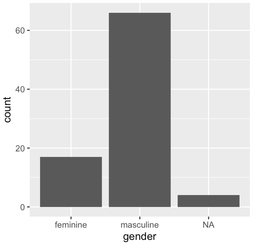
Explanation
This is really simple, but let me explain.
Here, we specified that we’re plotting data in the starwars dataset with the code data = starwars.
Inside the aes() function, we’ve mapped gender to the x-axis with x = gender. There are 3 categories in the gender variable, and those appear on the x-axis of the chart.
geom_bar() specifies that we want to plot a bar chart.
Notice that we did not map any variables to the y-axis. Because of this, by default, ggplot simply counted up the number of records by category (i.e., by gender). So the length of the bar (the y-axis, in this case) represents the count of the number of records.
EXAMPLE 2: Change border color of the bars
Quickly, I’ll show you how to modify the border color of the bars.
I don’t do this often, but I’ll show you, just so you know how to do it.
To change the border color, you need to use the color parameter.
ggplot(data = starwars, aes(x = gender)) +
  geom_bar(color = 'red')
OUT:
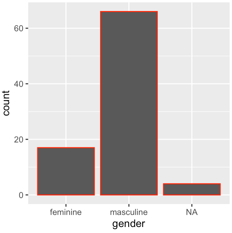
Explanation
As you can see, the border color of the bars has been changed to red.
How?
To do this, we set color = 'red' inside of geom_bar().
As I mentioned in the syntax section, you need to be careful with this. Most people think that color modifies the bar color, but it only modifies the border!
EXAMPLE 3: Change interior color of the bars
Now, we’ll change the color of the bars.
To do this, we’ll use the fill parameter inside of geom_bar.
ggplot(data = starwars, aes(x = gender)) +
  geom_bar(fill = 'red')
OUT:
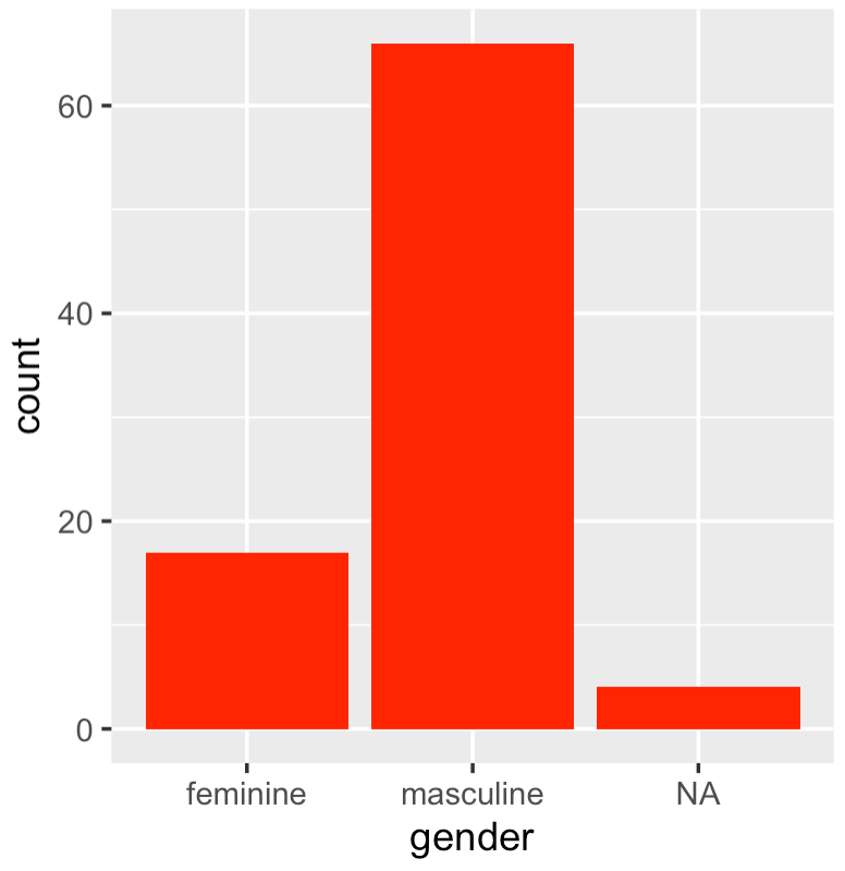
Explanation
Here, the bar colors have been changed to the color red.
To do this, we simply set fill = 'red' inside of geom_bar().
Remember that R has a variety of colors to choose from, so try a few more out like green, navy, darkred, etc.
EXAMPLE 4: Create a horizontal bar chart
Next, we’ll create a horizontal bar chart.
To do this, we’ll simply map our categorical variable to the y-axis instead of the x-axis. (Remember that in all of the previous examples, we mapped our categorical variable to the x-axis.)
Let’s take a look:
ggplot(data = starwars, aes(y = gender)) +
  geom_bar()
OUT:
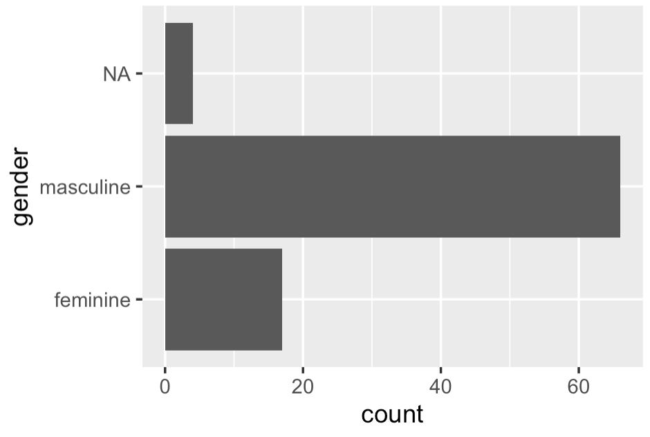
Explanation
To create this horizontal bar chart, we simply mapped our categorical variable to the y-axis instead of the x-axis.
To do this, we set y = gender inside of the aes() function.
Remember: the orientation of the bar chart depends on how we map our variables.
EXAMPLE 5: Set the bar length to a variable
Now, we’ll set the bar length to correspond to a variable.
Recall that in the last few examples, the bar length represented the count of the number of records by category. By default, when we use geom_bar(), ggplot plots the count of the number of records.
But we can actually set it up such that the length of the bar corresponds to a particular variable.
To show you this though, I’ll need to subset the data first.
Subset data
Here, we’re going to subset our data.
To do this, we’ll use the select function from dplyr to select a subset of columns: name, gender, height, species.
We’ll also use the filter function to subset the rows. Specifically, we’ll subset down to the rows where species is Human and where the height variable is not missing.
starwars_humans <- starwars %>%
  select(name, gender, height, species) %>%
  filter(species == 'Human') %>%
  filter(!is.na(height))
This subsetting operation might seem a little confusing if you don’t know dplyr. For more information on what we’re doing here, check out our dplyr tutorial.
Plot data
Now, we’ll plot the data.
Here, we’re going to plot the heights of individual human characters.
Let’s take a look, and then I’ll explain:
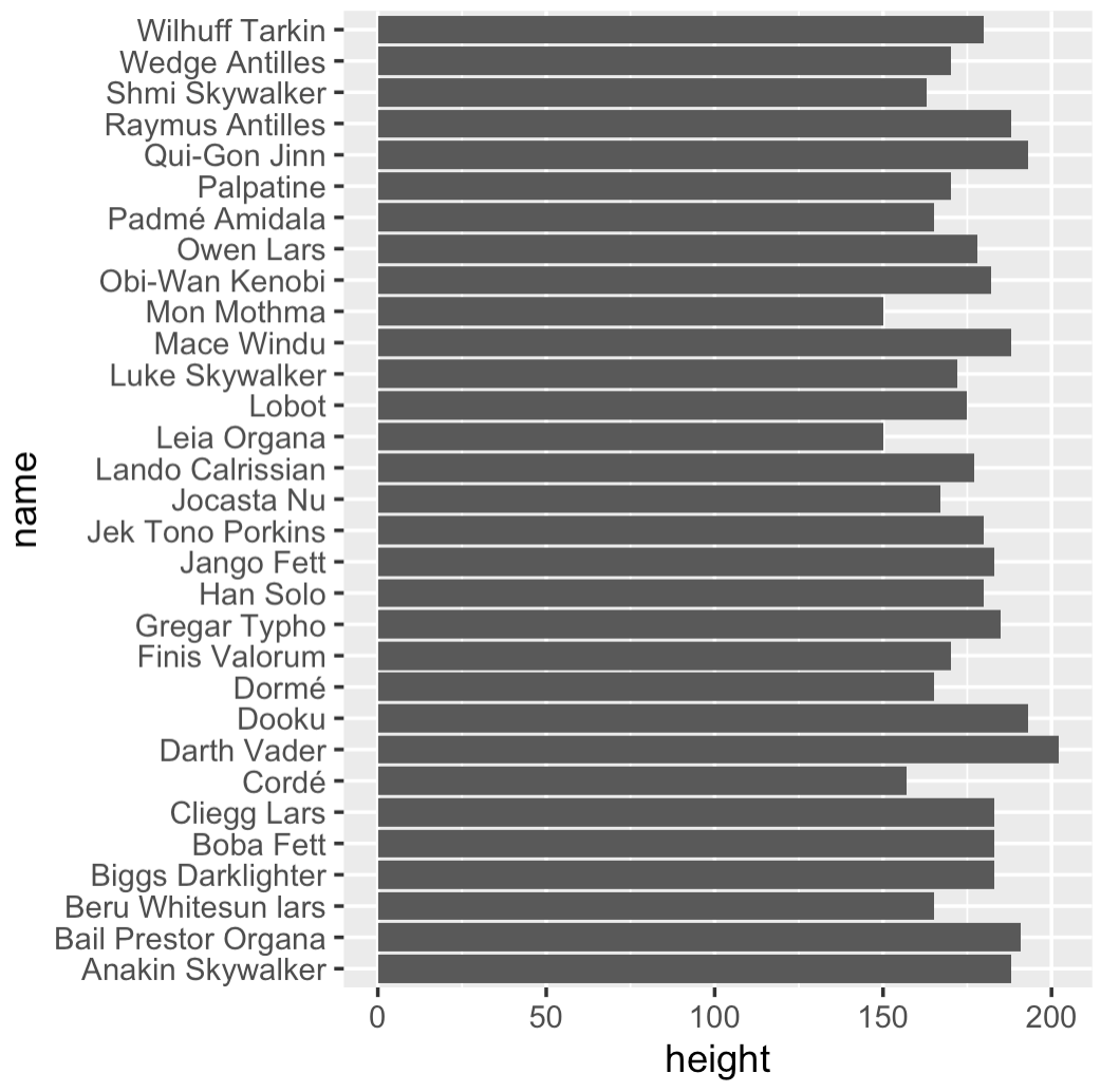
ggplot(data = starwars_humans, aes(y = name, x = height)) +
  geom_bar(stat = 'identity')
OUT:
Explanation
Here, we mapped name to the y-axis. The name variable contains categorical data (character names).
But in this visualization, the length of the bar represents the height of the character. Notice that this is in contrast to the previous examples. In the previous examples, the bar length represented the count of the number of records. By default, ggplot2 performed a statistical aggregation on the data. In the previous examples, ggplot counted the records and plotted the count.
But in this visualization, we’ve set it up so that the length of the bar represents a quantity contained in a variable. Specifically, the bar represents the height. To do this, we needed to set x = height.
Additionally though, to get this to work, we needed to use the stat parameter. Effectively, by setting stat = 'identity', we’re telling ggplot2 to plot the values contained in the numeric variable height. Instead of performing a statistical operation (i.e., counting the records), we’re telling ggplot that the length of the bar should be “identical” to the value in the numeric variable height.
This might seem like an odd way of doing it, but that’s how ggplot2 works for bar charts. If you want to plot the values in a specific variable, you need to set stat = 'identity' inside of geom_bar.
Leave your questions in the comments below
Do you have questions about how to make bar charts with geom_bar?
Is there something that I missed, or something else you’d like to know?
If so, leave your question in the comments section near the bottom of the page.
To learn more, you need to understand the ggplot system
There’s actually more that we could do with these bar charts, but not without a much broader understanding of the ggplot sytax system.
If you’re a beginner, you can use this blog post as a starting point.
After you learn the basics of geom_bar, I recommend that you study the complete ggplot system and master it. This is particularly true if you want to get a solid data science job. If you want to get a great data science job, you’ll need to be able to create simple plots like the barplot in your sleep. And you’ll need to do a lot more. You’ll need to be “fluent” in the basics.
If you’re serious about mastering data science, I strongly suggest you sign up for our email list. Here at Sharp Sight, we publish tutorials that explain how to master data science fast.
very helpful
Excellent … great to hear
One of the finest examples of intro lesson on geom_bar! do you have examples on labels. That is often tricky even for someone like me who has been using R for some years now!
This is one of the most concise, yet clearest explanation/walk through! Please continue to explain step-by-step with the visuals-it is so incredibly helpful. And I really appreciate and love how you break down the code and what all the elements mean :-) Wonderful! One of the best websites I have found (and I have been to MANY!).
Thanks for the complement. I work hard to make these tutorials as clear as possible.
(Also, if you search on google, you’ll find a *lot* more tutorials for data science in R and Python.)
Thanks
You’re welcome.
This was very helpful. I’m stuck with having my bar graph show zero count for specific categories. It is dropping the categories with zeros but I want them to show. Could you add something to address this or give me any pointers?