Data visualization is extremely important in data science.
Although you often hear about the importance of data manipulation (i.e., “80% of data science is data manipulation”), data visualization is just as important.
I explained why in a recent blog post about why you need to master data visualization. That blog post has a detailed explanation of why data visualization is important, and I recommend that you read it if you haven’t already.
To summarize though, data visualization:
- Is required for almost every step of the data science workflow
- Is critical at every data science job level, but especially at junior and intermediate levels
Whether you’re doing data exploration, data analysis, finding insights, storytelling with data, or building a machine learning model, you will probably need to use data visualization.
So, you need to make learning data visualization a priority.
The Problem of Data Visualization in Python
If you’re a Python user though, you’re going to run into a bit of a problem when you try.
Frankly, data visualization in Python is a pain in the a**.
Matplotlib is hard to use
When I say that data visualization in Python is difficult, I’m mostly talking about Matplotlib.
Matplotlib is the de facto standard for data visualization in Python. It’s the package that’s used in 90% of the books, videos, and courses that I’ve seen. It’s ubiquitous.
But the fact is, Matplotlib is hard to use for the most part.
Things like simple bar charts and scatterplots are somewhat easy to create, but that’s where the simplicity ends.
Doing other relatively simple things like adding multiple lines to a line chart, or creating a “dodged” bar chart (with different bars for different categories) is often confusing.
And slightly more complicated charts, like a small multiple chart, require a lot of confusing syntax.
Additionally, matplotlib doesn’t seem to work well natively with Python dataframes, which are now a standard for data science in Python.
This is in stark contrast to R’s ggplot2. ggplot2, although a little confusing to beginners, is extremely powerful and easy to use once you understand how it works.
Matplotlib, on the other hand, is almost always complicated and confusing. When you use it, things just seem harder than they should be.
Other options are also challenging
In an effort to find something better, I’ve personally looked at other options.
Bokeh is Bad For Data Science and Analytics
I was initially interested in Bokeh, which is very powerful.
But Bokeh is not really great for statistical visualization.
Bokeh excels at interactive visualizations. It’s really designed to produce visualizations that live on the internet, not necessarily static visualizations that are used for data exploration and analysis.
It also doesn’t work as well natively with Pandas dataframes.
So Bokeh has some uses, but I discourage it for data science and data analytics that you perform inside of an IDE.
Plotly is Okay, but Also Has Problems
I’ve also done some work with Plotly.
Plotly does have some strengths. First of all, Plotly is able to create simple visualizations with ease. For example, it’s easy to create a scatterplot, box plot, histogram, or line chart with Plotly. Simple small multiple charts are also relatively easy with Plotly.
It also has a somewhat easy syntax for formatting your charts. Formatting with Plotly is easier than formatting with Matplotlib.
But, whenever I’ve tried to make more complicated charts with multiple layers and/or facets, things start getting hard again.
Things that would be easy in R’s ggplot2 (like detailed charts with multiple layers), are still hard with Plotly. I’ve found myself spending too much time thinking about syntax, instead of just getting work done.
So in my opinion, Plotly is better than Matplotlib, but still needs work.
We Need a Better Data Visualization Option for Python
What we really need is a visualization toolkit that’s easy to understand, easy to use, works well with dataframes, and is capable of producing a wide range of statistical visualizations that we can use for data exploration and analysis.
After some research and experimentation, I discovered that such a package exists.
It’s Seaborn.
Learn Seaborn for Data Visualization
After quite a bit of experimentation with various Python data visualization packages, I discovered that Seaborn is the best option right now for statistical data visualization in Python.
There are a few major reasons for this.
Seaborn is Easy to Use
The biggest reason that I like Seaborn is that it’s easy to use.
In Seaborn, most common statistical visualizations can be created with a simple line or a few lines of code.
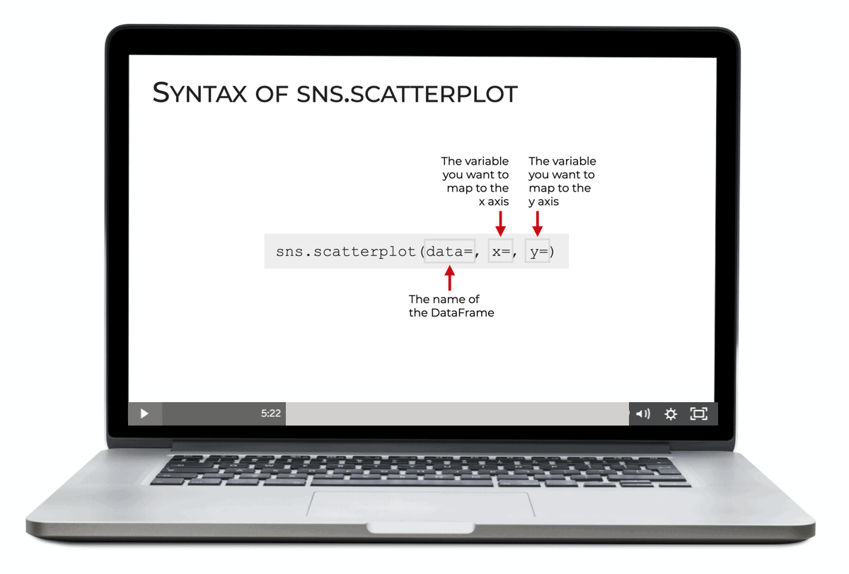
For example, if you want to create a scatterplot in Seaborn, once you have your data, the plot itself is very easy to create.
sns.scatterplot(data = norm_data
                ,x = 'x_var'
                ,y = 'y_var'
                )
I wrote that code on 3 lines to make it easier to read, but it could have been 1 line of code.
Notice as well that the parameters make sense.
There’s a data parameter to set the dataframe.
And there’s x and y parameters to set the variables that go on the x-axis and y-axis respectively.
The functions in Seaborn are fairly well designed, easy to understand, and easy to use.
Seaborn Enables You to Create a Wide Variety of Statistical Visualizations
Seaborn also enables you to create a wide variety of statistical data visualizations.
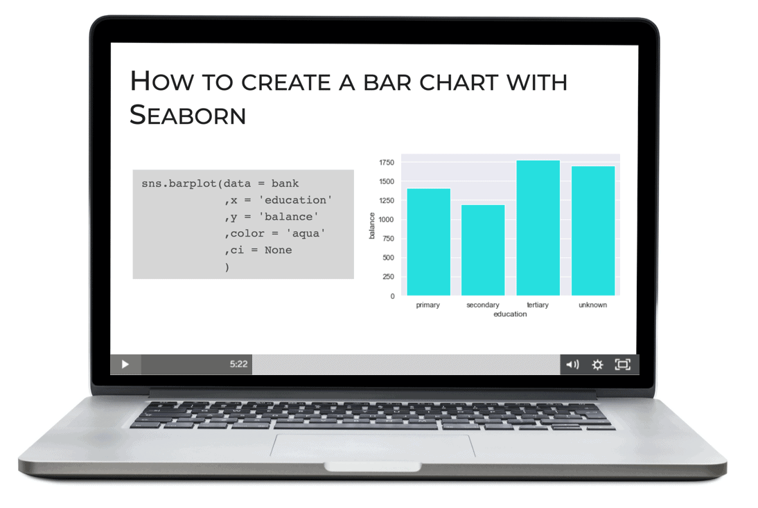
For example, bar charts are very straightforward to create.
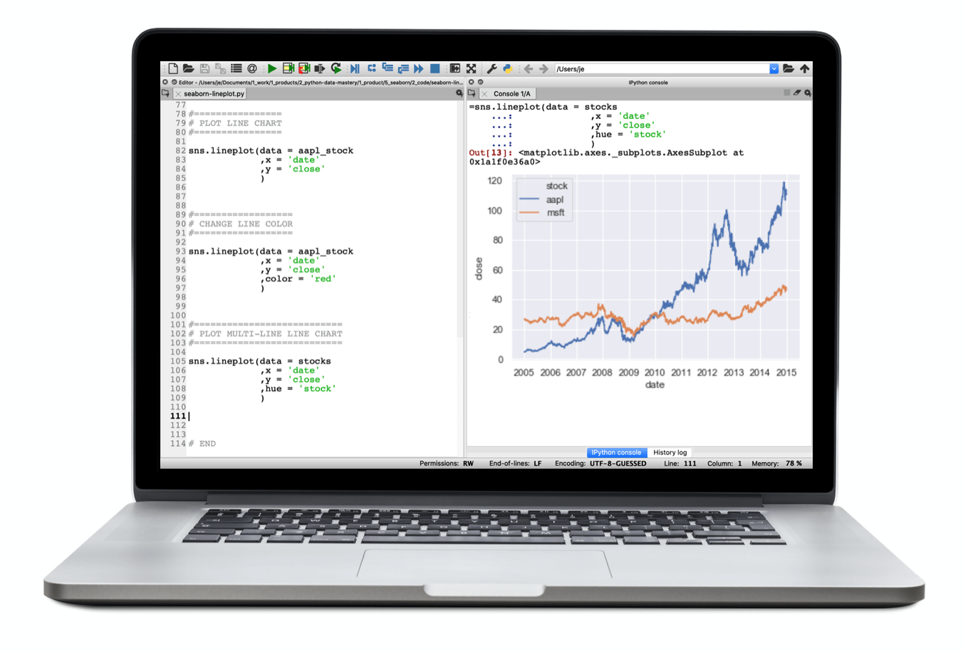
So are line charts:
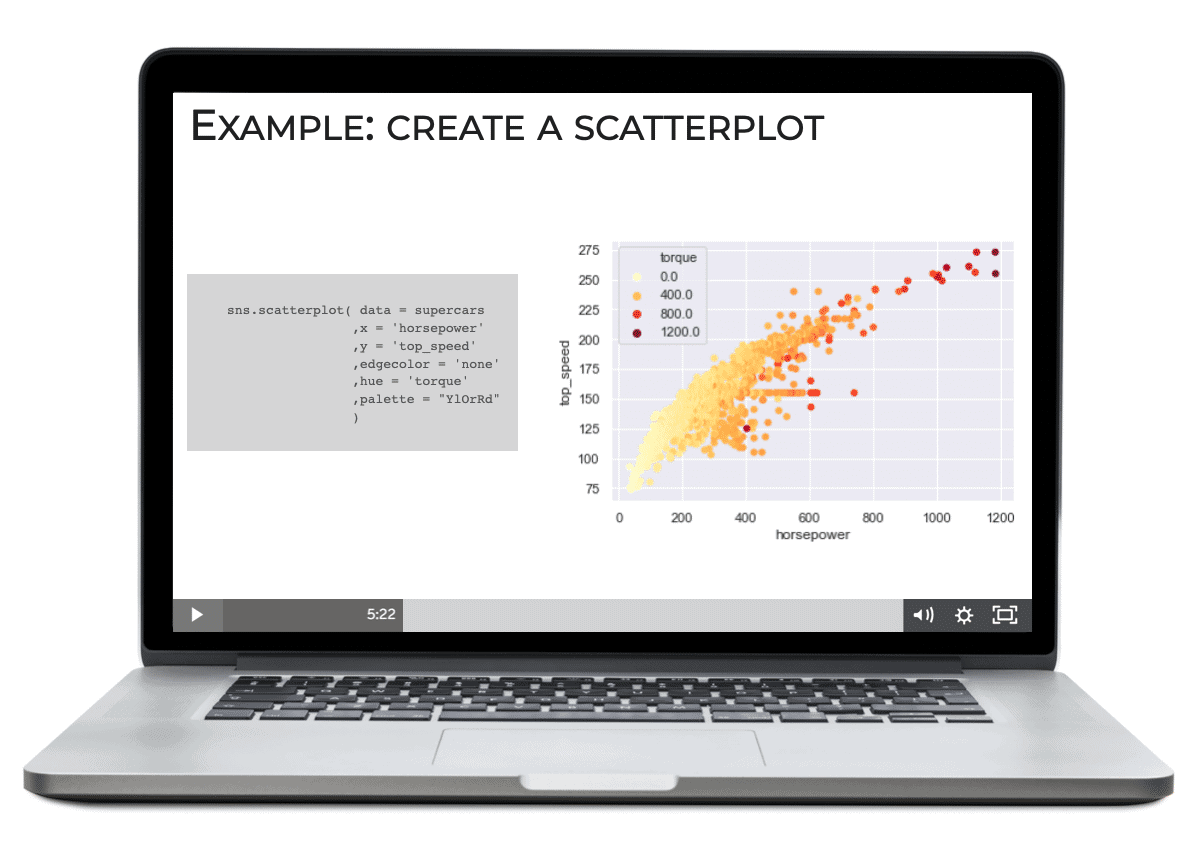
But Seaborn also enables you to create slightly more exotic visualizations.
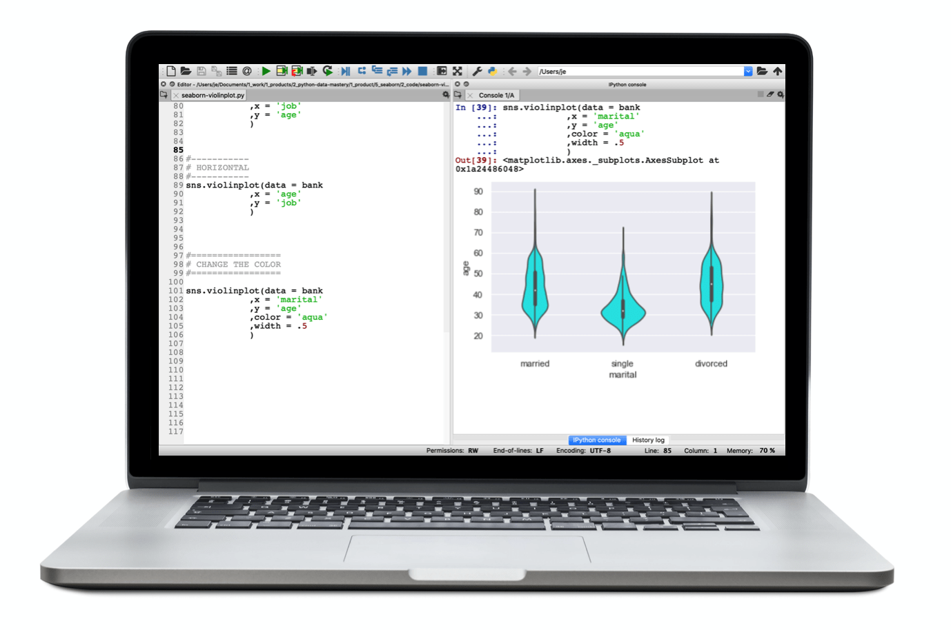
For example, you can use Seaborn to create violin plots:
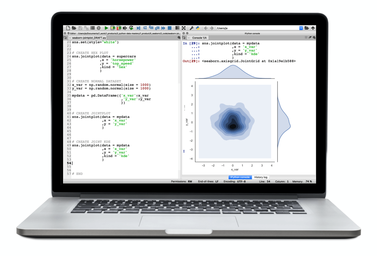
Two variable density plots:
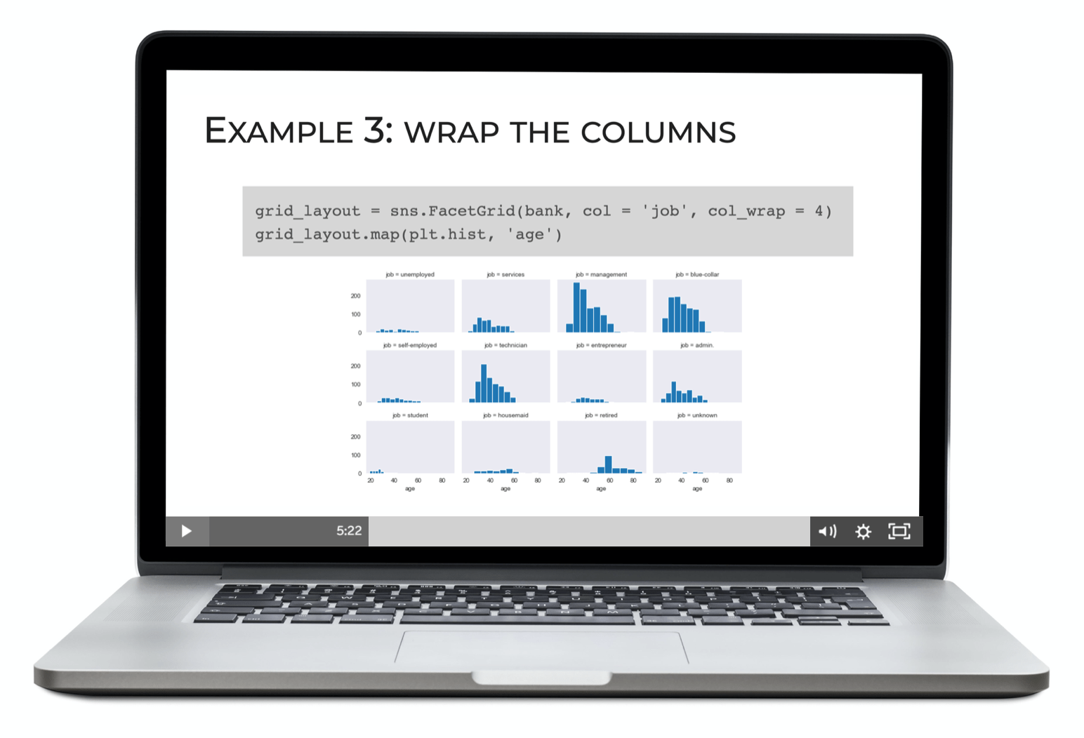
Small multiple charts:
As well as “pair plots,” heatmaps, and more.
Seaborn is a full toolkit for creating data visualizations that will help you analyze your data and find valuable insights.
And like I mentioned previously, all of these visualizations are relatively easy to create. Seaborn has simple functions for creating all of them.
Seaborn Works Natively with DataFrames
Pandas dataframes have become a standard for storing and manipulating data for data science projects.
Because of this, I’d argue that a great data visualization package should work seamlessly with Pandas dataframes.
That’s one of the reasons that I really like Seaborn.
Seaborn works natively with dataframes.
When you study the syntax, you’ll notice that most of the Seaborn functions have a data parameter. Many also have an x and y parameter.
In these Seaborn functions, the data parameter enables you to specify a Pandas dataframe as an input. They work seamlessly with dataframes.
Moreover, the x and y parameters enable you to directly specify dataframe variables (i.e., columns) as inputs to parameters like x and y. This also works for other parameters like the hue parameter which enables you to modify plot colors based on a third variable.
When you start working with Seaborn, you find that it “just works” with Pandas dataframes.
Seaborn Creates Beautiful, Multivariate Visualizations
Finally, you can use Seaborn to create beautiful, multivariate visualizations with only a few lines of code.
The “beauty” of these visualizations is important, because it makes them engaging to your audience.
But what’s more important here is that we can use Seaborn’s tools to easily manipulate plot aesthetics like size, opacity, color, and position to create visualizations that naturally produce insights. We can use Seaborn’s functionality to create visualizations that literally enable us to see the important features of our data. We can also use these complex visualizations to communicate insights to our partners.
I’ll emphasize again that Seaborn makes this relatively easy to do. Due to the simplicity of the syntax, creating beautiful, insightful visualizations becomes relatively easy once you know how it works.
UPDATE: Seaborn is Implementing the “Grammar of Graphics”
One other quick note.
According to Michael Waskom, the creator of Seaborn, the Seaborn team is developing a “new interface for making plots with seaborn” that’s based on the Grammar of Graphics.
This is likely to cement Seaborn as the best data visualization package for Python.
Why?
For those of you who have been reading the Sharp Sight blog for a while, you probably know that ggplot2 from R is one of my favorite data science toolkits.
The reason that I love ggplot2 so much, is that it implements a conceptual framework for data visualization called the Grammar of Graphics.
The Grammar of Graphics is a Conceptual Framework for How to Do Data Visualization
Without going into too much detail, the Grammar of Graphics describes a universal grammar – a theoretical framework – for how to build data visualizations in a systematic, streamlined way. Using this conceptual framework, you can theoretically create almost any data visualization.
But the Grammar of Graphics alone is just a theory. So developers have needed to create toolkits for different systems that implement the Grammar of Graphics.
ggplot2 implements the Grammar of Graphics for R.
Tableau implements the Grammar of Graphics as drag-and-drop desktop software.
But for some time, Python has lacked a good implementation of the Grammar of Graphics.
It appears that Seaborn will change this.
Seaborn will Soon Implement the Grammar of Graphics
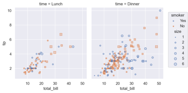
It’s not clear when this will be complete, but Waskom has specifically stated that he and his team are creating a special new Seaborn syntax that implements the Grammar of Graphics.
At the Seaborn blog, he shared an early example that shows this new Seaborn-Grammar-of-Graphics syntax. Specifically, he showed how you can use this syntax to create a faceted scatterplot.
import seaborn as sns
sns.set_theme()
tips = sns.load_dataset("tips")

import seaborn.objects as so
(
    so.Plot(
        tips, "total_bill", "tip",
        color="smoker", marker="smoker", pointsize="size",
    )
    .facet("time")
    .add(so.Scatter())
    .configure(figsize=(7, 4))
)
Which creates the following chart:
Grammar of Graphics for Python Will Be a Game Changer
An implementation of the Grammar of Graphics for Python will change the game.
As I’ve suggested in this post, data visualization in Python has been very difficult in the past. Many of the toolkit like Matplotlib are very hard to use.
An implementation of the Grammar of Graphics for Python will simplify data visualization in Python.
In turn, this will make it much easier to “find insights in data.”
And ultimately, it will facilitate better and faster data analysis in Python. (Remember: data analysis = data visualization + data manipulation.)
So if you’re serious about data science in Python, I strongly recommend that you learn Seaborn. It’s already very powerful, and useful.
And Seaborn is about to become even better.
Learn Seaborn to do Data Visualization in Python
Seaborn is hands down my favorite data visualization package for Python right now.
It’s the primary tool that I use for statistical data visualization.
And it’s also the only Python data visualization package that I teach to our beginning students (although, at advanced levels, students may want to explore other tools for specific use cases).
If you’re looking for a Python data visualization package that’s easy to use, easy to understand, powerful, and works well with Pandas dataframes, I think that Seaborn is definitely the best option.
How to Master Data Visualization using Seaborn
If you’re ready to master data visualization in Python using Seaborn, you should join our new course, Seaborn Mastery.
Seaborn Mastery is our premium course to help you master data visualization in Python using the Seaborn package.
We’ve designed this course to be the absolute fastest way to master Seaborn. The course breaks everything down, step by step. It clearly explains all of the techniques. It clearly explains the syntax. And it will give you a practice system that will help you memorize all of the syntax you learn. Ultimately, the course will help you master Seaborn within only a few weeks.
If you’re ready to master data visualization in Python, this is the course you’ve been waiting for.
We’re going to re-open enrollment for Seaborn Mastery on Tuesday June 7.
Nice piece of information you have shared with us. You’re doing a great job and Thanks for sharing.
Thanks for the complement. Good to hear that it was useful.
Have a look at Altair instead.
I’m well aware of Altair and think that it’s great.
But it doesn’t work inside most data science IDEs, so it’s almost useless for real world analytics.
(And don’t bother to say “but muh Jupyter” …. Jupyter is bad for actual project work.)