Why I Prefer R for Analytics
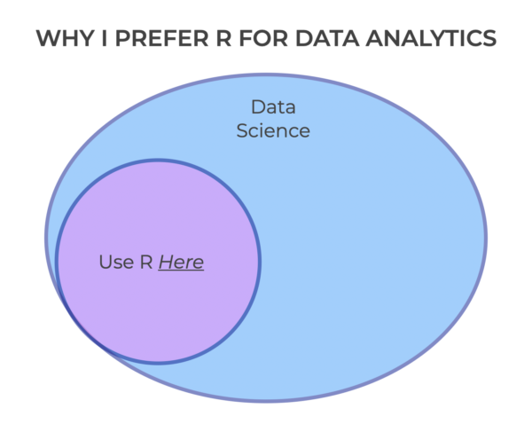
One of the the questions that I get over and over is, which data science language do I use? I have my own preferences with regards to programming languages, but there’s not always a clear answer. In fact, my standard answer is “it depends.” You see, different languages are good for different things. But what … Read more