I was thinking the other day about the “fast path” to mastering data science.
I think about this a lot, frankly, because our data science courses are designed to be the fastest way to master data science. That’s what we do here at Sharp Sight.
But I was thinking about it even more in the last few weeks.
If I had to recommend one skill to focus on in the beginning, what would it be?
If I had to start all over again, where would I focus?
If you’re a beginner, the answer might surprise you.
I wouldn’t start with data visualization, because data visualization in Python largely has prerequisites. I wouldn’t start with math, because math is mostly overrated for data science. And I definitely wouldn’t start with machine learning. Machine learning and deep learning are advanced topics that you should almost certainly learn after you’ve mastered the essentials.
So where would I start, and where would I focus my time, if I had to start all over again?
Data manipulation.
Data manipulation is the foundation for everything else
Most beginners eventually hear that data manipulation is important, but almost everyone (and I really mean everyone) underestimates just how important data manipulation is.
The fact is, that data manipulation is the foundation for almost everything else in data science.
When you start working on a new project … you need data manipulation.
When do data visualization … you often need data manipulation.
When you do data analysis … you almost always need data manipulation.
And data manipulation is certainly important even for more advanced topics like machine learning.
The inescapable fact is that you need to use data manipulation at almost every step of the data science workflow.
You often hear the statistic that “80% of data science work is data manipulation.”
To some newbies, this sounds like an exaggeration.
It’s not.
If and when you actually get a real data science job, you’ll spend a disproportionate amount of time just cleaning, wrangling, and reshaping your data.
If you pay attention to our tutorials, this should be obvious
If you consistently read and work with our tutorials, this should be somewhat obvious.
For example, in the last few weeks, we’ve published a series of tutorials that show how to wrangle, analyze and visualize a dataset about covid-19.
We’ve already published 6 tutorials. Most of these tutorials focus on one particular step or one task in the data science workflow.
Some are explicitly about data manipulation, like part 1 where we get and clean one covid19 dataset, or part 2 where we create a procedure to automate data cleaning.
But some are about data visualization or data exploration. For these, it doesn’t sound like they would involve a lot of data manipulation, but if you look closely, these tutorials also use data manipulation tools.
In fact, if you look at all of these tutorials, we need some data manipulation for almost all of them.
Let me say that again: in almost every tutorial in the recent covid19 series, we’ve needed to use Pandas data manipulation tools.
Let’s take a look at a few of these examples from the covid19 series, so you can see this in action.
Data manipulation is required to “build” datasets
Any veteran data analyst or data scientist can tell you that data manipulation is critical at the beginning of a data science project.
But new data science students often miss this fact, because they often get to practice with pre-cleaned datasets. That’s often a good thing. At Sharp Sight, our teaching philosophy is “start simple, and then increase the complexity.”
So for new data science students, it’s good if you’re working with pre-cleaned datasets.
But eventually you’re going to need to sit down and work on a real-world project, with real world data. Data in the real world is messy, so eventually, you’ll have to use data manipulation to get and clean your data.
Example: getting and cleaning a new dataset
Here’s an example.
A few weeks ago, we began our covid19 data analysis series. In the first installment of this series, we retrieved one of the covid19 datasets from Johns Hopkins university.
To start this, we had to get the new dataset.
(For a full explanation of what we did, and how we did it, please review Part 1 of our covid19, Python data analysis series.)
import pandas as pd

url = 'https://raw.githubusercontent.com/CSSEGISandData/COVID-19/master/csse_covid_19_data/csse_covid_19_time_series/time_series_covid19_confirmed_global.csv'

covid_data_RAW = pd.read_csv(url)
We also had to do things like renaming columns:
covid_data = covid_data_RAW.rename(
        columns = {'Province/State':'subregion'
                   ,'Country/Region':'country'
                   ,'Lat':'lat'
                   ,'Long':'long'
                   }
        )
We had to reshape the data using the Pandas melt method …
#==================================
# RESHAPE THE DATA
# - melt the data into 'tidy' shape
#==================================
covid_data = (covid_data.melt(id_vars = ['country','subregion','lat','long']
                 ,var_name = 'date_RAW'
                 ,value_name = 'confirmed'
                 )
)
We had to convert the dates to a new format, and create a new variable using the Pandas assign method:
#-------------
# CONVERT DATE
#-------------
covid_data = covid_data.assign(
         date = pd.to_datetime(covid_data.date_RAW, format='%m/%d/%y')
         )
Rearranged our data using both Pandas filter to rearrange the columns and Pandas sort values to sort the rows.
#=====================
# SORT & REARANGE DATA
#=====================
covid_data = (covid_data
               .filter(['country', 'subregion', 'date', 'lat', 'long', 'confirmed'])
               .sort_values(['country','subregion','lat','long','date'])
               )
And at one point, we used the Pandas set_index method to set the dataframe index.
Furthermore, in Part 2 of the series, we ended up merging on 2 additional datasets (for covid deaths and recoveries), which required us to drop some variables using the Pandas drop method and then merge the data with the Pandas merge method.
Getting and cleaning a dataset requires multiple functions
I want you to think about that series of operations.
To get and clean a dataset, we needed to use at least 10 separate data manipulation methods:
- read_csv
- rename
- to_datetime
- melt
- assign
- filter
- sort_values
- set_index
- drop
- merge
And keep in mind, this wasn’t a terribly complicated dataset. This was probably an “intermediate” level dataset, in terms of difficulty. Some more complicated csv files might require additional data manipulation techniques.
The good news is that this list of tools is relatively brief.
But the main point stands: in order to get and clean a dataset, you need to have a mastery of the essential data manipulation tools.
Data manipulation is often necessary for data exploration
It’s probably obvious that data manipulation tools should be necessary for data retrieval and cleaning, but what’s probably less obvious is that many of these same tools are necessary for data exploration.
Let’s take a look at an example of this with our recent covid19 data.
Example: exploring covid19 data
When we started the data exploration, we actually used some Pandas techniques to retrieve the finalized, cleaned up data from a csv file.
(Note: here is some code to get the fully merged and cleaned covid_data from our data exploration tutorial)
import pandas as pd
import datetime

covid_data = pd.read_csv('https://learn.sharpsightlabs.com/datasets/covid19/covid_data_2020-03-22.csv'
                         ,sep = ";"
                         )
covid_data = covid_data.assign(date = pd.to_datetime(covid_data.date, format='%Y-%m-%d'))
Once we got the data, we did some basic data inspection with simple print statements, looking at the columns, looking at the structure of the data, etc.
But after the basics, we went quite a bit further.
Check unique values
For example, we explored the data to check the unique values of the country variable.
pd.set_option('display.max_rows', 180)
(covid_data
    .filter(['country'])
    .drop_duplicates()
)
We did something similar to check the values of the date variable:
(covid_data
  .filter(['date'])
  .drop_duplicates()
)
Take a look at that code.
To identify the unique values, we actually had to use two data manipulation tools: the Pandas filter method, and Pandas drop_duplicates.
Check maxima and minima
Next, we looked at two numeric variables: lat and long.
These variables contain the latitude and longitude coordinates for the observations.
In exploring these, we wanted to just take a look at the range of values to check if the ranges looked consistent with latitude and longitude coordinates. We wanted to see if the data ranges looked “okay”, or if there were possibly some out-of-range values that could not have been lat or long coordinates.
To do this, we used more data manipulation tools from Pandas:
(covid_data
  .filter(['long','lat'])
  .agg(['min','max'])
)
Again, look at the code.
We used the Pandas filter method (again) and then we used the Pandas agg method. We used these methods in a “chain” in order to compute the maxima and minima for both the lat and long variables.
Explore other numeric variables
Later, we explored some additional numeric variables, confirmed, dead, and recovered.
#-----------------------------------------------
# EXAMINE VARIABLES: confirmed, dead, recovered
#-----------------------------------------------
(covid_data
 .filter(['confirmed','dead','recovered'])
 .describe()
)
Here again, we needed to use the Pandas filter method to do this.
Data exploration requires data manipulation tools
Most new data science students eventually hear that data exploration is important.
Many of these students try to “explore” their data, but eventually get stuck. They don’t know where to begin, and don’t actually know how to do it.
Take a look at some of the exploration code we just used (or take a look at the full tutorial for Part 3).
Most of it consisted of retrieving subsets, performing aggregations, and printing.
Certainly, exploration can get more complicated (I’ll show you some examples in the data visualization section of this blog post), but here is the point I want you to take away:
To do data exploration, you need to know and use data manipulation tools.
For the most part, data exploration is just applying data wrangling tools to view your data at a high level; drill down with subsets; aggregate and summarize your data; and describe various subsets.
Somewhere between 50 and 80% of the tools that you actually use to “explore” your data are actually data wrangling tools.
A quick note about data exploration
Keep in mind, it’s often underappreciated that data exploration is extremely important. Prior to almost any big project, you need to simply dig into the data and understand how it’s structured.
Whether you’re doing a simple one-off data analysis, or building a complicated machine learning model, you almost always need to explore your data. Moreover, you almost always need to explore your data over and over again, across the project lifecycle. It’s extremely important.
Data manipulation is often necessary for data visualization
Let’s take a look at data visualization now.
If you don’t know any better, data visualization sounds like something different and separate from data manipulation.
It’s definitely a different skillset in the abstract sense, but you cannot separate data visualization from data manipulation.
That is, to properly use data visualization techniques, you often need to use data manipulation techniques as well.
Let me show you.
Example: visualizing covid19 data
Here, we’ll take a look at some of the data visualization we did in part 4 of our covid19 series.
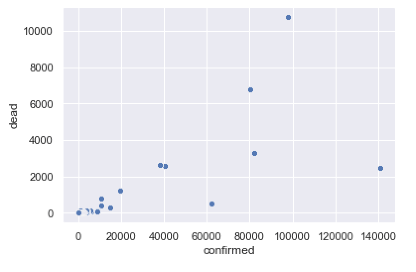
A “Simple” scatterplot
For starters, we did a simple scatterplot of confirmed cases vs deaths.
Seems simple, right?
Well, to do this, we needed to first subset data down to one specific date, and then aggregate the data so that the observations were at the country level:
import pandas as pd
import seaborn as sns
import numpy as np
import datetime

covid_data = pd.read_csv('https://learn.sharpsightlabs.com/datasets/covid19/covid_data_2020MAR31.csv'
                         ,sep = ";"
                         )
covid_data = covid_data.assign(date = pd.to_datetime(covid_data.date, format='%Y-%m-%d'))
covid_data_2020MAR29 = (covid_data
                        .query("date == datetime.date(2020, 3, 29)")
                        .filter(['country','confirmed','dead','recovered'])
                        .groupby('country')
                        .agg('sum')
                        .sort_values('confirmed', ascending = False)
                        .reset_index()
)
It was only after we wrangled the data that we used the Seaborn scatterplot function to actually plot the data.
sns.scatterplot(data = covid_data_2020MAR29
                ,x = 'confirmed'
                ,y = 'dead'
                )
Think about that:
The final function to visualize the data was only 1 function.
But we needed to use 7 data manipulation tools to get the data into the right shape, before we could ever visualize it.
In this particular case, to do a simple data visualization, the ratio of data manipulation to data visualization tools was 7 to 1!
A “simple” line chart
Let’s take a look at a line chart.
Again, this sounds simple, right?
Line charts are “easy”, right?
Once again, in order to create our line chart, we first needed to wrangle the data using 5 data wrangling tools.
confimed_by_date_xchina = (covid_data
                           .query('country != "China"')
                           .filter(['date','confirmed'])
                           .groupby('date')
                           .agg('sum')
                           .reset_index()
                           )
Once we wrangled the data into a new dataset called confimed_by_date_xchina, we were then able to plot that data with the Seaborn lineplot function:
sns.lineplot(data = confimed_by_date_xchina
             ,x = 'date'
             ,y = 'confirmed'
             )
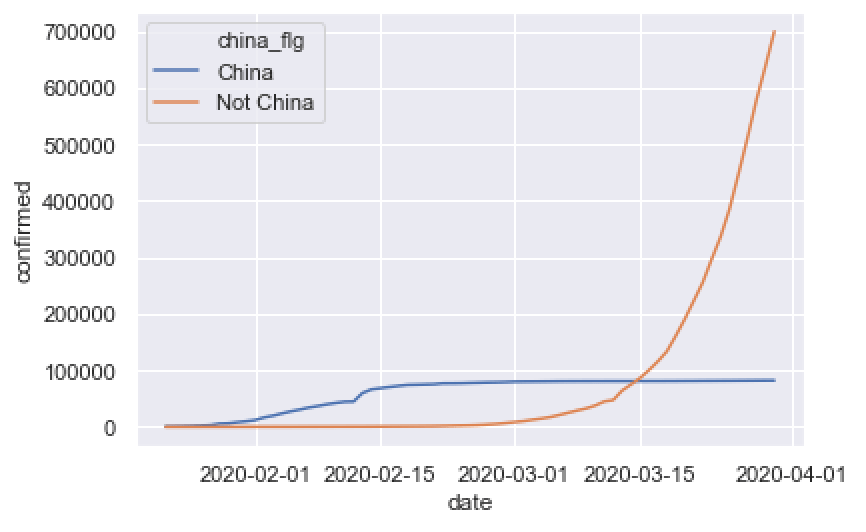
Once again: to actually do real-world data visualization in Python, you need to use a lot of data manipulation techniques to get data into the right form. (In this case, it was a 5/1 ratio of data manipulation methods to data visualization functions.)
The rest of the Part 4 tutorial goes on like this. Every time we used a data visualization tool, we needed to use 5+ data wrangling tools to get our data into the correct shape first.
(We also needed to do some moderately complex data wrangling in Part 5 in order to create a small multiple chart for Part 6.)
To do data visualization, you need data manipulation
Let me reiterate: in order to actually do data visualization, you very frequently need to use data manipulation tools first, in order to get your data into the right shape … the right shape to produce the correct data visualiztion.
And think about what I mentioned in the previous couple of sections:
In these cases when you need to use data wrangling tools prior to data visualization, the ratio is often 5 to 1 or higher!
When you actually do “data visualization” in these cases, you actually need to use relatively more data manipulation to get it done!
Data manipulation is required for more advanced techniques
I’ve already shown you that data manipulation is required for data cleaning, data exploration, and data visualization.
But it doesn’t stop there …
If you want to use more advanced techniques, like machine learning, data wrangling will still be critical.
You’ll often need to restructure your data; create new variables; aggregate your data; and visualize your data … all of which often require data manipulation tools.
The point should be clear to you: if you want to be great at data science – almost any aspect of data science – you had better know data manipulation.
Elite performers focus on fundamentals
This brings me to a final, and more general point: elite performers focus on fundamentals.
I can’t tell you how many people contact me on a weekly basis, asking me how to “learn machine learning” or some cool advanced topic.
I always tell them the same thing: learn data manipulation, and then learn data visualization.
Most of them ignore the advice and fail to master these foundational skills.
But top performers are different: top performers focus on fundamentals.
One of my favorite writers on this topic is a Navy SEAL named Chris Sajnog, who was a Navy SEAL firearms instructor.
In a book about learning marksmanship, Sajnog said that in order to perform well in high stress environments, a person must have a “strong foundation” in “the fundamentals.” He went on to say that a a person must perform the fundamentals “exceedingly well, with virtuosity.”
Let me say that again: to perform well in high stress environments, you must be able to perform the fundamentals like a master.
Business environments are not as life-and-death consequential as combat zones, but I can tell you that as a former employee of Apple and several other top-tier Fortune 500 companies, these elite work environments are often high stress.
You’re often operating with tight deadlines, complex demands, and sometimes a lot of money on the line.
Would you have what it takes?
You always hear about the 6 figure data science jobs (they are definitely out there) but do you have the skills to perform in a job like that?
I can tell you from experience – echoing Sajnog – that to perform in these elite business environments, you need to know the fundamentals extremely well.
Exotic techniques are sometimes useful, but these advanced techniques are almost always dependent on use of the fundamentals: namely things like data manipulation.
Like I noted earlier, for every 1 time I might use a fancy technique in a business environment, I’d spend 5 or 10 times as much time using data manipulation, just to get everything into the right shape.
Here’s a bit of tough love: you want to get a high paying data science job at some point? Do you want to work on great projects?
Master data manipulation.
Stop being like those lazy students who want shortcuts, who insist on jumping to the cool stuff, and who won’t ever make it.
Master. the. fundamentals.
We’re reopening our Python data manipulation course soon
If you’re really serious about mastering the fundamentals of data science ….
… and in particular, if you’re interested in mastering Python data manipulation with Pandas
… then you should enroll in our course, Pandas Mastery.
Pandas Mastery is designed to help you master data manipulation with Pandas as fast as possible.
We’re re-opening enrollment this week on Tuesday April 21, 2020.
If you’re ready to master data manipulation with Pandas, you should sign up. Hope to see you there.
I have always loved how you pound the importance of learning the fundamentals of Data Science specifically data manipulation. Scraping websites for projects, downloading .csv files, taking your courses and reading your fantastic tutorials have provided a great foundation for data visualization and taking the next step with machine / deep learning. You are absolutely right Josh, it has taken me about two years to have an idea of what I am doing rather than just copying and pasting. Well done!
So much depends on the fundamentals. The longer I teach and do data science work, the more important I think the fundamentals become.
Mastery of data manipulation, data visualization, and data analysis are the first milestone.
If a person can’t do those, they need to go back and study them more.
… it sounds like you’ve been practicing though, Michael, so keep it up.
Same for me as the above. I have been doing Data Science for around 2 years and it’s starting to click, at least the fundamentals anyway.
One thing I wanted to ask, one of your older posts I think suggested that data visualisation be the first thing to master. Have you changed your opinion on this over the years to wrangling?