I have a confession.
I’m an American, and I was raised an American.
But, I’ve been semi-nomadic for almost 10 years. A “digital nomad.”
That is, I’ve lived in many countries around the world since about 2014 (although, I also lived a substantial amount of time in Austin, Texas during the last 10 years).
I’m one of a growing number of people who call themselves location independent.
Us nomads and location independent people were doing remote work before it was cool.
Looking for Cities, As a Location Independent Entrepreneur
In the past, I moved somewhat frequently. Every 3 to 6 months.
Today though, I don’t move that often. Now, I tend to pick a city and stay there for at least 6 months.
Still, whether I move frequently, or stay in the same place for an extended period I have a set of criteria that help me choose where to live.
First, I want a place to have a relatively high quality of life. Ideally, good weather, walkability, somewhat reasonable costs, etcetera.
Second, I don’t want to get f*#^ing stabbed. Said differently, safety is a priority for me. I want to live in a location that’s relatively secure, with low crime.
To be fair, quality of life (QoL) is somewhat subjective, and the factors that might be included in quality of life could be complex (we’ll get to that in a moment).
But, roughly speaking, QoL and crime is what I’m looking at.
Using Numbeo as a Data Source for City Selection
So when I look for a new place to visit or live, I screen cities based on crime and general QoL.
Where can you get such data?
Numbeo.
The numbeo.com website explains itself as a crowd-sourced database of cost of living and quality of life information.
It has a variety of croudsourced data related to cost of living, like rental prices, food prices, purchasing power.
And also data related to quality of life, including healthcare, pollution, traffic, and crime.
It’s imperfect in some ways, but it’s often good enough to get some high-level information on a city, and I’ve used it several times to find and select a city to travel to.
In the past, that meant looking at the tables on the website and manually identifying prospective cities.
A Quick Idea for a Project
Of course, doing things manually is a bit inefficient, right?
And after all, I am a guy with some data skills.
So it occurred to me that this would be a cool little data project…
Scrape some data from Numbeo and use that data to find some great cities.
This is good for me, because maybe I’ll spot a unique city that I never thought of.
But this is good for you, dear reader, because it will allow me to show you how to do some data scraping and wrangling to accomplish something useful.
You’ll get to see some more data work in action.
A Small Project: Merge Crime and Cost Data
So, in the rest of this tutorial, we’ll do a simple data project.
We’re going to:
- scrape some quality of life data from Numbeo
- do some quick-and-dirty analysis on the QoL data
Let’s get started.
Scrape Data
Here, we’re going to scrape some quality of life data from numbeo.com.
We’ll use Beautiful Soup to scrape the data, and we’ll use a little bit of Python to do some quick formatting.
We’ll scrape the data in a series of steps, and I’ll quickly explain as we go.
Import Packages
First, we need to import the packages that we’ll use.
import requests
from bs4 import BeautifulSoup
import pandas as pd
Make a Request to the Webpage
Next, we’re going to “connect” to the webpage URL by making a request with requests.get().
Notice that we’re specifying the exact webpage with a string and storing it in qol_url.
# Send a GET request to the webpage
qol_url = 'https://www.numbeo.com/quality-of-life/rankings.jsp'
qol_response = requests.get(qol_url)
Parse the Webpage
Next, we’re going to parse the webpage with the BeautifulSoup() function, which generates a BeautifulSoup object.
# Create a BeautifulSoup object
qol_soup = BeautifulSoup(qol_response.content, 'html.parser')
Essentially, the qol_soup object has the contents of the webpage, but encoded into a data structure that Python can work with.
Get the Table Data
Next, we’ll get the table data.
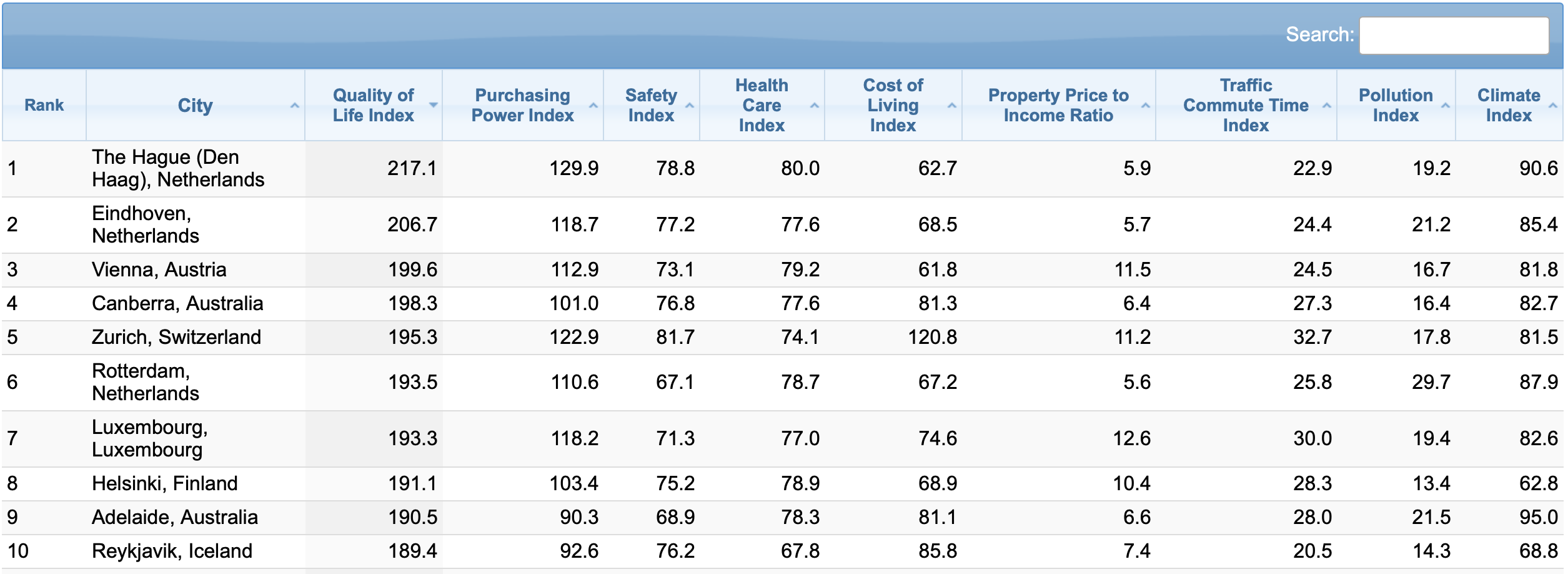
Specifically, I’m talking about the table of data that exists on the webpage we’re scraping:
To get that table data, we’re going to use the .find() method from Beautiful Soup.
# Find the table containing the QoL data
qol_table = qol_soup.find('table', {'id': 't2'})
Get the Headers
Next, we’re going to strip the column headers from the table data.
# Extract the table headers
qol_headers = [header.text.strip() for header in qol_table.find_all('th')]
Get the Row Data
Here, we’re going to get the rows of the data.
Essentially, this is finding all of the rows of data one at a time, retrieving that data from the table, and appending that row data to a Python list.
# Extract the table rows
qol_rows = []
for row in qol_table.find_all('tr'):
    qol_row_data = [data.text.strip() for data in row.find_all('td')]
    if qol_row_data:
        qol_rows.append(qol_row_data)
Once this finishes running, we have all of the table data in a the Python list, qol_row_data.
Create DataFrame and Clean Data
Now that we’ve scraped the data, let’s put it into a Pandas DataFrame and clean it so that it’s ready for analysis.
Create Dataframe
Here, we’re going to turn the list of row data into a Python dataframe with the pd.DataFrame function.
# Create a Pandas dataframe
qol_df = pd.DataFrame(qol_rows, columns = qol_headers)
Once you run the code, we have a DataFrame called qol_df. This contains the table data from the Numbeo page.
Print the Data (data inspection)
Next, we’ll do some quick data inspection. We just want to see what’s in our data and make sure that it looks OK (you should constantly inspect your data when you do a data project).
Notice that I’m using the pd.set_option() function to show 20 columns. We need to do this, because by default, Pandas only shows a few columns, and it makes it hard to see the full structure of the data.
# Display the dataframe
pd.set_option('display.max_columns',20)
print(qol_df)
OUT:
    Rank                               City Quality of Life Index  \
0         The Hague (Den Haag), Netherlands                 217.1
1                    Eindhoven, Netherlands                 206.7
2                           Vienna, Austria                 199.6
3                       Canberra, Australia                 198.3
4                       Zurich, Switzerland                 195.3
..   ...                                ...                   ...
237                            Tehran, Iran                  61.6
238                       Dhaka, Bangladesh                  57.5
239                         Beirut, Lebanon                  56.8
240                          Lagos, Nigeria                  48.4
241                     Manila, Philippines                  45.0

    Purchasing Power Index Safety Index Health Care Index  \
0                    129.9         78.8              80.0
1                    118.7         77.2              77.6
2                    112.9         73.1              79.2
3                    101.0         76.8              77.6
4                    122.9         81.7              74.1
..                     ...          ...               ...
237                   18.9         44.1              52.6
238                   25.9         36.8              40.1
239                   10.1         53.7              65.2
240                    7.6         32.5              46.3
241                   24.8         34.6              63.7

    Cost of Living Index Property Price to Income Ratio  \
0                   62.7                            5.9
1                   68.5                            5.7
2                   61.8                           11.5
3                   81.3                            6.4
4                  120.8                           11.2
..                   ...                            ...
237                 33.2                           29.0
238                 29.6                           15.4
239                 80.3                           41.3
240                 38.8                           12.2
241                 37.9                           37.6

    Traffic Commute Time Index Pollution Index Climate Index
0                         22.9            19.2          90.6
1                         24.4            21.2          85.4
2                         24.5            16.7          81.8
3                         27.3            16.4          82.7
4                         32.7            17.8          81.5
..                         ...             ...           ...
237                       52.9            81.0          71.0
238                       61.0            93.5          71.3
239                       39.8            93.7          94.7
240                       68.2            89.3          60.8
241                       53.6            89.9          61.2

[242 rows x 11 columns]
As you can see, we have various “quality of life” metrics like metrics for crime, weather, traffic, cost of living … all by city.
This data is pretty clean already, but we’ll quickly do some modifications to the column names.
Clean Column Names
The column names look mostly ok, but there are two issues:
- there are capital letters in the column names
- there are spaces in the column names
Spaces in particular can cause problems when you use a column name in Python code, so we want to remove them.
To do this, we need to pick a naming convention. Some people prefer “camel case,” which removes the spaces completely, and keeps capital letters (which create a “hump” in the name, thus the term “camel case”).
I prefer so-called “snake case,” where everything is lower case, and we replace spaces with underscores.
This makes the names easy to read and easy to type.
So here, we’re going to reformat the column names to snake case, by transforming all the letters to lower case, and replacing the spaces with underscores.
# RENAME COLUMNS
# – lower case
# – snake case
qol_df.columns = qol_df.columns.str.lower()
qol_df.columns = qol_df.columns.str.replace(' ','_')
Notice that to do this, we’re using some string methods from Pandas.
Drop the ‘Rank’ Column
Next, we’ll drop the rank column from the data.
Why?
Well the ranking is based on the original order of the data on the table. Once we start working with the data, we may want to re-sort it, which would make the rank column meaningless. Moreover, when we resort a dataframe, we can create our own rank column.
Essentially, this is a type of variable that I usually remove from a dataset, and only create it again if I need it, and after I sort or re-sort the data.
# DROP 'rank'
qol_df.drop(columns = 'rank', inplace = True)
Notice that to do this, we’re using the Pandas drop method.
Modify Data Types
Now, let’s quickly inspect and possibly modify the data types of the columns.
First, we’ll inspect the current data types:
qol_df.dtypes
OUT:
city                              object
quality_of_life_index             object
purchasing_power_index            object
safety_index                      object
health_care_index                 object
cost_of_living_index              object
property_price_to_income_ratio    object
traffic_commute_time_index        object
pollution_index                   object
climate_index                     object
Ok. These are all “object” data types.
That will be fine for city (because an “object” data type will operate as a string).
But these data types might cause problems for our metrics and “index” variables.
So, we need to recode the data types.
To do that, we’ll create a mapping from column name to new data type, using a Python dictionary.
Then, we’ll use the Pandas astype method to change the data type:
dtype_mapping = {
    #'city':''
    'quality_of_life_index':'float64'
    ,'purchasing_power_index':'float64'
    ,'safety_index':'float64'
    ,'health_care_index':'float64'
    ,'cost_of_living_index':'float64'
    ,'property_price_to_income_ratio':'float64'
    ,'traffic_commute_time_index':'float64'
    ,'pollution_index':'float64'
    ,'climate_index':'float64'
    }


#qol_df_TEST = qol_df.astype(dtype_mapping)
#qol_df_TEST.dtypes

qol_df = qol_df.astype(dtype_mapping)
I’ll leave it to you to check the datatypes.
Inspect Data Again
Finally, let’s inspect the data again with the Pandas head method.
qol_df.head()
OUT:
                                city quality_of_life_index  \
0  The Hague (Den Haag), Netherlands                 217.1
1             Eindhoven, Netherlands                 206.7
2                    Vienna, Austria                 199.6
3                Canberra, Australia                 198.3
4                Zurich, Switzerland                 195.3

  purchasing_power_index safety_index health_care_index cost_of_living_index  \
0                  129.9         78.8              80.0                 62.7
1                  118.7         77.2              77.6                 68.5
2                  112.9         73.1              79.2                 61.8
3                  101.0         76.8              77.6                 81.3
4                  122.9         81.7              74.1                120.8

  property_price_to_income_ratio traffic_commute_time_index pollution_index  \
0                            5.9                       22.9            19.2
1                            5.7                       24.4            21.2
2                           11.5                       24.5            16.7
3                            6.4                       27.3            16.4
4                           11.2                       32.7            17.8

  climate_index
0          90.6
1          85.4
2          81.8
3          82.7
4          81.5
Ok.
This looks pretty good.
We have our columns, the column names look good.
Etcetera.
Let’s do some quick analysis to find out what in the data.
Analyze Data
In this section we’ll do some quick and dirty analysis.
I’m going to keep it somewhat simple, so it’ll be far from comprehensive.
I just want to:
- create a few visualizations to get an overview of the data, create
- create a few visualizations to look at specific variables
- do some data wrangling to get lists of cities that meet certain criteria
Let’s start with the high level visualizations, and then we’ll move on from there.
Import Packages
Here, we’re going to import a couple of packages.
In an earlier section, we already imported Pandas, which will enable us to do some necessary filtering, reshaping, and overall data wrangling.
But here, we need to import some visualization tools to help us visualize our data.
In particular, we’ll import Seaborn (the traditional Seaborn package).
And we’ll also import the terrific Seaborn Objects toolkit, which is now my favorite data visualization toolkit for Python.
import seaborn as sns
import seaborn.objects as so
Histograms of Numeric Variables
Now that we have our data visualization toolkits ready, we’re going to create histograms of the numeric variables.
But, in the interest of time, we won’t make them one at a time.
Instead, we’ll use what is arguably my favorite visualization technique, the small multiple.
Having said that, it’s a little complicated to make, because we first need to reshape our data using Pandas melt, and then we need to create the small multiple. We’ll use Seaborn Objects to create the small multiple chart, so you need to know how to use that as well.
Test out How to “Melt” Our Data
Very quickly, let me show you what the melt operation looks like. We’re going to select the numeric data types only, and then “melt” the data into long format:
# test melt
(qol_df
  .select_dtypes(include = np.number)
  .melt()
)
OUT:
                   variable  value
0     quality_of_life_index  217.1
1     quality_of_life_index  206.7
2     quality_of_life_index  199.6
3     quality_of_life_index  198.3
4     quality_of_life_index  195.3
                    ...    ...
2173          climate_index   71.0
2174          climate_index   71.3
2175          climate_index   94.7
2176          climate_index   60.8
2177          climate_index   61.2

[2178 rows x 2 columns]
Look at the structure of the output. We no longer have multiple named columns with their respective metrics within those columns.
Instead, there’s a row for every value of every variable in our old dataset. All of those numeric values are now organized into a single column called value.
And there’s a corresponding column called variable that contains the column name that was formerly associated with every numeric value.
Keep in mind: this still contains the same data as qol_df, it’s just organized into an alternative format … the so-called “long” format.
Make “Small Multiple” Histograms
Ok.
Now we’ll make our small multiple chart.
To do this, we’re going to use the melt operation that I just showed you. We need our data to be in “long” format for the small multiple plot to work.
And we’ll use the output of the melt operation as the DataFrame input to the Seaborn Objects so.Plot() function, which initializes a Seaborn Objects visualization.
(so.Plot(data = (qol_df
                 .select_dtypes(include = np.number)
                 .melt()
                 )
         ,x = 'value'
         )
   .add(so.Bars(), so.Hist())
   .facet(col = 'variable', wrap = 3)
   .share(y = False, x = False)
 )
OUT:
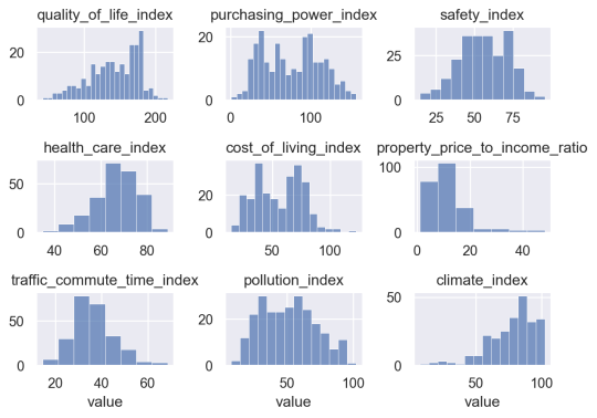
Notice that to create this visualization, we need to use the .add() method, which allows us to draw “bars” and create our histograms.
We also need to use the .facet() method, which facets the data into different panels (by the ‘variable‘ column generated by the melt operation). This creates a small multiple format.
I’m also using .share() to make the x and y axes independent of one another (by default, Seaborn will force all of the panels to all use the same axes).
This small multiple format gives us a good overview of the data in the DataFrame.
I’ll leave it to you to take a close look at most of the variables.
But here, we’ll take a closer look at two variables in particular: quality_of_life_index, and safety_index.
Make Histogram: Quality of Life Index
Here, we’ll make an independent histogram of quality_of_life_index.
You’ll notice that the code is similar to the small multiple chart that we created above.
The main difference is that we’re directly using the data in our DataFrame called qol_df.
We’re also explicitly mapping quality_of_life_index to the x-axis.
And we’ve removed the facet operation, since this is not a small multiple chart.
# HISTOGRAM: quality_of_life_index
(so.Plot(data = qol_df
         ,x = 'quality_of_life_index'
         )
   .add(so.Bars(), so.Hist())
 )
OUT:
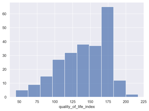
As you can see, the data is roughly “bell” shaped, but a little bit skewed (and not exactly “normally distributed”). There’s a distinct peak around quality_of_life_index = 175. I’m not terribly interested in why there’s a peak at that value, but under some circumstances, such a peak would be something you might want to investigate, depending on what questions you’re trying to answer.
Make Histogram: Safety Index
Now, let’s make a similar histogram of safety_index.
# HISTOGRAM: safety_index
(so.Plot(data = qol_df
         ,x = 'safety_index'
         )
   .add(so.Bars(), so.Hist())
 )
OUT:
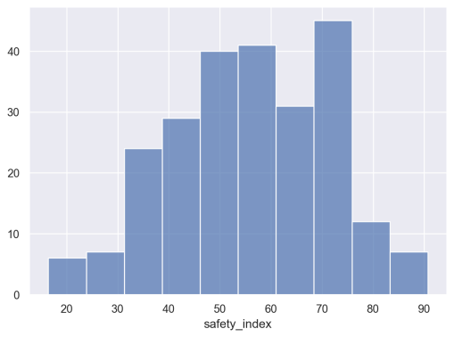
You’ll notice that this is a little more symmetrical than the previous histogram.
To be honest, I may not do very much with the information in this visualization and the previous visualization, and that’s okay.
During data exploration and analysis, you’re probably going to create a lot of visualizations that you don’t need in the long run. It’s totally normal, so get used to it.
Correlation between QoL and Safety
Let’s quickly examine the relationship between quality of life and safety in this data.
I suspect that they’re related at least a little bit, and I can evaluate that hunch with some quick visualization and analysis.
First, we’ll create a scatterplot of quality_of_life_index vs safety_index.
# SCATTERPLOT: quality_of_life_index vs safety_index
(so.Plot(data = qol_df
         ,x = 'quality_of_life_index'
         ,y = 'safety_index'
         )
   .add(so.Dot())
 )
OUT:
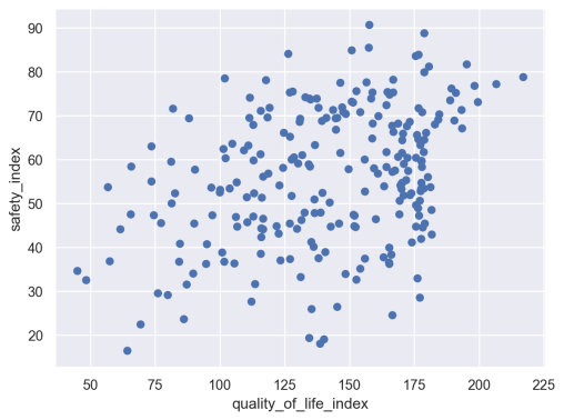
Hmm. They do look slightly correlated, but maybe not a lot.
Let’s quickly calculate the correlation between these two variables:
(qol_df
 .filter(['quality_of_life_index','safety_index'])
 .corr()
 )
OUT:
                       quality_of_life_index  safety_index
quality_of_life_index               1.000000      0.357141
safety_index                        0.357141      1.000000
The correlation is about .357.
This is less than I initially expected.
Identify Cities that Match Criteria
Ok. Now that we’ve looked at and visualized our data a little bit, let’s try to answer the original question that drew me to this data.
Let’s look for some cities that have both high quality of life, and high safety.
To find these cities, we’re simply going to subset our data down to rows that meet certain criteria.
Top 30% safety, Top 30% Quality of Life
Here, I’m going to look for cities that are:
- in the top 30% in terms of safety
- in the top 30% in terms of quality of life
I’m going to use Pandas to find these cities.
Let’s run the code and then I’ll explain:
# FIND CITIES WITH HIGH QoL and HIGH SAFETY
(qol_df
 .filter(['city','safety_index','quality_of_life_index'])
 .query(f'safety_index > {qol_df.safety_index.quantile(q = .7)}')
 .query(f'quality_of_life_index > {qol_df.quality_of_life_index.quantile(q = .7)}')
 .sort_values(by = 'quality_of_life_index', ascending = False)
 .reset_index(drop = True)
 )
OUT:
                                 city  safety_index  quality_of_life_index
0   The Hague (Den Haag), Netherlands          78.8                  217.1
1              Eindhoven, Netherlands          77.2                  206.7
2                     Vienna, Austria          73.1                  199.6
3                 Canberra, Australia          76.8                  198.3
4                 Zurich, Switzerland          81.7                  195.3
5              Rotterdam, Netherlands          67.1                  193.5
6              Luxembourg, Luxembourg          71.3                  193.3
7                   Helsinki, Finland          75.2                  191.1
8                 Adelaide, Australia          68.9                  190.5
9                  Reykjavik, Iceland          76.2                  189.4
10                Copenhagen, Denmark          73.5                  188.9
11                Geneva, Switzerland          70.3                  184.7
12          Edinburgh, United Kingdom          69.1                  184.3
13             Amsterdam, Netherlands          68.0                  183.0
14                    Munich, Germany          81.2                  180.7
15                       Muscat, Oman          79.9                  178.9
16    Abu Dhabi, United Arab Emirates          88.8                  178.9
17          Cambridge, United Kingdom          70.8                  178.1
18                Quebec City, Canada          83.9                  176.7
19                     Ottawa, Canada          71.7                  176.7
20        Dubai, United Arab Emirates          83.6                  175.6
21                 Stuttgart, Germany          68.6                  173.3
22            Wellington, New Zealand          67.6                  172.2
23                    Valencia, Spain          68.2                  168.8
24  Salt Lake City, UT, United States          66.3                  167.0
This is kind of interesting.
The top 10 are highly represented by the Netherlands and the Nordics. I’ve personally spent only a little time in the Netherlands, but I loved it when I was there. I’ve never been to any of the Nordic countries, so maybe this is an indication that I should go?
I’m also surprised to see a few places. Particularly Muscat, Oman and Abu Dhabi.
Many of these places (like Germany, Austria, and the Nordics) are places that I’ve wanted to go, and this confirms that they may be good travel destinations.
A Quick Explanation of the Pandas Code
Take a look at the Pandas code that I used to create this list.
The core of the code block is the two calls to the Pandas query method.
These lines of code allow us to find the rows where:
- safety index is in the top 30%
- quality of life index is in the top 30%
I also used the filter() method to retrieve a subset of columns, which makes everything a little easier to work with and read.
And I used Pandas sort_values to resort the DataFrame by a particular column.
Finally, I used Pandas reset_index to reset the row index (we could eventually use this to create a “rank” variable, but I didn’t do that in this case).
Importantly, notice that the whole expression is enclosed in parenthesis, and each method call is on a separate line. This is a good example of the “Pandas method chaining” technique that I’ve described elsewhere. If you want to be great at Pandas data wrangling, you need to know how to do this.
Top 30% safety, Top 50% QOL, Bottom 50% Cost
Finally, let’s one one more search.
Here, I’m going to look for
- in the top 30% in terms of safety
- in the top 50% in terms of quality of life
- but bottom 50% in terms of cost
Basically, I’m looking for a Unicorn.
A city with high safety, good quality of life, but low cost.
Our strategy will be almost the same as above:
We’ll “query” our data to subset the rows, based on certain conditions.
# FIND CITIES WITH HIGH SAFETY, MODERATE QoL, and MODERATE COST
(qol_df
 .filter(['city','safety_index','quality_of_life_index','cost_of_living_index'])
 .query(f'safety_index > {qol_df.safety_index.quantile(q = .7)}')
 .query(f'quality_of_life_index > {qol_df.quality_of_life_index.quantile(q = .5)}')
 .query(f'cost_of_living_index < {qol_df.cost_of_living_index.quantile(q = .5)}')
 .sort_values(by = 'quality_of_life_index', ascending = False)
 .reset_index(drop = True)
 )
OUT:
                              city  safety_index  quality_of_life_index    cost_of_living_index
0                      Muscat, Oman          79.9                  178.9                    50.0
1   Abu Dhabi, United Arab Emirates          88.8                  178.9                    55.9
2                   Valencia, Spain          68.2                  168.8                    51.4
3               Ljubljana, Slovenia          78.2                  166.9                    54.1
4                    Split, Croatia          67.7                  166.5                    45.6
5                   Rijeka, Croatia          74.8                  165.5                    45.9
6                Vilnius, Lithuania          72.4                  164.3                    51.6
7                     Madrid, Spain          69.9                  161.2                    54.5
8            Prague, Czech Republic          75.3                  158.9                    54.6
9              Brno, Czech Republic          73.9                  158.4                    48.5
10         Qingdao, Shandong, China          90.7                  157.7                    32.7
11                  Zagreb, Croatia          77.6                  156.6                    51.0
12               Timisoara, Romania          75.6                  152.7                    36.7
13             Riyadh, Saudi Arabia          73.2                  150.9                    53.5
14                 Lisbon, Portugal          70.4                  148.6                    51.5
15                    Bursa, Turkey          70.9                  147.6                    35.9
16    Jeddah (Jiddah), Saudi Arabia          71.9                  147.2                    52.4
17             Cluj-Napoca, Romania          77.5                  146.5                    41.3
Ok. Again with Muscat and Abu Dhabi.
As a Nomad, these are really off of my radar.
There's also a lot of cities in Croatia and a couple in Spain or Portugal (these don't surprise me ... there are a lot of Nomads in both Lisbon and parts of Spain).
More Work is Required (like any analysis)
Now I want to be clear: I'm not sure if any of these cities will be good places to visit or live as a nomad.
But these give us a rough starting point.
Like any analysis, our data work is a starting point.
When you analyze a dataset in a business context, you'll often get your numeric results, but then you need to do more research. That might mean reading documentation related to your numeric results. And (in business), it often means talking to people.
We don't do analytics in isolation. We almost always do it in combination with other resources.
So what that means for me, in this analysis, is that I'll take these lists and maybe do some reading. I'll read about a few of these cities, and maybe talk to some friends who may have traveled to some of these places.
I'll ask questions, and continue my research in other ways.
So remember: data analysis and analytics are often only one part of a data-centric project.
Leave Your Comments Below
What do you think about what I've done here.
Do you have questions about the code?
Do you have questions about the process?
What else do you wish that I had done here?
I want to hear from you.
Leave your questions and comments in the comment section at the bottom of the page.
Awesome. Really learnt a lot.
Great to hear. ????????????
# Find the table containing the QoL data
qol_table = qol_soup.find(‘table’, {‘id’: ‘t2’})
How did you make out which elements are to be searched because it couldn’t find any such tag as ‘table’ in the dev tools.
This took some tinkering and trial/error.
Thanks. I am a newbie. Tried to follow along and learnt much!!
Looking forward to more such projects.
????????????
Hi.
I have a question about code :
(qol_df
.filter([‘city’,’safety_index’,’quality_of_life_index’])
.query(f’safety_index > {qol_df.safety_index.quantile(q = .7)}’)
)
qol_df.safety_index.quantile(q = .7) returns a float value then why is it converted to a dictionary by enclosing it within {} ? thanx in advance.
The awesome application of Data Science tools.
Real life case which extends the ways of thinking.
Great demonstration of the skills!
Thanks for that all!