For many data scientists and data analytics professionals, as much as 80% of their work is data wrangling and exploratory data analysis.
Of course, everyone wants to focus on machine learning and advanced techniques, but the reality is that a lot of the work of many data scientists is a little more mundane.
That isn’t to discourage you from entering the field (data science is great). But you need to realize how important it is to know and master “foundational” techniques.
One of the techniques you will need to know is the density plot. The density plot is a basic tool in your data science toolkit.
If you’re not familiar with the density plot, it’s actually a relative of the histogram. Like the histogram, it generally shows the “shape” of a particular variable.
But there are differences. In a histogram, the height of bar corresponds to the number of observations in that particular “bin.” However, in the density plot, the height of the plot at a given x-value corresponds to the “density” of the data. Ultimately, the shape of a density plot is very similar to a histogram of the same data, but the interpretation will be a little different.
Either way, much like the histogram, the density plot is a tool that you will need when you visualize and explore your data. It’s a technique that you should know and master.
Let’s take a look at how to make a density plot in R.
Two ways to make a density plot in R
For better or for worse, there’s typically more than one way to do things in R. For just about any task, there is more than one function or method that can get it done.
That’s the case with the density plot too. There’s more than one way to create a density plot in R.
I’ll show you two ways. In this post, I’ll show you how to create a density plot using “base R,” and I’ll also show you how to create a density plot using the ggplot2 system.
I want to tell you up front: I strongly prefer the ggplot2 method. I’ll explain a little more about why later, but I want to tell you my preference so you don’t just stop with the “base R” method.
The “base R” method to create an R density plot
Before we get started, let’s load a few packages:
library(ggplot2)
library(dplyr)
We’ll use ggplot2 to create some of our density plots later in this post, and we’ll be using a dataframe from dplyr.
Now, let’s just create a simple density plot in R, using “base R”.
First, here’s the code:
pressure_density <- density(storms$pressure)

plot(pressure_density)
And here's what it looks like:
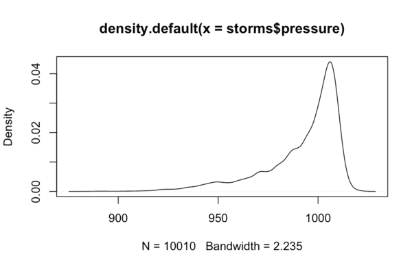
I'm going to be honest. I don't like the base R version of the density plot. In fact, I'm not really a fan of any of the base R visualizations.
Part of the reason is that they look a little unrefined. They get the job done, but right out of the box, base R versions of most charts look unprofessional. Base R charts and visualizations look a little "basic."
For this reason, I almost never use base R charts. My go-to toolkit for creating charts, graphs, and visualizations is ggplot2.
The ggplot method to create an R density plot
Readers here at the Sharp Sight blog know that I love ggplot2.
There are at least two reasons for this.
First, ggplot makes it easy to create simple charts and graphs. ggplot2 makes it easy to create things like bar charts, line charts, histograms, and density plots.
Second, ggplot also makes it easy to create more advanced visualizations. I won't go into that much here, but a variety of past blog posts have shown just how powerful ggplot2 is.
Finally, the default versions of ggplot plots look more "polished." ggplot2 charts just look better than the base R counterparts.
Having said that, let's take a look. Let's take a look at how to create a density plot in R using ggplot2:
ggplot(data = storms, aes(x = pressure)) +
  geom_density()
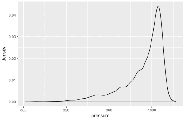
Personally, I think this looks a lot better than the base R density plot. With the default formatting of ggplot2 for things like the gridlines, fonts, and background color, this just looks more presentable right out of the box.
Ok. Now that we have the basic ggplot2 density plot, let's take a look at a few variations of the density plot.
Variations of the R density plot
There are a few things we can do with the density plot. We can add some color. We can "break out" a density plot on a categorical variable. We can create a 2-dimensional density plot.
Let's take a look.
How to color a ggplot2 density plot
First, let's add some color to the plot. We will "fill in" the area under the density plot with a particular color.
To do this, we can use the fill parameter.
ggplot(data = storms, aes(x = pressure)) +
  geom_density(fill = 'cyan')
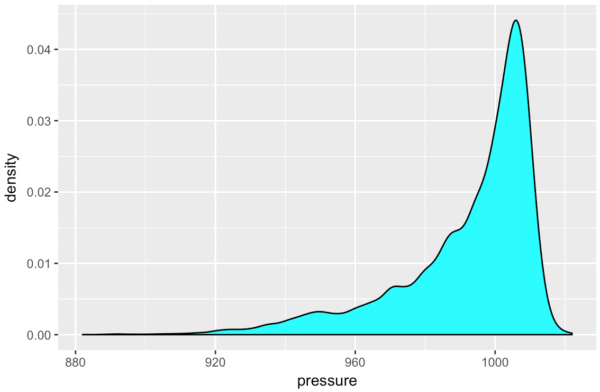
There are a few things that we could possibly change about this, but this looks pretty good.
Before moving on, let me briefly explain what we've done here. The fill parameter specifies the interior "fill" color of a density plot. In fact, in the ggplot2 system, fill almost always specifies the interior color of a geometric object (i.e., a geom).
So in the above density plot, we just changed the fill aesthetic to "cyan." A more technical way of saying this is that we "set" the fill aesthetic to "cyan."
One final note: I won't discuss "mapping" verses "setting" in this post. But if you really want to master ggplot2, you need to understand aesthetic attributes, how to map variables to them, and how to set aesthetics to constant values.
Density plot with multiple categories
Now let's create a chart with multiple density plots.
Here, we're going to be visualizing a single quantitative variable, but we will "break out" the density plot into three separate plots. We'll plot a separate density plot for different values of a categorical variable.
The code to do this is very similar to a basic density plot. We'll use ggplot() to initiate plotting, map our quantitative variable to the x axis, and use geom_density() to plot a density plot.
But, to "break out" the density plot into multiple density plots, we need to map a categorical variable to the "color" aesthetic:
ggplot(iris, aes(x = Sepal.Length)) +
  geom_density(aes(color = Species))
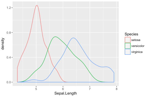
Here, Sepal.Length is the quantitative variable that we're plotting; we are plotting the density of the Sepal.Length variable. Species is a categorical variable in the iris dataset. We are "breaking out" the density plot into multiple density plots based on Species. By mapping Species to the color aesthetic, we essentially "break out" the basic density plot into three density plots: one density plot curve for each value of the categorical variable, Species.
"Small multiple" version of an ggplot density plot
Another way that we can "break out" a simple density plot based on a categorical variable is by using the small multiple design.
I am a big fan of the small multiple. The small multiple chart (AKA, the trellis chart or the grid chart) is extremely useful for a variety of analytical use cases. This chart type is also wildly under-used. Because of it's usefulness, you should definitely have this in your toolkit.
When you're using ggplot2, the first few lines of code for a small multiple density plot are identical to a basic density plot. We'll use ggplot() the same way, and our variable mappings will be the same.
However, we will use facet_wrap() to "break out" the base-plot into multiple "facets." We are using a categorical variable to break the chart out into several small versions of the original chart, one small version for each value of the categorical variable.
In the following case, we will "facet" on the Species variable. Remember, Species is a categorical variable. So, the code facet_wrap(~Species) will essentially create a small, separate version of the density plot for each value of the Species variable.
ggplot(iris, aes(x = Sepal.Length)) +
  geom_density() +
  facet_wrap(~Species)
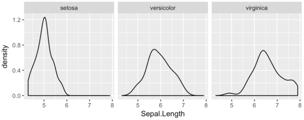
Notice that this is very similar to the "density plot with multiple categories" that we created above. But instead of having the various density plots in the same plot area, they are "faceted" into three separate plot areas.
I won't give you too much detail here, but I want to reiterate how powerful this technique is. "Breaking out" your data and visualizing your data from multiple "angles" is very common in exploratory data analysis. You'll need to be able to do things like this when you are analyzing data. It can also be useful for some machine learning problems.
Ultimately, you should know how to do this.
How to make a 2-dimensional density plot in R
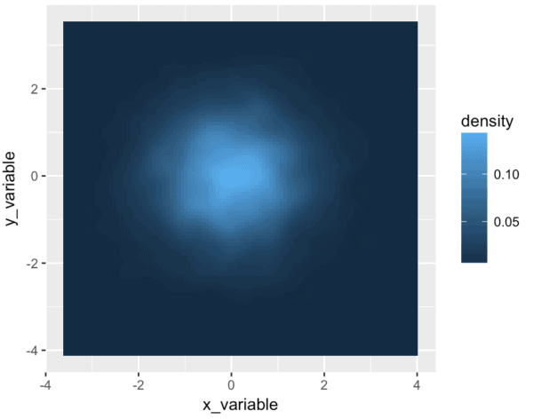
Beyond just making a 1-dimensional density plot in R, we can make a 2-dimensional density plot in R.
Be forewarned: this is one piece of ggplot2 syntax that is a little "un-intuitive."
df <- tibble(x_variable = rnorm(5000), y_variable = rnorm(5000))

ggplot(df, aes(x = x_variable, y = y_variable)) +
  stat_density2d(aes(fill = ..density..), contour = F, geom = 'tile')
Syntactically, this is a little more complicated than a typical ggplot2 chart, so let's quickly walk through it.
In the first line, we're just creating the dataframe. It contains two variables, that consist of 5,000 random normal values:
df <- tibble(x_variable = rnorm(5000), y_variable = rnorm(5000))
In the next line, we're just initiating ggplot() and mapping variables to the x-axis and the y-axis:
ggplot(df, aes(x = x_variable, y = y_variable)) +
Finally, there's the last line of the code:
stat_density2d(aes(fill = ..density..), contour = F, geom = 'tile')
Essentially, this line of code does the "heavy lifting" to create our 2-d density plot. stat_density2d() indicates that we'll be making a 2-dimensional density plot. geom = 'tile' indicates that we will be constructing this 2-d density plot out of many small "tiles" that will fill up the entire plot area. When you look at the visualization, do you see how it looks "pixelated?" Do you see that the plot area is made up of hundreds of little squares that are colored differently? Those little squares in the plot are the "tiles."
As you've probably guessed, the tiles are colored according to the density of the data. Syntactically, aes(fill = ..density..) indicates that the fill-color of those small tiles should correspond to the density of data in that region.
So essentially, here's how the code works: the plot area is being divided up into small regions (the "tiles"). These regions act like bins. There's a statistical process that counts up the number of observations and computes the density in each bin. The color of each "tile" (i.e., the color of each bin) will correspond to the density of the data.
Finally, the code contour = F just indicates that we won't be creating a "contour plot." stat_density2d() can be used create contour plots, and we have to turn that behavior off if we want to create the type of density plot seen here.
How to change the color of a 2-dimensional density plot
Just for the hell of it, I want to show you how to add a little color to your 2-d density plot.
Using colors in R can be a little complicated, so I won't describe it in detail here. But I still want to give you a small taste. Using color in data visualizations is one of the secrets to creating compelling data visualizations. If you want to be a great data scientist, it's probably something you need to learn.
Here, we'll use a specialized R package to change the color of our plot: the viridis package. viridis contains a few well-designed color palettes that you can apply to your data.
library(viridis)

ggplot(df, aes(x = x_variable, y = y_variable)) +
  stat_density2d(aes(fill = ..density..), contour = F, geom = 'tile') +
  scale_fill_viridis()
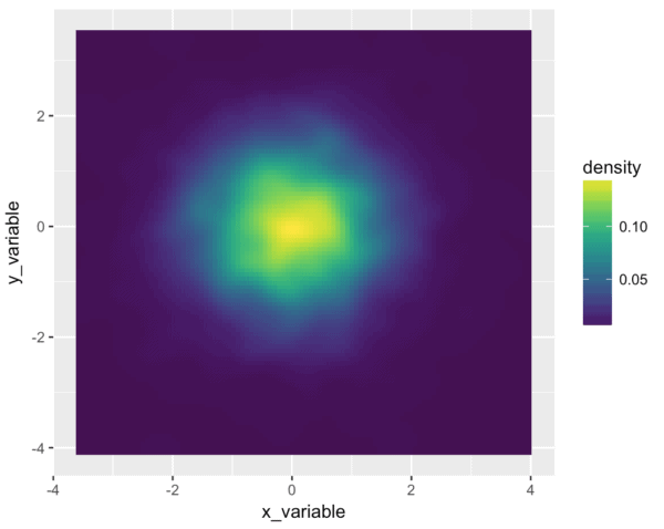
Wow. I love the viridis package.
So what exactly did we do to make this look so damn good?
We used scale_fill_viridis() to adjust the color scale. A little more specifically, we changed the color scale that corresponds to the "fill" aesthetic of the plot. Remember, the little bins (or "tiles") of the density plot are filled in with a color that corresponds to the density of the data. But what color is used? The default is the simple dark-blue/light-blue color scale. But when we use scale_fill_viridis(), we are specifying a new color scale to apply to the fill aesthetic. scale_fill_viridis() tells ggplot() to use the viridis color scale for the fill-color of the plot.
How to make a "polished" density plot
In the last several examples, we've created plots of varying degrees of complexity and sophistication. Having said that, one thing we haven't done yet is modify the formatting of the titles, background colors, axis ticks, etc.
If you're just doing some exploratory data analysis for personal consumption, you typically don't need to do much plot formatting. But if you intend to show your results to other people, you will need to be able to "polish" your charts and graphs by modifying the formatting of many little plot elements. If you want to publish your charts (in a blog, online webpage, etc), you'll also need to format your charts. And ultimately, if you want to be a top-tier expert in data visualization, you will need to be able to format your visualizations.
That being said, let's create a "polished" version of one of our density plots. Here, we're going to take the simple 1-d R density plot that we created with ggplot, and we will format it. We'll change the plot background, the gridline colors, the font types, etc.
To do this, we'll need to use the ggplot2 formatting system.
We'll basically take our simple ggplot2 density plot and add some additional lines of code.
ggplot(data = storms, aes(x = pressure)) +
  geom_density(fill = 'cyan', color = 'cyan') +
  labs(title = 'The pressure variable is strongly left-skewed') +
  theme(text = element_text(family = 'Gill Sans', color = "#444444")
        ,panel.background = element_rect(fill = '#444B5A')
        ,panel.grid.minor = element_line(color = '#4d5566')
        ,panel.grid.major = element_line(color = '#586174')
        ,plot.title = element_text(size = 24)
        ,axis.title = element_text(size = 18, color = '#555555')
        ,axis.title.y = element_text(vjust = .5, angle = 0)
        ,axis.title.x = element_text(hjust = .5)
  )
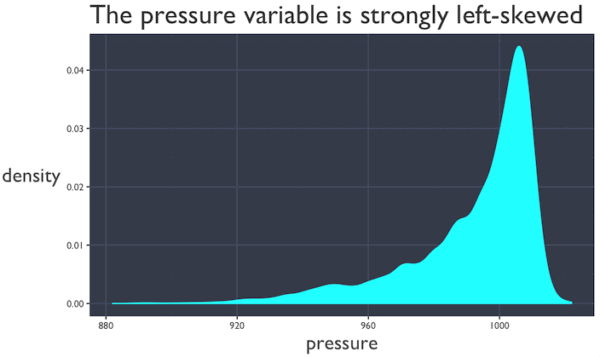
Here, we've essentially used the theme() function from ggplot2 to modify the plot background color, the gridline colors, the text font and text color, and a few other elements of the plot.
Full details of how to use the ggplot2 formatting system is beyond the scope of this post, so it's not possible to describe it completely here. I just want to quickly show you what it can do and give you a starting point for potentially creating your own "polished" charts and graphs.
If you really want to learn how to make professional looking visualizations, I suggest that you check out some of our other blog posts (or consider enrolling in our premium data science course).
How to use the density plot
Ultimately, the density plot is used for data exploration and analysis. Let's briefly talk about some specific use cases.
Exploratory data analysis
One of the critical things that data scientists need to do is explore data.
Do you need to "find insights" for your clients? You need to explore your data.
Do you need to create a report or analysis to help your clients optimize part of their business? You need to explore your data.
Do you need to build a machine learning model? You need to explore your data.
Data exploration is critical. In fact, I think that data exploration and analysis are the true "foundation" of data science (not math).
Having said that, the density plot is a critical tool in your data exploration toolkit.
You'll typically use the density plot as a tool to identify:
- skewness
- outliers
- unusual values
Machine learning
This is sort of a special case of exploratory data analysis, but it's important enough to discuss on it's own.
The density plot is an important tool that you will need when you build machine learning models.
Essentially, before building a machine learning model, it is extremely common to examine the predictor distributions (i.e., the distributions of the variables in the data). In order to make ML algorithms work properly, you need to be able to visualize your data. You need to see what's in your data. You need to find out if there is anything unusual about your data.
These basic data inspection tasks are a perfect use case for the density plot.
You can use the density plot to look for:
- Skewness
- Outliers
- Data that is not normally distributed
- Other unusual properties
There are some machine learning methods that don't require such "clean" data, but in many cases, you will need to make sure your data looks good. To do this, you can use the density plot.
If you want to learn more data science, sign up for our email list
That's just about everything you need to know about how to create a density plot in R.
To be a great data scientist though, you need to know more than the density plot. Moreover, when you're creating things like a density plot in r, you can't just copy and paste code ... if you want to be a professional data scientist, you need to know how to write this code from memory.
If you're thinking about becoming a data scientist, sign up for our email list. We'll show you essential skills like how to create a density plot in R ... but we'll also show you how to master these essential skills.
very nice