This tutorial will show you how to use facet_grid in ggplot2. Specifically, it will show you how to use facet_grid to create small multiple charts.
facet_grid is fairly easy to understand, but it assumes some basic knowledge of ggplot2. ggplot2 is a data visualization package for the R programming language. If you don’t already know the basics of ggplot2, I recommend that you check out this ggplot tutorial.
Having said that, this tutorial will cover several things:
You can click on the links above to move directly to those sections.
Ok, let’s get into it.
facet_grid creates small multiple charts in ggplot2
The small multiple chart is a type of data visualization. Essentially, the small multiple chart creates several versions of the same chart that are very similar, and lays them out in the same chart in a grid layout.
In a small multiple chart, each small visualization is typically called a “panel”. Typically, the different panels of the chart are different from one another on the basis of some variable.
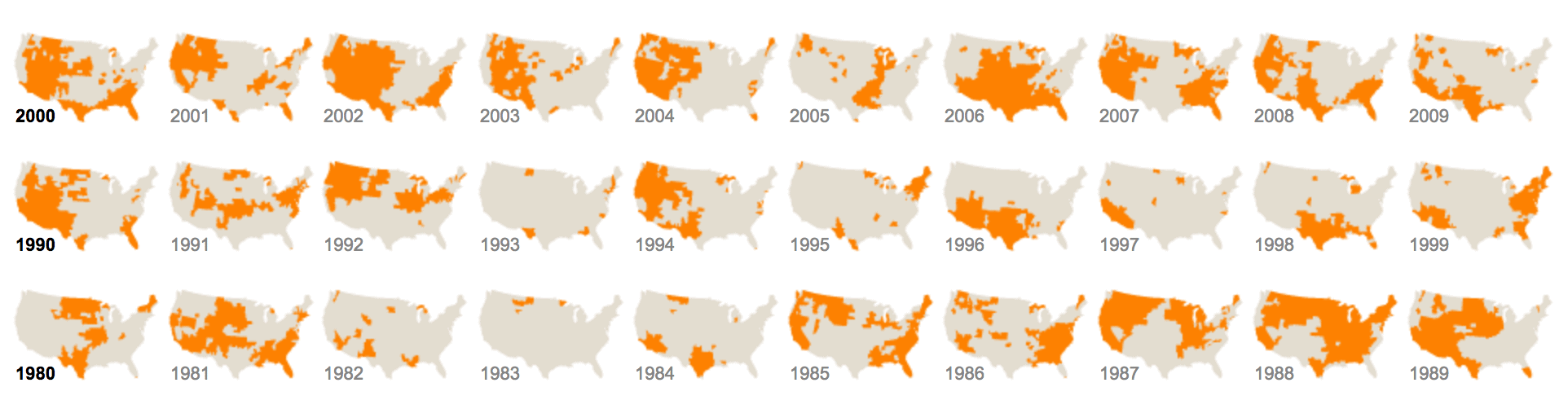
For example, if you had a “year” variable in your dataset, you might create a small multiple chart where every panel represents a different year. Each panel would represent a subset of the data for a given year. Here’s an example of such a small multiple chart from the New York Times:
facet_grid is one of the two primary tools for creating small multiple charts in ggplot2. The other technique for creating small multiples is facet_wrap, which was explained in a previous tutorial.
These two techniques primarily differ in how they arrange the panels of the small multiple chart. facet_wrap “wraps” the panels around, row by row, whereas facet_grid creates a grid of panels using two discrete variables.
facet_grid creates a “grid” of small data visualizations
facet_grid creates small multiple charts with a specific structure.
It creates several small “panels” (small versions of the same chart) arranged in a grid format. The grid is structured according to the values of two categorical variables.
For example, let’s say that we’ve made a density plot of a variable using ggplot2.
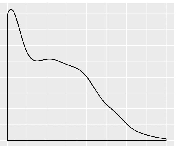
We want to take that density plot and break it out into small multiples.
If we use facet_grid to create the small multiple chart, we need to select two variables with discrete values (i.e., categorical variables or integer variables), and use those to construct the grid layout.
For example, let’s say we have two other variables in our dataset: var_1 and var_2.
We can use those discrete variables with facet_grid() to create a grid layout.
So let’s say that var_1 has two values, A and B. And var_2 also has two values, 1 and 2.
When we use these two variables with facet_grid, it will create a grid of small versions of our density plot.
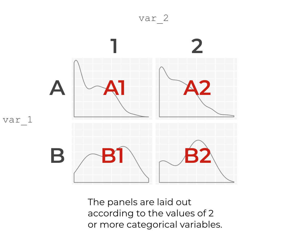
The data for each small panel will actually be a subset of the overall data. So panel A1 will be a density plot where var_1 == A and var_2 == 1. Panel B1 will be a density plot where var_1 == B and var_2 == 1. And so on.
It’s important to understand this point: each small panel is essentially a data visualization based on a subset of the overall data. For each panel, it’s as if you used the dplyr filter function to create a subset and then re-plotted the data. The subsets will be based on the combinations of values of your two faceting variables.
The syntax of facet_grid
The syntax of facet_grid is fairly straight forward. It’s based on the syntax for creating a simple chart with ggplot2. So to use facet_grid, we typically need to create some other type of data visualization with ggplot2, and then we add the syntax for facet_grid on after that.
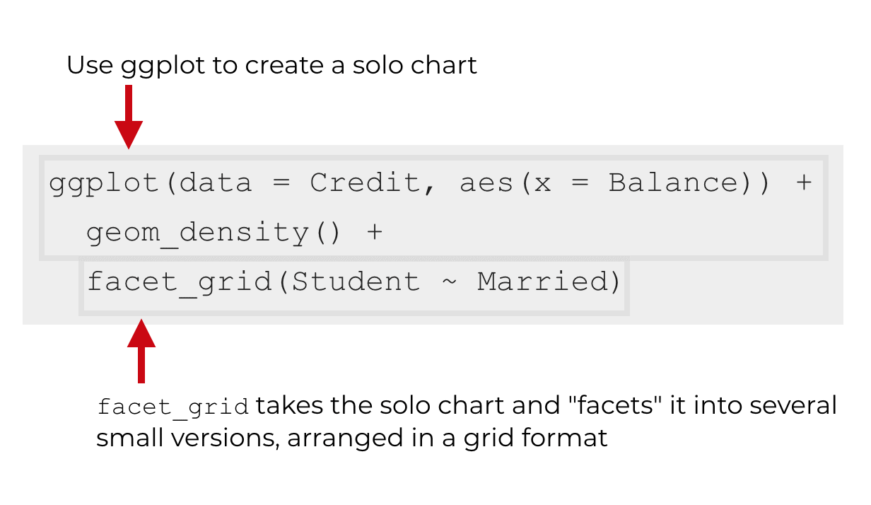
Importantly, the code inside of facet_grid dictates how the panels of the small multiple chart will be structured.
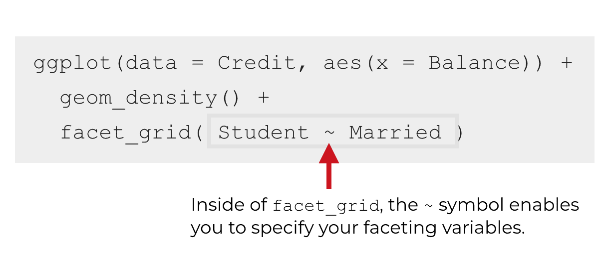
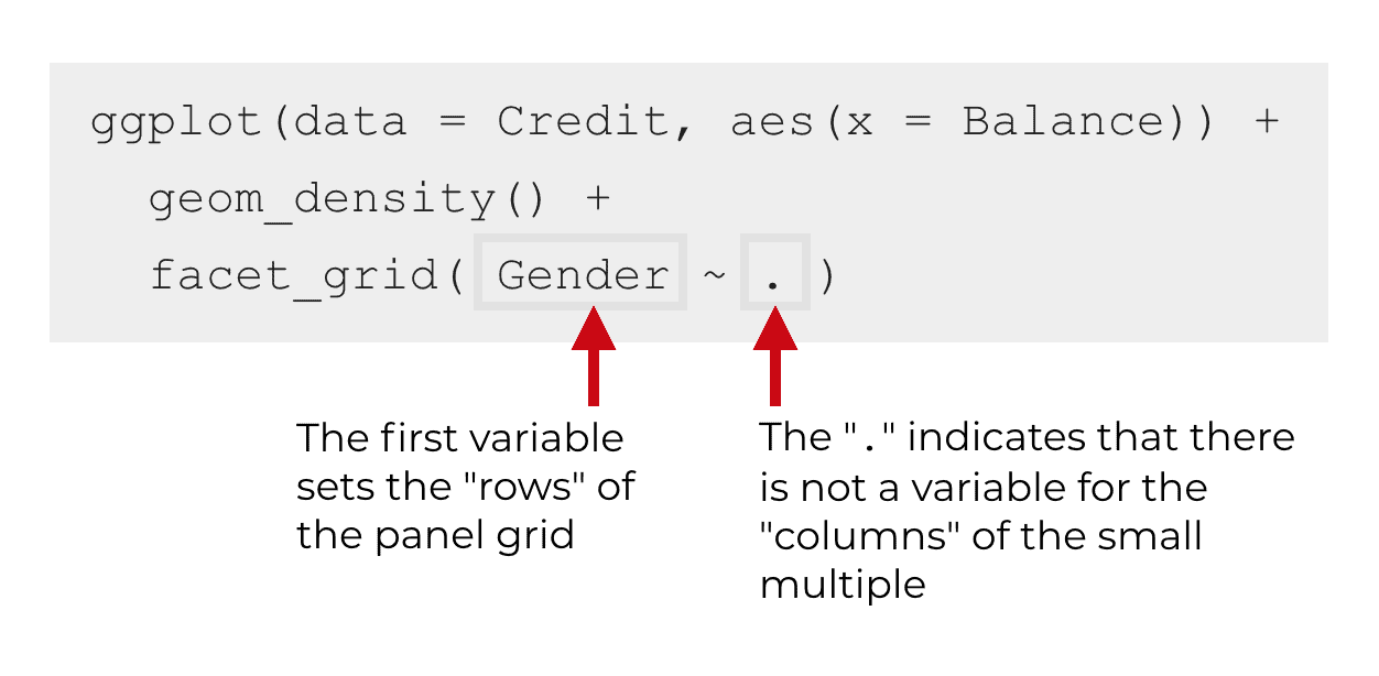
Inside of facet_grid, we need to specify two variables, separated by a tilde symbol, ~.
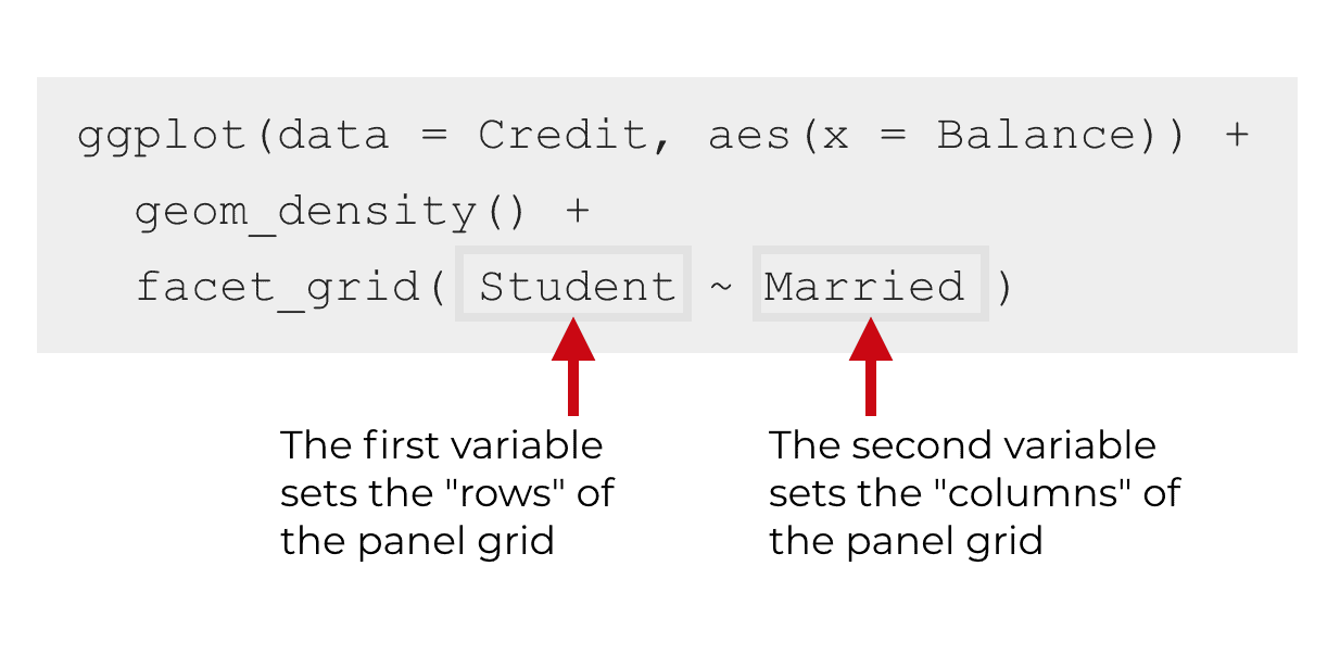
The first variable specifies the “rows” of the small multiple grid. There will be one row in the small multiple grid for every value of the first variable.
The second variable specifies the “columns” of the small multiple grid. There will be one column in the small multiple grid for every value of the second variable.
The two variables are separated by a tilde.
So if we want to have the Student variable control the rows, and the Married variable control the columns, we would use the syntax facet_grid(Student ~ Married).
Examples: how to use facet_grid
Although the syntax explanation above should help you understand how facet_grid works, it’s always best to work with a few concrete examples when learning a new technique.
That being the case, I’m going to show you some real examples that you can play with in R.
Load packages
In these examples, we’re going to work with the Credit dataset from the ISLR package. We’ll also be using tools from ggplot2 and the tidyverse package to create our visualizations. If you’re not familiar with it, the tidyverse package is a bundle of multiple R packages that includes ggplot2, the dplyr data manipulation package, and several other R data science packages.
That being the case, you will need to have a couple of packages installed on your machine: the ISLR package and the tidyverse package. If you’re working in RStudio, you can do that from Tools > Install packages on the menu bar. Once you’re there, you can type in the name of the package and install it.
Furthermore, you will need to have the package loaded. You’ll need to load the ISLR package, as well as the tidyverse package. To load these into your environment, you’ll need to run the following code:
library(tidyverse)
library(ISLR)
Data inspection
Before creating a our small multiple charts, let’s quickly inspect our data.
First, let’s just print out the Credit dataframe. The Credit dataframe is a traditional data.frame object, and not a tibble. Older data.frame objects don’t print out well, so we’re going to use the pipe operator to pipe the Credit dataset into the as_tibble() function. From there, we’ll pipe the output into print() to print out the data. Printing the data in this way will make it easier to read.
Credit %>%
  as_tibble() %>%
  print()
And here’s the output:
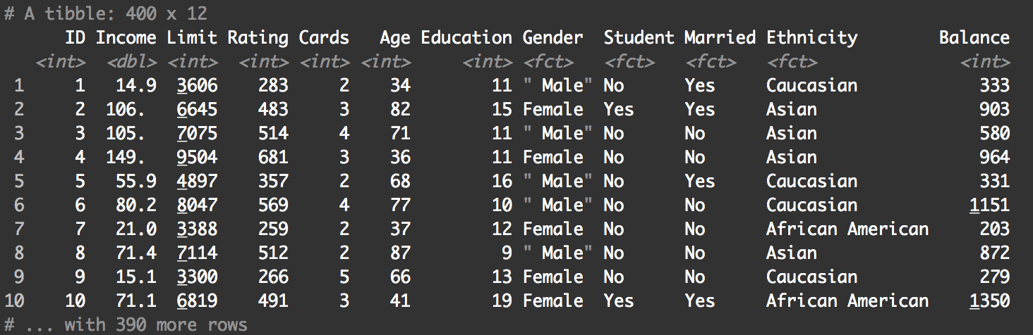
At a first glance, the data looks relatively clean.
The thing that I want to draw your attention to is several of the categorical variables. The Student, Gender, Married, and Ethnicity variables are all factor variables. These are perfect for use in a small multiple design. There are also one or two integer variables that might work – such as the Cards variable – because integers are discrete. Assuming that these variables have a limited number of unique values, we could use them in our small multiple design.
Let’s take a closer look at a few of these variables.
The important thing that we need to look at is the unique values. For the small multiple design to work, you need discrete variables with a limited number of unique values. If there are too many unique values, your small multiple chart will be too complicated. You need to check the variables to make sure that there are only a few unique values.
To examine the unique values, we can aggregate the variables using dplyr::group_by() and dplyr::summarise(). This will essentially group the data on the unique values of the variable in question and show the summarized unique values of that variable.
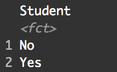
Here is the code to calculate the unique values of the Student variable:
Credit %>%
  group_by(Student) %>%
  summarise()
Which produces the following output:
And here is the code to calculate the unique values of the Gender variable:
Credit %>%
  group_by(Gender) %>%
  summarise()
Which produces the following output:
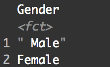
Both of these factor variables – Student and Gender – have only two unique values. The unique values of Student are Yes and No, and the unique values of Gender are Male and Female.
The structure of these variables is important. Because both of these variables have a relatively small number of unique values, they will be good candidates for use in facet_grid.
How to make a simple small multiple chart with facet_grid
Ok. Now that we’ve examined our data, let’s actually make some data visualizations.
Create a simple density plot
The first thing we’re going to do is create a simple density plot. This density plot will be the “solo” chart – the base chart – that we will later break out into multiple panels.
Here’s the code to create a density plot of the Balance variable of the Credit dataframe.
ggplot(data = Credit, aes(x = Balance)) +
  geom_density()
And here is the density plot that it produces:

Ok, what are we doing here? We’re creating a density plot of the Balance variable from the Credit dataset.
The code data = Credit specifies that we’re going to visualize data from the Credit dataframe. The code aes(x = Balance) indicates that we’re going to visualize the Balance variable (which is being mapped to the x-axis). Finally, geom_density() indicates that we’re going to create a density plot; it tells ggplot2 exactly how to visualize the Balance variable. We could also have used geom_histogram() to create a histogram. Try that out and see that happens!
Create a small multiple by adding facet_grid
Now that we’ve created a “solo” density plot, let’s break this out into a small multiple chart.
We’re going to facet this chart on the two variables we looked at earlier: the Student variable and the Gender variable.
Faceting on these two variables is very easy. To do it, we’re basically going to use the facet_grid() function. Inside of the function we’ll have the two variables, separated by the tilde symbol.
ggplot(data = Credit, aes(x = Balance)) +
  geom_density() +
  facet_grid(Student ~ Gender)
And this is the output:
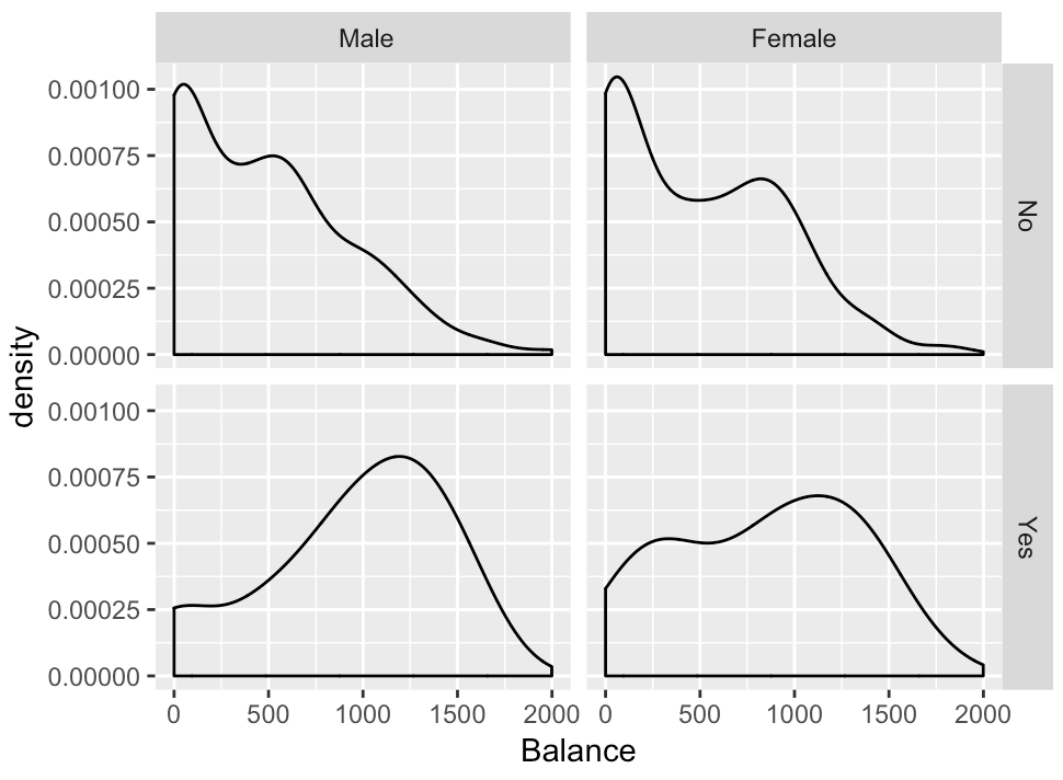
Notice the structure of the chart. There are 4 panels. Each of these panels represents a subset of the data. The upper left hand panel represents male non-students. The lower left hand panel represents male students. The upper right hand panel represents female non-students and the lower right hand panel represents female students. Critically, each panel is built with a subset of the data, as if we had created a subset with the filter function for the different combinations of values of Student and Gender.
Furthermore, notice how the structure of the chart relates to the code. The third line of code is facet_grid(Student ~ Gender). As you can see, the “rows” of the grid are the unique values of Student variable. The “columns” of the grid are the unique values of the Gender variable. This structure of the panels corresponds to the faceting specification facet_grid(Student ~ Gender).
How to make a small multiple with one column
Now that you’ve seen how to make a small multiple chart with two variables, we’re going to modify the technique and use one variable.
Specifically, we’re going to use one variable to make a small multiple chart with only a single column of panels.
The syntax is very similar to the syntax we reviewed earlier. We’re still going to use facet_grid to create the small multiple chart, and we’re still going to use the tilde syntax inside of facet_grid. The main difference is how we specify the variables inside of facet_grid.
The code is fairly straightforward. You just need to remember that the first variable inside of facet_grid controls the rows of the panel and the second variable controls the columns. If you want a single column, then you can use the “.” as sort of a placeholder in the facet_grid tilde syntax.
That said, here is the R syntax that you can run:
ggplot(data = Credit, aes(x = Balance)) +
  geom_density() +
  facet_grid(Gender ~ .)
And here is what the output looks like.
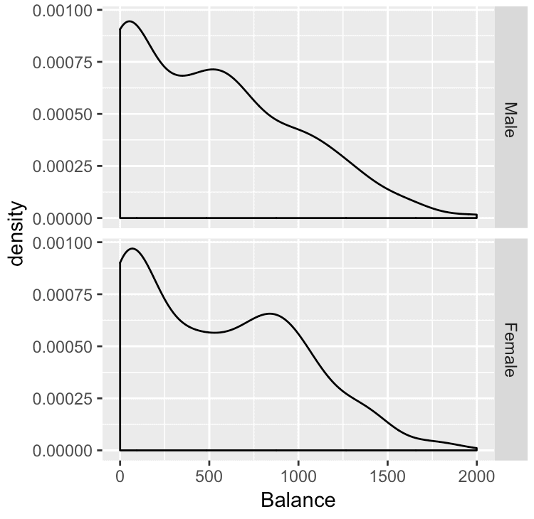
Notice the structure of the output and how it corresponds to the faceting specification. The code that we used to create the small multiple chart is facet_grid(Gender ~ .). The Gender variable is specifying the “rows” of the panel layout. There is one row in the small multiple layout for each value of Gender: Male and Female.
But because we want only one column in the layout, there is not a variable in the second position of the tilde syntax. We have only a “.“, which indicates that there will be a single column in the small multiple layout.
How to make a small multiple with one row
Now, let’s create a small multiple chart with a single row.
Syntactically, it’s very similar to the syntax of a small multiple with one column.
The major difference is how we specify the variables inside of facet_grid.
When we want to make a small multiple with a single row, we use a “.” in the first position in the tilde syntax. Remember, the first variable controls the rows of the layout, so when we use the “.” in this way, we’re telling ggplot2 that we want a single row.
Then the second variable will be the variable that defines the columns of the layout.
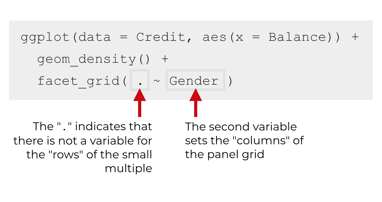
So let’s assume again that we’re working with the Credit dataset. If we want a single row, and also one column for every value of the Gender variable, we’d use the syntax facet_grid(. ~ Gender) to specify the small multiple layout:
ggplot(data = Credit, aes(x = Balance)) +
  geom_density() +
  facet_grid(. ~ Gender)
This code will produce the following chart:
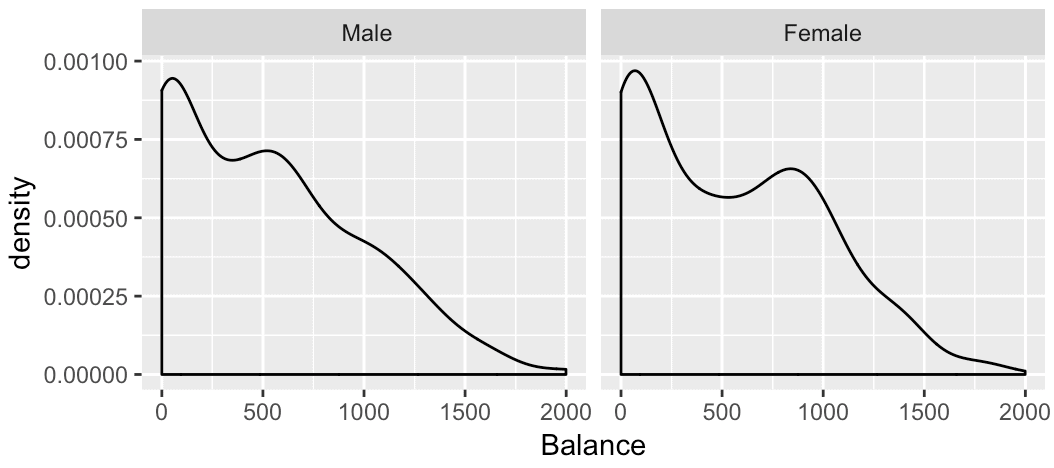
Again, notice how the syntax corresponds to the small multiple layout. Because we have one row in the layout, we’ve used the “.” in the first position inside of facet_grid. Then after the tilde, we have the Gender variable. This sets the columns of the panel grid. Correspondingly, the small multiple layout has one column for each value of the Gender variable.
Why I love facet_grid (and why you should master it)
As I’ve written about in the past, the small multiple chart is a very useful technique. It’s useful and dramatically under-valued.
One reason that it’s so useful is that it enables you easily to make comparisons between or across different categories. A great deal of data analysis and data exploration is just making comparisons, so the small multiple design comes in very handy.
Additionally, a lot of data analysis and data exploration involves looking for anomalies. Commonly, this requires you to “zoom in” on different categories. Or it requires you to filter your data on multiple different categories to look for something that might be interesting. The small multiple design gives you a tool for doing just that. It enables you to “zoom in” on several different categories all at once. It’s a quick way to examine your data from multiple perspectives at the same time.
In spite of it’s power and usefulness, it’s still rarely used. Few analysts use the technique. Part of the reason that it’s rarely used is that in most software systems, creating a small multiple chart is hard to do. Typically, you’d have to filter your data by hand and create each individual chart by hand, one at a time.
As you’ve seen in this tutorial though, if you’re using ggplot2, creating small multiple charts is easy. This is one of the reasons that I strongly recommend ggplot2 (and the tidyverse) to beginning data scientists. ggplot2 makes hard things easy. It makes it easy to create a small multiple chart.
So if you’re getting started with data science – and specifically data science in R – I strongly recommend that you learn ggplot2. And make sure to master the small multiple technique by learning facet_grid.
For more data science tutorials, sign up for our email list
If you’re interested in mastering tools like facet_grid, and other tools in R, sign up for our email list.
Here at Sharp Sight, we teach data science.
Every week, we publish articles and tutorials about data science …
… specifically, we publish free tutorials about data science in R.
If you sign up for our email list, you’ll get these tutorials delivered right to your inbox.
You’ll learn about:
- ggplot2
- dplyr
- tidyr
- machine learning in R
- … and more.
Want to learn data science in R? Sign up now.