This tutorial will teach you how to use facet_wrap to create small multiple charts in ggplot2.
The small multiple design is an incredibly powerful (and underused) data visualization technique.
facet_wrap is great, because it enables you to create small multiple charts easily and effectively. It makes it easy to create small multiple charts.
Having said that, this tutorial will explain exactly how to create small multiple charts with facet_wrap.
First, the tutorial will quickly explain small multiple charts. After that, it will show you the syntax to create small multiple charts with facet_wrap. And finally, the tutorial will show you a few examples, so you can see how the technique works.
facet_wrap creates small multiple charts in ggplot2
The small multiple chart is a chart where a data visualization is repeated in several small panels.
For example, here’s an example of a small multiple chart from the New York Times:
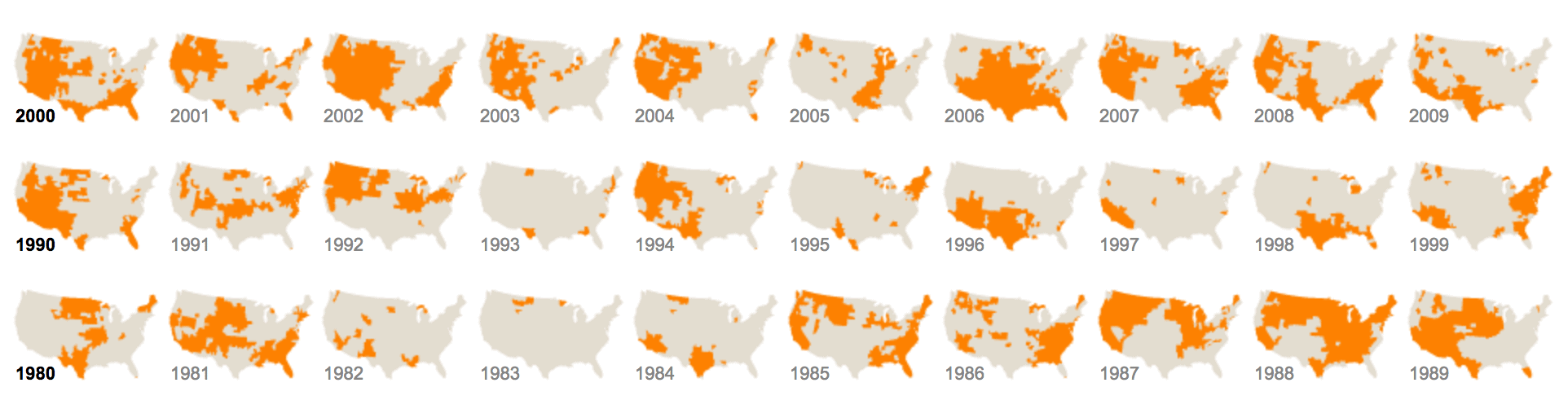
In this example, the map of the United States has been re-created for every year. Each small map (one for every year) is broken out into a separate panel.
Each panel is a “small” version of the overall data visualization technique. So there are multiple small versions of the same type of chart. Multiple versions. Small versions. “Small multiple.” That’s where the name comes from.
Because this design breaks the visualization into separate panels, it is sometimes called the “panel chart.” You might also hear it called a trellis chart.
Small multiple charts are often hard to create. Creating them in Excel is a bit of a pain in the a$$. Many other data visualization tools can’t create them at all.
But creating a small multiple chart is relatively easy in R’s ggplot2.
facet_wrap “wraps” the panels like a ribbon
ggplot2 has a two primary techniques for creating small multiple charts: facet_wrap and facet_grid.
The primary difference between facet_wrap and facet_grid is in how they lay out the panels of the small multiple chart.
Essentially, facet_wrap places the first panel in the upper right hand corner of the small multiple chart. Each successive panel is placed to the right until it reaches the final column of the panel layout. When it reaches the final column of the layout, facet_wrap “wraps” the panels downward to the next row.
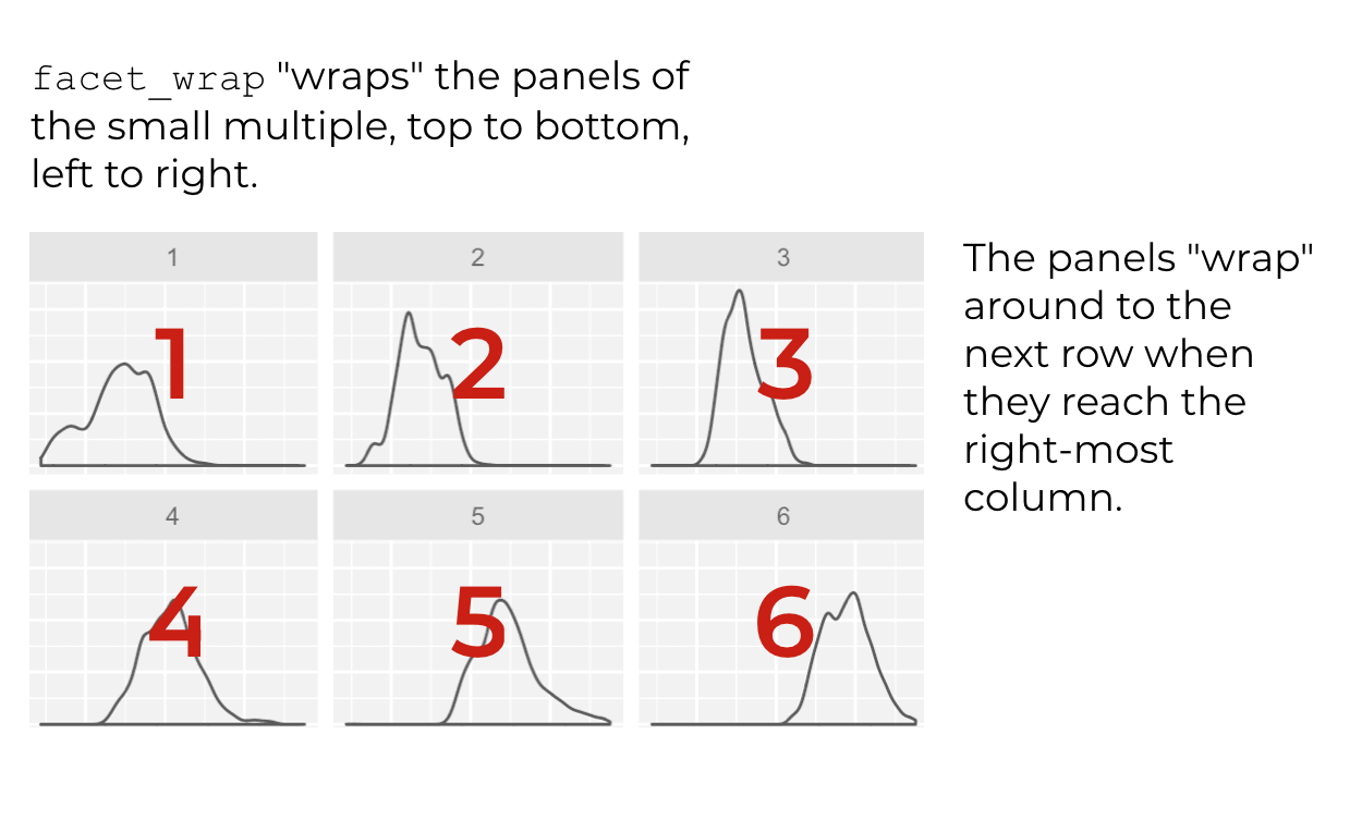
So ultimately, facet_wrap lays out the panels like a “ribbon” that wraps around (and downward) from one row to the next.
Creating this sort of small multiple chart is hard in most software. However, it’s rather easy to do in ggplot2 with facet_wrap.
With that in mind, let’s look at how to create this sort of small multiple plot in ggplot2.
A quick review of ggplot2 syntax
Creating small multiple charts is surprisingly easy in ggplot2, once you understand the syntax.
Here, I’m going to quickly review the syntax of ggplot2, and then I’ll explain how to use facet_wrap.
The syntax of ggplot2
To use facet_wrap and create small multiple charts, you first need to be able to create basic data visualizations with ggplot. That means that you should first have a good understanding of the ggplot2 syntax.
ggplot2 is extremely systematic. Let’s quickly break down the ggplot2 syntax to see how it works.
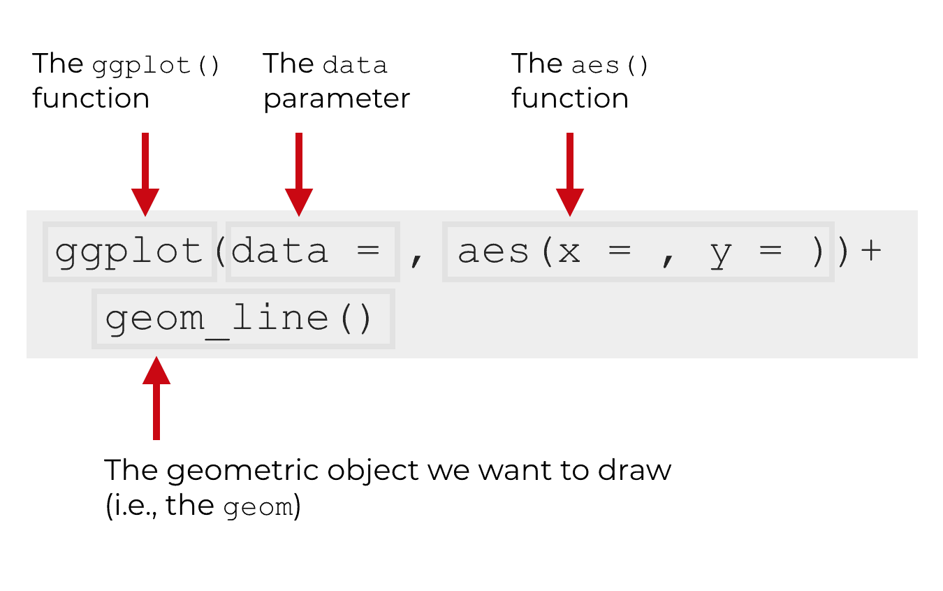
There are 4 basic parts of a simple data visualization in ggplot2: the ggplot() function, the data parameter, the aes() function, and the geom specification.
Let’s quickly talk about each part.
The ggplot() function
The ggplot() function is the core function of the ggplot2 data visualization system. When you use this function, you’re basically telling ggplot that you’re going to plot something. The ggplot() function initiates plotting.
But what exactly you’re going to create is determined by the other parts of the syntax.
The data = parameter
The data that you plot is specified by the data = parameter.
Remember that ggplot2 is essentially a tool for visualizing data in the R programming language. More specifically, ggplot visualizes data that is contained inside of dataframes. ggplot2 almost exclusively operates on dataframes.
Having said that, the data parameter enables you to specify the dataframe that contains your data. It enables you to specify the dataframe that contains the variables that you want to visualize.
Geometric objects (e.g., geom_line)
In the example above, the second line of code has a geom, specifically geom_line. You might be asking … “what the hell is a geom?”
A geom is something you draw. It’s short for “geometric object.” Once you understand that “geoms” are actually “geometric objects,” they become easier to understand.
“Geoms” (aka, geometric objects) are the geometric objects that get drawn in the data visualization; things like lines, bars, points, and tiles.
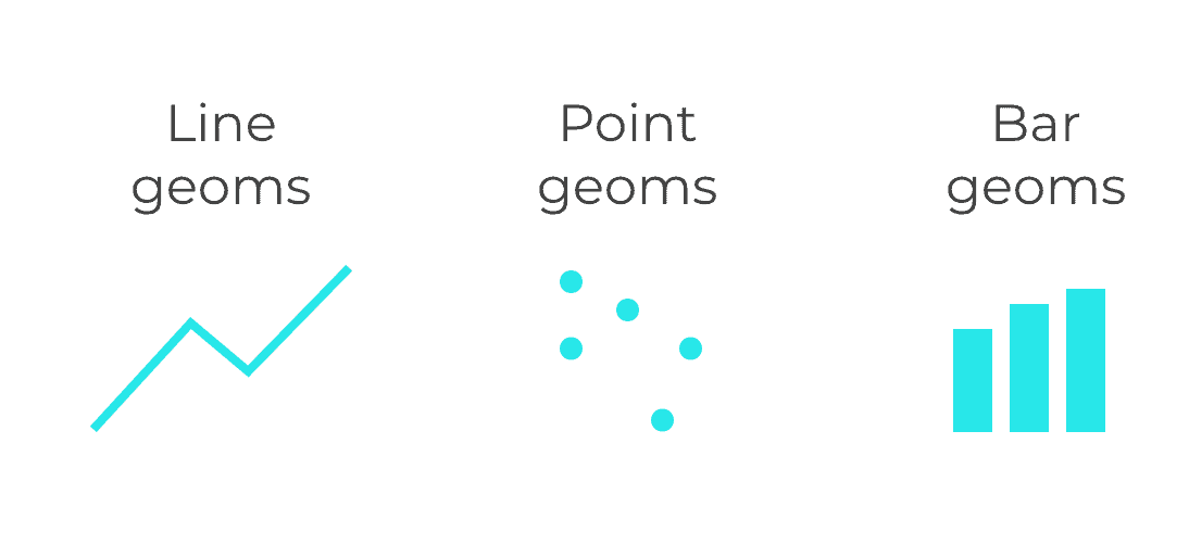
Keep in mind that there are dozens of geoms in the ggplot2 system, but all of them are essentially just types of shapes that we can draw in a data visualization.
The aes() function
The hardest thing to understand in ggplot2 is the aes() function.
The aes() function enables you to create a set of mappings from data (in your dataframe) to the aesthetic attributes of the plot.
That doesn’t make sense to many people, so let me quickly explain.
Your dataframe has data. It has variables.
The plot that you’re trying to draw has “geoms” … geometric objects.
Those geometric objects have aesthetic attributes; things like color and size. Think about it. If you draw a point (a point geom), that point will have attributes like the color and size.
Importantly, when we create a data visualization, what we’re doing is connecting the data in a dataset to elements in the visualization.
More specifically, we create a “mapping” that connects the variables in a dataset to the aesthetic attributes of the geometric objects that we draw.
Here’s where the aes() function comes in.
The aes() function is the function that creates those mappings. It creates the mappings between variables in your dataframe (the data frame that you specify with the data parameter), and the aesthetic attributes of the geoms that you draw.
Essentially, the aes() function enables you to connect the data to the visuals that your audience can see.
If you do it right, you map the data to the geoms in a way that creates something that’s insightful.
facet_wrap “facets” a solo chart into multiple panels
The basic syntax that we just reviewed enables you to make individual charts.
That’s often enough, but sometimes we need more.
In some cases, we need to create many similar charts that are almost exactly the same, but with slight variations.
For example, maybe you want to re-create a bar chart for every year and compare them. Or maybe you want to create two versions of a scatter plot, but for different values of a categorical variable like male/female, so you can compare them side by side.
If you do this manually, creating multiple similar versions of the same chart can be tedious. And sometimes it’s very hard to do. What if you want to create the same chart for every year in your data, and there are 30 years!?
There’s a solution to this.
You can use facet_wrap to create a small multiple chart.
The syntax of facet_wrap
As I mentioned earlier in this tutorial, you can use facet_wrap to create a small multiple chart. A visualization with many small versions of the same chart, arranged in a grid format.
The syntax for this is easy. It starts with the syntax for a basic visualization in ggplot, and then adds the function facet_wrap().
Let’s take a look.
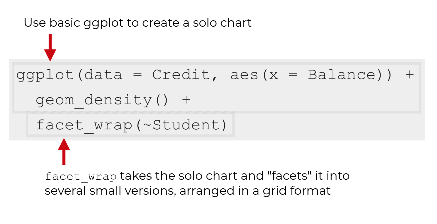
In a simple example like the syntax above, there are two parts.
First there is the “solo chart.” This is the syntax for creating a data visualization in ggplot2. At minimum, you’ll need to use the ggplot() function to initiate plotting. You’ll also need to specify your geom (or geoms, if you have a more complicated plot). And you’ll need the aes() function to specify your variable mappings. Essentially, you need to at least have all of the piece of a data visualization.
After that, you use the facet_wrap() function to “break out” the solo chart into several small versions of that chart. facet_wrap basically enables you to specify the facets, or panels of the small multiple design.
Inside of facet_wrap is your faceting variable. This is the specific variable upon which your visualization will be faceted.
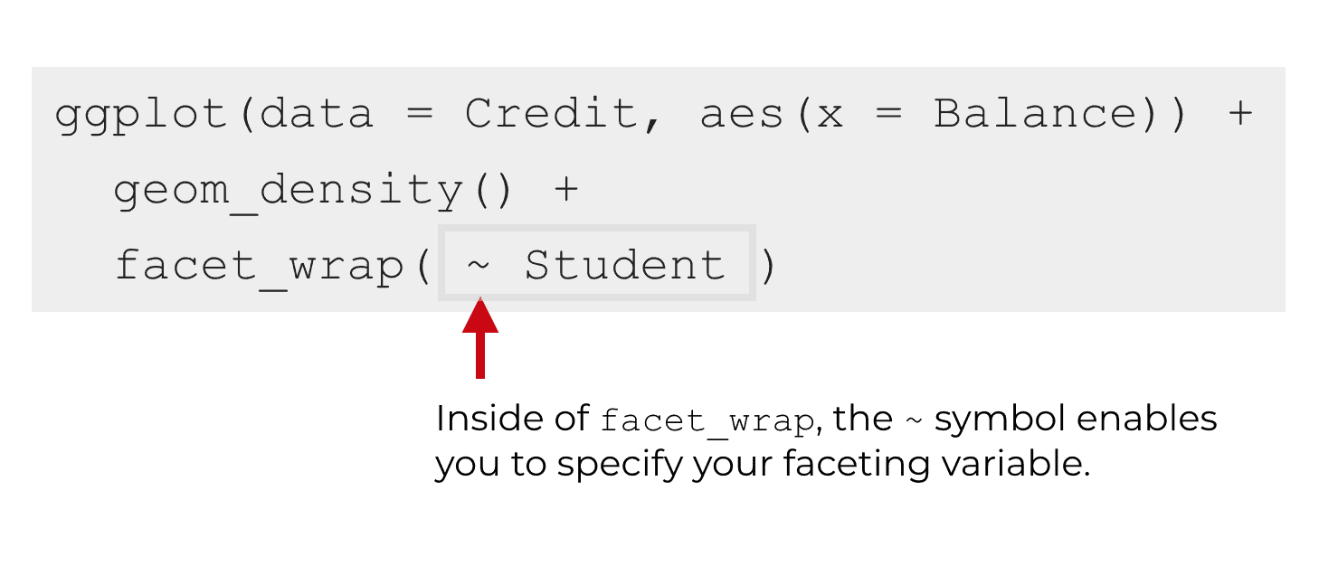
Notice the syntax. The variable name is preceded by the tilde symbol, ~. Typically, the faceting variable itself is a categorical variable (i.e., a factor variable). When we use facet_wrap, it will create one small version of the “solo chart” for every value of your faceting variable.
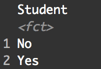
So if you facet on a variable called Student, and that variable has two values, Yes and No, then the code facet_wrap(~Student) will create two small versions of your chart. It will create one version for the two different values of the categorical faceting variable.
Examples: how to use facet_wrap
Ok. Now that I’ve explained how the syntax works, let’s work through a couple of concrete examples.
Here, I’ll walk you through these examples step by step.
Load packages
Before you get started, you’ll need to have a few things in place. First, you will need to have installed a few packages: tidyverse, ISLR, and nycflights13. If you’re working in RStudio, you can do that from Tools > Install Packages.
Next, you will need to load those packages into your working environment in RStudio. To do that, you’ll need to run the following code:
library(ISLR)
library(tidyverse)
library(nycflights13)
Initially, we’re going to be working with the Credit dataframe from the ISLR package.
Very quickly take a look at the data to see what’s in it. You can do that by printing out the data:
Credit %>%
  as_tibble() %>%
  print()
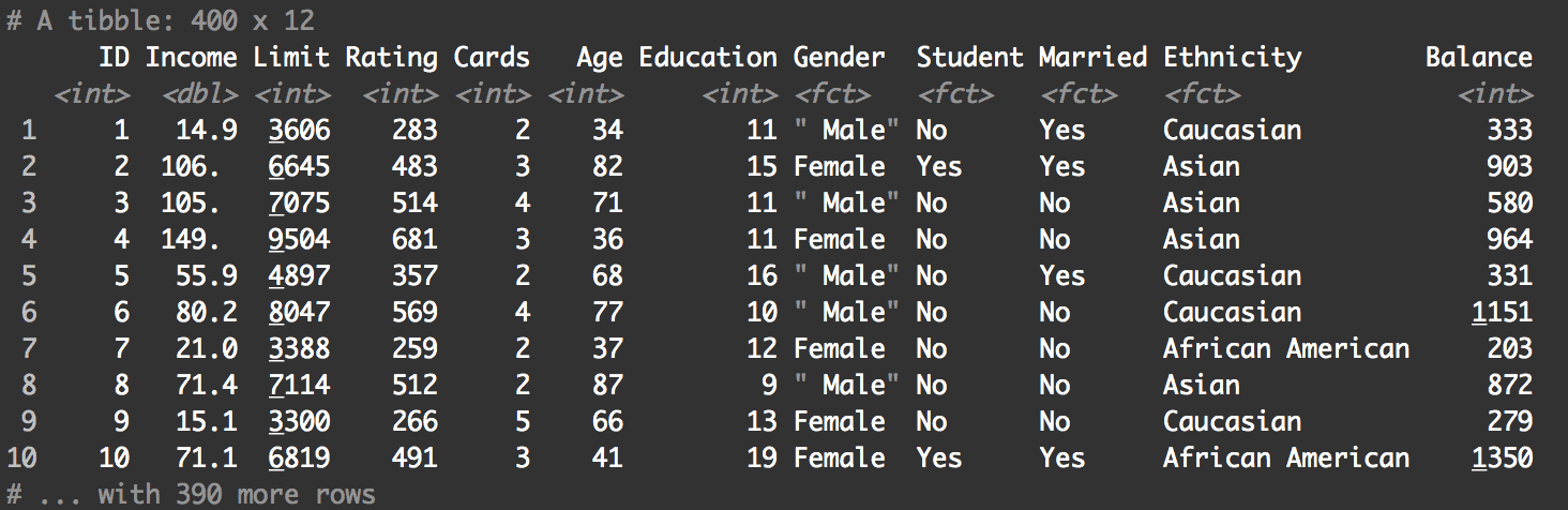
Keep in mind that the Credit dataset is a traditional dataframe object (not a “tibble”). Tibbles print out better, so in the above code, I’ve coerced it to a tibble before printing.
In any case, take a look at the data. This is data about bank customers, and you can see not only bank product data (like the customers’ “Balance”), but also information about the customer like their income, education level, gender, and marital status. We’re not going to use everything in this dataset, but it’s a good habit to examine your data so you know what’s in it.
How to make a simple small multiple chart with facet_wrap
In our first example, we’re going to make a simple small multiple chart using facet_wrap.
This example will be similar to the code that we looked at earlier when I explained the syntax.
Before we actually make the small multiple, let’s first start by creating a “solo” chart with ggplot2. The small multiple that we create later will build on this simple chart.
Create a simple density plot
As I noted above, we’ll be working with the Credit dataset from the ISLR package. We’re going to plot a density plot of the Balance variable.
To do this, we’ll use the following code:
ggplot(data = Credit, aes(x = Balance)) +
  geom_density()
And here is the chart that it creates:

Let’s quickly unpack what we did here.
We initiated plotting using the ggplot() function.
The data that we are using is the Credit dataset from the ISLR package. We specified that we would be plotting this data by using the syntax data = Credit.
We indicated that we wanted to plot the Balance variable by using the code x = Balance. This appears inside of the aes() function. So essentially, we are mapping the Balance variable to the x axis (i.e., the x aesthetic).
And finally, we specified the geom that we want to use with the code geom_density(). We could also have used a different type of geom. For example, we could have used geom_histogram(), which would have made a histogram instead of a density plot.
Combined together, this code creates a single, simple density plot.
Create a small multiple by adding facet_wrap
Now, let’s break this out into a small multiple plot.
To do this, we’re going to facet on the Student variable. The Student variable is a categorical variable – a factor variable – that indicates whether or not the customer is a student.
When working with factor variables like this, it can be helpful to inspect them and identify the unique values. Again, you want to inspect your data so you know what’s in it; this will help you know what to expect when you create your charts.
Credit %>%
  as_tibble() %>%
  print()
Again, you can see that the Student variable is a factor variable.
At a quick glance, it looks like the allowed values are Yes and No, but let’s confirm. Here, we’ll quickly identify the unique values of the Student variable:
Credit %>%
  group_by(Student) %>%
  summarise()
The output of this code shows us the two unique values of Student, Yes and No:
Now that we’ve looked at the Student variable, we’re a little better prepared to create our small multiple chart with facet_wrap. We’re going to “break out” the simple density chart that we made above into two small panels. There will be two, because there are two levels of the Student variable.
Let’s do it:
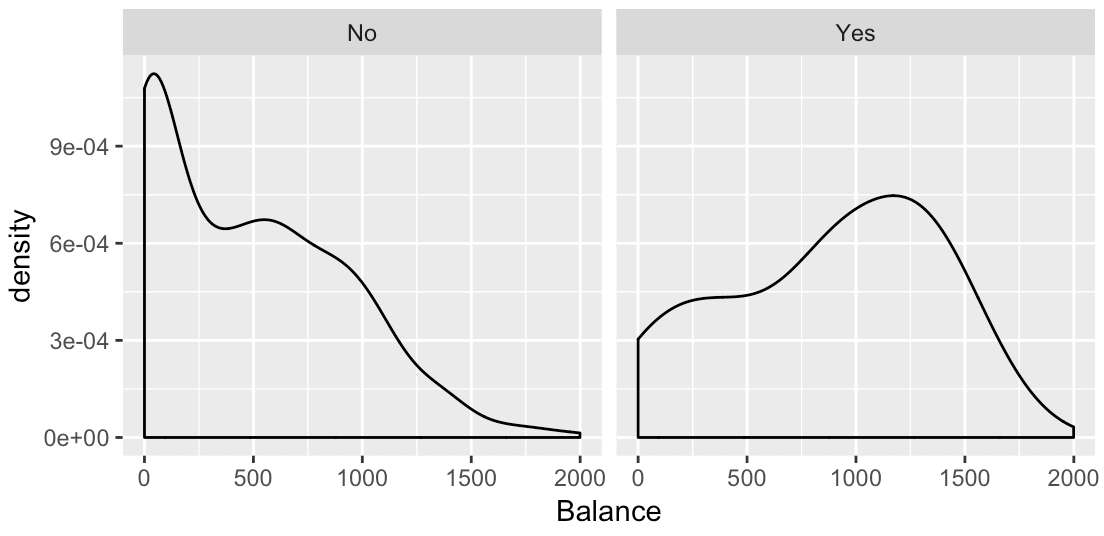
ggplot(data = Credit, aes(x = Balance)) +
  geom_density() +
  facet_wrap(~Student)
And here’s the output:
So what do we have here?
If you look at the individual panels, you can see that each panel is a density plot. Why? Because that’s the “solo” chart that we created with ggplot in the first two lines of code. Those first two lines specify that we’ll create a density plot of the Balance variable (if you don’t understand this, go back to the earlier section where I explain how to make the “solo” chart).
Additionally, the overall chart is broken out into two panels: one panel for “Yes” and one panel for “No“. These values are the two values of the Student variable. Essentially, the third line of code, facet_wrap(~Student), has taken the base density plot and broken it out into two panels; one panel for each value of the Student variable.
How to use the ncol parameter
Now that we’ve reviewed how to make a simple small multiple chart, let’s do something a little more complicated.
Here, we’re going to manipulate the number of columns in the grid layout of a small multiple chart.
To show you an example of this, we’ll work with a new dataset. We’ll be working with the weather dataframe from the nycflights13 package.
Quickly, let’s take a look at the contents:
print(weather)
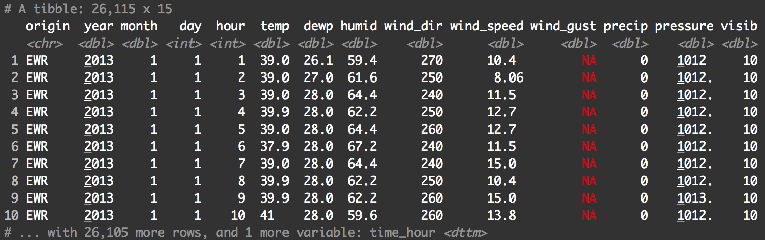
There are a few good variables that we could work with here, but right now, we’re going to focus on temp and month.
temp is a numeric variable (a double) and month is an integer. Having said that, because month is an integer variable with only 12 values, it will operate somewhat similar to a categorical variable. We can therefore use month as our faceting variable.
First, let’s just create a density plot of the temp variable:
ggplot(data = weather, aes(x = temp)) +
  geom_density()
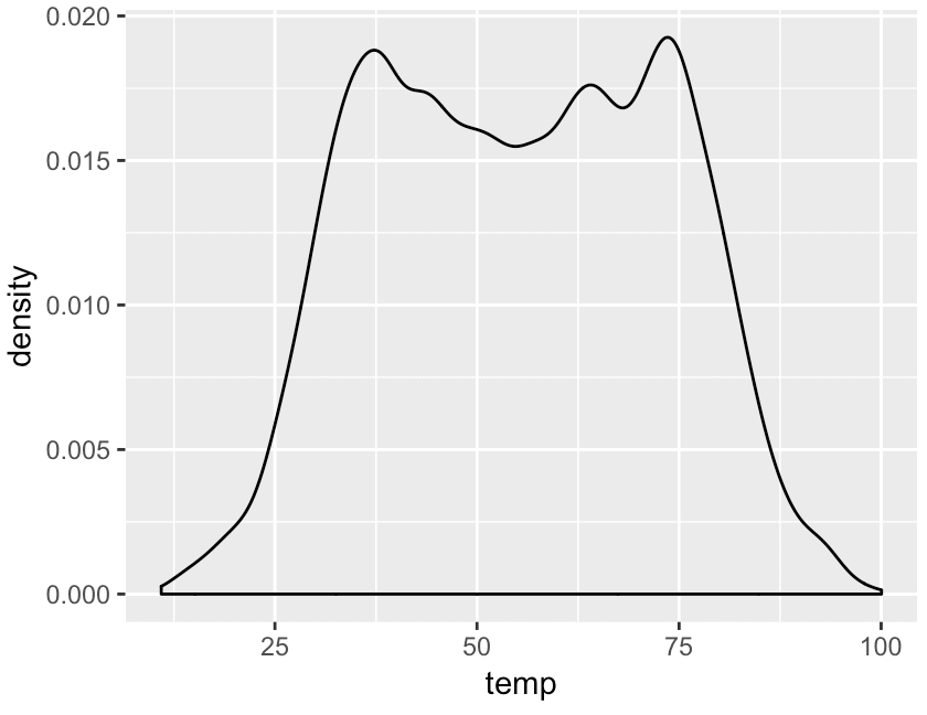
This is a simple density plot. This will serve as the basic “solo” chart that we will break out into multiple panels by using facet_wrap.
Let’s do that.
Here, we’re going to use facet_wrap to create a small version of this density plot for every value of the month variable.
ggplot(data = weather, aes(x = temp)) +
  geom_density() +
  facet_wrap(~month)
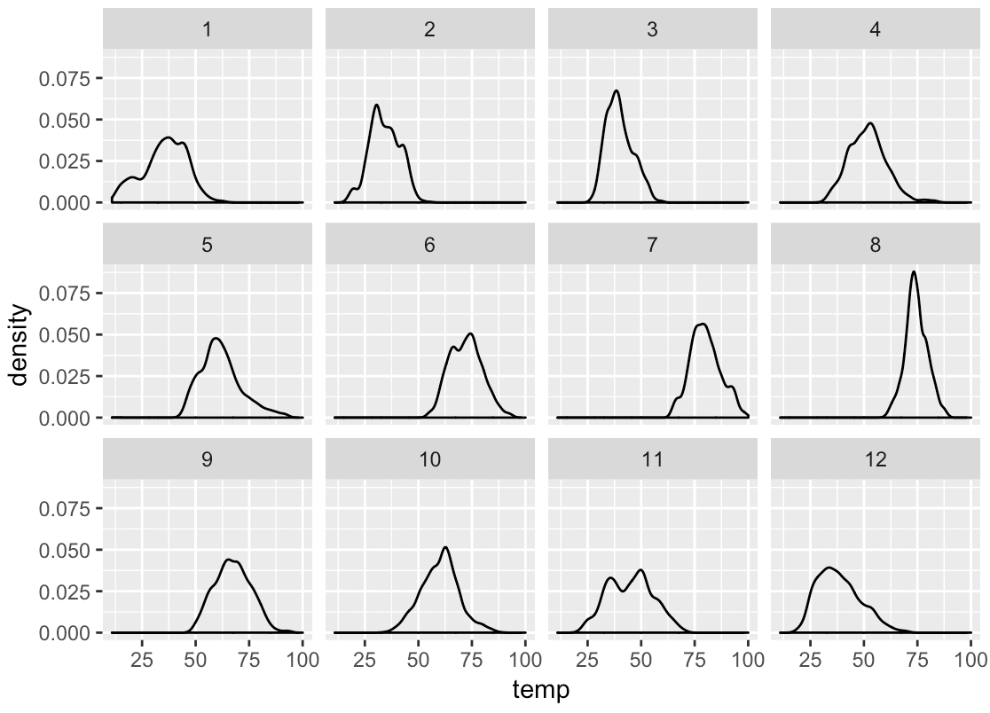
Notice a few things:
First, there are 12 values for the month variable. By using the code facet_wrap(~month), we’ve broken out the base density plot into 12 separate panels, one for each month.
Notice also that facet_wrap has laid out the panels like a ribbon. The first panel is in the top left hand corner (month 1), and they are then laid out left to right, top to bottom. Moreover, the panels “wrap” around to a new row in the grid layout when they reach a certain number of panels. Panels 1, 2, 3, and 4 are in the first row of the grid layout, but then panel 5 is in the next row. Panel 5 was “wrapped” downward into the next row of the grid layout.
But how many columns does the grid layout have? By default, ggplot2 will calculate the number of columns of the layout based on the total number of categories for your faceting variable. There are 12 values for the month variable, so ggplot2 calculated that there should be 4 columns in the layout.
That’s the default behavior though. By default, ggplot2 will calculate the number of rows and columns in the layout for you.
That said, you can change the default behavior and specify the exact number of rows or columns yourself.
Here, we’re going to manually specify the number of columns in the layout.
To do this, we’re going to use the ncol parameter of facet_wrap.
ggplot(data = weather, aes(x = temp)) +
  geom_density() +
  facet_wrap(~month, ncol = 3)
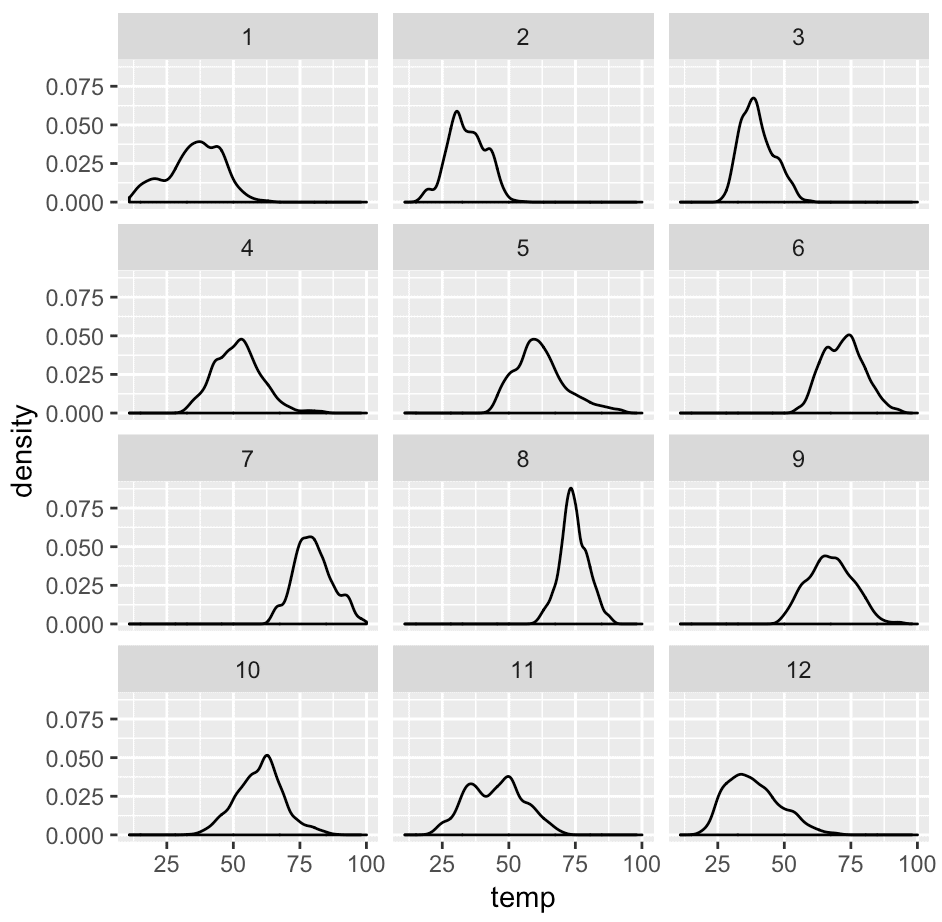
If you’ve understood the other examples earlier in this tutorial, this should make sense. The code is almost exactly the same as the code we just used to create a small multiple chart a few paragraphs ago. But now, we’re specifying that we want exactly 3 columns. To do this, we’ve used the code ncol = 3 inside of facet_wrap.
Keep in mind that you can specify fewer columns or more columns depending on the design that you want to produce. Play around with it and see what you like.
How to use the nrow parameter
Just like you can specify the number of columns, you can also specify the number of rows.
To specify the number of rows of the grid layout, you can use the nrow parameter.
It works almost exactly the same way as the ncol parameter, so if you understood the example in the previous section, this should make a lot of sense.
Let’s take a look.
Here, we’re going to make a small multiple chart with 2 rows in the panel layout.
ggplot(data = weather, aes(x = temp)) +
  geom_density() +
  facet_wrap(~month, nrow = 2)
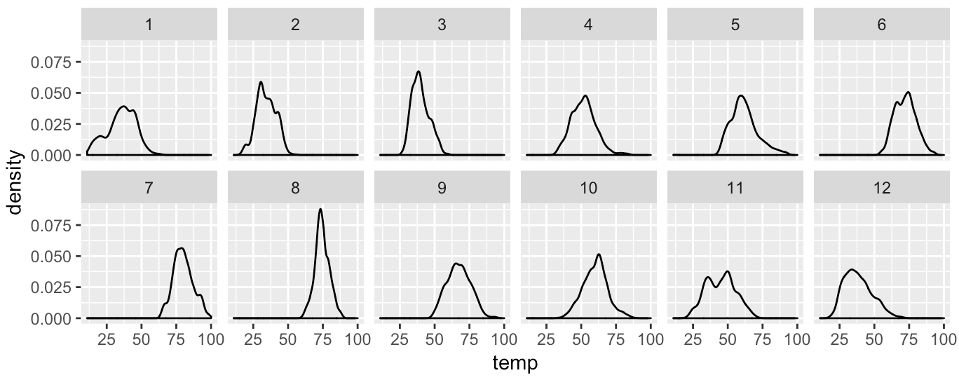
This is pretty straight forward. The code ncol = 2 has forced the grid layout to have 2 rows.
Why I love facet_wrap (and why you should master it)
The small multiple chart is one of my favorite data visualization designs.
This visualization layout enable you to make direct comparisons between categories. A great deal of data analysis is just about making comparisons. Faceting enables you to make those comparisons.
Data analysis also requires you to “zoom in” on your data to look at things with more detail. Again, faceting enables you to do this. The small multiple design is perfect for “zooming in” on your data to see new details and find new insights.
This is why I really love facet_wrap.
In most software, creating a small multiple chart is a pain in the a$$. Try to make a small multiple chart in Excel and you’ll see what I mean. It’s possible, but time consuming and error prone.
But in ggplot2, making small multiple charts is easy. Just add a line of code that invokes facet_wrap (or facet_grid), and you can turn almost any data visualization into a small multiple chart.
Because of this, I think that facet_wrap is one of the best tools for you to have in your R data visualization toolkit. If you’re serious about doing great work as a data scientist or data analyst in R, I recommend that you master it.
For more data science tutorials, sign up for our email list
If you’re interested in mastering tools like facet_wrap, and other tools in R, sign up for our email list.
Here at Sharp Sight, we teach data science.
Every week, we publish articles and tutorials about data science …
… specifically, we publish free tutorials about data science in R.
If you sign up for our email list, you’ll get these tutorials delivered right to your inbox.
You’ll learn about:
- ggplot2
- dplyr
- tidyr
- machine learning in R
- … and more.
Want to learn data science in R? Sign up now.
I really loved this tutorial. Keep it up, guys.
On a more serious note, I loved the easy vocabulary and the human side of the tutorial.
????????????
Thank you for your tutorial, it’s amazing!! indeed we should master facer_wrap
what should I do if I want to do facet_wrap to only see charts 1, 3, 5, and 7 ?
Probably use filter() first on your faceting variable, to only include specific categories.