This tutorial will show you how to use geom_line to create line charts with ggplot2.
Using geom_line is fairly straight forward if you know ggplot2. But if you’re a relative beginner to ggplot, it can be a little intimidating.
That being said, I’m going to walk you through the syntax step by step.
We’ll first talk about the ggplot syntax at a high level, and then talk about how to make a line chart with ggplot using geom_line.
After I explain how the syntax works, I’ll show you a concrete example of how to use that syntax to create a line chart.
Ok … let’s jump in.
The syntax of ggplot2 and geom_line
One of the great things about creating data visualizations with ggplot2 is that the syntax is extremely formulaic.
It looks complex to beginners, but once you understand how it works, it is concise, powerful, and flexible. The ggplot2 system is very well designed, and once you get the hang of it, it makes it easy to create beautiful, high-quality charts … especially line charts.
Having said that, let’s talk about the syntax of ggplot2 first, so you understand how it works at a high level.
A quick introduction to ggplot2
As I mentioned earlier, ggplot2 is highly systematic. Let’s take a look at the high-level syntactical features of ggplot2, so you understand how the system works.
Let’s quickly discuss the main parts of the ggplot2 syntax.
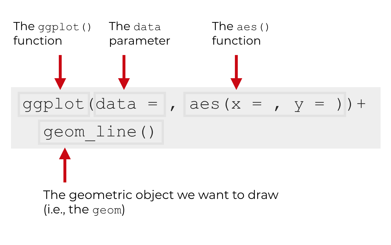
The ggplot function
The ggplot() function is the foundation of the ggplot2 system. It essentially initiates the ggplot2 system and tells R that we’re going to plot something.
So when you see the ggplot() function, understand that the function will create a chart of some type.
Having said that, the exact type of chart is determined by the other parameters.
The data parameter
The data = parameter specifies the data that we’re going to plot.
Specifically, the data = parameter indicates the dataframe that we will be plotting; the dataframe that contains the data we will visualize. To be clear, ggplot2 works almost exclusively with dataframes. Your data and variables will need to be in a dataframe in order for ggplot2 to operate on them.
The aes function
The aes() function specifies how we want to connect the visual aspects of our chart to the data that’s in our dataframe.
A little more technically, the aes() function specifies the aesthetic mappings from the data to the chart.
That might sound confusing, so let me explain. When we create a data visualization, we are creating a visual representation of data that exists in a dataset. We are effectively translating from “data space” to “visual space.”
In order to translate from a dataset to visual objects that we can draw and see, we need to connect variables in the data to objects in a visualization.
More technically, we need to map variables in the data to elements of the plot.
For example, if we are creating a line chart in R, typically we will “map” one variable to the x axis and “map” another variable to the y axis.
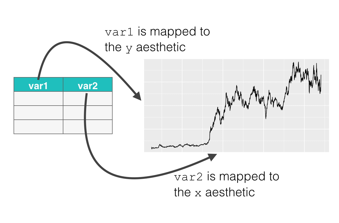
The aes() function enables us to specify how we want to perform those mappings. It enables us to specify which variables in the data should connect to which parts of the plot. Keep in mind that those “parts” of the plot are technically called the “aesthetic attributes” of the plot. That’s where the name of the function comes from; aes() is an abbreviation of “aesthetic attribute.”
Geometric objects
The last part of the basic ggplot2 syntax is the geometric object. We often call the geometric objects of a plot “geoms.”
You might be asking, “What the f*$# is a geom?”
It’s not that hard to understand ….
Geometric objects are things that we can draw. Things like bars, points, lines, etc.
So you want to make a scatter plot? You need to plot point geoms. Want to make a bar chart? You need to plot bar geoms. Want to make a line chart? You need to plot line geoms.
The type of geom you select dictates the type of chart you make.
The syntax of geom_line
Now that we’ve quickly reviewed ggplot2 syntax, let’s take a look at how geom_line fits in.
Remember what I just wrote: the type of geom you select dictates the type of chart make.
If you want to make a line chart, typically, you need to use geom_line to do it. (There are a few rare examples to this, but this is almost always how you do it.)
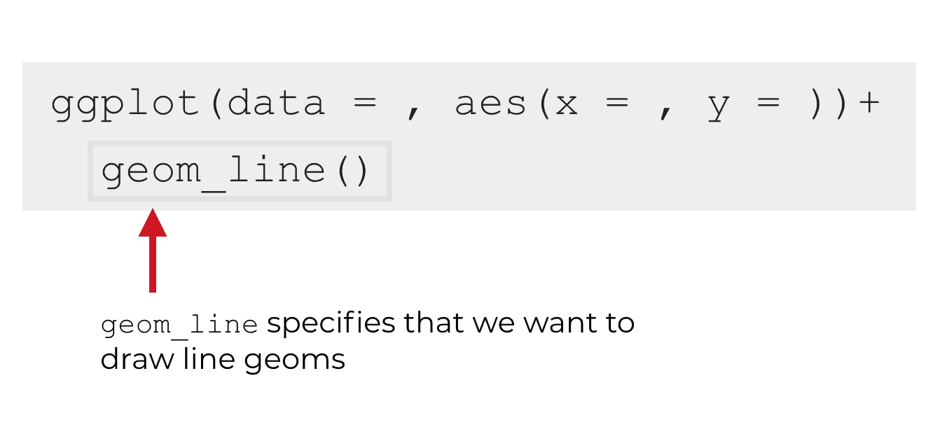
So essentially, you need to use geom_line to tell ggplot2 to make a line chart.
Example of how to use geom_line
This might still seem a little abstract. We’ve talked about the syntax at a high level, but to really understand syntax, it’s almost always best to work with some concrete examples.
Having said that, let’s work through an example so you can see how we structure the syntax. I’ll also explain the syntax, so you know how it works.
Plotting Tesla stock price using ggplot2 and geom_line
In this example, we’re going to plot the stock price of Tesla stock using ggplot2.
I’ve already pulled the stock data (from finance.yahoo.com)
First, we’re going to import the tidyverse library. If you’re not familiar with it, the tidyverse package is a bundle of other R packages. Specifically, it is a collection of packages related to data manipulation, data visualization, and data science in R. ggplot2 is one of the packages in the tidyverse, so when we load the tidyverse, it will automatically load ggplot2.
library(tidyverse)
Next, let’s load the data. I’ve already downloaded the data and cleaned it up using dplyr, so now we just need to import it using the read_csv function.
read_csv will import the data into an R dataframe.
# IMPORT DATA INTO R
tsla_stock_metrics <- read_csv("https://www.sharpsightlabs.com/datasets/TSLA_start-to-2018-10-26_CLEAN.csv")
Quickly, let's print out the data to take a look:
print(tsla_stock_metrics)
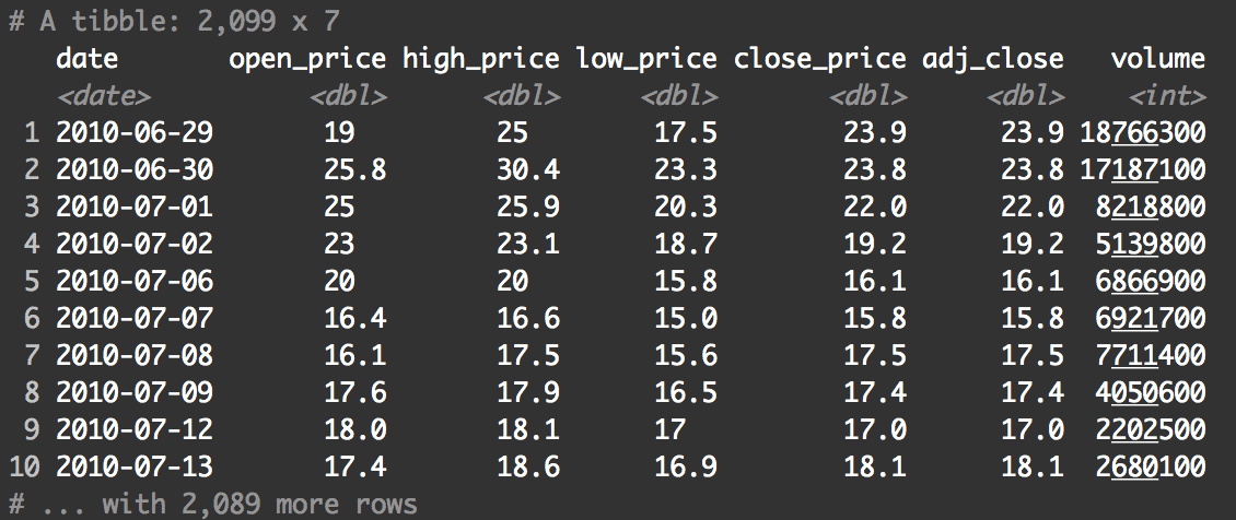
Remember ... as you're performing an analysis (big or small), you should consistently inspect your data by doing things like printing out observations.
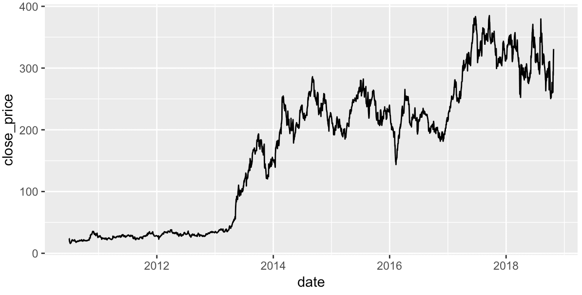
Ok. Now, let's create a rough draft of the chart.
ggplot(data = tsla_stock_metrics, aes(x = date, y = close_price)) +
  geom_line()
And here's what it looks like:
Let's quickly review what we've done in this code.
An explanation of this example
The ggplot() function indicates that we're going to plot something; that we're going to make a data visualization of some type using the ggplot2 system.
The code data = tsla_stock_metrics indicates that we'll be plotting data that's contained within the tsla_stock_metrics dataframe.
After the data parameter, the aes() function is specifying our variable mappings. Specifically, we are mapping the date variable to the x axis (the x aesthetic) and we're mapping the close_price variable to the y axis (the y aesthetic).
Finally, we're using geom_line() to indicate that we want to draw line geoms. Remember ... the type of geom that you use determines the type of chart that you make. Keep in mind, that you could actually try different geoms. For fun, consider changing the geom to something else ... maybe geom_bar. As an exercise, experiment with changing the geom to see what happens.
Ultimately, this code produces a pretty decent "first draft" line chart. It's not perfect (we'll work on this more later in the tutorial), but it's not bad for a first draft.
This is actually one of the reasons that I love ggplot2. As I've said many times in the past, ggplot2 makes excellent "first draft" charts. The charts look pretty good even without formatting.
And as another side note, I want to point out that as you're performing an analysis, this would be your first step. You generally want to make a simple chart that doesn't have a lot of formatting as your first draft. That's because a quick-and-dirty chart like this won't take nearly as much time as a finalized version, but it still conveys quite a bit of information. You can use these rough draft charts early in an analysis, and share them with close team members.
A more complex version of the line chart
Having said that, in some cases, you will want to ultimately have a chart that is more refined. For example, if you're creating an analysis that needs to be published or presented to someone important (a client, upper management, etc) you will want to have a chart that looks a little better.
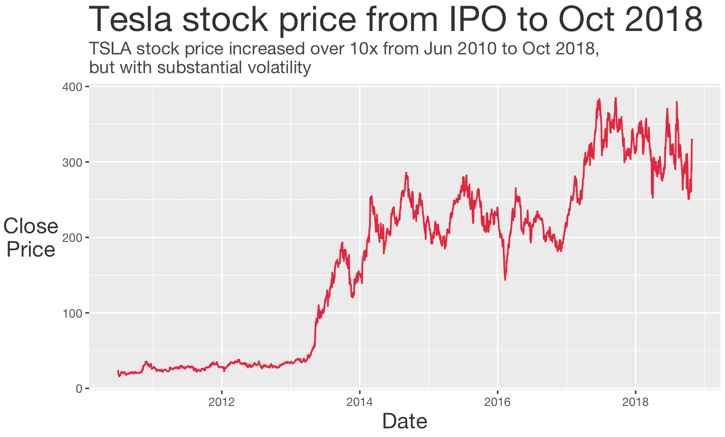
With that in mind, we'll create one more version of this line chart. We're going to create a chart that is more formatted.
ggplot(data = tsla_stock_metrics, aes(x = date, y = close_price)) +
  geom_line(color = '#E51837', size = .6) +
  labs(title = 'Tesla stock price from IPO to Oct 2018'
       ,y = 'Close\nPrice'
       ,x = 'Date'
       ,subtitle = str_c("TSLA stock price increased over 10x from Jun 2010 to Oct 2018,\n"
                          ,"but with substantial volatility")
       ) +
  theme(text = element_text(color = "#444444", family = 'Helvetica Neue')
        ,plot.title = element_text(size = 26, color = '#333333')
        ,plot.subtitle = element_text(size = 13)
        ,axis.title = element_text(size = 16, color = '#333333')
        ,axis.title.y = element_text(angle = 0, vjust = .5)
        )
And here is the output:
Let me quickly explain this.
The basis for this chart is almost identical to the first rough draft chart. Take a look at the first two lines:
ggplot(data = tsla_stock_metrics, aes(x = date, y = close_price)) +
  geom_line(color = '#E51837', size = .6)
This code is almost identical to the initial first draft chart that we made earlier in this tutorial. The major difference in these first two lines is that we modified the color and the size of the line inside of geom_line().
The rest of the code after those first two lines is all formatting code. We used the labs() function to add a title and text labels. After the labs() function, we used the theme() function to format the "non data elements" of the chart. Specifically, we modified the text color, the text size (of the plot title and axis titles), and a few other things.
You should master the basics of ggplot2
In this tutorial, I showed you how to use geom_line to make a line chart in ggplot2. I showed you how to make a very simple line chart, but also how to make a more "polished" line chart.
If you want to learn data science in R, you really need to know this technique. In fact, there is a whole set of foundational techniques you should master if you want to be a good data scientist. You should know how to create a bar chart, create a scatter plot, and create histograms. You should know how to filter data, add new variables, and perform a variety of other data visualization and data manipulation tasks.
Learning (and mastering) these skills is not hard ... we can show you how.
For more data science tutorials, sign up for our email list
Here at Sharp Sight, we teach data science.
If you're interested in data science, sign up for our email list.
Every week, we publish articles and tutorials about data science ...
... specifically, we publish free tutorials about data science in R.
If you sign up for our email list, you'll get these tutorials delivered right to your inbox.
You'll learn about:
- ggplot2
- dplyr
- tidyr
- machine learning in R
- … and more.
Want to learn data science in R? Sign up now.
Excellent explanation of ggplot Function in very easy language.
Perhaps the clearest, most understandable explanation I have found about ggplot and how it works. Thank you!
P.S. The official package man./help pages remain so obscure for the uninitated…
Lol.
My new tagline for the website will be “Sharp Sight: Even better than the official documentation.”