This blog post is a fairly comprehensive ggplot2 tutorial for beginners.
If you’re new to R and ggplot, this ggplot2 tutorial will cover a few things:
If you’re new to ggplot, I recommend that you read the whole tutorial. But if you want to skip to a particular section, click on the appropriate link in the list above. The link will send you directly to the appropriate section in the tutorial.
What is ggplot2?
First, let’s start with the basics. Here, we’re going to cover what ggplot2 is, and how it fits into the larger data science ecosystem for the R programming language?
ggplot2 is a toolkit for data visualization in R
ggplot2 is a package in the R programming language that enables you to create data visualizations.
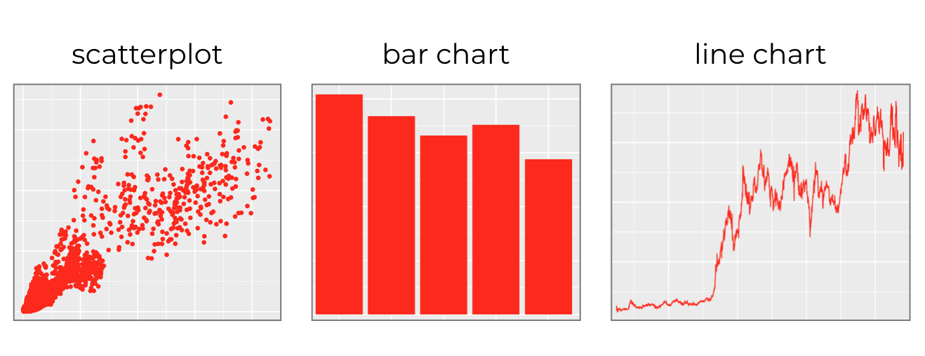
You can use it to create simple data visualizations scatter plots, bar charts, and line charts:
But you can also use it to create fairly advanced and complicated data visualizations, like detailed maps:
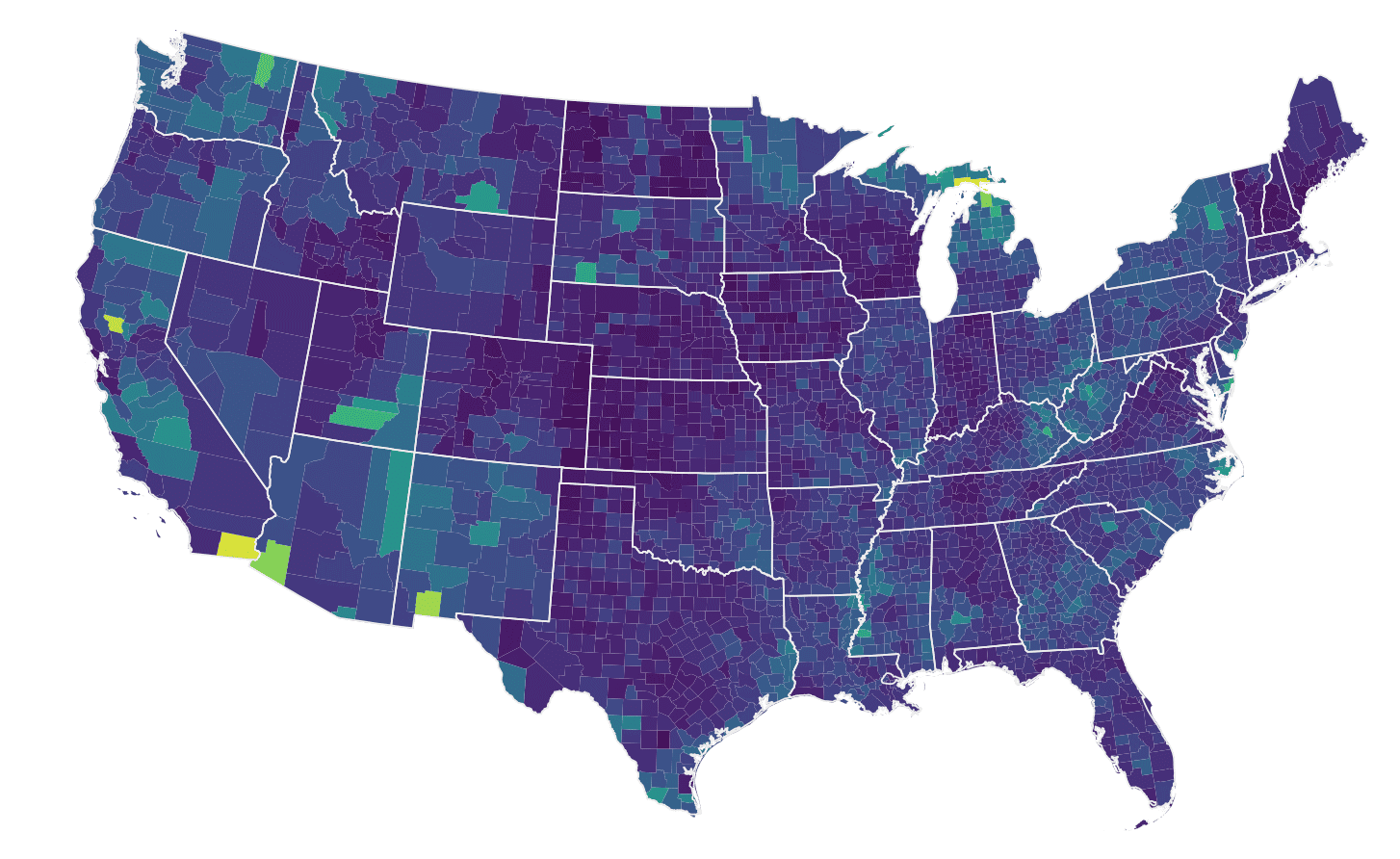
Ultimately, ggplot2 can create very simple data visualizations, and it can create very complicated data visualizations. It’s both powerful and flexible.
ggplot2 is part of the Tidyverse data science toolkit
Although ggplot2 focuses on data visualization, it is part of a larger family of R packages for doing data science in R.
This set of data science packages is called the tidyverse. The tidyverse packages cover the full range of the data science workflow, so there are packages for importing data, data manipulation and cleaning, data visualization, and modeling.
In particular, the tidyverse includes:
- readr for importing data
- dplyr for data manipulation
- ggplot2 for data visualization
- stringr for string manipulation
- lubridate for date manipulation
- tidyr for putting data into a “tidy” format
- … and others
The full list of packages in the tidyverse can be found elsewhere.
What’s important to understand is that the tidyverse provides a coherent set of tools for doing data science in the R programming language, and ggplot2 is one part of that broader toolkit.
Importantly, the packages from the tidyverse share a common philosophy concerning how data science should be performed. This philosophy manifests in the how the syntax is structured and how they operate.
Let’s quickly cover some of the important design features of the tidyverse, and how these relate to ggplot2.
The ggplot2 operates on dataframes
The ggplot2 package operates on R dataframes. This is because (for the most part) the tidyverse packages focus on dataframes, in one way or another.
In fact, the name “tidyverse” comes from the concept of a “tidy” dataframe. A so-called “tidy” dataframe is a dataset where every variable has its own column, every observation has its own row, and every value has its own cell in the dataframe grid.
Some of the packages – like the tidyr package – work to reshape data into this tidy format.
Other packages – like forcats and stringr – primarily operate on the variables within a “tidy” dataframe.
And some packages “do stuff” with dataframes. For example, ggplot2 visualizes the data that’s in a tidy dataframe. ggplot expects the input data to be in a dataframe. It doesn’t work with other data structures, for the most part.
Several other packages – like dplyr – also require the input data to be in a “tidy” dataframe.
The tidyverse is highly modular
All of the functions in the tidyverse packages are highly modular. That means that for the most part, all of the functions are designed to do one thing, and one thing only.
For example, in ggplot2, the ggplot() function initiates plotting. That’s essentially the only thing that it does. There’s a separate function that you use to draw bars (for a bar chart). Another function for drawing points for a scatterplot. And there are still other functions for formatting the elements of your plot.
In ggplot2 and the rest of the tidyverse, almost every little operation that you want to perform has a separate function.
This might seem odd, but once you see it in action, it seems like a great way to structure things.
All of these little functions in ggplot2 and the tidyverse are like little Lego building blocks that you can snap together.
In terms of workflow, this means that you can write your code iteratively.
Just trust me on this. It’s great.
The tidyverse and ggplot are easy to use
One of the primary advantages of the tidyverse is that it is relatively easy to use.
Part of this comes from the design of the syntax.
For starters, almost everything is named in a way that’s clear and easy to understand. If you want to “filter” out some of the rows of your data, there is a function called filter() from dplyr. Or if you want to “select” specific variables from a dataset, dplyr also has a function called select().
Other functions have little prefixes that make them easy to work with. For example, essentially all of the functions from the stringr package use the prefix str_. So if you’re using RStudio, you can type in str_ and then hit the stringr package.
Moreover, the names of those stringr functions are well named. So if you need to “replace” characters in a string, you can use str_replace(). If you want to convert all of the characters in a string to lower case, you can use str_to_lower(). The names of the functions begin with str_, and they are otherwise named in a way that makes them easy to remember.
The fact that the functions are clearly named is actually a really big deal.
Because things are clearly named, functions are much easier to remember. This makes it a lot easier to write code.
It also makes it easier to read code. Reading code for the tidyverse is often like reading psudocode.
This is one of the reasons that I recommend that new R users learn the tidyverse. It’s also one reason that I recommend that many data science beginners learn R, instead of a different data science language.
ggplot2 has a highly structured syntax
Part of the reason that ggplot itself is powerful and easy to use is that it has a highly structured syntax.
This is because it is based on a theoretical framework called The Grammar of Graphics.
I won’t explain the Grammar of Graphics here, but understand that it enables a data scientist to think about data visualization in a highly structured way. Moreover, because the syntax of ggplot2 is based on the Grammar of Graphics, it makes it possible to create data visualizations with a relatively concise syntax, whether they are simple visualizations or and complex visualizations .
Having said that, let’s take a look at the syntax of ggplot2 to understand how it works.
The syntax of ggplot2
Now that we’ve talked about what ggplot2 is and how it fits into the tidyverse, lets move on to the heart of this ggplot2 tutorial. Let’s talk about the syntax of ggplot2.
The great thing about the syntax of ggplot2 is that its highly systematic. The systematic nature of ggplot is one of its best features. The structured nature of ggplot2 makes it very powerful, once you understand it.
On the other hand though, the syntax can be a little confusing to beginners. Once you understand how the system works, it makes a lot of sense, but you might need to do some work to understand it first.
That being said, let’s take a careful look at the syntax.
The basics of ggplot syntax
There are four main parts of a basic ggplot2 visualization: the ggplot() function, the data parameter, the aes() function, and the geom.
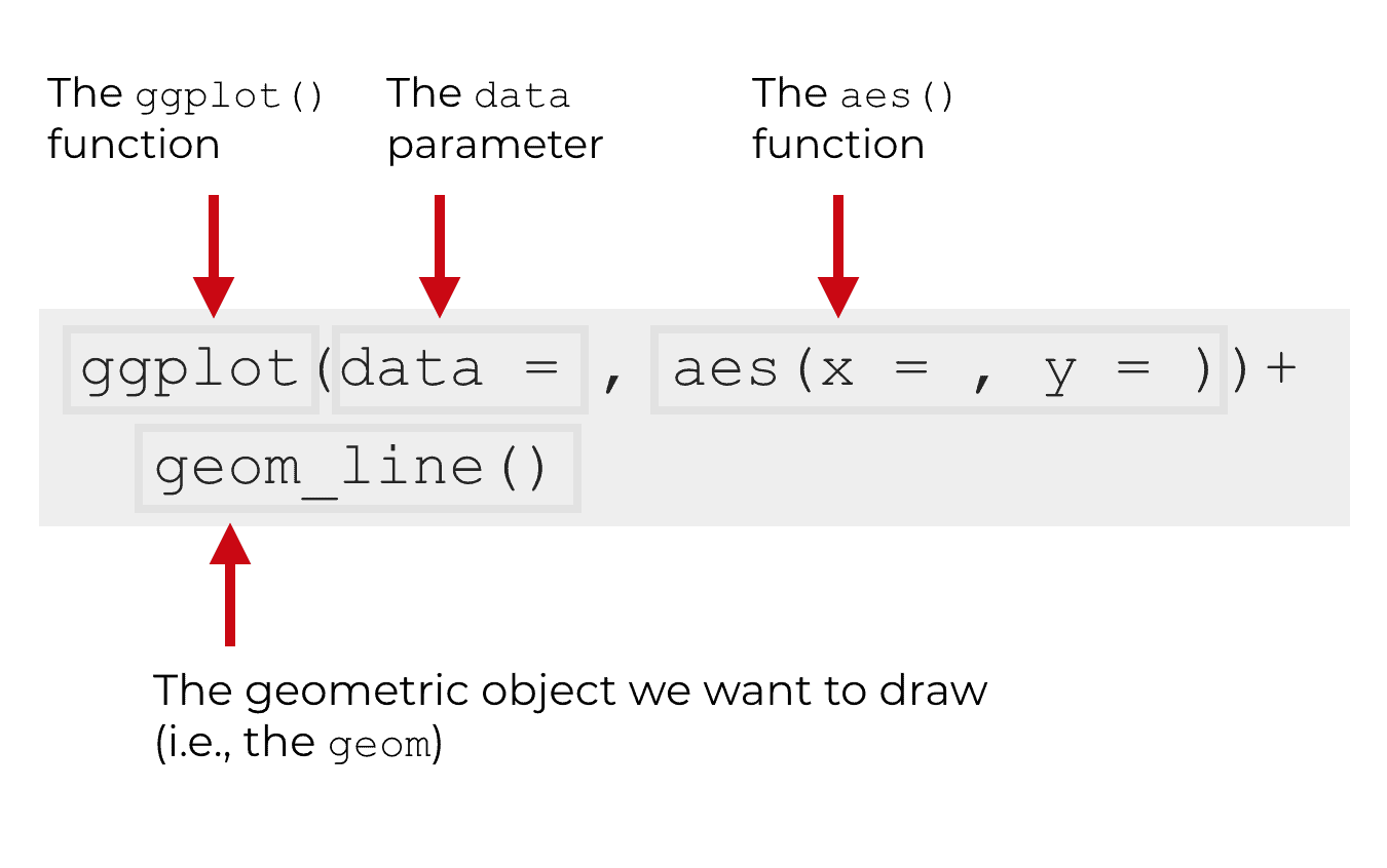
Let’s talk about each of these separately.
The ggplot function
The ggplot() function is the core function of ggplot2. It initiates plotting.
Essentially, any time you want to create a data visualization with ggplot2, you’re going to use this function. Almost everything else in the ggplot2 system is built “on top of” this function.
The data parameter
Inside of the the ggplot() function, the first parameter is the data parameter.
The data parameter essentially specifies the data that you want to visualize. More specifically, it specifies the data.frame object that contains the data that you want to visualize. The ggplot2 system works almost exclusively with data.frame objects. So when you provide an argument to the data parameter, it will always be a data.frame object of some type (i.e., a a traditional data.frame or a tibble).
Geoms (AKA, geometric objects)
“Geoms” are the geometric objects of a data visualization. They are the things that get drawn in a data visualization.
This is often confusing to beginners, so let me give you 3 simple examples.
Lines, points, and bars are all types of “geoms.”
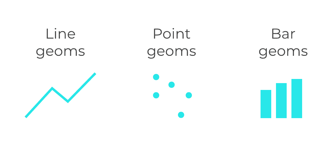
Lines, points, and bars are all geometric objects that you can draw in a data visualization. There are many other types of geoms as well like boxes for a box plot, polygons, etc.
So here’s an example. Let’s say you want to make a line chart.
The “geom” that you need to draw to create a line chart like this is a “line geom.” You can draw line geoms with the geom_line() function.
Similarly, if you want to draw bars for a bar chart, you use geom_bar(). You can draw point geoms for a scatterplot.
This is critical: the type of geom or geoms that you use determine the type of data visualization that gets created.
geoms have attributes like color and size
There’s something important that you need to know about geoms. Geoms have attributes.
Think about it. Anything that you draw has attributes like its position in the coordinate system, color, size, shape, etc.
And remember, geoms are the visual things that we draw in a plot. Therefore, any geom that you draw has attributes.
For example, point geoms have attributes like color, size, x-position, and y-position. We call these aesthetic attributes. Aesthetic attributes are essentially the visual details about the color, size, and position of your geometric objects.
This is important, because it relates to the final part of the basic ggplot2 syntax.
The aes function
I just introduced you to geometric objects, which are the things that we draw in a data visualization. And I just noted that those geometric objects have attributes like color, size, and shape.
Also, a little earlier in this ggplot tutorial, we talked about the data parameter. The data parameter specifies the data that you will plot.
So there’s a dataset that you will plot, and then there’s the visual output itself, which is determined by your geom specification.
But how do you connect them?
Remember: data visualizations are essentially visual representations of an underlying dataset. For the data visualization process to work properly, there needs to be a connection between the data (the dataframe) and the visual objects that we draw (the geoms).
You need a way to “connect” the dataset to the geoms that get drawn.
The aes function creates mappings from data to geoms
Said a little more precisely, we need a mapping from the underlying data to visual objects that get drawn (the geoms).
How do we do this? How do we connect the dataset to the visual objects in the chart?
We do this with the aes() function.
The aes() function enables you to create a set of “mappings” from your dataset to the geoms in your data visualization. More precisely, the aes() function allows you to map the variables in your data frame to the aesthetic attributes of the geometric objects of your plot.
Recall from earlier in the tutorial, we talked about these two things: dataframes and geoms. The dataframe is specified by the data parameter and the geom is specified by the geom that you choose (e.g., geom_line, geom_bar, etc). The aes() function is what enables you to connect these two things.
Let’s talk a little more specifically about what this function does.
Remember that all geoms have aesthetic attributes. For example, point geoms have attributes like color, size, shape, x-position, and y-position.
When you use the aes() function, you are really connecting variables in your dataframe to the aesthetic attributes of your geoms.
A quick example of the aes function
Here’s an example. Let’s say that you want to plot line geoms. Essentially, you want to create a line chart.
Line geoms have aesthetic attributes like their position on the x axis, position on the y axis, and color. By using the aes() function, we can connect the variables in the dataframe to those aesthetic attributes, which will cause the line to vary on the basis of the underlying data.
So imagine you have a dataset called dummy_data, and it has two variables, var1 and var2. You want to put var1 on the x axis and var2 on the y axis. To create this variable mapping, you can use the aes() function.
ggplot(data = dummy_data, aes(x = var1, y = var2) +
  geom_line()
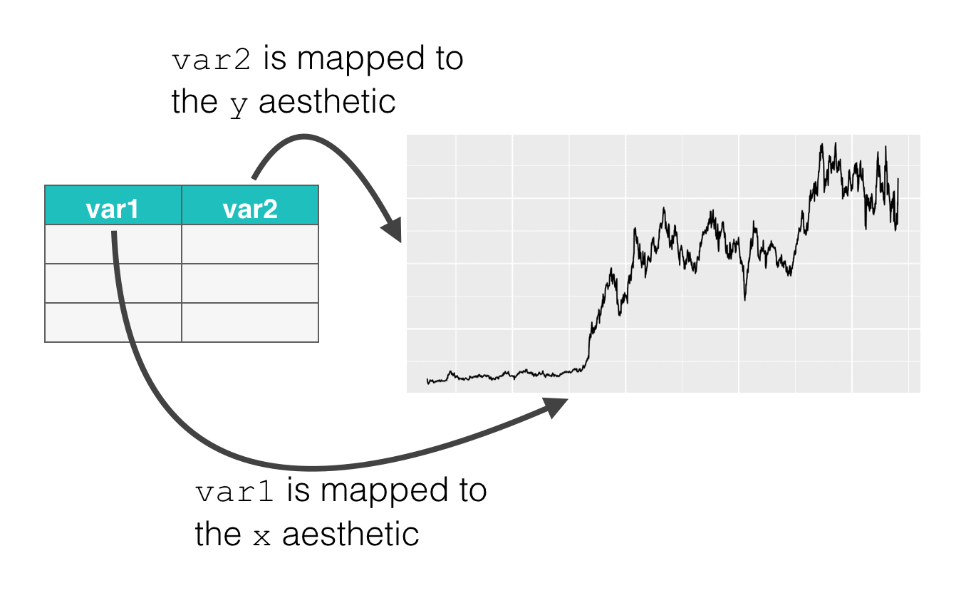
Take a look at the code and then look at the image. Inside of the aes() function, we have the code x = var1 and y = var2. Here, x refers to the x position aesthetic. Similarly, y refers to the y position aesthetic. These are aesthetic attributes of the points on the line that we’re drawing. And ultimately, by using the aes() function this way, we’re connecting the parts of the line to the underlying data in the dataset, dummy_data.
Keep in mind that ggplot2 geoms have lots of aesthetic attributes that you can manipulate: x-position, y-position, color, size, shape, and more. Also, keep in mind that different geoms (lines, points, bars, etc) have different aesthetic attributes that you can manipulate.
Some aesthetics are relatively universal (like x-position) but others are specific to specific geoms.
Regardless, to get the full power out of the ggplot2 system, you need to have a firm understanding of how to create variable mappings using the aes() function.
Examples: how to use ggplot2
Ok. Now that I’ve explained the syntax of ggplot2, let’s look at some examples.
Whenever you’re learning a new programming language, I strongly recommend that you study and practice very simple examples until you really understand how they work. To rapidly master a programming language, you really need to understand basic tools, techniques, and concepts first.
With that in mind, I’m going to show you how to make some basic plots with ggplot2.
Keep in mind that there are other tutorials on this website that explain these techniques in greater detail. However, the simple examples in this ggplot tutorial will give you a quick introduction to these plots and how they work.
The data and packages that we’ll be using
In these examples, we’ll be working with a few packages and datasets.
We’ll primarily be working with the ggplot2 package and using data from the ggplot2 package. Additionally, we’re going to use some other tools from the tidyverse. With that in mind, you need to make sure that you have these packages installed and loaded.
Package installation
To install the packages in RStudio, you can go to Tools > Install Packages in the menu bar. Once you’re there, a window will open up and you can type the name of the packages into the text box. Then click “Install.” Make sure to install ggplot2 and tidyverse.
Load packages
Once you have the packages installed, you’ll need them loaded in RStudio. To load them, you’ll need to use the library() function like this:
library(ggplot2)
library(tidyverse)
Technically, you don’t need to load ggplot2 here, because ggplot2 will be automatically loaded when you load the tidyverse package. But since this is a ggplot2 tutorial, I’m making it explicit.
In any case, you’ve loaded these packages by running the code, you should be ready to go.
How to make a scatterplot with ggplot2
First, we’ll make a scatterplot.
ggplot(data = txhousing, aes(x = listings, y = sales)) +
  geom_point()
So what are we doing here? Let’s break it down.
The ggplot() function indicates that we’re going to plot something. Really, the only thing that the ggplot() function does is initiate plotting. All of the “heavy lifting” is done by the other parts of the syntax.
Immediately inside of the ggplot() function, you can see the data = parameter. Using the data parameter, we’ve indicated that we’re going to plot data from the txhousing dataset by using the code data = txhousing.
On the second line of code, we’ve used the geom_point() function to indicate that we’re going to plot point geoms. Essentially, we’re using this to plot points.
Finally, take a look at the aes() function inside of ggplot(). As I mentioned earlier in this ggplot tutorial, the aes() function enables us to connect our dataset to our geometric objects. So what specifically did we do here? The exact code is aes(x = listings, y = sales). This code maps the listings variable to the x axis and the sales variable to the y axis.
Now, check out the output of the code:
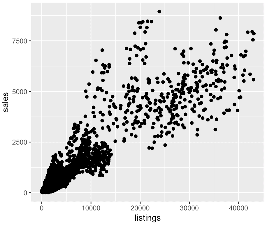
Just as we’ve specified with the aes() function, you can see that we’ve mapped the listings variable to the x axis and the sales variable to the y axis.
And because we’ve used geom_point(), ggplot has drawn points. In the plot, every point essentially represents a different row of data. For each point, the x axis position corresponds to the value of listings, and the y axis position corresponds to the value of sales.
Keep in mind that this is a relatively simple example of how to make a scatterplot. For a little more detail, see our other tutorials for more information about how to make scatterplots in ggplot2.
How to make a bar chart with ggplot2
For the next example in our ggplot2 tutorial, let’s take a look at how to create a bar chart with ggplot.
First, here’s the code. You can paste this into RStudio and run it.
ggplot(data = midwest, aes(x = state)) +
  geom_bar()
Once again, let’s break this down.
If you’ve been following the syntax explanations through this ggplot2 tutorial, this code should mostly make sense.
The ggplot() function initiates plotting. Then immediately inside the ggplot() function, the code data = midwest indicates that we’ll be plotting data from the midwest dataframe.
On the second line of code, the geom_bar() function indicates that we’ll be drawing bars. Essentially, this indicates that we’re going to make a bar chart.
Then, take a look at the aes() function. As always, the aes() function tells ggplot which variables to plot on the chart. In this particular case, the code aes(x = state) puts the state variable on the x axis of the chart.
Notice though that we haven’t mapped any variable to the y axis. By default, if you use geom_bar() and you don’t map any variable to the y axis using the aes() function, ggplot will count the records.
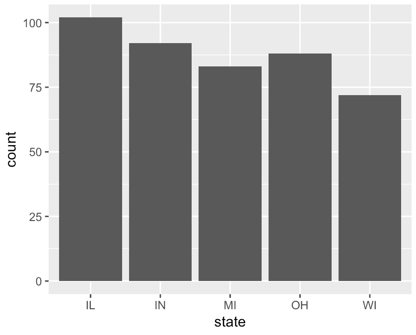
So in this case, the length of the bar corresponds to the count of the number of records for the category on the x axis.
Create a bar chart with stat = ‘identity’
There’s also another way to make a bar chart. It’s possible to map a variable to the y axis too, so the length of the bar correspond to the value of the y axis variable (instead of the count).
To show you an example of this, I’m going to create a new dataset that calculates the total population by state. In order to create this summarised dataset, we’ll use the group_by() and the summarise() functions from dplyr.
Having said that, in order to really understand this, you’ll need to understand dplyr and the “pipe” syntax. Explaining dplyr is beyond the scope of this blog post (since this is a ggplot2 tutorial), so check out our dplyr tutorial for more explanation of how this works.
midwest_populations <- midwest %>%
  group_by(state) %>%
  summarise(total_population = sum(poptotal))
Ultimately, this code produces a summarised dataset that contains two variables: state and total_population.
Let’s print it out so you can see it:
print(midwest_populations)
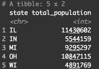
Again, there are two variables: the state, and then the total population of that state.
The important detail here is that there is one observation for every state. This is different from the original midwest dataset, where there was one record for every county, and therefore multiple records for every state.
This is relevant, because now we can map the state variable to the x axis and the total_population variable to the y axis.
Let’s take a look:
ggplot(midwest_populations, aes(x = state, y = total_population)) +
  geom_bar(stat = 'identity')
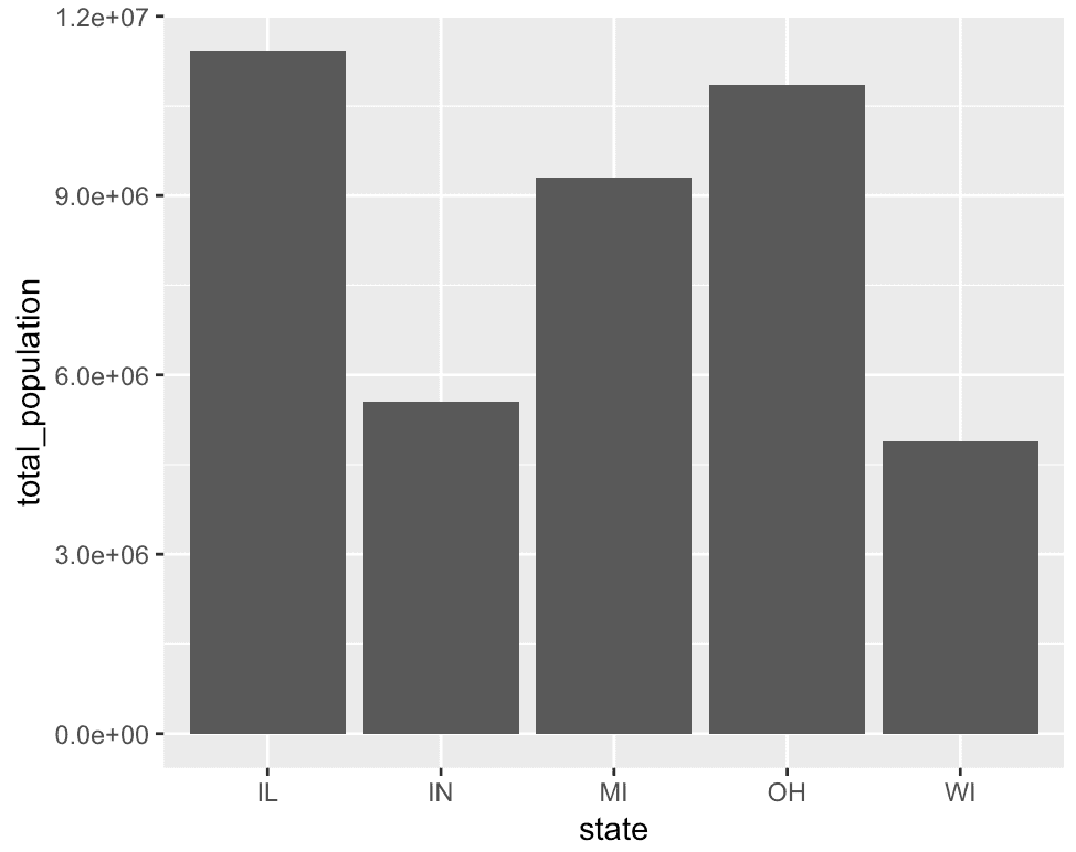
An explanation of stat = ‘identity’ in geom_bar
Let’s break this down.
The dataset, midwest_populations, has only two variables, state and total_population. Inside the aes() function, we’ve mapped state to the x axis and total_population to the y axis. Notice that this is different from our previous example, where we only mapped state to the x axis.
Furthermore, take a look inside of the call to geom_bar(). Inside of geom_bar(), there’s a piece of syntax that says stat = 'identity'. This syntax essentially says that the length of the bar should correspond to the value of the variable on the y axis. Remember, by default, geom_bar() wants to count the records and make the length of the bar correspond to that count.
When we use the the code geom_bar(stat = 'identity') we’re really overriding that default behavior, and making the length of the bar correspond to the variable mapped to the y axis. Keep in mind that this only really works if you have a variable mapped to the y axis. So you need to use the aes() function in concert with the syntax stat = 'identity'.
These are two very simple examples of bar charts. If you want more details about how to create bar charts in ggplot2, check out our previous tutorial on how to use geom_bar().
How to make a line chart with ggplot2
Now, let’s finally make a line chart.
Again, if you’ve been following along with this ggplot2 tutorial, the syntax for the line chart should make sense.
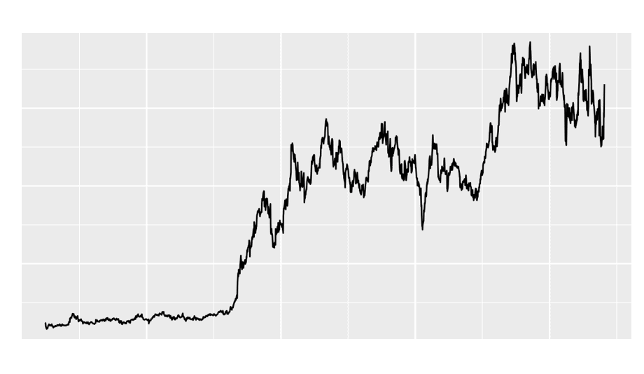
To make this line chart with ggplot2, we’re going to use a dataset of the stock price of Tesla (the car company). I previously gathered and cleaned that dataset, so it’s largely ready to go.
# IMPORT DATA INTO R
tsla_stock_metrics <- read_csv("https://www.sharpsightlabs.com/datasets/TSLA_start-to-2018-10-26_CLEAN.csv")
Very quickly, let's examine the data by printing it out.
print(tsla_stock_metrics)
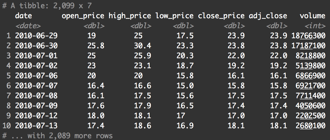
As you can see, there are several variables here. We're mainly going to be interested in the date variable and the open_price variable.
ggplot(data = tsla_stock_metrics, aes(x = date, y = open_price)) +
  geom_line()
Again, if you've been following along so far in this ggplot2 tutorial, this should mostly make sense.
We're setting the dataset with the code data = tsla_stock_metrics. Then inside the aes() function, we're mapping date to the x axis and open_price to the y axis. Finally, we're using geom_line() to indicate that we want ggplot to draw lines.
Notice as well how similar this is to our previous examples. Just like in the previous examples in this ggplot2 tutorial, we're simply designating a dataframe, mapping variables to the x and y axes, and specifying a geom. In the simplest cases, that's all there is to making a data visualization with ggplot2.
Other charts you can make with ggplot2
The three examples in this ggplot2 tutorial are three of the charts that you'll probably use most often ... the line chart, bar chart, and scatterplot.
Having said that, there are many other charts you can make with ggplot2.
You can make histograms:
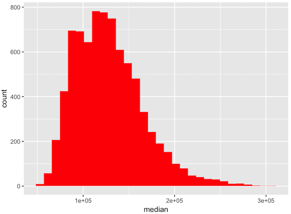
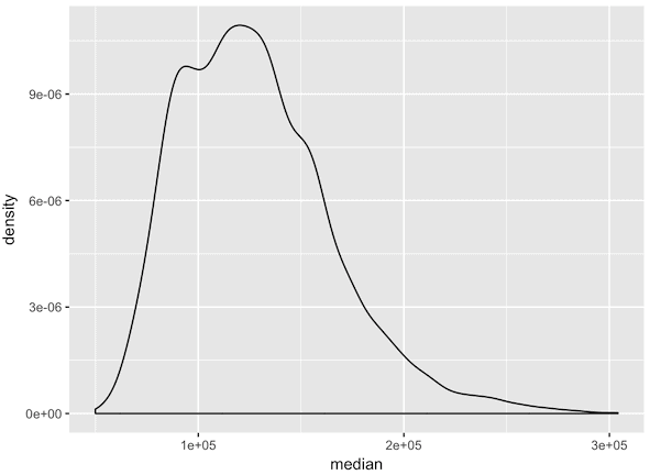
Or you can make density plots:
ggplot2 also makes it easy to make much more complicated data visualizations, like geospatial maps:
There's also a lot that you can do to format a chart.
So even though this ggplot2 tutorial gives you the basics, there's still more to learn.
For more data science tutorials, sign up for our email list
If you want to master ggplot2 and other data science tools, sign up for our email list.
Here at Sharp Sight, we teach data science.
Every week, we publish articles and free tutorials about data science.
If you sign up for our email list, you'll get these tutorials delivered right to your inbox.
You'll learn about:
- ggplot2
- dplyr
- tidyr
- machine learning in R
- … and more.
Want to learn data science in R? Sign up now.
Thanks!
You’re welcome.
You guys are awesome !! Thank you !!
You’re welcome …
Great tutorial! Thanks for your detailed explanation. It helps a lot to conceptualize the code. Looking forward to learning more.
ggplot2 is a little challenging in the beginning, but it makes a lot of sense once you “get it” ….
Good to hear that this helped.
Your tutorial is just what us beginners need: “short and strong” (straight translation from Dutch). To the point with great examples that explains it all in a few lines. Thank you for sharing. I am very thankful I found your site!
Thank you for the complement.
I try to write all of my tutorials to be “short and strong.”
Thanks-very well explained. I was never quite sure what aesthetics really covered as its always been explained in quite a confusing way or not at all in other places. Also how the different elements of the code build up makes more sense now
Good to hear that it helped.