One of the most important skills you’ll need as a data scientist (and a junior data scientist in particular) is telling stories with data.
Companies, hiring managers, and recruiters not only need you to be able to find insights in data; they also need you to be able to communicate with data.
In practice, communicating or storytelling with data actually means using charts and graphs. You need to be able to select the right chart to communicate a particular message. But you’ll also need to modify charts and graphs to communicate clearly and precisely. You want people to look at your chart and immediately “get it.”
How to highlight data in ggplot2
One technique you can use to communicate more clearly with your visualizations is highlighting data. You can highlight particular elements of interest in a chart or graph.
There are a few ways to do this, but I want to show you how to do this in ggplot2.
At a high level, here’s how we’ll do it:
- Create an “indicator” variable that identifies the items of interest
- Use color to highlight those specific items of interest, based on the “indicator” variable
So to highlight data in a ggplot2 plot, you need two core tools: dplyr::mutate() and ggplot2::scale_fill_manual() (or something similar).
I’ll show you how to use these in your code in a moment, but first, I’ll briefly explain these tools and how they fit into our highlighting strategy.
Use dplyr::mutate to create an indicator “flag”
To highlight data in a ggplot visualization, the first thing you need to do is create a new indicator variable. Essentially, you’re going to use dplyr::mutate() to create a TRUE/FALSE indicator variable based on some condition or conditions.
For example, if you’re working with sales data and you want to highlight all of the observations where price is greater than $25, you would use mutate() to create a flag for observations where price > 25.
If this doesn’t make sense, don’t worry … I’ll show you a concrete example in a minute.
Use scale_fill_manual or scale_color_manual to set the highlight color
Next, you’ll need to use ggplot2::scale_fill_manual() or ggplot2::scale_color_manual() to modify the color of the data based on your new indicator variable.
So for example, if you wanted to highlight data where price is greater than $25, you would use ggplot2::scale_color_manual() to set the highlight color for the different TRUE or FALSE values of the new indicator variable that you just created.
Doesn’t make sense yet?
Fair enough. Let’s take a look at some examples.
Example: how to highlight data in a ggplot bar chart
Let’s work through an example of how to highlight data in ggplot2.
Here, we’ll highlight a specific bar in a bar chart.
First things first: we’ll load the packages and inspect the data.
#==============
# LOAD PACKAGES
#==============
library(ggplot2)
library(tidyverse)


#--------
# INSPECT
#--------
midwest %>% glimpse()
midwest %>% count(state)
This dataset has demographic data for the states and counties in five midwestern states: Illinois, Indiana, Michigan, Ohio, and Wisconsin.
Create a simple bar chart
Before we create a full highlighted bar chart, we’re going to do something very simple. We’ll plot a bar chart of the number of counties in each state.
To accomplish this, we’re going to use the ggplot() function with geom_bar() and the correct variable mappings:
#=================
# SIMPLE BAR CHART
#=================
ggplot(data = midwest, aes(x = state)) +
  geom_bar()
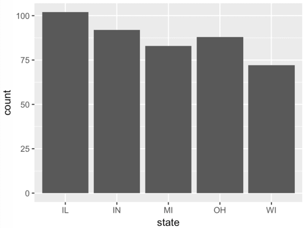
This is very simple. It’s a basic use of ggplot2. (If you don’t know how this works, go back and practice it until you have it memorized!)
Create a ggplot bar chart using the ‘pipe’ operator
Ok. Now, I want to create the same bar chart, but we’re going to make one minor syntactical change (you’ll understand why in a moment).
Instead of using the data = parameter to specify the dataset inside of the ggplot() function, we’re going to do something different. We’re going to pull the dataset outside of the ggplot() function, and we will use the pipe operator, %>%, to “pipe” the dataset into ggplot().
#===========================================
# SIMPLE BAR CHART (USING THE PIPE OPERATOR)
#===========================================
midwest %>%
  ggplot(aes(x = state)) +
    geom_bar()
In terms of output, this is effectively identical to the first version of the code. The resulting plot is exactly the same, but syntactically it’s a slightly different way to do it.
But if the output is exactly the same, why change it? The reason is that in the next step, we’re going to insert a new line of code between the dataset (midwest) and the ggplot() function.
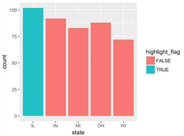
Create an “indicator variable” and create a highlighted bar chart
In this step, we’re going to create an indicator variable using using dplyr::mutate().
Essentially, instead of piping the data directly into the ggplot() function, we are piping the dataset into mutate where we are going to modify the dataset. The mutate() function will add a new variable to the dataset, which is then piped into ggplot2 for plotting.
#===============================
# BAR CHART WITH HIGHLIGHTED BAR
#===============================
midwest %>%
  mutate(highlight_flag = ifelse(state == 'IL', T, F)) %>%
  ggplot(aes(x = state)) +
    geom_bar(aes(fill = highlight_flag))
This isn’t too complicated, but let’s unpack it.
The critical piece of code is the new line that uses mutate():
mutate(highlight_flag = ifelse(state == 'IL', T, F))
What exactly does this do?
The mutate() function indicates that we’re going to add a new variable to the dataset, midwest. The name of the new variable is highlight_flag, and the value of highlight_flag depends on the value of the state variable: if state is ‘IL‘ then highlight_flag is T (i.e., True). Otherwise highlight_flag is F (i.e., False).
This new variable – highlight_flag – is an indicator variable. If state is Illinois, then it’s true, otherwise it’s false.
We will be able to use this variable to change the color of our bars. If highlight_flag is T, the bar will be one color, otherwise, it will be another color.
The way that we do this is by mapping highlight_flag to the fill aesthetic. It happens in the following line of code:
geom_bar(aes(fill = highlight_flag)).
Remember: the fill aesthetic is a ggplot2 parameter that controls the “fill color” of bars in a bar chart. By mapping highlight_flag to the fill aesthetic, we are telling ggplot2 that the bar colors should correspond to the values of the new highlight_flag variable.
Do you understand the strategy now?
We’re using mutate() to create a new variable. The new variable (which has values T or F), is being mapped to the fill aesthetic, which controls the color of the bars in the bar chart.
Change the color of the highlighted bar
There’s only one more step to complete the effect.
Notice the in the new highlighted bar chart that the colors of the bars are pink and light blue.
No offense if you like pink and light blue, but they are … how can I put this … not to my taste.
Pink and light blue are the default colors when you map a categorical variable to the fill aesthetic in ggplot2. I didn’t choose those colors. In fact, I’d like the highlighted bar to be colored red.
So how do we choose the colors of the bars after we’ve mapped a variable to the fill aesthetic?
There are a few ways to change the color of the geoms in ggplot2, but in this case, we will do it with scale_fill_manual(). We will use scale_fill_manual() to set the color that corresponds to different values of the variable we mapped to the fill aesthetic. Essentially, we can use scale_fill_manual() to override the defaults and set the fill colors of the bars – both the highlight color and the color of the other bars.
#===============================
# BAR CHART WITH HIGHLIGHTED BAR
#===============================
midwest %>%
  mutate(highlight_flag = ifelse(state == 'IL', T, F)) %>%
  ggplot(aes(x = state)) +
    geom_bar(aes(fill = highlight_flag)) +
    scale_fill_manual(values = c('#595959', 'red'))
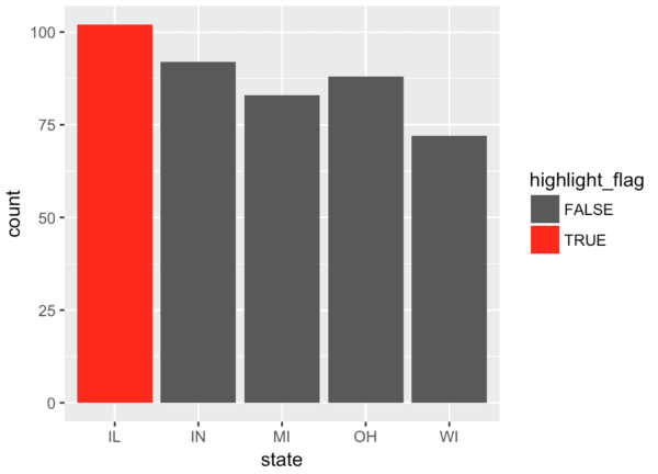
Essentially, we’re using scale_fill_manual() to set the bar color to ‘red’ if highlight_flag is T (i.e., true), and setting the color to #595959 if highlight_flag is F.
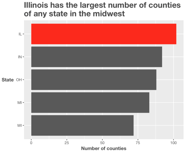
How to highlight a bar in a barchart: a finalized, ‘polished’ example
Ok, we’ve created a bar chart with a single highlighted bar.
As I commonly do though, I want to show you a “polished” version of the chart. The bar chart we just created is OK for purposes of analysis, but it lacks “polish.” The previous bar chart might not be appropriate for a presentation to clients or a management team.
That being the case, here’s a version with several modifications. I’ll add a title; format the title; add axis titles; flip the coordinates; and format the overall text in the plot.
#===============================
# BAR CHART WITH HIGHLIGHTED BAR
#===============================
midwest %>%
  group_by(state) %>%
  summarise(county_count = n()) %>%
  mutate(highlight_flag = ifelse(state == 'IL', T, F)) %>%
  ggplot(aes(x = fct_reorder(state, county_count), y = county_count)) +
    geom_bar(aes(fill = highlight_flag), stat = 'identity') +
    scale_fill_manual(values = c('#595959', 'red')) +
    coord_flip() +
    labs(x = 'State'
         ,y = 'Number of counties'
         ,title = str_c("Illinois has the largest number of counties"
                        , "\nof any state in the midwest")
    ) +
    theme(text = element_text(family = 'Helvetica Neue', color = '#444444')
          ,plot.title = element_text(size = 18, face = 'bold')
          ,legend.position = 'none'
          ,axis.title = element_text(face = 'bold')
          ,axis.title.y = element_text(angle = 0, vjust = .5)
    )
A few comments:
Notice that I grouped the data by state using dplyr::group_by(). I decided to do this because I wanted to reorder the bars in the bar chart by the number of counties (remember: the length of the bar corresponds to the number of counties). To reorder the bars in this way, I needed to create a new variable called county_count that I could explicitly reference in forcats::fct_reorder() to reorder the bars. This is a minor technical detail, but I wanted to call it out so you don’t get confused.
Setting aside the technical details, pay attention to how the chart communicates.
The title “tells a story.” I’ve used the title to call out a detail in the chart that I want to highlight. Moreover, the “story” from the headline works in concert with the highlight color of the highlighted bar.
This is how you communicate with data.
To communicate with data, you need to use titles, text copy, annotations, and color to communicate to your audience. You want the elements of the chart to work together to tell your audience something important or interesting that’s in the chart.
Example: how to highlight data in a ggplot scatterplot
Let me show you another example of to highlight data in ggplot2. I’ll show you how to highlight points in a scatterplot.
First, let’s build a basic scatterplot to understand what’s in these variables and how they are related.
#=============================================
# SIMPLE SCATTERPLOT (USING THE PIPE OPERATOR)
#=============================================

midwest %>%
  ggplot(aes(x = percollege, y = percadultpoverty)) +
    geom_point()
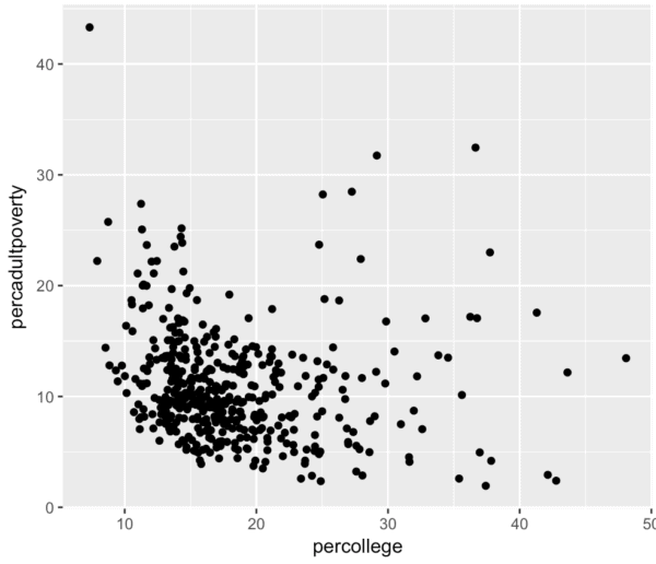
There seems to be a modest negative relationship between the variable percollege and percadultpoverty. The relationship is not quite linear, and it’s slight, but it is immediately obvious when we plot the data.
Having said that, there are few counties (i.e. points) in the upper right hand corner that stand out. You can see that there are a few counties where the percent of people with a college degree is greater than 30% and the percent of adults in poverty is greater than 20%.
Wait … when I describe it to you in words, it’s not immediately clear exactly which points I’m talking about?
Fair enough, I can fix that …
#====================================
# SCATTERPLOT WITH HIGHLIGHTED POINTS
#====================================

midwest %>%
  mutate(highlight_flag = ifelse(percollege > 30 & percadultpoverty > 15, T, F)) %>%
  ggplot(aes(x = percollege, y = percadultpoverty)) +
    geom_point(aes(color = highlight_flag)) +
    scale_color_manual(values = c('#595959', 'red'))
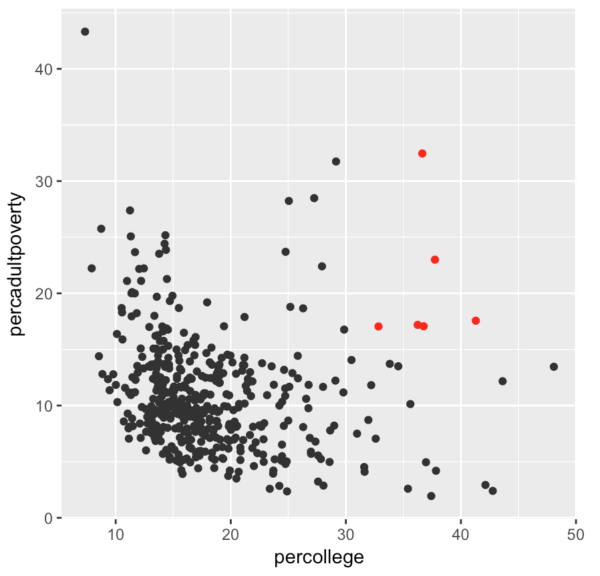
Do you see what I did there?
Something jumped out at me in the plot. I tried to communicate what I was seeing verbally, but it was a little challenging. In fact, as I tried to explain what I was seeing to you, it was easier and more effective to just highlight the f*^ing points.
This is visual communication.
Highlighting plot elements is a tool for “telling stories with data”
To “tell stories with data” you need to be able to use the tools of data science – like data visualization and highlighted elements in visualizations – to communicate with people. You want people to look at your visualization and just “get the message.”
The good news is that humans are “wired” for visual information. Evolutionary, the visual system is much older than the areas for language processing. The human visual system can rapidly interpret information that is presented visually.
As the saying goes, “a picture is worth a thousand words.” It’s true. Images are more effective than words, if you know how to properly use color, shape, size to communicate to you audience. It’s even more effective if you use color, shape, and size in combination with text so that they support each other to communicate a specific message.
Ultimately, as a data scientist, part of your job is presenting information in a way that takes advantage visual nature of human cognition. You need to use visual techniques so that your audience just “get’s it.” One of those techniques is highlighting data in visualizations.
How to use highlighted plots in the data analysis process
Now that we’ve talked about how to use this technique and why it’s valuable, let’s quickly talk about when you might use it.
Highlighting elements of a plot is a technique that you can use at several phases of the data science workflow, but there are two phases that are particularly important:
- Exploratory data analysis
- Analyses and reports
You might consider these to be one and the same, but that’s not the case. Performing exploratory data analysis is not quite the same thing as producing a finalized analysis.
Let’s briefly talk about these two phases, and how you can use highlighting in them.
How to use highlighted plots in exploratory data analysis
One thing you need to master in order to be a great data scientist is exploratory data analysis.
Much like the name implies, exploratory data analysis involves (wait for it …) exploring data. Whether your final deliverable is a report to business partners, or a machine learning model that makes predictions, you will first need to explore your data to find out what’s in it.
In the case of creating a report, you will use EDA to explore your data in an attempt to “find insights.” When you use EDA to find insights, your first task is to understand the data for yourself personally. You need to see the interesting elements. You need to see the anomolies. You need to see them.
When performing exploratory data analysis, highlighting specific parts of a chart enables you to literally see relevant information in a chart.
I can’t stress this enough. As an analyst, you need to see insights in data. One of the tools for helping you see the data in new ways is highlighting.
How to use highlighted plots in reports and presentations
Some of your deliverables as a data scientist will be reports, analyses, and presentations. In many of these presentations, you will need to communicate with your data. As noted earlier, your business partners will want you to “tell a story” with your data.
This actually works hand-in-hand with the exploratory data analysis process. In the first step, in EDA, you will identify the story and see important insights for yourself. Your first task – as noted earlier – will be to see personally.
But once you see the insights – once you see the story – you need to be able to share the insights with others in a way that they can easily understand.
As I noted previously, the human brain is wired for visual information. When you create reports and analyses, you can use highlighting to emphasize relevant points or details in the data. Use highlighting to communicate the insights that you’ve found and seen for yourself.
Master the basics, then master details techniques like highlighting data
Highlighting data in ggplot2 plots can be surprisingly useful. It’s a technique that you can use in EDA, reporting, analysis, and “data storytelling.”
But it is a bit of an intermediate technique. As you saw in this tutorial, to execute this technique, you need to combine several different tools from ggplot and dplyr to make this work.
That being the case, before you start practicing intermediate techniques like this, make sure that you have a solid foundation in ggplot2 and dplyr.
Here at Sharp Sight, we have a firm belief that data science students should master the fundamentals first.
We believe that becoming a great data scientist starts with mastering the fundamentals. That means mastering basic techniques like the bar chart, line chart, and histogram … even if they are a little un-sexy.
Once you master those simple techniques, you can move on to intermediate techniques like highlighting plot elements, just like I showed you in this blog post.
My recommendation to you then, is start with simple techniques like ggplot’s geom_bar() and geom_line(). Master basic techniques from dplyr like mutate() and the other major dplyr verbs. Once you’ve mastered those basic techniques, you can expand your toolkit to tools like scale_fill_manual() and scale_color_manual(), which will enable you to customize your plots and do things like highlight plot elements.
Start by mastering the fundamentals, then steadily expand your toolkit.
If you can do that, you’ll be on the path to becoming a top-performing data scientist.
Excellent work and fluent way to visualize data,thanks very much for your showing about hightlighting the data .Being a loyal R user,I am really expecting more articles for visualizing data!