This tutorial will show you how to make a histogram in R with ggplot2.
It’ll explain the syntax of the ggplot histogram, and show step-by-step examples of how to create histograms in ggplot2.
If you need something specific, just click on any of the following links.
Table of Contents:
As always though, you’ll learn more if you read the blog post carefully from start to finish.
A Quick Introduction to Histograms
Very quickly, let’s review what histograms are and how they’re structured.
If you need to understand the syntax or see some examples, then you can skip to the sytnax section or the examples section.
Histograms plot data distributions
Histograms are very important for data visualization, data exploration, and data analysis.
In fact, they’re probably one of the top 3 or 4 most important visualization techniques.
They’re important, because the help us visualize and explore data distributions.
Specifically, histograms show us the count of the number of records for particular ranges of a variable.
The Structure of a Histogram
Here’s how they’re structured.
Typically, we map a numeric variable to the x-axis. This is the variable that we want to visualize, so we can see how it’s distributed.
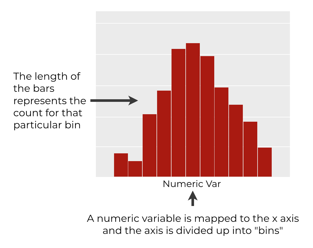
This numeric variable is then divided up into ranges, which are often called “bins.”
From there, we count the number of records for each bin and plot the number of records as a bar. So each range for the variable we’re analyzing will have a bin associated with it. The length of each bar represents the count of the number of records.
When we plot all of these bars together (again, one for each range) we get a histogram. And collectively, the collection of bars in the histogram show us the shape of the data. They help us see how the data are distributed.
Obviously though, we don’t do this manually. As data scientists, we use a programming language like R to do all of these calculations for us and plot the result.
Let’s quickly discuss how we can create histograms in R.
How to create a histogram in R
There are actually several ways to create a histogram in R.
You can create an “old school” histogram in R with “Base R”. Specifically, you can create a histogram in R with the hist() function.
This is the old way to do things, and I strongly discourage it.
The old school plotting functions for R are poorly designed. They’re hard to use. They’re hard to modify. And they produce charts that are relatively ugly.
To create a histogram in R, use ggplot2
If you need to create a histogram in R, I strongly recommend that you use ggplot2 instead.
ggplot2 is a powerful plotting library that gives you great control over the look and layout of the plot.
The syntax is easier to modify, and the default plots are fairly beautiful.
With that in mind, let me show you how to create a ggplot histogram.
The syntax of a ggplot histogram
Now, let’s take a look at the syntax for creating a histogram with ggplot2.
I’m going to try to explain everything in a fair amount of detail, but if you’re not already familiar with ggplot2, you might want to review our ggplot2 tutorial for beginners.
Let me quickly break that syntax down.
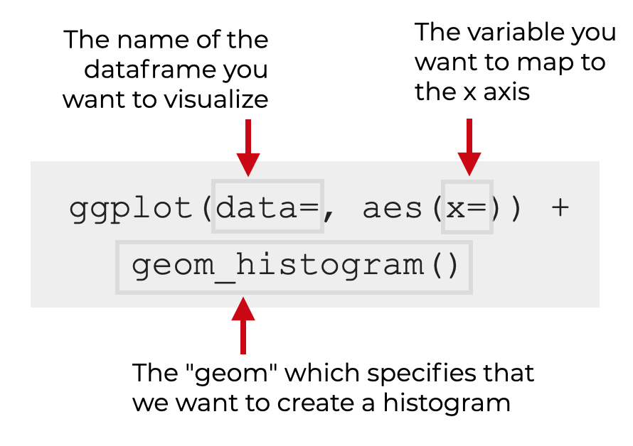
The ggplot function
The ggplot() function simply initiates plotting with the ggplot2 data visualization system.
You’ll use it every time you create a visualization with ggplot2. However, the exact details for everything else will differ from visualization to visualization.
The data parameter
Inside the ggplot() function, you’ll find the data parameter.
The data parameter enables you to specify the dataframe that contains the variable you want to plot.
Remember that ggplot2 is set up to visualize data that’s in dataframes, so you need to provide the name of a dataframe as the argument to this parameter.
For example, if you have a dataset named txhousing, you’ll set data = txhousing.
The aes function
Also inside the ggplot() function, you’ll find a call to the aes() function.
The aes() function enables you to “map” variables to aesthetic attributes in your visualization. That might sound complicated, but it’s really just about connecting variables in your dataframe to axes and other attributes of your chart.
If you need to review what the aes() function does, you should read our explanation of the aes() function in our ggplot2 tutorial.
The x parameter
Inside the aes() function, you’ll see the x parameter.
The x parameter enables us to specify the numeric variable that we want to map to the x-axis. This will be the numeric variable that gets plotted as a histogram.
For example, if you have a variable in your dataframe called median, you would set x = median.
The histogram “geom”
Finally, we have geom_histogram().
This tells ggplot2 that we want to plot a histogram.
Remember: when we use ggplot2, we specify the dataframe and the variable mappings with the data parameter, the aes() function, etc.
But to specify the type of plot, like a histogram, scatterplot, bar chart, etc … we need to specify a “geom.”
The geom ultimately specifies what type of chart we’ll create.
And to create a histogram, we use geom_histogram().
Additional parameters
There are also a few optional parameters that you can use to control the exact behavior of your histogram.
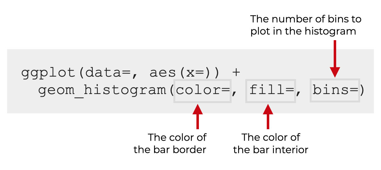
Let’s look at each of these one at a time.
Color
The color parameter controls the border color of the histogram bins.
Be careful.
Many people think that this controls the interior color, but that’s incorrect. It controls the border color. (I’ll show you examples in the examples section.)
Remember: R has a variety of colors to chose from. You can choose simple colors like red, green, and blue, but there are also many more interesting colors like aquamarine and more. Play around and find a few that you like!
Additionally, when you provide an argument to this parameter, it needs to be presented as a string. So for example, you would set color = 'red'.
Fill
The fill parameter controls the interior color of the histogram bins.
Again, be careful. The fill parameter controls the interior color, and the color parameter controls the border color.
When you provide an argument to this parameter, it needs to be presented as a string. So for example, you would set fill = 'red'.
Also, remember: R has a variety of colors to chose from. You can choose simple colors like red, green, and blue, but there are also many more interesting colors.
Bins
The bins parameter controls the number of bins that are plotted in the histogram.
By default, this is set to bins = 30.
However, you can increase or decrease the number of bins as you like.
Controlling the number of bins in your histogram is a way to change how you analyze your variable. Typically, decreasing the number of bins will smooth over variation in your data. Increasing the number of bins will show more detail.
Which you chose (more detail or more “smoothness”) depends on what you’re looking for!
Examples: Histograms in R with ggplot2
Ok. Now that we’ve looked at the syntax, let’s look at some examples of how to create histograms in R with ggplot2.
Examples:
- Create a simple ggplot histogram
- Change the border color
- Change the bin color
- Modify the number of histogram bins
Run this code first
Before we get into it, let’s load the tidyverse package. Remember that the tidyverse package contains ggplot2.
We’ll also inspect txhousing, which is the dataset that we’ll be using.
Load Tidyverse
You can load the tidyverse package with the following code:
#-----------------
# LOAD PACKAGES
#-----------------
library(tidyverse)
Inspect Data
Next, let’s quickly inspect our dataset.
In the following examples, we’ll be using the txhousing dataset, which contains housing data for different cities and years in Texas.
We can inspect this dataframe with the glimpse() function:
txhousing %>% glimpse()
OUT:
# Observations: 8,602 # Variables: 9 # $ city"Abilene", "Abilene", "Abilene", "Abilene", "Abilene", "Abilene", "Abil... # $ year 2000, 2000, 2000, 2000, 2000, 2000, 2000, 2000, 2000, 2000, 2000, 2000,... # $ month 1, 2, 3, 4, 5, 6, 7, 8, 9, 10, 11, 12, 1, 2, 3, 4, 5, 6, 7, 8, 9, 10, 1... # $ sales 72, 98, 130, 98, 141, 156, 152, 131, 104, 101, 100, 92, 75, 112, 118, 1... # $ volume 5380000, 6505000, 9285000, 9730000, 10590000, 13910000, 12635000, 10710... # $ median 71400, 58700, 58100, 68600, 67300, 66900, 73500, 75000, 64500, 59300, 7... # $ listings 701, 746, 784, 785, 794, 780, 742, 765, 771, 764, 721, 658, 779, 700, 7... # $ inventory 6.3, 6.6, 6.8, 6.9, 6.8, 6.6, 6.2, 6.4, 6.5, 6.6, 6.2, 5.7, 6.8, 6.0, 6... # $ date 2000.000, 2000.083, 2000.167, 2000.250, 2000.333, 2000.417, 2000.500, 2...
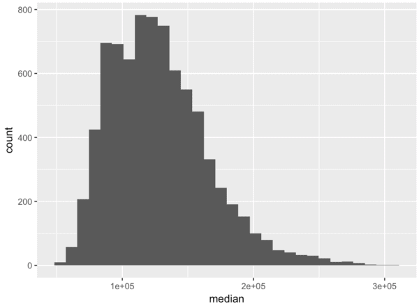
EXAMPLE 1: Create a simple ggplot histogram
Let’s start with a very simple histogram.
Here, we’re going to plot a histogram of the median variable.
ggplot(data = txhousing, aes(x = median)) +
  geom_histogram()
OUT:
Explanation
This is fairly straightforward, but you need to understand it, since it forms the basis of the other examples.
Here, we initiate plotting by calling ggplot().
Inside the ggplot() function, we’re setting data = txhousing. This indicates that we’ll be plotting data in the txhousing dataframe.
Next we have the aes() function. This enables us to specify which variables are mapped to which axes, and which “aesthetics” of the plot. Here, we’re setting x = median, which means that we’re going to plot median on the x-axis.
Finally, on the second line we see geom_histogram(). This indicates that we’re going to plot the variable as a histogram.
EXAMPLE 2: Change border color
Now that we’ve created a simple histogram in example 1, let’s make some modifications.
Here, we’ll change the border color of the bins.
ggplot(data = txhousing, aes(x = median)) +
  geom_histogram(color = 'turquoise4')
OUT:
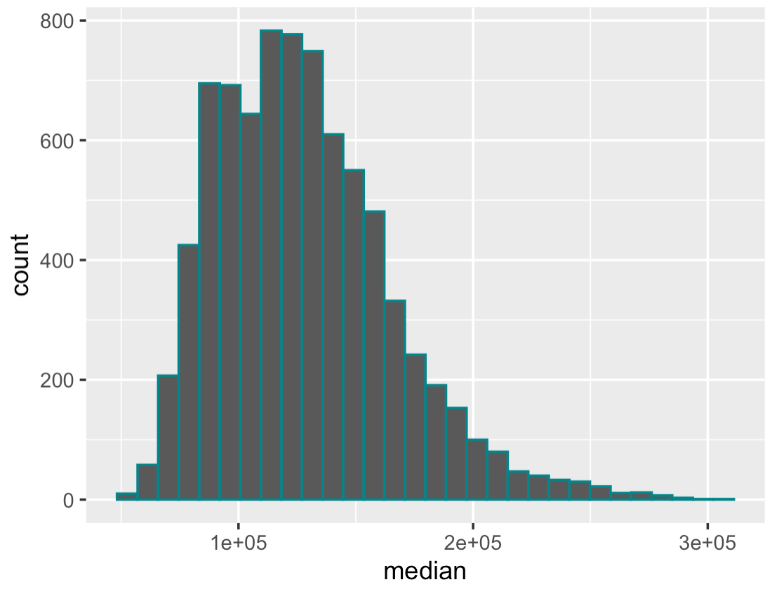
Explanation
This is fairly straightforward.
The code is almost identical to the code from example 1.
The only difference is that we’ve set color = 'turquoise4' inside of geom_histogram(). This has changed the border color of the bins to a shade of turquoise.
EXAMPLE 3: Change bin color
Next, we’ll change the color of the bins themselves. The interior of the bins.
To do this, we’ll use the fill parameter.
Let’s take a look:
ggplot(data = txhousing, aes(x = median)) +
  geom_histogram(fill = 'red')
OUT:
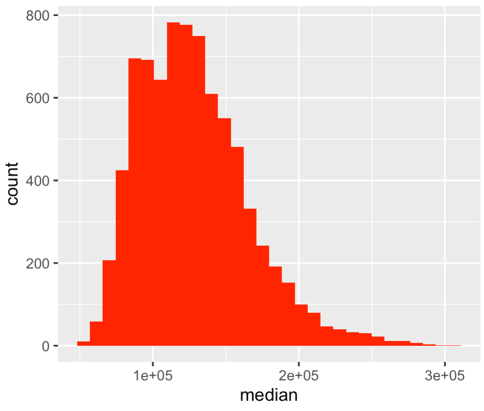
Explanation
Here everything is almost exactly the same as our simple ggplot histogram from example 1.
The only major difference is that we’ve set fill = 'red'. As you can see, this has changed the color of the bins to red.
Notice that there’s no visible border between the bins. This may be okay, but you may want to change the border color as well. To do that you can use the color parameter, as shown in example 2.
Example 4: Modify the number of histogram bins
Finally, let’s modify the number of histogram bins.
By default, ggplot2 creates a histogram with 30 bins. That’s often fine, but sometimes, you want to increase or decrease the number of bins.
To do that, we can use the bins parameter. Here, we’ll decrease the number of bins to 10 bins:
ggplot(data = txhousing, aes(x = median)) +
  geom_histogram(bins = 10)
OUT:
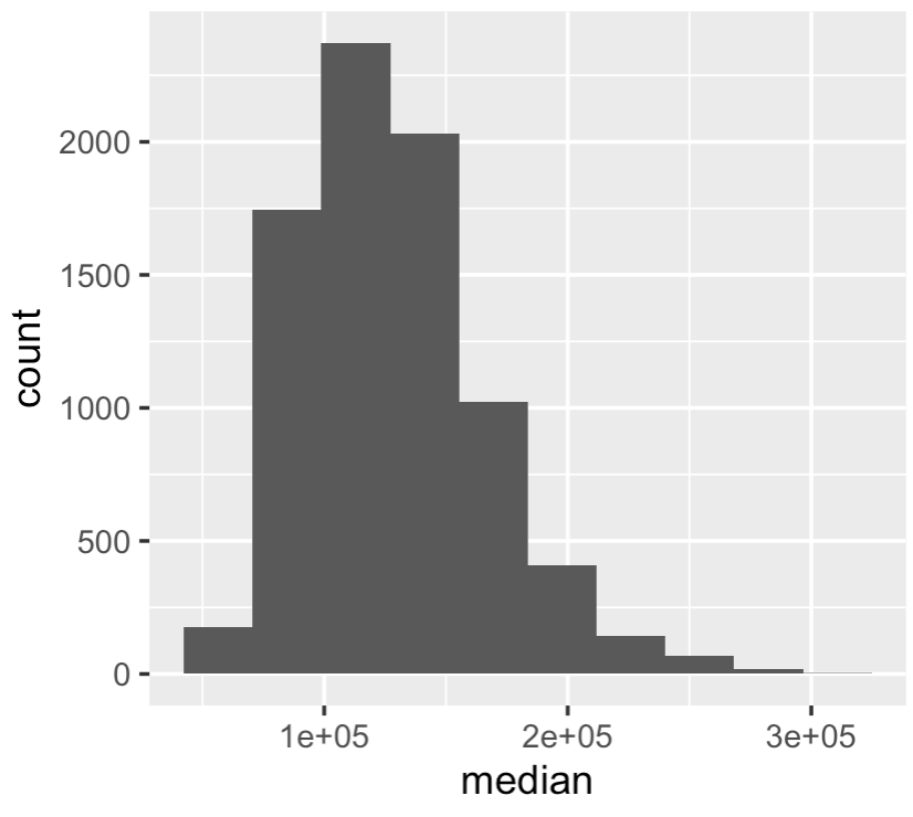
Explanation
This is pretty straight forward.
Here, we’ve created a histogram with 10 bins by setting bins = 10.
As you can see, by reducing the number of bins, we’ve smoothed over some of the variation in the data.
If you want, you can also try to increase the number of bins. Try setting it to 60 or 70 and see what happens.
Keep in mind that selecting a good value for the number of bins is more an art than a science. It really depends on what your goals are and what you’re looking for in the data.
This is a good reminder that it’s not strictly enough to know the syntax. You need to know how to use data visualizations properly!
Leave your other questions in the comments below
Do you have questions about ggplot histograms? Do you want to know how to do something else that I haven’t explained here?
If so, leave your question in the comments section below.
Sign Up to Learn More about Data Science in R
This tutorial should give you a good overview of how to create a histogram in R with ggplot2.
But there’s a lot more to learn.
If you want to be great at data visualization in R, there’s a lot more to learn about ggplot2.
And if you want to learn data science more broadly, you’ll need to learn about dplyr, tidyr, forecats, and more.
That said, if you’re serious about mastering data science and data visualization in R, I strongly suggest you sign up for our email list. Here at Sharp Sight, we regularly publish tutorials that explain how to do data science in R and Python.
Very nice examples. Thank you.
You’re welcome.
How to make labels for x axes readable ?
Many thanks for this very clear tutorial on how to make histogram in r with ggplot2. You made it very simple and easy to follow. Regards.
You’re welcome.
Hi Mr. Joshua,
These tutorials are SUUUPER !!
I am new R user.
Starting from ground zero.
Your explanations are clear and easy to understand.
Thank you much and GOD bless you and yours always!
I forgot to mention, I have no programming background whatsoever. And no coding experience at all. Yet. your tutorials are easy to understand and clear as well.
Carlos
Great to hear. You’re welcome.