This tutorial will show you how to create a Plotly boxplot in Python using Plotly Express. It explains the syntax and will show you step-by-step examples of how to create box plots with Plotly.
If you need something specific, you can click on any of the following links. The link will take you to the appropriate section in the tutorial.
Table of Contents:
- A quick review of boxplots
- Introduction to the Plotly Express boxplot
- The syntax of
px.box() - Plotly boxplot examples
Ok, let’s start off with a quick review of boxplots.
A quick review of boxplots
Before we look at Plotly boxplots specifically, let’s quickly review what a boxplot is generally.
Boxplots visualize summary statistics for numeric data
A boxplot is data visualization that shows summary statistics for your data.
More specifically, boxplots plot what is typically called the “five number summary.” The five number summary is a set of statistics that includes:
- the minimum
- the first quartile (25th percentile)
- the median
- the third quartile (75th percentile)
- the maximum
Together, these metrics tell us a lot about the overall distribution of a numeric variable.
When you plot the 5 number summary in a boxplot, it looks something like this:
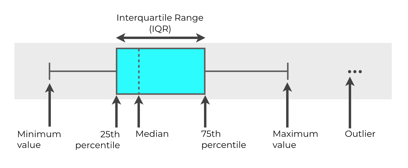
In the visual above, you can see different parts of the 5 number summary in different parts of the boxplot.
Let’s quickly talk about each of those parts.
The box
The actual box in a boxplot represents what we call the interquartile range (or IQR for short). The IQR is the range from the 25th percentile of the data to the 75th percentile.
So the left end of the box represents the 25th percentile and the right end of the box represents the 75th percentile. The width of the box represents the interquartile range.
The line that goes through the middle of the box (the dotted line) represents the median of the data.
The whiskers
Outside the box, we have two lines that extend away from the box. One on each side. We call these the “whiskers.”
The ends of these whiskers represent the minimum and maximum values. Although we call these the “minimum and maximum” they are often not exactly the absolute minimum/maximum. Instead, these values represented by the ends of the whiskers are typically calculated according to a formula. The minimum is calculated as Q1 – 1.5*IQR. The maximum is calculated as Q3 + 1.5*IQR.
Outliers
Finally, we have the outliers … the points that you can see beyond the whiskers.
These outliers are extreme values that exist beyond the computed “minimum” and “maximum” values. They’re so extreme that we consider them to be a little unusual, so they’re typically plotted separately, as points.
As you can see, boxplots are a useful visualizations, because they concisely display several important metrics, all in the same chart. They let you see the median, IQR, minimum, maximum, and outliers all in the same visualization.
An Introduction to the Plotly Boxplot
So now that we’ve talked a little about boxplots generally, let’s look at Plotly boxplots.
You’re probably aware that Plotly is a data visualization toolkit for Python. Plotly Express is a more specialized toolkit gives us a set of high-level data visualization functions. Plotly Express gives us tools for creating simple bar charts, line charts, histograms, and scatterplots.
Plotly Express: a quick way to create boxplots in Python
In addition to many functions for other essential visualizations, Plotly Express has a simple function for creating boxplots: the px.box function.
You might be wondering why you might use Plotly Express, instead of other options. For example, in Python, you can use Matplotlib to create boxplots, and you can also use Seaborn to create boxplots.
One advantage is that Plotly Express is set up to work natively with dataframes. Although Seaborn works well with dataframes, Matplotlib does not (which is one reason I favor Plotly and Seaborn over Matplotlib).
But Plotly also has a powerful and easy-to-use data visualization syntax that enables you to modify your charts. Matplotlib is very powerful, but it’s typically seen as being very complex. And Seaborn is actually built on top of Matplotlib, so if you want to make big changes to your Seaborn charts, you’re still stuck using Matplotlib syntax.
Plotly is the best of both worlds
With Plotly, you get the power of Matplotlib, along with the simplicity of Seaborn.
It’s sort of the best of both worlds.
That’s why for many of my data visualizations tasks in Python, I’m starting to favor Plotly over Matplotlib and Seaborn.
That’s true generally, and also true for simple things like boxplots.
The syntax of px.box
Now that we’ve talked a little bit about boxplots, and the advantages of Plotly boxplots specifically, let’s look at the syntax.
In the simplest form, the syntax for a Plotly boxplot looks something like this:
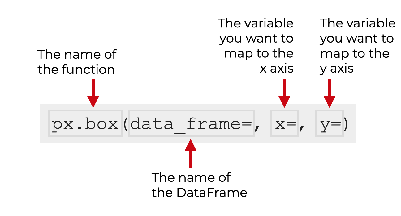
Keep in mind that when we call the function as px.box, I’m assuming that you’ve imported Plotly Express with the alias px (which is the common convention).
So you call the function as px.box().
Inside the parenthesis, there are several parameters that you can use to modify the resulting boxplot.
Let’s look at a few of those parameters.
The parameters of px.box
The bad news is that the px.box function has several dozen parameters.
The good news is that you’ll only use a few of those parameters regularly. In the interest of simplicity, I we’re going to apply the 80/20 rule and focus on a few of the most important parameters that I think are most important to know.
So here, we’re going to cover 5 of the most essential parameters:
data_framexycolor_discrete_sequencecolor
Let’s take a look at each of these separately.
data_frame
The data_frame parameter enables you to specify a DataFrame that you want to plot.
This parameter is optional.
If use this parameter, you’ll provide the name of a Pandas Dataframe as the argument.
Additionally, if you use this parameter, you will also change how you use the x and y parameters.
x
The x parameter enables you to specify the variable you want to map to the x-axis.
This parameter will accept numeric variables or categorical variables. It depends on the structure of the boxplot you’re trying to build (I’ll show you examples in the examples section).
Note that if you specify a DataFrame with the data_frame parameter, then the argument to the x parameter will be the name of one of the DataFrame columns. And when you use the parameter this way, the name of the DataFrame column should be inside quotations.
Alternatively, if you do not use the data_frame parameter, then you can provide a Python list, Numpy array, or an array-like object as the argument to the x parameter. If you use the x parameter this way (without a DataFrame), then there’s no need for quotation marks. You simply provide the name of the list or list-like object.
y
The y parameter is very similar to the x parameter.
The y parameter enables you to specify the variable you want to map to the y-axis.
This parameter will accept numeric variables or categorical variables. Again, it depends on the exact type of boxplot and the structure of the boxplot you’re trying to build.
If you specify a DataFrame with the data_frame parameter, then the argument to the y parameter will be the name of one of the DataFrame columns, presented inside quotations.
Alternatively, if you do not use the data_frame parameter, then you can provide a Python list, Numpy array, or an array-like object as the argument to the y parameter. If you use the y parameter this way (without a DataFrame), then there’s no need for quotation marks. You simply provide the name of the list or list-like object.
color_discrete_sequence
The color_discrete_sequence enables you to change the color of the boxes in the boxplots.
The argument to this parameter is a list of color names. Color names can be “named” colors, or hex colors (or one of several other formats).
The color names should be inside quotation marks.
You can provide a single color, or several colors inside the list.
Effectively, this parameter enables you to specify the color palette used for the boxes.
color
The color parameter enables you to map a variable to the color of the boxes.
So for example, if you want to color-code the boxes according to different categories in your data, then you could map a categorical variable to the color parameter. If you do this, then the color of different boxes will correspond to different categories in your data.
This may be hard to understand, so I’ll show you an example of how to use the color parameter in example 3.
Examples: How to create box plots with Plotly Express
Ok. Now that you’ve learned about the syntax of px.box, let’s take a look at some examples of how to create box plots with Plotly.
Examples:
- Create a simple Plotly express boxplot
- Break out the boxplot by a categorical variable
- Change the color of the Plotly boxplot
- Break the boxplot out by a second categorical variable (using color)
- Create a vertical boxplot
Run this code first
Before you run any of these examples, you’ll need to run some preliminary code to set everything up.
Specifically, you’ll need to import some important packages and create the DataFrame that we’re going to be working with.
Import packages
First, let’s import the Python packages that we’ll be using.
We need to import both Numpy and Pandas. We’ll use those to create the data that we’re going to plot.
We also need to import Plotly Express, since that’s the toolkit that we’ll use to create our Plotly boxplots.
#----------------
# IMPORT PACKAGES
#----------------
import pandas as pd
import numpy as np
import plotly.express as px
Create dataframe
Next, we need to create our DataFrame with some variables that we can use in a boxplot.
Here, we’re going to create some mock “test score” data. The data will have three variables: score, class, and gender. So imagine that there is a group of students, divided up into several different classes, with male and female students, who all take a test. The dataset will contain the test score information for these different students.
To create this dataset, we’ll use several Numpy and Pandas functions.
We’ll use to create 3 Numpy arrays with normally distributed data. We’ll call these arrays score_array_A, score_array_B, and score_array_C.
When we use np.random.normal to create this normally distributed data, we’ll use the loc and scale parameters to give the data in the arrays different means and standard deviations. (We’ll see the different means and standard deviations when we plot them.)
Note also that before we use np.random.normal to create our normally distributed data, we’re using the np.random.seed function to set the see for Numpy’s random number generator. We do this for reproducibility (i.e., so when you run this code, your “random” numbers will be the same as the “random” numbers you see in the blog post).
If you don’t understand why we use seeds, you should read our tutorial on numpy.random.seed.
Ok. Let’s run this code:
# set seed
np.random.seed(41)

#create three different normally distributed datasets
score_array_A = np.random.normal(size = 300, loc = 85, scale = 3)
score_array_B = np.random.normal(size = 300, loc = 80, scale = 7)
score_array_C = np.random.normal(size = 300, loc = 73, scale = 4)
So at this point we have our 3 Numpy arrays with normally distributed data.
Next, we’ll combine these Numpy arrays into a single Pandas DataFrame.
To do that though, we’ll turn each of these Numpy arrays into a separate DataFrame, and then combine them together.
First, let’s just make DataFrames out of our Numpy arrays.
#turn normal arrays into dataframes
score_df_A = pd.DataFrame({'score':score_array_A,'class':'Class A'})
score_df_B = pd.DataFrame({'score':score_array_B,'class':'Class B'})
score_df_C = pd.DataFrame({'score':score_array_C,'class':'Class C'})
Notice that each of these DataFrames has a variable called score. This score variable contains the normally distributed “test scores” that we created earlier.
Each DataFrame also has a variable called class. This class variable has a different value in each of these DataFrames: 'Class A', 'Class B', or 'Class C'. Again: you can imagine there being three separate classes of students. This class variable encodes that information. When we combine these together into a single DataFrame, this class variable will contain those 3 categories.
Combine data together into dataframe
Now, let’s combine those 3 separate DataFrames together into a single DataFrame. To do that, we’ll use the pd.concat() function.
#concat dataframes together
score_data = pd.concat([score_df_A,score_df_B,score_df_C])
After running this, we’ll have a DataFrame called score_data.
Add variable
Finally, we are going to create a “gender” variable that encodes the different genders of the students (male and female).
To do this, we’ll need to use the Pandas assign method along with the Numpy where technique.
score_data = score_data.assign(gender = np.where(score_data.score%3 > 1, "Male","Female"))
The final DataFrame, score_data, contains test score data (normally distributed, for 3 classes and two different genders.
(Keep in mind that this is just some simple dummy data that we can use with our boxplots. To create this, we just used some data wrangling tools. Doing things like this is one of the reasons you should master Pandas and Numpy.)
Set Plotly Image Rendering
One final thing before we plot our boxplots.
If you’re using Plotly in an IDE like Spyder, you’ll need to run some code to get the visualizations to display inside the IDE:
If you’re using Spyder (or your IDE) you can run the following code:
import plotly.io as pio
pio.renderers.default = 'svg'
Having said that, if you’re using Jupyter, that code probably won’t be necessary.
Ok. All of our setup should be complete. We’re ready to make some boxplots.
EXAMPLE 1: Create a simple Plotly boxplot
First, let’s just create a very simple boxplot.
This will be a boxplot with only 1 box. We’ll refrain from breaking the data out by category this time.
To do this, we’re going to call the px.box() function.
Inside the parenthesis, we’ll set the DataFrame with the data_frame parameter, and we’ll map the score variable to the x-axis with the code x = 'score'.
Let’s take a look:
px.box(data_frame = score_data
       ,x = 'score'
       )
OUT:
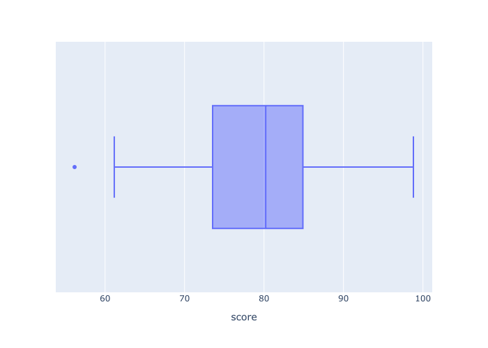
Explanation
This boxplot is extremely simple.
It’s plotting the “five number summary” for all of the data in the score variable in the score_data DataFrame.
You can see the mean of the data at about 80 (this is the line that cuts through the middle of the box).
The left end of the box shows the 1st quartile, and the right end of the box shows the 3rd quartile.
The two whiskers show the computed minimum and maximum values at about 62 and 92 respectively.
You can also see one outlier at the left hand side (the single point) at about 56.
If you look a this visualization, you’ll get a rough idea about how the score variable is distributed. At a glance, you can see the median, min, max, and several other metrics.
Having said that, this is a pretty simple boxplot, and there are ways we could modify it to change or improve it.
Let’s take a look at some modifications.
EXAMPLE 2: Break out the boxplot by a catagorical variable
Next, we’re going to break out the data by the categorical variable, class.
To do this, we’ll map the class variable to the y parameter.
px.box(data_frame = score_data
       ,x = 'score'
       ,y = 'class'
       )
OUT:
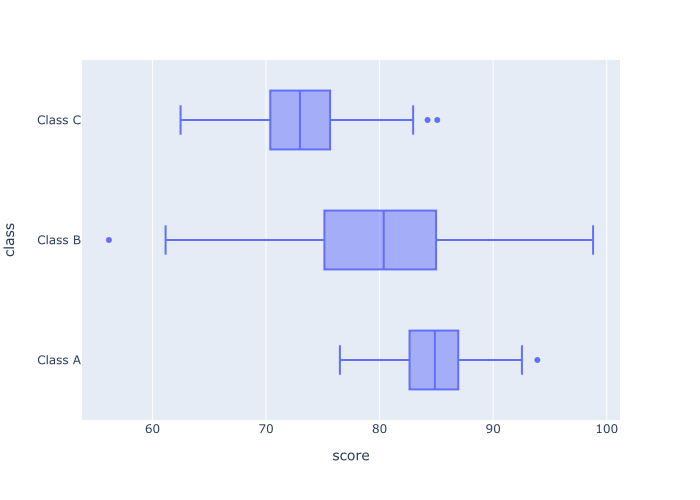
Explanation
Here, we have a boxplot of the score variable.
But this numeric variable has been further broken out by a categorical variable, class. To do this, we used the code y = 'class'. By doing this, Plotly is showing one separate box for each class (Class A, Class B, Class C).
This enables us to examine the score distributions of each class, and compare them against each other.
EXAMPLE 3: Change the color of the Plotly boxplot
Now, let’s just change the color of the boxes.
Notice that by default, the color of the boxes is a medium blue color.
For aesthetic reasons, we may want to change the color of the boxes.
In this example, we’ll change the color to ‘red‘.
To do this, we need to use the color_discrete_sequence parameter. Specifically, we’ll set the color_discrete_sequence parameter to color_discrete_sequence = ['red'].
Let’s take a look:
px.box(data_frame = score_data
       ,x = 'score'
       ,y = 'class'
       ,color_discrete_sequence = ['red']
       )
OUT:
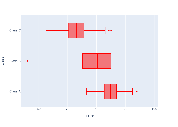
Explanation
So what happened here?
It’s pretty straight forward. This is the same boxplot as the boxplot in example 2, but we’ve changed the color to ‘red’.
Notice that the argument to the color_discrete_sequence parameter is a Python list that contains the color name. And the color name is inside quotation marks. This is important. The color name needs to be inside quotes, and inside a Python list.
And also remember: you can use Python “named” colors like red, green, and blue, but you can also use hexadecimal colors. Try a few out and see what looks good to you.
EXAMPLE 4: Break the boxplot out by a second categorical variable (using color)
Next, we’re going to break out the data on a second categorical variable. Specifically, we’re going to separate the data into more categories by color.
To do this, we’re going to map our gender variable to the color parameter.
px.box(data_frame = score_data
       ,x = 'score'
       ,y = 'class'
       ,color= 'gender'
       )
OUT:
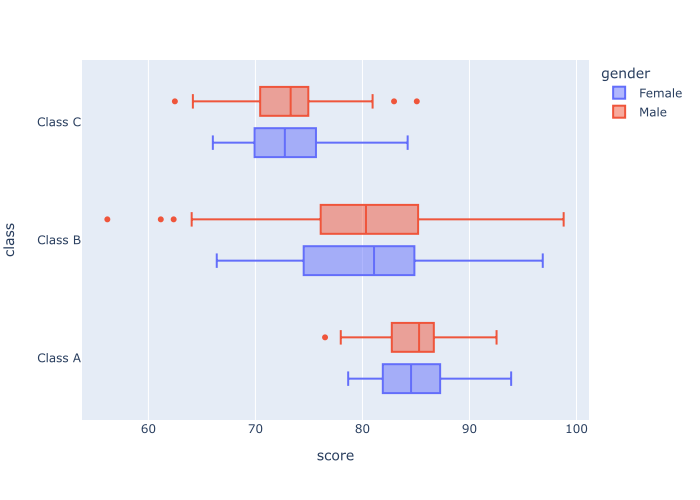
Explanation
Notice here that the data have been broken out by two categorical variables.
We mapped the class variable to the y-axis. This creates one categorical separation.
We also mapped the gender variable to the color parameter. This creates a second categorical separation in the visualization.
By mapping multiple categorical variables to different parameters, we’re creating a multivariate visualization that helps us make more comparisons across categories and combinations of categories.
EXAMPLE 5: Create a vertical boxplot
Finally, let’s create a vertical boxplot.
This will be a variation of the simple boxplot we made in example 2. But whereas that visualization was oriented horizontally, this one will be oriented vertically.
The best way to accomplish this is to swap the variable mappings to the x parameter and y parameter. You can just swap the variables you map to the x parameter and y parameter.
So in this example, we’re going to map class to the x-axis and map score to the y-axis.
px.box(data_frame = score_data
       ,x = 'class'
       ,y = 'score'
       )
OUT:
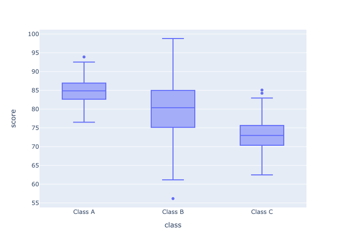
Explanation
You can see in the output that we have the different categories of “class” along the x axis now. And the numeric score variable is presented along the y axis.
By changing how we map the score and class variables to our axes, we effectively change the orientation of the plot.
Leave your other questions in the comments below
Do you have questions about creating scatter plots with Plotly?
Is there something that we didn’t cover here that you need to understand?
Write your question in the comments section at the bottom of the page.
Join our course to learn more about Plotly
The examples you’ve seen in this tutorial should be enough to get you started, but if you’re serious about learning Plotly, you should enroll in our premium course called Plotly Mastery.
Plotly Mastery will teach you all of the essentials that you need to know, including:
- How to create essential data visualizations in Python
- How to add titles and axis labels
- Techniques for formatting your charts
- How to create multi-variate visualizations
- How to think about data visualization in Python
- and more …
Additionally, the course comes with our unique practice system that will enable you to memorize all of the syntax you learn. If you practice like we show you, you’ll master Plotly syntax within a few weeks and become “fluent” in writing Plotly code.
Find out more here: