In this tutorial, I’ll show you how to make a Plotly histogram with the px.histogram function.
I’ll explain the syntax of px.histogram and I’ll also show you clear, step-by-step examples of how to make histograms with Plotly express. I’ll show you a simple histogram, as well as a few variations.
The tutorial has several sections. If you need something specific, you can click on any of the following links. The links will take you to specific locations in the tutorial.
Table of Contents:
- A quick introduction to histograms
- A review of histograms in Plotly
- The syntax of
px.histogram() - Examples
Ok. Let’s get to it.
A Quick Introduction to Histograms
Before we look at the syntax, let’s quickly review histograms.
Histograms
When you explore or analyze data, you need to look at your variables.
There are different ways to do this, depending on the variable type.
When you’re inspecting numeric variables, one of the most common methods of inspection us the histogram. Histograms show you how the numeric variable is distributed.
Typically, in a histogram, we map a numeric variable to the x-axis.
Then, the x-axis is divided up into sections, which we call “bins.” There might be a bin from 0 to 20, then another bin from 20 to 40, and so on.
Then, in the final step, we count the number of observations in each bin and plot a bar for each bin. The length of the bin corresponds to the count of the observations in that bin.
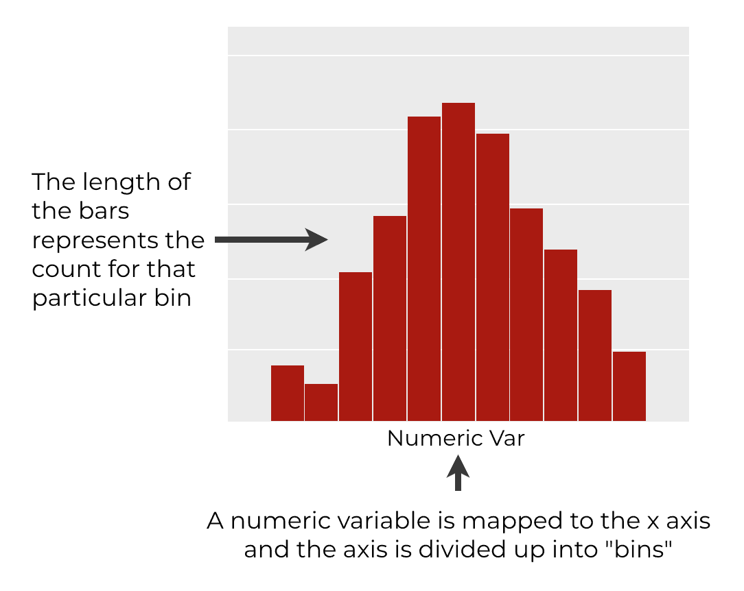
So histograms are one way to look at the density of the data for different values of the variable. It’s a way to plot the distribution of the variable.
Plotly Histograms
Now that we’ve reviewed histograms generally, let’s discuss how to create Plotly histograms.
Plotly, as you probably know, is a data visualization toolkit for Python.
Plotly has a powerful API for creating complex visualizations.
But it also has a simplified toolkit called Plotly Express, which you can use to quickly create a variety of simple visualizations like bar charts, line charts, scatterplots, and more.
Plotly express has a specialized function for creating histograms, the px.histogram() function.
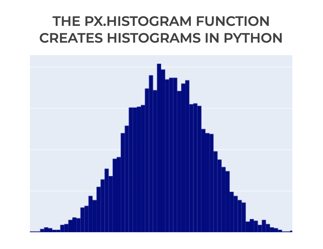
This function is a simple, yet flexible way to create histograms in Python (while also giving you access to the powerful underlying syntax of the Plotly system).
The syntax of px.histogram
Now that we’ve reviewed histograms generally, let’s look at the syntax for a Plotly express histogram.
The syntax for a histogram made with px.histogram is very simple.
Typically, we call the function as px.histogram().
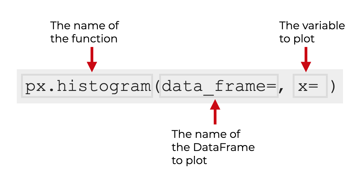
Keep in mind that this assumes that you’ve imported Plotly Express with the alias px. You can do that with the code import plotly.express as px.
Inside the parenthesis, you can use the data_frame parameter to specify a DataFrame (optional). And you use the x parameter to specify the numeric variable that you want to plot.
There are also a few additional parameters that you can use to modify your histograms.
With that in mind, let’s look at a few.
The parameters of px.histogram
The bad news is that the px.histogram function has several dozen parameters.
The good news is that you really only need to learn a few of them. Whenever you’re learning Python functions, you should try to apply the 80/20 rule, and identify the most commonly used parameters.
The parameters that I recommend you learn are:
data_framexnbinscolor_discrete_sequence
Let’s take at each of these.
data_frame (optional)
The data_frame parameter allows you to specify a Python DataFrame that you want to plot.
This parameter is optional.
If you use it, then you’re telling px.histogram that you want to plot a variable in the DataFrame that you specify.
x
You use the x parameter to specify the specific numeric variable that you want to plot.
If you use the data_frame parameter to specify a DataFrame, then the argument to this parameter will be the name one of the columns in that DataFrame. If you specify a DataFrame column, then you’ll pass the name of that column as a string. For example, if you want to plot the mycolumn variable in a DataFrame, you’ll use the syntax x = 'mycolumn'.
Alternatively, you can also choose to plot a numeric variable that exists outside of a DataFrame. This could be data in a Python list or a Numpy array. If you do this, then you can skip the quotation marks around the name. (For the most part, the quotation marks are only required when you plot a DataFrame column.)
color_discrete_sequence (optional)
The color_discrete_sequence parameter changes the color of your histogram. It changes the color of the bars.
The argument you to this parameter can be a “named color,” like ‘red‘, ‘orange‘, or ‘blue‘. (Python has a long list of named colors.)
You can also use a hex color. Hexadecimal colors are a little complicated for beginners, so in the interest of space and simplicity, I’m not going to explain them here (but they’re useful to learn, eventually).
nbins
The nbins parameter controls the number of bins in the histogram (i.e., the number of bars).
The argument to this parameter should be an integer (i.e., the number of bins you want). For example, if you set nbins = 50, the function will create a histogram with 50 bars (i.e., bins).
I’ll point out here that sometimes, you will specify a value for nbins, but the function will create a histogram with slightly fewer bins. You sometimes need to play with this to get a histogram with a roughly appropriate number of bins.
I’ll show you how to change the number of bins in example 4.
Examples: how to make histograms with Plotly Express
Now that we’ve looked at the syntax, let’s look at some examples of how to create histograms with Plotly Express.
Examples:
- Create a simple Plotly histogram
- Change the bar color
- Change the number of bins
- Create a histogram with multiple categories
- Change the colors of a multi-categories histogram
Run this code first
Before we look at the examples, you’ll need to run some preliminary code to import some packages and to create our data.
Import packages
First, we’ll import some Python packages.
import numpy as np
import pandas as pd
import plotly.express as px
We’re going to use Numpy to create some normally distributed data that we can plot.
We’ll use Pandas to turn that data into a DataFrame.
And we’ll use Plotly Express to create our histograms.
Create dataset
Next, let’s create our DataSet.
We’re going to do this in two steps:
- create normally distributed data with the Numpy random normal function
- combine the normally distributed variables into a DataFrame
First, we’ll use the Numpy Random Normal to create two normally distributed variables. Here, I’m calling those variables normal_data_a and normal_data_b.
np.random.seed(33)
normal_data_a = np.random.normal(size = 500, loc = 100, scale = 10)
normal_data_b = np.random.normal(size = 700, loc = 75, scale = 5)
We’re creating two normally distributed datasets, because I want the dataset to have two separate peaks.
So now that we have our two normally distributed variables, we’ll turn each of them into a dataframe. Notice that as we do this, we’re using the Pandas assign function to create a new categorical variable called group.
df_normal_a = pd.DataFrame(data = normal_data_a, columns=['score']).assign(group = 'Group A')
df_normal_b = pd.DataFrame(data = normal_data_b, columns=['score']).assign(group = 'Group B')

score_data = pd.concat([df_normal_a, df_normal_b])
Here, we’re also using the Pandas concat function to combine these two different DataFrames together into one single dataframe called score_data.
Let’s look at the final score_data DataFrame with a print statement:
print(score_data)
OUT:
         score    group
0    96.811465  Group A
1    83.970194  Group A
2    84.647821  Group A
3    94.295991  Group A
4    97.832717  Group A
..         ...      ...
695  84.728235  Group B
696  75.675768  Group B
697  78.171504  Group B
698  69.243985  Group B
699  75.073327  Group B
If you look a the data, you can see that this DataFrame has two variables: score and group. We’re going to use both in our histograms.
Set Plotly Image Rendering
One last thing before we plot our data.
If you’re using Plotly in an Integrated Development Environment like Spyder or PyCharm, you’ll need to run some extra code to get the visualizations to display inside the IDE:
If you’re using an IDE you can run the following code:
import plotly.io as pio
pio.renderers.default = 'svg'
Having said that, if you’re using a Jupyter notebook, that code shouldn’t be necessary.
Ok. All of our setup should be complete. We’re ready to make some histograms.
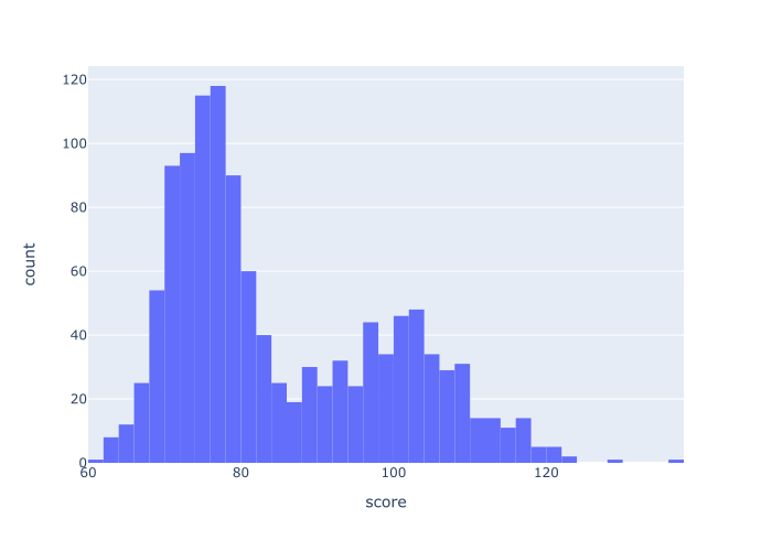
EXAMPLE 1: Create a simple Plotly histogram
Let’s start with a simple histogram.
Here, we’ll just use px.histogram to plot the data in the score variable.
Here’s the code:
px.histogram(data_frame = score_data
            ,x = 'score'
            )
And here’s the output:
Explanation
This is a very simple histogram plotted with the px.histogram function.
Inside the function call, we specified the DataFrame to plot with the code data = score_data. And we specified the exact column to plot x = 'score'.
Notice that the name of the column, 'score', is presented as a string. When we plot a DataFrame column, the name of the column must be passed to the x parameter this way.
Visually, you can see that the histogram has about 50 bins. We can actually change that, which we’ll do in one of the other examples.
Also, notice that the default color is a light blue. This is fine most of the time, but there may be situations where you want to change the color for aesthetic or design reasons.
Let’s look at how to do that.
EXAMPLE 2: Change the bar color
In this example, we’ll look at how to change the color of the histogram bars.
As I just mentioned, the default color is a sort of medium blue.
Here, we’ll to change the bar color to “darkred.” To do this, we’ll set the color parameter to color = 'darkred'.
px.histogram(data_frame = score_data
             , x = 'score'
             ,color_discrete_sequence = ['darkred']
             )
OUT:
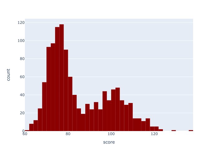
Explanation
This histogram is almost exactly the same as the histogram in example 1.
The only difference is that we’ve changed the color of the bars to the color 'darkred'.
To do that, we set the color_discrete_sequence parameter to color_discrete_sequence = ['darkred'].
Notice that the name of the color is in quotations, inside of a list. (With this parameter, you can actually specify multiple different colors, if you have multiple categories.)
As I mentioned previously, in the syntax section, you can use a variety of named colors when you use this parameter, like red, green, dark red, etc. You can also use hexadecimal colors. Try a few out!
EXAMPLE 3: Change the number of bins
Now, let’s change the number of bins in the histogram.
Here, we’re going create a histogram with 20 bins.
px.histogram(data_frame = score_data
             ,x = 'score'
             ,nbins = 20
             )
OUT:
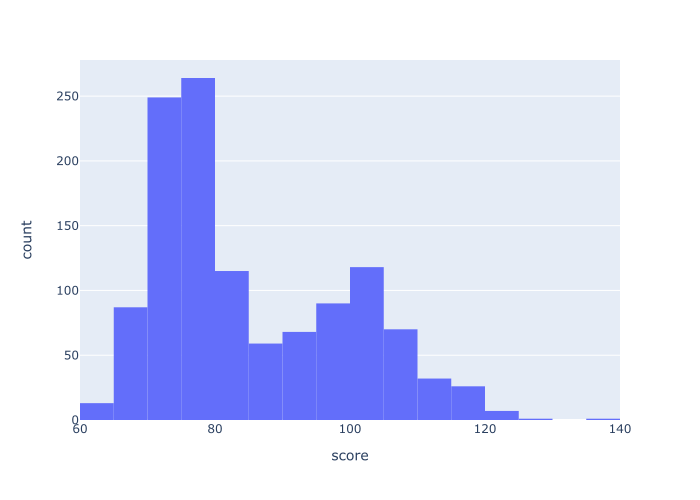
Explanation
Here, we’ve created a histogram with 20 bins.
To do this, we’ve used the nbins parameter, which we set to nbins = 20.
Keep in mind that when you analyze your data, it can be useful to look at different histograms with different numbers of bins. A large number of bins tends to show lots of detail, whereas a small number of bins smooths over the details to show the rough shape of the distribution. Neither one is “right.” How you look at your data depends on what you’re looking for or what you’re trying to do.
So you need to try different numbers of bins and evaluate the resulting histogram based on your analytical goals.
Ultimately, there’s a bit of an art to choosing the right number of bins. You’ll need to practice using this technique to know the best choice.
EXAMPLE 4: Create a histogram with multiple categories
Next, let’s create a histogram with multiple categories.
Remember that when we created our dataset, we created a categorical variable called group. This variable has two values: Group A and Group B.
We can use this categorical variable to create a histogram with multiple categories.
So in this example, we’re going to plot our data and break it out into different groups.
To do this, we’ll use the color parameter:
px.histogram(data_frame = score_data
             ,x = 'score'
             ,color = 'group'
             )
OUT:
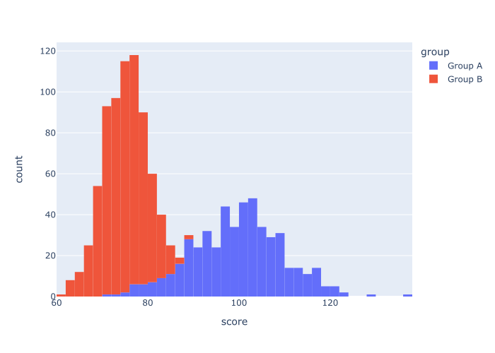
Explanation
As you can see, the resulting visualization has two histograms: one for Group A and one for Group B. Both of these histograms appear in the same visualization, but they have different colors.
To do this, we set the color parameter to color = 'group'.
Remember that the group variable is contains categorical data. It has two values: Group A and Group B.
So when we set color = 'group', Plotly Express actually breaks the data out into two histograms … one for each category, where each histogram has a different color.
This is a great technique to use if your data has different categories, and you want to visualize those categories in the same plot.
EXAMPLE 5: Create a histogram with multiple categories, and change the colors
Finally, let’s create a histogram with multiple categories, and change the colors.
This will be sort of like example 4, where we made a multi-category histogram, and sort of like example 2, where we changed the color.
Let’s take a look, and then I’ll explain.
px.histogram(data_frame = score_data
             ,x = 'score'
             ,color = 'group'
             ,color_discrete_sequence = ['navy','darkorange']
             )
OUT:
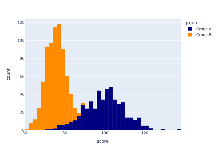
Explanation
So what happened here?
In this example, we called the px.histogram function to create a Plotly histogram.
We used the data_frame parameter to specify the DataFrame, and we used the x parameter to specify the exact column.
We used color = 'group' to indicate that we want to make a multi-category histogram, where the different categories of the group variable correspond to the different colors.
And finally, we used the code color_discrete_sequence = ['navy','darkorange'] to set the exact colors used for the different categories.
This example sort of combines several of the techniques we used in previous examples.
Leave your other questions in the comments below
Do you still have questions about making a Plotly histogram?
If so, just leave your questions in the comments section below.
If you want to master Plotly, join our course
In this blog post, I’ve shown you how create a Plotly histogram using px.histogram(). But to really master Python data visualization with Plotly, there’s a lot more to learn.
That said, if you’re serious about learning Plotly and if you want to master data visualization in Python, you should join our premium online course, Plotly Mastery.
Plotly Mastery is an online course that will teach you everything you need to know about Python data visualization with the Plotly package.
Inside the course, you’ll learn:
- how to create essential plots like bar charts, line charts, scatterplots, and more
- techniques for creating multivariate data visualization
- how to add titles and annotations to your plots
- learn “how to think” about visualization
- how to “customize” your charts, and make them look beautiful
- how to “tell stories with data”
- and much more …
Additionally, when you enroll, you’ll get access to our unique practice system that will enable you to memorize all of the syntax you learn. If you practice like we show you, you’ll memorize Plotly syntax and become “fluent” in data visualization.
You can find out more here: