This tutorial will show you how to make a Plotly scatter plot. Specifically, it will show you how to create a scatterplot with Plotly express.
So the tutorial will explain the syntax of the px.scatter function, including some important parameters.
It will also show you clear, step-by-step examples of how to create a scatter plot in Plotly express.
Table of Contents:
- Introduction to the Plotly Scatterplot
- The syntax of the Plotly scatter plot
- Plotly express scatter plot examples
- Plotly scatterplot FAQ
If you need something specific, you can click on any of the links above.
However, if you’re new to Plotly or new to data science in Python, everything will probably make more sense if you read the whole tutorial.
Ok. Let’s get to it.
A quick introduction to the Plotly scatter plot
As you’re probably aware, a scatterplot is a data visualization that plots two numeric variables. One numeric variable is mapped to the x-axis, and the other is mapped to the y-axis.
Then, individual observations in the data are plotted as points.
px.scatter creates scatterplots
There are actually several ways to create scatterplots in Python (i.e., the Seaborn scatter and Matplotlib scatter) and there is also more than one way to create a scatterplot with Plotly.
But the easiest way to create scatter plots with Plotly is with the px.scatter function from Plotly Express.
Here, I’ll walk you through the basic syntax for a Plotly Express scatterplot, and I’ll explain a few additional parameters that will enable you to modify your plots.
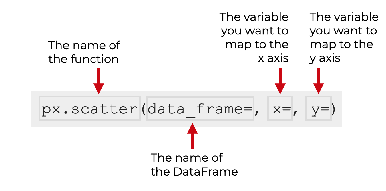
The syntax of px.scatter
The syntax to create a scatterplot with Plotly Express is fairly simple.
In the simple case, you simply call the function as px.scatter, provide the name of the dataframe you want to plot, and them map variables to the x and y axes.
Note that this assumes that you’ve imported Plotly Express as px. This is the common convention, and we’ll be sticking with it in this tutorial.
Beyond a basic scatterplot, there are some variations on the scatterplot that you can also create by using a few parameters. Let’s look at those parameters, and then we’ll look at some examples afterward.
The parameters of px.scatter
The px.scatter() function has roughly 4 dozen parameters that you can use modify your Plotly scatterplots.
The truth is, you’ll probably only use a few of these regularly, so it’s a poor use of time to try to explain all of them.
So in the spirit of applying the 80/20 rule, I’ll explain what I think are the most important parameters that you should learn first:
data_framexycolorcolor_discrete_sequenceopacity
Let’s quickly discuss each of these
data_frame (required)
The data_frame parameter allows you to specify the Pandas DataFrame that contains the data that you want to plot.
Your DataFrame should be in so-called “tidy” format. Tidy data is data structured so that every variable is in its own column and every observation has its own row. (There are other formats that your data could be in, so you need to be careful about the format of your data.)
This parameter is optional. If you don’t provide a DataFrame, then you’ll need to change how you use the x and y parameters.
x
The x parameter allows you to specify the variable that will be mapped to the x-axis.
The variable that you use as the argument to this parameter should be numeric (although the function will allow string variables in some special cases).
If you specify a DataFrame with the data_frame parameter, the argument to this parameter should be a name of one of the columns of your dataframe.
Alternatively, if you don’t specify a DataFrame, then you can use the Series or list-like object as the argument to the x parameter.
y
The y parameter is very similar to the x parameter.
The y parameter allows you to specify the variable that will be mapped to the y-axis.
The variable that you provide as the argument to this parameter should be numeric (although the string variables are allowed in some special cases).
If you specify a DataFrame with the data_frame parameter, the argument to this parameter should be a name of one of the columns of your dataframe.
Alternatively, if you don’t specify a DataFrame, then you can use the Series or list-like object as the argument to the y parameter.
color_discrete_sequence
The color_discrete_sequence parameter enables you to modify the interior color of the points (or the whole color palette applied to a set of points).
If you plot a scatterplot with only one color, then by default, the color the points will be a medium blue.
If you plot a scatterplot with multiple colors (i.e., multiple categories), there is a set of default colors that will be applied as the default color palette.
By using the color_discrete_sequence parameter, you can override those defaults, and specify the exact colors that you want for your points or categories of points.
I’ll show you an example of this in example 2.
By default, the color is a sort of medium blue, but you can change it to a wide variety of colors. This parameter will accept so-called “named colors“, but hexadecimal colors will work too.
color
The color parameter enables you to modify the color of the points according to some variable.
This parameter will accept a categorical argument (e.g., a string) or a numeric variable.
For example, if your data has multiple categories, you can use the color parameter to separate these categories by color in your scatterplot.
You can also pass a numeric variable to the color parameter. In this case, the function will vary the color of the points along a gradient according to numeric values of the variable you provide.
Note also that the variable that you pass as an argument can be the name of a column in a DataFrame (if you’ve used the data_frame parameter). Or, you can pass in a Pandas Series or list-like object.
I’ll show you an example of this in example 4.
opacity
The opacity parameter enables you to change the opacity of the points (i.e. how transparent they are).
The opacity scale ranges from 0 to 1, with 1 being fully opaque and 0 being fully transparent. 1 is the default.
I’ll show you an example of how to use this parameter in example 3.
Examples: how to make a a scatterplot with Plotly
Ok. Now that we’ve looked at the syntax for px.scatter, let’s take a look at a few examples of how to use this function to create scatterplots.
Examples:
- Create a simple scatter plot
- Change the interior color of all of the points
- Make the points more transparent to mitigate overplotting
- Change the color according to a categorical variable
- An example that combines multiple techniques
Run this code first
Before you run any of the examples, you’ll need to run some code to get everything set up.
Specifically, we’re going to import the relevant packages and we’ll create the DataFrame that we’ll use in our examples.
Import packages
First, let’s import some Python packages that we’ll use.
We’ll import Numpy and Pandas to help us create a DataFrame with some random numeric data.
And obviously, we’ll need to import Plotly to create our Plotly scatterplot.
import pandas as pd
import numpy as np
import plotly.express as px
Create data
Next, we need to create the DataFrame that we’ll be plotting.
Here, we’re going to create a simple DataFrame that contains two normally distributed numeric variables and one categorical variable. I’ll call the numeric variables x_var and y_var, and I’ll call the categorical variable categorical_var.
np.random.seed(0)
x_var = np.random.normal(size = 6000)
y_var = np.random.normal(size = 6000)

norm_data = pd.DataFrame({'x_var':x_var
                         ,'y_var':y_var}
                         )

norm_data = norm_data.assign(category_var = np.where(x_var > 1, "Category A","Category B"))
Here, we’re using Numpy random seed to set the seed for our random number generator, and we’re using Numpy random normal to create our numeric variables. Then, we’re using the pd.DataFrame function to combine them together into a DataFrame.
We’re also using the using the Numpy where function along with the Pandas assign technique to create our categorical variable, category_var.
Let’s take a look at the data by printing out the first few rows of data with the head() technique:
norm_data.head()
OUT:
      x_var     y_var category_var
0  1.764052  2.042536   Category A
1  0.400157 -0.919461   Category B
2  0.978738  0.114670   Category B
3  2.240893 -0.137424   Category A
4  1.867558  1.365527   Category A
Here, we can see the first 5 rows, which should give you a rough idea of what the data look like. Again, we have two numeric variables, and one categorical.
We’ll be able to use these to plot a few different types of scatterplots.
So now that we have our data, let’s run some examples.
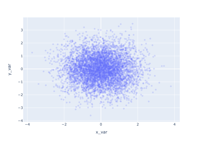
EXAMPLE 1: Create a simple scatter plot
First, we’ll start with a simple scatter pot.
To create this, we’ll call the px.scatter() function.
Inside the parenthesis, we’ll use the data_frame parameter to specify the DataFrame that we’ll be plotting, norm_data.
Then, we’ll map the variable x_var to the x-axis and y_var to the y-axis.
px.scatter(data_frame = norm_data
           ,x = 'x_var'
           ,y = 'y_var'
           )
And when we run the code, here is the output:
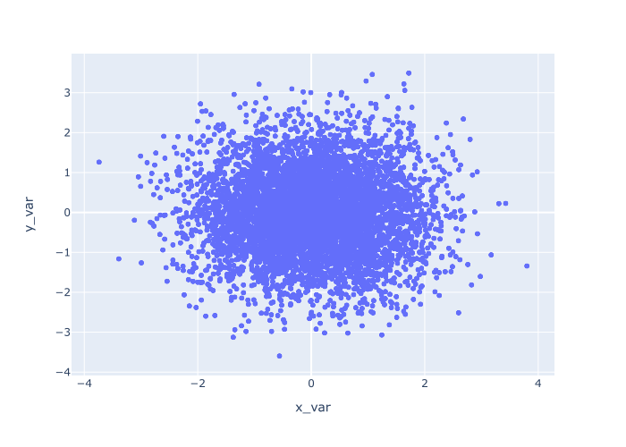
Explanation
This is fairly simple, but let me explain.
The px.scatter function specifies that we want to create a scatter plot.
The data_frame parameter specifies the dataset we want to plot.
And we use the x and y parameters to specify the variables that we want to plot on the x and y axes, respectively.
When we run it all, the function draws a single point for every row of data. The location of each point is specified by x_var and y_var.
EXAMPLE 2: Change the interior color of all of the points
Now, let’s change the color of the points.
To do this, we’ll use the color_discrete_sequence parameter.
In this example, we’ll set the color of the points to 'red'. Having said that, you could use any valid “named color” in Python. It’s also acceptable to use hexadecimal colors.
Ok. Let’s take a look:
px.scatter(data_frame = norm_data
           ,x = 'x_var'
           ,y = 'y_var'
           ,color_discrete_sequence = ['red']
           )
OUT:
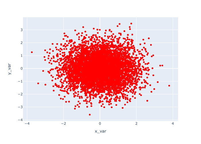
Explanation
Again, this is fairly simple.
This example is almost exactly the same as example 1.
The main difference is that we’ve changed the color of the points to ‘red‘ by using the code color_discrete_sequence = ['red'].
You can obviously use other colors besides red, so try some out and see what you like.
EXAMPLE 3: Make the points more transparent to mitigate overplotting
Now, let’s modify the transparency of the points.
You probably noticed in our previous two examples that there are a lot of points. In fact, there are so many points that they overlap each other. We call this ‘overplotting,’ and it’s a common issue when plotting scatterplots.
There are several ways to deal with overplotting, but one of the best is to make the points more transparent.
In Plotly, this is easy to do with the opacity parameter.
By default, the opacity parameter is set to 1, which is fully opaque.
So to make the points more transparent, we’ll decrease the opacity. Specifically, we’ll set opacity = .2.
Remember, the scale for opacity is between 0 and 1, with 1 being fully opaque and 0 being fully transparent.
By setting opacity = .2, we’re making the points only 20% of full opacity. At this level, the points are almost transparent!
Let’s take a look:
px.scatter(data_frame = norm_data
           ,x = 'x_var'
           ,y = 'y_var'
           ,opacity = .2
           )
OUT:
Explanation
Here, you can see that the points are significantly more transparent.
Because of this, it’s a little easier to see how the data are distributed. The data is more dense at the center, and it thins out as you move toward the edges.
To get this effect, we simply set opacity = .2, which decreases the opacity (i.e., makes the points more transparent).
Again, this is a technique that you need to know to be able to deal with overplotting.
EXAMPLE 4: Change the color according to a categorical variable
Next, we’ll modify the color of the points again.
But this time, instead of making all of the points the same color, we’ll color the points according to a third categorical variable.
To accomplish this, we’re going to map our categorical variable, category_var, to the color parameter.
Let’s take a look:
px.scatter(data_frame = norm_data
           ,x = 'x_var'
           ,y = 'y_var'
           ,color = 'category_var'
           )
OUT:
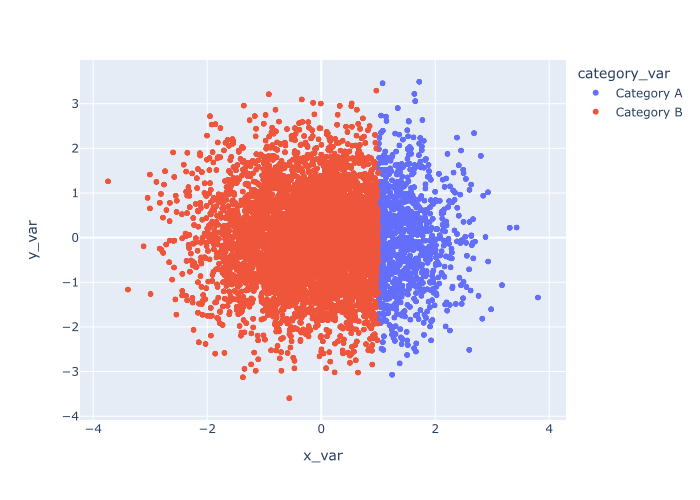
Explanation
In this example, the color of the points is dictated by the value of the category_var variable.
Points that are assigned to ‘Category A‘ have been colored blue, and the points assigned to ‘Category B‘ are orange.
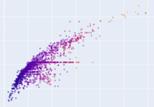
This is a very useful technique when you have a categorical variable that you want to use to further analyze your scatterplot data. It’s one way to create a multivariate plot to analyze multiple variables at the same time.
EXAMPLE 5: An example that combines multiple techniques
Finally, let’s combine two of the techniques from the previous examples.
We’ll modify the color and opacity (i.e., alpha) at the same time.
px.scatter(data_frame = norm_data
           ,x = 'x_var'
           ,y = 'y_var'
           ,color = 'category_var'
           ,opacity = .2
           )
OUT:
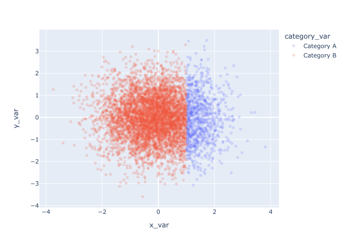
Explanation
Here we’ve colored the points according to the values in category_var and we’ve set opacity = .2 to reduce overplotting.
Leave your other questions in the comments below
Do you have questions about creating scatter plots with Plotly?
Is there something that we didn’t cover here that you need to understand?
Write your question in the comments section at the bottom of the page.
Join our course to learn more about Plotly
The examples that I’ve shown you here should be enough to get you started with creating scatterplots with Plotly Express.
But if you really want to master data visualization in Python using Plotly, then there’s a lot more to learn.
That being said, if you want to master data visualization with Plotly, then you should enroll in our premium course called Plotly Mastery.
Plotly Mastery will teach you all of the essentials of data visualization, like:
- How to create essential data visualizations in Python
- How to add titles and axis labels
- Techniques for formatting your charts
- How to create multi-variate visualizations
- How to think about data visualization in Python
- and a lot more …
Moreover, it will show you how to master the syntax within a few weeks. This course will help you become “fluent” in data visualization with Plotly.
Find out more here:
Hi Josh,
I have been using Seaborn for most visualizations within Spyder. It is very convenient in that the plots display almost instantaneously within Spyder. When I tried using Plotly Express to create the scatter plot you included in this post, no output showed up in Spyder. I checked some online sites to see if there is a solution, but they seem quite awkward to use to interactively explore data relationships. Do you know of an easier way to get Plotly plots displayed in Spyder?
Thanks,
Bill
Yeah, there’s a way to fix that …
Just add the following lines of code to your imports:
This will enable Spyder to display the output as an image.
(Thanks for mentioning BTW … I need to add a note about this in the tutorial.)