
This tutorial is part of a series of tutorials analyzing covid-19 data.
For parts 1, 2, and 3, see the following posts:
https://www.sharpsightlabs.com/blog/python-data-analysis-covid19-part1/
https://www.sharpsightlabs.com/blog/python-data-analysis-covid19-part2/
https://www.sharpsightlabs.com/blog/analyzing-covid-19-with-python-part-3-eda/
Covid19 analysis, part 4: visual data exploration
So far in this tutorial series, we’ve focused mostly on getting data, particularly in parts 1 and 2.
Most recently, in part 3, we began “checking” and exploring our data. To be clear though, most of the operations we performed in part 3 were simple print statements and aggregations to check if the data looked “correct.”
Here in part 4, we’ll start to explore our data visually.
We could call this “exploratory data analysis” … which would be sort of true, but not completely.
Here, we’re going to start making simple visualizations of our data to explore it and almost literally “look inside” the dataset.
Having said that, this isn’t going to be a detailed analysis and it won’t be particularly exhaustive.
Ultimately, I want to give you a quick, high-level overview of how to explore a dataset using data with relatively simple data visualization tools.
Tools we’ll use in this tutorial
Briefly, I want to explain what skills you’ll need to really understand what we’re doing here.
Like the other tutorials in this series, we’ll be using the Python programming language to visualize and analyze our data.
For the front end visualization part, we’ll be using Seaborn. Seaborn is a data visualization package for Python.
Having said that, to properly explore and visualize a dataset, you almost always need to use data manipulation techniques as well. That being the case, we’ll use a lot of Pandas to wrangle our data before visualizing. In particular, we’ll use Pandas to subset, reshape, and aggregate our data into the right form that’s needed for specific Seaborn functions.
Skills you need
All that being the case, it will be really helpful for you to know Pandas and Seaborn.
To be fair, even if you don’t know those packages, you should still be able to follow along.
If you have Python, Pandas, and Seaborn installed, you should be able to copy the code from this tutorial and run it. If you read the explanations carefully, you can probably get a rough idea of what’s going on.
But to really understand, you’ll eventually want a solid understanding of Python, Pandas, and Seaborn. If you’re really serious about learning these skills, you should enroll in one of our Python courses.
I want to emphasize though: if you don’t know these skills yet, just follow along and try to run the code. If your system is set up with the right packages, it should still work.
A brief table of contents
With all that in mind, let me give you a quick overview of the sections of this tutorial.
The following Table of Contents will enable you to navigate to specific sections of the tutorial.
Table of Contents:
- Get data and install packages
- Basic data inspection
- Some general comments on visual exploration
- Create a scatterplot
- Create line charts
- Make bar charts
- Closing remarks about visualization and visual exploration
So, if you want to create a specific visualization, you can just go to the proper section and get the code.
As always though, it’s best if you read through everything, step by step.
Get Data and Packages
First, we need to import the correct Python packages and we need to get the data.
To get the most up-to-date data, you can go to part 2 of this tutorial series and run the code there. The code in part 2 will enable you to get a fully up-to-date file with the most recent covid-19 data from Johns Hopkins.
But if you don’t want to go back to part 2, I’ll have a file that you can download here, with some code below.
First, you’ll need to import Pandas, Seaborn, Numpy, and the datetime package:
import pandas as pd
import seaborn as sns
import numpy as np
import datetime
Next, we will set the formatting for our charts:
sns.set()
And then you can import the data:
covid_data = pd.read_csv('https://learn.sharpsightlabs.com/datasets/covid19/covid_data_2020MAR31.csv'
                         ,sep = ";"
                         )
covid_data = covid_data.assign(date = pd.to_datetime(covid_data.date, format='%Y-%m-%d'))
Keep in mind that this dataset contains data up to March 31, 2020, which was the date that I pulled the data. If you use this data after March 31, it will not be the most “up to date” data.
Again, if you want completely up-to-date data, you can go back to part 2 and run the code there.
Basic Data Inspection
Briefly, let’s do some data inspection.
We did some more comprehensive data inspection in part 3 of this series, and I definitely recommend that you read that blog post.
But here, we can just do some simple inspection to reacquaint ourselves with the data.
Here, we’re just trying to get a quick look at the variables that are in the data and the general format of the records. That will give us some ideas about what types of visualizations we can create.
Print rows
First, let’s just print a few rows with the head method.
# PRINT ROWS
covid_data.head()
OUT:
       country subregion       date   lat  long  confirmed  dead  recovered
0  Afghanistan       NaN 2020-01-22  33.0  65.0          0     0        0.0
1  Afghanistan       NaN 2020-01-23  33.0  65.0          0     0        0.0
2  Afghanistan       NaN 2020-01-24  33.0  65.0          0     0        0.0
3  Afghanistan       NaN 2020-01-25  33.0  65.0          0     0        0.0
4  Afghanistan       NaN 2020-01-26  33.0  65.0          0     0        0.0
We have at least one categorical variable, country. Categorical variables are good for bar charts, so we’ll probably use that.
There’s also a date variable, which is good for time-series based line charts.
Lat and long are numeric. I’m not sure that these will be useful for “simple” visualizations, but at some point later in the series, these will be perfect for making a world map of covid19 cases. In the meantime though, in this tutorial, I’ll probably make a histogram of these, just to see what it looks like.
Finally, we have confirmed, dead, and recovered.
These will be good “value” variables for some of the other visualizations that I’ve already mentioned.
When we make a bar chart, we’ll need a categorical variable (like country) but also a numeric variable. confirmed, dead, and recovered will be perfect for that. We can also use these variables as the numeric variables in line charts vs date.
It might also be interesting to create a scatterplot of confirmed vs dead or something similar.
Some quick notes on visualization and exploration
Whenever you start visualizing your dataset, your goal is not to make perfect, publication ready visuals.
Instead, you’re just trying to create quick-and-dirty visualizations to search for insights.
That means, you want to “polish” your visualizations just enough so that you can find interesting things in the data. Just enough so that you can find insights.
But in these initial stages of visual exploration, they do. not. need. to. be. perfect.
Save the ultra-polished versions for later phases, once you’ve found a chart that you can use to tell a story and you want to show to other people.
Simple visualizations of the covid-19 dataset
Ok. Enough with the preliminary BS.
Let’s visualize some data.
Scatter plot
First, let’s start very simple.
Here, we’ll just create a scatter plot of confirmed cases vs deaths.
Wrangle data
To create this chart, we actually need to wrangle our data a little bit.
Here, we’re going to subset the rows of the DataFrame to get the data for the most recent complete date in this dataset (March 29, 2020).
To do that, we’ll use the Pandas query method.
covid_data_2020MAR29 = (covid_data
                        .query("date == datetime.date(2020, 3, 29)")
                        .filter(['country','confirmed','dead','recovered'])
                        .groupby('country')
                        .agg('sum')
                        .sort_values('confirmed', ascending = False)
                        .reset_index()
)
And we can print out a few records:
print(covid_data_2020MAR29)
OUT:
                              country  confirmed   dead  recovered
0                                  US     140886   2467     2665.0
1                               Italy      97689  10779    13030.0
2                               China      82122   3304    75582.0
3                               Spain      80110   6803    14709.0
4                             Germany      62095    533     9211.0
..                                ...        ...    ...        ...
173                        MS Zaandam          2      0        0.0
174                       Timor-Leste          1      0        0.0
175                  Papua New Guinea          1      0        0.0
176  Saint Vincent and the Grenadines          1      0        1.0
177                          Botswana          0      0        0.0
Plot the scatterplot
Now that we have the data, let’s plot it.
Here, we’ll use the Seaborn scatterplot function to create the scatterplot.
We’re putting confirmed cases on the x axis and dead on the y axis.
sns.scatterplot(data = covid_data_2020MAR29
                ,x = 'confirmed'
                ,y = 'dead'
                )
OUT:
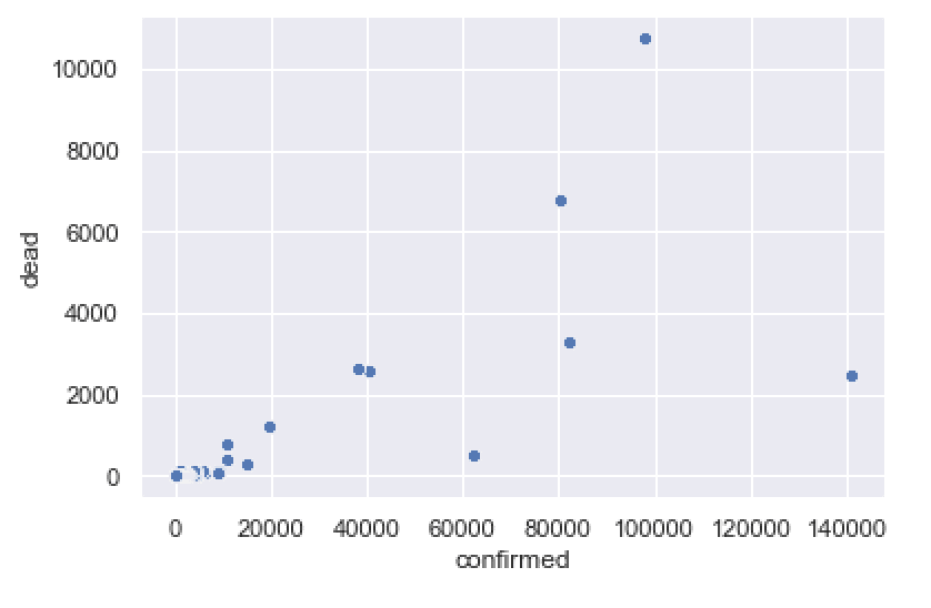
This gives us a rough idea of the death rate for different countries, and enables us to quickly compare. Some countries have a relatively small number of deaths compared to cases (e.g., US and Germany). Other countries have a relatively high number of deaths compared to cases (e.g., Italy).
To be clear, this is a highly imperfect chart.
Visually, there are several things that we could change …. we might change the dot colors, the dot sizes, the font, etc.
Additionally, comparing deaths to cases like this may be problematic while the epidemic is still under way (there are still confirmed cases that are neither deaths or recovered, so the death counts may not be completely comparable to the cases).
Having said that, this chart gives us a rough view of the data. It’s good enough to give us a rough look at the deaths vs cases. We can update it later as the dataset improves, and we can enhance the formatting later, if we want a more polished chart.
Line charts
Next, let’s create some line charts.
To be fair, creating these line charts takes a bit of work. They aren’t terribly hard to make if you know Pandas and Seaborn. But ultimately, creating these line charts requires us to aggregate and “wrangle” our data quite a bit. If you know Pandas, it won’t be so bad. If you don’t know pandas, it will be challenging.
(Once again, if you want to master data science in Python, you need to master Pandas. You should consider enrolling in one of our courses to get the right skills.)
Line chart of world covid-19 cases over time (excluding China)
First, we’ll create a line chart of covid-19 cases verses time, excluding China.
To do this, we’ll first aggregate the data, and then we’ll plot.
Aggregate data
Ok, here we’re going to aggregate and subset the data.
confimed_by_date_xchina = (covid_data
                           .query('country != "China"')
                           .filter(['date','confirmed'])
                           .groupby('date')
                           .agg('sum')
                           .reset_index()
                           )
And let’s print it out:
print(confimed_by_date_xchina)
OUT:
         date  confirmed
0  2020-01-22          7
1  2020-01-23         11
2  2020-01-24         21
3  2020-01-25         28
4  2020-01-26         43
..        ...        ...
64 2020-03-26     447809
65 2020-03-27     511394
66 2020-03-28     578707
67 2020-03-29     637995
68 2020-03-30     700167
This dataset is just the aggregated worldwide confirmed cases by date, excluding China.
How did we get it?
We used the Pandas query method to subset the data down to records where country is not equal to China.
We used filter to retrieve the date and confirmed variables.
The groupby and agg methods enabled us to aggregate the data by date.
As I mentioned earlier: to get the right data for our line chart, we need to do a fair amount of data manipulation. Make sure you master essential Pandas skills.
Plot aggregated data
Now, let’s plot our data.
Remember: the data is aggregated by date. In the confimed_by_date_xchina, we have the total number of non-Chinese confirmed covid-19 cases by date.
Now, to create our line chart, we’re going to use the Seaborn lineplot function.
We’ll put date on the x axis and confirmed on the y axis. (Notice that the names of the variables must be in quotations.)
sns.lineplot(data = confimed_by_date_xchina
             ,x = 'date'
             ,y = 'confirmed'
             )
OUT:
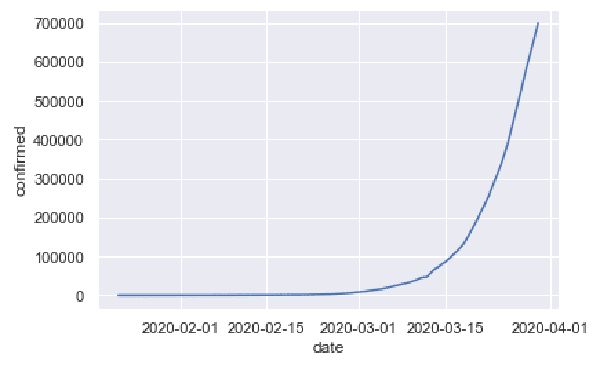
This is pretty simple, but it shows something important: the rapid rise of worldwide covid19 cases.
This is a very simple chart that can tell a story about what’s happening right now.
Concerning the plot itself, it’s simple, but still looks pretty good.
Earlier in this tutorial, I set the plot background formatting with sns.set(), and that actually does a lot to make the plot look decent.
To be fair, there’s a lot more that we could do to this. Ideally, we probably want to add a title, maybe change the font, and possibly change the line color.
But at early stages of visual data exploration, those things are not priorities. Early on, when you’re first visualizing your data, just create the basic charts. You can polish them later.
Line chart of world covid-19 cases over time, China vs World
Next, let’s do a similar chart.
Here, we’re going to create a line chart that shows two lines.
We’ll show one line for China, and another line for the rest of the world.
To do this, we need to wrangle our data again.
Aggregate data
The data aggregation here will be similar to the aggregation for the previous example.
Here, we’re still going to group our data and aggregate it to sum up the total number of confirmed cases by date.
But, we want to aggregate by a categorical variable that separates China vs Not-China.
So the first step is just creating a new categorical variable called china_flg. This variable has two values. It is “China” if the country variable is China, and “Not China” otherwise. To create this variable, we’re using the Pandas assign method, and we’re using the Numpy where function to conditionally assign the values “China” or “Not China”, depending on the value of the country variable.
After that, the aggregation is almost exactly the same as the aggregation for our simple line chart in the previous example.
Let’s take a look:
confirmed_by_date_china_xchina = (covid_data
                           .assign(china_flg = np.where(covid_data.country == 'China', 'China', 'Not China'))
                           .filter(['date','confirmed','china_flg'])
                           .groupby(['date','china_flg'])
                           .agg('sum')
                           .reset_index()
                           )
And now, let’s print out a few rows:
print(confirmed_by_date_china_xchina)
OUT:
          date  china_flg  confirmed
0   2020-01-22      China        548
1   2020-01-22  Not China          7
2   2020-01-23      China        643
3   2020-01-23  Not China         11
4   2020-01-24      China        920
..         ...        ...        ...
133 2020-03-28  Not China     578707
134 2020-03-29      China      82122
135 2020-03-29  Not China     637995
136 2020-03-30      China      82198
137 2020-03-30  Not China     700167
As you can see, the data have the confirmed cases, by date, for China and “Not China” (i.e., the rest of the world).
Plot the data
And now, let’s plot the data:
#-----------------
# PLOT: line chart
#-----------------
sns.lineplot(data = confirmed_by_date_china_xchina
             ,x = 'date'
             ,y = 'confirmed'
             ,hue = 'china_flg'
             )
OUT:
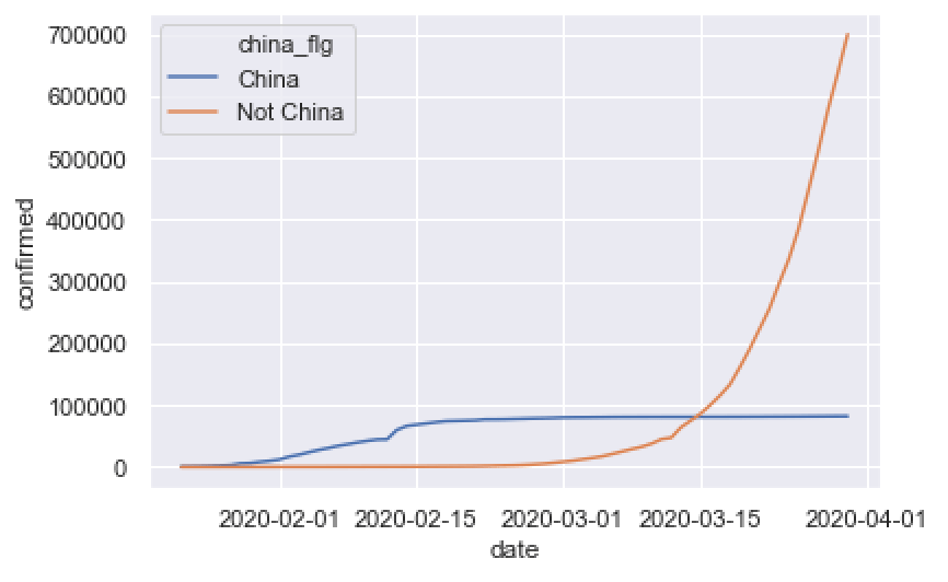
This is pretty simple, but it still tells an important story.
China’s cases leveled off after some strict medical and policy interventions, and relatively speaking, cases in the rest of the world have exploded.
Certainly, there’s more that we might say about this, but I want to focus on the technique more than anything.
The code to create the plot is simple. We used the Seaborn lineplot function to create a line chart. We put date on the x axis and confirmed on the y axis. It’s almost exactly the same as the code for the line chart in the previous example.
The only major difference in the line chart code is that we mapped “china_flg” to the hue parameter. This is the bit that creates the two different lines. The code is creating two lines of different colors (i.e., hues) depending on the value of “china_flg“.
But notice that the whole thing depends on good data manipulation. For this to work, we needed to aggregate our data and create the “china_flg” variable with Pandas.
Line chart of important countries over time
Let’s do one more line chart.
Here, we’ll create a line chart that plots cases for a few countries with major outbreaks, US, China, Italy, Spain, and France.
This is obviously not an exhaustive list, and obviously many other countries are having outbreaks, but I selected a few in the interest of simplicity.
(You can modify the code yourself to include different countries.)
Aggregate the data
First, we’ll wrangle the data.
This is very similar to the last 2 examples, except we’re using the Pandas query method to retrieve rows of data for US, China, Italy, Spain, and France.
#---------------
# AGGREGATE DATA
#---------------
confirmed_by_date_top_countries = (covid_data
                           .filter(['date','country','confirmed'])
                           .query('country in ["US","China","Italy","Spain","France"] ')
                           .groupby(['date','country'])
                           .agg('sum')
                           .reset_index()
                           )
Plot the data
And now let’s plot.
#-----------------
# PLOT: line chart
#-----------------
sns.lineplot(data = confirmed_by_date_top_countries
             ,x = 'date'
             ,y = 'confirmed'
             ,hue = 'country'
             )
OUT:
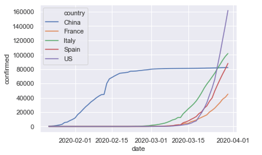
As you can see, this enables us to compare the growth of covid19 cases over time for different countries.
And as I mentioned earlier: this is a simple chart. There’s more that we could do to improve it, like adding a title, changing colors, etc. But this is probably good enough for a first pass.
Bar charts
Now, let’s make a bar chart.
Specifically, I want to make a bar chart that shows the number of cases, by country, for the top 15 countries.
Like the previous examples, we’re going to need to do a fair amount of data wrangling to get the data into the right shape for this bar chart.
Wrangle Data
Here, we’re going to create a DataFrame with the top 15 countries with the most confirmed covid19 cases (as of March 29, 2020).
To do this, we need to use several Pandas methods, chained together.
We’ll start with the covid_data DataFrame.
Then we’ll use Pandas query to subset down to the data for March 29, 2020.
After that, we’ll retrive only the country and confirmed variables.
Next, we’ll group and aggregate the data to sum up the confirmed cases by country.
Then we’ll sort the values in descending order using sort values, and we’ll use iloc to slice the data and retrieve the top 15 rows.
(Note, we’re also using reset_index here to reset the numeric index of the DataFrame, after sorting the rows.)
Here’s the code:
confirmed_by_country_top15 = (covid_data
                        .query('date == datetime.date(2020, 3, 29)')
                        .filter(['country','confirmed'])
                        .groupby('country')
                        .agg('sum')
                        .sort_values('confirmed', ascending = False)
                        .reset_index()
                        .iloc[0:15,:]
                        )
And let’s print out the data:
print(confirmed_by_country_top15)
OUT:
           country  confirmed
0               US     140886
1            Italy      97689
2            China      82122
3            Spain      80110
4          Germany      62095
5           France      40708
6             Iran      38309
7   United Kingdom      19780
8      Switzerland      14829
9      Netherlands      10930
10         Belgium      10836
11    Korea, South       9583
12          Turkey       9217
13         Austria       8788
14          Canada       6280
Perfect. This is exactly the form that we want. We have the country name, and the total number of confirmed cases for the top 15 countries.
Now let’s plot.
Plot barchart
Here, we’ll use the Seaborn barplot function to create a barchart of our data.
sns.barplot(data = confirmed_by_country_top15
            ,x = 'country'
            ,y = 'confirmed'
        )
OUT:
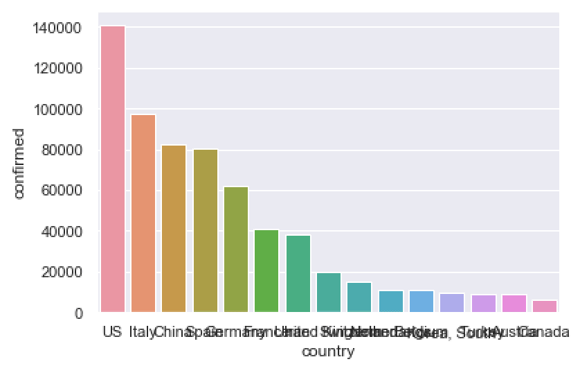
To be honest, this chart is a little problematic.
The country names on the x axis all overlap with one another.
And the bars are all different colors. This is not good. Most of the time, your bars should be the same color, unless you’re trying to highlight a few particular bars, or you need to group the bars into categories of some type.
Let’s clean this up, just a bit.
Create horizontal bar chart
Here, we’re going to create a horizontal bar chart with the bars all the same color.
To do this, we’ll map the country name to the y axis, and the confirmed count to the x axis (this is the opposite of our previous chart).
sns.barplot(data = confirmed_by_country_top15
            ,y = 'country'
            ,x = 'confirmed'
            ,color = 'darkred'
        )
OUT:
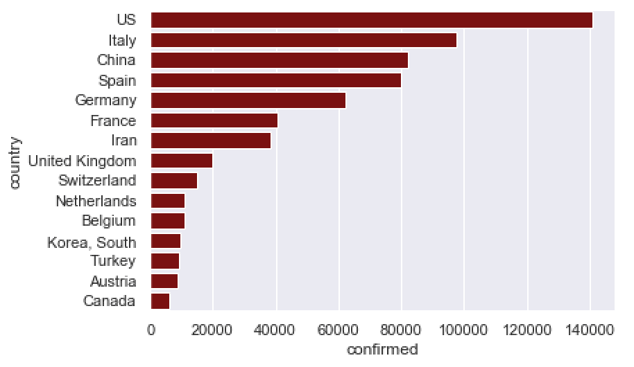
Much better.
The horizontal bar chart is much better in cases like this, because the names don’t overlap when you put them on the y axis. The whole thing is much easier to read.
To be clear, there’s still more we could do here. We probably would want to add a title. We might want to change the font. Etcetera.
But this is a good start. We can (and possibly will) modify this later.
Closing remarks about visual data exploration
I created this tutorial to show you how to approach early data visualization and visual data exploration.
That being the case, I want to reiterate that these charts are all intended to be “first drafts.” All of them are a little rough around the edges and could use some extra work to improve them or polish them up in some way.
That’s fine. Data visualization and exploration is an iterative process. The best, most striking, most polished data visualizations, all start out as plain looking ones. As you visualize your data, start with a rough draft to get the dataset right, and the basic plot in the right form. Then iterate to polish it up.
I also want to emphasize that some of these charts “tell good stories,” like the bar chart and our line charts.
Other charts (like perhaps, the scatterplot) don’t show very much, or the story they tell is a little inconclusive.
Both are okay.
Sometimes, you have a hypothesis about your data, you create the chart, and you find nothing.
Other times, you stumble on something interesting by chance, and it ends up being a very important find with a lot of impact on your organization.
You just never know.
So at early stages of data exploration, generate some ideas and hypotheses about your data.
Come up with charts that you think might be interesting, and then create them.
If you find something, great. If you think there’s more, then investigate more.
But if you create a visualization and it’s un-insightful, or uninteresting, or not useful, that’s fine. Just move on. It’s okay, and normal.
You often need to create a lot of “uninteresting” visualizations before you find anything important.
Sign up to learn more
Do you want to see part 5 and the other tutorials in this series?
Sign up for our email list now.
When you sign up, you’ll get our tutorials delivered directly to your inbox.
.assign(china_flg = np.where(covid_data.country == ‘China’, ‘China’, ‘Not China’))
gives me: “NameError: name ‘np’ is not defined”
You need to import numpy with the following code:
That wasn’t in the original published version of this tutorial, so I updated it just now.
Great tutorial really, for a suggestion, we could get testing data and correlate tested per capita to dead per capita, maybe for select countries where those data are a bit reliable
Yeah, that’s possible.
The hard part is the join. I think that JHU has a xref table that could help us join on external data source.
This is a possible tutorial for the future … join on the testing data at the state or country level and then analyze tests vs deaths, etc.
Another outstanding tutorial Josh. With what I have learned today I can now try to plot at the state and county level. Thank you for providing some basics in plotting with seaborn.
Also for the beginners, don’t forget to import the matplotlib library otherwise the graph will not appear.
import matplotlib.pyplot as plt
plt.show()
I can’t wait for the next tutorial Josh!
Many thanks, Michael
This is somewhat off-topic, but I tried to generalize covid_data_2020MAR29 to use the latest date, computed as:
latest_date = covid_data[-1: ][“date”]
I couldn’t get the .query to work “date == latest_date”, or “date == @latest_date”, or … I can’t get the data types on the left and right of the “==” to agree, so that I can make the comparison. Any suggestions? Thanks.
I managed to get something to work:
latest_date = covid_data[-1: ][“date”]
latest_date_series = latest_date.repeat(len(covid_data.date)).reset_index(drop = True)
covid_data_latest = (covid_data
.query(“date == @latest_date_series”)
.filter([‘country’,’confirmed’,’dead’,’recovered’])
.groupby(‘country’)
.agg(‘sum’)
.sort_values(‘confirmed’, ascending = False)
.reset_index()
)
Suggestions for improvement welcome.
I wanted to get a barplot showing both confirmed and dead for each country. The following gives me exactly the kind of thing I want:
ax = confirmed_by_country_top15_2.plot.barh(x = ‘country’)
where …top_15_2 just adds ‘dead’ to the filter list of the top_15 dataframe.
But I’m unable to find any native seaborn way to accomplish the same thing. Any suggestions? Thanks.
I’m not sure exactly how your dataset is structured, so I’ll use the
confirmed_by_country_top15dataset from my code.You probably want to use the Seaborn barplot function:
sns.set()
sns.barplot(data = confirmed_by_country_top15
              ,y = 'country'
              ,x = 'confirmed'
              ,color = 'red'
              )
We have a fairly detailed tutorial about
sns.barplot()here: https://www.sharpsightlabs.com/blog/seaborn-barplot/Bar charts in Seaborn are a little complicated in that you need to pre-aggregate the data. We’ve done that here, but it can be confusing to Seaborn beginners if you don’t know that … essentially, to use Seaborn properly, you very frequently need to use some Pandas data manipulation.
Keep in mind that Seaborn also has the
countplot()function which also creates bar charts …. which one you use depends on how your data are structured and what you’re trying to visualize.Thanks. I did run across `countplot()` while I was thrashing around with this, but I didn’t get immediate gratification from it, so I kept looking. It’s probably worth my time to go back to look at `countplot` again.
I was using exactly your dataset, except that I was keeping both `dead` and `confirmed`. The problem was that `sns.barplot` doesn’t have any obvious (to me) way to include more than one `y` value. I did manage to get something to work, simply (?) by using `barplot` twice:
import matplotlib.pyplot as plt
ax1 = sns.barplot(data=confirmed_by_country_top15_2,
y = ‘country’,
x = ‘confirmed’,
color=’skyblue’,
label = ‘confirmed’
)
ax2 = sns.barplot(data=confirmed_by_country_top15_2,
y = ‘country’,
x = ‘dead’,
color=’red’,
label = ‘dead’
)
ax2.set(xlabel =’persons’)
ax2.legend()
plt.show()
Do you want to have a bar chart with deaths and confirmed plotted as separate bars, side by side …. that wasn’t totally clear to me in the beginning.
If I’m understanding properly, you should be able to do this with
sns.barplotorsns.countplot… you can use thehue =parameter.But to do this, you’ll need to melt your data so that dead and confirmed are under a single categorical variable instead of being separate variables.
…. honestly, to be able to do this, you really need to know your way around both Pandas and Seaborn.
Thanks. I think have this working. (BTW, I didn’t have any particular format in mind, i.e., side-by-side or overlapping. Just wanted a clear display of the info.)
In any case, I took your suggestion to create an additional categorical variable, `status`, which has values either `confirmed` or `dead`. Then I renamed the `’confirmed` and `dead` cols in the respective dataframes to `count`.
Then I “stacked” the dataframes (df.append()) for confirmed and dead and made a horizontal bar chart, country vs. count, with `hue = status`. It’s hard to be sure that this is entirely correct, but the image *looks* like the one I got with the two previous methods.
Thanks for the suggestion.
Yeah …. that sounds about right.
There are a few ways to do it … if the files are already combined, you can melt the
confirmedanddeadvariables into one single, new variable. Or you can subset, rename, and stack (which is what I think you did).Good to hear that you got something close to what you wanted …
BTW, I’m wondering how you get the formatted code into these comments. I tried indenting by four spaces, a la SO, but that didn’t seem to work (unless maybe I didn’t keep proper track of the spaces). Here’s a simple test:
import matplotlib.pyplot as plt
To format the code, I’m using the <code> and <pre> tags
To be honest, I’m not sure if you’ll be able to use them …. you can give it a shot though.
<code> YOUR CODE <\code>
<pre> YOUR CODE <\pre>
In [4]: import numpy as np
In [5]: np.sin(np.linspace(-np.pi, np.pi, 10))
Out[5]:
array([-1.22464680e-16, -6.42787610e-01, -9.84807753e-01, -8.66025404e-01,
-3.42020143e-01, 3.42020143e-01, 8.66025404e-01, 9.84807753e-01,
6.42787610e-01, 1.22464680e-16])
In [6]: