In the last several tutorials, we’ve been analyzing and working with covid-19 data.
This is the second week of April, and the covid-19 epidemic has become a worldwide crisis.
In any crisis … in any environment where you need to make decisions, you need good information.
Data science can help.
So in this series of tutorials, I’ve been showing you how to get, wrangle, and visualize data.
Here’s what we’ve done so far, just to get you back up to speed:
- part 1: get initial covid19 dataset
- part 2: create combined “master” covid19 dataset (this step is important!)
- part 3: simple data inspection
- part 4: exploratory data visualization
- part 5: create “daily new cases” variable
As you can see, in the most recent step (part 5) we found a way to calculate daily new cases. (Note: after doing this, I went back and updated part 2, which is the tutorial where we create the dataset we’ve been using. If you go back to part 2, there is now code there to add daily new cases to the covid_data dataset.)
Now that we have the “new cases” variable, we’re going to visualize it.
Visualizing “daily new cases” using Seaborn
Our end goal will be to create a “small multiple chart” of the daily new cases for the top few countries. Specifically, we’re going to create a small multiple chart of line charts.
If you don’t know, I love small multiple charts.
In my opinion, the small multiple chart is one of the most useful but most underused charts in the world of data visualization.
It’s a great technique to learn, practice, and master.
Having said that, you often need to wrangle your data into the right shape in order to use it properly. We already did that data wrangling in previous tutorials in this series, but I still have to reiterate: make sure that you learn Pandas.
Ok, having said all of that, let’s get to it and create our small multiple chart.
Preliminary steps (do this first)
Before you run any of the code in this tutorial, you’ll need to import the proper packages and get the covid_data dataset.
Import packages
Here, we’ll import Pandas, Seaborn, and datetime.
#================
# IMPORT PACKAGES
#================
import pandas as pd
import seaborn as sns
import matplotlib.pyplot as plt
import datetime
We’re going to need Pandas to get our dataframe, and to do a little bit of data wrangling on our data (i.e., create subsets, etc).
And we’ll obviously use Seaborn for data visualization.
Get covid-19 data
Next, let’s get the covid-19 dataset.
I retrieved and saved the covid-19 dataset from Johns Hopkins as of April 9, 2020. The data is combined and “wrangled” into the proper shape.
You can download the data with this code:
#============
# IMPORT DATA
#============
covid_data = pd.read_csv('https://learn.sharpsightlabs.com/datasets/covid19/covid_data_2020-04-09.csv'
                         ,sep = ";"
                         )
covid_data = covid_data.assign(date = pd.to_datetime(covid_data.date, format='%Y-%m-%d'))
covid_data = covid_data.fillna(value = {'subregion':''})
Alternatively, you can run the code in part 2 of the Python covid-19 series to create an up-to-date dataset.
Create a line chart of new covid19 cases
We’re actually going to start by creating a single line chart first.
Typically, before I create a full small multiple chart that has multiple panels, I prefer to create a single chart of the chart type that we’ll use in the small multiple panels.
In this case, our final small multiple chart will have line charts.
So that being the case, I want to make a solo line chart just to get a feel for the data and to work out some of the aesthetics.
Create a super simple line chart
Let’s start with a simple line chart.
Here, we’ll create a line chart of new covid-19 cases for the USA.
To do that, we’ll subset the covid_data dataset, and then we’ll plot.
Subset data down to USA
First, we’ll use the Pandas query method to subset the rows of our Pandas dataframe. We’ll subset down to the rows where country is “US“.
#------------
# GET US DATA
#------------
covid_data_US = (covid_data
                 .query('country == "US"')
                 )
Let’s print it out, just to take a look.
print(covid_data_US)
OUT:
      country subregion       date  ...   dead  recovered  new_cases
18960      US           2020-01-22  ...      0        0.0        NaN
18961      US           2020-01-23  ...      0        0.0        0.0
18962      US           2020-01-24  ...      0        0.0        1.0
18963      US           2020-01-25  ...      0        0.0        0.0
18964      US           2020-01-26  ...      0        0.0        3.0
      ...       ...        ...  ...    ...        ...        ...
19034      US           2020-04-05  ...   9619    17448.0    28219.0
19035      US           2020-04-06  ...  10783    19581.0    29595.0
19036      US           2020-04-07  ...  12722    21763.0    29556.0
19037      US           2020-04-08  ...  14695    23559.0    32829.0
19038      US           2020-04-09  ...  16478    25410.0    32385.0
As you can see, in this subset, we have covid-19 data, by date, for the USA. This includes confirmed cases, but also “new cases”, which we’ll use in our plot.
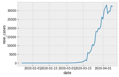
Plot the data
Now, let’s plot the data using a Seaborn lineplot:
plt.style.use('bmh')
sns.lineplot(data = covid_data_US
             ,x = 'date'
             ,y = 'new_cases'
             )
OUT:
Clean up the formatting
Now, we’ll very quickly clean up the formatting.
Here, we’ll change the orientation of the x axis tick labels to 45 degrees, so they don’t overlap.
We’ll also add a title.
sns.lineplot(data = covid_data_US
             ,x = 'date'
             ,y = 'new_cases'
             )
plt.xticks(rotation=45, horizontalalignment='right')
plt.title('Covid-19 daily new cases\nin the United States', fontsize = 18)
OUT:
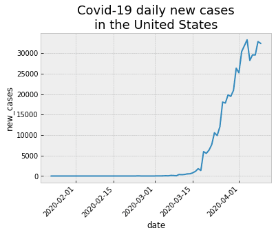
There’s more that we could possibly do here, but I think that this chart is pretty damn good for a quick-and-dirty line chart.
Create small multiple chart
Now, we’ll take this and create a small multiple chart.
Specifically, we’re going to create a small multiple line chart of the “top 9” countries that have the most new daily cases (as of April 9, 2020).
To do this, we’ll need to retrieve some information about our dataset, wrangle our data into shape, and then plot.
Get “top 9” countries
First, we’ll retrieve the top 9 countries, in terms of daily new cases.
To do this, we’ll use several Pandas methods.
We’ll use query to subset the rows down to the data for April 9 (the most recent row in this dataset).
Then we’ll use sort_values to sort the data by new cases from high to low.
We’ll use the Pandas iloc method to retrieve the top 9 rows ….
And then retrieve the country variable.
covid_top9_countries = (covid_data
 .query('date >= datetime.date(2020, 4, 9)')
 .sort_values('new_cases', ascending = False)
 .iloc[0:9]
 .country
)
The output is actually a Pandas series, but we can retrieve the values as a list.
Let’s print out the countries in covid_top9_countries.
print(covid_top9_countries.values)
OUT:
['US' 'Spain' 'Germany' 'France' 'United Kingdom' 'Italy' 'Turkey' 'Brazil' 'Iran']
Next, we’ll use this list to subset our overall dataframe.
Subset dataframe to top 9 countries
Here, we’re going to subset covid_data down to the top 9 countries we just identified.
We’re using the Pandas filter method to retrieve a few specific columns of data (we don’t need the rest right now).
Then we’re using query to retrieve rows for the countries in our covid_top9_countries Series.
After that, we’re using groupby and agg to compute the total new cases by country, for every date in the dataset.
#--------------------------------
# CREATE SUBSET:
# - top 9 countries with the most
#   new cases
#--------------------------------
covid_data_country_sub = (covid_data
 .filter(['country','date','new_cases'])
 .query("country in @covid_top9_countries.values")
 .groupby(['country','date'])
 .agg('sum')
 .reset_index()
)
(Note that we’re also using the Pandas reset index method to reset country and date back to columns after using groupby.)
Ok. Next, we can plot this subset.
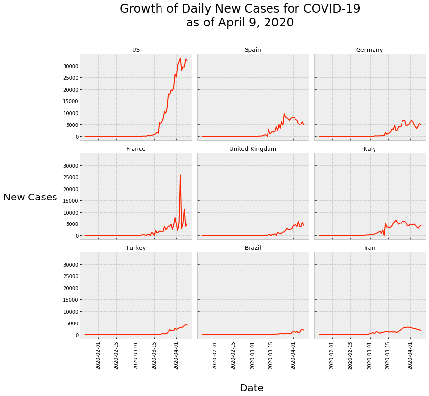
Create small multiple of daily covid-19 cases
Here, we’ll plot the subset of data in covid_data_country_sub as a small multiple chart.
I’m going to give you the code and show you the output, and explain it after.
grid_layout = sns.FacetGrid(covid_data_country_sub
                            ,col = 'country'
                            ,col_wrap = 3
                            ,col_order= covid_top9_countries.values
                            ,aspect = 1.2
                            )
grid_layout.map(sns.lineplot, 'date', 'new_cases',color ='#FF2700')
grid_layout.set_titles('{col_name}')
for ax in grid_layout.axes:
    ax.set_xlabel("")
    ax.set_ylabel("")
for ax in grid_layout.axes:
    for label in ax.get_xticklabels():
        label.set_rotation(90)
grid_layout.fig.text(0.5, -.1,'Date', fontsize=20) #add text
grid_layout.fig.text(-0.12, .5,'New Cases', fontsize=20) #add text
grid_layout.fig.suptitle('Growth of Daily New Cases for COVID-19\nas of April 9, 2020'
                         ,y = 1.12
                         ,fontsize = 24
                         )
OUT:
So what do we have here?
This is a small multiple plot that shows the daily new cases, by day, for the top 9 countries with the most daily cases (as of April 9, 2020).
As you can see, there’s a line chart (like the one we initially made for only the USA) for each of the 9 countries. And the line charts are laid out in a grid form. This form makes them easy to compare.
In terms of syntax, the two most important pieces of code here are grid_layout = sns.FacetGrid() and grid_layout.map(sns.lineplot, 'date', 'new_cases').
The line of code that contains grid_layout = sns.FacetGrid() just establishes the grid layout for the plot. It tells Seaborn that we’ll be plotting the covid_data_country_sub dataframe, and that the different panels (i.e., the “columns” of the grid) will be the values of the country variable.
The line of code with grid_layout.map(sns.lineplot, 'date', 'new_cases') indicates that we want to plot a Seaborn lineplot inside of each panel, with date on the x axis, and new_cases on the y axis.
Everything else is just formatting.
To be clear, the formatting is a little bit of a pain in the a**.
Having said that, that’s all the more reason to master Seaborn and master Python data science in general.
If and when you’re ready to really master these skills, you should check out one of our Python courses.
Next steps
There’s quite a bit more that we can do with this dataset and some of the related datasets.
I definitely want to make a heatmap of the daily new cases.
I also want to possibly plot the “7 day rolling average” of the daily new cases.
It would also be great to make a world map of the cases.
There’s a lot more that we can do …. and there will be several more tutorials showing you how to do these things, step by step.
If you want to see what we do next, make sure to sign up for our email list.
Sign up to learn more
Do you want to see the next tutorial and the other tutorials in this series?
Sign up for our email list now.
When you sign up, you’ll get our tutorials delivered directly to your inbox.
Another superb tutorial Josh. Today’s tutorial allows me to practice small, multiple charts at the state and county level but first I need to become better at Pandas to wrangle the data. Thank you very much for the seeds of learning you provide and hopefully I can use these “underused” charts in future blogs.
Keep the awesome tutorials coming and I can’t wait for the next one!
Many thanks, Michael
Looking forward to this. Many thanks!
????????????