Right now, many people are pursuing data science because they want to learn artificial intelligence and machine learning. And for good reason. Machine learning is white hot right now, and it will probably reshape almost every sector of the world economy.
Having said that, if you want to be a great machine learning expert, and a great data scientist in general, you need to master data visualization too.
This is because data visualization is a critical prerequisite for advanced topics (like machine learning), and also because visualization is very useful for getting things done in its own right.
So let’s talk a little more about data visualization. As you begin learning data visualization in R, you should master the basics: the how to use ggplot2, how to think about data visualization, how to make basic plots (like the bar chart, line chart, histogram, and scatterplot).
And I really mean that you need to master these basics. To be a great data scientist, you need to be “fluent” in these basics. You should be able to write the code for basic charts and plots without even thinking about it. If you can’t, you should go back and practice them. Don’t get shiny object syndrome and try to move on to advanced topics before you do. Show some discipline. Master the foundations.
After you do master the foundations though, you’ll need to learn some intermediate tools.
One such thing that you’ll need to learn is how to work with color. Specifically, you’ll need to learn how to manipulate the “fill” color of things like density plots (as well as heatmaps).
With that in mind, let’s take a look at using color in density plots.
As always, we’re going to use the meta-learning strategy of learning the tools with basic cases. Essentially, we’ll learn and practice how to modify the
As always, first we will load the packages we will need.
#--------------
# LOAD PACKAGES
#--------------

library(tidyverse)
library(viridis)
library(RColorBrewer)
Next, we will set a “seed” that will make the dataset exactly reproducible when we create our data. Without this, running
#---------
# SET SEED
#---------
set.seed(19031025)
Now, we will create our data frame.
We will use
#------------------
# CREATE DATA FRAME
#------------------
df.data <- tibble(x = runif(20000)
                  ,y = rnorm(20000)
             )
Now that we have a dataset created, let's create a simple plot of the data. Ultimately, we will be working with density plots, but it will be useful to first plot the data points as a simple scatter plot.
Here, we're using the typical
#--------------------
# CREATE SCATTER PLOT
#--------------------

ggplot(df.data, aes(x = x, y = y)) +
  geom_point()
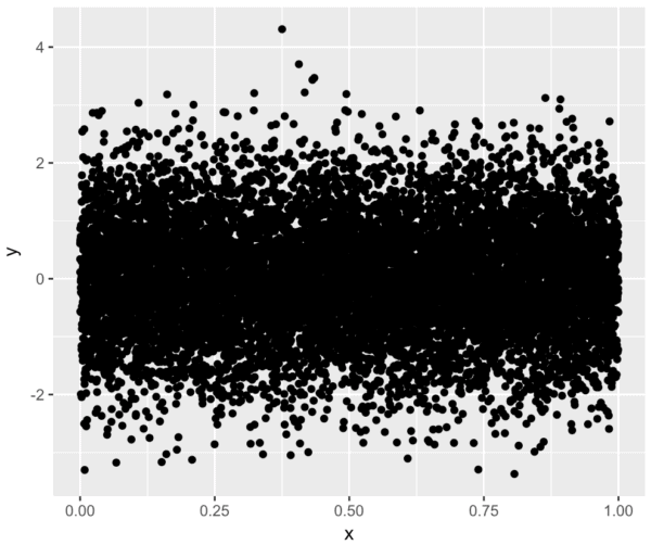
Ok. We can at least see the data points and the general structure of the data (i.e., the horizontal band).
Having said that, these data are very heavily overplotted. There are a few ways to mitigate this overplotting (e.g., manipulating the alpha aesthetic), but a great way is to create a density plot.
To create the density plot, we're using
#------------------------------
# DENSITY PLOT, w/ DEFAULT FILL
#------------------------------

ggplot(df.data, aes(x = x, y = y)) +
  stat_density2d(aes(fill = ..density..), geom = 'tile', contour = F)
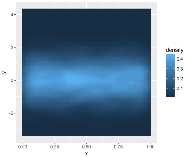
This isn't bad. It gives us a sense of the density of the data (you can see the thick band across the middle). However, there are two issues.
First, the differences in density are not completely obvious, because of the color scale. The default light blue/dark blue color scheme doesn't illuminate the differences in data density.
Second, this is just not very aesthetically appealing. It just doesn't look that good.
To fix these issues, let's modify the color scheme. I'll show you a few options. Some will work better than others, and after you see these, I'll encourage you to experiment with other color palettes.
Let's first take a look at the color palette options.
You can examine a large number of ready-made color palettes from the
#-----------------------
# DISPLAY COLOR PALETTES
#-----------------------

display.brewer.all()
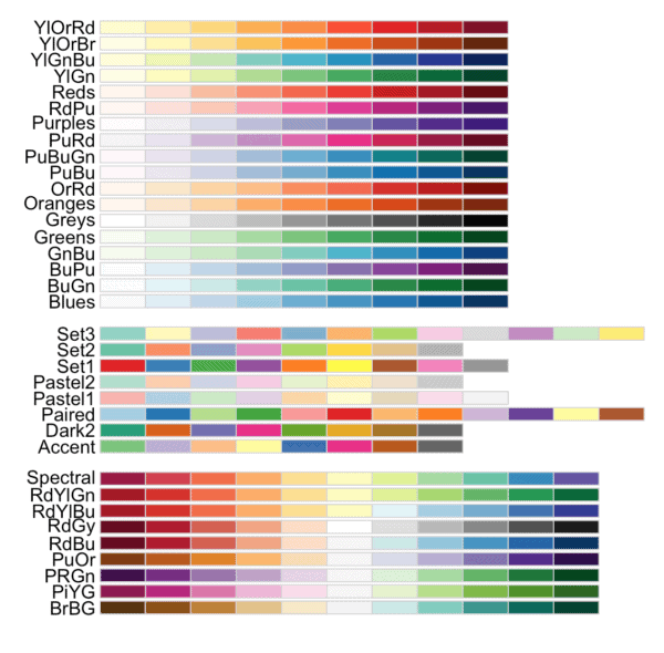
As you can see, there are quite a few palettes from
#--------------------------------
# FILL WITH COLOR PALETTE: Greens
#--------------------------------

ggplot(df.data, aes(x = x, y = y)) +
  stat_density2d(aes(fill = ..density..), geom = 'tile', contour = F) +
  scale_fill_distiller(palette = 'Greens')
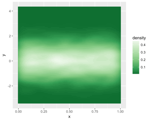
Now let's use a few more color palettes.
#------------------------------------------------------
# FILL WITH COLOR PALETTE: Reds, Greys, Red/Yellow/Blue
#------------------------------------------------------

ggplot(df.data, aes(x = x, y = y)) +
  stat_density2d(aes(fill = ..density..), geom = 'tile', contour = F) +
  scale_fill_distiller(palette = 'Reds')
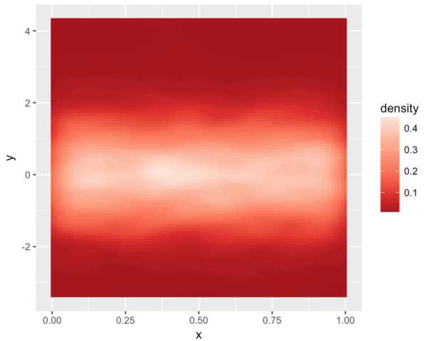
... grey
ggplot(df.data, aes(x = x, y = y)) +
  stat_density2d(aes(fill = ..density..), geom = 'tile', contour = F) +
  scale_fill_distiller(palette = 'Greys')
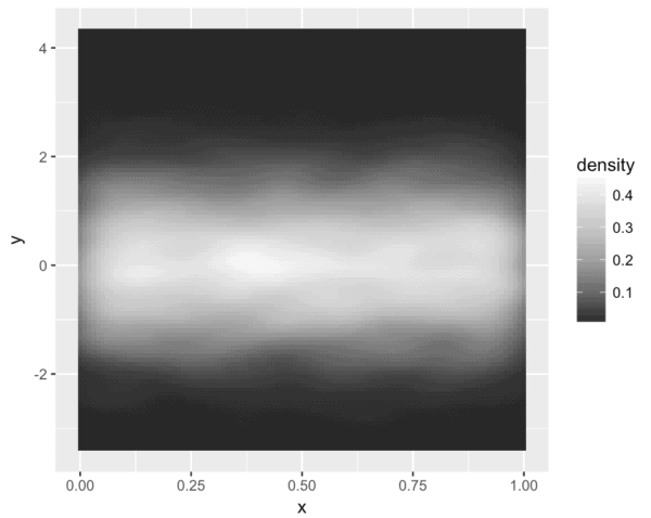
... and a scale from red, to yellow, to blue.
ggplot(df.data, aes(x = x, y = y)) +
  stat_density2d(aes(fill = ..density..), geom = 'tile', contour = F) +
  scale_fill_distiller(palette = 'RdYlBu')
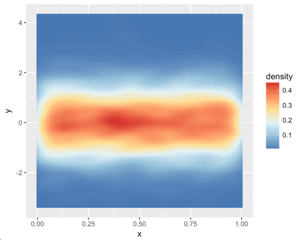
These aren't bad.
I think they work a little better than the default color scheme, but I think we can do better, so let's try one more.
The following plot uses a custom color palette from the
#---------------------------------
# FILL WITH COLOR PALETTE: Viridis
#---------------------------------

ggplot(df.data, aes(x = x, y = y)) +
  stat_density2d(aes(fill = ..density..), geom = 'tile', contour = F) +
  scale_fill_viridis()
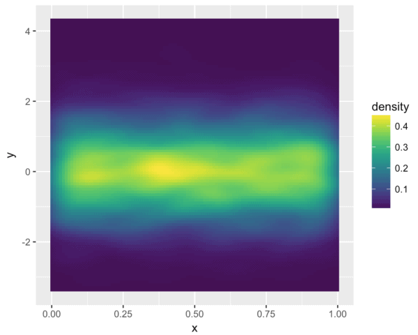
I should have called this blog post "ggplot for people who love Mark Rothko."
Ok, the viridis color palette (and a related set of palettes in the
Master these techniques with simple cases
Admittedly, when you move on to more complex datasets later, it will take a bit of finesse to properly apply these color palettes.
But as I noted earlier, when you're trying to master
With that in mind, if you want to master these color and fill techniques, learn and practice these tools with simple cases like the ones shown here, and you can attempt more advanced applications later.
Sign up now, and discover how to rapidly master data science
To master data visualization and data science, you need to master the essential tools.
Moreover, to make rapid progress, you need to know what to learn, what not to learn, and you need to know how to practice what you learn.
Sharp Sight is dedicated to teaching you how to master the tools of data science as quickly as possible.
Sign up now for our email list, and you'll receive regular tutorials and lessons.
You'll learn:
- How to do data visualization in R
- How to practice data science
- How to apply data visualization to more advanced topics (like machine learning)
- ... and more
If you sign up for our email list right now, you'll also get access to our "Data Science Crash Course" for free.