Ok … welcome back to this covid19 data analysis series with R.
In this series, we’re analyzing covid19 data with the R programming language.
So far in this series, we’ve done several things:
- We retrieved a simple covid19 csv file in part 1
- In part 2, we created a process to retrieve several related covid19 datafiles, clean them up, and merge them into a single “master file”
- Later, in part 3, we began to explore the data, largely using dplyr and subsetting techniques
- Most recently, in part 4, we began visualizing the data … and really, we were using data visualization to explore our data further
If you haven’t read those yet, you might want to go back to those tutorials to understand what we’ve done so far.
Now, in this tutorial, I want to talk to you about something that happens often, but something that you’ll probably never learn about in standard data science tutorials.
I want to talk about finding problems in data, and what to do.
We explore our data to check our data
One of the reasons that we explore our data is that we’re trying to validate the data.
We’re trying to make sure that the numbers are correct. We’re trying to ensure that the data are accurate. And we’re trying to ensure that the data are “clean.”
How we often approach this is to simply explore and inspect the data.
You saw this back in parts 3 and 4 of this series.
In part 3, we used dplyr to explore our data.
Specifically, we:
- generated subsets
- examined unique values of categorical variables
- looked at ranges (i.e., minima and maxima) for some of our numeric variables
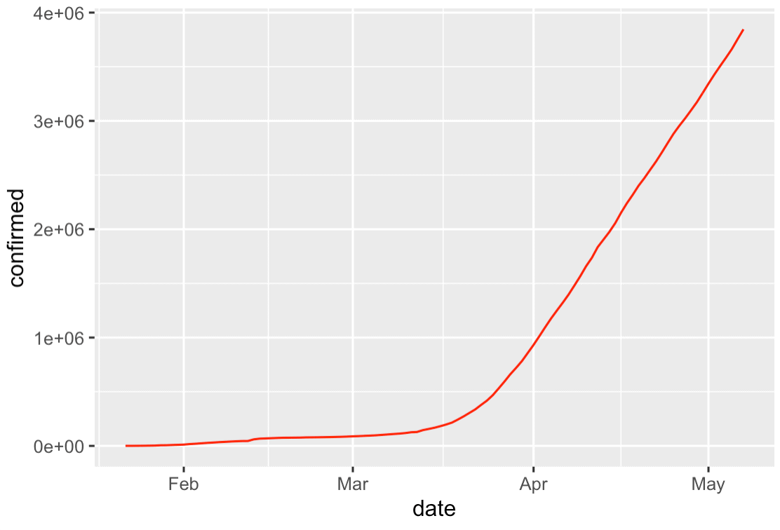
In part 4, we expanded on this by visualizing the data with ggplot2. We did simple things just to get an overview. For example, we plotted a line chart of the worldwide covid19 cases over time:
Again, in part, we did these things partially just to explore the data.
When we created those relatively simple charts, we found a few high-level charts that could help us “tell a story” with our data, but we didn’t really find any anomalies.
At least … not in the charts I showed you.
Mo data, mo problems
If you master the core data science skillset, you become very skilled at cleaning data.
What I mean, is that you become skilled enough to clean a dataset well. Subsequently, you won’t run into many problems once you start exploring.
So to go back to our tutorial series: we imported, cleaned, and merged our data in parts 1 and 2.
Without patting my self on the back too much, I’m fairly skilled with dplyr and R. So I was able to “clean” the data and wrangle it into shape.
So by the time I got to the “data exploration” steps in parts 3 and 4, yes, I was looking for possible problems in the data, but I didn’t really find anything bad. So those data exploration steps were less about finding problems, and more about getting an overview of the data, the values in the variables, etc.
But sometimes, the more you dig, the more you find.
Finding a “problem” halfway through a project
So let me tell you about a “problem” that I discovered as I started digging further into the data (and what you can learn from it).
As I was writing the blog post for part 4 (the part where we started exploring the data visually), I began by just writing the code for the charts.
I literally followed the data analysis process that I teach in our premium Sharp Sight data science courses: “overview first, zoom and filter, details on demand.”
(Yes … there’s a process that you can use to analyze your data, once you’ve mastered the data science toolkit.)
Again, in our data analysis process, the first step is to get an overview.
I followed the process and created our high-level bar charts, scatter plots, and histograms.
But after I created the high-level charts, I wanted to “drill in” to the data.
That’s part of our data analysis process. You start with the overview, then “zoom and filter” to get more detail.
Seeing the problem (literally)
So after creating those high level charts, I created a small multiple chart.
A small multiple chart is a great way to zoom in on different categories in a dataset to get more detail.
A small multiple chart takes a high level “overview” chart, and breaks it out into small versions of that chart … one small version each category of a categorical variable.
Given our data analysis process of “overview first, zoom and filter, details on demand”, the small multiple is perfect tool to “zoom in” on our data.
Small multiple of covid19 new cases
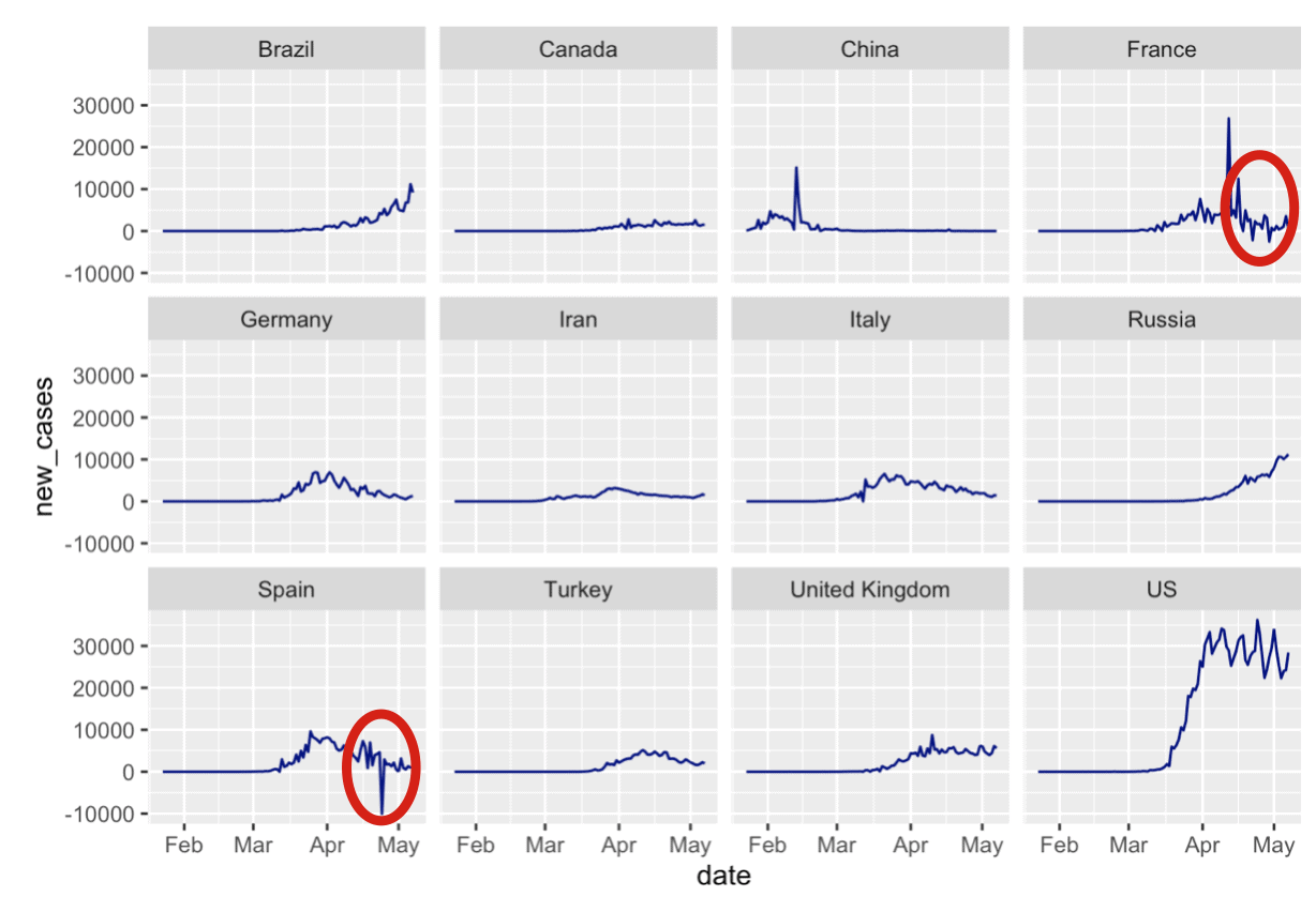
Specifically, I created a small multiple chart of new covid19 cases, broken out by country (i.e., one panel for every country, although I limited it to the top 12 countries).
When I created the chart, I immediately spotted a problem.
I’ll show you the chart so you can see it, and also give you the code so you can create this yourself.
To create this small multiple chart, we’ll import some packages, import the data, and then plot it with dplyr and ggplot2.
import packages and data
First, let’s import the R packages and data.
#================
# IMPORT PACKAGES
#================
library(tidyverse)
library(lubridate)

#=========
# GET DATA
#=========
file_path <- "https://www.sharpsightlabs.com/datasets/covid19/covid_data_2020-05-08.csv"
covid_data <- read_delim(file_path,delim = ";")
Create small multiple
Now we can create the small multiple chart.
#--------------------------
# IDENTIFY TOP 12 COUNTRIES
#--------------------------
covid_data %>%
  filter(date == as_date('2020-05-03')) %>%
  group_by(country) %>%
  summarise(confirmed = sum(confirmed)) %>%
  arrange(-confirmed) %>%
  top_n(12, confirmed) ->
  covid_top_12

#--------------------------
# PLOT SMALL MULTIPLE CHART
#--------------------------
covid_data %>%
  filter(country %in% covid_top_12$country) %>%
  group_by(country, date) %>%
  summarise(new_cases = sum(new_cases)) %>%
  ggplot(aes(x = date, y = new_cases)) +
    geom_line() +
    facet_wrap(~country, ncol = 4)
If you run that code, here's what you get:
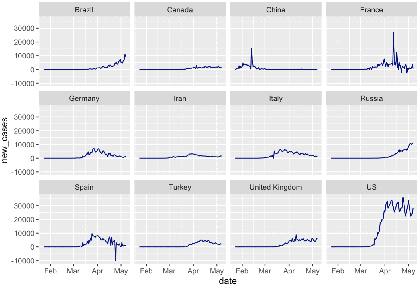
Wait ....

Do you see that?

Are those negative values in the new cases for Spain?
F*ck.
No matter what, you'll probably find a problem in your data
Before I explain what's going on here, I want you to understand:
No matter what you do, you'll often find a problem in your data.
Maybe something big. Maybe something small.
Maybe something that is explainable or doesn't matter, or maybe something you really need to fix.
But, it's very common to find a problem.
To be honest though that's exactly why we explore our data
Remember: we use visualizations to explore data
We use data visualizations for two major purposes:
- to find insights
- to communicate insights
That first one is important in the context of "data exploration".
When we explore our data, we're trying to "find insights" in the data.
Sometimes, that's about some external, end result. For example, if I'm working with a marketing dataset, I'll try to "find insights" that will improve marketing campaigns.
But we can also use data visualization to find insights about the data itself ... to check the data. Again, we do this in an effort to try to make the data as clean and accurate as possible.
If there's a problem in the data, I want to find it. I want to find it early.
And if there's a problem in the data, I can use data visualization to literally see the problem.
So are the negative values a problem?
With all that said, let's get back to the dataset.
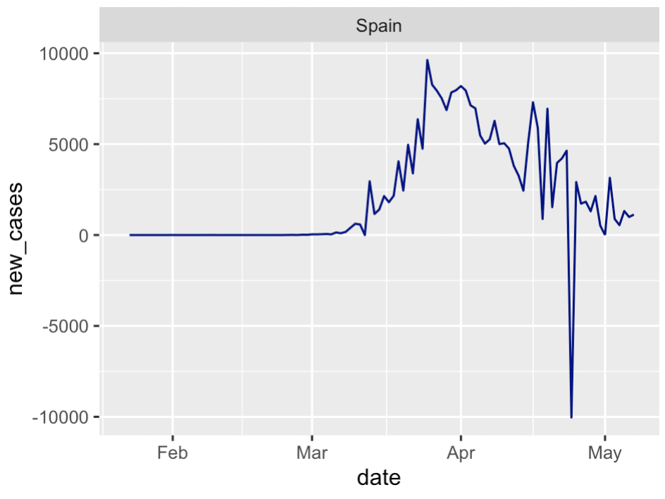
When you look at this small multiple chart, you can actually see a few anomalies. The most obvious one is in Spain around the end of April. There seem to be some other, similar anomalies for the France data as well.
When you find something like this, the first thing that you want to do is just try to compare against another authoritative source, if one exists.
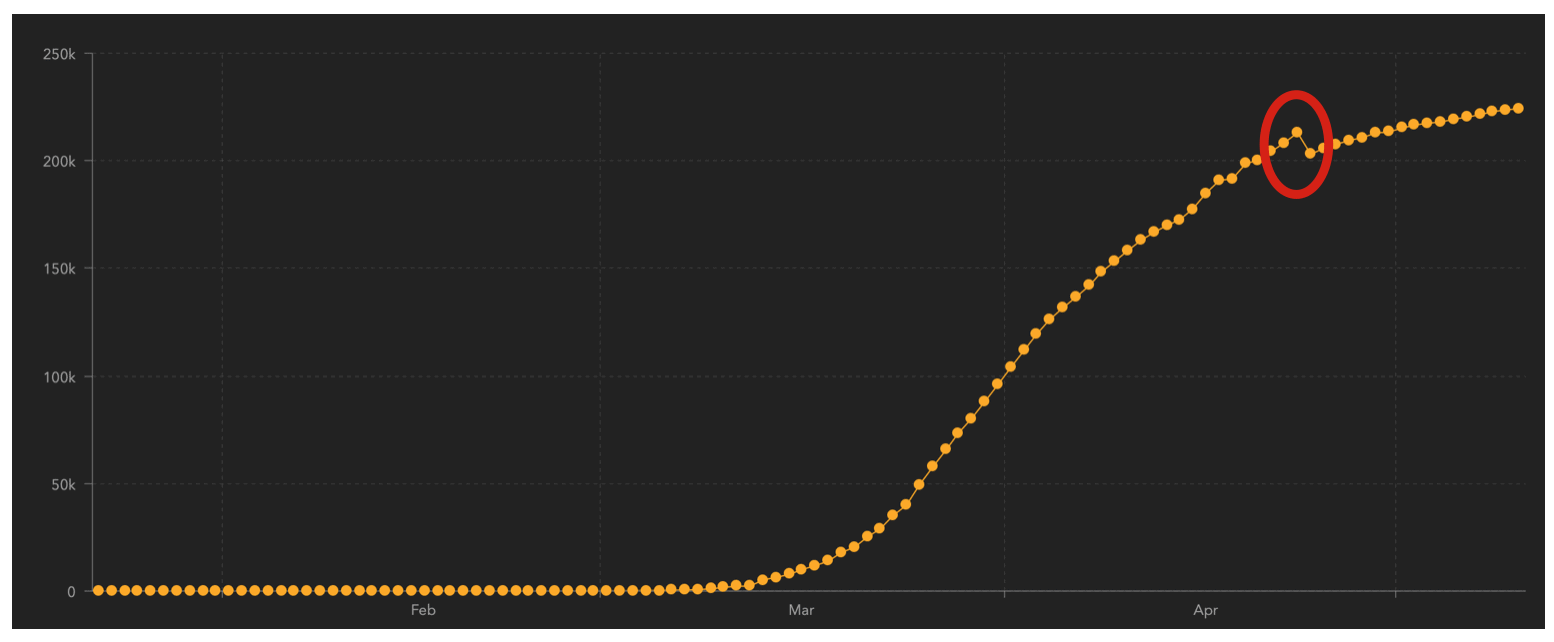
So in this case, I went back to the Johns Hopkins covid19 dashboard and looked at the data for Spain (you can pull up the data for specific countries).
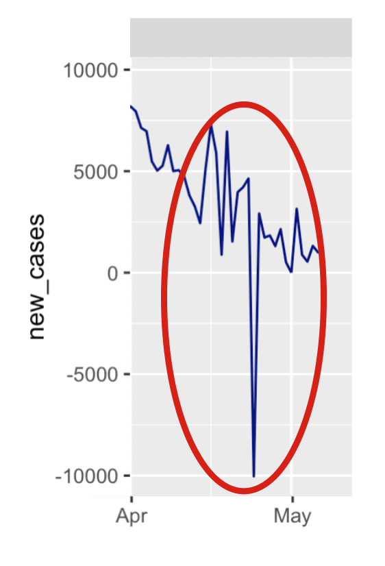
What I found is that there's a drop in confirmed cases in Spain on April 24.
Then I went back to our covid_data dataset and performed a print statement.
# PRINT RECORDS
covid_data %>%
  filter(country == 'Spain') %>%
  filter(month(date) == '4') %>%
  print(n = 30)
OUT:
# A tibble: 30 x 9
   country subregion date         lat  long confirmed  dead recovered new_cases
   [chr]   [chr]     [date]     [dbl] [dbl]     [dbl] [dbl]     [dbl]     [dbl]
...
21 Spain   NA        2020-04-21    40    -4    204178 21282     82514      3968
22 Spain   NA        2020-04-22    40    -4    208389 21717     85915      4211
23 Spain   NA        2020-04-23    40    -4    213024 22157     89250      4635
24 Spain   NA        2020-04-24    40    -4    202990 22524     92355    -10034
25 Spain   NA        2020-04-25    40    -4    205905 22902     95708      2915
26 Spain   NA        2020-04-26    40    -4    207634 23190     98372      1729
27 Spain   NA        2020-04-27    40    -4    209465 23521    100875      1831
...
In this output here, I removed some of the rows just to save space ...
But look at row 24. That's the data for April 24, 2020. You can see the drop in new cases of -10,034 in the new_cases column. You can also see the drop in the confirmed column if you just subtract the data for April 23 from April 24 (i.e., if you calculate the new cases manually using the data in the confirmed column).
So here, we've actually identified the exact date where this anomaly occurred.
Moreover, we can check this data against the data in the "authoritative" source ... the JHU dashboard.
When we do this, we can see that our data for confirmed cases exactly matches the data in the JHU data for Spain. (To do this, you can select the data for Spain in the JHU dashboard and hover over the points in the line chart to get the number of confirmed cases for a particular day.)
Our data are okay ... but there's a lesson
After investigating a little bit, it looks like our data are okay. At least, the dataset is consistent with the official JHU data.
Ideally, we'd want to find out the exact reason for this drop in confirmed cases. It's likely a revision of the data or a change in how the confirmed cases were being reported (I checked the JHU data store on Github, but the actual cause wasn't explained.)
Having said that, identifying this problem though is a time point to reinforce some important lessons ... lessons that you probably don't hear enough.
(This is a teachable moment, you guys.)
Lesson 1: Always check your data
Always check your data.
Check your data repeatedly.
Look at your data from different perspectives.
Check your data after every major operation. Then check it extensively after you've created a finalized dataset
Lesson 2: Issues and discrepancies are common, so look for them
Issues and discrepancies are common.
A lot of data science students learn data science with "clean" data. Students often work with and practice with "clean" data. For example, the iris dataset in R or the diamonds dataset from ggplot2. These datasets are relatively clean. Most datasets that that are used in books or courses are also similarly clean.
That's actually good in many ways, because it simplifies learning.
But in the real world, data are messy.
It's very, very common to find discrepancies or issues with your data.
One type of error is that you find a number that doesn't make sense, like in our example above with the drop in Spanish new cases.
A different type of issue is your data might be different than a different dataset.
For example, your business might have multiple teams, and those teams might have different numbers for the same metric.
One particular example of this is when I worked as a data scientist at a big American Megabank. At this bank, we had several different data science teams in different departments. These teams often had different databases. Sometimes, there would be a cross-department project, and different teams would pull their data from those different databases. The data would sometimes be different, and we'd all need to compare the datasets and account for the differences.
I hate to say it, but that's part of the job.
Expect issues and discrepancies, and look for them.
Lesson 3: master data visualization
Since you need to check your data and look for possible problems, you need the right toolkit.
Data visualization is what you need.
Trust me on this.
If you print out your data using a print() statement, do you think you'll see an error in dozens, even thousands of lines of data?
No.
Of course not.
But if you plot the data using an information-rich visualization technique like a small multiple chart, you will be much more likely to see the problems. If you master the tools, and you apply the right data exploration process, you'll see possible issues almost immediately.
I can't emphasize this enough: if you want to be able to check, validate, and analyze your data, you must master data visualization.
To master data visualization in R, enroll in one of our courses
As we frequently discuss here at the Sharp Sight blog, in order to master data visualization in R, you really should master dplyr and ggplot2.
If you're serious about learning these skills, then you should consider enrolling in one of our premium R data science courses.
For example, our comprehensive R data science course, Starting Data Science with R, will open for enrollment next week.
Sign Up to Learn More
In addition to our paid courses, we also regularly post free R and Python tutorials here at the Sharp Sight blog.
If you want free data science tutorials delivered to your inbox, sign up for our email list.