
Welcome back. Hopefully you’ve been following along with our R data analysis series. This tutorial is part of a series of tutorials analyzing covid-19 data with R.
So far in this series, we’ve used R to retrieve a simple covid19 dataset. Later, we used R to create a repeatable process for data retrieval and cleaning. And we also used R (namely, dplyr) to start exploring the data.
If you haven’t been following along, or you want to refresh your memory, you can go back to parts 1, 2, and 3:
- part1: basic data retrieval
- part2: dataset creation
- and part3: initial data exploration
So at this stage we have a dataset, and we have a rough idea of what’s in that data.
Now, we want to explore that data visually using data visualization.
Covid19 analysis, part 4: visual data exploration
In this tutorial, we’ll explore our covid19 data using data visualization.
More specifically, we’ll be using R’s ggplot2 to create some simple data visualizations like line charts and bar charts.
To be clear: this is sort of an extension of the data exploration that we did in part 3. In part 3, we primarily used dplyr to subset our data to look at the contents of specific rows and columns.
Here, we’ll still just be looking at our data, but we’ll be using visual tools.
As I said: this is still sort of like data exploration.
When you get a new dataset, you almost always want to visualize it in a variety of ways, just to see if anything is interesting, and to see if any charts “tell a story.” You’re looking for insights the way a gold miner pans for gold.
Tools we’ll use in this tutorial
In this tutorial, we’ll mostly be using ggplot2 and dplyr.
For those of you who are a little unfamiliar, ggplot2 is the premier data visualization toolkit for R these days.
Having said that, in order to really use ggplot2 properly you almost always need to subset or wrangle your data into new shapes. So here, we’ll be using ggplot2 in combination with dplyr.
Skills you need
With that in mind, it will be helpful if you have a solid understanding of ggplot2 and dplyr.
If you don’t, that will still be okay … you can still copy-paste the code and run it. I’ll also explain a lot of the code here, and provide links to some older tutorials that will explain some of the techniques in greater detail.
But if you really want to increase your skill, so you really understand this tutorial, and so you can do work like this on your own, you should consider enrolling in our premium R course. Our premium R course, Starting Data Science, will teach you both ggplot2 and dplyr, as well as several other important R toolkits.
A brief table of contents
Our general process in this tutorial will be just to create quite a few visualizations and try to see if anything “pops.”
If we find anything interesting, we can decide to explore further.
That said, the tutorial is organized into sections, but the order of those sections isn’t particularly important.
Table of Contents:
- Get data and install packages
- Basic data inspection
- Create a scatterplot
- Make bar charts
- Create line charts
- Closing remarks about visualization and visual exploration
You can use these links to jump to a particular section in the tutorial.
A quick note: these aren’t meant to be perfect
As I mentioned earlier, we’re still sort of exploring the data … we’re just using visual tools.
As such, these visualizations are not meant to be perfect.
They are meant to be “rough” drafts.
If we find something we like, we can refine it or modify it later.
Ok … let’s get started.
Get Data and Packages
First, before we make any visualizations, we need to import some packages and get our dataset.
Import Packages
As I mentioned previously, we’ll primarily be using ggplot2 and dplyr. These packages can both be loaded with the tidyvese pacakge (which includes a variety of related packages for data manipulation and data visualization in R).
We’ll also need to get lubridate in order to do a little date manipulation.
You can run the following code to import tidyverse and lubridate packages:
#================
# IMPORT PACKAGES
#================
library(tidyverse)
library(lubridate)
Import data
Next, we’ll get our data.
Here, you actually have two options.
Option 1:
You can go back to part 2 and recreate the covid19 dataset yourself. All of the code is there, and with only a little knowledge, you should be able to modify it to get an up-to-date covid19 dataset.
That option will give you the most up-to-date data.
Option 2:
On the other hand, the simpler option is simply downloading a pre-created dataset.
To make things easy for you, I ran the code in part 2 and created a dataset for you.
The data was created on May 8, so if you use this file at any point after May 8, the data will not be completely up-to-date. It’ll still work though, and it’s faster.
It’s up to you.
If you want to download the pre-created data from May 8, you can run the following code:
file_path <- "https://www.sharpsightlabs.com/datasets/covid19/covid_data_2020-05-08.csv"
covid_data <- read_delim(file_path,delim = ";")
Ok.
Assuming that you've retrieved the covid19 data using one of those options, you'll be ready to start using that data.
Basic Data Inspection
Very quickly, let's do some simple data inspection.
We did quite a bit of data exploration and subsetting in part 3, and if you didn't review that post yet, I strongly recommend that you do. That post will help you understand what's in the data.
But to quickly re-acquaint yourself with the data, you can print out a few rows.
Print rows
First, let's just print a few rows with the print() function.
# PRINT ROWS
covid_data %>% print()
OUT:
# A tibble: 28,462 x 9
   country    subregion date         lat  long confirmed  dead recovered new_cases
   [chr]      [chr]     [date]     [dbl] [dbl]     [dbl] [dbl]     [dbl]     [dbl]
 1 Afghanist… NA        2020-01-22    33    65         0     0         0        NA
 2 Afghanist… NA        2020-01-23    33    65         0     0         0         0
 3 Afghanist… NA        2020-01-24    33    65         0     0         0         0
 4 Afghanist… NA        2020-01-25    33    65         0     0         0         0
 5 Afghanist… NA        2020-01-26    33    65         0     0         0         0
 6 Afghanist… NA        2020-01-27    33    65         0     0         0         0
 7 Afghanist… NA        2020-01-28    33    65         0     0         0         0
 8 Afghanist… NA        2020-01-29    33    65         0     0         0         0
 9 Afghanist… NA        2020-01-30    33    65         0     0         0         0
10 Afghanist… NA        2020-01-31    33    65         0     0         0         0
# … with 28,452 more rows
As you can see, we have two "character" variables: country and subregion. These are just what they sound like ... the country and subregion within a country (if it's reported).
There's a date variable that gives us the date for the data recorded in a particular row.
There's lat and long (latitude and longitude).
And then we have confirmed, dead, recovered, and new_cases. These are the actual counts of the number of people who have had covid, the number who died, recovered, etc. The new_cases variable tells us the number of new cases for that day for a particular country/subregion (compared to the previous day).
Seeing this data will give us some ideas about what visualizations to create.
Numeric variables and date variables can be used for line charts.
Pairs of numeric variables can also be used for scatterplots.
Categorical character data is often good for bar charts, but if we're dealing with 150+ countries, we'll need to subset that down to a reasonable number of values.
Again: knowing your data helps you understand what visualizations are possible.
Simple visualizations of the covid-19 dataset
Now that we have the data and we roughly know what's in it, let's visualize.
Scatter plot
Let's start with a scatterplot.
Scatterplots are often a good starting point, just because they're usually sort of easy.
Here, we'll create a scatter plot of confirmed cases vs deaths for different countries.
Wrangle data and plot
To create this chart, we actually need to wrangle our data a little bit.
The dataset is organized at the country/subregion/date level. There's one row of data for every combination of country, subregion, and date.
Some countries (like the US) don't have any subregions listed, so it's strictly at the country level. Other countries (like China) do have subregions listed in the data.
Therefore, if we want to look at data at the country level, we need to aggregate the data.
The way to do that with the Tidyverse is with group_by() and summarise().
Here, we're going to take our dataset, covid_data, and pipe it into filter() to subset down to the data for May 7.
Then, we're selecting only a few variables.
Then, we're grouping by country, and summarising to calculate the total confirmed and dead by country (our grouping variable).
We're taking the output of that dplyr pipeline and piping it into ggplot2. We're using geom_point() to create a scatterplot.
covid_data %>%
  filter(date == as_date('2020-05-07')) %>%
  select(country, confirmed, dead, recovered) %>%
  group_by(country) %>%
  summarise(dead = sum(dead)
            ,confirmed = sum(confirmed)
            ) %>%
  ggplot(aes(x = confirmed, y = dead)) +
    geom_point()
Here's the output:
OUT:
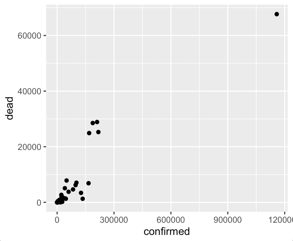
Frankly, this chart is a little uninteresting.
That's okay.
Data visualization and visual data exploration are iterative.
The best way to find something interesting is to create a lot of charts that are uninteresting. We'll often create a few things, refine, iterate, etc. So it's okay if some of your charts are a little dull.
Having said that, this gives us a quick view of the confirmed cases and deaths for different countries, and enables us to quickly compare.
One thing that obviously stands out, is the outlier point in the upper right hand corner. We'll learn more about that country in a minute when we make our bar charts.
Bar charts
Let's make a few bar charts.
As we just saw, there is one country that seems to have a lot more confirmed cases and deaths than the others. You can possibly guess which country that is, but we can use a visualization to get a better look.
Here, we're going to create a bar chart of the top 15 countries with the most confirmed cases.
As in the previous section, to do this, we'll need to do some data manipulation before we actually plot the data.
Wrangle Data and make bar chart
To make our bar chart, we'll wrangle the data with dplyr functions and then pipe the output into ggplot().
We'll start at the top of the pipeline with the covid_data dataset.
Then, we'll use the filter() function to subset down to the rows of data for May 7 (the most recent data in the dataset I'm using).
Then we'll select the variables that we're interested in, group by country, and then summarise to compute the total confirmed cases at the country level.
Here, we're using arrange() to sort the data by the number of confirmed cases (in descending order).
And we're using top_n() to select the top 15 countries.
The output of that whole pipeline is being piped into ggplot(), and we're using geom_bar() to create a bar chart.
covid_data %>%
  filter(date == as_date('2020-05-07')) %>%
  select(country, confirmed) %>%
  group_by(country) %>%
  summarise(confirmed = sum(confirmed)) %>%
  arrange(-confirmed) %>%
  top_n(15) %>%
  ggplot(aes(x = country, y = confirmed)) +
    geom_bar(stat = 'identity', fill = 'darkred')
OUT:
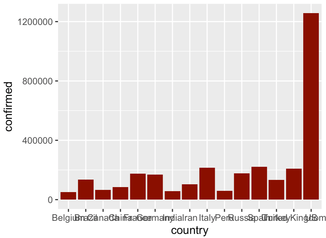
I'm not gonna lie .... this is a little ugly.
The problem is that the bars are out of order and the names overlap.
We'll fix that.
Create horizontal bar chart
Here, we'll modify the previous chart and create a horizontal bar chart.
The data manipulation process will be exactly the same as the previous example.
But now, we'll put the countries on the y axis and the confirmed cases on the x axis.
covid_data %>%
  filter(date == as_date('2020-05-07')) %>%
  select(country, confirmed) %>%
  group_by(country) %>%
  summarise(confirmed = sum(confirmed)) %>%
  arrange(-confirmed) %>%
  top_n(15) %>%
  ggplot(aes(y = fct_reorder(country, confirmed), x = confirmed)) +
    geom_bar(stat = 'identity', fill = 'darkred') +
    labs(y = '')
OUT:
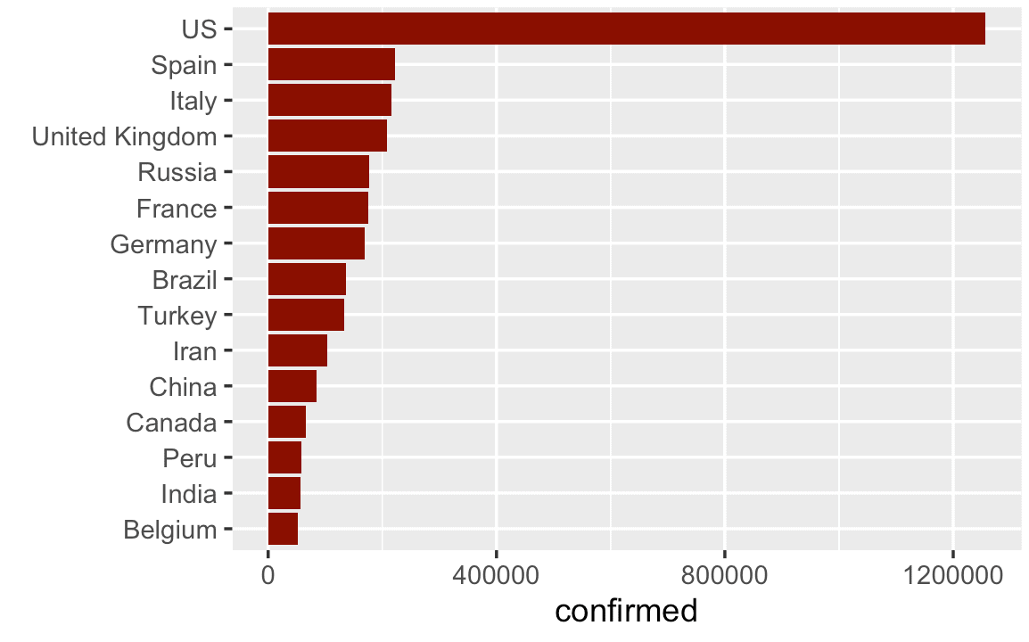
This is much better.
There's still a few more things that we could do (like add a title, etc), but this is really a lot better.
I'm showing this to you so you understand that it's not enough just to know how to build charts and graphs. You need to know how to use them.
Here, we turned this from a vertical bar chart to a horizontal bar chart. (We also sorted the bars with the forcats::fct_reorder() function.)
This simple design choice makes the chart a lot easier to read.
Line charts
Next, let's create some line charts.
Like the previous examples, these charts will require us to use a significant amount of data wrangling to get the data into the right shape.
Line chart of world covid-19 cases over time (excluding China)
First, we'll create a line chart of covid-19 cases verses time, excluding China.
To do this, we'll first aggregate the data, and then we'll plot.
Specifically (and similar to the previous examples), we'll filter down to the data where country is not China.
Aggregating the data by date, so we can compute the total worldwide confirmed cases by date.
We're taking the output of that dplyr pipeline and piping it into ggplot() with geom_line(). The geom_line() function is telling ggplot to plot a line chart.
#===============
# WORLD EX-CHINA
#===============

covid_data %>%
  filter(country != 'China') %>%
  group_by(date) %>%
  summarise(confirmed = sum(confirmed)) %>%
  ggplot(aes(x = date, y = confirmed)) +
    geom_line(color = 'red')
OUT:
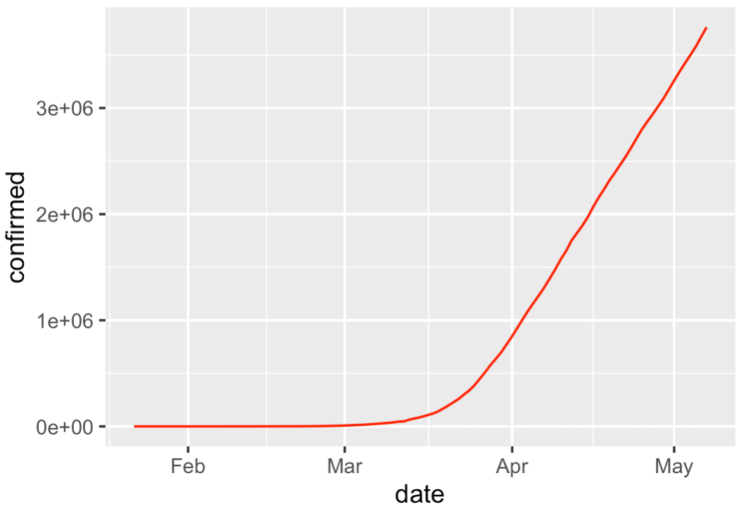
There's not too much here, but it shows something important: the rapid rise of worldwide covid19 cases.
Having said that, I want you to remember that there's a rough process for data analysis that is encapsulated by the mantra "overview first, zoom and filter, details on demand."
Here, we're largely getting an overview of the data. We'll probably drill in later on, or use more exotic techniques to visualize the data in more interesting ways.
Ultimately, I want you to understand that exploring your data like this with simple visualizations is part of the process.
Concerning the plot itself, it's simple, but still looks pretty good ... good enough for right now. We can take something like this and polish it later.
Line chart of world covid-19 cases over time, China vs World
Next, let's do a similar chart.
Here, we're going to create a line chart that shows two lines.
We'll show one line for China, and another line for the rest of the world.
To do this, we need to wrangle our data again and then plot.
Wrangle and plot
Doing this is very similar to the last example.
The major difference is that we will use the mutate() function to create an indicator variable called china_ind that will distinguish between China vs Not-China.
So here, we'll start with the covid_data dataset.
We're piping that into the mutate() function to create our indicator variable, china_ind.
Then we're piping that into group_by() and summarise() to aggregate the confirmed cases by china_ind and date.
And all of that output is being piped into ggplot(). Again, we're using geom_line to create the line chart and here we're using scale_color_manual() to specify different colors for the two different lines.
covid_data %>%
  mutate(china_ind = if_else(country == 'China', 'China', 'Not China')) %>%
  group_by(china_ind, date) %>%
  summarise(confirmed = sum(confirmed)) %>%
  ggplot(aes(x = date, y = confirmed)) +
    geom_line(aes(color = china_ind)) +
    scale_color_manual(values = c('navy', 'red'))
OUT:
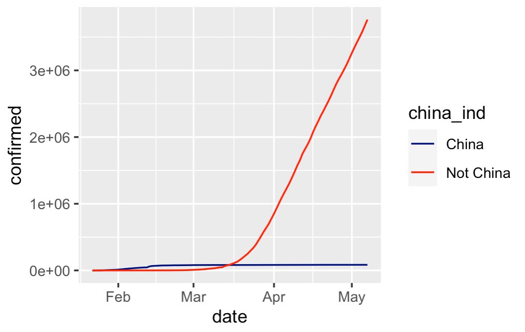
This chart is very simple, and a little rough around the edges, but it tells an important story:
China's cases of covid-19 have tapered off, the the rest of the world has grown dramatically.
There are more ways that we could refine this chart. And there probably some ways that we could "dig in" to find more insights. But this is a good starting point for comparison.
Line chart of important countries over time
Let's do one more line chart.
Here, we're going to create a line chart of a few major countries that have been in the news with major covid outbreaks.
We'll plot the US, China, Italy, Spain, and France.
Wrangle and plot the data
Here, we'll once again wrangle the data with dplyr and plot with ggplot().
This example is very similar to some previous examples, but here we're subsetting the data down to the rows for US, China, Italy, Spain, and France by using the dplyr::filter() function.
#====================
# IMPORTANT COUNTRIES
#====================

covid_data %>%
  filter(country %in% c("US","China","Italy","Spain","France")) %>%
  group_by(country, date) %>%
  summarise(confirmed = sum(confirmed)) %>%
  ggplot(aes(x = date, y = confirmed)) +
    geom_line(aes(color = country)) +
    scale_color_manual(values = c('navy', 'orange','green', 'purple', 'red'))
OUT:
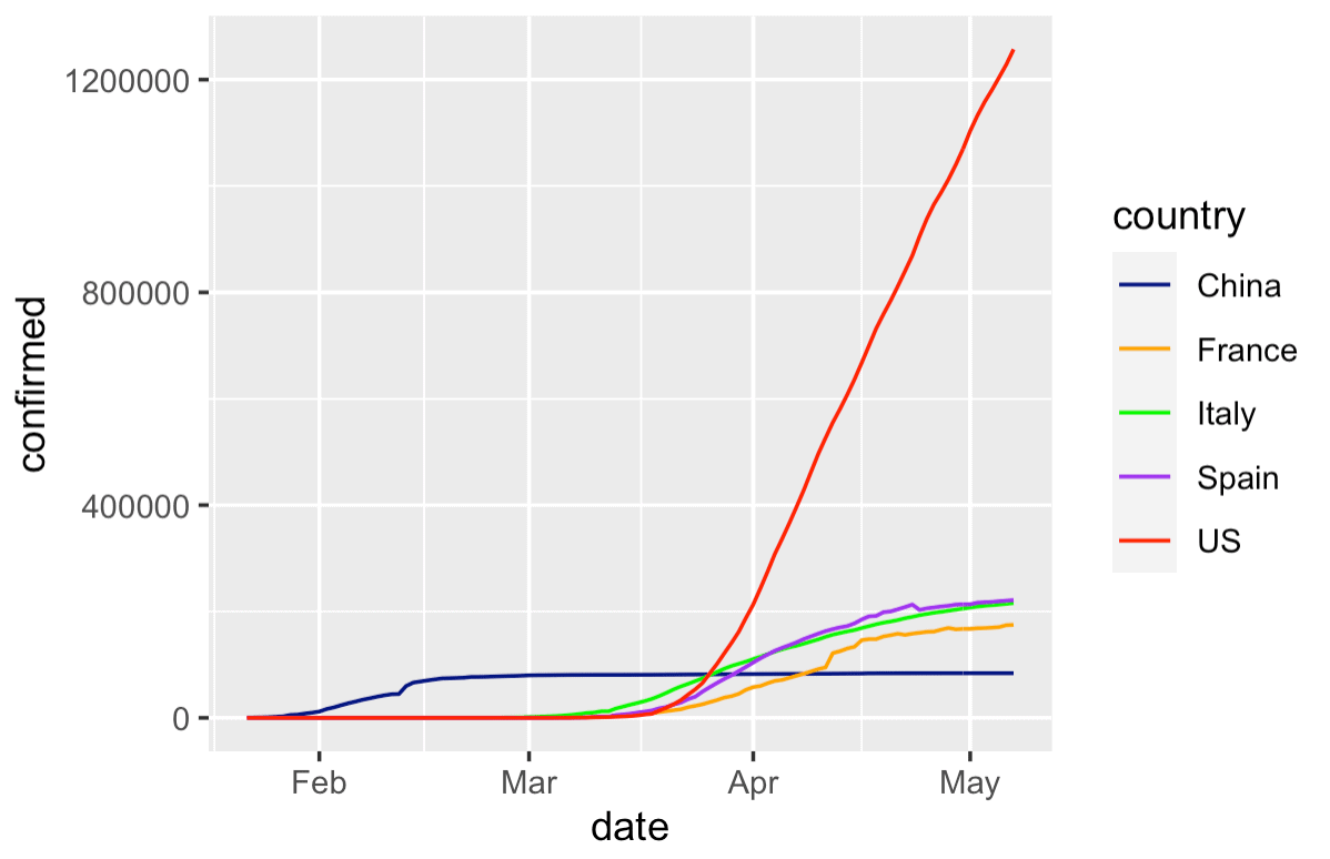
Again, this chart is still a little rough around the edges, but it's okay as a first draft.
This gives us a quick way to compare the growth of covid between a few different countries.
It also gives us a rough template for how to make such a chart .... if we wanted to plot different countries, it would be fairly simple to change the code (try it!).
Closing remarks about visual data exploration
I created this tutorial because I want to show you how I would approach the initial stages of a data analysis or data visualization task.
Notice that none of these data visualizations are perfect. Far from it.
If you think that data visualizations show up perfect and fully formed the first time around, then you have a lot to learn.
Data analysis and data visualization are iterative.
If I was working on a project, I'd probably create these visualizations in rough-draft form and then I'd share them with immediate team members. Maybe I'd call a co-worker over to my desk and say "hey, I just created these ... let's talk about what they mean."
Based on what I see in the charts (or what my colleagues see), we'd form new hypotheses and questions, create more charts, and discuss.
If at any point I find something that's really important, great. I'll "flag" that as important, and return to it later. Eventually, I'll take those important charts and graphs and fully polish them, with better colors, annotations, better fonts, titles, etc. And those finalized, "polished" charts will probably be put into a report or analysis to be sent to someone important.
But in order to get to the professional looking, polished charts, you need to make a lot of rough looking ones.
You Should Master ggplot2 and dplyr
I'm sure you already noticed, but I'll drive the point home:
To create charts and graphs in R, you need to know dplyr and ggplot2.
These are very powerful tools and they're great for data visualization and analysis (and they can do a lot more than we've shown here).
But to use them properly, you need to know them really well.
If you're really serious about data science in R with ggplot2 and the tidyverse, you should consider enrolling in our premium R data science course, Starting Data Science.
Sign up to learn more
Aside from our paid courses though, we also plan to post a lot more free tutorials here at the Sharp Sight blog.
If you want to get our free tutorials delivered directly to your inbox, then sign up for our free email list.
I did something similar you can see it in github or shinny (It is in spanish for now)
https://github.com/hermesh2/ncov-19/tree/master/Covid
https://javiervillacampa.shinyapps.io/Covid/