This tutorial will explain how to create a scatter plot in R with ggplot2.
It will explain the syntax for a ggplot scatterplot, and will also show you step-by-step examples.
If you need something specific, you can click on any of the following links …
Table of Contents:
But it’s probably better if you read the whole tutorial. Everything will make more sense that way.
A Quick Review of Scatterplots
Let’s quickly review what a scatterplot is.
Scatterplots visualize numeric data. Specifically, a scatterplot show the relationship between two numeric variables, where the values of one variable are plotted on the x-axis and the values of the other variable are plotted on the y-axis.
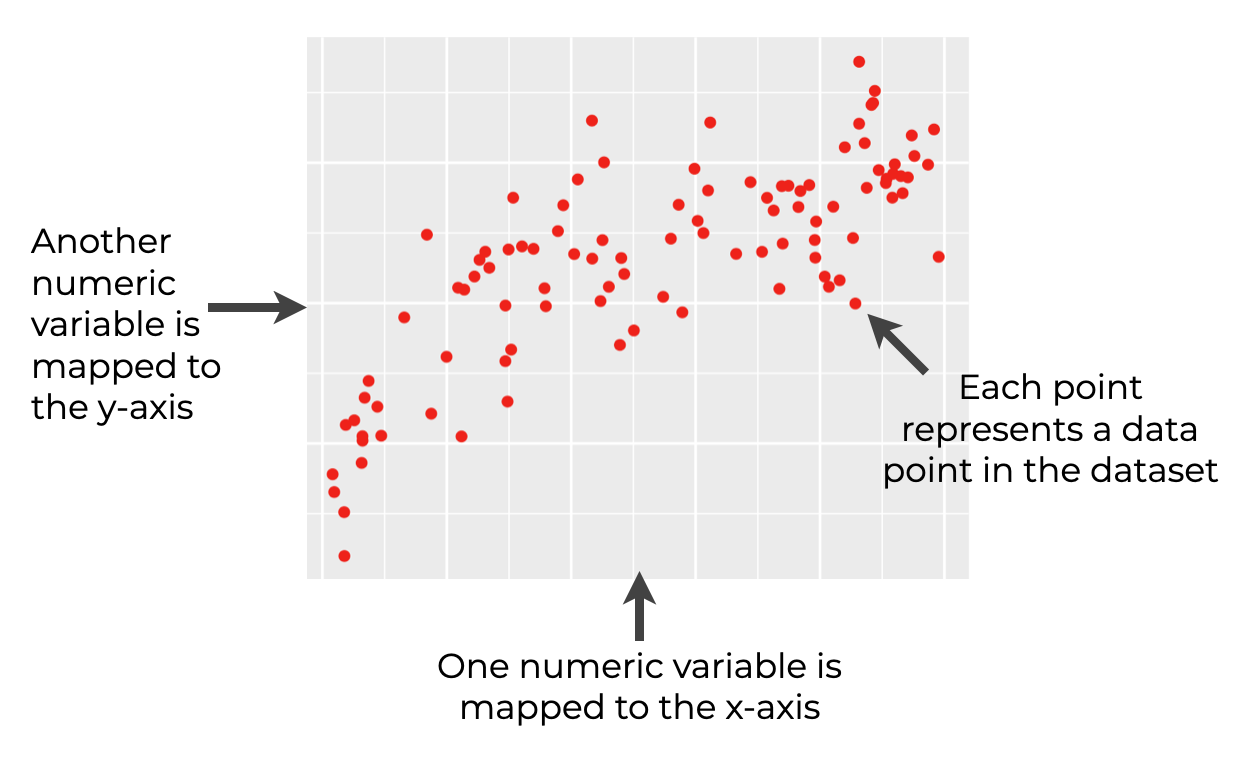
Scatterplots are extremely useful tools for showing the relationship between two numeric variables. For data visualization, reporting, and analytics, you’ll use them over and over.
Scatter Plots in R
If you need to create a scatter plot in R, you have at least two major options, which I’ll discuss briefly.
- base R
- ggplot
I strongly prefer the ggplot2 scatterplot, but let me quickly talk about both.
base R scatterplots
You can create a scatterplot in R using the plot() function.
I’m going to be honest: I strongly dislike the base R scatterplot, and I strongly discourage you from using the plot() function.
Like many tools from base R, the plot() function is hard to use and hard to modify beyond making simple modifications. The syntax is clumsy, hard to remember, and often inflexible.
I haven’t used the plot() function to create a scatterplot in R in almost a decade. There’s a better way …
ggplot2 scatterplots
If I need to make a scatter plot in R, I always use ggplot2.
If you’re an R user, you’ve probably heard of ggplot2. The ggplot2 package is a toolkit for doing data visualization in R, and it’s probably the best toolkit for making charts and graphs in R. In fact, once you know how to use it, ggplot2 is arguably one of the best data visualization toolkits on the market, for any programming language.
ggplot2 is powerful, flexible, and the syntax is extremely intuitive, once you know how the system works.
If you need to make a scatterplot in R, I strongly recommend that you use ggplot2.
Having said all of that, let’s take a look at the syntax for a ggplot scatterplot.
The syntax for a ggplot scatterplot
The secret to using ggplot2 properly is understanding how the syntax works.
If you’re not familiar with how the ggplot2 system works, you might want to read our introduction to ggplot2 tutorial. That tutorial explains most of the basics of the ggplot system.
At a high level, the syntax for a ggplot2 scatterplot looks something like this:
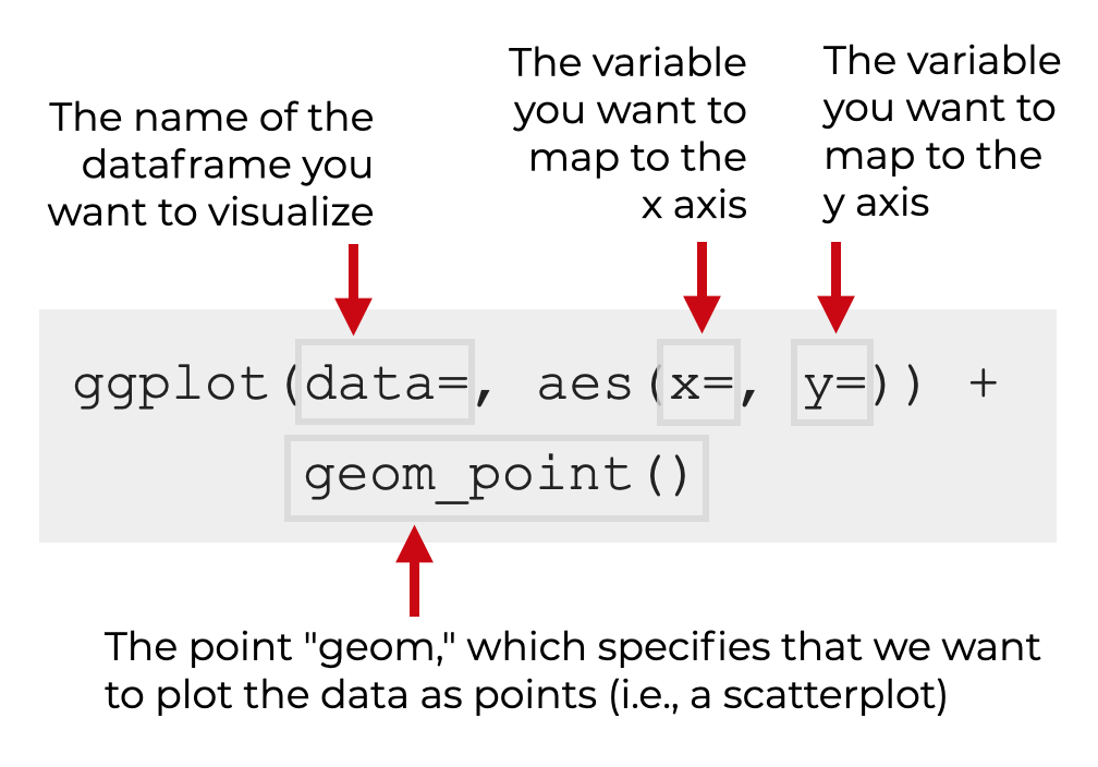
There are a few critical pieces to this syntax that you need to know:
- The
ggplot()function - The
data =parameter - The
aes()function - Geometric objects (AKA, “geoms”)
Let’s take a look at each of those separately.
The ggplot function
The ggplot() function is simply the function that we use to initiate a ggplot2 plot.
You’ll use this every time that you want to make any type of data visualization with ggplot2. However, the other parameters and functions you use along with it will dictate exactly what visualization gets created.
The data parameter
The data parameter tells ggplot2 the name of the dataframe that you want to visualize. When you use ggplot2, you need to use variables that are contained within a dataframe. The data parameter tells ggplot where to find those variables.
So for example, if your dataframe is named my_dataframe, you will set data = my_dataframe.
Remember: ggplot2 operates on dataframes.
The aes function
The aes() function tells ggplot() the “variable mappings.” This might sound complex, but it’s really straightforward once you understand.
When we visualize data, we are essentially connecting variables in a dataframe to parts of the plot. For example, when we make a scatter plot, we “map” one numeric variable to the x axis, and another numeric variable to the y axis. We map these variables to different axes within the visualization.
The aes() function allows us to specify those mappings; it enables us to specify which variables in a dataframe should connect to which parts of the visualization. If this doesn’t make sense, just sit tight. I’ll show you an example in a minute.
(For more detailed explanation of the aes() function, read the section about the aes() function in our ggplot2 tutorial.)
The point “geom”
Finally, a geometric object is the thing that we draw.
When you create a bar chart, you draw “bar geoms.” When you create a line chart, you draw “line geoms.” And when you create a scatter plot, you are draw “point geoms.”
The geom is the thing that you draw.
In ggplot2, we need to explicitly state the type of geometric object that we want to draw (i.e., bars, lines, points, etc).
When create a scatter plot, we draw point geoms (i.e., points). To specify that we want to draw points, we call geom_point().
Additional parameters
There are also a few additional parameters that you can use to control the appearance of the points in your scatterplot.
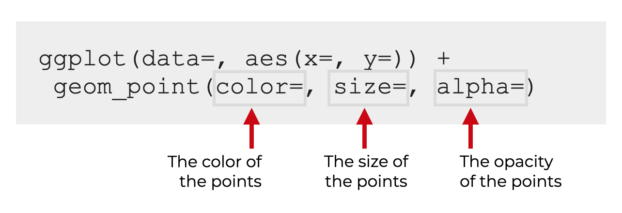
Specifically, the most important parameters you should know are:
- color
- size
- alpha
Let me quickly discuss each of these.
Color
The color parameter controls the color of the points.
When you provide an argument to this parameter, you can provide a “named” color like red, green, blue, etc. R has a variety of named colors, so explore them and find some you like.
Keep in mind, that when you provide the color name, it needs to be enclosed inside of quotation marks. So for example, you’ll set color = 'red'.
Size
The size parameter enables you to specify the size of the points.
If you want to play with this parameter, there’s not a perfect way to choose a good size, so I recommend that you use some trial and error to find one that works.
You can also use this parameter to create a bubble chart, but that’s slightly more complicated, so we won’t cover it here.
Alpha
The alpha parameter enables you to modify the opacity of the points (i.e., how transparent the points are).
This value needs to be between 0 and 1, where:
- 1 is fully opaque
- 0 is fully transparent
By default, this parameter is set to alpha = 1.
This parameter is very useful when you have a large number of points, and your scatterplot has an issue with overplotting. Dealing with overplotting is somewhat of a nuanced issue, but one way to handle it is by decreasing the alpha value.
I’ll show you an example of this in the examples.
Examples: How to make scatterplots with ggplot2
Ok. Now that I’ve quickly reviewed how the syntax works for a ggplot2 scatterplot, let’s take a look at some examples of how to create a scatter plots in R with ggplot.
Examples:
- Create a simple scatterplot with ggplot2
- Change the Color of the Points
- Change the Size of the Points
- Add a LOESS Smooth Line
- Add a Linear Regression Line
Run this code first!
A few quick things before you run the examples.
You’ll need to run some code to load ggplot2 and also to create the dataset that we’ll be working with.
Load the tidyverse package
First, you need to make sure that you’ve loaded the ggplot2 package.
Actually, I recommend that you load the tidyverse package. Remember that the tidyverse package includes ggplot2.
Keep in mind that this also assumes that you’ve installed the tidyverse package on in RStudio.
library(tidyverse)
Create a sample dataset
Next, we’ll need to create a dataset to plot.
Here, we’re going to create a new dataframe called, scatter_data.
set.seed(55)
scatter_data <- tibble(x_var = runif(100, min = 0, max = 25)
             ,y_var = log2(x_var) + rnorm(100)
             )
We can take a look at this dataframe with the following code:
scatter_data %>% glimpse()
OUT:
Rows: 100 Columns: 2 $ x_var13.6953379, 5.4539920, 0.8740999, 19.7887324, 14.0060519, 1.8556294, 3.2… $ y_var 2.6122496, 2.7738665, -1.2230670, 3.6239948, 3.6479324, 1.1145059, 2.244…
As you can see, this dataframe has two variables, x_var and y_var. We'll be able to plot these variables as a scatterplot.
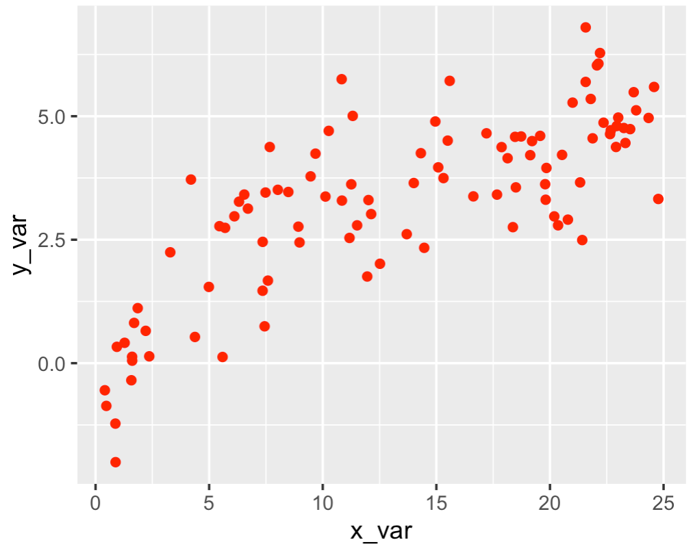
EXAMPLE 1: Create a simple scatterplot with ggplot2
Now that we have our dataframe, scatter_data, we'll plot it with ggplot2.
Let's run the code first, and then I'll explain.
ggplot(data = scatter_data, aes(x = x_var, y = y_var)) +
  geom_point()
OUT:
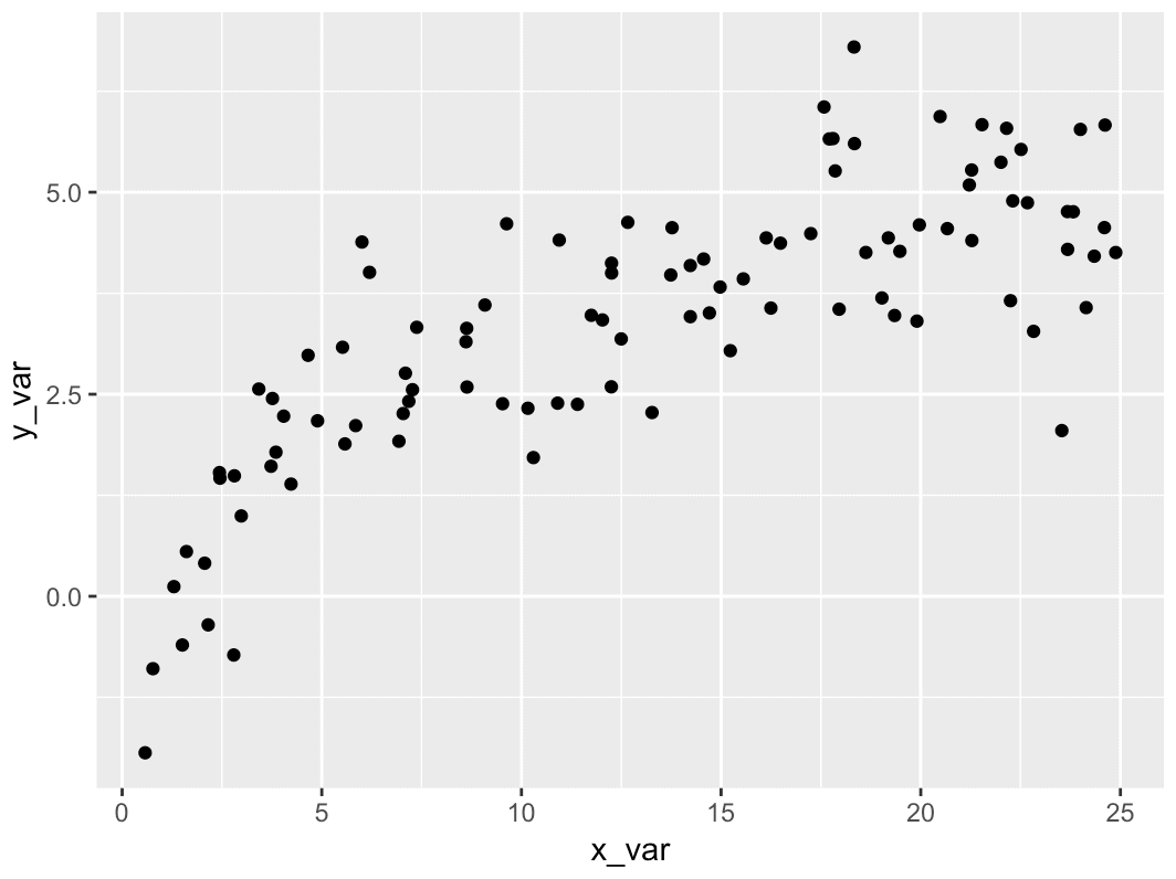
Explanation
As you can see, this code has created a simple scatter plot. It's pretty straightforward, but let me explain it.
We're initiating the ggplot2 plotting system by calling the ggplot() function.
Inside of the ggplot2() function, we're telling ggplot that we'll be plotting data in the scatter_data dataframe. We do this with the syntax data = scatter_data.
Next, inside the ggplot2() function, we're calling the aes() function. Remember, the aes() function enables us to specify the "variable mappings." Here, we're telling ggplot2 to put our variable x_var on the x-axis, and put y_var on the y-axis. Syntactically, we're doing that with the code x = x_var, which maps x_var to the x-axis, and y = y_var, which maps y_var to the y-axis.
Finally, on the second line, we're using geom_point() to tell ggplot that we want to draw point geoms (i.e., points).
That's it. That's all there is to it. The syntax might look a little arcane to beginners, but once you understand how it works, it's pretty easy.
Having said that, there are still a few enhancements we could make to improve the chart. Let's talk about a few of those.
EXAMPLE 2: Change the Color of the Points
Now, we'll make a simple modification by changing the color of the scatterplot points.
To change the color of the points to a solid color, we need to use the color parameter.
ggplot(data = scatter_data, aes(x = x_var, y = y_var)) +
  geom_point(color = 'red')
OUT:
Explanation
Again, this is very straightforward.
To create this, we just set color = 'red' inside of geom_point(). We do this inside of geom_point() because we're changing the color of the points. (There are more complex examples were we have multiple geoms, and we need to be able to specify how to modify one geom layer at a time.)
EXAMPLE 3: Change the Size of the Points
In this example, we'll change the size of the points.
We can do that with the size parameter.
ggplot(data = scatter_data, aes(x = x_var, y = y_var)) +
  geom_point(color = 'red', size = 4)
OUT:
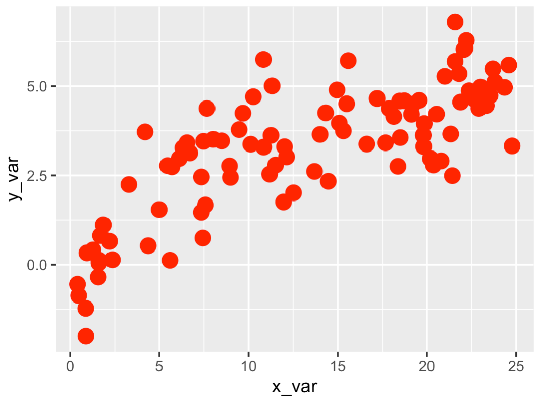
Explanation
Here, we've increased the size of the points by setting size = 4 inside of geom_point().
Now, to be clear: I'm not sure that I like this scatterplot with larger points. I actually think that the defaults were just fine.
Having said that, sometimes, you need to increase or decrease the size of your scatterplot points, so I wanted to show you how it's done.
As a side note, decreasing the size of your points can be a great way to deal with overplotting. Try it with the diamonds dataframe from ggplot2.
EXAMPLE 4: Add a Smooth Trend Line
Now, we'll add a smooth trend line.
To add a smooth line, we can use the statistical operation stat_smooth().
ggplot(data = scatter_data, aes(x = x_var, y = y_var)) +
  geom_point(color = 'red') +
  stat_smooth()
OUT:
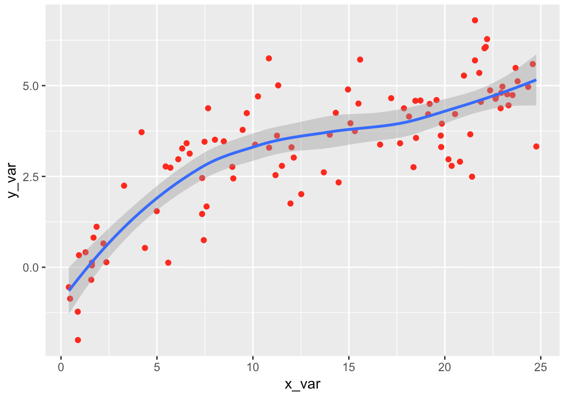
Explanation
Here, we added a smooth line by adding the code stat_smooth() after the scatterplot code.
Notice that the first two lines are exactly the same as the code for our simple scatterplot (with red points).
So to add the smooth line, we simply use the '+' and then stat_smooth().
This is one of the reasons that ggplot2 is so great. Frequently, modifications to a simple plot only require you to tack on a call to an additional function. So you can build the base version of a plot, and then enhance it by adding new lines of code.
Keep in mind that the default trend line is a LOESS smooth line, which means that it will capture non-linear relationships.
But, you can also add a linear trend line. Let's do that next.
EXAMPLE 5: Add a Linear Trend Line
To add a linear trend line, you can use stat_smooth() and specify the exact method for creating a trend line using the method parameter.
Specifically, you'll use the code method = 'lm' as follows:
ggplot(data = scatter_data, aes(x = x_var, y = y_var)) +
  geom_point(color = 'red') +
  stat_smooth(method = 'lm')
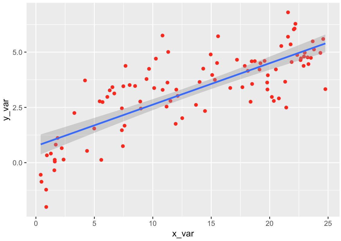
Explanation
The code for this example is essentially the same as the code for example 4.
The only difference is that we've added the code method = 'lm' inside of stat_smooth(). This causes stat_smooth() to add a linear regression line to the scatterplot, instead of a LOESS smooth line.
Leave your other questions in the comments below
Do you have more questions about how to create a scatterplot in R with ggplot2?
Is there something you need to do that I didn't cover here?
If so, leave your question in the comments section near the bottom of the page.
Sign Up to Learn More Data Science in R
This tutorial should give you a good overview of how to create a scatter plot in R, but if you really want to master data visualization in R, there's a lot more to learn.
And there's even more if you need to learn data manipulation and machine learning.
The good news is that here at Sharp Sight, we publish free data science tutorials every week.
If you sign up for our free newsletter, you'll get our free data science tutorials delivered right to your inbox.
When you sign up, you’ll get free tutorials on:
- ggplot2
- dplyr
- data wrangling
- machine learning
- … and more.
We have tutorials about data science in Python too.
So if you're serious about learning data science, just sign up for our free newsletter.
I like the way you are explaining your lessons and I would want to be getting such lessons.
????
My interest in data science is ignited and I want to learn moe
????
Thanks
How do you display only specific ‘Y’ axis values in a line plot.