This tutorial will show you how to create a Seaborn boxplot. It will explain the syntax and show you step-by-step examples of how to create box plots with Seaborn.
The tutorial is divided up into several sections. If you need something specific, you can click on one of the following links and it will take you to the correct section in the tutorial.
Table of Contents:
- Introduction to Seaborn
- A quick review of boxplots
- Introduction to the Seaborn boxplot
- The syntax of
sns.boxplot() - Seaborn boxplot examples
But, if you’re new to Seaborn or new to data visualization in Python, I recommend that you read the whole tutorial.
Ok, let’s start off with a quick review of Seaborn and data visualization in Python.
A quick introduction to Seaborn
First, let’s just review what Seaborn is.
Seaborn is a data visualization package for the Python programming language.
Python has a variety of data visualization packages and toolkits that data scientists can use.
However, many data visualization toolkits in Python are difficult to use or are poorly suited for statistical visualization and analysis. For example, matplotlib is a powerful data visualization toolkit for Python, but the syntax is often clumsy and difficult to remember … particularly for more complicated visualizations.
Moreover, matplotlib (and many of the other options) were not designed with DataFrames in mind. Considering that Pandas DataFrames are essential tools for data science in Python today, lack of compatibility with DataFrames is a serious drawback.
Seaborn is a toolkit for statistical visualization in Python
Seaborn “fills the gap” with regard to data visualization in Python.
Specifically, Seaborn provides a simple, easy to use toolkit for doing statistical visualization in Python.
Importantly, Seaborn was designed with Pandas DataFrames in mind. Many of the tools in Seaborn use DataFrames as inputs (although not all of them). Seaborn makes it much easier to manipulate and visualize variables that already exist inside of Pandas DataFrames.
So the major advantages of Seaborn (over other Python data visualization packages) is that it works well with DataFrames, and it has a variety of functions for creating common charts and graphs.
Using Seaborn, you can create scatterplots, bar charts, as well as more complicated data visualizations.
One of the useful charts that you can create with Seaborn is the boxplot.
A quick review of boxplots
Before we move on to the syntax for how to create a Seaborn boxplot, let’s quickly review what boxplots are and how they work.
Boxplots visualize summary statistics for your data
The boxplot is a technique that you can use to visualize summary statistics for your data.
Specifically, boxplots plot something we call the “five number summary.” The five number summary is a group of statistical values that includes:
- the minimum
- the first quartile (25th percentile)
- the median
- the third quartile (75th percentile)
- the maximum
Collectively, these five numbers give us a lot of information about the distribution of a variable.
Boxplots plot the five number summary
As I mentioned in the last section, boxplots plot the five number summary.
They look something like this:
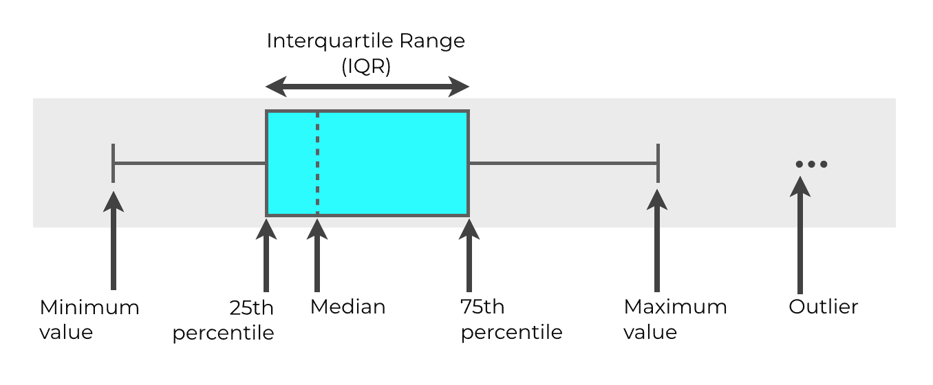
So in the above example, you can see the box in the middle. That’s the “box” part of the boxplot. One end of the box represents the 25th percentile of the data distribution (Q1), and the other end of the box represents the 75th percentile (Q3).
Inside of the box example above, there’s a line that goes through the box … that represents the median of the data.
The width of the box, from the 25th percentile to the 75th percentile, is the “interquartile range.” The interquartile range is also called the IQR.
The whiskers
Then on either side of the box itself are two “whiskers” that extend away from the box. One whisker extends to the “minimum” value and the other whisker extends to the maximum value. For this reason, boxplots are sometimes called “box and whisker” plots.
Commonly, the minimum and maximum values are calculated according to a formula. Typically, the minimum is calculated as Q1 – 1.5*IQR. The maximum is typically calculated as Q3 + 1.5*IQR.
Outliers
Sometimes, there are also observations that extend beyond the whiskers … beyond the “minimum” and “maximum” values. You can see those in the above example as the “dots” beyond the right whisker. Those are outliers.
Again: boxplots are very useful because they show these summary statistics and outliers all in the same chart. In a single visualization, you can see important numbers like the median, maximum, minimum, and outliers, all at once.
An Introduction to the Seaborn Boxplot
Now that you’ve learned some of the basics about Seaborn and the basics of boxplots, let’s talk about boxplots in Seaborn.
The Seaborn boxplot function creates boxplots from DataFrames
Seaborn has a function that enables you to create boxplots relatively easily … the sns.boxplot function.
Importantly, the Seaborn boxplot function works natively with Pandas DataFrames. The sns.boxplot function will accept a Pandas DataFrame directly as an input.
This is unlike many of the other ways to create a boxplot in Python. As I mentioned earlier, many of the other data visualization toolkits like Matplotlib do not work well with DataFrames.
Seaborn boxplot: probably the best way to create a boxplot in Python
Because Seaborn was largely designed to work well with DataFrames, I think that the sns.boxplot function is arguably the best way to create a boxplot in Python.
Frankly, the syntax for creating a boxplot with Seaborn is just much easier and more intuitive.
Having said that, let’s take a look at the syntax for the sns.boxplot function.
The syntax of sns.boxplot
The sns.boxplot function is the Seaborn function we use for creating boxplots.
There are a variety of parameters that we can use to modify the function, but in the simplest case, the syntax looks something like this:
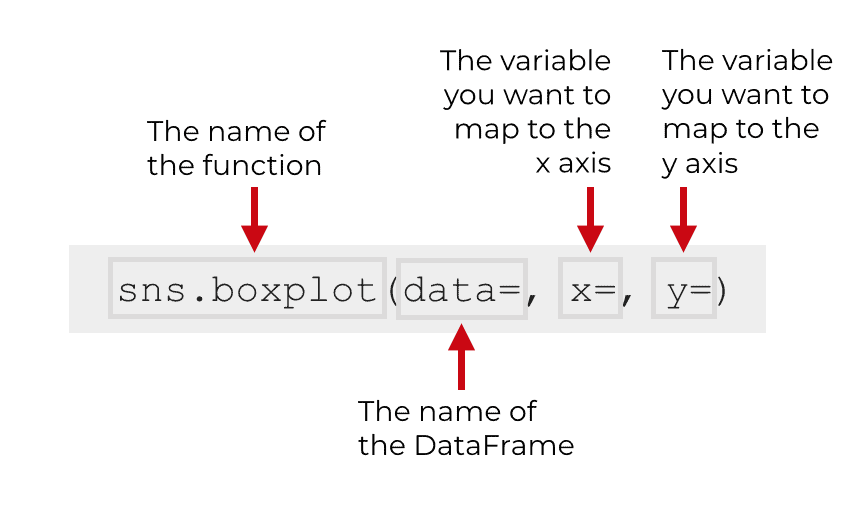
Assuming that you’ve imported Seaborn with the alias sns, you will call the function as sns.boxplot().
Keep in mind that it is common convention to import Seaborn with the code import seaborn as sns, but if you import Seaborn with a different alias, you’ll call the function with that alias. In this tutorial, I’ll be using the syntax sns.boxplot.
Having said that, to really understand the function, you need to understand the parameters that control how the function works.
Let’s talk more about the parameters of sns.boxplot.
The parameters of sns.boxplot
The sns.boxplot function has over a dozen parameters that you can use to modify your boxplots.
In this tutorial, we’re going to cover 5 of the most essential parameters:
dataxycolororient
Let’s talk about each of these.
data
The data parameter enables you to specify the dataset you want to use in your chart.
Technically, this parameter accepts a variety of inputs. You can provide a DataFrame, array, or list of arrays to this parameter.
However, DataFrames are probably the most common, and in this tutorial we’re going to stick to DataFrames.
x
The x parameter enables you to specify the variable you want to put on the x axis.
It’s possible to map numeric variables or categorical variables to the x parameter.
Which variable and the type of variable you map to the x parameter depends on how you want to structure your boxplot.
To clarify this, I’ll show you examples in the examples section.
y
The y parameter is similar to the x parameter.
The y parameter enables you to specify the variable you want to put on the y axis.
Like the x parameter, it’s possible to map numeric variables or categorical variables to the y parameter.
To clarify, I’ll show you examples in the examples section.
color
The color parameter enables you to change the color of the boxes. When you use this parameter, you’ll almost always set the color to a specific color like red, blue, etc.
hue
The hue parameter works a little differently than the color parameter, but they are related.
When you use the hue parameter, you’ll provide a categorical variable. When you pass a categorical variable to hue, sns.boxplot will create separate boxes for the different categories, and will color those boxes a different “hue.”
I’ll show you an example of this in the examples section.
orient
The orient parameter enables you to change the orientation of the boxplot.
Possible values are v and h, for vertical and horizontal respectively.
If you don’t specify a value, Seaborn will infer the correct orientation from the variables that you map to x or y.
Ok… now that you’ve learned about some of the important parameters, let’s take a look at some examples of how to create a box plot with Seaborn.
Examples: How to create a box plot with Seaborn
Let’s take a look at some examples of how to use sns.boxplot to create boxplots.
We’re going to start with relatively simple examples, and then increase the complexity of the charts by adding new parameters.
Examples:
- Create a simple Seaborn boxplot
- Change the color of the Seaborn boxplot
- Break out the boxplot by a catagorical variable
- Change the ‘hue’ of the bars
Run this code first
Before you run any of the examples, you’ll need to run some preliminary code.
You need to import the correct packages, create the DataFrame that we’re going to use, and set the formatting for the charts.
Let’s do those now.
Import packages
First, you just need to import a few Python packages.
Specifically, you’ll need to import Numpy, Pandas, and Seaborn.
We’re going to use Numpy and Pandas to create our DataFrame, and obviously, we’ll use Seaborn to create our boxplot.
import numpy as np
import pandas as pd
import seaborn as sns
Create dataframe
Next, let’s actually create our DataFrame.
We’re going to create some dummy data that has “test scores.” The data will have three variables: score, class, and gender. You can think of the dataset as a set of test scores, for male and female students, who are in one of three classes.
To create this dummy data, we’ll use a few functions from Numpy and Pandas. In the interest of clarity, I’m going to explain it.
We’ll start buy creating three different normally distributed Numpy arrays using Numpy random normal. These are called score_array_A, score_array_B, and score_array_C.
Here, we’re using the loc and scale parameters to give these datasets different means and standard deviations respectively. (You’ll be able to see the differences when we plot them.)
Notice as well that we’re using the np.random.seed function to set the seed for the random number generator. This is so your “random” data looks exactly the same as the data in this tutorial. (If you don’t understand this, please read our tutorial on numpy.random.seed.)
# set seed
np.random.seed(41)

#create three different normally distributed datasets
score_array_A = np.random.normal(size = 300, loc = 85, scale = 3)
score_array_B = np.random.normal(size = 300, loc = 80, scale = 7)
score_array_C = np.random.normal(size = 300, loc = 73, scale = 4)
Next, we’ll turn these into 3 DataFrames. Each of the DataFrames will have a variable called score. The data in the score variables will be the data from the normally distributed Numpy arrays we just created in the last step.
Each DataFrame will also have a variable called class. The class variable will denote which “class” the data is from: 'Class A', 'Class B', or 'Class C'. Think of the data like data from a school … there are different “classes” that have different students, and the students have a “score” on some test. This class variable will serve as a categorical variable that we can use to split out our data.
#turn normal arrays into dataframes
score_df_A = pd.DataFrame({'score':score_array_A,'class':'Class A'})
score_df_B = pd.DataFrame({'score':score_array_B,'class':'Class B'})
score_df_C = pd.DataFrame({'score':score_array_C,'class':'Class C'})
Combine data together into dataframe
Next, we’ll just concatenate these three DataFrames together using the pd.concat() function.
#concat dataframes together
score_data = pd.concat([score_df_A,score_df_B,score_df_C])
Add variable
Finally, we’ll create a “gender” variable that separates the “students” in our data into male and female. We’ll do this with the Pandas assign method, and a bit of data manipulation using the Numpy where function.
score_data = score_data.assign(gender = np.where(score_data.score%3 > 1, "Male","Female"))
The finalized dataset, score_data, contains normally distributed score data, for three different classes and two different genders.
(Note that this is just dummy data that we’ll use for practice. We created this with a bit of clever data wrangling using Pandas and Numpy. This is one of the reasons you should master data manipulation in Python!)
Set Seaborn formatting
One last step before we run the examples.
We’re going to use the sns.set() function to “set” the background formatting for our charts.
By default, Seaborn may use matplotlib formats for charts, which are ugly.
By using sns.set(), Seaborn will set the background formatting to appear more attractive (better background colors, gridlines, etc).
To use this special Seaborn formatting, you can run the following code:
sns.set()
Ok. Now we’re ready for our examples.
EXAMPLE 1: Create a simple Seaborn boxplot
First, we’ll just create a boxplot of all of our data, without breaking the data out by category in any way.
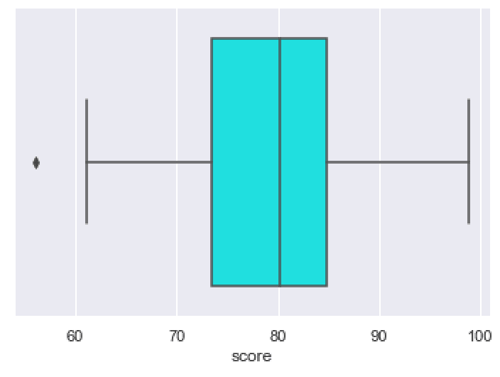
To do this, we’ll call the sns.boxlot() function. Inside of the function, we’ll pass our DataFrame, score_data, to the data parameter. When we do this, we’re just telling the function that we want to plot data from the score_data DataFrame.
We’re also specifying x = 'score'. This just means that we’re mapping the score variable to the x axis. Notice as well that the variable name, 'score', is enclosed in quotation marks. This is necessary when you reference variables.
Ok. Let’s run the code:
sns.boxplot(data = score_data
            ,x = 'score'
            )
And here is the output:
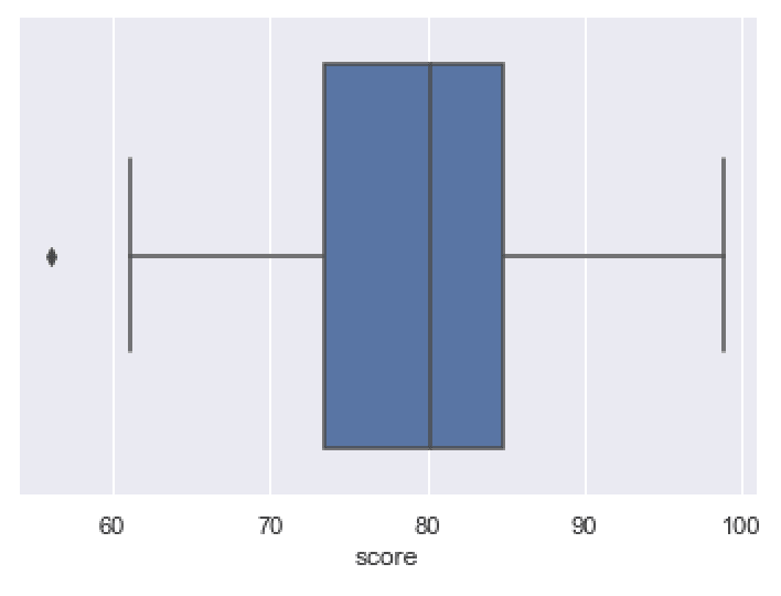
The output plots a boxplot of the score variable for all of the records in score_data.
In the chart, you can see all of the numbers of the so-called “five number summary.”
The mean of the data is roughly at 80. You can see that as the black line in the middle of the box.
The maximum is about 98, and the minimum is about 62. You can see these numbers respectively marked out by the ends of the right and left whiskers.
You also have the 1st quartile and 3rd quartile marked out as the left side and right side of the blue box, respectively.
If you analyze and evaluate the plot, you can get a sense of how the data are distributed. Again, the boxplot tells us quite a bit: the median, max, min, etc.
As a data scientist or analyst, you can use a visualization like this to look for anomalies; validate assumptions; or answer questions you might have about your data.
Overall, this simple Seaborn box plot is okay, but there are several things that we could change or modify.
Let’s do that.
EXAMPLE 2: Change the color of the Seaborn boxplot
First, let’s just change the color of the boxplot.
By default, the color of the box is set as a sort of medium blue.
Here, we’ll change it to ‘cyan‘.
To do that, we’ll set the color parameter to color = 'cyan'.
sns.boxplot(data = score_data
            ,x = 'score'
            ,color = 'cyan'
            )
OUT:
This is pretty simple. It’s the exact same boxplot as the plot in example 1, but the color has been changed.
EXAMPLE 3: Break out the boxplot by a catagorical variable
Next, we’ll break out the boxplot by our categorical variable, class.
To do this, we’ll set the y parameter to y = class.
sns.boxplot(data = score_data
            ,x = 'score'
            ,y = 'class'
            ,color = 'cyan'
            )
OUT:
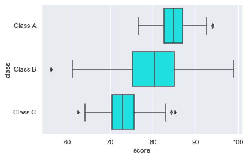
Notice that the data are now broken out by the categorical variable, class. There’s one box for each class, so we can analyze the data distributions for each class.
(Note that I also changed the color of the boxes to ‘cyan’ in this example as well.)
EXAMPLE 4: Change the ‘hue’ of the bars
Now, we’ll use the hue parameter to change the hue (i.e., the color) of the bars, depending on a categorical variable.
To do this, we’ll set the hue parameter to our categorical variable, gender.
sns.boxplot(data = score_data
            ,y = 'class'
            ,x = 'score'
            ,hue = 'gender'
            )
OUT:
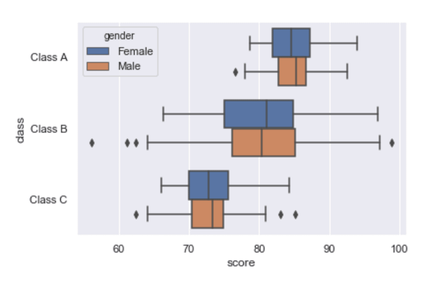
Notice that our data are broken out by two categorical variables now.
By putting class on the y axis, we’re breaking our data out by class.
Then by mapping gender to the hue parameter, we’re breaking our data out by a second categorical variable. In the chart, the different “genders” appear as different boxes with different colors.
EXAMPLE 3: Create a vertical boxplot
Finally, let’s change the orientation of the boxplot.
There is a way that you can do this with the orient parameter, but there’s actually a simpler way.
You can just swap the variables you map to the x parameter and y parameter.
So here, we’re going to put class on the x axis and score on the y axis (instead of the other way around, like we did in example 3).
sns.boxplot(data = score_data
            ,y = 'score'
            ,x = 'class'
            ,color = 'cyan'
            )
OUT:
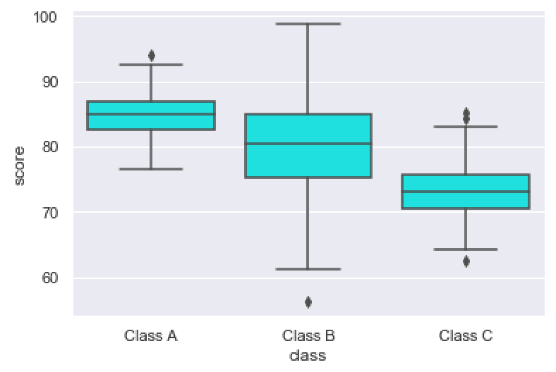
As you can see, we have the different categories of “class” along the x axis now. And the score is being measured by the y axis.
Swapping the variables among the x parameter and y parameter is an easy way to change the orientation of the boxplot.
Leave your other questions in the comments below
Do you have questions about creating scatter plots with Seaborn?
Is there something that we didn’t cover here that you need to understand?
Write your question in the comments section at the bottom of the page.
Join our course to learn more about Seaborn
The examples you’ve seen in this tutorial should be enough to get you started, but if you’re serious about learning Seaborn, you should enroll in our premium course called Seaborn Mastery.
There’s a lot more to learn about Seaborn, and Seaborn Mastery will teach you everything, including:
- How to create essential data visualizations in Python
- How to add titles and axis labels
- Techniques for formatting your charts
- How to create multi-variate visualizations
- How to think about data visualization in Python
- and more …
Moreover, it will help you completely master the syntax within a few weeks. You’ll discover how to become “fluent” in writing Seaborn code.
Find out more here:
Can we add q1 , q2, q3 and whisker’s value on the chart?
good explanation
explained nicely
????
Is there a way to do this via seaborn objects
Unfortunately, there’s not a “boxplot” feature yet with Seaborn Objects.
I suspect that they’ll add this in an upcoming release.