In this tutorial, I’ll show you how to use the sns.countplot function to create a Seaborn countplot.
I’ll explain what this function does, how the syntax works, and I’ll show you some step-by-step examples.
If you need something specific, you can click on any of the following links, and it will take you to the appropriate section of the tutorial.
Table of Contents:
Ok. Let’s get to it.
A quick introduction to the Seaborn Countplot
First, I’ll just provide an overview of what the countplot function does.
At a high level, the Seaborn Countplot function creates bar charts of the number of observations per category.
When you use sns.countplot, Seaborn literally counts the number of observations per category for a categorical variable, and displays the results as a bar chart.
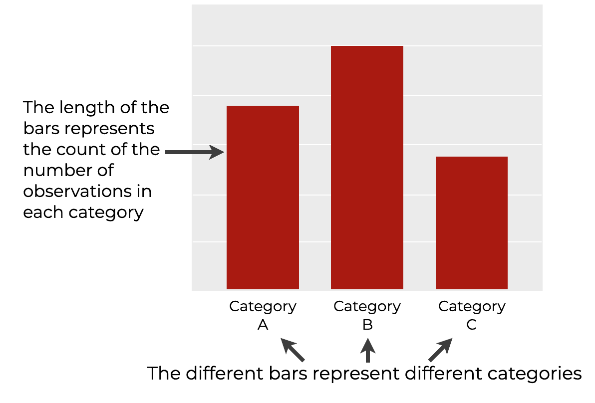
Essentially, the Seaborn countplot() is a way to create a type of bar chart in Python.
Keep in mind that Seaborn has another tool for creating bar charts as well – the sns.barplot function. I’ll explain the differences at length in the FAQ section, but to summarize: the countplot function plots the count of records, but barplot plots a computed metric.
Ok. Now that you have a high-level view of what the Seaborn countplot() function does, let’s look at the syntax.
The syntax of sns.countplot
For the most part, the syntax of sns.countplot is very simple.
In this section, I’ll explain the syntax to make a simple countplot, but I’ll also mention a few extra parameters that you can use to modify your countplot.
A quick note
One quick note before we look at the syntax.
Whenever we use a Python package like Seaborn, we need to import that package first.
Importantly, how exactly you import a package will have an impact on the syntax.
Having said that, we’re going to assume that you’ve imported Seaborn with the alias sns.
You can do that with the following code:
import seaborn as sns
This is the common convention among Seaborn users and Python data scientists, so we’ll use that import convention here.
sns.countplot syntax
Ok, let’s look at the basic syntax to use the countplot function.
To call the function, you’ll type the syntax sns.countplot(). As I just mentioned, this assumes that you’ve imported Seaborn with the alias sns.
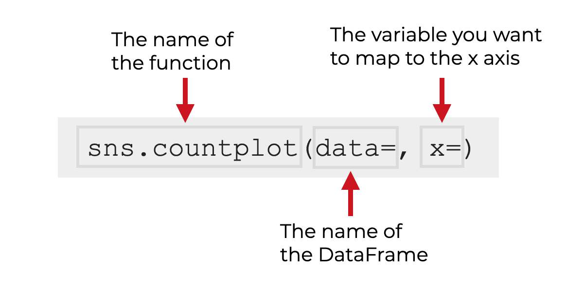
Inside of the parenthesis, there are a few parameters that you use to control the function.
Let’s look at those.
The parameters of sns.countplot
The countplot function has about a dozen parameters that control its behavior, but in my opinion, the most important are:
dataxyhuecolor
Let’s look at these one at a time.
data
The data parameter enables you to specify the dataset that contains the data you want to plot.
The argument to this is often a Pandas dataframe, but it can also be an array or a list of arrays.
Importantly, when you pass an argument to this parameter (like the name of a dataframe), the name does not need to be inside of quotation marks.
Additionally, technically, this parameter is optional, meaning that you don’t necessarily need to provide an argument to this parameter. Having said that, it’s most common to use the countplot function on a dataframe, and in the examples section, we’ll be operating primarily on Pandas dataframes.
x
The x parameter controls the variable that you want to map to the x-axis.
If you use the data parameter to specify a dataframe that you want to operate on, then the argument to x parameter will be a variable in that dataframe.
For a typical vertical bar chart, the variable that you map to x will be a categorical variable. In that case, the categories in the x variable will correspond to the different bars in the bar chart (you’ll see an example of this in the examples section).
Having said that, you can also use the countplot() function to create a horizontal bar chart, in which case you’ll probably use the y parameter instead.
Note: when you pass a dataframe variable name to this parameter, the variable name must be inside of quotations. I’ll show you examples of this in the examples section.
y
You can also use the y parameter to map a categorical variable to the y axis.
This is commonly used if you want to create a horizontal bar chart instead of a vertical bar chart. (I’ll show you an example of this in example 3.)
color
The color parameter can be used to change the color of the bars.
By default, each bar of your countplot will be a different color, as set by the defaults in Seaborn.
But if you want all of the bars to have the same color (which I recommend), you can use the color parameter.
Any of the Python “named” colors will be acceptable here. Hexidecimal colors will also work.
hue
You can use the hue parameter to map a second categorical variable to the “hue” of the bars.
In this case, the colors of different bars will correspond to the categories of the second categorical variable.
This enables you to create so-called “dodged” bar charts.
I’ll show you an example of this in example 4.
Examples: How to make Count Plots and Bar Charts with Seaborn
Ok, let’s look at some examples of how to create bar charts and countplots using the Seaborn countplot function.
If you need something specific, you can click on any of the following links. The link will take you directly to the appropriate example.
Examples:
- Create a Simple Vertical Countplot
- Change the Colors of the Bars
- Create a Horizontal Countplot
- Create a “Dodged” Countplot
Run this code first
Before you run any of the examples, you’ll need to import Seaborn and retrieve the dataset that we’ll be working with.
Import Seaborn
First, let’s import Seaborn.
You can do that with the following code:
import seaborn as sns
As explained in the syntax section, importing Seaborn this way enables us to call Seaborn functions with the prefix sns.
Get dataset
Next, we’re going to retrieve the dataframe that we’ll be working with.
In these examples, we’ll be working with the titanic dataframe.
To get this dataframe, we can use Seaborn’s load_dataset() function as follows:
titanic = sns.load_dataset('titanic')
And, we can print out the data:
     survived  pclass     sex   age  sibsp  parch     fare embarked   class     who  adult_male deck  embark_town alive  alone
0           0       3    male  22.0      1      0   7.2500        S   Third     man        True  NaN  Southampton    no  False
1           1       1  female  38.0      1      0  71.2833        C   First   woman       False    C    Cherbourg   yes  False
2           1       3  female  26.0      0      0   7.9250        S   Third   woman       False  NaN  Southampton   yes   True
3           1       1  female  35.0      1      0  53.1000        S   First   woman       False    C  Southampton   yes  False
4           0       3    male  35.0      0      0   8.0500        S   Third     man        True  NaN  Southampton    no   True
..        ...     ...     ...   ...    ...    ...      ...      ...     ...   ...          ...  ...          ...   ...    ...
886         0       2    male  27.0      0      0  13.0000        S  Second     man        True  NaN  Southampton    no   True
887         1       1  female  19.0      0      0  30.0000        S   First   woman       False    B  Southampton   yes   True
888         0       3  female   NaN      1      2  23.4500        S   Third   woman       False  NaN  Southampton    no  False
889         1       1    male  26.0      0      0  30.0000        C   First     man        True    C    Cherbourg   yes   True
890         0       3    male  32.0      0      0   7.7500        Q   Third     man        True  NaN   Queenstown    no   True
This data records information of people who were aboard the Titanic, which sank in the North Atlantic in 1912. If you look closely, you can see that the data contains a 0/1 indicator variable about whether the person survived, as well as some additional passenger information such as sex, embark_town, and class.
All of these variables are suitable for a bar chart.
EXAMPLE 1: Create a Simple Vertical Countplot
First, let’s start very simple.
Here, we’re going to create a simple bar chart of the counts by category (i.e., a countplot).
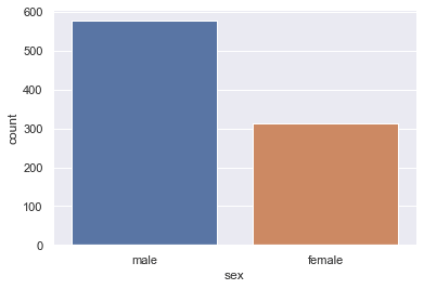
To do this, we’ll map the dataset to the data parameter with the code data = titanic.
And we’ll map the ‘sex‘ variable to the x-axis with the code x = 'sex'. Remember that the sex variable holds information about the gender of the passenger.
Let’s run the code and take a look:
sns.countplot(data = titanic
            ,x = 'sex'
            )
OUT:
Explanation
This is very simple, but let me explain.
Here, we plotted data from the titanic dataframe. We indicated that we wanted to plot variables in this dataset with the code data = titanic.
We used the x parameter to specify a categorical variable to put on the x-axis. The two possible categories of this variable are male and female.
Notice a few things about the syntax
Calling sns.countplot() like this generates a vertical bar chart, where the categories are along the x-axis, and the length of each bar corresponds to the count of the number of records for that particular category.
Notice that by default, the bars have different colors. This is the default behavior of Seaborn, which we’ll change in the next example.
EXAMPLE 2: Change the Colors of the Bars
Here, we’ll change the color of the bars.
As you saw in example 1, the bars of a Seaborn countplot are different colors by default.
Personally, I don’t like those defaults, and I prefer to have the bars all the same color unless we use the hue parameter (which I’ll show you in example 4).
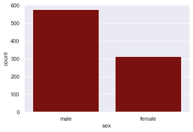
So here, we’ll change the color of the bars to dark red by setting the color parameter to 'darkred'.
sns.countplot(data = titanic
            ,x = 'sex'
            ,color = 'darkred'
            )
OUT:
Explanation
It should be pretty obvious what we did here, but I’ll quickly explain.
Here, we used the color parameter to change the color of all of the bars. Here, we changed them to dark red (i.e., darkred), but you can experiment with some of the other valid Python colors.
Notice that when we reference a color name inside of sns.countplot(), the color is presented as a string … that is, the color name must be inside of quotation marks.
EXAMPLE 3: Create a Horizontal Countplot
Next, let’s create a horizontal bar chart.
This is extremely easy to do.
Instead of mapping our categorical variable, sex, to the x-axis, we’ll map the categorical variable to the y-axis.
To do this, we’ll set the y parameter to y = 'sex'.
sns.countplot(data = titanic
            ,y = 'sex'
            )
OUT:
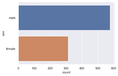
Explanation
This is really simple once you look at the syntax.
To create a horizontal bar chart or countplot in Seaborn, you simply map your categorical variable to the y-axis (instead of the x-axis). When you map the categorical variable to the y-axis, Seaborn will automatically create a horizontal countplot.
EXAMPLE 4: Create a “Dodged” Countplot
Finally, we’ll create a so-called “dodged” countplot.
In a dodged countplot, we’ll have one categorical variable mapped to the x-axis. But we’ll also have a second categorical variable mapped to the hue parameter.
When we do this, Seaborn will create a new set of bars for each category of the second categorical variable.
This might sound confusing, but it’ll make complete sense once you see it.
Let’s take a look.
sns.countplot(data = titanic
            ,x = 'sex'
            ,hue = 'survived'
            )
OUT:
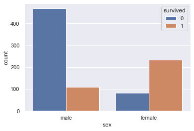
Explanation
So what happened here?
In this example, we mapped the variable sex to the x-axis, similar to what we did in example 1.
But additionally, we mapped the survived variable to the hue parameter using the code hue = 'survived'.
And notice what happened: there are 4 bars. There are two bars for each category of sex. So for male, there’s a bar for survived == 0 and a bar for survived == 1. The same for female. The bars for the count of people who died are colored blue (i.e., survived == 0) and the bars for the count of people who survived are colored orange (survived == 1).
Effectively, when we map a second categorical variable to the hue parameter, Seaborn creates additional bars for the new categories. These new bars are “dodged” side by side, but have different colors (i.e., different hues).
So when we create a dodged bar chart like this, we can look at categories within categories, like male survivors, male deaths, female survivors, and female deaths.
Frequently asked questions about Seaborn Countplots
Ok. Now that you’ve looked at some examples, let’s look at one common question about the Seaborn Countplot function.
Frequently asked questions:
What’s the difference between countplot and barplot?
If you’re trying to make a bar chart with Seaborn, you’re probably aware that Seaborn has two functions for creating bar charts: countplot and barplot.
What’s the difference?
Here’s the simple difference:
countplotplots the count of the number of records by categorybarplotplots a value or metric for each category (by default, barplot plots the mean of a variable, by category)
So for example, let’s say that we’re working with the titanic dataset that we used above.
If you want to plot the number of males and females, you can do that with countplot:
sns.countplot(data = titanic
            ,x = 'sex'
            )
OUT:
But if you want to create a bar chart of the average age, by gender, you’ll need to use barplot for that:
sns.barplot(data = titanic
            ,x = 'sex'
            ,y = 'age'
            )
OUT:
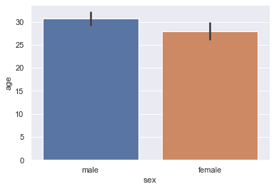
In this example that we made with barplot, we mapped sex to the x-axis and age to the y-axis. When we map a numeric variable to the y-axis like this, Seaborn computes the mean (i.e., the average age), and that mean value becomes the length of the bar.
So when you want to count values, use countplot. If you want to compare a metric across categories, use barplot.
(For more information about the barplot function, read our tutorial about sns.barplot. )
Leave your other questions in the comments below
Do you still have questions about the Seaborn countplot function?
If so, just leave your questions in the comments section below.
If you want to master Seaborn, join our course
In this tutorial, I’ve explained how to use the Seaborn countplot technique, but if you want to master data visualization Python, you’ll need to learn a lot more.
That said, if you’re serious about learning and mastering data visualization in Python, you should join our premium online course, Seaborn Mastery.
Seaborn Mastery is our online course that will teach you everything you need to know about data visualization with the Seaborn package.
Inside the course, you’ll learn:
- how to create all of the essential plots like bar charts, line charts, scatterplots, and more
- how to add titles and annotations to your plots
- techniques for creating multivariate data visualization
- learn “how to think” about visualization
- how to “tell stories with data”
- and much more …
These are the essentials of data visualization that you need to know.
Additionally, you’ll discover our unique practice system that will enable you to memorize all of the syntax you learn. If you practice like we show you, you’ll memorize the syntax to do data visualization with Seaborn in only a few weeks!
You can find out more here:
thanks for this great lecture.
You’re welcome.
Is there a way we can also show total number of counts above each bar?
Nice one, Josh!
Many thanks.