This tutorial will show you how to make a Seaborn histogram with the sns.histplot function.
I’ll explain the syntax of sns.histplot but also show you clear, step by step examples of how to make different kinds of histograms with Seaborn.
The tutorial is divided up into several different sections. You can click on one of the following links and it will take you to the appropriate section.
Table of Contents:
- A quick introduction to histograms
- A review of histograms in Seaborn
- The syntax of
sns.histplot() - Examples
Ok. Let’s get into it.
A Quick Introduction to Histograms
First, let’s just do a quick review of histograms.
When you’re analyzing or exploring data, one of the most common things you need to do is just look at how variables are distributed.
At a variety of different points in the data science workflow – from data exploration to machine learning – you often need to look at how the data are distributed.
There are a variety of tools for looking at data distributions, but one of the simplest and most powerful is the histogram.
Histograms
Histograms are arguably the most common tool for examining data distributions.
In a typical histogram, we map a numeric variable to the x axis.
The x axis is then divided up into a number of “bins” … for example, there might be a bin from 10 to 20, the next bin from 20 to 30, the next from 30 to 40, and so on.
When we create a histogram, we count the number of observations in each bin.
Then we plot a bar for each bin. The length of the bar corresponds to the number of records that are within that bin on the x-axis.
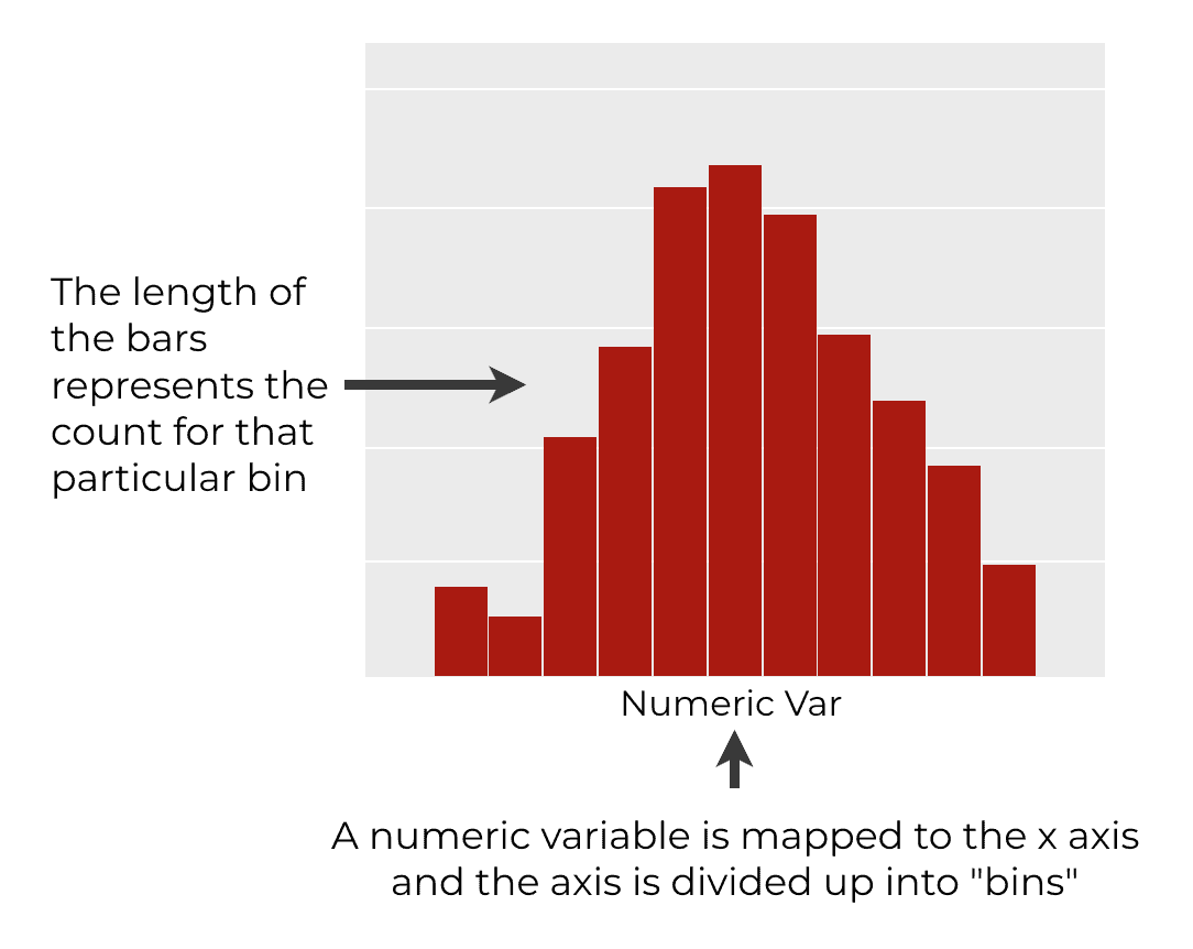
Ultimately, a histogram contains a group of bars that show the density of the data (i.e., the count of the number of records) for different ranges our x-axis variable. So the histogram shows us how a variable is distributed.
Histograms in Seaborn
Now that I’ve explained histograms generally, let’s talk about them in the context of Seaborn.
As you probably know, Seaborn is a data visualization package for Python.
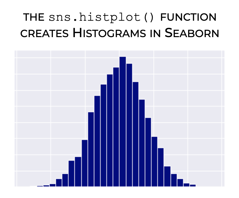
Seaborn has one specialized function for creating histograms: the seaborn.histplot() function.
Additionally, Seaborn has two other functions for visualizing univariate data distributions – seaborn.kdeplot() and seaborn.distplot(). (To learn bout “distplots” you can check out our tutorial on sns.distplot)
Having said that, in this tutorial, we’re going to focus on the histplot function.
With that in mind, let’s look at the syntax.
The syntax of sns.histplot
The syntax of the Seaborn histplot function is extremely simple.
That said, there’s one important thing that you need to know before we look at the precise syntax.
One Note about Importing Seaborn
Like all Python packages, before we use any functions from Seaborn, we need to import it first.
This is important, because how we import Seaborn will impact the syntax that we type.
The common convention among Python data scientists is to import Seaborn with the alias sns.
You can do that with the following code:
import seaborn as sns
Assuming that you’ve done that, you’ll be ready to look at and use the sytnax.
A simple version of Seaborn histplot syntax
Ok, assuming that you’ve imported Seaborn as I described above, we typically call the histplot function as sns.histplot().
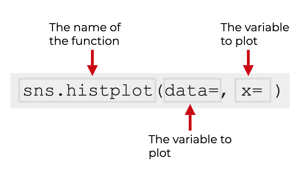
Inside of the parenthesis, we typically use the data parameter to specify the dataframe we want to operate on, and we use the x parameter to specify the exact variable that we want to plot.
Still, there are several other parameters that you can use to change how the histplot() function behaves.
Let’s look at some of those parameters.
The parameters of sns.histplot
For better or worse, the sns.histplot function has almost three dozen parameters that you can use.
The good news is that for the most part, you’ll typically only really need 6 or 7. There might be some instances where you need an uncommon parameter, but typically, you’ll only need a few to create your Python histogram.
The ones that I recommend that you learn are:
xcoloralphabinsbinwidthkdehue
Let’s take a closer look at each of them.
data
The data parameter enables you to specify a dataset that you want to plot.
This is typically a Pandas dataframe, but the function will also accept Numpy arrays.
When you specify an argument, you simply pass in the name of your data. So for example, if your dataset is named mydata, you will pass that in as an argument with the syntax data = mydata. You’ll see examples of this in the examples section.
x
The x parameter enables you to specify the numeric variable that you want to plot. In other words, this is the variable from which Seaborn will create the histogram.
If you’ve used the data parameter to specify a dataframe, then the argument to x will be the name one of the variables in that dataframe.
Note as well that the argument to the x parameter must be passed in as a string… i.e., it needs to be enclosed inside quotations.
So it will typically look something like x = 'myvariable'.
color (optional)
The color parameter does what it sounds like: it changes the color of your histogram. Specifically, it changes the color of the bars.
The argument you provide to this parameter can be a so-called “named color,” like ‘red‘, ‘green‘, or ‘blue‘. (Python has a long list of named colors.)
You can also use hexadecimal colors. Hex colors are a little complicated for beginners, so in the interest of space and simplicity, I’ll explain them in a seprarate tutorial.
alpha
The alpha parameter controls the opacity of the bars.
This is not actually one of the parameters that you’ll find in the official documentation, but it is available when you use sns.histplot().
Additionally, it might be important for you, because by default, the bars of the Seaborn histogram are slightly transparent. If you want to change that, you’ll need to use the alpha parameter.
I’ll show you how in example 3.
bins
The bins parameter enables you to control the bins of the histogram (i.e., the number of bars).
The most common way to do this is to set the number of bins by providing an integer as the argument to the parameter. For example, if you set bins = 30, the function will create a histogram with 30 bars (i.e., bins).
You can also provide a vector of values, in which case, those values will specify the breaks of the bins (this is more complicated, and not a technique that I use almost at all).
I’ll show you how to change the number of bins in example 4.
binwidth
The binwidth parameter enables you to specify the width of the bins.
If you use this, it will override the bins parameter.
So for example, if you set binwidth = 10, each histogram bar will be 10 units wide.
I’ll show you how to change the binwidth in example 5.
kde
The kde parameter enables you to add a “kernel density estimate” line over the top of your histogram.
A KDE line is essentially a smooth line that shows the density of the data. KDE lines are an alternative way to histograms to show how values are distributed, but KDE lines are also sometimes used together with histograms.
This parameter accepts a boolean value as an argument (i.e., True or False). By default, it’s set to kde = False, so by default, the KDE line will not be shown.
If you set kde = True, the histplot() function will add the KDE line.
I’ll show you how to add a KDE line in example 6.
hue
The hue parameter enables you to map a categorical variable to the color of the bars.
Effectively, when you do this, histplot() will show multiple different histograms; one for each value of the categorical variable you map to hue. And those different histograms will have different colors (i.e., different “hues”).
I’ll show you how to create a multi-category histogram in example 7.
Examples: how to visualize distributions with seaborn
Ok, now that you’ve learned about the syntax and parameters of sns.histplot, let’s take a look at some concrete examples.
Examples:
- Create a simple histogram
- Change the bar color
- Modify the bar transparency
- Change the number of bins
- Change the bin width
- Add a KDE density line
- Create a histogram with multiple categories
Run this code first
Before you run any of these examples, you’ll need to run some preliminary code first.
In particular, you need to import a few packages, set the background formatting for the plots, and create a new DataFrame.
Import packages
First, you need to import three packages, Numpy, Pandas, and Seaborn.
We’ll use Numpy to create some normally distributed data that we can plot, and we’ll use the Pandas dataframe function to combine that normally distributed data into a Dataframe. We’ll obviously need Seaborn in order to use the histplot function.
import numpy as np
import pandas as pd
import seaborn as sns
Set formatting
Next we’ll set the chart formatting using the sns.set() function.
Depending on your Python settings, the default plot format settings for Seaborn can produce visualizations that are a little ugly. Depending on your settings, things like background colors, fonts, and other aesthetic features can be a little ugly. Thankfully, Seaborn gives us a few simple ways to change those default settings to produce beautiful, well designed charts.
Although there are several ways to change the plot format settings, the simplest (and arguably one of the best) is the sns.set() function.
Here, we’ll use the sns.set() function to set our plot formatting.
sns.set()
Create dataset
The last thing we need to do before running the examples is create our data.
We’ll do this in two steps:
- create normally distributed data with Numpy random normal
- combine the normal data into a dataframe
First, let’s create some normally distributed data using the np.random.normal function .
np.random.seed(33)
normal_data_a = np.random.normal(size = 500, loc = 100, scale = 10)
normal_data_b = np.random.normal(size = 700, loc = 75, scale = 5)
Here, we’re actually creating two normally distributed datasets, so our dataframe will have two peaks (you’ll see this when we plot the data).
Now, we’ll combine it into a Dataframe using the Pandas dataframe function and the Pandas concat function.
df_normal_a = pd.DataFrame(data = normal_data_a, columns=['score']).assign(group = 'Group A')
df_normal_b = pd.DataFrame(data = normal_data_b, columns=['score']).assign(group = 'Group B')

score_data = pd.concat([df_normal_a, df_normal_b])
The final output, score_data, is a Pandas dataframe
Let’s print it out so we can see it:
print(score_data)
OUT:
         score    group
0    96.811465  Group A
1    83.970194  Group A
2    84.647821  Group A
3    94.295991  Group A
4    97.832717  Group A
..         ...      ...
695  84.728235  Group B
696  75.675768  Group B
697  78.171504  Group B
698  69.243985  Group B
699  75.073327  Group B
As you can see, the score_data dataframe has two variables: score and group. We’ll be able to use both of these in our histograms.
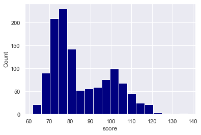
EXAMPLE 1: Create a simple Seaborn histogram
First, we’ll create a simple Seaborn histogram with the histplot function.
Let’s take a look, and I’ll explain it after.
Here’s the code:
sns.histplot(data = score_data
            ,x = 'score'
            )
And here’s the output:

Explanation
Overall, this histogram shows us the distribution of the score variable inside the score_data dataframe.
Syntactically, we created this by first calling the sns.histplot() function.
Inside the parenthesis, we specified the dataframe with the code data = score_data.
And we specified the specific variable to plot with the code x = 'score'. Note that when we specify the variable that we want to plot, we need to present that variable name as a string, meaning that we need to enclose the variable name inside of quotation marks.
A couple of notes on the plot:
This histogram has about 16 visible bins. This number of bins was calculated by the histplot function. The calculates the number of bins to use based on the “sample size and variance”.
Having said that, it’s often a good idea to look at different bin numbers. We’ll do that in another example.
Also, notice that the bars are semi-transparent. I personally don’t like this for a single-variable histogram. I’ll show you how to change that in another example by using the alpha parameter.
EXAMPLE 2: Change the bar color
Next, we’re going to change the color of the bars of your Seaborn histogram.
By default, the color is a sort of medium blue color.
In this example, we’ll to change the bar color to “navy.” To do this, we’ll set the color parameter to color = 'navy'.
sns.histplot(data = score_data
            ,x = 'score'
            ,color = 'navy'
            )
OUT:

Explanation
Notice that the histogram bars have been changed to a darker shade of blue.
To do this, we simply used the color parameter and set color = 'navy'.
Remember that Python will accept a variety of named colors like red, green, dark red, etc. Try a few out!
EXAMPLE 3: Modify the Bar Transparency
Next, let’s change the transparency of the bars.
You may have noticed in the previous examples that the bars are slightly transparent. Just a little.
Personally, I don’t like this. If we’re only plotting one variable, there’s no reason for the bars to be transparent.
To change this, we can use the alpha parameter.
sns.histplot(data = score_data
            ,x = 'score'
            ,color = 'navy'
            ,alpha = 1
            )
Here’s the output:
Explanation
If you look carefully, you’ll notice that the histograms in examples 1 and 2 were slightly transparent.
But here in this example, the bars are fully opaque.
We accomplished this by setting alpha = 1.
The alpha parameter controls the opacity of the bars. The value can be set to any value from 0 to 1.
When alpha = 1, the bars will be fully opaque.
When alpha = 0, the bars will be fully transparent.
You can play around with this if you like, but I typically like alpha set to 1.
EXAMPLE 4: Change the number of bins
Next, let’s change the number of bins in the histogram.
Here, we’re going create a histogram with 50 bins.
sns.histplot(data = score_data
            ,x = 'score'
            ,color = 'navy'
            ,alpha = 1
            ,bins = 50
            )
OUT:
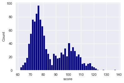
Explanation
Here, we’ve simply created a Seaborn histogram with 50 bins.
To do this, we set the bins parameter to bins = 50.
Keep in mind that it can be very insightful to try out different bin numbers.
Sometimes, a small number of bins can smooth over roughness in the data, but a small number of bins can also hide important features in the distribution.
A large number of bins can show details in how the data are distributed, but sometimes, a large number of bins can be too “granular.”
Ultimately, you need to try out different values and evaluate the resulting visualization based on your analytical goals.
Having said that, as an analyst or data scientist, you need to learn when to use a large number of bins, and when to use a small number.
There’s a bit of an art to choosing the right number of bins, and it takes practice.
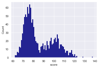
EXAMPLE 5: Change the bin width
Instead of using the bins parameter, we can also use the binwidth parameter to specify a specific width for the histogram bars.
Let’s take a look.
sns.histplot(data = score_data
            ,x = 'score'
            ,color = 'navy'
            ,alpha = 1
            ,binwidth = 1
            )
OUT:
Explanation
Here, we set binwidth = 1. This generated a histogram where the bars are all 1 unit wide.
As a side note: I think this might be a little bit too granular. There are probably too many bars here and the plot is showing too much detail. (I used this example mostly for the purposes of illustration.)
It might be better to try a higher bins. A value of 5 or 10 will probably be better. Try them out!
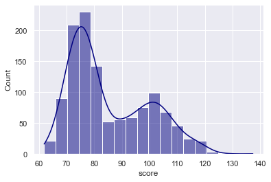
EXAMPLE 6: Add a KDE density line
Next, we’ll modify our Seaborn histogram and add a KDE density line to show the density of the data.
Remember: KDE stands for “kernel density estimate.” KDE lines are smooth lines that show how the data are distributed, and can be a good compliment to histograms.
Let’s take a look.
sns.histplot(data = score_data
            ,x = 'score'
            ,color = 'navy'
            ,kde = True
            )
OUT:
Explanation
Here, we added a KDE line with the code kde = True.
Remember that by default, the kde parameter is set to kde = False. When we set kde = True, it adds the KDE line over the top.
Notice that the KDE line enables us to see how the data are distributed while smoothing over some of the variations in the underlying data. Because they smooth over some of the roughness, they can be good for giving us a high level view of data density, and they offer a good contrast to histograms.
EXAMPLE 7: Create a histogram with multiple categories
Finally, let’s create a Seaborn histogram with multiple categories.
You might have noticed when we created our dataset, that there is a variable called group. This is a categorical variable with two values, Group A and Group B.
In this example, we’re going to plot the distribution of the score variable for both of these different groups.
To do this, we’ll use the hue parameter:
sns.histplot(data = score_data
            ,x = 'score'
            ,alpha = .7
            ,hue = 'group'
            )
OUT:
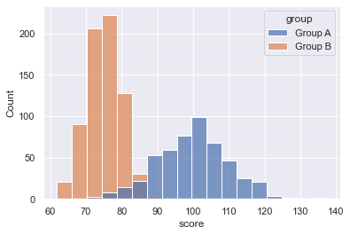
Explanation
Take a look at the output. The output plot has two histograms: one for Group A and one for Group B. Both histograms appear in the same plot, but have different colors.
To create this, we set the hue parameter to hue = 'group'.
Remember: the group variable is a categorical variable with the values Group A and Group B.
So what we’re doing here, is we’re breaking out the data by category, with different categories colored with different “hues.”
This is a good technique if your data has multiple categories, and you want to compare those categories in the same plot.
Leave your other questions in the comments below
Do you still have questions about making a Seaborn histogram?
If so, just leave your questions in the comments section below.
If you want to master Seaborn, join our course
In this blog post, I’ve shown you how create a Seaborn histogram using sns.histplot(). But to really master data visualization in Python, there’s a lot more to learn.
That said, if you’re serious about learning Seaborn and mastering data visualization in Python, you should join our premium online course, Seaborn Mastery.
Seaborn Mastery is an online course that will teach you everything you need to know about Python data visualization with the Seaborn package.
Inside the course, you’ll learn:
- how to create essential plots like bar charts, line charts, scatterplots, and more
- techniques for creating multivariate data visualization
- how to add titles and annotations to your plots
- how to “tell stories with data”
- learn “how to think” about visualization
- and much more …
Additionally, when you enroll, you’ll get access to our unique practice system that will enable you to memorize all of the syntax you learn. If you practice like we show you, you’ll memorize Seaborn syntax and become “fluent” in writing data visualization.
You can find out more here:
Really helpful, contain detail explanation. Thanks for sharing!
You’re welcome
Beautifully explained. Thanks for the great work!
You’re welcome.