One of the biggest questions from data science students is what to focus on.
All of us have limited time and there is a lot to learn in data science.
Many overzealous students throw caution to the wind, and immediately try to learn advanced topics like machine learning. As I’ve said many times, this is foolish.
Instead, you need to master the basics before you move on to advanced topics.
In past blog posts, I’ve emphasized the importance of data manipulation.
It’s true that data manipulation is a huge part of data science, and is one of the critical foundations.
But I’d also argue that data visualization is just as important.
Along with data manipulation, data visualization is one of the essential pillars of data science.
Why Data Visualization is So Important
So why is data visualization so critical?
I’d argue that there are two main reasons that data visualization is so important:
- Data visualization is used at almost all levels of data science
- Data visualization is critical for almost every part of the data science workflow
Essentially, you need data visualization at almost every level of data science job (junior, intermediate, and advanced). And you also need data visualization for almost every step in your day-to-day data science work.
Let’s analyze this a little more closely, so you can understand why you need to master data visualization early in your data science career.
Data visualization is used in all data science job levels
First of all, data visualization is used at all data science job levels.
To explain this, let me give you a rough sketch of three different data science job levels.
- Junior Data Scientist
- Intermediate Data Scientist
- Advanced Data Scientist
To be clear: these are very rough categories. Most companies will have several sub-categories within each of these (e.g., “Junior Data Scientist I”, “Junior Data Scientist II”, etc). Many companies will also have specialist roles related to data science, like database engineer, machine learning specialist, etc. And some unique companies will have very different job categories for data scientists.
However, these three job titles show a very general job progression that you’ll find at many businesses.
Let’s quickly discuss these different job levels, and what they entail. When we do, you’ll see that data visualization is critical for almost all of them.
Junior Data Scientist
This level is what I consider to be the “entry level” of a data science team.
At this job level, you’re getting data, cleaning it up, exploring it, visualizing it, analyzing it, and presenting results.
As a junior data scientist, you’re sort of a glorified data analyst. I like to call this type of work, “data analysis on steriods.”
Notice though that data visualization is one of the key skills.
In fact, I’d argue that data visualization is somewhere between 20% and 50% of the work.
We can argue about what percentage exactly (the percent will be different at different companies and in some specific rolls). What’s important is that data visualization is a critical part of the job.
As a junior data scientist, you need data visualization.
Intermediate Data Scientist
As an Intermediate Data Scientist, your work will actually look a lot like the work of a Junior Data Scientist.
In many ways, it’s more of the same: you’ll be getting data, cleaning it up, visualizing it, and analyzing it.
There are two major differences though.
First, at this stage, you might start to specialize in something.
Some data scientists are great at getting and cleaning data, so they might specialize in that. Other data scientists are better at data visualization, and specialize in visualization. Others still might have a knack for presentation, and may be tasked more with presentations and client-facing deliverables.
The second difference at this level, is that machine learning commonly comes into play.
While Junior Data Scientists are rarely do much machine learning (in spite of what you might have heard), Intermediate level data scientists might start to build some ML models.
In many cases, these will be simpler types of models like linear regression, logistic regression, clustering, and decision trees. (More advanced techniques like deep learning will be more rare.)
What’s important to recognize, is that at this level, you’ll still be doing a lot of data visualization. You might specialize in something, and you might start using a few advanced techniques, but the job still requires a lot of data visualization.
If you need to get and explore a dataset, you’ll probably need to use data visualization.
If you need to perform an analysis and “find insights” in your data, you’ll definitely need to use data visualization.
And if you start to do some machine learning, guess what … you’ll still need to use some data visualization to evaluate your models, run diagnostics, and communicate results.
Data visualization is still critical at an intermediate data science job level.
Advanced Data Scientist
Once you hit an advanced level, the required skills typically shift.
Here, you’re much more likely to be using machine learning techniques, and more “advanced” techniques like deep learning.
It’s also much more likely that you’ll be responsible for building systems and applications. You might also be responsible for optimizing those systems, which require much deeper understanding of software engineering and algorithms.
Having said that, although data visualization is a somewhat smaller proportion of the job at this level, it’s still important.
In almost all cases, you’ll still be getting data and analyzing it, which means that you’ll still need to use both data manipulation and data visualization techniques.
And again, if you’re doing machine learning, you’ll still need to use data visualization to evaluate model performance, run diagnostics, and communicate your results.
As I’ve said: data visualization is a necessary skill at almost every data science job level.
Data Visualization is Critical for Almost Every Part of the Data Science Workflow
Not only is data visualization critical for different job levels on a data science team, data visualization is used in almost every part of the day-to-day data science workflow.
Almost from start to finish, no matter what you’re doing as a data scientist, you’ll need to use data visualization as either the primary tool, or a supplementary tool to get your work done.
Data Exploration
For example, when you first get or create a dataset, one of the first things you’ll need to do is explore the data.
Before you do anything else, you simply need to know what’s in the data.
To find out, you’ll perform “data exploration.”
Often times, we’re trying to answer basic questions like:
- how numeric variables are distributed
- what categories exist in categorical variables
- whether there are any lingering problems with the data that still need to be fixed
At this stage, you’re just trying to figure out what’s in the data.
To do this, you’ll use many simple data inspection techniques, like the Python print() statement and data aggregation techniques.
But you can also use data visualization.
For example, if you want to view the data distribution for a variable, you can create a histogram or density plot (e.g. you can use the Seaborn distplot function).
Similarly, you can create a bar chart to examine categorical variables or use scatterplots to examine pairs of numeric variables.
When you’re doing initial data exploration, data visualization is actually a very useful toolkit.
Data Analysis
Similarly, data visualization is critical for data analysis.
Data analysis is somewhat similar to data exploration, in that you’re trying to understand the data.
But when you do data analysis, you’re commonly trying to answer specific questions like “how can we improve sales” or “what is the biggest opportunity for Team A.”
To answer these questions, you’re going to perform data analysis.
At this phase of work, a lot of young data scientists get stuck. Many data science students have no idea how to do “data analysis.”
To help, I’ll let you in on a secret …
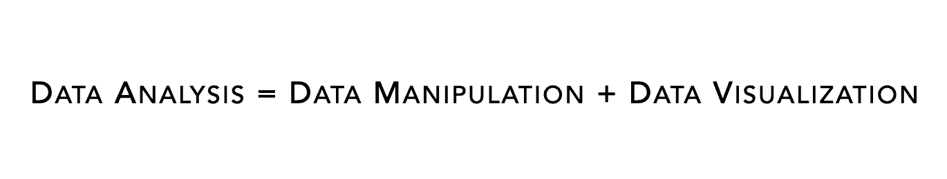
For the most part, data analysis is really just data manipulation and data visualization combined together.
Now to be fair, the actual process of combining data manipulation and data visualization to do data analysis is a little more complicated. But at its root, data analysis is mostly just applied data manipulation and data visualization.
So if you want to analyze your data, you need to master data visualization first.
Finding Insights
This is a good point to talk about “finding insights” in data.
If you look at almost any data-related job description, it will say that applicants need to be able to “find insights in data.”
WTF does that mean?
Finding insights is really just data analysis. Companies want you to be able to analyze data to find valuable pieces of information that they can use to improve metrics (i.e., profitability, customer retention, system performance, etc).
If you want to be able to “find insights in data,” you really need to be able to analyze data. And as I just mentioned, this ultimately means that to find insights, you need to be able to apply data visualization in a strategic way.
Again, data visualization is critical.
Communicating Insights
Once you analyze your data and find some insights, you commonly need to communicate those insights to other people.
Frequently you’ll communicate your results to your colleagues and immediate management.
But many times, you’ll also need to communicate your results to higher level executives.
This group of people are often less technical. They also have less time and need an ultra-distilled message that clearly shows the most important findings or results.
How do you do this?
You use data visualization.
The most common method of communicating upward to an executive team is with a Powerpoint-style presentation with lots of charts and graphs.
In these presentations, you literally need to show your audience the most important findings and results.
Data visualizations – like bar charts, line charts, etc – are almost always the best way to communicate quickly and clearly to a management team.
They are easy to create, easy to explain, and usually easy to understand (if you use them properly).
I’d argue that data visualizations are the most important tools for data communication and for “storytelling with data.” You absolutely need data visualizations for this phase of work.
Machine Learning
Many data science students think that machine learning is about equations and algorithms, but that’s mostly not true.
It does help to understand the mathematics behind machine learning techniques, but most of the actual computation is performed by the computer.
Moreover, most of the code to perform those computations is abstracted away. For most data scientists, building a machine learning model is as simple as calling a few functions (like the fit() function from Sci-Kit Learn).
But that’s not to say that machine learning is easy. It’s still difficult.
Frequently, you still need to build several different models, compare models, evaluate performance, and run diagnostics.
How do you do this?
In many cases, to evaluate models and diagnose problems, you need to use data visualization techniques. To compare models, you can use some standard techniques like bar charts. To evaluate model performance, there are some more specialized charts like the ROC curve.
These are just a couple of examples. The overall point is that in practice, building machine learning models involves lots of analysis and visualization.
Master Data Visualization Early
I hope you’re getting the picture.
Data visualization is a foundational skill for data science.
You need it for almost every step of the data science workflow.
You need it at almost every data science job level.
Without data visualization skill, you will probably be completely unqualified to do actual work.
But with it, you’ll not only be qualified to do work at a junior level, but you’ll be prepared to learn more advanced data science skills later.
So before you jump to advanced topics like machine learning, you should master data visualization.
Mastering data visualization should be just as big of a priority as mastering data manipulation.
So study hard, and master data visualization very early in your data science career.
Master Python Data Visualization using Seaborn
If you’re ready to master data visualization in Python, you should join our new course, Seaborn Mastery.
Seaborn Mastery is our premium course to help you master data visualization in Python using the Seaborn package.
We’ve designed this course to be the absolute fastest way to master Seaborn. It breaks everything down, step by step. It clearly explains all of the techniques. And it will give you a practice system that will help you memorize all of the syntax you learn. Ultimately, the course will help you master Seaborn within only a few weeks.
This is a brand new course, and we’ll open enrollment for it on Tuesday September 15.
If you’re ready to master data visualization in Python, this is the course you’ve been waiting for.