Master Python Data Visualization
in 10 Minutes Per Day
Discover our step-by-step system for mastering Seaborn data visualization in Python, in as little as 10 minutes per day
• Master data visualization in Python with Seaborn
• Memorize Seaborn Syntax
• In as little as 10 minutes per day
• Even if you struggle to find time

Hi. I’m Josh Ebner, the founder of Sharp Sight, and a former data scientist at Apple.

I’m sure that you know that data science is extremely valuable.
Right now, the average pay for a data scientist is almost $150,000.

That’s about $50K more than an engineer or software developer.
And about $75K more than a traditional data analyst.
You could make a lot more money by transitioning to a data science job.
BUT, getting one of those data science jobs will be challenging.
And a few specific problems will stand in your way …
Problem 1:
You Need to KnowData Visualization
As a data professional, you need to use data visualization for almost every part of the data science workflow.
For starters, any data science roll will require you to be able to make a variety of charts and graphs:
- Bar charts
- line charts
- histograms
- heatmaps
- small multiple charts (these are really important)
- pairplots
- bubble charts
- area charts
I could go on and on …
You need to be able to create this quickly, and accurately. When I worked at Apple, I’d often get “emergency” requests for some charts and graphs … and I had to prepare them really fast.
That’s what it takes to get a high-paying data science job.
And it’s not just making these charts … you need to be able to format them correctly.
And you need to be able to use them for things like:
… data exploration
… data analysis
… “finding insights”
… storytelling with data
… presentations to executives
All of these skills require visualization in one way or another.
If you want to make a ton of money with data science, you NEED to know data visualization, and you need to know it well.
Problem 2:
They’re Going to Test You
If you want to get a highly-paid data science job, there’s going to be some competition.
You’ll need to submit resumes that explicitly tell them that you have the skills that they’re looking for.
You’ll need to be able to tell recruiters and hiring managers that “Yes, I know how to make bar charts, line charts, histograms, and all of the critical visualizations that a data scientist needs.”
But … there’s more
They’re going to test you.
Before I got my job at Apple, they tested me on my ability to write code.
And over my career, I’ve interviewed at many of the biggest companies in the USA, like Meta (Facebook), LinkedIn, Bank of America, and others.
Every single one tested me on my ability to write code.
So as a data science candidate, you need to understand, that they’re going to test you.
Now to be clear: these coding exams are based on how to do data science tasks …
So, how to write code for essential data visualizations, like bar charts, histograms, line charts, pair plots, and on and on.
Like it or not, if you want that $150,000 data science job, you need to memorize the code to create those visualizations, just so you can pass their interview coding exam.
Problem 3:
Learning Data Visualization is Hard
Let’s face it: learning data science is hard.
You need to learn lots of tools and techniques, like all of the visualization tools I mentioned earlier: bar charts, stacked bars, line charts, area charts, scatterplots, bubble charts, small multiples, pairplots. And a lot more
Moreover, you need to learn a lot of conceptual knowledge, like:
- how to pick the right data visualization for a particular problem
- how to “tell stories with data”
- how to “find insights in data”
- how to “communicate visually” to non-technical people
And so on.
There’s a lot to learn.
But it’s worse than that.
On top of how much there is to learn, it’s very hard to find time.
You’re busy, right?
Work, friends, social life, maybe a hobby or two.
You have a busy life and it’s hard to find time to learn all of those tools, techniques, and concepts.
And to top it off, I bet you forget a lot of what you learn.
Have you ever learned some Python syntax, and the forgotten it?
It’s very common …
But forgetting the things you learn will make it even harder.
Harder to use your time efficiently …
And harder to past the data science interview exams.
If you’re serious about learning data science well enough to actually get a high-paying job, you’ll need to find a way that enables you to simplify learning data science.
You’ll need a way to remember everything well enough to pass the interview tests …
And you’ll a study process that’s efficient enough for you to master these skills, even with your limited time.
But here’s a secret …
There’s a way to master data visualization, memorize the syntax (so you can pass any interview), and do it in as little as 10 minutes per day.
A few years ago, I was in a similar position as you.
I wanted to upskill and make more money …
But many of the skills I needed to learn were difficult.
AND I kept forgetting syntax.
AND I was really busy on top of that.
I needed to find a more effective, more efficient way to learn.
So I took a bit of a sidetrack …
I researched how to learn faster, more efficiently, and with better long term memory of things like complex data science syntax.
I read about how Navy SEALs train. I read about how chess masters train. I read about how polyglots learn new languages (polyglots are people who speak multiple languages).
Eventually, I started noticing patterns.
All of these elite performers use similar practice methods to train and learn new skills.
Finally, I “cracked the code” on learning data science.
And everything changed.
What if you could master data science in as little as 10 minutes per day?
After months (even years) of struggling to learn data science, I finally “cracked the code.”
I developed a training system to enable me to very rapidly learn new data science skills.
This system is hyper-efficient.
With as little of 10 minutes of practice per day, this system has enabled me and my students to master data visualization in Python.
And importantly, this system has helped me and my students memorize the code.
If you practice using our system, you’ll be able to write Python visualization code “with your eyes closed” …
… and make any visualization that an interview exam might test you on.
If you practice like we show you, you’ll be able master Python data visualization in a couple of months, in as little as 10 minutes per day.
Here’s how …
Introducing …
Seaborn Mastery
A systematic, step-by-step course to help you learn and master data visualization in Python using the Seaborn package.
Learn the essential tools of data visualization in Python
To be a top performer, you really need to know about a dozen important data visualizations.
These visualizations are like tools that you can use to analyze data, find insights, and “tell stories with data.”
Seaborn Mastery will simplify data visualization by focusing intensely on these most commonly used visualizations.
You’ll discover the visualizations that you absolutely need to know …
Without being overwhelmed with things that you won’t need.
This is the 80/20 rule in action.
Seaborn Mastery will show you the visualizations that you need to know, explain the syntax, and help you memorize all of the syntax that you learn.
When you join the course, you’ll learn and master all of the essential visualizations that you need in order to become a top performer.
Memorize Seaborn Syntax
One of the most important benefits of the course, is that it will help you memorize all of the syntax that you learn.
Have you ever learned some Python syntax, but then forgotten it a few days later?
Have you ever had to look up some syntax on Google to finish a task?
It’s okay if you have … I’ve been there too …
But you should know that there’s a better way
There’s a way to memorize Python syntax so that you remember it FOREVER
When you join Seaborn Mastery, you’ll get access to our unique practice system that will help you memorize Seaborn syntax.
This practice system incorporates deep insights from psychology and neuroscience, and will help you “hack your memory” to memorize all of the syntax you lear.
Once you take the course and practice like we show you, you’ll remember all of Seaborn syntax you learn, permanently.
Get the tools to analyze data and find insights
To analyze your data and “find insights,” you need the right tools
In fact, to analyze data and find insights, you need to use data visualizations.
Seaborn Mastery will give teach you the critical data visualization tools that you need to do data analysis and to find the valuable insights that your partners want.
Master data visualization using Seaborn
Seaborn Mastery will enable you to rapidly master data visualization with Seaborn.
If you’ve ever struggled with data visualization in Python, this is the course you need.
When you join, you’ll learn everything that you need to know quickly, systematically, and efficiently.
If you study the material, and practice like we show you, you willl “master” data visualization in Python within a few weeks.
Skyrocket your productivity
Knowing syntax and knowing the right tools is important …
… but at the end of the day, it’s all about productivity.
To get hired, and to get paid you need to be able to do real work and get things done
Seaborn Mastery will give you the tools you need to visualize your data efficiently and effectively …
Once you complete the course, your productivity will increase dramatically.
Seaborn Mastery will walk you through a systematic, step-by-step process to help you master the Seaborn package, and enable you to visualize your data like a pro.
“Learning this way is almost addictive!”
– Victor O., Sharp Sight student
In Seaborn Mastery, you’ll learn essential data visualization skills, systematically
Seaborn Mastery will teach you the essential skills of data visualization using the Seaborn package.
But the course is highly structured.
You’ll learn Seaborn tools in a way that’s efficient, effective, and fast.
To do this, the course is divided up into several different modules:
In Module 1, you’ll learn:
Visualize Relationships
Between Variables
In module 1, you’ll learn how to visualize relationships between numeric variables.

So in this module, you’ll learn several important techniques:
- Scatterplot
- Lineplot
- Bubble Chart
- Pairplot
- Regplot
Scatterplots and line charts are essential tools that you absolutely need to know, but they can be a little complicated to a Seaborn beginner.
We’ll explain everything in a way that makes them easy to understand and easy to use.
We’ll also show you some extra techniques that will help you wield the full power of Seaborn when visualizing relationships between variables.

In Module 2, you’ll learn:
Visualize Categorical Data
Next, you’ll learn how to visualize categorical data.
Seaborn actually has several techniques for visualizing categorical data, which sometimes confuses beginners.
This course will explain everything you need to know to visualize your categorical data

You’ll learn about bar charts and count plots, as well as when to use each of these techniques.
You’ll learn about box plots, including how to manipulate the aesthetics of your plots like color, plot orientation, etc.

And you’ll learn how to create “violin plots,” which are like a specialized, multivariate boxplot.

This module will clearly explain the syntax for each of the techniques, and will help you memorize all of the syntax, so you’ll be able to visualize your categorical data like a data-vis master.
In Module 3, you’ll learn:
Visualize Data Distributions
In this module, you’ll learn how to visualize data distributions.

You’ll learn:
- How to plot distributions of single variable
- How to plot distributions of two variables
- How to manipulate the aesthetic features of your charts

We’ll explain the syntax, and give you clear, step-by-step example of how to use these visualizations.
In Module 4, you’ll learn:
Create Multi-Plot Visualizations
In this module, you’ll learn a set of techniques for creating plots with multiple charts.

Specifically, you’ll learn:
- How to make small multiple charts
- How to plot many variables in “pairs” to quickly find correlations and relationships

These tools are very powerful multivariate techniques, that are essential for “finding insights” in data.
In Module 5, you’ll learn:
Change Plot Aesthetics
In this module, you’ll learn how to format your charts and change plot aesthetics..

You’ll learn how to quickly set a “theme” for your charts to make them look more professional.
And you’ll learn other techniques for controlling fine-grained aspects of your charts and graphs.
In Module 6, you’ll learn:
Work with Colors
and Color Palettes
Finally, you’ll learn how to work with colors and color palettes.

You’ll learn how to modify the colors of your charts, to make them look more professional, but also to communicate insights more clearly to your colleagues.

This is the final bit of polish that will enable you to create beautiful, insightful data visualizations in Python.
BONUS:
Data Visualization
Teardown Vault
Seaborn Mastery contains bonus vaults of data visualization teardowns.
In the “data visualization teardown” vault, you’ll learn more about “how to think” about data visualization, and how to “tell stories with data.”
In these video lessons, I break down data visualizations and explain the good, the bad, and the ugly. These lessons will help you sharpen your understanding of how to effectively use data visualizations to communicate valuable insights.


These teardowns will sharpen your intuition on how to best design individual charts, and also how to use them to “tell stories with data.”
BONUS:
“Seaborn Objects” Essentials
In September of 2022, the Seaborn team released a new system for creating data visualizations in Python.
In my opinion, this “Seaborn Objects” system is the best, most powerful, most easy to use data visualization toolkit for Python.
It’s based on the Grammar of Graphics, so it’s structurally similar to ggplot2 from R, as well as Tableau.
In terms of usability though, this new system will enable you to create complex, beautiful, insightful visualizations, with a simple, easy-to-understand syntax.
And you’ll learn about it in this bonus section of Seaborn Mastery.

You’ll learn the syntax for this new system, and you’ll learn how to use it to create both common charts (like scatterplots, histograms, etc), and also more complex charts like small multiples and pairplots.
This powerful new Seaborn system is so new, it’s difficult to find any good information on it.
But you’ll learn everything about it that you need to know, in Seaborn Mastery.
BONUS:
5 Visualization Mistakes
That Make You Look Like an Amateur
Data visualization is as much about good design as it is about writing syntax to create visualizations.
And a big part of good design is avoiding simple design mistakes.
So in this bonus, I’ll show you 5 of the most common data visualization mistakes that amateurs make.
These are things that you NEED to know, so you know what to avoid doing.
You’ll learn:
- 3 Major Plot Title Mistakes
- The #1 Worst Visualization That You Need to AVOID (hint: it’s extremely common)
- The Reason that 3D Charts are Terrible (and what to do instead)
… and more


This bonus will further sharpen your intuition about how to create great visualizations by telling you 5 things that you absolutely need to avoid.
(You really need to see this, because you’re probably doing at least 1 or 2 of them …)
BONUS:
5 Ways To Improve
Your Data Visualizations
Again … data visualization is about more than just writing syntax.
A lot of visualization is knowing how to use different elements of a plot to communicate to an audience visually.
Have you ever heard someone say the phrase “telling stories with data”?
Visual design is a big part of that.
You have to know how to structure your visualizations.
That’s why in this bonus, I’ll show you 5 simple ways to improve the design of your visualizations.
You’ll learn:
- The RIGHT Way to Use the Plot Title
- How to Use the Plot Subtitle
- Why Plot Annotations are Useful (And what to Use Them For)
… and more


In this bonus, you’ll learn more tips and strategies to improve your visualizations, so you create your charts and graphs like a high-paid pro.
BONUS:
How to Choose the Best Visualization
for Every Task
In order to “find insights in data” and “tell stories with data” you need to know how to choose the right visualization for every task and situation.
This lesson will explain, step by step, how to choose the right visualization for your data.


This lesson alone should be worth $100 dollars …. it will show you the secret to choosing the right visualization every time.
Once you read this, it will be easy to “find insights” and do “data driven storytelling” …
Just like I used to do for Apple and Bank of America.
BONUS:
Matplotlib Essentials
In this bonus module, you’ll learn about Matplotlib.
Matplotlib is an extremely common data visualization toolkit for Python.
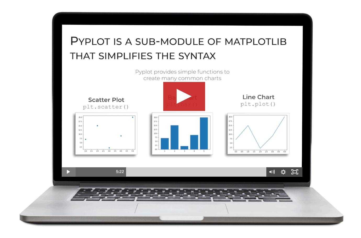
In the Matplotlib modules, you’ll learn:
- How to create bar charts
- How to create scatter plots
- How to create histograms
- How to create line charts
- How to format your data visualizations with “style sheets”
Although I prefer to use Seaborn, due to it’s simplicity and ease of use, Matplotlib is still very commonly used, so you should probably know how to use it. This module will teach you the Matplotlib essentials that you need to know.
BONUS:
Seaborn Visualization Cheat Sheet
The course also comes with a handy Seaborn “cheat sheet” that will enable you to quickly review the relevant techniques and syntax..

BONUS:
The Essentials of
Data Visualization for Machine Learning
Data visualization is a big part of exploratory data analysis for machine learning, as well as machine learning diagnostics.
In this bonus module, we’ll show you how to use some of the visualization tools that you learn in the course for machine learning.

If you’re interested in Python AI (and you SHOULD be, because it will be worth millions), then you need to understand how to apply data visualization for AI and machine learning.
This module will show you the essentials that you absolutely need.
Memorize Seaborn Visualization Syntax
Seaborn Mastery has been designed to help you memorize Python visualization syntax.
Like it or not, you need to know Python syntax.
For example, when you interview for a data job, they’re going to test you to make sure you know the syntax, and to check that you know what you’re doing.
So imagine…
You’re in your data science coding interview, and they ask you to visualize a dataset …
They ask you for a scatterplot …
You smile briefly, and then effortlessly type the code to visualize your data ….

Imagine how satisfying it will be to ace your coding interview …
How exciting it will be to get the job offer …
How great it would be to make thousands more than you’re already making.
It’s all possible.
BUT, to make it happen, you need to master these visualization skills.
When you join Seaborn Mastery, you’ll discover a training system that will help you master those necessary visualization skills, and memorize seaborn syntax.
Our training system will enable you to memorize the syntax for for visualizing your data with beautiful, insightful charts and graphs.
By memorizing the essential syntax, you’ll dramatically increase your likelihood of getting that coveted data science job.
After a few weeks of practice, you’ll be able to write Seaborn code fluently, rapidly, and from memory.
“Your practice method is simply effective beyond words”
– Joshua F., Sharp Sight student
About Your Instructor
Hi. I’m Josh Ebner, the founder of Sharp Sight, and a former data scientist at Apple.
I’ve been doing data science and analytics since 2004 (literally since before we called it data science).
I’ve done data science and analytics at some of the biggest and best companies in the world, including Apple, Bank of America, HP, Ogilvy, Kraft, and many others.

Over the course of my career, I’ve made thousands of data visualizations.
I designed this course to help you quickly increase your skill with visualization, but also data storytelling, finding insights, data communication. The skills you need to get a data science job.
I want to turn you into a skilled data visualization pro, as quickly and efficiently as possible, using our step-by-step training system.
“I have been practicing almost every day and it really helped me memorize all the syntax.”
– Corey H., Sharp Sight student
Read What our Students are saying about our courses and training method
I get it …
You’re probably skeptical.
Becoming “fluent” in Seaborn in a few weeks sounds too good to be true.
Mastering data visualization in Python in a few weeks doesn’t seem possible …
But it IS possible.
You can become “fluent” in Seaborn and master data visualization skills in only a few weeks.
Our past students have had amazing results.
Here’s what our past students have had to say about our courses and training methodology:
“I enrolled in your data science program this past year …. It’s amazing!
Having taught for 20 years, you have one of best approaches I’ve seen to teaching.”
“I want to say thank you for the quality of the course.
The concepts are combined very well with this course. It’s great.”
“The course is amazing.”
“You deliver excellent information, parsed into just the right units, and provide an awesome way to practice and internalize the material.
… the course is delivering on all the promises, and it’s improving my understanding of everything.”
“Being able to write down key code snippets without looking up anywhere else is so useful.”
“The course is very good.”
“I’m really enjoying the lectures, coding walkthroughs, and practice.
They’ve been tremendously helpful and I can really see my fluency developing.”
“I have been practicing almost every day and find that it really helped me memorize all the syntax.”
“I feel much more comfortable and proficient after going through the videos and practicing.”
“Your DSSR method is simply effective beyond words.”
When you join Seaborn Mastery, you’ll get everything you need to rapidly master data visualization in Python:
 Over 45 video lessons
Over 9 hours of video content
Over 1600 lines of sample code
Over 200 practice exercises
A system for practicing syntax (this works so well, you’ll be writing code “with your eyes closed”)
A bonus vault of data visualization teardowns
Lifetime access to course materials (access everyday, 24/7, permanently)
Free access to all future updates to the Seaborn Mastery course
Seaborn Mastery
is right for you if answer YES to
any of these questions…
Do you want to learn data visualization in Python?
Do you want to learn Seaborn?
Do you want to increase your skill in data visualization?
Do you need to “find insights” in your data?
Do you feel like you’ve gotten as far as you can on your own?
Are you tired of “half assed” free tutorials, that only show you the basics?
Are you frustrated with the official documentation, which is often out of date and difficult to understand?
Are you ready to invest in your skill set and accelerate your data science learning?
Do you want to learn the best ways to do data visualization in Python?
Do you want to become a data scientist?
You want to be more productive with your data projects?
Do you want to learn the “foundation” for advanced data science topics?
Are you overwhelmed with data science material?
Have you taken other data science courses, but still feel “lost” or “stuck” when you work on projects?
Are you really time constrained, and need a fast and highly efficient learning system?
Do you want to use a proven system to help you master data visualization?
Do you keep getting stuck on Python’s “finicky” syntax for data visualization?
Do you want a clear, step-by-step course that will help you master data visualization in Python?
Do you sometimes forget Seaborn Syntax?
Are you interested in memorizing the syntax for doing data visualization in Python?
Can you already make simple plots, but need to “dress them up” so they look more professional?
Do you need to learn how to “finalize the details” of a plot?
Do you want to be more productive on your data science projects?
Do you want to be a “top tier” data scientist?
Do you want to write Seaborn code “fluently” ?
No matter what stage you’re at in your data science training, if you answered “yes” to even ONE of of the questions above, you should join Seaborn Mastery, RIGHT NOW.
BUT!
If you’re looking for a course that will magically turn you into a data unicorn without any effort at all, then don’t join.
If you’re out of cash and definitely can’t afford the course, don’t join.
Seaborn Mastery is a step-by-step system that will enable you to rapidly master visualization in Python …
IF you do the work.
You must be willing to put in some effort in order to get the results.
If you’re willing to do that, then Seaborn Mastery can help you master data visualization in Python within weeks.
Frequently Asked Questions
Do I need to know Python?
Yeah, you’ll need to know at least some of the basics.
You should know some of the basics of dataframes, and if you want to really get the most out of it, you should know how to do a little data manipulation with Pandas.
Having said that, if you know some of those foundations, Seaborn Mastery will teach you everything you need to know about how to use Seaborn to do data visualization.
How does the course work?
Seaborn Mastery is an online video course.
After purchasing the course, you’ll get access to a member area, where you will find video lectures, code, practice exercises.
New lessons will be released over several weeks and once a lesson is opened up, you can review the material whenever you want.
The course is very flexible, in the sense that you can review the material when you want, once a module opens up. Moreover, you can study wherever you want: your home office, your couch, or anywhere is convenient for you.
“Is this course live?”
This is not a live course.
This is an online video course. You will have access to the course 24 hours a day by logging into the member area.
This makes the course very flexible … you can watch the videos and practice whenever is convenient for you.
“What if I live in India, or China, or Europe?”
You can take this course from anywhere in the world. This course is 100% online, so you can take it from anywhere.
“How long do I have access?”
This is an online course, so you have 24/7 access.
You’ll also have permanent access, so you can return to the material as often as you like (even next year).
"Can I use a different programming language?"
No.
This course only uses the Python programming language. There are other good data science programming languages (like R), but this course exclusively uses Python.
If you want to learn how to do data science or data visualization with R, you should enroll in one of our R-based courses.
“If I want to become a data scientist, would this be a first step?”
This course is great for learning data visualization, one of the pillars of data science.
If you want to be a great data scientist, you really need to know data visualization.
However, this is probably not the best course if you’re a true beginner with data science in Python. Before taking this course, you should know a little bit about “base Python” and you should have a decent understanding of dataframes and data manipulation in Python.
But once you know some of those basic skills, this course will help you learn and master data visualization in Python with the Seaborn package.
Data visualization is a critical skill, so we strongly recommend this course after you’ve learned some of the basics.
“Will this prepare me to learn machine learning later on?”
Yes.
Although Seaborn Mastery does not teach machine learning, it has been specifically structured to prepare you to learn machine learning in the future.
Seaborn Mastery teaches you data visualization.
Data visualization is very important for building machine learning models, because you need to visualize and explore your data throughout the machine learning workflow.
That being said, this course will give you the visualization skills that you’ll need to build machine learning models later on.
“Do I need to know calculus or advanced math?”
No.
Seaborn Mastery avoids math topics completely.
A lot of data science “advice” will tell you that you need to know advanced math to learn data science. This is a huge myth.
Most working data scientists (working in business and industry) do not use math on a daily basis.
Instead, most people who work in the data industry use data visualization almost every day.
If you want to be a great data scientist, you need to know and master data visualization. This course will teach you that skill set.
So, don’t worry if you don’t know calculus or linear algebra. You won’t need it.
“How much work do I need to put in to the course?”
A couple hours per week.
Every week, a new module will open. Most modules have 3 to 5 lessons, and each lesson has 1 or 2 videos.
You should be able to watch all of the videos in a module in 60 to 90 minutes.
Additionally, most of the modules also have practice exercises. We recommend that you practice with these practice exercises every day for 15 to 20 minutes.
You can adjust your practice level as needed, so if you only have 10 minutes a day, you can do that.
If you study and practice like we show you, you should be able to master Seaborn techniques within 4 to 6 weeks.
(If you have less time to put in, it may take longer to get results.)
In any case, between the videos and practice exercises, you should expect the course to take a couple of hours per week.
“Why are there monthly payments?”
There are two payment options: you can pay in full with a one-time payment OR you can pay in monthly installments.
We created the monthly payment plan to make the course more cashflow friendly.
If you choose to pay in installments, you will make an installment payment every month for 5 months. By selecting this payment plan, you are committing to 5 complete payments … that’s the cost of the course.
Keep in mind that if you choose to pay the full cost of the course immediately with a one-time payment, you will get a discount compared to the payment plan option.
“How long does the course last? How many lessons?”
There are 6 core modules, and each module has several lessons and exercises.
When you join, you’ll get access to an introductory “setup” module, and you’ll get access to the first content module soon after. After that, new modules open every week. You’ll see all of the material within about 6 weeks.
But there are exercises to help you master the syntax. To really get results, you should practice for a few weeks afterwards. You should start to see your “fluency” with the techniques develop within a few weeks. If you continue to practice, your fluency will continue to develop beyond that … but only if you practice!
Try the course
risk-free for 30 days

Try the course.
If you’re not completely satisfied with your progress, let me know within 30 days and I’ll refund all of your money, no questions asked.
This is entirely RISK FREE for you. You’ll get to try out the best resource for learning data visualization in Python using Seaborn …. and if you’re not completely satisfied, I’ll refund your money.
Yes! I want lifetime access
to Seaborn Mastery!
Choose your payment option:
One time
payment
When you join, you’ll get lifetime access to the Seaborn Mastery course, including videos, code, practice exercises, and all future updates.
One payment today of:
$247
You’ll save an extra $38
today when you pay in full.
Choose this option for the lowest price.
Monthly
Installments
When you join, you’ll get lifetime access to the Seaborn Mastery course, including videos, code, practice exercises, and all future updates.
5 monthly payments of:
$57
This option is designed to keep this training
cashflow-friendly. When you enroll in the
payment plan, you agree to make all 4 payments.

Get the most efficient way
to learn data visualization
in Python
I’m sure you’re busy and crunched for time.
I am too …
That’s exactly why I designed Seaborn Mastery to be the most time efficient way to learn and master Seaborn.
It’s designed to help you master data visualization as fast as possible … in the smallest amount of time.
To be clear: I’m not talking about taking shortcuts. Shortcuts are for lazy people who don’t want to put in any effort.
I’m talking about efficiency.
Everything about Seaborn Mastery is designed to be maximally efficient.
… focusing on the most important techniques
… the structure of the course
… the lessons (you can even play the videos at 2x speed)
… the practice exercises (which will help you memorize the syntax in only a few weeks)
Everything about Seaborn Mastery is designed to be as time efficient as possible.
If you can put in only 20 or 30 minutes a day …
… and if you practice exactly like we show you
Then you’ll be visualizing your data like a pro in only a few weeks.
If you’re ready to learn Seaborn and if you’re ready to stop wasting time, then enroll now.
Yes! I want lifetime access
to Seaborn Mastery!
Choose your payment option:
One time
payment
When you join, you’ll get lifetime access to the Seaborn Mastery course, including videos, code, practice exercises, and all future updates.
One payment today of:
$247
You’ll save an extra $38
today when you pay in full.
Choose this option for the lowest price.
Monthly
Installments
When you join, you’ll get lifetime access to the Seaborn Mastery course, including videos, code, practice exercises, and all future updates.
5 monthly payments of:
$57
This option is designed to keep this training
cashflow-friendly. When you enroll in the
payment plan, you agree to make all 4 payments.
A skillset worth thousands
According to Glassdoor, the average salary for a data scientist is almost $150,000.
That’s over DOUBLE the median household income in the US.
Do the math.
Mastering data science skills could be worth tens of thousands of dollars in a single year.
And over the course of your career, data science skills could be worth hundreds of thousands of dollars.
Seaborn Mastery will help you master one of the most important data science skills.
It’s a major step towards mastering data science in Python and increasing your earning power.
Enrolling in Seaborn Mastery could easily give you a 10x return on investment.
Yes! I want lifetime access
to Seaborn Mastery!
Choose your payment option:
One time
payment
When you join, you’ll get lifetime access to the Seaborn Mastery course, including videos, code, practice exercises, and all future updates.
One payment today of:
$247
You’ll save an extra $38
today when you pay in full.
Choose this option for the lowest price.
Monthly
Installments
When you join, you’ll get lifetime access to the Seaborn Mastery course, including videos, code, practice exercises, and all future updates.
5 monthly payments of:
$57
This option is designed to keep this training
cashflow-friendly. When you enroll in the
payment plan, you agree to make all 4 payments.
You could save yourself
years of time
Time is your most valuable resource.
It’s a terrible waste of your time to try to figure data science out by yourself. Some data science students waste years learning useless skills, or struggling to learn anything at all, because they don’t have any plan.
Seaborn Mastery will save you valuable time …
The course is highly structured and extremely efficient.
It’s designed to enable you to learn data visualization in Python as fast as possible, by teaching you the right things, in the right order, and giving you a high-performance practice system for mastering what you learn.
You could save yourself hundreds of hours of unnecessary work.
Don’t try to figure it out alone.
If you join, you’ll get a step-by-step plan. You’ll also get a high performance practice system that will enable you to master data visualization with Seaborn in a matter of weeks.
Don’t try to figure it out alone. Save yourself your valuable time.
Do the math. If you value an hour of your time at $50 dollars, and this course saves you just 100 hours, that’s $5000 saved.
And personally, I value my time a lot higher than $50 an hour.
If you do too … if you value your time at more than $50/hour, then you could save thousands of dollars.
Do the math.
This course could save you thousands of dollars, just by saving you time.
Yes! I want lifetime access
to Seaborn Mastery!
Choose your payment option:
One time
payment
When you join, you’ll get lifetime access to the Seaborn Mastery course, including videos, code, practice exercises, and all future updates.
One payment today of:
$247
You’ll save an extra $38
today when you pay in full.
Choose this option for the lowest price.
Monthly
Installments
When you join, you’ll get lifetime access to the Seaborn Mastery course, including videos, code, practice exercises, and all future updates.
5 monthly payments of:
$57
This option is designed to keep this training
cashflow-friendly. When you enroll in the
payment plan, you agree to make all 4 payments.
Data Visualization in Python,Made Easy
Data visualization in Python is notoriously challenging.
Traditional tools like Matplotlib have overly complex syntax. In particular, Matplotlib has “finicky” syntax that never seems to do what you need it to.
Personally, whenever I tried to visualize my data in Python, I’d constantly get stuck.
I frequently struggled to create anything beyond basic plots.
Moreover, the documentation for Python’s data visualization tools is often complicated, hard to understand, and sometimes out of date.
For years, I asked myself “isn’t there an easier way to do this in Python?”
Well, now there is.
I designed this course to make data visualization in Python as easy as possible.
I’ve simplified Python data visualization with three things:
- Selection
- Simplification
- Practice System
First, I’ve selected the best data visualization package for Python: Seaborn.
Seaborn is great, because it has a very simple syntax. The syntax is easy to understand. And the functions operate at a “high level,” meaning that you can create charts and graphs with very simple functions. With Seaborn, you don’t have to use loops and other techniques to plot your data.
But remember: Seaborn is built on top of matplotlib. So you can use Seaborn to do high-level plotting … but if you need to dig into the low-level details, you can do that too.
Second, I’ve simplified everything. For every Seaborn plotting function (like functions for bar charts, line charts, small multiple charts, etc), the course breaks everything down into simple pieces. The lessons in the course explain what every part of the syntax does. When you take the course, everything will become crystal clear.
Third, I’ve made this course highly systematic. After breaking all of the syntax down, step-by-step, we show you how to practice that syntax to help you memorize it all. And we show you how to apply everything you learn.
Seaborn Mastery is an end-to-end system to help you learn data visualization in Python, ULTRA FAST.
This is the easiest, most efficient way to learn data visualization in Python using Seaborn.
Yes! I want lifetime access
to Seaborn Mastery!
Choose your payment option:
One time
payment
When you join, you’ll get lifetime access to the Seaborn Mastery course, including videos, code, practice exercises, and all future updates.
One payment today of:
$247
You’ll save an extra $38
today when you pay in full.
Choose this option for the lowest price.
Monthly
Installments
When you join, you’ll get lifetime access to the Seaborn Mastery course, including videos, code, practice exercises, and all future updates.
5 monthly payments of:
$57
This option is designed to keep this training
cashflow-friendly. When you enroll in the
payment plan, you agree to make all 4 payments.
Ace the Data Visualization Section
of Your Data Science Interview
If you want to pass your data science interview, you need to know data visualization syntax by memory
Every big tech company – like Facebook, Google, Amazon, Apple – they will all test your ability to write data science code
And so will a variety of other companies, like banks and insurance companies.
This is a well known part of the data science interview process.
And like it or not, if you want a $150,000+ data science job, you need to pass the interview, which means, you need to have the syntax memorized.
Seaborn Mastery will help you memorize all of the Seaborn syntax that you learn.
We developed a practice system based on cognitive neuroscience …
And this practice system will “hack your memory” so you remember all of
the necessary syntax.
Passing your data science interview could be worth tens of thousands of dollars over the course of your career.
So this course, and our practice system, are easily worth 10X the price you’ll pay.
And we guarantee that the system will work for you by giving you 30 days to try it out.
You have nothing to lose and it could be worth tens of thousands to you.
Yes! I want lifetime access
to Seaborn Mastery!
Choose your payment option:
One time
payment
When you join, you’ll get lifetime access to the Seaborn Mastery course, including videos, code, practice exercises, and all future updates.
One payment today of:
$247
You’ll save an extra $38
today when you pay in full.
Choose this option for the lowest price.
Monthly
Installments
When you join, you’ll get lifetime access to the Seaborn Mastery course, including videos, code, practice exercises, and all future updates.
5 monthly payments of:
$57
This option is designed to keep this training
cashflow-friendly. When you enroll in the
payment plan, you agree to make all 4 payments.