Bubble Plot Overview
The bubble chart is a variant of the scatterplot.
Like in the scatterplot, points are plotted on a chart area (typically an x-y grid).
Two quantitative variables are mapped to the x and y axes, and a third quantitative variables is mapped to the size of each point.
Uses
Bubble charts are used when you want to compare data points on three quantitative variables. The x and y position represent the magnitude of two of the quantitative variables, and the area of the bubble represents the magnitude of the third quantitative variable.
Code: bubble chart in R
Below, we provide some simple code to create a bubble chart in R using the ggplot2 package. To do this, you’ll need to have R and ggplot2 installed. If you don’t have R set up and installed, enter your name and email in the sidebar on the right side of the page and we’ll send you a pdf to help you get set up.
Here’s the code to create a simple bubble chart in R.
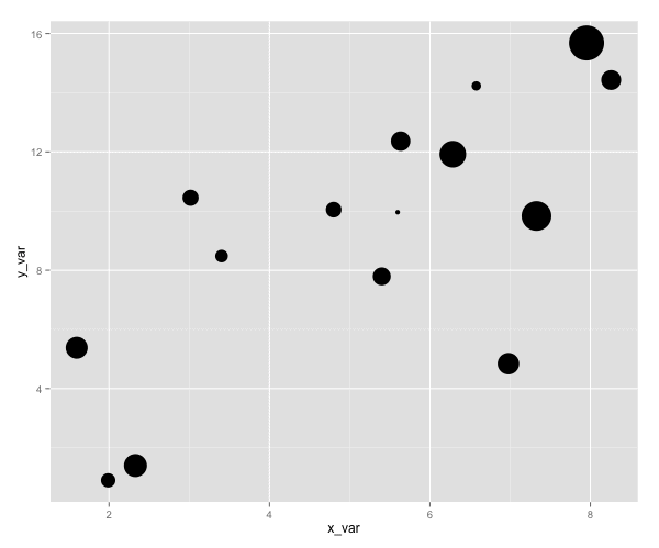
library(ggplot2)    # load ggplot2 plotting package

# set 'seed' for random number generation
set.seed(53)

# CREATE DATA FRAME
#  1. create 'x_var' as 15 random, normally distributed numbers (using rnorm)
#  2. create 'y_var' as 15 random, normally distributed numbers (using rnorm)
#  3. create 'size_var' as a random number between 1 and 10
#  4. combine these variables into a single data frame using the data.frame() function
x_var <- rnorm( n = 15, mean = 5, sd = 2)
y_var <- x_var + rnorm(n = 15, mean = 5, sd =4)
size_var <- runif(15, 1,10)

df.test_data <- data.frame(x_var, y_var, size_var)

# PLOT THE DATA USING GGPLOT2
ggplot(data=df.test_data, aes(x=x_var, y=y_var)) +
  geom_point(aes(size=size_var)) +
  scale_size_continuous(range=c(2,15)) +
  theme(legend.position = "none")
Results
Explanation
Does this seem complicated? It's okay if the code seems a little difficult to understand at first. That's okay.
It's probably obvious to you that this is basically a scatterplot. (If you haven't read about how to build a scatterplot in r then it might be instructive to start there.)
What might not be obvious is that the code to create a scatterplot vs a bubble chart in R (using ggplot) is almost identical.
To illustrate that point, let's look at the code first.
ggplot(data=df.test_data, aes(x=x_var, y=y_var)) +
  geom_point(aes(size=size_var)) +          # Plot points
  scale_size_continuous(range=c(2,15)) +    # Modify the size of the bubbles.  Don't worry about this line.
  theme(legend.position = "none")           # Remove the legend, just to simplify the plot. Don't worry about this line.
Here, we're calling the
Next we use the
On the next line, we indicate that we want to plot points. We do this by using
geom_point(aes(size=size_var)) + # Plot points
We're doing something special though. Look at that additional call to the
Remember, 'size_var' is a variable in our data frame. And
So basically,
Now let's take another look. Try removing
# Modified Plot
ggplot(data=df.test_data, aes(x=x_var, y=y_var)) +
  geom_point()
Which gives us the following plot:
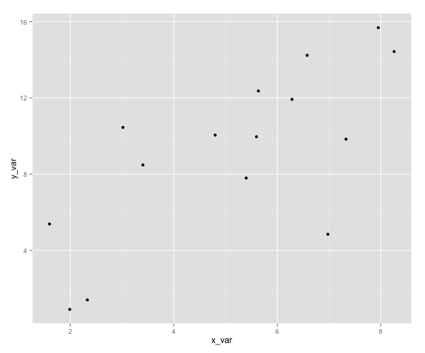
What is this? It's a scatter plot.
When we create plots in R with the ggplot2 package, the difference between a scatterplot and a bubble chart is simply
That's why ggplot is so powerful. Adding or removing a few pieces of code can give you new chart types. Moreover, how you do this is systematic. There's an underlying system that underpins how ggplot works. Once you understand that system, you can create truly stunning, insightful, valuable visualizations easily.
Notes
The proper way to size each bubble is by mapping the variable to the area of the bubble (not the radius, diameter, or circumference of the bubble). See Wikipedia.
GGPlot automatically sizes according to area, so you don't have to worry about that when using the code above, but it is something to keep in mind if you ever use a different data visualization tool.
Related Visualizations
Scatterplot
Quadrant Chart
Dot Distribution Map