Last week, I was talking to a guy who’s learning analytics, coaching him on what skills to learn next and helping him plan a career path. He’s a smart guy with an analytical background and minor coding experience, but he’s new to R.
Towards the end of the conversation, I asked him, “what’s the biggest challenge you have right now, learning analytics.”
His response? “The code is intimidating.”
I get it. Learning R can seem daunting.
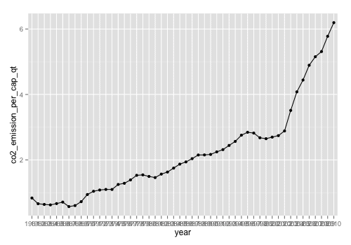
Here’s an example. Take the following R line chart.

This a is plot of China CO2 emissions data (from The World Bank) made with R’s ggplot2 package.
Here’s the code that produced it:
# LOAD GGPLOT2 GRAPHICS PACKAGE
library(ggplot2)

# READ IN DATA
year <- c("1961","1962","1963","1964","1965","1966","1967","1968","1969","1970","1971","1972","1973","1974","1975","1976","1977","1978","1979","1980","1981","1982","1983","1984","1985","1986","1987","1988","1989","1990","1991","1992","1993","1994","1995","1996","1997","1998","1999","2000","2001","2002","2003","2004","2005","2006","2007","2008","2009","2010")
co2_emission_per_cap_qt <- as.numeric(c("0.836046900792028","0.661428164381093","0.640001899360285","0.625646053941047","0.665524211218076","0.710891381561055","0.574162146975018","0.60545199674633","0.725149509123457","0.942934534989582","1.04223969658961","1.08067663654397","1.09819569131687","1.09736711056811","1.25012409495905","1.28528313553995","1.38884289658754","1.52920110964112","1.5426750986837","1.49525074931082","1.46043181655825","1.56673968353113","1.62905590778943","1.75044806018373","1.87105479144466","1.93943425697654","2.03841068876927","2.1509052249848","2.15307791087471","2.16770307659104","2.24590127565651","2.31420729031649","2.44280065934625","2.56599389177193","2.75575496636525","2.84430958153669","2.82056789057578","2.67674598026467","2.64864924664833","2.69686243322549","2.74212081298895","2.88522504139331","3.51224542766222","4.08013890554173","4.4411506949345","4.89272709798477","5.15356401658718","5.31115185538876","5.77814318390097","6.19485757472686"))

# COMBINE DATA INTO DATAFRAME
df.china_co2 <- data.frame(year,co2_emission_per_cap_qt)

# PLOT WITH GGPLOT2 PACKAGE
ggplot(data=df.china_co2, aes(x=year, y=co2_emission_per_cap_qt,group=1)) +
  geom_line(color="#aa0022", size=1.75) +
  geom_point(color="#aa0022", size=3.5) +
  scale_x_discrete(breaks=c("1961","1965","1970","1975","1980","1985","1990","1995","2000","2005","2010")) +
  ggtitle("China CO2 Emissions, Yearly") +
  labs(x="", y="CO2 Emissions\n(metric tonnes per capita)") +
  theme(axis.title.y = element_text(size=14, family="Trebuchet MS", color="#666666")) +
  theme(axis.text = element_text(size=16, family="Trebuchet MS")) +
  theme(plot.title = element_text(size=26, family="Trebuchet MS", face="bold", hjust=0, color="#666666"))
If you’re new to analytics and just getting started, this probably does seem intimidating. It’s dense. There’s a lot going on here.
But don’t be intimidated. I won’t say that this is easy, but it is very systematic and straightforward once you get the hang of it.
Moreover, the critical thing to realize here is that I didn’t sit down hammer out this code in it’s entirety. No code, no visualization, shows up fully formed.
This is really important.
Understand: Visualization is iterative.
The Iterative Data Visualization Process
The full code above is the result of a process, an iterative process that builds the visualization piece-by-piece and line-by-line of code.
I’m going to walk you through that process, step-by-step, and use the walkthrough to illustrate an important point about learning and executing data analytics.
Step 1: Simple R line chart
Let’s start with two lines of code (note, I’m not going to explain the creation of the dataframe in this tutorial.)
ggplot(data=df.china_co2, aes(x=year, y=co2_emission_per_cap_qt,group=1)) +
  geom_line()

Ok. This is fugly.
The x-axis labels are “cramped.” There are too many gridlines. There’s no title. The axis titles read like variable names, not like English. That is to say, this isn’t really functional. But, all things considered, this is really close to the final product already. With only two lines of code, we’ve plotted our data into a basic line chart. We just need to clean it up a little.
Before we do that, let’s review how this example code works. (Note: most of what follows builds on the basic line chart tutorial. It might be instructive to review that.)
I want you to understand that there is a deep structure behind the line chart. There is a deep structure behind all data visualizations.
Specify the data to plot
In the first line, we call the ggplot() function. And inside of the ggplot() function, the first thing we see is the data= parameter. This parameter lets us specify the data we’re going to plot. Our data is in the df.china_co2 dataframe, so we indicate that using the following: data=df.china_co2.
Create a relationship between variables and visual elements
Next, you see a call to the aes() function. This is a really important function in ggplot2 because it allows us to build out the relationships between the variables in our dataset and the aesthetic properties of the geometric objects that we’ll draw in the plot. Conceptually (according to the Grammar of Graphics), a data visualization can be broken down to the following: drawing geometric objects on a plot area in a systematic way, such that the data has a direct relationship to the aesthetic properties (x-position, y-position, color, and size) of those geometric objects.
Draw stuff
Now that we’ve specified our dataset using data= and specified how variables in our dataset are related to aesthetic features of the plot using aes(), we need code that does the actual drawing.
This is what geom_line() does. It tells the ggplot() function that we want to draw lines. This is important because the ggplot2 package is set up to allow us to draw a wide variety of geoms: lines, points, bars, boxes (and more complicated shapes). More on that in a second.
Back to geom_line(). To be more specific, we’re drawing line segments that connect data points. To be clear though geom_line() only draws the lines, not the points themselves.
Want to see the points? Add one line of code.
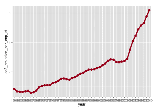
Step 2: Add points (new layer)
Here, we’re going to add points on top of the line segments that we’ve already drawn.
This illustrates the concept of layering which is part of what makes the ggplot2 package so powerful. We can build plots in layers, plotting multiple pieces of data in a single plot. Here we’re layering in a simple way (points on top of line segments) but layering can be quite complex and can lead to some very sophisticated plots (more on that another time.)
Also note that in terms of process, we’re building this data visualization in layers.
# Add Points
ggplot(data=df.china_co2, aes(x=year, y=co2_emission_per_cap_qt,group=1)) +
  geom_line() +
  geom_point()
Keep in mind that adding points here with geom_point() is essentially the same as drawing points for a scatterplot.
Step 3: Add color
Next, we’ll make some minor modifications to our geometric objects, our points and lines. We’re going to:
1. Increase the size
2. Add color
We do this by setting two parameters in both geom_line() and geom_point().
# Add Color, Modify Size/Color of Geometric objects
ggplot(data=df.china_co2, aes(x=year, y=co2_emission_per_cap_qt,group=1)) +
  geom_line(color="#aa0022", size=1.75) +
  geom_point(color="#aa0022", size=3.5)
We change the color of our geoms with the color= parameter and we change the size with size= parameter. Note that in this code, we’re setting these individually for each geom. Right now, we’re setting the color of both our line geoms and our point geoms to the same hexidecimal color, #aa0022. If we wanted to, we could set them to different colors.
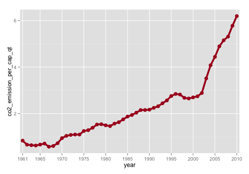
Step 4: Edit gridlines
The color and sizing makes our line look bolder and more aesthetically pleasing, but overall, the plot is still messy. To fix that, we’re going to specify the exact “breaks” for our gridlines using the c() function.
(Note: I’m not going to fully explain the c() function here. I’ll eventually do a tutorial on it. But quickly, it’s a function that allows you to combine a set of values into a collection.)
# Define exact x-axis marks
ggplot(data=df.china_co2, aes(x=year, y=co2_emission_per_cap_qt,group=1)) +
  geom_line(color="#aa0022", size=1.75) +
  geom_point(color="#aa0022", size=3.5) +
  scale_x_discrete(breaks=c("1961","1965","1970","1975","1980","1985","1990","1995","2000","2005","2010"))
scale_x_discrete() allows us to specify discrete breaks for our x-axis. Inside that function, we specify exactly where we want our gridlines using breaks=c(“1961″,”1965” …).
Now we have gridlines at 5 year intervals. That gives us a much cleaner, more readable plot.
(As an aside, notice that I also added a line at “1961.” You could make an argument to remove it, but adding it frames the plot a little better. It also shows that ggplot2 has lots of flexibility; for example, you can add a gridline wherever you want.)
Step 5: Add title, edit axis labels
Next, we’re going to add chart title and edit the axis titles. We do that with two lines of code:
  ggtitle("China CO2 Emissions, Yearly") +
  labs(x="", y="CO2 Emissions\n(metric tonnes per capita)")
ggtitle() does exactly what you think it does. It adds a title.
The labs() function allows us to set the titles (labels) of our x and y axes. Here, we’re removing the x-axis label by setting it to “” (I’ve removed it because it’s obvious from the title and the data itself that these are years on the x-axis). We’re also adding a “English language” title for the y-axis.
That gives us the following plotting code:
# ADD TITLE AND X, Y Labels
ggplot(data=df.china_co2, aes(x=year, y=co2_emission_per_cap_qt,group=1)) +
  geom_line(color="#aa0022", size=1.75) +
  geom_point(color="#aa0022", size=3.5) +
  scale_x_discrete(breaks=c("1961","1965","1970","1975","1980","1985","1990","1995","2000","2005","2010")) +
  ggtitle("China CO2 Emissions, Yearly") +
  labs(x="", y="CO2 Emissions\n(metric tonnes per capita)")
And the resulting plot:
This looks a lot better. Almost there.
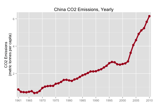
Step 6: Format title and axes
As a final step, we’ll refine the plot just a little more by formatting the plot title, y-axis title, and the axis gridline labels. We do that by adding three new lines of code, which gives us the following, complete plotting code:
# FORMAT TITLE AND AXES
ggplot(data=df.china_co2, aes(x=year, y=co2_emission_per_cap_qt,group=1)) +
  geom_line(color="#aa0022", size=1.75) +
  geom_point(color="#aa0022", size=3.5) +
  scale_x_discrete(breaks=c("1961","1965","1970","1975","1980","1985","1990","1995","2000","2005","2010")) +
  ggtitle("China CO2 Emissions, Yearly") +
  labs(x="", y="CO2 Emissions\n(metric tonnes per capita)") +
  theme(axis.title.y = element_text(size=14, family="Trebuchet MS", color="#666666")) +
  theme(plot.title = element_text(size=26, family="Trebuchet MS", face="bold", hjust=0, color="#666666")) +
  theme(axis.text = element_text(size=16, family="Trebuchet MS"))
Which produces the finalized r line chart:
The ggplot2 theme system is a separate set of tutorials in and of itself, but essentially, we’re setting the color, font family, and size of the text elements (the titles and labels).
The Importance of Process
In the above tutorial, we’ve broken down the building of a data visualization into a process.
What you need to keep in mind is that most of the time, this is exactly how I write code and create new visualizations. Iteratively. Learn to create this way.
Also keep in mind, that this extends to analytics and data science more broadly. Whether your deliverable is a chart, or a presentation, or a model, you need to start thinking in terms of iterative processes that build the final result a little bit at a time.
This emphasis on process (and ultimately, workflow) is really the piece that distinguishes the people who swim from those who sink in the data deluge.
Appendix: Full “iterative” code, R line chart
year <- c("1961","1962","1963","1964","1965","1966","1967","1968","1969","1970","1971","1972","1973","1974","1975","1976","1977","1978","1979","1980","1981","1982","1983","1984","1985","1986","1987","1988","1989","1990","1991","1992","1993","1994","1995","1996","1997","1998","1999","2000","2001","2002","2003","2004","2005","2006","2007","2008","2009","2010")
co2_emission_per_cap_qt <- as.numeric(c("0.836046900792028","0.661428164381093","0.640001899360285","0.625646053941047","0.665524211218076","0.710891381561055","0.574162146975018","0.60545199674633","0.725149509123457","0.942934534989582","1.04223969658961","1.08067663654397","1.09819569131687","1.09736711056811","1.25012409495905","1.28528313553995","1.38884289658754","1.52920110964112","1.5426750986837","1.49525074931082","1.46043181655825","1.56673968353113","1.62905590778943","1.75044806018373","1.87105479144466","1.93943425697654","2.03841068876927","2.1509052249848","2.15307791087471","2.16770307659104","2.24590127565651","2.31420729031649","2.44280065934625","2.56599389177193","2.75575496636525","2.84430958153669","2.82056789057578","2.67674598026467","2.64864924664833","2.69686243322549","2.74212081298895","2.88522504139331","3.51224542766222","4.08013890554173","4.4411506949345","4.89272709798477","5.15356401658718","5.31115185538876","5.77814318390097","6.19485757472686"))

df.china_co2 <- data.frame(year,co2_emission_per_cap_qt)

# Plot Line
ggplot(data=df.china_co2, aes(x=year, y=co2_emission_per_cap_qt,group=1)) +
  geom_line()

# Add Points
ggplot(data=df.china_co2, aes(x=year, y=co2_emission_per_cap_qt,group=1)) +
  geom_line() +
  geom_point()


# Add Color, Modify Size/Color of Geometric objects
ggplot(data=df.china_co2, aes(x=year, y=co2_emission_per_cap_qt,group=1)) +
  geom_line(color="#aa0022", size=1.75) +
  geom_point(color="#aa0022", size=3.5)


# Define exact x-axis marks
ggplot(data=df.china_co2, aes(x=year, y=co2_emission_per_cap_qt,group=1)) +
  geom_line(color="#aa0022", size=1.75) +
  geom_point(color="#aa0022", size=3.5) +
  scale_x_discrete(breaks=c("1961","1965","1970","1975","1980","1985","1990","1995","2000","2005","2010"))


# ADD TITLE AND X, Y Labels
ggplot(data=df.china_co2, aes(x=year, y=co2_emission_per_cap_qt,group=1)) +
  geom_line(color="#aa0022", size=1.75) +
  geom_point(color="#aa0022", size=3.5) +
  scale_x_discrete(breaks=c("1961","1965","1970","1975","1980","1985","1990","1995","2000","2005","2010")) +
  ggtitle("China CO2 Emissions, Yearly") +
  labs(x="", y="CO2 Emissions\n(metric tonnes per capita)")


# FORMAT TITLE AND AXES
ggplot(data=df.china_co2, aes(x=year, y=co2_emission_per_cap_qt,group=1)) +
  geom_line(color="#aa0022", size=1.75) +
  geom_point(color="#aa0022", size=3.5) +
  scale_x_discrete(breaks=c("1961","1965","1970","1975","1980","1985","1990","1995","2000","2005","2010")) +
  ggtitle("China CO2 Emissions, Yearly") +
  labs(x="", y="CO2 Emissions\n(metric tonnes per capita)") +
  theme(axis.title.y = element_text(size=14, family="Trebuchet MS", color="#666666")) +
  theme(axis.text = element_text(size=16, family="Trebuchet MS")) +
  theme(plot.title = element_text(size=26, family="Trebuchet MS", face="bold", hjust=0, color="#666666"))
Love this tutorial! I agree, this is definitely the best way to approach building visualizations!
Thanks! This sort of iterative process really is key for doing high quality work. Hope you’re making good progress, Daryle.
Hey, this tutorial helped me tremendously in understanding how ggplot2 works. I was able to generate the exact plot I wanted. I appreciate your effort and time put into writing this guide. The “How to make a small multiples chart in R” guide helped me a bunch also. Keep ’em coming!
Cheers
That’s awesome…. exactly what I hoped it would do for you and other people reading here.
GGPlot2 is so systematic. It takes a little time up front to learn how it works, but after you get past that, it makes visualization much, much easier.
What’s the significance of assigning a value of 1 to ‘group’ in the ggplot function?
I didn’t see this in your earlier tutorial on line charts.
The line geom requires the “group” parameter. That is, you always need to havegroup= in your aes() call.
What it does is tellggplot() what “group” the points belong to. You can imagine a case where you want to plot three separate lines. These three separate lines would each belong to different “groups.”
In the above case, we’re only plotting one line, so there’s only one group. The way to specify that is withgroup=1 .
Make sense?
Makes perfect sense. Thanks for the clarification.
Hello! Thank you so much for this tutorial. It helped in doing my own plot with my own data. However, there’s one question that remains unanswered for me.
Let me start by pasting my code so that you know the “elements” with which I’m working.
# READ IN DATA
tiempo_de_estancia_en_chile <- c("Grupo de control", "3 años y menos", "4 a 10 años", "11 años y más", "2a generación")
frecuencia_de_uso_del_pp <- as.numeric(c("52", "38", "15", "4", "0"))
#COMBINE DATA INTO DATAFRAME
df.uso_pp <- data.frame(tiempo_de_estancia_en_chile,frecuencia_de_uso_del_pp)
# PLOT WITH GGPLOT2 PACKAGE
ggplot(data = df.uso_pp, aes(x=tiempo_de_estancia_en_chile, y=frecuencia_de_uso_del_pp,group=1)) +
geom_line(color="#aa0022", size=1.75) +
geom_point(color="#aa0022", size=3.5) +
ggtitle("Frecuencia de uso del pretérito perfecto en función del tiempo de estancia en Chile") +
labs(x="Tiempo de estancia en Chile", y="Frecuencia de uso del PP") +
theme(axis.title.y = element_text(size=14, family="Trebuchet MS", color="#666666")) +
theme(axis.text = element_text(size=16, family="Trebuchet MS")) +
theme(plot.title = element_text(size=26, family="Trebuchet MS", face="bold", hjust=0, color="#666666"))
As you can see, my x axis is labeled "Tiempo de estancia en Chile". It contains info for "Grupo de control", "3 años y menos", "4 a 10 años", "11 años y más", "2a generación" (that's the order I put it in when writing my code).
But when I plot all this, the order of the elements in my x axis is not the same order as I put them in my code. I get the one that starts with a 1 first (obviously), and "Grupo de control" last.
How to fix/manipulate this so that I get them in the order I want, and so that I am able to visualize the fact that the numbers in y decrease according to "length of residence in Chile" ("tiempo de estancia en Chile")?
Thank you for your help!
Codetiempo_de_estancia_en_chile as a factor variable, and use forcats::fct_inorder() to specify the order.
library(tidyverse) library(forcats) tiempo_de_estancia_en_chile <- fct_inorder(c("Grupo de control", "3 años y menos", "4 a 10 años", "11 años y más", "2a generación")) frecuencia_de_uso_del_pp <- as.numeric(c("52", "38", "15", "4", "0")) #COMBINE DATA INTO DATAFRAME df.uso_pp <- data_frame(tiempo_de_estancia_en_chile,frecuencia_de_uso_del_pp)Thank you so much for your help! I sincerely appreciate it :-)