Last week in Mapping Texas Ports with R [part 1], we created a simple map of Texas ports with R, ggplot2, and geom_sf.
That map was really just a “rough draft.” It’s not terrible, but it didn’t look great either.
This week, we’re going to take that map and polish it up a little bit.
Let’s get started.
Run preliminary code
First, you’ll need to run some preliminary code.
This code is very similar to the code in part 1, with a few minor modifications (e.g., I made some modifications to the port names, etc).
#================
# import packages
#================
library(tidyverse)
library(sf)
library(ggspatial)
library(rnaturalearth)
library(tidygeocoder)
library(maps)
library(ggrepel)


#=============
# GET MAP DATA
#=============
world_map_data <- ne_countries(scale = "medium", returnclass = "sf")
state_map_data <- map('state', fill = TRUE, plot = FALSE) %>% st_as_sf()

class(world_map_data)
class(state_map_data)


#------------------
# CREATE SIMPLE MAP
#------------------
state_map_data %>%
  filter(ID == 'texas') %>%
  ggplot() +
    geom_sf()


#--------------------------
# DRAFT: Map of Texas Coast
#--------------------------
ggplot() +
  geom_sf(data = world_map_data) +
  geom_sf(data = state_map_data) +
  coord_sf(xlim = c(-100, -91), ylim = c(25,33))


#=====================
# CREATE LIST OF PORTS
#=====================

portlist = c('Port Brownsville, Texas'
            ,'Port Isabel, Texas'
            ,'Port Mansfield, Texas'
            ,'Port Corpus Christi, Texas'
            ,'Port Lavaca, Texas'
            ,'Port Freeport, Texas'
            ,'Texas City, Texas'
            ,'Port Galveston, Texas'
            ,'Port Houston, Texas'
            ,'Port Sabine Pass, Texas'
            ,'Port Arthur, Texas'
            ,'Port Beaumont, Texas'
            ,'Port of Orange, Texas'
            )


#geo_osm('Port of Texas City, Texas')

#--------------
# CREATE TIBBLE
#--------------
port_data = tibble(location = portlist)


#--------------------
# CREATE 'BRIEF' NAME
#--------------------
port_data %>%
  mutate(location_brief = str_replace(location, ', Texas', '')) ->
  port_data


#---------------------------------
# CREATE EMPTY LAT, LONG VARIABLES
#---------------------------------
port_data %>%
  mutate(lat = NA
         ,long = NA
         ) ->
  port_data


#inspect
head(port_data)


#------------------
# GEOCODE LOCATIONS
#------------------
for(i in 1:nrow(port_data)){
  coordinates = geo_osm(port_data$location[i])
  port_data$long[i] = coordinates$long
  port_data$lat[i] = coordinates$lat
}


#inspect
head(port_data)
You’ll need to run that code, because it has some of the building blocks that we need going forward.
After you run it, you can create our rough draft from part 1:
#--------------------------
# DRAFT: Map of Texas Coast
#--------------------------
ggplot() +
  geom_sf(data = world_map_data) +
  geom_sf(data = state_map_data) +
  geom_point(data = port_data, aes(x = long, y = lat), color = 'red') +
  coord_sf(xlim = c(-100, -92), ylim = c(25,33))
OUT:
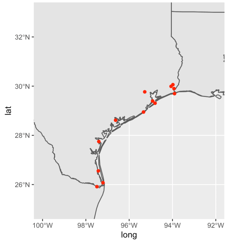
Again … this is really rough around the edges, so to speak.
In the next step, we’ll make it look good.
Polishing up the Texas map
We’ll improve this in steps.
We’re going:
- to create a theme to modify the fonts and colors
- create an updated, themed plot
- add the state labels
- add the port names
- adjust the port name positions
Let’s go …
Create theme
Here, we’re going to create a “theme” that will format the plot elements of our chart.
Specifically, it will do things like:
- change the font for the text
- change the background color
- change the gridline color
- change the font size for the title, subtitle, and other text
To do this, we’re going to use the ggplot theme function, and change specific plot elements.
#-------------
# CREATE THEME
#-------------

mytheme <- theme(text = element_text(family = 'Avenir')
                 ,panel.grid.major = element_line(color = '#cccccc'
                                                  ,linetype = 'dashed'
                                                  ,size = .3
                                                  )
                 ,panel.background = element_rect(fill = 'aliceblue')
                 ,plot.title = element_text(size = 32)
                 ,plot.subtitle = element_text(size = 14)
                 ,axis.title = element_blank()
                 ,axis.text = element_text(size = 10)
                 )
Notice that we're changing the color of panel.background to 'aliceblue'. That will make the color of the ocean on the map a light shade of blue.
Also note that we're saving this theme syntax as mytheme. That's one great thing about ggplot2 ... you can save your theme code with a name, and then re-use it for multiple plots.
Create 'themed' map of Texas ports with ggplot and geom_sf
Next, we'll apply our theme and create a themed map (i.e., a map that has updated colors, etc).
Here, we're using ggplot() in combination with the geom_sf function to create the basic map with the country and state shapes.
Notice also that we're applying mytheme to the plot.
We're also making some modifications to the point sizes and the color of the land on the map. We're actually using geom_point twice. One is a semi-transparent point that identifies a plot location. The second use of geom_point is creating a fully opaque border around those points.
These are somewhat subtle design choices. They aren't hard to do, but you need to know a few tricks to understand how to execute them. Moreover, you really need to learn enough about plot design to realize that it might be a good idea to plot the data like this.
#-------------------------------------
# CREATE BASE PLOT: Map of Texas Coast
#-------------------------------------
land_color <- c('antiquewhite1')

base_plot <- ggplot() +
  geom_sf(data = world_map_data, fill = land_color, size = .4) +
  geom_sf(data = state_map_data, fill = NA, size = .4) +
  geom_point(data = port_data, aes(x = long, y = lat), size = 4, color = 'red', alpha = .15) +
  geom_point(data = port_data, aes(x = long, y = lat), size  = 4, shape = 1,  color = 'red') +
  coord_sf(xlim = c(-100, -90), ylim = c(25,33)) +
  mytheme
Next, we can plot the chart, base_plot by using print():
#---------
# SHOW MAP
#---------
print(base_plot)
OUT:
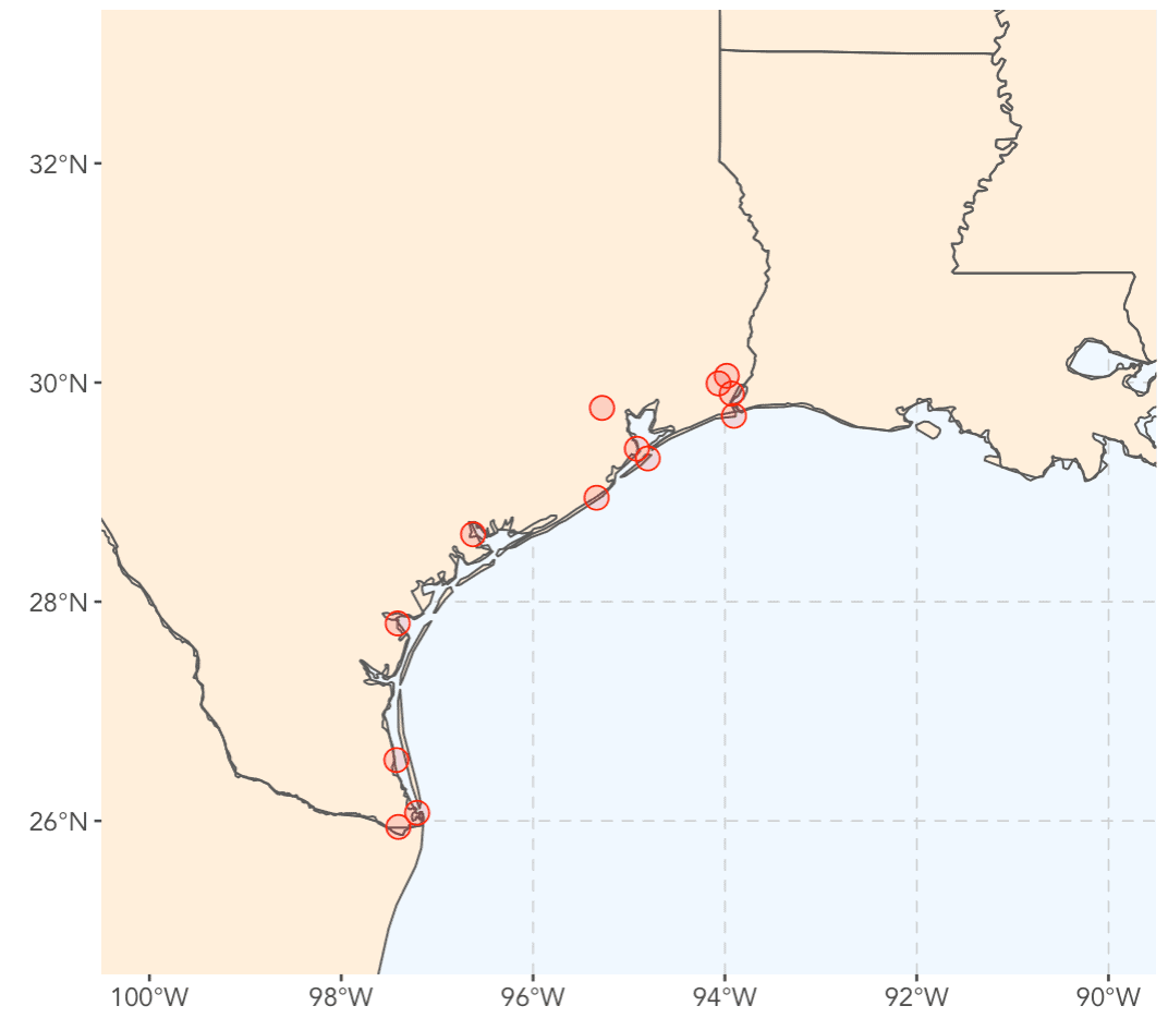
This already looks a lot better.
Notice that we've changed the land color and the ocean color. We changed the land color with the fill= parameter of geom_sf. We changed the ocean color with the panel.background theme element. Most of the other modifications were also made with the theme changes.
Create labels for state name data
Next, we're going to modify our state-level data to make some labels that we can add to the plot.
There's a few things we need to do. We need to change the state names (the ID variable) to title case.
We need to calculate the center of the state (where we want to add those state name labels), and add those centroid X and Y coordinates to the dataset.
And we also need to add some "nudge" variables that will enable us to move the labels a little away from the centroid, as needed.
All of this is a little complicated. Not terribly, but a little.
Notice though that we're mostly just using dplyr functions like mutate() and then some functions from the sf package that help us calculate the centroids.
#----------------------
# CHANGE STATE NAME
# change to "title case"
#----------------------
state_map_data %>%
  mutate(ID = str_to_title(ID)) ->
  state_map_data


names(state_map_data)


#--------------------
# ADD STATE CENTROIDS
#--------------------
state_map_data %>%
  mutate(centroid = st_centroid(geom)) ->
  state_map_data


#------------------------
# ADD X AND Y COORDINATES
#------------------------
statename_coords <- state_map_data %>%
  st_centroid() %>%
  st_coordinates() %>%
  as_tibble()

state_map_data %>%
  bind_cols(statename_coords) %>%
  select(ID, X, Y, centroid, geom) ->
  state_map_data


#----------------------------
# ADD OFFSETS FOR STATE NAMES
#----------------------------
state_map_data %>%
  mutate(x_nudge = case_when( ID == 'Texas' ~ 1.3
                              ,ID == 'Louisiana' ~ -.6
                              ,ID == 'Mississippi' ~ 1.5
                              ,TRUE ~ 0
                              )
         ,y_nudge = case_when( ID == 'Texas' ~ .5
                              ,ID == 'Louisiana' ~ 1
                              ,TRUE ~ 0
                              )
         ) ->
  state_map_data
From here, we'll use geom_text() to create some labels that we can add to our plot, which we'll save as state_names.
state_names <- geom_text(data = state_map_data
                    ,aes(x = X, y = Y, label = ID)
                    ,color = "#333333"
                    ,size = 4
                    ,fontface = 'bold'
                    ,nudge_x = state_map_data$x_nudge
                    ,nudge_y = state_map_data$y_nudge
                    )
And now we can plot:
#----------
# ADD NAMES
#----------
base_plot +
  state_names
OUT:
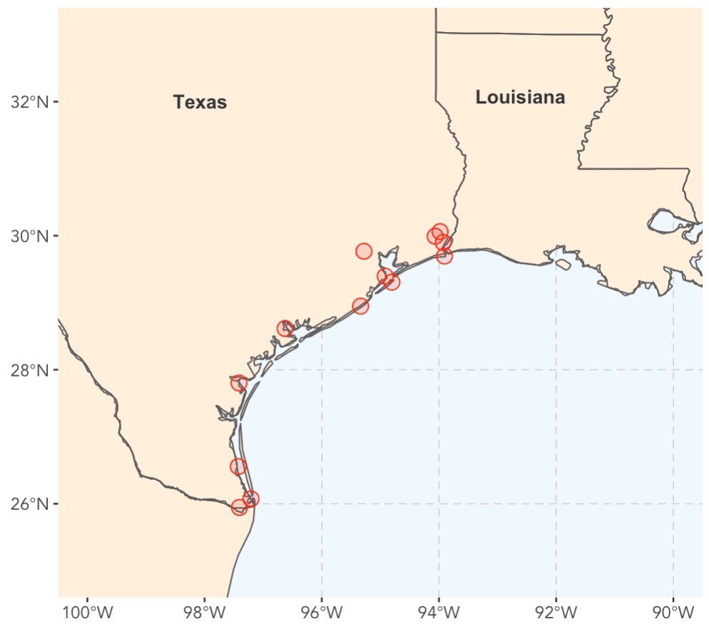
Better.
We're getting close.
Add port names
Now, we'll add the port names.
First, let's just do a simple trial of this.
Draft of map with port names
Here, we'll just do a dry run and try to add the port names with geom_text().
#---------------
# ADD PORT NAMES
#---------------
base_plot +
  state_names +
  geom_text(data = port_data
            ,aes(x = long, y = lat, label = location_brief)
            ,family = 'Avenir')
OUT:
Ok, I'll be honest. This is a f*#^ing mess.
We need to "nudge" those port names to new locations.
Move port name labels
Here we're going to move the labels to new positions, slightly offset from the actual port location.
To do this, we'll ultimately use geom_text_repel(), which adds text labels, but also repels those labels away from one another, so they do not overlap.
To make this work we first need to create some offsets.
Create label offests
Here, we're going to create some offset variables called x_nudge and y_nudge. These will eventually tell geom_text_repel() to "nudge" the text label away from the actual label location by a small amount in the x and y direction.
Here, we're adding these variables with the dplyr::mutate() function, in combination with case_when, which allows us to conditionally create different offsets for different ports.
#----------------------------------------------
# CREATE X AND Y 'NUDGE' OFFSETS FOR PORT NAMES
#----------------------------------------------
port_data %>%
  mutate(x_nudge = case_when( location == 'Port Brownsville, Texas' ~ 1.3
                             ,location == 'Port Isabel, Texas' ~ 1.3
                             ,location == 'Port Mansfield, Texas' ~ 1.5
                             ,location == 'Port Corpus Christi, Texas' ~ 1.5
                             ,location == 'Port Lavaca, Texas' ~ -1
                             ,location == 'Port Freeport, Texas' ~ 1
                             #,location == 'Port of Texas City, Texas' ~ 0
                             ,location == 'Texas City, Texas' ~ -1
                             ,location == 'Port Galveston, Texas' ~ 1
                             ,location == 'Port Houston, Texas' ~ -1.5
                             ,location == 'Port Sabine Pass, Texas' ~ .5
                             ,location == 'Port Arthur, Texas' ~ 1
                             ,location == 'Port Beaumont, Texas' ~ -.6
                             ,location == 'Port of Orange, Texas' ~ 1.6
                             ,TRUE ~ 0)
         ,y_nudge = case_when( location == 'Port Brownsville, Texas' ~ -1
                             ,location == 'Port Isabel, Texas' ~ 0
                             ,location == 'Port Mansfield, Texas' ~ .2
                             ,location == 'Port Corpus Christi, Texas' ~ 0
                             ,location == 'Port Lavaca, Texas' ~ .5
                             ,location == 'Port Freeport, Texas' ~ -.5
                             ,location == 'Texas City, Texas' ~ 0
                             ,location == 'Port Galveston, Texas' ~ -.5
                             ,location == 'Port Houston, Texas' ~ .8
                             ,location == 'Port Sabine Pass, Texas' ~ -.5
                             ,location == 'Port Arthur, Texas' ~ .1
                             ,location == 'Port Beaumont, Texas' ~ .6
                             ,location == 'Port of Orange, Texas' ~ .5
                             ,TRUE ~ 0)
  ) ->
  port_data
Ok. Let's try to plot again.
Plot map, with port labels and offsets
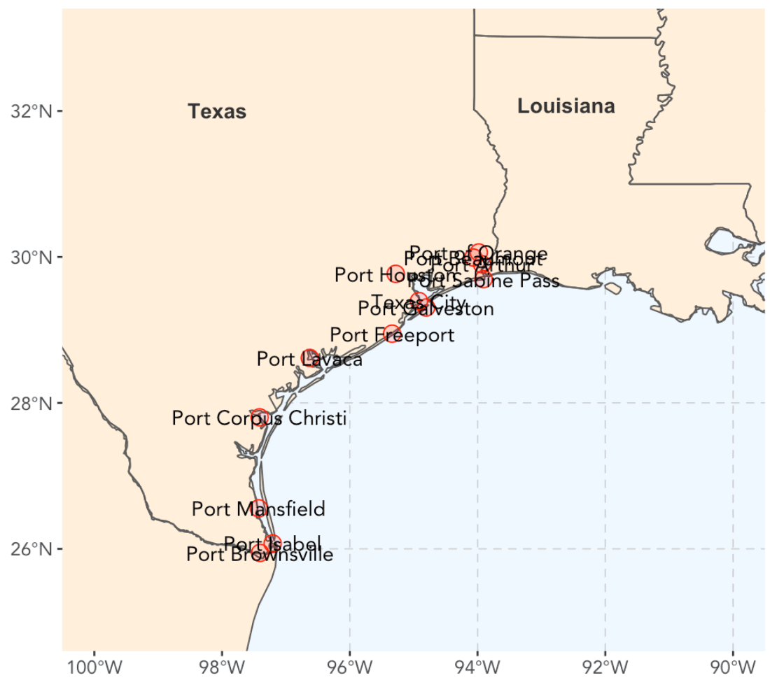
So finally, we're going to put everything together.
We're going to use the base plot that we created earlier and saved with the name base_plot.
We'll add the state names with the state_names object we created earlier.
And we'll use geom_text_repel() to add the port names. Notice that we're using the parameters nudge_x and nudge_y to pass in the offsets that we just created in the previous section. Ultimately, geom_text_repel() will add the labels with those offsets, and then use an iterative process to "repel" the names away from each other until they don't overlap.
Notice that we're also using using the labs() function to add a title and subtitle.
Ok, let's do it.
#==================
# CREATE FINAL PLOT
#==================
base_plot +
  state_names +
  geom_text_repel(data = port_data
                  ,aes(x = long
                       ,y = lat
                       ,label = location_brief
                       )
                  ,family = 'Avenir'
                  ,nudge_x = port_data$x_nudge
                  ,nudge_y = port_data$y_nudge
                  ,segment.color = "#333333"
                  ) +
  labs(title = '13 Texas Ports'
       ,subtitle = 'Texas has over a dozen excellent ports, many of which are under-utilized')
OUT:
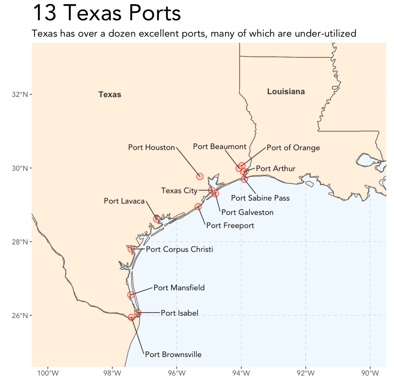
Alright!
This looks really pretty good.
There is probably a few other things that we might want to do here, but I'm very satisfied with this.
Notice that all of the port names are offset away from the points and none of them overlap.
To be honest, this is partially due to geom_text_repel() working it's magic, but it's also from a lot of trial and error from me manually modifying the offsets. It was a little challenging to get "just right," and really required a lot of iteration.
Final notes
Much of the code here was based off an example of how to create maps with the sf pacakge over at rspatial.org.
Their example was part of the inspiration for this tutorial series. I used their code as a starting point, although I heavily modified it to match my data and my map, as well as to match my particular programming style (for example, I used case_when to add the offsets).
If you're interested in creating maps in R programmatically, you should check out r-spatial.org.
Supply chain analytics will probably become important
To bring this back to my original motivation in part 1, I should note that it might be good to learn about geospatial data visualization.
For a variety of reasons, I think we're likely to have a lot more spatial information going forward ... from devices and sensors that will increasingly be added to tech products.
Additionally, with all of the supply chain reorientation happening right now, I think there will be more demand for fine-grained supply chain analytics. This tutorial doesn't cover everything you'd need to know ... not by a longshot. But it's something to keep in mind, and you might want to skill up.
Sign up to increase your data skills
If you want to skill up and increase your data science skills, sign up for our email list.
Every week, we publish free data science tutorials.
When you sign up for our email list, you’ll get all of our tutorials delivered directly to your inbox.
... we'll help you learn data science so you can take advantage of all of the opportunities that are emerging in the data industry.
I tried to use this example and came across the following:
There is a long list of packages to use and most of them are not my usual packages so I had to install them: fine but a bit of warning might have helped. I do accept that you did discuss some of these packages in Part 1 but I came straight to Part 1 …
The following packages were not listed but they seemed also to be needed so I installed them, too:
rnaturalearthdata
rgeos … this will not install no matter what I try and I have done a bit of a search for it but I cannot make it install
I had a problem with tidygeocoder that meant I had to use devtools to get it and eventually it failed to install
I fully appreciate you are not responsible for all of these blips, Josh but I thought you ought to know about them.
I am running this version of RStudio 1.3.959 and version 3.4.3 (2017-11-30) of R
Sometimes installing packages in R can be a pain.
Not sure why those didn’t install for you … they installed on my machine okay.
I understand though … it can be frustrating.
I noticed similar things on my Ubuntu 18.04 system. I’m not sure what OS the OP is running, but I eventually got things to work. In my case all the R packages were being compiled, and in many cases the packages depended on external libraries, or external header files (*.h), etc. I just had to babysit the package installation and note the errors as they occurred. In most cases the R installer would provide suggestions as to what to do about the missing stuff. E.g., I often had to install the “developer” version of a given Ubuntu package (install “foo-dev” in addition to “foo”). There really is a -load of packages required for this stuff.
Lots of good info here. The theme example was useful. I knew one could make themes but had never ventured into that territory. You touched on one of the reasons for my avoidance of themes: it’s one thing to have the tools to make a theme; it’s another thing to have the design skills to make a good one. Any advice about the latter?
One of the best ways to improve design is to copy other designers.
I recommend data visualizations from Fivethirtyeight and the NYT. Both are good at creating polished, well constructed visualizations. Literally, take something they do, and recreate it in R or Python. Over time, it’ll start to click and you’ll understand what makes it good.
I took a look at spatial.org, as you suggested. Looks very useful. (I can see why you changed the state ;-) It appears that the “sf” package has a number of vignettes that elaborate on the subject of mapping, most of which is still foreign to me.
Mapping is actually sort of a pain in the a** in almost any language, but not that bad in R.
Having said that, the
sfpackage makes it a lot easier, more intuitive, and more powerful.If you decide to go down the “geospatial visualization” rabbit hole,
ggplotandsfare probably the tools you want to use.Great job! It is a valuable help for me
Thanks … great to hear.