In the last few months since covid-19 has struck, everyone is suddenly talking about supply chains.
Just a few months ago, this was sort of a “boring” topic, only discussed by import specialists and corporate operations managers.
But now, here we are, wondering where our toilet paper is going to come from.
I’m being a little playful here, but it’s obviously serious, and I suppose that’s why everyone is talking about it.
Everyone, almost everywhere, is starting to rethink how they will get critical supplies.
This has me personally thinking about these things. And because I live in the great state of Texas in the United States, I’ve been thinking about Texas in particular.
Thinking about Texas,
thinking about data
I’m personally very bullish on Texas.
There’s news right now that Tesla might move it’s headquarters to Texas (Musk said “Texas or Nevada), and Austin, Texas is now one of the two finalists for where to put the new Tesla Gigafactory.
Ultimately, I think that Texas will be one of the next business and technology hotspots of the next couple of decades.
Here’s a quick Twitter thread that explains some of the details …
Austin.
There’s a very strong argument that Austin will be the next great tech hotspot, especially if Tesla moves here.
Here is a first-principles analysis of why Austin and Texas are likely to perform very well over the next 10 to 20 years.https://t.co/XO4gHzpaVE
— Joshua Ebner (@Josh_Ebner) May 18, 2020
To put it simply: Texas is geographically well positioned to take advantage of new shifts in trade.
Thinking about this started me thinking about some of the details … the details about Texas, supply chains, trade infrastructure, and geography.
Mapping Texas ports with R
As it turns out, as I was beginning to think about Texas and supply chains, I was also playing with some new techniques in R.
Specifically, I’ve been playing with creating maps with the sf package.
I’ve made some maps in the past, but to some extent, it was a little hard. Creating maps with R was challenging for few reasons.
But the new sf package makes things really fairly easy.
All that being said, I realized that this would be a good opportunity to create a map related to Texas supply chain infrastructure.
We’ll create a map of 13 Texas ports
In this tutorial and the next tutorial, we’ll create a map of 13 Texas ports.
I’m going to split this project up into two parts:
- Here in part 1, we’ll just create a rough draft of our map. Really, we just want to get the basic code working, and get a rough draft of our map.
- In the next tutorial, part 2, we’ll polish the map to make it look good.
Let’s get started with part 1.
Import packages
First, let’s just import some packages.
We’ll be using the tidyverse package, which will load both dplyr and ggplot2. We need dplyr for basic dataframe manipulation tools, as well as ggplot data visualization tools.
The sf and ggspatial packages will give us some specific mapping tools.
We’ll use rnaturalearth and maps for some map data.
And we’ll need tidygeocoder to get the lat/long coordinates for the ports that we want to plot.
# IMPORT PACKAGES

library(tidyverse)
library(sf)
library(ggspatial)
library(rnaturalearth)
library(tidygeocoder)
library(maps)
Now that we have the packages, let’s get some data.
Get map data
Here, we’ll get the data for our maps.
There are a few different ways to get map data in R, but here we’ll get the data for a worldwide country map with ne_countries() and we’ll get the data for a US state map with map().
# GET MAP DATA

world_map_data <- ne_countries(scale = "medium", returnclass = "sf")
state_map_data <- map('state', fill = TRUE, plot = FALSE) %>% st_as_sf()
Notice that in both cases, we’re getting this data as an sf object, which is like a special kind of dataframe that includes geospatial data.
Create preliminary plot
Let’s just start veeeeery simple and just plot one of the datasets.
Plot world data
Here, we’ll plot world_map_data to create a map of the world.
To do this, we’ll use ggplot, but we’re going to use the geom_sf() function to actually plot this specific data.
ggplot() +
  geom_sf(data = world_map_data)
OUT:
This is a very simple map.
But notice something important: we didn’t have to specify any “aesthetic mappings.” We didn’t need to tell ggplot anything about the long and lat coordinates. Nothing about how to plot polygons (which was a requirement in the past).
We just tell ggplot to use geom_sf(), and pass an sf object to the data parameter. From there, if the sf object is structured correctly, ggplot knows that it’s geospatial data and will plot it accordingly.
This makes working with geospatial data dramatically easier.
Zoom in on Texas Coast
Next, we’ll zoom in on the Gulf Coast around Texas.
To do this, we’ll use the coord_sf() function to set the limits on latitude and longitude for the plotting window. Notice that we’re doing that with the xlim and ylim parameters.
ggplot() +
  geom_sf(data = world_map_data) +
  geom_sf(data = state_map_data) +
  coord_sf(xlim = c(-100, -91), ylim = c(25,33))
OUT:
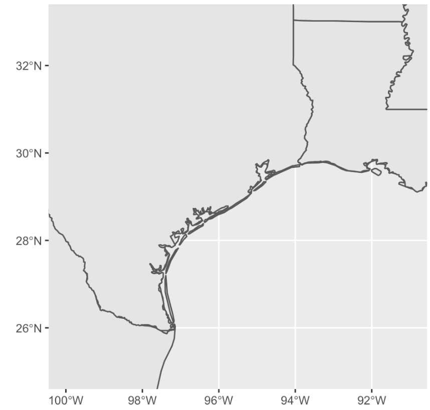
Frankly, this is not bad. It’s simple, but it’s starting to look like something.
A few notes:
Here we used geom_sf() a second time to add a new layer. Specifically, we added the state borders from state_map_data, so we can see the border between Texas and Louisiana.
We also zoomed in on this particular region with coord_sf(). Zooming and filtering your data is very important for data analysis, so you eventually need to know how to do this.
Add ports
The next part is a little harder, so we’ll do it in steps.
Get port names
Here, I’m just creating a vector of port names (strings).
The vector is called portlist.
portlist = c('Brownsville, Texas'
            ,'Port Isabel, Texas'
            ,'Port Mansfield, Texas'
            ,'Corpus Christi, Texas'
            ,'Port Lavaca, Texas'
            ,'Port Freeport, Texas'
            ,'Texas City, Texas'
            ,'Port Galveston, Texas'
            ,'Port Houston, Texas'
            ,'Port Sabine Pass, Texas'
            ,'Port Arthur, Texas'
            ,'Port Beaumont, Texas'
            ,'Port of Orange, Texas'
            )
And we need to transform this into a tibble.
port_data = tibble(location = portlist)
The new tibble is called port_data, and it has the location names of the ports in a variable called location.
Add lat/long variables
Now, we’ll add a lat and long variable to the tibble.
#---------------------------------
# CREATE EMPTY LAT, LONG VARIABLES
#---------------------------------
port_data %>%
  mutate(lat = NA
         ,long = NA
         ) ->
  port_data
To do this, we’re just using the mutate function from dplyr.
Let’s take a quick look at it:
#inspect
head(port_data)
OUT:
# A tibble: 6 x 3
  location                lat  long
  [chr]                 [lgl] [lgl]
1 Brownsville, Texas    NA    NA
2 Port Isabel, Texas    NA    NA
3 Port Mansfield, Texas NA    NA
4 Corpus Christi, Texas NA    NA
5 Port Lavaca, Texas    NA    NA
6 Port Freeport, Texas  NA    NA
Now we have a dataframe (i.e., tibble) with the location names, lat, and long.
Get port coordinates
Next, we’ll get the coordinates for the port locations.
Ultimately, we’ll do this with tidygeocoder::geo_osm() function, but to get the individual coordinates for specific locations, we need to do this one at a time in a for loop.
#------------------
# GEOCODE LOCATIONS
#------------------
for(i in 1:nrow(port_data)){
  coordinates = geo_osm(port_data$location[i])
  port_data$long[i] = coordinates$long
  port_data$lat[i] = coordinates$lat
}
Frankly, I really dislike for-loops in R, so I’m not going to comment.
We should, however, take a look at the data.
#inspect
head(port_data)
OUT:
# A tibble: 6 x 3
  location                lat  long
  [chr]                 [dbl] [dbl]
1 Brownsville, Texas     25.9 -97.5
2 Port Isabel, Texas     26.1 -97.2
3 Port Mansfield, Texas  26.6 -97.4
4 Corpus Christi, Texas  27.7 -97.4
5 Port Lavaca, Texas     28.6 -96.6
6 Port Freeport, Texas   28.9 -95.3
Alright.
We have our ports with the lat and long coordinates. We’re ready.
Plot rough draft of Texas ports
Let’s plot the data.
ggplot() +
  geom_sf(data = world_map_data) +
  geom_sf(data = state_map_data) +
  geom_point(data = port_data, aes(x = long, y = lat), color = 'red') +
  coord_sf(xlim = c(-100, -92), ylim = c(25,33))
OUT:
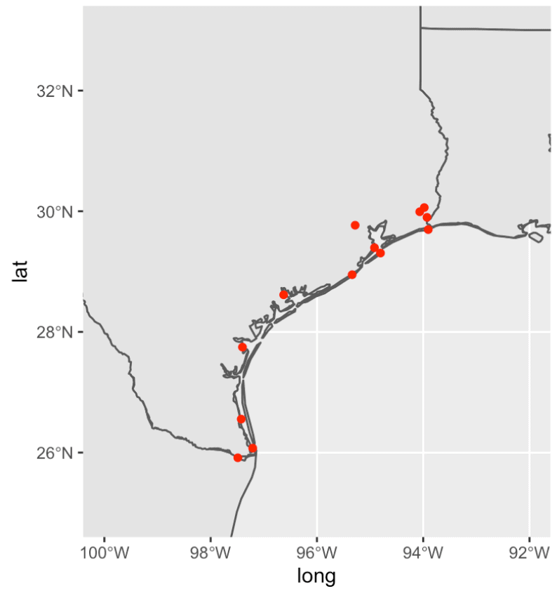
Not bad.
There’s still a lot that we need to do to improve this.
We need to:
- Change the color of the land and water
- Add a legend
- Add labels
- Add a title
Etcetera.
There’s more to do, but this is a good rough draft.
We continue this tutorial and polish the map up in part 2.
Sign Up for More Data Science Tutorials
Want more data science tutorials for R?
Sign up for our email list.
When you sign up for our email list, you’ll get all of our tutorials delivered directly to your inbox.
That includes free tutorials for data science in R, but also other tutorials about data science in Python …
When you sign up, you’ll get free tutorials about ggplot2, dplyr, Numpy, Pandas, scikit learn, and more.
Well done sir.
Keep it up.
I have a question Sharp Sights.
For someone who wants to go into big data analytics using pyspark, does that person still need to know numpy and pandas?
Or does learning pyspark overshadow all the numpy and panda knowledge?
I’m asking cos I have no idea how pyspark works… I only know it handles much bigger data than pandas.
Please, just help me break this down.
Thanks.
Why do you need “big data” tools?
What is your actual goal? What problem are you trying to solve?
You haven’t told me much, but from my side, it sounds like you just heard the term “big data” and assumed that you needed to be able to analyze the biggest f*cking data out there.
I can provide some guidance, but you need to tell me:
What is your real goal?
Interesting
Yes, I have vague knowledge about big data.
I wanted to find out about Hadoop (because I see it often whenever big data is mentioned)… so I tried researching on hadoop.
I found out it was very efficient for very high amount of data but the “hadoop” was not easy to learn. So I wanted to find out if Pandas could also work like hadoop for handling big data… then I was referred to the python equivalence of hadoop for handling big data…. which is Pyspark.
So I wanted to know is Pyspark has an entirely different syntax to Pandas or if I shouldn’t even worry much about Pyspark or hadoop….
I’m going to reply to this properly when I have sufficient time.
Okay… Thank you so much.
I have a question when i am running the code “state_map_data % st_as_sf()”
The error reported is “Error in as_mapper(.f, …) : argument “.f” is missing, with no default”
I am really confusing.
Please, just help me break this down.
Thanks.
Based on how you worded this, it’s not clear what you actually did.
Did you run this code? Exactly like this?
… ?
That code doesn’t make sense.
The actual code is:
map('state', fill = TRUE, plot = FALSE) %>% st_as_sf()Again, I can’t really answer your question because it’s not clear exactly what you’ve done.
I ran into a similar issue. The problem for me was that there is a similar function in both the ‘tidyverse’ and the ‘map’ packages. When both packages are loaded you have to specify which package to take the function from using ‘package::’ before your function. Try the following:
maps::map(‘state’, fill = TRUE, plot = FALSE) %>% st_as_sf()