In machine learning, evaluating the performance of a model is as important as its creation.
We need tools and techniques to help guarantee that the model performs well and meets the standards of our task.
Enter the ROC curve – a powerful visualization designed for evaluating the performance of a machine learning classification system.
This tutorial will explain all of the essentials that you need to know about ROC curves: what they are, how they’re structured, how we use them to evaluate and tune classifiers, and more.
If you need something specific, you can click on any of the following links. The link will take you to the appropriate section of the tutorial.
Table of Contents:
- A Quick Review of Classification
- The ROC Curve
- Classification Thresholds
- What Does a “Good” ROC Curve Look Like?
- Additional Concepts And Other Considerations Related to ROC Curves
- Frequently Asked Questions
Still, although ROC curves seem simple at first, they can be fairly complicated to understand once you start examining the details.
And for that reason, I recommend that you read the whole blog post.
Having said all of that, let’s jump in.
A Quick Review of Classification
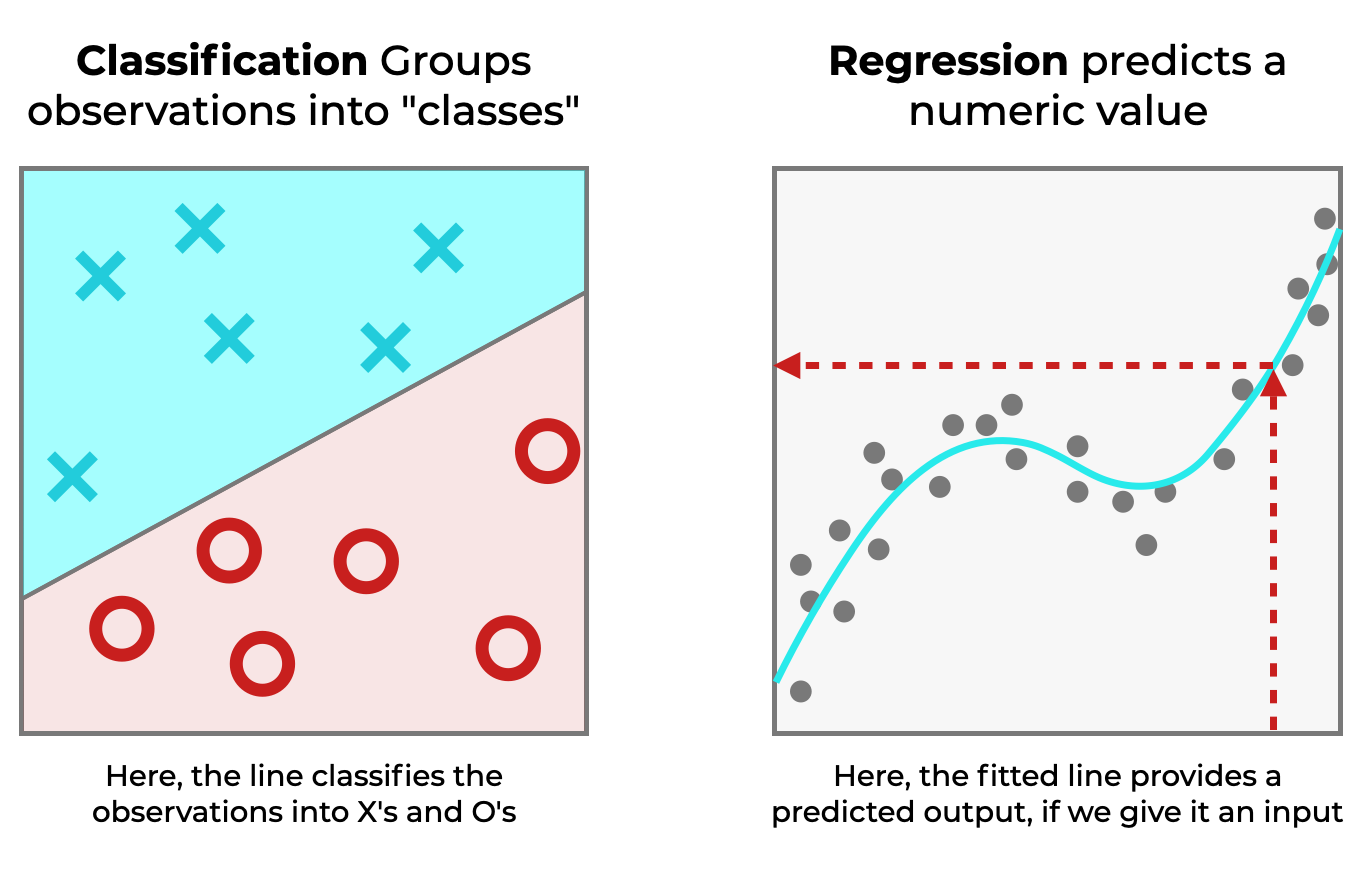
We’ll start with a quick review of classification, since ROC curves are a tool to evaluate classifiers.
Classification is a type of supervised learning, where we train a model with input data, which allows it to “learn” how to make predictions.
And classification is one of the two most common types of supervised learning (the other being regression).
Whereas in regression, the model learns to predict numbers (like 1, 2, 750) …
In classification, the model learns to predict categories.
Remember, this is important because ROC curves help us evaluate the performance of classifiers.
And since this is important to understand, and to set up our discussion of how and why we use ROC curves, let’s look at an example of a hypothetical classifier.
A Hypothetical Classifier: The Cat Detector
Here’s a quick example.
Imagine that you have a system that does one thing: it detects cats.
We’ll call it, The Cat Detector.
The inputs to the Cat Detector are images, and the outputs are as follows:
Catif the cat detector predicts that the image is a cat.Not Catif the cat detector predicts that the image is not a cat.
Simple, right?
But not so fast.
A good classification model is supposed to make predictions, but those predictions are almost always imperfect.
Machine learning systems sometimes make mistakes.
Four Types of Correct and Incorrect Predictions
We use classification systems to make predictions, and sometimes those predictions are correct.
But sometimes the predictions are incorrect.
And in fact, for a simple binary classification system, there are 4 possible correct and incorrect predictions.
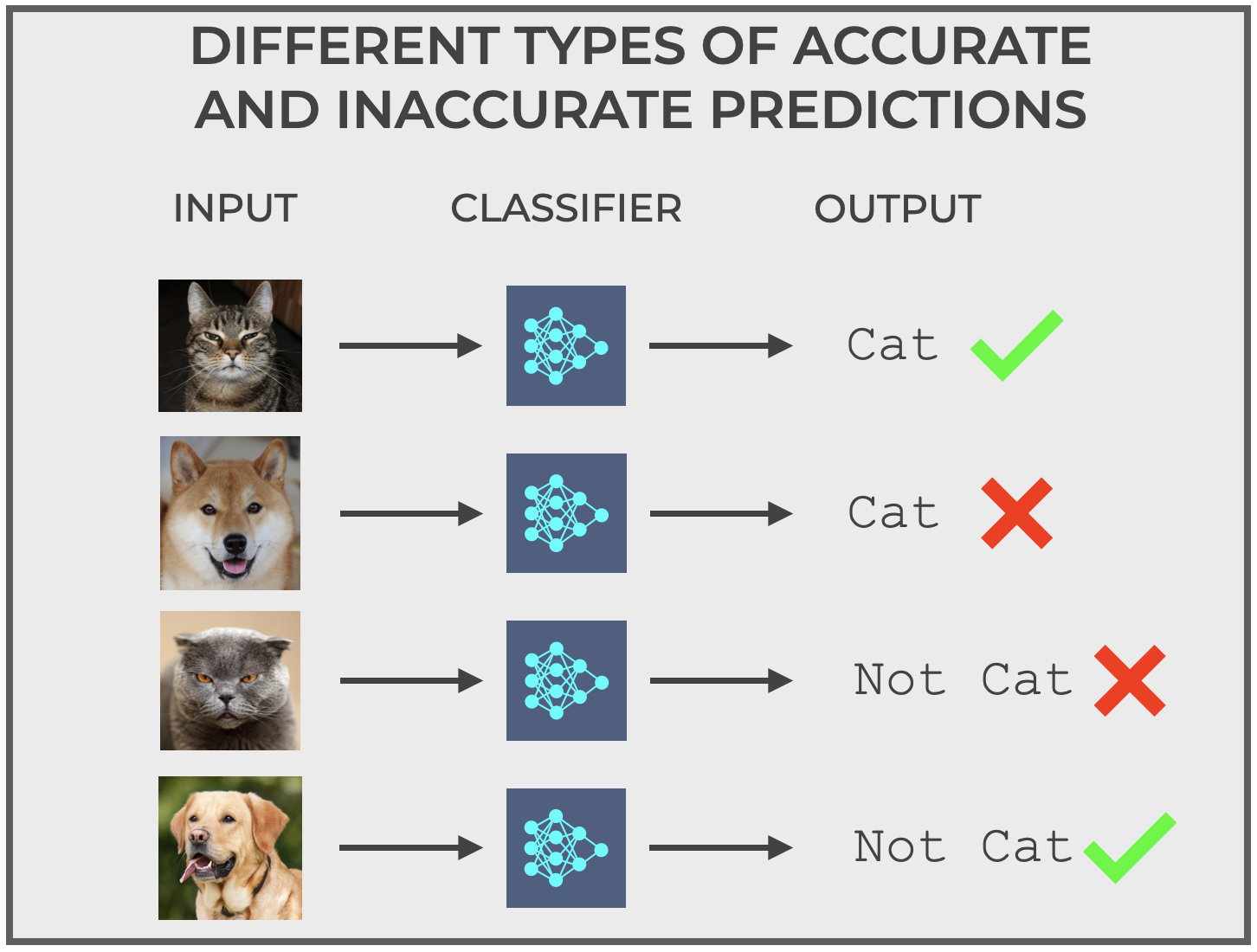
The system can predict:
- Correctly predict
catif the actual image is a cat. - Correctly predict
not catif the actual image is not a cat. - Incorrectly predict
catif the actual image is not a cat. - Incorrectly predict
not catif the actual image is a cat.
True Positive, True Negative, False Positive, And False Negative
Instead of outputting cat or not cat, let’s change the outputs to make them more general.
We’ll restructure the binary classifier so that the system outputs:
positiveif it predicts a cat, or …negativeif it predicts not cat.
With this more general coding of binary outputs, we can recategorize the four different types of correct and incorrect predictions we described earlier, as follows, and also give them names:
- True Positive: Correctly predict
positiveif the actual image is a cat. - True Negative: Correctly predict
negativeif the actual image is not a cat. - False Positive: Incorrectly predict
positiveif the actual image is not a cat. - False Negative: Incorrectly predict
negativeif the actual image is a cat.
These concepts of True Positive, True Negative, False Positive, and False Negative are very important in classification.
They show up over and over in different concepts like Precision, Recall, Sensitivity and Specificity …
And they’re very important for understanding ROC curves.
The ROC Curve
Now that we’ve reviewed classification, as well as the concepts of True Positive, True Negative, False Positive and False Negative, we’re ready to dive into ROC curves.
Short for “Receiver Operating Characteristic,” the ROC curve is a diagnostic tool that we use to evaluate binary classifiers.
More specifically, the ROC curve helps us understand how well a classifier distinguishes between two classes for different threshold levels (I’ll talk about thresholds a little later in the post).
The Structure of an ROC Curve
An ROC curve plots two quantities:
- True Positive Rate
- False Positive Rate
True Positive Rate and False Positive Rate are related TP, TN, FP and FN as follows:
(1) 
(2) 
The ROC curve plots True Positive Rate (TPR) on the y-axis and the False Positive Rate (FPR) on the x-axis.
And it looks like this:
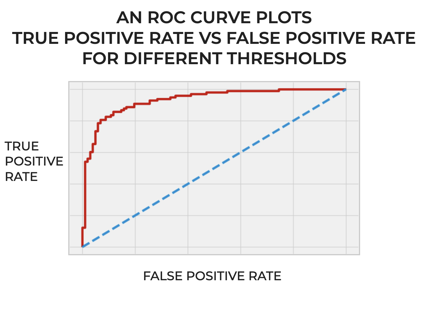
Essentially, it plots TPR and FPR for different thresholds of a binary classifier.
What’s a threshold?
I’m glad you asked …
Classification Thresholds
In many classification systems, the prediction is not just a hard “yes” or “no”.
Instead, it’s a probability score that indicates the likelihood that an instance belongs to the positive class. It’s almost like how confident the classifier is that a particular example is “positive.” These probability scores fall between 0 and 1.
For example, a probability score of .9 would mean that the classifier is 90% confident that an instance belongs to the positive class.
Now, what does this have to do with thresholds?
When you build your binary classifier, how “confident” do you want it to be before it assigns the label of “positive” to a particular example?
Is any probability score over .5 good enough?
Or do you want your classifier to be more confident?
You could design your classifier so that it needs a probability score of .7 to assign the label of “positive”.
Or you could design it to require an even higher probability score to assign the label of “positive”.
As the designer of the classification model, you get to decide how confident the model needs to be.
And that’s the threshold.
The threshold is like a cutoff point for probability score that you require in order for a classifier to assign the label of “positive”.
And importantly, it’s something that you get to decide as the machine learning engineer.
ROC Curves Plot Classifier Performance for Different Thresholds
Imagine that we build our classification system and we compute the True Positive Rate (TPR) and False Positive Rate (FPR) for every classification threshold.
Remember, as I mentioned earlier, the probability scores for a classification model should fall between 0 and 1. So the classification thresholds themselves will also be between 0 and 1. (Technically, the threshold could be exactly 0 or 1, but in practice, this is rare.)
So imagine that for every value of the classification threshold from 0 to 1 (or at least, many values in that range in regular increments), we compute TPR and FPR.
Then after we compute TPR and FPR for all of those classification thresholds, we plot them.
And when we plot them, every point on the ROC curve represents a different classification threshold.
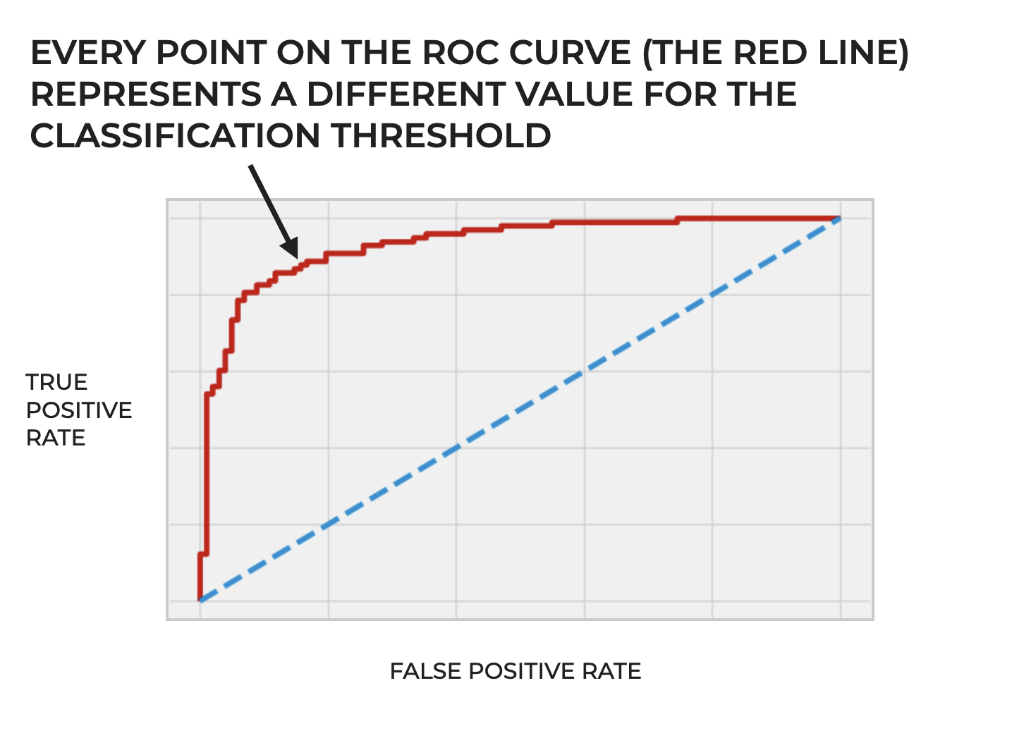
So ultimately, the ROC curve is a way of visually evaluating the performance of a classifier across different classification thresholds. Said differently, an ROC curve illustrates the trade-offs between the true positive rate and the false positive rate at different settings of the threshold.
We Can Adjust the Threshold of a Classifier, Based on the Problem
So again, we have flexibility to select a particular threshold.
But why adjust the threshold at all? Why is it necessary?
This is important because different thresholds prioritize different types of predictions, and those differing priorities can have real world consequences.
Let’s consider some scenarios to try to understand this.
Example 1: Medical Diagnostics
Imagine a classifier that you design to identify the presence of a life-threatening disease.
A cancer detector.
If we set the classification threshold for our system too high, it might produce too many false negatives (a high threshold produces more false negatives).
And remember: a false negative is when a classifier predicts negative, but the actual value is positive.
In the context of cancer detection, a false negative would be a case where the cancer detector predicts negative (i.e., no cancer), but the actual underlying truth is positive (i.e., that the person actually does have cancer). In the context of cancer detection, a false negative could be disastrous. A false negative on a cancer diagnosis could eventually lead to a person’s death.
On the other hand, a false positive (predicting positive when the actual underlying truth is negative) could lead to unnecessary tests, not to mention personal stress for the patient.
In this case, we’d probably want to lower the threshold in order to minimize false negatives.
Example 2: Spam Email Detection System
Let’s consider another example that most of us deal with every day: spam detection in an email system.
Modern spam detectors are largely machine learning classification systems.
They evaluate incoming email and classify it as spam or not spam (sometimes called ham).
In this scenario, a false positive (i.e., classifying genuine email as spam) would probably be a bigger problem than a false negative (letting a few spam emails slip through).
What happens if you get an important email (a job offer from Elon Musk, an “I’ve been thinking of you” letter from a long lost love, an invite to Richard Branson’s island, etc.) and the classification system incorrectly sends it to your spam folder.
A disaster.
In this case, we’d probably want to select a higher classification threshold, which would require a very high “certainty” from the model in order to classify a piece of email as spam.
This would limit false positives.
What Does a “Good” ROC Curve Look Like?
So far, I’ve only explained what ROC curves are, how they’re constructed, and why we use them.
But remember that ROC curves are ultimately a diagnostic tool that help us evaluate how classifiers perform (how they perform across a range of decision boundaries).
But what does a good or bad ROC curve look like?
The “Perfect” ROC Curve
Ideally, a perfect ROC curve should hug the upper left corner of the plot area. Such a curve would be a line that starts at the origin, goes nearly straight up along the y-axis, and then rightward along the top of the plot area.
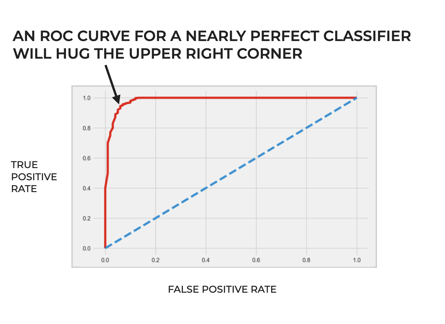
An ROC curve with this shape would indicate a classifier that can identify all positive cases perfectly, without any false positives.
A “Terrible” ROC Curve
Alternatively, a bad classification system without any predictive capability at all would have an ROC curve that’s a straight diagonal line from the origin at the lower left hand side of the plot area to the upper right hand corner.
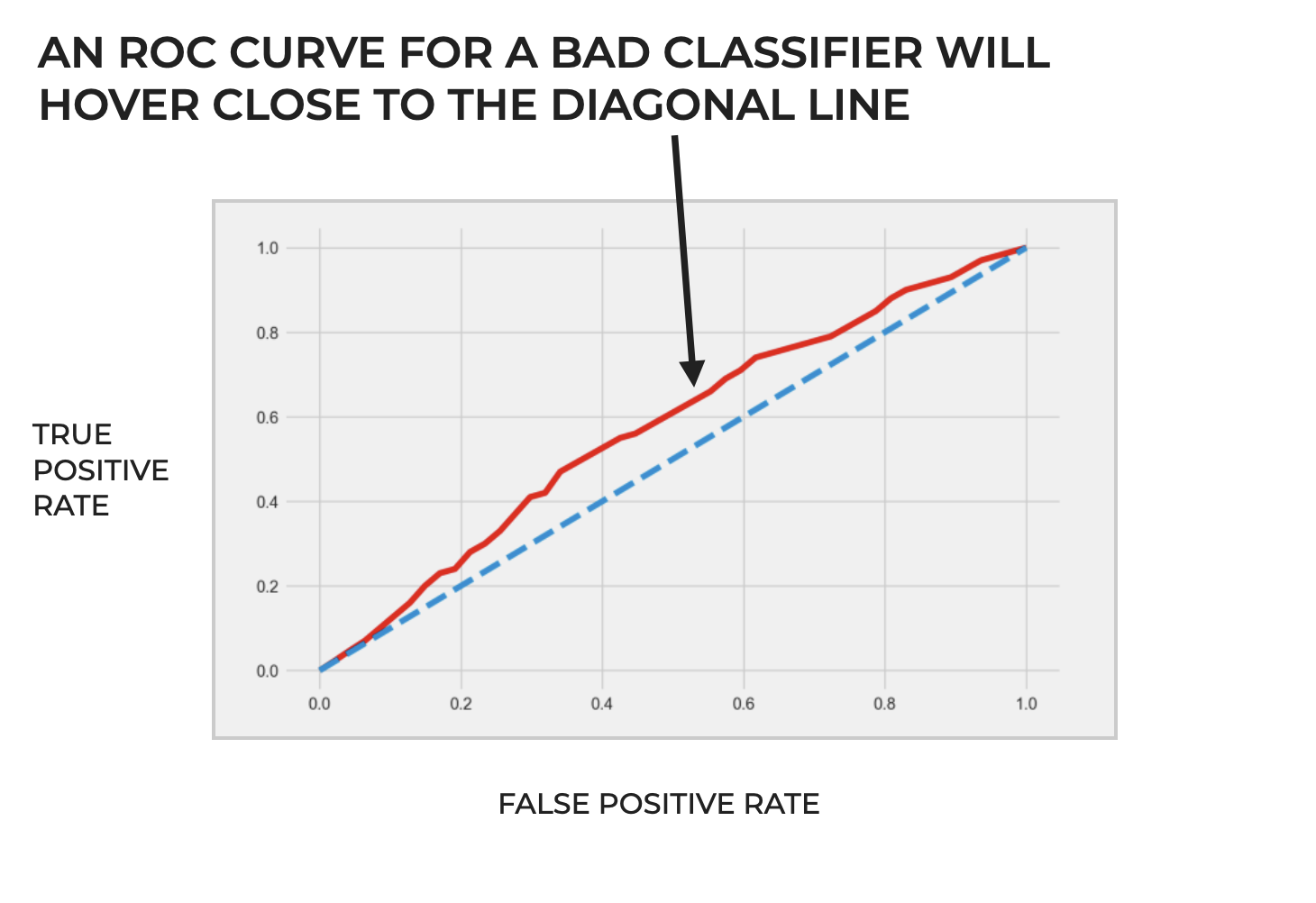
This would essentially indicate a classifier with random performance; performance that’s no better than flipping a coin.
Such a classifier would have an equal chance of predicting a false positive as it would a true positive.
Additional Concepts And Other Considerations Related to ROC Curves
So far, I’ve given you a high-level overview of what ROC curves are, how they’re structured, and why we use them.
But they’re also related to several other concepts in machine learning.
Area Under the Curve
Area Under the Curve – often referred to as ROC AUC – is a metric that summarizes the overall performance of a classifier.
As the name suggests, we calculate ROC AUC by computing the area under the ROC curve.
Subsequently, the “perfect” classifier that hugs the upper left hand corner of the plot area would have an ROC AUC of 1, while the “random” classifier, with an ROC curve that traces the diagonal from the bottom left to the upper right would have an ROC AUC of .5.
More generally, there’s a rough system for interpreting ROC AUC scores that’s similar to academic letter grades:
0.9 – 1.0 = A (outstanding)
0.8 – 0.9 = B (excellent/ good)
0.7 – 0.8 = C (acceptable/ fair)
0.6 – 0.7 = D (poor)
0.5 – 0.6 = F (no discrimination)
Although it should be noted that these ranges are somewhat dependent on the specific task, and may not apply for all situations and problems.
Ultimately, ROC AUC provides a single numerical measure of a classifiers performance across the full range of possible thresholds.
ROC Curves in Multiclass Classification
ROC curves are primarily designed for binary classification, but we can extend them to handle datasets with 3 or more classes.
To do this, we need to use a strategy called “one-vs-the-rest” (AKA, “one-vs-all).
In this strategy, we take one of the classes and evaluate it against all of the other classes.
In such a scenario, if we have  possible target classes, we will generate ROC curves.
One at a time, we’ll treat one of the classes as the positive class, and treat the remaining classes collectively as the negative class (if the class is anything but the positive class, it’s treated as negative).
For this one-vs-the-rest encoding, we then compute the True Positive Rate and False Positive Rate across the range of classification thresholds, which in turn gives us the data for the ROC curve for that particular one-vs-the-rest.
And we’ll repeat that process – creating that positive/negative encoding, computing the TPR and FPR metrics, and plotting the ROC curve – for every class.
For example, if our dataset has three target classes, A, B, and C, we would have:
- ROC Curve 1: A vs. (B+C)
- ROC Curve 2: B vs. (A+C)
- ROC Curve 3: C vs. (A+B)
So for a 3 class problem, we’d have 3 ROC curves.
Visualizing ROC Curves for a Multiclass Problem
Once you’ve computed the ROC curve data for the different one-vs-the-rest encodings, there are a couple of ways to visualize the data.
Possibly the most common way is to simply plot all of the ROC curves on the same chart. This provides a comprehensive look at the performance of the classifier across all classes.
Alternatively, you can visualize the ROC curves separately, but these will be harder to compare.
Additionally, for multiclass problems, we can compute what’s called a micro-average and macro-average ROC curve. These provide an aggregated performance metric.
It’s important to note, however, that multiclass classification can be a complex problem, particularly if the target classes are imbalanced.
Because of the complexities involved in multiclass classification, I’ll probably write more about ROC curves for the multiclass scenario later, when I can give it more specific attention.
Frequently Asked Questions About ROC Curves
I’ve tried to cover all of the essentials about ROC curves in this blog post.
Having said that, have I missed something important that you need to know?
Tell me your questions and feedback in the comments section.
For more machine learning tutorials, sign up for our email list
In this tutorial, I’ve explained ROC curves; what they are, how they’re structured, and how we use them.
This will be a big help as you’re learning the conceptual foundations of classification.
But if you want to master machine learning, there’s a lot more to learn.
That said, if you want to master machine learning, then sign up for our email list.
When you sign up, you’ll get free tutorials on:
- Machine learning
- Deep learning
- Scikit learn
- … as well as tutorials about Numpy, Pandas, Seaborn, and more
We publish tutorials for FREE every week, and when you sign up for our email list, they’ll be delivered directly to your inbox.
I would be very interested in how to use ROC curves in multinomial regressions.
Excellent.????????????
Thank you very much
You’re welcome