In this tutorial, I’ll show you how to make a matplotlib scatter plot.
The scatter plot is a relatively simple tool, but it’s also essential for doing data analysis and data science.
Having said that, if you want to do data science in Python, you really need to know how to create a scatter plot in matplotlib. You should know how to do this with your eyes closed.
This tutorial will show you how to make a matplotlib scatter plot, and it will show you how to modify your scatter plots too.
Overall, the tutorial is designed to be read top to bottom, particularly if you’re new to Python and want the details of how to make a scatter plot in Python. Ideally, it’s best if you read the whole tutorial.
Having said that, if you just need quick help with something, you can click on one of the following links. These links will bring you to the appropriate section in the tutorial.
- A quick introduction to matplotlib
- The syntax for the matplotlib scatter plot
- Examples of how to make a scatter plot with matplotlib
Again though, if you’re a relative beginner and you have the time, I recommend that you read the full tutorial. Everything will make more sense that way.
Ok. Before I show you how to make a scatter plot with matplotlib, let me quickly explain what matplotlib is.
A quick introduction to matplotlib
Matplotlib is a data visualization module for the Python programming language. It provides Python users with a toolkit for creating data visualizations.
Some of those data visualizations can be extremely complex. You can use matplotlib to create complex visualizations, because the syntax is very detailed. This makes the syntax very adaptable for different visualization problems.
On the other hand, the complex syntax of matplotlib can make it more complicated to quickly create simple data visualizations.
This is where pyplot comes in.
What is pyplot
When you start working with matplotlib, you might read about pyplot.
What is pyplot?
To put it simply, pyplot is part of matplotlib. Pyplot is a sub-module of the larger matplotlib module.
Specifically, pyplot provides a set of functions for creating simple visualizations. For example, pyplot has simple functions for creating simple plots like histograms, bar charts, and scatter plots.
Ultimately, the tools from pyplot give you a simpler interface into matplotlib. It makes visualization easier for some relatively standard plot types.
As I mentioned, one of those plots that you can create with pyplot is the scatter plot.
Let’s take a look at the syntax.
The syntax of the matplotlib scatter plot
Creating a scatter plot with matplotlib is relatively easy.
To do this, we’re going to use the pyplot function plt.scatter().
For the most part, the synax is relatively easy to understand. Let’s take a look.
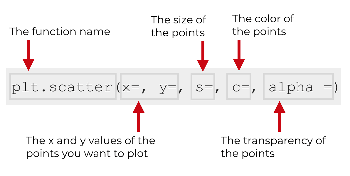
First of all, notice the name of the function. Here, we’re calling the function as plt.scatter(). Keep in mind that we’re using the syntax plt to refer to pyplot. Essentially, this code assumes that you’ve imported pyplot with the code import matplotlib.pyplot as plt. For more information on that, see the examples below.
To create a scatter plot with matplotlib though, you obviously can’t just call the function. You need to use the parameters of the function to tell it exactly what to plot, and how to plot it.
With that in mind, let’s take a look at the parameters of the plt.scatter function.
The parameters of plt.scatter
Pyplot’s plt.scatter function has a variety of parameters that you can manipulate … nearly a dozen.
The large number of parameters can make using the function a little complicated though.
So in the interest of simplicity, we’re only going to discuss five of them: x and y, c, s, and alpha.
Let’s talk about each of them.
x and y
The x and y parameters of plt.scatter are very similar, so we’ll talk about them together.
Essentially, they are the x and y axis positions of the points you want to plot.
The data that you pass to each of these should be in an “array like” format. In Python, structures with “array like” formats include things like lists, tuples, and NumPy arrays.
Commonly, you’ll find that people pass data to these parameters in the form of a Python list. For example, you might set x = [1,2,3,4,5].
In this tutorial though, we’ll work with NumPy arrays. You’ll see this later in the examples section, but essentially, we’ll pass values to the x and y parameters in the form of two NumPy arrays.
c
The c parameter controls the color of the points.
There are several ways to manipulate this parameter.
First, you can set the c parameter to a “named color.” Named colors are colors like “red,” “green,” “blue,” and so on. Python has a large number of named colors, so if you want something specific, take a look at the options and use one in your plot.
You can also set the c parameter using a hexidecimal color. For example, you can set c = "#CC0000" to set the color of the points to a sort of “fire engine red” color. Using hex colors is great, because they can give you very fine-grained control over the colors in your visualization. On the other hand, hexidecimal colors can be a little bit complicated for beginners. That being the case, we’re not going to really cover hex colors in this tutorial.
It’s also possible to create a color mapping for your points, such that the color of the points varies according to some variable. Unfortunately, this is somewhat complicated for a beginner. So in the interest of simplicity, I won’t explain it here. If you’re really interested in complex visualization with more visually appealing colors, I strongly recommend using R’s ggplot2 system instead.
s
The s parameter controls the size of the points.
The default value is controlled by the lines.markersize value in the rcParams file.
We’re not going to work extensively with the s parameter, but I’ll show you a simple example of how it works in the examples below.
alpha
Finally, the alpha parameter controls the opacity of the points.
This must be a value between 0 and 1 (inclusive), where 1 is fully opaque and 0 is fully transparent.
Examples: how to make a scatter plot in matplotlib
Now that you understand the syntax and the parameters of the plt.scatter function, let’s work through some examples.
Run this code before you get started
One last thing though before you try to run the examples.
… you’ll need to run some code to get these examples to work properly.
Import modules
First, you’ll need to import a few modules into your working environment. The following code will import matplotlib, numpy and pyplot.
import matplotlib
import numpy as np
import matplotlib.pyplot as plt
Create dataset
Also, you need to create some data.
We’re essentially going to create two vectors of data.
We’ll create the first, x_var, by using the np.arange function. This data, x_var, essentially contains the integer values from 0 to 49.
The second variable, y_var, is the same value of x_var with a little random noise added in with the np.random.normal function.
# CREATE DATA
np.random.seed(42)

x_var = np.arange(0, 50)
y_var = x_var + np.random.normal(size = 50, loc = 0, scale = 10)
You’ll see what the data looks like in a minute. The whole point of this tutorial is that we’re going to plot it! But essentially, when we plot them together, they will look like highly correlated linear data.
Ok, now that we have our data, let’s plot it.
How to make a simple scatter plot with matplotlib
We’ll start off by making a very simple scatter plot.
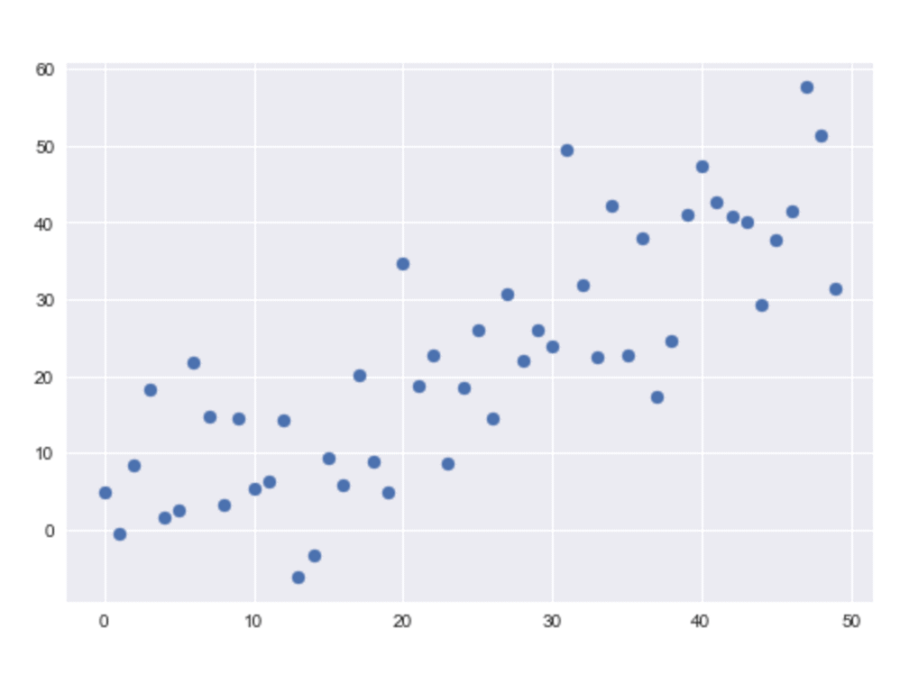
To do this, we’re going to call plt.scatter() and set x = x_var and y = y_var.
# PLOT A SIMPLE SCATTERPLOT
plt.scatter(x = x_var, y = y_var)
And here is the output:
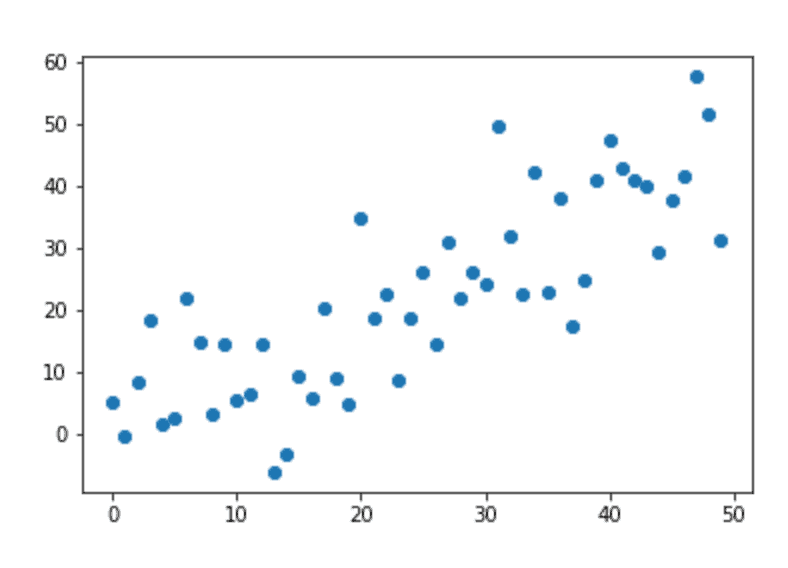
Let me explain a few things about the code and the output.
First, notice the code. We mapped x_var to the x axis and we mapped y_var to the y axis.
You can see that this directly translates into how the points are plotted. For any given point in the scatter plot, the x axis value comes from the x_var variable, and the y axis value comes from the y_var variable. Said differently, the locations of the points are contained in the variables x_var and y_var.
I also want to note that you don’t need to explicitly need to type the parameters x and y. For example, you could remove x = and y = from the code, and it would still work. Like this:
plt.scatter(x_var, y_var)
This code works the same as plt.scatter(x = x_var, y = y_var). They are operationally identical. If you remove x = and y = from the code, Python still knows that you are passing x_var and y_var to the x and y parameter. It essentially knows that the first variable should be mapped to x and the second should be mapped to y. This is known as defining argument values by position. It’s very common to see that in code, so I want you to understand it.
A basic matplotlib scatter plot is a little “ugly”
At this point, I need to point out that a default matplotlib scatter plot is a little plain looking. It’s a little unrefined.
An unrefined chart is fine if you’re doing exploratory data analysis for personal consumption. But if you need to create a chart and show it to anyone important – like a management team in a business – this chart is unrefined. It lacks polish.
Like it or not, that lack of polish will reflect a little poorly on you. You can deny it all you want, but it can be very useful to learn how to polish your charts and make them look more professional. I’ll show you how in an example further down in this tutorial.
Change the color of the points
Although there is a lot we would need to do to make the basic scatter plot look better, changing the color of the points is a simple way to improve the aesthetics of the chart.
Let me show you how.
As noted earlier in this tutorial, you can modify the color of the points by manipulating the c parameter.
Multiple ways to set the color of points
There are actually several different ways to modify the c parameter to change the color of the points.
The two primary ways to do this are to set the parameter to a “named color” or to set the parameter to a “hex color.”
Here in this tutorial, I’ll show you how to set the color of the points to a “named color.” Hex colors are a little more complicated, so I’m not going to explain them here.
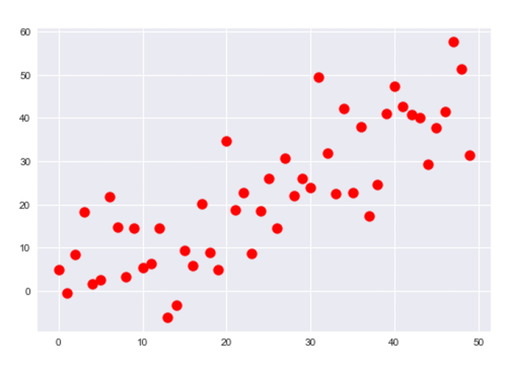
We can change the color of the points in our scatter plot by setting the c parameter to a “named color.”
What are named colors? This is very simple. Named colors are colors like “red,” “green,” and “blue.” Python has a pretty long list of named colors. I recommend that you become familiar with a few of them, so you have a few that you can use regularly in your plots.
When you know what color you want to use for your points, provide that color as the argument to the c parameter.
For example, if you want to set the color of the points to “red” you can use the code c = 'red' inside of plt.scatter.
Here’s the code to do that:
plt.scatter(x_var, y_var, c = 'red')
The code produces the following output:
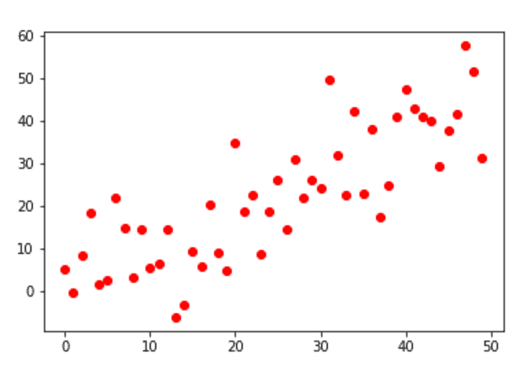
As you can see, this code has changed the color of the points to red.
This chart still lacks polish, but by using the c parameter, we now have a little more control over the aesthetics of our scatter plot.
Change the size of the points
You can also change the size of the points.
You can do that by using the s parameter.
Changing the size is very similar to changing the color. Just provide a value.
plt.scatter(x_var, y_var, s = 120)
And here’s the output:
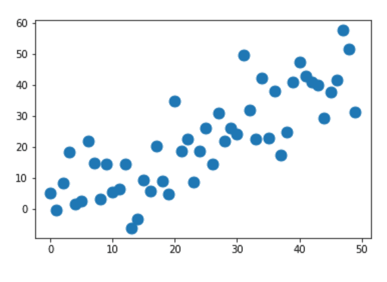
As you can see, the size of the points is larger than the size of the points in our simple scatter plot.
The value that you give to the s parameter will be the point size in points**2.
Make your matplotlib scatter plot look more “professional”
As I mentioned earlier, the default formatting for pyplot plots is a little unrefined.
Again, that’s not a big deal if you’re just exploring data on your laptop and don’t intend to show it to anyone important. The default matplotlib formatting is OK for rough drafts.
But I definitely think you should “polish” your charts if you need to show them to anyone important. For example, if you work in a business environment and you need to present an analysis to a high-level management team, you’ll want your charts to be polished and aesthetically pleasing. The appearance of your visualizations matter. Don’t ignore it.
That being the case, let me show you a quick way to improve the look of your pyplot scatter plots.
We’re going to use a function from the seaborn module to change some of our plot formatting.
To use seaborn, we’ll need to import the seaborn module. You can do that with the following code.
# import seaborn module
import seaborn as sns
Now that seaborn is installed, we’re going to use the seaborn.set() function to re-set the plot defaults:
#set plot defaults using seaborn formatting
sns.set()
After running sns.set(), you can re-plot your data, and you’ll notice that it looks quite a bit better.
#plot scatter plot with matplotlib.pyplot
plt.scatter(x = x_var, y = y_var)
Here’s the plot:
As you can see, the chart looks different. More professional, in my opinion.
The background color has been changed. There are gridlines now. The default color for the points is actually slightly different. The changes here are actually pretty minor, but I think they make a big difference in making the chart look better.
Run this to remove seaborn formatting
One quick note about the using seaborn formatting.
If you run the seaborn.set() function above, you may find that all of your pyplot charts have that formatting.
How do you turn it off?
You can remove the seaborn formatting by using the seaborn.reset_orig() function.
# REMOVE SEABORN FORMATTING
sns.reset_orig()
A matplotlib scatter plot using multiple parameters
Let’s do one more example.
Here, we’re going to use several of the parameters and techniques from prior examples together in a single example. The output will be a little more polished, and it will give you a sense of how to create a scatter plot with pyplot while controlling multiple parameters at the same time.
Here’s the code:
# FINALIZED EXAMPLE
import seaborn as sns
sns.set()
plt.scatter(x_var, y_var, s = 120, c = 'red')
And here is the output:
Not bad.
It’s not perfect, and we could probably do a few things to improve it, but a plot like this will be “good enough” in many circumstances.
If you want to learn data science in Python, learn matplotlib
Having said that, if you really want to get the most out of our data visualizations in Python, you need to learn a lot more about matplotlib and pyplot. We’ve really just covered the basics here.
Moreover, if you’re serious about learning data science in Python, you really need to know matplotlib. Data visualization is an important part of data science, and if you’re doing data visualization in Python, matplotlib is often the tool of choice.
For more Python data science tutorials, sign up for our email list
If you’re interested in data science in Python, sign up for our email list now.
Every week, we publish data science tutorials here at the Sharp Sight blog.
By signing up, you’ll get our tutorials delivered directly to your inbox.
You’ll get free tutorials on:
- Matplotlib
- NumPy
- Pandas
- Base Python
- Scikit learn
- Machine learning
- Deep learning
- … and more.
Want to learn data science in Python? Sign up now.