This tutorial will explain how to make a matplotlib histogram.
If you’re interested in data science and data visualization in Python, then read on. This post will explain how to make a histogram in Python using matplotlib.
Here’s exactly what the tutorial will cover:
- A quick introduction to matplotlib
- The syntax for the matplotlib histogram
- Examples of how to make a histogram with matplotlib
Clicking on any of the above links will take you to the relevant section in the tutorial.
Having said that, if you’re a relative beginner, I recommend that you read the full tutorial.
Ok, let’s get started with a brief introduction to matplotlib.
A quick introduction to matplotlib
If you’re new to Python – and specifically data science in Python – you might be a little confused about matplotlib.
Here’s a very brief introduction to matplotlib. If you want to skip to the section that’s specifically about matplotlib histograms, click here.
What is matplotlib?
Matplotlib is a module for data visualization in the Python programming language.
If you’re interested in data science or data visualization in Python, matplotlib is very important. It will enable you to create very simple data visualizations like histograms and scatterplots in Python, but it will also enable you to create much more complicated data visualizations. For example, using matplotlib, you can create 3-dimensional plots of your data.
Data visualization is extremely important for data analysis and the broader data science workflow. So even if you’re not interested in data visualization per-se, you really do need to master it if you want to be a good data scientist.
That means, if you’re doing data science in Python, you should learn matplotlib.
What is pyplot
Related to matplotlib is pyplot.
You’ll often see pyplot mentioned and used in the context of matplotlib. Beginners often get confused about the difference between matplotlib and pyplot, because it’s often unclear how they are related.
Essentially, pyplot is a sub-module in matplotlib. It provides a set of convenient functions that enable you to create simple plots like histograms. For example, you can use plt.plot() to create a line chart or you can use the plt.bar() function to create a bar chart. Both plt.plot() and plt.bar() are functions from the Pyplot module.
In this tutorial, we’ll be using the plt.hist() function from pyplot. Just remember though that a pyplot histogram is effectively a matplotlib histogram, because pyplot is a sub-module of matplotlib.
Now that I’ve explained what matplotlib and pyplot are, let’s take a look at the syntax of the plt.hist() function.
The syntax of the matplotlib histogram
From this point forward, we’re going to be dealing with the pyplot hist() function, which makes a histogram.
The syntax is fairly straight forward in the simplest case. On the other hand, the hist() function has a variety of parameters that you can use to modify the behavior of the function. Really. There are a lot of parameters.
In the interest of simplicity, we’re only going to work with a few of those parameters.
If you really need to control how the function works, and need to use the other parameters, I suggest you consult the documentation for the function.
The parameters of plt.hist
There are 3 primary parameters that we’re going to cover in this tutorial: x, bins, and color.
x
The x parameter is essentially the input values that you’re going to plot. Said differently, it is the data that you want to plot on the x-axis of your histogram.
(If that doesn’t make sense, take a look at the examples later in the tutorial.)
This parameter will accept an “array or sequence of arrays.”
Essentially, this means that the numeric data that you want to plot in your histogram should be contained in a Python array.
For our purposes later in the tutorial, we’re actually going to provide our data in the form of a NumPy array. NumPy arrays are also acceptable.
bins
The bins parameter controls the number of bins in your histogram. In other words, it controls the number of bars in the histogram; remember that a histogram is a collection of bars that represent the tally of the data for that part of the x-axis range.
More often than not, you’ll provide an integer value to the bins parameter. If you provide an integer value, the value will set the number of bins. For example, if you set bins = 30, the histogram will have 30 bars.
You can also provide a string or a Python sequence to the bins parameter to get some additional control over the histogram bins. Having said that, using the bins parameter that way can be a little more complicated, and I don’t recommend it to beginners.
Also, keep in mind that the bins parameter is optional, which means that you don’t need to provide a value.
If you don’t provide a value, matplotlib will use a default value. It will use the default value defined in the matplotlib.rcParams file, which contains matplotlib settings. Assuming that you haven’t changed those settings in matplotlib.rcParams, the bins parameter will default to 10 bins.
For examples of how to work with the bins parameter, consult the example below about histogram bins.
color
Finally, let’s talk about the color parameter.
As you might guess, the color parameter controls the color of the histogram. In other words, it controls the color of the histogram bars.
This parameter is optional, so if you don’t explicitly provide a color value, it will default to a default value (which is typically a sort of inoffensive blue color).
If you decide to manually set the color, you can set it to a “named” color, like “red,” or “green,” or “blue.” Python and matplotlib have a variety of named colors that you can specify, so take a look at the color options if you manipulate the color parameter this way.
You can also provide hexidecimal colors to the color parameter. This is actually my favorite way to specify colors in data visualizations, because it gives you tight control over the aesthetics of the chart. On the other hand, using hex colors is more complicated, because you need to understand how hex colors work. Hex colors are beyond the scope of this blog post, so I won’t explain them here.
Examples: how to make a histogram in matplotlib
Ok, now that I’ve explained the syntax and the parameters at a high level, let’s take a look at some examples of how to make a histogram with matplotlib.
Most of the examples that follow are simple. If you’re just getting started with matplotlib or Python, first just try running the examples exactly as they are. Once you understand them, try modifying the code little by little just to play around and build your intuition. For example, change the color parameter from “red” to something else. Basically, run the code and then play around a little.
Run this code before you get started
One more thing before we get started with the examples.
Before you run the examples, make sure to run the following code:
Import modules
import matplotlib
import numpy as np
import matplotlib.pyplot as plt
This code will import matplotlib, pyplot, and NumPy.
We’re going to be using matplotlib and pyplot in our examples, so you’ll need them.
Create dataset
Also, run this code to create the dataset that we’re going to visualize.
# CREATE NORMALLY DISTRIBUTED DATA
norm_data = np.random.normal(size = 1000, loc = 0, scale = 1)
This will create a dataset called norm_data, using the NumPy random normal function. This data is essentially normally distributed data that has a mean of 0 and a standard deviation of 1. How to use NumPy random normal is beyond the scope of this post, so if you want to understand how the code works, consult our tutorial about np.random.normal.
Ok, on to the actual examples.
How to make a simple histogram with matplotlib
Let’s start simple.
Here, we’ll use matplotlib to to make a simple histogram.
# MAKE A HISTOGRAM OF THE DATA WITH MATPLOTLIB
plt.hist(norm_data)
And here is the output:
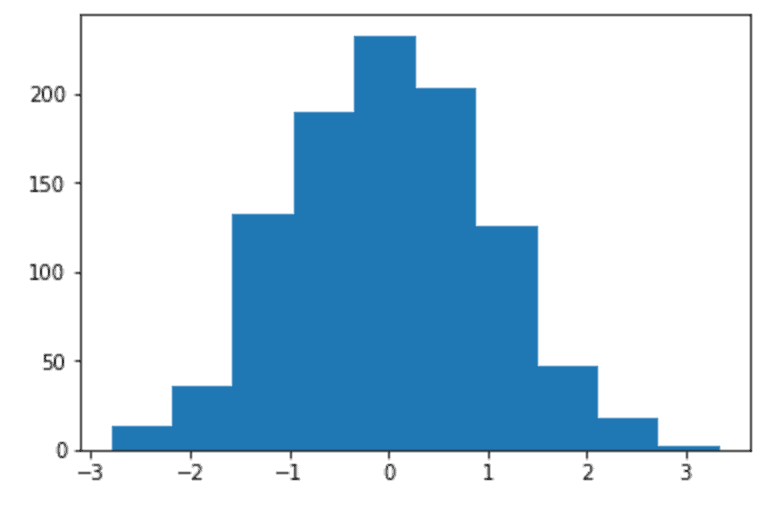
This is about as simple as it gets, but let me quickly explain it.
We’re calling plt.hist() and using it to plot norm_data.
norm_data contains normally distributed data, and you can see that in the visualization.
Aesthetically, the histogram is very simple. Because we didn’t use the color parameter or bins parameter, the visualization has defaulted to the default values. There are 10 bins (my current default) and the color has defaulted to blue. The plot is also relatively unformatted.
I will be honest. I think the default histogram is a little on the ugly side. At least, it’s rather plain. That’s OK if you’re just doing data exploration for yourself, but if you need to present your work to other people, you might need to format your chart to make it look more pleasing.
Change the color of the bars
Let’s talk about how to change the color of the bars, which is one way to make your chart more visually appealing.
As noted above, we can change the color of the histogram bars using the color parameter.
As you saw earlier in the previous example, the bar colors will default to a sort of generic “blue” color.
Here, we’re going to manually set it to “red.”
plt.hist(norm_data, color = 'red')
The code produces the following output:
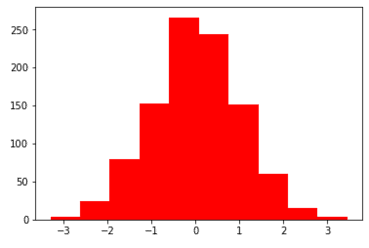
As you can see, the bars are now red.
The chart is still a little visually boring, but this at least shows you how you can change the color. As you become more skilled in data visualization, you can use the color parameter to make your histograms more visually appealing.
Change the number of bins
Now, let’s modify the number of bins.
Changing the number of bars can be important if your data are a little uneven. You can increase the number of bins to get a more fine-grained view of the data. Or, you can decrease the number of bins to smooth out abnormalities in your data.
Because this tutorial is really about how to create a Python histograms, I’m not going to talk a lot about histogram application. However, I do want you to see how you can modify the bins parameter. That will give you more control over the visualization when you begin to apply the technique.
Here’s the code:
plt.hist(norm_data, bins = 50)
And here’s the output:
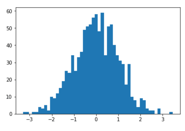
So what have we done here?
We increased the number of bins by setting bins = 50. As I noted above, the bins parameter generally defaults to 10 bins. Here, by increasing the number of bins to 50, we’ve generated a more fine-grained view of the data. This can help us see minor fluctuations in the data that are invisible when we use a smaller number of bins.
Make your matplotlib histogram look more “professional”
Now that we’ve covered some of the essential parameters of the plt.hist function, I want to show you a quick way to improve the appearance of your plot.
We’re going to use the seaborn module to change the default formatting of the plot.
To do this, we will first import seaborn.
# import seaborn module
import seaborn as sns
Next, we’ll use the seaborn.set() function to modify the default settings of the chart. As you’ll see in a moment, this will change the default values for the background color, gridlines, and a few other things. Ultimately, it will just make your histogram look better.
#set plot defaults using seaborn formatting
sns.set()
Finally, let’s replot the data using plt.hist.
#plot histogram with matplotlib.pyplot
plt.hist(norm_data)
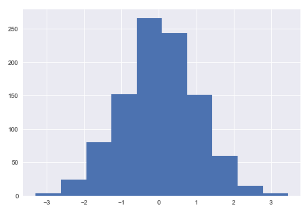
As you can see, the chart looks different. More professional, in my opinion.
The bar colors are slightly different, and the background has been changed. The changes are actually fairly minor, but I think they make a big difference in making the chart look better.
Run this to remove seaborn formatting
One quick note.
If you run the above code and use the sns.set() function to set the plot defaults with seaborn, you might run into an issue.
… you might find that all of your matplotlib charts have the new seaborn formatting.
How do you make that go away?
You can remove the seaborn formatting defaults by running the following code.
# REMOVE SEABORN FORMATTING
sns.reset_orig()
When you run this code, it will return the plot formatting to the matplotlib defaults.
A histogram example using multiple parameters
Ok, let’s do one more example.
Here, I want to show you how to put the pieces together.
We’re going to modify several parameters at once to create a histogram:
# FINALIZED EXAMPLE
import seaborn as sns
sns.set()
plt.hist(norm_data, bins = 50, color = '#CC0000')
And here is the output:
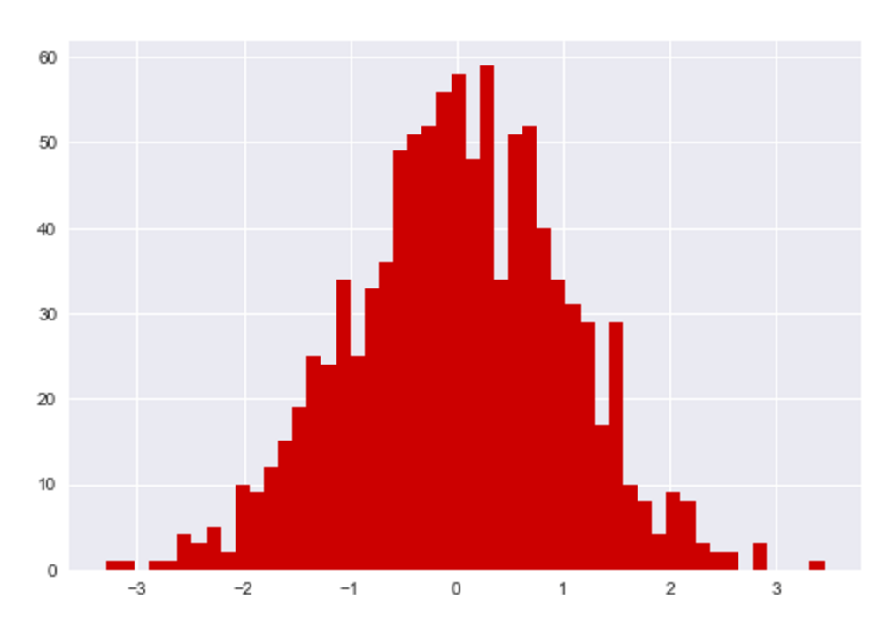
What have we done here?
We used plt.hist() to plot a histogram of norm_data.
Using the bins parameter, we increased the number of bins to 50 bins.
We used the color parameter to change the color of the bars to the hex color ‘#CC0000‘, which a shade of red.
Finally, we used the sns.set() function to change the plot defaults. This modified the background color and the gridlines.
Overall, I think this is a fairly professional looking chart, created with a small amount of code.
There’s definitely more that we could do to improve this chart (with titles, etc), but for a rough draft, it’s pretty good.
If you want to learn data science in Python, learn matplotlib
In this tutorial, we’re really just scratching the surface.
There’s a lot more that you can do with matplotlib, beyond just making a histogram.
To really get the most out of it, and to gain a solid understanding of data visualization in Python, you need to study matplotlib.
For more Python data science tutorials, sign up for our email list
With that in mind, if you’re interested in learning (and mastering) data visualization and data science in Python, you should sign up for our email list right now.
Here at the Sharp Sight blog, we regularly post tutorials about a variety of data science topics … in particular, about matplotlib.
If you sign up for our email list, our Python data science tutorials will be delivered to your inbox.
You’ll get free tutorials on:
- Matplotlib
- NumPy
- Pandas
- Base Python
- Scikit learn
- Machine learning
- Deep learning
- … and more.
Want to learn data science in Python? Sign up now.
Hi, brother ????????
That’s great
????????????