In this tutorial, I’ll show you how to create small multiple charts with Plotly Express.
So I’ll explain the syntax of how to create Plotly small multiple charts.
I’ll also show you a few clear examples, so you can see how it’s done.
The tutorial has several sections. If you need something specific, just click on the appropriate link.
Table of Contents:
- A quick introduction to small multiples in Python with Plotly
- The syntax to create Plotly small multiple charts
- Examples
Ok. Let’s get started
A Quick Introduction to Small Multiple Charts with Plotly
The small multiple chart is one of the most useful data visualization techniques available to the data scientist.
Long time readers of the Sharp Sight blog will know that I really love small multiple charts.
Small multiple charts are useful, because they enable you to break out a data visualization into separate “panels”. Typically, you’ll take an existing plot, and break it out into panels by an additional categorical variable. This enables you to compare the data across multiple categories.
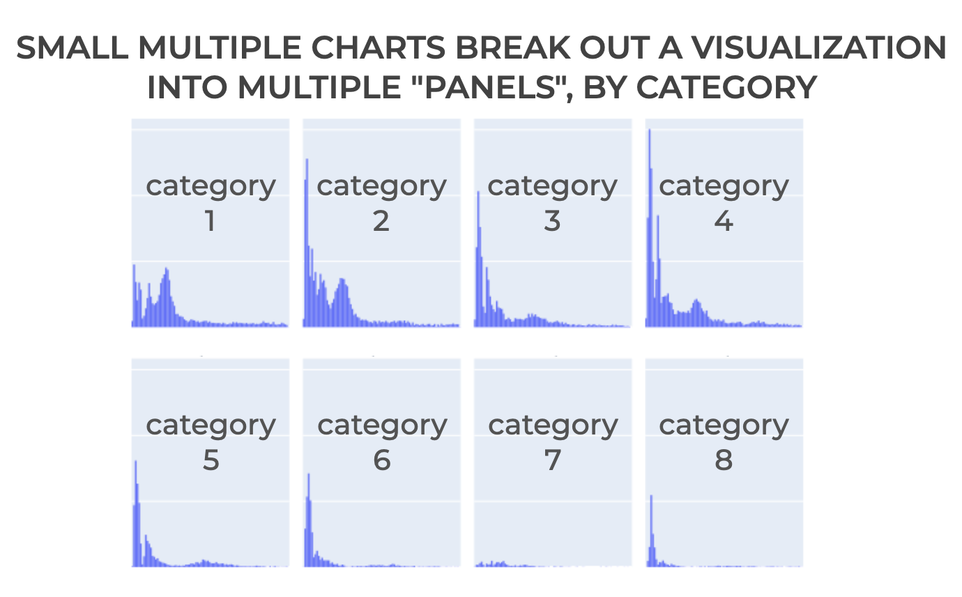
Again: small multiple charts are extremely powerful and useful for data analysis.
But they are often under-used, because they are often hard to make. This is particularly true in Python.
Having said that, although they are somewhat difficult to make with many Python data visualization packages, they are moderately easy to create with Plotly Express … as long as you know the right syntax.
Let’s take a look at the syntax to see how we can create small multiple charts with Plotly.
The syntax to create Plotly small multiple charts
Here, I’ll show you the syntax for how to create small multiple charts with Plotly.
To be clear: there is no single function that you can use to create small multiple charts.
Rather, you create small multiple charts by using special parameters available with existing Plotly express functions.
For example, you can use special parameters to create small multiple charts for the:
- plotly histogram
- plotly scatterplot
- plotly bar chart
- plotly line chart
- plotly imshow
And several other plotly express tools.
To do this, you need to use the facet_row and facet_col parameters inside of those existing plotly functions:
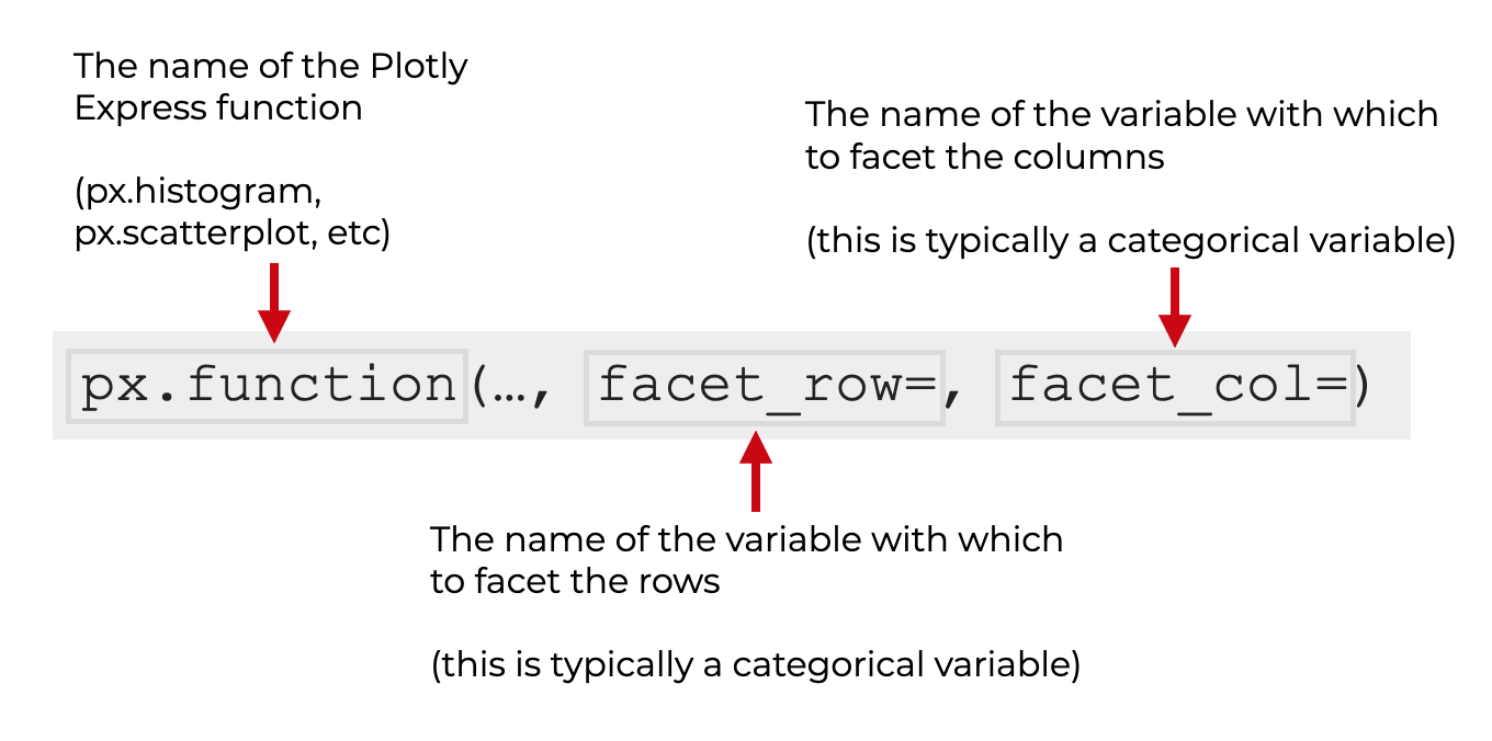
So for example, if you want to create a small multiple histogram, then you can call px.histogram() and use the facet_row= parameter inside the function call (I’ll show you examples of this in the examples section).
Again: there’s no single function for a Plotly small multiple. You create them by using a few parameters inside the existing Plotly Express functions.
Plotly small multiple parameters
There are several parameters that control the creation of small multiple charts with Plotly express.
The 3 most important are:
- facet_row
- facet_col
- facet_col_wrap
Again, these parameters are available for px.scatterplot, px.line, px.histogram, px.imshow, and most of the other Plotly express functions. These parameters work the same in the context of all of those tools.
Let’s quickly take a look at what each of those parameters does.
facet_row
The facet_row= parameter controls the variable that breaks out the visualization into different panels, oriented vertically (i.e., in the row direction).
This is typically a categorical variable.
facet_col
The facet_col= parameter controls the variable that breaks out the visualization into different panels, oriented horizontally (i.e., in the column direction).
This is typically a categorical variable.
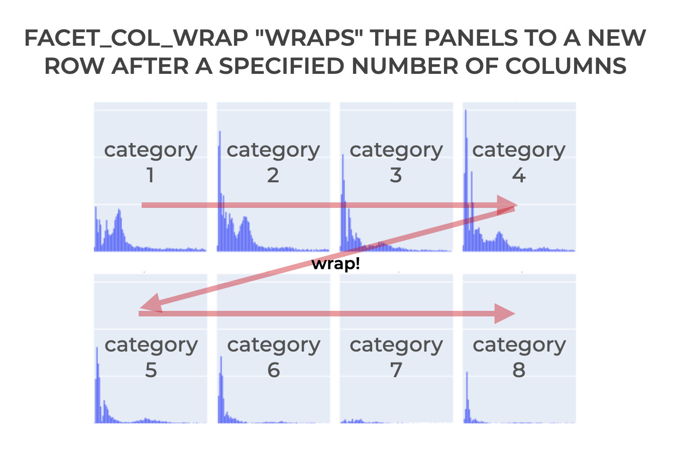
facet_col_wrap
The facet_col_wrap= parameter controls the number of panels in the horizontal direction (i.e., the “column” direction).
The argument to this parameter should be an integer.
So for example, if you set facet_col_wrap = 3, the function will plot new panels vertically and there will be 3 “columns” of panels. Any additional panels will be “wrapped” to a new row of panels.
These parameters may be somewhat difficult to understand when explained like this, so the best way to understand how they work is with clear examples.
Examples: how to create Plotly small multiple charts
Now that we’ve looked at the syntax and parameters associated with Plotly small multiple charts, let’s look at some examples.
Examples:
- Create a simple Plotly histogram
- Facet on 1 variable, by column
- Facet on 1 variable, by row
- Wrap panels by column
- Create a “facet grid” by facetting on 2 variables
Run this code first
Before you run the examples, you’ll need to import some packages and run some preliminary code.
Import packages
First we need to import a couple of Python packages.
import seaborn as sns
import plotly.express as px
We’ll obviously need plotly.express to create our Plotly charts and Plotly small multiples.
We’ll also use Seaborn to get a dataset.
Get data
In these examples, we’ll use the diamonds dataframe that’s available in the Seaborn package.
You can get it with the following code:
diamonds = sns.load_dataset('diamonds')
Set Up Image Rendering
Finally, before you can run Plotly, you may need to change some setting for the visualizations to render properly.
By default, Plotly is set up to render images in browser windows.
If you’re using an Integrated Development Environment like Spyder for your Python data science programs, you’ll need to set it up to render plots from Plotly. (I use Spyder, so I need to do this step myself.)
Note that if you’re using Jupyter, you can skip this code!
To set up Plotly to render your plots as svg images in your IDE, you can run the following code:
import plotly.io as pio
pio.renderers.default = 'svg'
Once you’ve run all of this preliminary code, you should be read to run these examples.
(If you have any problems getting set up, leave a comment in the comments section near the bottom of the page.)
EXAMPLE 1: Create a simple Plotly histogram
First, we’ll start by creating a simple Plotly histogram.
We’re going to create a simple histogram, because this will serve as a basis for the small multiple charts we’ll create later.
Let’s take a look:
px.histogram(data_frame = diamonds
             ,x = 'price'
             )
And here’s the output:
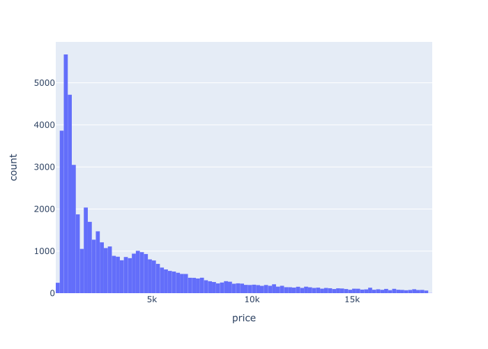
Explanation
Here, we’re plotting data from the diamonds dataframe.
Specifically, we’re plotting the price variable on the x axis, and showing the distribution by plotting a histogram.
If you’re confused about what we’re doing here, you should read our tutorial about Plotly express histograms.
EXAMPLE 2: Facet on 1 variable, by column
Now that we have our simple histogram from example 1, let’s “facet” this plot by a categorical variable.
Specifically, we’ll facet along the columns on the ‘cut‘ variable.
Let’s take a look:
px.histogram(data_frame = diamonds
             ,x = 'price'
             ,facet_col = 'cut'
             )
OUT:
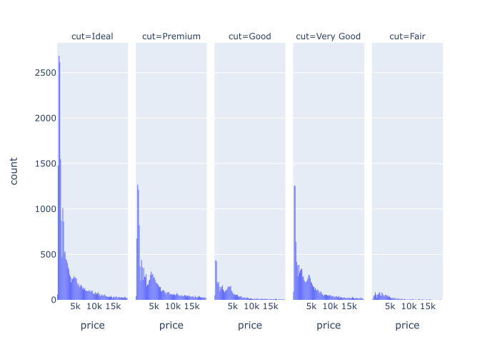
Explanation
Notice that the output is very similar to the output in example 1. Specifically, each little “panel” in this new plot is like a small version of the original histogram.
So here, we’ve faceted on the cut variable. To do this, we’ve used the facet_col parameter. Specifically, we set facet_col = 'cut'. (Notice that the name of the variable is in quotations.)
And in the output, each panel is a small version of the original. There’s one panel for each value of the cut variable.
That’s why we call it a “small multiple” chart. There are multiple small versions of the original; one small version for each level of the facet variable.
EXAMPLE 3: Facet on 1 variable, by row
Next, we’ll facet on a single variable, by row.
Let’s take a look:
px.histogram(data_frame = diamonds
             ,x = 'price'
             ,facet_row = 'cut'
             )
OUT:
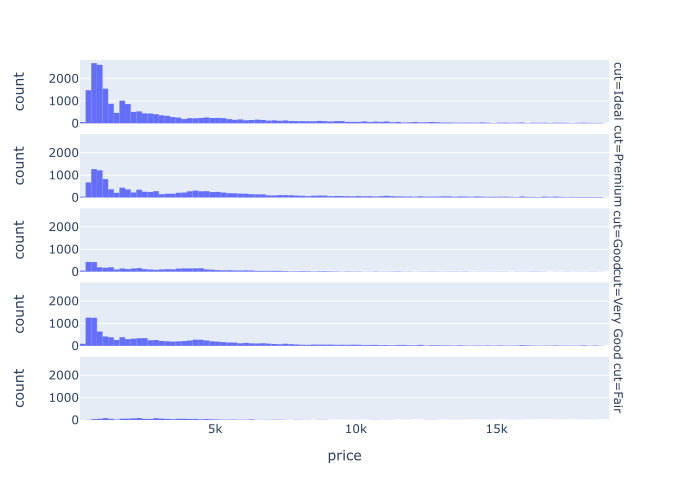
Explanation
This is very similar to example 2.
But here, instead of faceting by column, we’re faceting by row.
To do this, we set facet_row = 'cut'. The cut variable is a categorical variable in the diamonds dataframe.
The resulting plot contains 5 small versions of the original histogram, organized into rows.
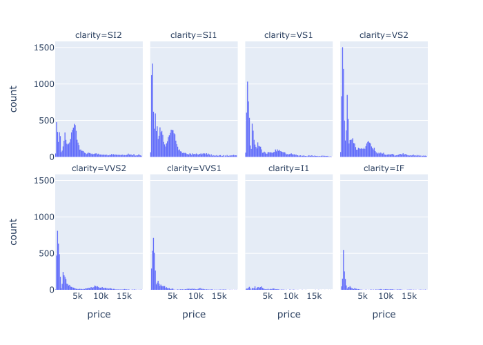
EXAMPLE 4: Wrap panels by column
Next we’ll facet along the columns by a categorical variable, clarity.
But in this example, the faceting variable, clarity, has too many categories to fit well in a single row of panels.
So, we’ll use facet_col_wrap to “wrap” the panels to a new row, after we exceed a maximum number of panels across.
Let’s take a look and then I’ll explain further.
px.histogram(data_frame = diamonds
             ,x = 'price'
             ,facet_col = 'clarity'
             ,facet_col_wrap = 4
             )
OUT:
Explanation
So what happened here?
In this example, we faceted on the clarity variable. We faceted by column.
This variable has 8 unique values, which is arguably too many to fit horizontally.
So to make the panels fit better in the plot area, we set facet_col_wrap = 4. This specifies that we want a maximum of 4 panel columns (i.e., 4 panels across).
After reaching 4 panels in the column direction, the facet_col_wrap parameter causes Plotly to “wrap” the next panel to a new row.
That’s really all this does. facet_col_wrap sets the maximum number of panels across, and forces the system to start a new row for additional panels.
EXAMPLE 5: Create a “facet grid” by facetting on 2 variables
Next, we’ll facet on two variables.
We’ll facet by column on the cut variable and by row on the color variable.
px.histogram(data_frame = diamonds
             ,x = 'price'
             ,facet_col = 'cut'
             ,facet_row = 'color'
             )
OUT:
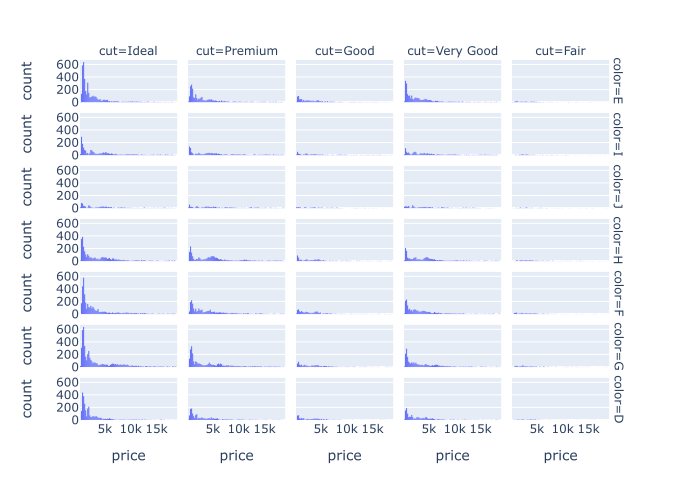
Explanation
Here, we’ve faceted on two categorical variables, cut and color.
To do this, we used both faceting parameters: facet_col and facet_row.
Specifically, we set facet_col = 'cut' and facet_row = 'color'.
As you can see in the output plot, this has faceted the original histogram into multiple panels, broken out by the values of cut along the columns, and the values of color along the rows of the grid.
This type of plot is very useful for multivariate data analysis. You need to learn this technique!
Final Note: You can use this technique with different plotly visualizations
One final note before we end.
In this tutorial, I’ve demonstrated these Plotly small multiple techniques using Plotly histograms.
BUT, you can use this technique with a variety of other Plotly express plots, such as:
- plotly scatterplot
- plotly bar chart
- plotly line chart
- plotly imshow
- … and others
The parameters work the same for those visualizations as they do for the histogram. Try them out!
Leave your other questions in the comments below
Do you still have questions about creating small multiple charts in Plotly?
If so, just leave your questions in the comments section below.
If you want to master Plotly, join our course
In this blog post, I’ve shown you how create small multiple charts with Plotly Express. But to really master Python data visualization with Plotly, there’s a lot more to learn.
That said, if you’re serious about learning Plotly and if you want to master data visualization in Python, you should join our premium online course, Plotly Mastery.
Plotly Mastery is an online course that will teach you everything you need to know about Python data visualization with the Plotly package.
Inside the course, you’ll learn:
- how to create essential plots like bar charts, line charts, scatterplots, and more
- techniques for creating multivariate data visualization
- how to add titles and annotations to your plots
- learn “how to think” about visualization
- how to “customize” your charts, and make them look beautiful
- how to “tell stories with data”
- and much more …
Additionally, when you enroll, you’ll get access to our unique practice system that will enable you to memorize all of the syntax you learn. If you practice like we show you, you’ll memorize Plotly syntax and become “fluent” in data visualization.
You can find out more here: