In this tutorial, I’ll show you how to create a Plotly line plot using px.line function from Plotly Express.
I’ll quickly review line charts, explain the syntax of the px.line function, and finally show you some clear examples of how to create line charts with Plotly.
If you need anything specific, the following links will take you to the appropriate section in the tutorial.
Table of Contents:
With all that in mind, let’s get stared.
A quick introduction to the Seaborn Lineplot
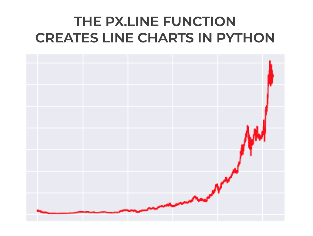
As I’m sure you’re aware, the px.line function creates line charts in Plotly.
Why Use Plotly to Create Line Charts
To be clear, there are a variety of ways to create line charts in Python. You can create line charts with Matplotlib and you can create line charts with Seaborn.
There are even a couple of ways to create line charts with Plotly.
But one of the best ways to create line charts in Python is with Plotly Express.
Plotly Express is a simple API that enables you to quickly create essential data visualizations like line charts, bar charts, and scatterplots.
The syntax is easy to write and easy to understand.
The advantage though, is that you can use Plotly’s more advanced data visualization syntax to modify your charts.
So with Plotly express, you get simplicity when you want it, but you get a set of powerful options to customize your charts. Plotly gives you the best of both worlds.
But the exact line plots you create with Plotly depends on the syntax.
That being case, let’s look at the syntax of px.line.
The Syntax for a Plotly Express Line Chart
The syntax of px.line is fairly simple, but there are a couple of important details that you’ll need to learn.
A quick note
Before we look at the syntax, I want to point out one thing about syntax conventions.
As you probably know, whenever we want to use a package like Plotly, we need to import it first.
And it’s very common to import Python packages with a nickname (i.e., an alias).
Python data scientists commonly import Plotly Express with the nickname px. You can do that with the following code:
import plotly.express as px
When we import Plotly Express with this alias, we can use px as the prefix before we call the function itself (which I’ll show you in just a moment).
Again, this is the common convention when calling Plotly Express functions, and I’ll be using that convention going forward.
px.line syntax
Okay, now, let’s look at the syntax of px.line.
Assuming that we’ve imported Plotly with the alias px, we can call the function with the code px.line().
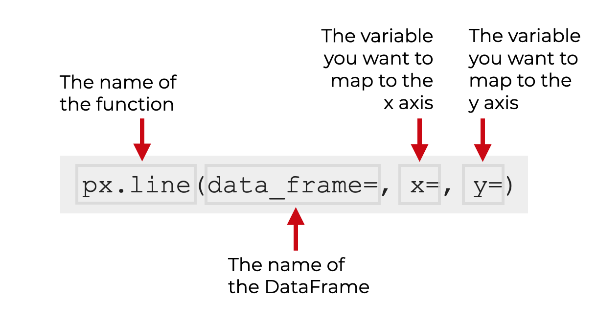
Inside the parenthesis, we can use several parameters that control exactly how the function works. Let’s take a look at those parameters.
The parameters of px.line
The px.line function has several dozen parameters. Almost too many to learn.
In such a case where there are a lot of parameters, you should apply the 80/20 rule and learn and focus on a few of the most important parameters.
The commonly used parameters that I recommend you learn are:
data_framexycolorcolor_discrete_sequence
Let’s look at these individually.
data_frame
The data_frame parameter enables you to specify a Pandas DataFrame to plot.
To be clear: you can use px.line to plot data in a DataFrame, but you can also plot data in list-like objects.
So, this parameter is optional.
(Having said that, I almost always use px.line to plot data that’s inside a DataFrame.)
If you decide to use this parameter, you can pass the name of a DataFrame as the argument. Keep in mind that the name of the dataframe does not need to be inside quotation marks.
If you decide not to use this parameter, you’ll need to supply list-like objects to the x parameter and y parameter.
x
The x parameter enables you to specify the variable that you want to map to the x-axis.
If you specify a dataframe with the data_frame parameter, then the argument to the x parameter will be the name of a variable in that DataFrame.
Alternatively, if you don’t use the data_frame parameter, you can specify a Python list, a 1D Numpy array, or a list-like object..
If you specify a DataFrame column as the argument to this parameter, the column name should be inside of quotation marks (i.e., you pass the name of the column as a string). I’ll show you examples of this in the examples section.
y
The y parameter enables you to specify the variable that you want to map to the y-axis.
Similar to the x parameter, the argument to the y parameter can be a dataframe column name, an independent Numpy array, or a Python list.
If you’re plotting data in a DataFrame, the argument to the y parameter will be a column name from the DataFrame. (The name should be inside quotation marks.)
If you don’t use the data_frame parameter to specify a DataFrame, then the argument to the y parameter can be a Numpy array, Python list, or list-like object.
color_discrete_sequence
The color_discrete_sequence parameter allow you to set the exact color of your line or lines.
The argument to this parameter should be a Python list that contains the name or names of the colors of the lines in the line chart. The color names inside the list can take a variety of formats, including “named” colors and hex colors.
So for example, if your plot has a single line, and you want to change the line color to red, you can use the code color_discrete_sequence = ['red'].
Again, there are a variety of formats for the color names that are acceptable.
And, if your line chart has multiple lines, you can specify multiple colors.
So effectively, the color_discrete_sequence parameter enables you to specify the color palette of the lines in your line chart.
I’ll show you examples of these in the examples section.
color
The color parameter effectively enables you create a multi-line line chart, where each line is a different color
The argument to this parameter is a variable (either a list-like object, or a DataFrame column) that contains a categorical variable.
So when you supply a categorical variable with multiple categories to the color parameter, px.line will create a line chart with multiple lines, where each line has a different color, and each line represents a different category.
Keep in mind that this parameter does not change the color palette of the lines. It does not set the colors of the lines themselves.
It simply specifies a variable with categorical data that should corresponds to the different lines.
I’ll show you an example of this in example 3.
Examples: How to make Line Charts in Python using Seaborn
Now that we’ve looked at the syntax of px.line, let’s look at some examples of how to create line charts with Plotly Express.
We’ll work through several different examples.
Examples:
- Create a Simple Line Chart with One line
- Change the Color of the Line
- Create a Line Chart with Multiple Lines
- Change the Colors of a Multi-line Line Chart
The links above will take you to each specific example, if you need to make a specific kind of line chart.
Run this code first
Before you run the examples, you’re going to need to do a few things. You’ll need to import Plotly Express and you’ll need to download the dataset that we’re going to work with.
Import Pacakges
First, we need to import the Plotly express package. We also need to import Pandas.
You can import them with the following code:
import plotly.express as px
import pandas as pd
As I explained in the syntax section, when we import Plotly this way, we can use the prefix px when we call our Plotly functions.
Get dataset
Next, we need to get the dataset that we’ll be working with.
The dataset that we’ll be using is stock data. Specifically, stock data for Amazon and Google over a period of several years. Since this is time-series data, it’s well suited to building line charts.
The data is stored at a URL on our website, and to get the data, we’re going to use the read_csv() function. This will get the data from the URL and import the raw data into a CSV file.
So to get get the data, run this code:
stocks = pd.read_csv("https://www.sharpsightlabs.com/datasets/amzn_goog_2000-01-01_to_2020-12-05.csv")
stocks.date = pd.to_datetime(stocks.date)
And let’s quickly print out the first few records with a print statement:
print(stocks)
OUT:
           date         open         high          low        close     adj_close    volume stock
0    2000-01-03    81.500000    89.562500    79.046875    89.375000     89.375000  16117600  amzn
1    2000-01-04    85.375000    91.500000    81.750000    81.937500     81.937500  17487400  amzn
2    2000-01-05    70.500000    75.125000    68.000000    69.750000     69.750000  38457400  amzn
3    2000-01-06    71.312500    72.687500    64.000000    65.562500     65.562500  18752000  amzn
4    2000-01-07    67.000000    70.500000    66.187500    69.562500     69.562500  10505400  amzn
...         ...          ...          ...          ...          ...           ...       ...   ...
9364 2020-11-30  1781.183960  1788.064941  1755.000000  1760.739990   1760.739990   1823800  goog
9365 2020-12-01  1774.369995  1824.829956  1769.369995  1798.099976   1798.099976   1739000  goog
9366 2020-12-02  1798.099976  1835.650024  1789.473022  1827.949951   1827.949951   1222000  goog
9367 2020-12-03  1824.010010  1847.199951  1822.650024  1826.770020   1826.770020   1227300  goog
9368 2020-12-04  1824.520020  1833.160034  1816.989990  1827.989990   1827.989990   1376100  goog
If you look at the data, you’ll see several different variables related to the stocks. There is a date variable that records the date. There are also an open, close, high, and low variables that record the open price, close price, high and low prices, respectively.
With these variables, we’ll be able to use px.line to plot line charts of stock price over time.
There is also a stock variable. This contains the label for our two different stocks: Amazon and Google.
We can look at the values of this variable by using the Pandas unique function:
pd.unique(stocks.stock)
OUT:
array(['amzn', 'goog'], dtype=object)
Here, you can see that the stock variable has two unique values: 'amzn' and 'goog'.
With this variable (along with the others), we’ll be able to create a multi-line line chart.
Create data subset of Amazon data
Before we create our charts, let’s do one more thing.
Here, we’re going to create a subset that contains only the data for the Amazon stock.
To do this, we’ll use the Pandas query() method to subset the data, returning only the rows where stock == 'amzn'.
amazon_stock = stocks.query("stock == 'amzn'")
So now, the amazon_stock DataFrame contains only Amazon stock data. We’ll be able to use this when we create our first line chart … a line chart with only one line.
EXAMPLE 1: Create a Simple Line Chart with One line
Let’s start by creating a simple line chart with only one line.
In this example, we’ll plot the amazon_stock dataset and show Amazon stock price over time.
Here’s the code:
px.line(data_frame = amazon_stock, x = 'date', y = 'close')
OUT:
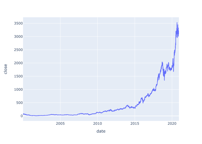
Explanation
This is very simple, but let me explain.
Here, we used the px.line() function to plot our line chart.
The parameters inside the parenthesis specify exactly what we want to plot, and how.
Here, the data_frame parameter has specified that we want to plot data in the amazon_stock dataframe.
The code x = 'date' specifies that we’re plotting date on the x-axis and the code y = 'close' specifies that we’re plotting close on the y-axis. (Remember, close is the closing price of the stock on each specific day.)
So the output that we get is a line chart of the Amazon stock closing price, by day.
EXAMPLE 2: Change the Color of the Line
Now, let’s change the color of the line.
As you saw in example 1, the default color of our Plotly line chart is blue. (Although your default may be different, if you’ve already altered your default settings.)
Blue is fine, but there may be cases where you want to change the color.
Changing the color of a line in your line chart is fairly simple to do. To do this, you can use the color_discrete_sequence parameter.
Let’s look at the code, and then I’ll explain.
px.line(data_frame = amazon_stock
            ,x = 'date'
            ,y = 'close'
            ,color_discrete_sequence = ['red']
            )
OUT:
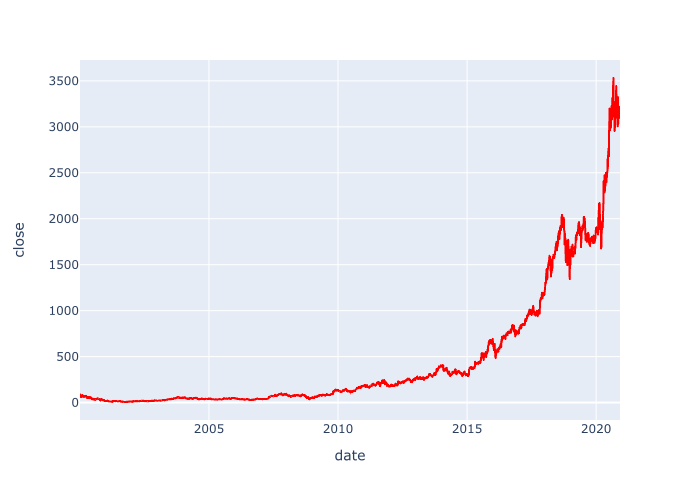
Explanation
Here, to change the color, we added the code color_discrete_sequence = ['red']
Notice that we provided the name of a “named color” (red). Notice that the name of the color is inside of quotation marks. Additionally, the name of the color is inside of a list.
This might seem strange, but you’ll see in one of the upcoming examples, that if we have a multi-line line chart, we can use similar syntax … but we can provide the names of multiple colors inside the list.
I’ll show you that later.
Remember though that when you use this technique, you can use any of Python’s named colors. You can also use hex colors. Experiment and find some colors that you like.
EXAMPLE 3: Create a Line Chart with Multiple Lines
Next, let’s create a line chart with multiple lines, where every line is a different color.
To create this example, we’re going to use the stocks DataFrame. Remember that the stocks DataFrame contains data Amazon stock and Google stock.
The code for this example is very similar to the code for example 1 and example 2. The main difference is that here, we’ll use the color parameter to map a categorical variable to the color of the lines.
Let’s take a look and I’ll explain afterwards:
px.line(data_frame = stocks
            ,x = 'date'
            ,y = 'close'
            ,color = 'stock'
            )
OUT:
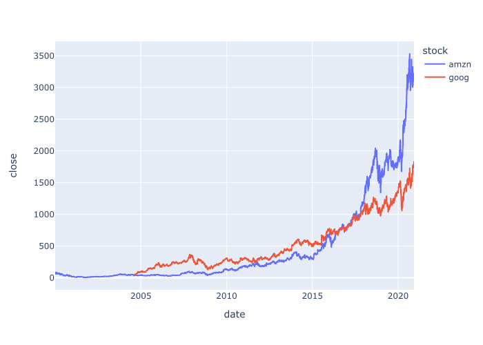
Explanation
So what happened here?
As you can see, the output is a line chart with multiple lines.
How did we get it?
The important piece of syntax is the code color = 'stock'.
Remember that the stock variable in the stocks DataFrame contains the ticker symbols for our two stocks: amzn and goog.
By using the code color = 'stock', we’re telling Plotly to create a multi-line line chart, where the color of the lines corresponds to the categories in the stock variable.
So by setting color = 'stock', we’ve told Plotly to create a line chart with two different lines: one line for amzn and one line for goog.
Note that this is a fairly simple example, because the stocks data only has two ticker symbols. If it had the data for more stocks, Plotly would create a line chart with more lines.
EXAMPLE 4: Change the Colors of a Multi-line Line Chart
Finally, let’s change the colors of the lines in our the multi-line chart.
To do this, we’ll use the color_discrete_sequence parameter.
Let’s run the code first, and then I’ll explain it.
px.line(data_frame = stocks
            ,x = 'date'
            ,y = 'close'
            ,color = 'stock'
            ,color_discrete_sequence = ['navy', 'darkorange']
            )
OUT:
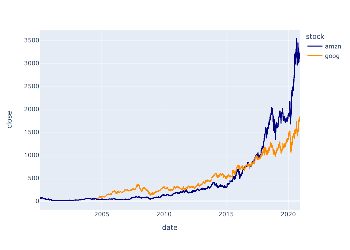
Explanation
In this example, we modified the color palette of the lines by using the color_discrete_sequence parameter.
Specifically, we provided a list of color names to the parameter with the code color_discrete_sequence = ['navy', 'darkorange'].
Here, I’ve used the colors ‘navy’ and ‘darkorange’, but you could use any of the Python named colors. You could also use hex colors. Try a few out and see what you like.
Frequently asked questions about Seaborn Lineplots
Ok. Now that we’ve looked at some examples of Seaborn line charts, let me address a common question.
Frequently asked questions:
Is a Plotly line chart better than a Matplotlib line chart or a Seaborn line chart?
A common question among new Python data science students is which toolkit to use.
Should you use Matplotlib? Seaborn? Plotly?
My least favorite is Matplotlib. In the past, I wrote a tutorial about creating Matplotlib line charts, and I suppose that Matplotlib is OK in a pinch. But honestly, I’ve always found Matplotlib to be unnecessarily complex and hard to use. I avoid it whenever I can.
You can also create line charts with Seaborn. Technically, Seaborn is built on top of Matplotlib. But the syntax of Seaborn is much higher level. It’s easier to understand and easier to write.
Having said that, I’m starting to favor Plotly. Plotly has all of the power of Matplotlib, but with Plotly express, you get the simplicity of Seaborn. Plotly sort of has the best of both worlds.
So at this point, I’m starting to favor Plotly.
Do you have a preference? If so, leave your opinion in the comments section below.
Leave your other questions in the comments below
Do you still have questions about Plotly line plots?
If so, just leave your questions in the comments section below.
If you want to master Seaborn, join our course
In this blog post, I’ve shown you how to use the Plotly line function to create line charts in Python.
But if you need to visualize and analyze your Python data, you’ll need to learn a lot more.
With that in mind, if you want to master data visualization in Python, you should join our premium online course, Plotly Mastery.
Plotly Mastery is our online course that will teach you everything you need to know about data visualization with the Plotly package.
Inside the course, you’ll learn:
- how to create essential plots like bar charts, line charts, scatterplots, and more
- techniques for creating multivariate data visualization
- how to add titles and annotations to your plots
- how to “tell stories with data”
- learn “how to think” about visualization
- and much more …
Additionally, when you enroll, you’ll get access to our special practice system that will help you memorize all of the syntax. If you practice like we show you, you’ll memorize Plotly syntax and become “fluent” in data visualization.
You can find out more here:
Learn More About Plotly Mastery
This is a great tutorial! I’m a beginner with Plotly and this was really helpful.
Great to hear.