In this tutorial, I’ll show you how to make a simple matplotlib line chart. Essentially, I’ll show you how to use the plt.plot function from pyplot to create a line chart.
Line charts are a little confusing in Python
I’ll be honest. Creating a line chart in Python is a little confusing to beginners.
If you’ve been trying to create a decent line chart in Python and just found yourself confused, don’t worry. Many beginners feel a little confused.
Part of the problem is that the tools for creating data visualizations in Python are not as well designed as some modern tools like ggplot in R. If you’ve come from R, you might find that creating a line chart is actually more challenging in Python.
Another issue is that many of the examples online for how to make a line chart with matplotlib are bad. Many of the examples are either out of date, or more complex than they need to be.
Those things being the case, this blog post will try to clear up some of the confusion and introduce you to some basic syntax to get you started.
The contents of this tutorial
Although this blog post won’t show you everything about data visualization with matplotlib, it will show you some of the essential tools so you can make a basic line chart. It will give you a foundation that you can build on as you continue to learn.
The tutorial has several different sections that will help you understand creating line charts with pyplot.
You’ll learn:
- What is matplotlib?
- The syntax for the matplotlib line chart
- Examples of how to make a line chart with matplotlib
If you need help with something specific, you can click on one of the links. The links will take you directly to the relevant section within this blog post.
On the other hand, if you’re just getting started with data visualization in Python, it’s probably a good idea to read the entire blog post. Instead of just trying to copy and paste some code, it’s good to read through everything so you know how it all works.
A quick introduction to matplotlib
Before we get started actually creating line charts, let’s talk about matplotlib first.
If you’re just getting started with data science in Python, you’ve probably heard about matplotlib, but you might not know what it is.
What is matplotlib?
Matplotlib is a module for Python that focuses on plotting and data visualization. It’s very flexible and it provides you with tools for creating almost any data visualization you can think of.
On the other hand, it was initially released in 2003, and some of the techniques for creating visualizations feel out of date.
Specifically, the syntax for matplotlib is a little “low level” in some cases, and this can make it difficult to use for many beginners.
However, one thing that can make matplotlib easier to use is the pyplot sub-module.
What is pyplot?
Pyplot is part of matplotlib … it is a sub-module within the overall matplotlib module.
The pyplot sub-module provides a set of “convenience functions” for creating common data visualizations and performing common data visualization tasks. Essentially, pyplot provides a set of relatively simple tools for creating common charts like the bar chart, scatter plot, and line chart.
Pyplot still isn’t perfect (it can still be a little confusing to beginners), but it simplifies the process of creating some data visualizations in Python.
Now that you know a little more about matplotlib and pyplot, let’s examine the syntax to create a line chart.
The syntax of the matplotlib line chart
To create a line chart with pyplot, you typically will use the plt.plot function.
The name of the function itself often confuses beginners, because many of the other functions in pyplot have names that directly relate to the chart that they create. For example, you create a bar chart in pyplot by using the plt.bar function. You create histograms by using the plt.hist function. And you create scatter plots in matplotlib by using the plt.scatter function.
You’d think that to create a line chart, there would be a function called “plt.line()“, right?
No. That’s not how you create a line chart with pyplot.
To create a matplotlib line chart, you need to use the vaguely named plt.plot() function.
That being said, let’s take a look at the syntax.
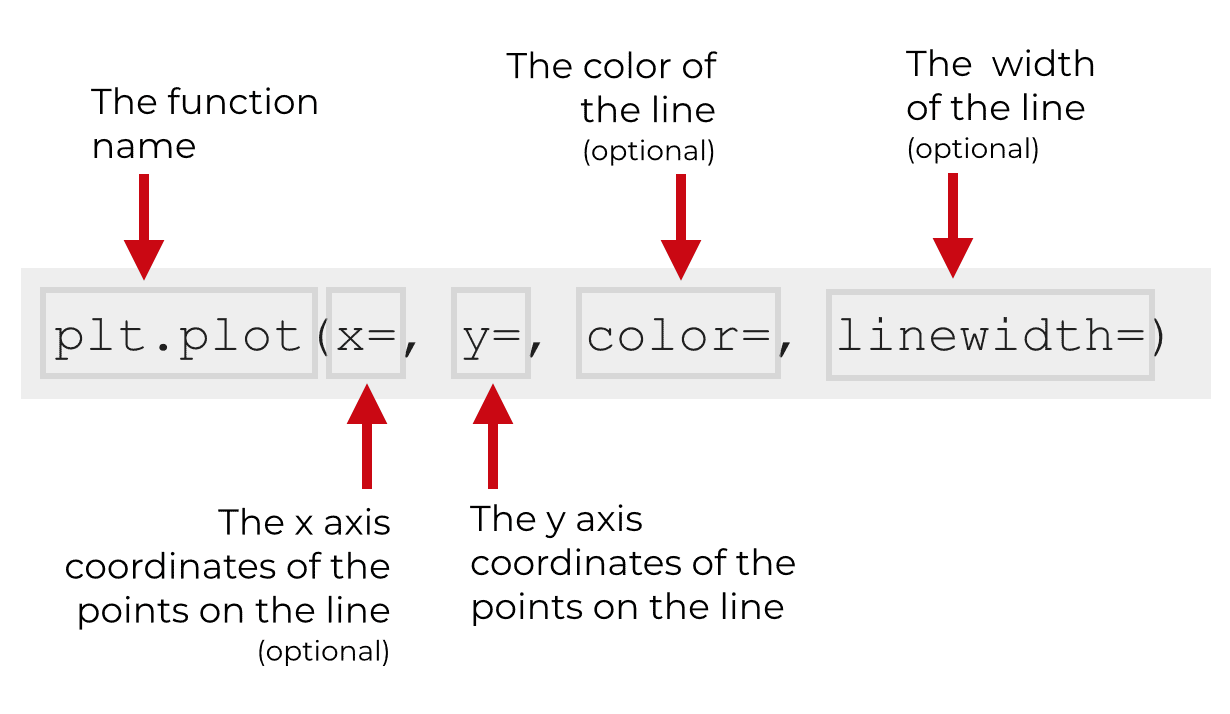
The plt.plot function has a lot of parameters … a couple dozen in fact.
But here in this tutorial we’re going to simplify things and just focus on a few: x, y, color, and linewidth.
I want to focus on these parameters because they are the one’s you will probably use most often. Also, by focusing down on a few, you can make it easier to learn the syntax. If you’re just getting started, you really need to simplify things as much as possible until you learn and memorize the basics. Once you learn the basics, then make things more complex.
Ok. Let me explain the parameters I mentioned, one at a time.
The basic parameters of plt.plot
Here, I’ll explain four important parameters of the plt.plot function: x, y, color, and linewidth.
y
The y parameter allows you to specify the y axis coordinates of the points along the line you want to draw.
Here’s a very simple example. The following line has been created by connecting four points. The y axis coordinates of these points are at 2, 5, 4, and 8.
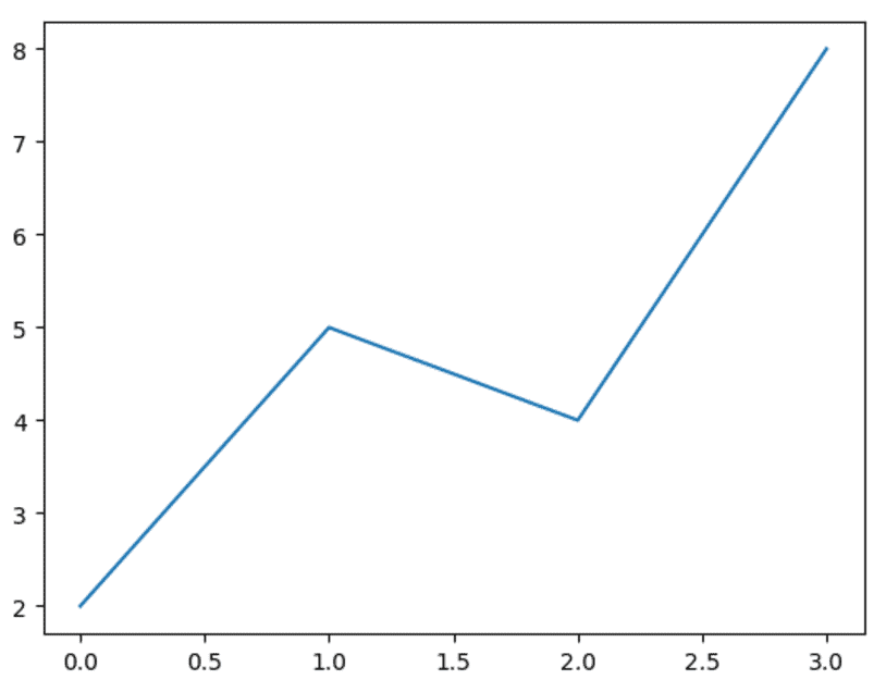
The plt.plot function basically takes those points and connects them with line segments. That’s what the function does.
We tell plt.plot the position of those points by passing data to the y parameter.
Typically, we will pass data to this parameter in the form of an array or an array-like object. You can use a Python list or similar objects like NumPy arrays.
Keep in mind, the y parameter is required.
I’ll show you exactly how to use this parameter in the examples section of this tutorial.
x
The x parameter is similar to the y parameter.
Essentially, the x parameter enables you to supply the x axis positions of the points on the line.
So let’s take another look at the example we saw in the last section:
Here, the line is made up of segments that connect four points.
The points are at locations 1, 2, 3, and 4 on the x axis.
We tell the plt.plot function these x axis locations by using the x parameter.
Typically, we’ll supply these x axis positions in the form of a Python list. More broadly though, we can supply the x axis positions in the form of any array-like object … a list, a NumPy array, etc.
Keep in mind that the x parameter is optional. That means that although you need to supply values for the y parameter, you do not need to supply values for the x parameter. If you don’t provide any data to the x parameter, matplotlib will assume that the x axis positions are [0, 1, 2, ... n - 1], if you have n points. Basically, the x axis positions will just be 0 to n – 1.
Here in this tutorial, we are mostly going to omit the arguments to the x parameter.
color
The color parameter does what you probably expect that it does … it changes the color of the line.
There are a few ways to define the color that you want to use and the easiest way is to use a “named” color. Named colors are colors like “red”, “blue”, “yellow”, and so on. Python and matplotlib recognize several dozen “named” colors. They aren’t limited to the simple colors that we commonly talk about, but there are colors like “crimson”, “wheat”, “lavender”, and more. It’s a good idea to become familiar with a few of the named colors.
Having said that, I strongly prefer to use hexideceimal colors in my data visualizations. Hex colors allow for a lot more flexibility and they allow you to customize your plots to a much larger degree. Essentially, with hex colors, you can “mix your own” colors.
On the other hand, although hex colors allow for more flexibility, they are harder to use. You’ll also need to learn about how hexidecimal numbers work in order to really understand hex colors.
Given that hex colors are a little more complicated we’re not really going to cover them here. I’ll explain hex colors in a future blog tutorial.
linewidth
The linewidth parameter is also fairly self explanatory. It controls the width of the line that’s plotted.
I’ll show you an example in the examples section below to show you how to use this to increase or decrease the width of the plotted line.
Examples: how to make a line chart plot in matplotlib
Now that we’ve gone over a few of the important parameters of the plt.plot function, let’s look at some concrete examples of how to use the plt.plot function.
Here, I’ll show you a simple example of how to use the function, and I’ll also show you individual examples of how to use the parameters that I explained earlier in this tutorial.
Run this code before you get started
Before you start working with the examples themselves, you need to run some code.
Import modules
First, you need to run some code to import a few Python modules. You need to import the pyplot submodule of matplotlib. You also need to import the seaborn module. We’ll be using that later to do some formatting.
# IMPORT MODULES
import matplotlib.pyplot as plt
import seaborn as sns
Notice that we’re importing these modules with different names. For example, we’re importing the pyplot module as plt. We’re importing the seaborn module as sns. We’re essentially giving these modules “nicknames” … these are aliases that we can use to simplify and shorten our code. You’ll see these later as we call the functions from pyplot and seaborn.
Create dataset
After you import the modules, you’ll need to get the data that we’re going to use.
For these examples, we’re going to use stock price data from the company Tesla, Inc. The data is from the IPO in June of 2010 to the fall of 2018.
# GET DATA FROM TXT FILE

tsla_stock_data =  pd.read_csv("https://www.sharpsightlabs.com/datasets/TSLA_start-to-2018-10-26_CLEAN.txt")
#--------------------
# EXTRACT CLOSE PRICE
#--------------------
tsla_close_price = tsla_stock_data.close_price
As noted above, most of the parameters that we’re going to work with require you to provide a sequence of values. Here, we’ve imported the date using the read_csv() function from pandas, and then extracted one variable, tsla_close_price. The way that we’ve extracted this data, the tsla_close_price is actually a Pandas series.
Having said that, the plt.plot() function can also operate on Python lists, tuples, and array-like objects.
A quick note about learning and practice
In the following examples, we’re going to keep things very simple.
This is a general principle that you should remember when you’re learning a new programming language or skill. Start simple. Break everything down and isolate individual techniques.
Once you’ve broken down the individual techniques, study them and practice them.
Then, after you’ve mastered the basic techniques, you can start to combine those techniques into more complicated structures.
Start simple and then increase the complexity.
With that in mind, let’s start to look at a few very simple examples of how to make a line chart with matplotlib.
How to make a simple line chart with matplotlib
For our first example, we’re going to start very simple. This will be as simple as it gets.
We’re basically going to plot our Tesla stock data with plt.plot.
To do this, we’ll call the plt.plot() function with the tsla_close_price data as the only argument.
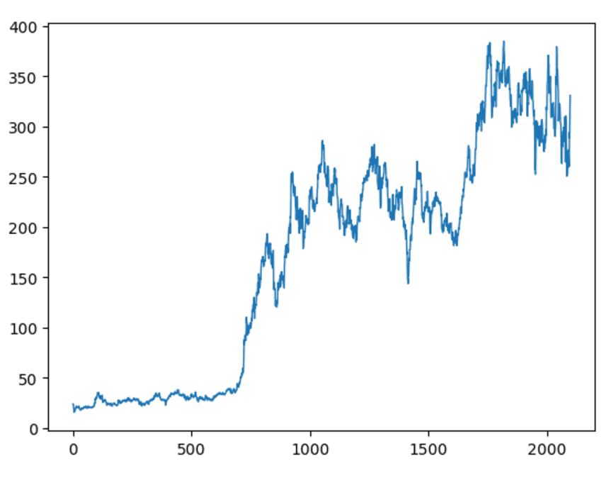
#-----------------
# SIMPLE LINE PLOT
#-----------------
plt.plot(tsla_close_price)
And here is the output:
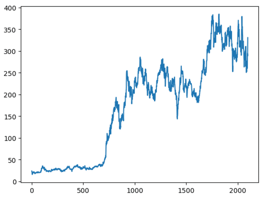
There’s nothing fancy about this, but it’s a decent rough draft, and it’s easy to understand.
Let’s break it down.
We’ve called the plt.plot() function. Inside of the function, we see the data set name tsla_close_price, which is the daily closing price of Tesla stock from June of 2010 to the fall of 2018.
Notice that we didn’t explicitly refer to any of the parameters. You’ll often see this in Python code. It’s very common for Python programmers to leave the names of the parameters out of the syntax.
So which parameter is being used here?
The code is implicitly using the y parameter. When you supply a single argument to the plt.plot function, the function assumes that the argument you supply should be connected to the y parameter. This is effectively like setting y = tsla_close_price.
With that in mind, you can understand what this plot shows. The y axis essentially shows the value of the closing price on any given day. Each observation in tsla_close_price is effectively a point on the line, and the plt.plot function just creates a line that connects them.
What about the x axis? We actually didn’t supply any data to the x parameter, so the plt.plot function just generated x axis values from 0 to n – 1 (where n is the total number of observations in the tsla_close_price data).
We can interpret the x axis as the number of days since the IPO. That’s not typically what we’d show … in many cases we’d probably show the date on the x axis. However, I wanted to make this example as simple as possible. Remember my recommendation a few sections ago: when you’re learning syntax, start by studying very simple examples. This example is as simple as it gets.
Change the color of the line
Next, let’s increase the complexity of the chart just a little bit.
Here, we’re going to change the color of the line.
To do this, we’ll use the color parameter.
#------------------
# CHANGE LINE COLOR
#------------------
plt.plot(tsla_close_price, color = 'red')
Which produces the following chart:
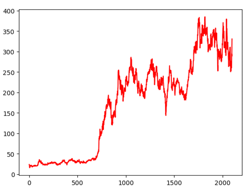
This is very simple. We essentially created this with the same code as the previous example, but we added an extra piece of syntax. Essentially, we added the syntax color = 'red', which (surprise) turns the line to a red color.
As you’re playing with this syntax, try out different colors. You can change the color to ‘green’, ‘yellow’, or another of the matplotlib colors. Part of learning data visualization is learning which colors to use. To learn this, you need to try out different aesthetic values, and see what looks good.
Change the width of the line
Now, I’ll show you how to change the width of the line.
To do this, you need to use the linewidth parameter.
This is very straight forward. All we need to do is provide a numeric argument to the linewidth parameter (an integer or decimal number).
By default, the linewidth parameter is typically set to 1.5.
In the charts so far, this has made the line just slightly too thick, so I’m going to reduce it to 1.
#------------------
# CHANGE LINE WIDTH
#------------------
plt.plot(tsla_close_price, linewidth = 1)
And here’s the output:
The difference is subtle, but I think this linewidth looks better for this particular chart.
When you create your own line charts, I recommend playing around with the width of the line. The “right” line width will depend on the chart that you’re making. For some charts you’ll want a thicker line and for others you’ll want a thinner line. As you learn and master data visualization, you’ll simply need to develop your judgement about when to use a thick or thin line.
Having said that, actually setting the width is easy enough. When you’re using pyplot, just use the linewidth parameter.
Improve the formatting of your pyplot line chart
One problem I have with the charts that we’ve made so far is that the formatting is a little ugly.
Unfortunately, this is one of the downsides of standard matpotlib … the default settings create charts that are a little unrefined. The default charts are okay if you’re just doing basic data analysis for personal consumption; they are okay if you aren’t going to show them to anyone important. But if you plan to present your work to anyone important – say important colleagues or a management team – the basic charts aren’t great. You should present charts that have a little more polish.
That being said, in this section, I’ll show you a quick trick for improving the formatting of your Python line chart.
To do this, we’re going to use a simple function from the seaborn module.
Use seaborn formatting to improve your charts
The seaborn module is a data visualization module for Python. I won’t explain seaborn too much here, but at a high level, seaborn works along side and on top of matplotlib.
We’re going to use a special function from the seaborn package to improve our charts: the seaborn.set() function.
Import seaborn
To use the sns.set() function, you’ll need to import seaborn into your working environment.
The following code will import seaborn with the alias sns.
# import seaborn module
import seaborn as sns
Use seaborn.set() to change default formatting
Once you have seaborn imported, you can use seaborn.set() function.
To use it, you simply need to call the function by itself.
Because we’ve imported seaborn as sns, we can call the function as sns.set().
#set plot defaults using seaborn formatting
sns.set()
Calling the function this way will change the formatting for your matplotlib charts.
Let’s take a look.
Here, we’re simply going to replot our line chart.
#----------------------------------------
# PLOT LINE CHART WITH SEABORN FORMATTING
#----------------------------------------
plt.plot(tsla_close_price)
Here’s the output:
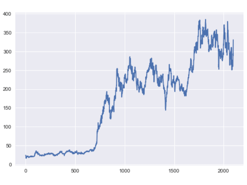
Notice what the sns.set function did. It changed the background color and added some white gridlines in the background. There are also a few other changes that aren’t immediately visible in this example.
The formatting changes are relatively minor, but I think this looks dramatically better.
Run this to remove seaborn formatting
One quick note …
When you run the seaborn.set() function, it may end up changing the formatting on all of your matplotlib charts going forward.
Many people do not want this, and want to turn off the seaborn formatting.
How do you turn it off?
You can turn off the seaborn formatting by running the following code:
#--------------------------
# REMOVE SEABORN FORMATTING
#--------------------------
sns.reset_orig()
This will reset the plot formatting for your matplotlib charts to the original values (although it will respect any custom setting that you’ve established for your rcParams file).
Putting the pieces together: an improved matplotlib line chart
Let’s do one more example that combines all of the parameters and techniques that we’ve learned so far.
Here, we’re going to modify the linewidth and the line color, and we’re going to modify the background formatting by using the sns.set function.
#------------------------
# FINAL COMBINED EXAMPLE
#------------------------
import seaborn as sns
sns.set()
plt.plot(tsla_close_price, color = 'crimson', linewidth = 1)
And here is the output:
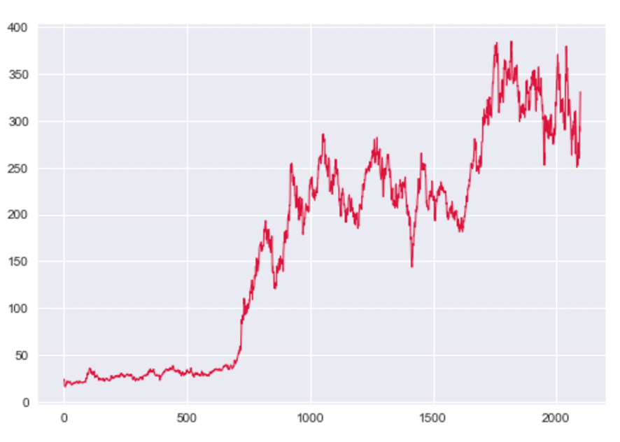
You should understand this if you’ve carefully read the previous examples in this tutorial. However, let me quickly explain it.
Here, we’ve used the plt.plot() function to plot the data contained in tsla_close_price. We used the linewidth parameter to make the line a little thinner, and we used the color parameter to change the color of the line to ‘crimson’, which is very close to the color of Tesla’s logo.
We also used the seaborn.set() function to enhance the background formatting and make your matplotlib line chart look more “polished.”
Overall, there’s still more that we could do to improve this, but it’s pretty good.
Make sure to reset the matplotlib defaults!
Let me give you one quick reminder …
When you use the sns.set() function to change the formatting of your charts, it may change the formatting of all of your charts in the future.
To remove that formatting and revert the formatting to the matplotlib defaults, you can use the following code:
# reset defaults
sns.reset_defaults()
This will reset the formatting of your charts to the default matplotlib format.
If you want to learn data science in Python, learn matplotlib
This tutorial should be enough to get you started making line charts with matplotlib.
But, this is really only the beginning.
If you’re serious about data visualization and data science with Python, you’ll need to learn more. You’ll need to learn how to add titles to your plots, format the text, add annotations, and a lot more.
Moreover, to really learn data science in Python, you can’t strictly learn the data visualization tools. You’ll need to learn at least a little about data manipulation … for example, you should learn about NumPy arrays and learn about Pandas dataframes. You should probably also study some machine learning as well.
What I’m getting at is that if you’re serious about data visualization and data science in Python, you will need to learn more.
For more Python data science tutorials, sign up for our email list
And if you’re ready to learn more, we can help.
Here at Sharp Sight, we teach data science.
We regularly publish free data science tutorials, right here at the Sharp Sight blog.
To get these tutorials delivered right to your inbox, sign up for our email list.
When you sign up, you’ll get free tutorials about:
- Matplotlib
- NumPy
- Pandas
- Base Python
- Scikit learn
- Machine learning
- Deep learning
- … and more.
Want to learn data science in Python? Sign up now.