In this tutorial, you’ll learn how to create a matplotlib bar chart.
Specifically, you’ll learn how to use the plt.bar function from pyplot to create bar charts in Python.
Bar charts in Python are a little challenging
I’ll be honest … creating bar charts in Python is harder than it should be.
People who are just getting started with data visualization in Python sometimes get frustrated. I suspect that this is particularly true if you’ve used other modern data visualization toolkits like ggplot2 in R.
But if you’re doing data science or statistics in Python, you’ll need to create bar charts.
The contents of this tutorial
To try to make bar charts easier to understand, this tutorial will explain bar charts in matplotlib, step by step.
The tutorial has several different sections. Note that you can click on these links and they will take you to the appropriate section.
- A quick introduction to matplotlib
- The syntax for the matplotlib bar chart
- Examples of how to make a bar chart with matplotlib
If you need help with something specific, you can click on one of the links.
However, if you’re just getting started with matplotlib, I recommend that you read the entire tutorial. Things will make more sense that way.
Ok. First, let’s briefly talk about matplotlib.
A quick introduction to matplotlib
If you’re new to data visualization in Python, you might not be familiar with matplotlib.
Matplotlib is a module in the Python programming language for data visualization and plotting.
For the most part, it is the most common data visualization tool in Python. If you’re doing data science or scientific computing in Python, you are very likely to see it.
However, even though matplotlib is extremely common, it has a few problems.
The big problem is the syntax. Matplotlib’s syntax is fairly low-level. The low-level nature of matplotlib can make it harder to accomplish simple tasks. If you’re only using matplotlib, you might need to use a lot of code to create simple charts.
There’s a solution to this though.
To simplify matplotlib, you can use pyplot.
What is pyplot?
Pyplot is a sub-module within matplotlib.
Essentially, pyplot provides a group of relatively simple functions for performing common data visualization tasks.
For example, there are simple functions for creating common charts like the scatter plot, the bar chart, the histogram, and others.
If you’re new to matplotlib and pyplot, I recommend that you check out some of our related tutorials:
- How to make a scatterplot with matplotlib
- A quick introduction to the matplotlib histogram
- How to make a line chart with matplotlib
In this tutorial though, we’re going to focus on creating bar charts with pyplot and matplotlib.
With that in mind, let’s examine the syntax.
The syntax of the matplotlib bar chart
The syntax to create a bar chart with pyplot isn’t that bad, but it has a few “gotchas” that can confuse beginners.
Let’s take a high-level look at the syntax (we’ll look at the details later).
To create a bar chart with pyplot, we use the plt.bar() function.
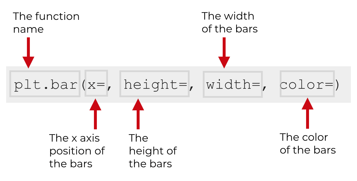
Inside of the plt.bar function are several parameters.
In the picture above, I’ve shown four: x, height, width, and color. The plt.bar function has more parameters than these four, but these four are the most important for creating basic bar charts, so we will focus on them.
Let’s talk a little more specifically about these parameters.
The parameters of plt.bar
Here, I’ll explain four important parameters of the plt.bar function: x, height, width, and color.
x
The x parameter specifies the position of the bars along the x axis.
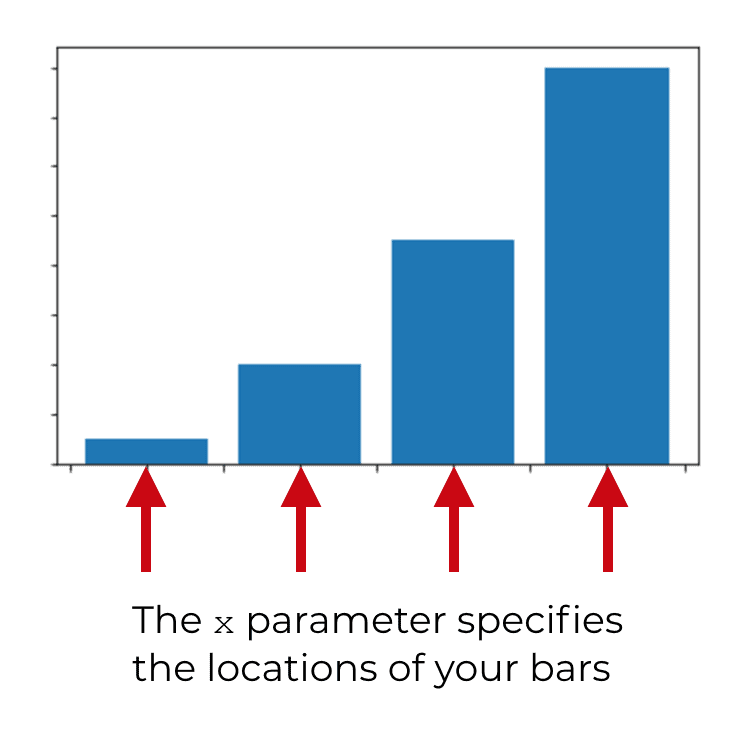
So if your bars are at positions 0, 1, 2, and 3 along the x axis, those are the values that you would need to pass to the x parameter.
You need to provide these values in the form of a “sequence” of scalar values. That means that your values (e.g., 0, 1, 2, 3) will need to be contained inside of a Python sequence, like a list or a tuple.
In this tutorial, I’m assuming that you understand what a Python sequence is. If you don’t, do some preliminary reading on Python sequences first, and then come back when you understand them.
height
The height parameter controls the height of the bars.
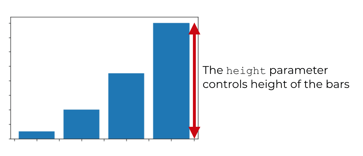
Similar to the x parameter, you need to provide a sequence of values to the height parameter …. one value for each bar.
So if there are four bars, you’ll need to pass a sequence of four values. If there are five bars, you need to provide a sequence of five values. Etc.
The examples section will show you how this works.
width
The width parameter controls the width of the bars.
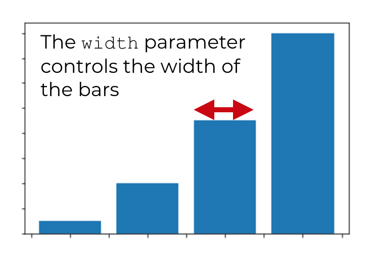
You can provide a single value, in which case all of the bars will have the same width.
Or, you can provide a sequence of values to manually set the width of different bars.
By default, the width parameter is set to .8.
color
The color parameter controls the interior color of the bars.
You can set the value to a named color (like “red”, “blue”, “green”, etc) or you can set the color to a hexidecimal color.
Although I strongly prefer hex colors (because they give you a lot of control over the aesthetics of your visualizations), hex colors are a little more complicated for beginners. Having said that, this tutorial will only explain how to use named colors (see the examples below).
Examples: how to make a bar chart plot in matplotlib
Ok … now that you know more about the parameters of the plt.bar function, let’s work through some examples of how to make a bar chart with matplotlib.
I’m going to show you individual examples of how to manipulate each of the important parameters discussed above.
Run this code before you get started
Before you work with the examples, you’ll need to run some code.
You need to run code to import some Python modules. You’ll also need to run code to create some simple data that we will plot.
Import modules
Here is the code to import the proper modules.
We’ll be working with matplotlib, numpy, and pyplot, so this code will import them.
import matplotlib
import numpy as np
import matplotlib.pyplot as plt
Note that we’ve imported numpy with the nickname np, and we’ve imported pyplot with the nickname plt. These are fairly standard in most Python code. We can use these nicknames as abbreviations of the modules … this just makes it easier to type the code.
Create dataset
Next, you need to create some data that we can plot in the bar chart.
We’re going to create three sequences of data: bar_heights, bar_labels, and bar_x_positions.
# CREATE DATA
bar_heights = [1, 4, 9, 16]
bar_labels = ['alpha', 'beta', 'gamma', 'delta']
bar_x_positions = [0,1,2,3]
As noted above, most of the parameters that we’re going to work with require you to provide a sequence of values. Here, all of these sequences have been constructed as Python lists. We could also use tuples or another type of Python sequence. For example, we could use the NumPy arange function to create a NumPy array for bar_heights or bar_x_positions. As long as the structure is a “sequence” it will work.
Ok, now that we have our data, let’s start working with some bar chart examples.
How to make a simple bar chart with matplotlib
Let’s start with a simple example.
Here, we’re just going to make a simple bar chart with pyplot using the plt.bar function. We won’t do any formatting … this will just produce a bar chart with default formatting.
To do this, we’re going to call the plt.bar() function and we will set bar_x_positions to the x parameter and bar_heights to the height parameter.
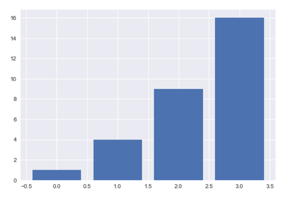
# PLOT A SIMPLE BAR CHART
plt.bar(bar_x_positions, bar_heights)
And here is the output:
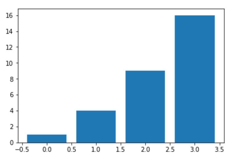
This is fairly simple, but there are a few details that I need to explain.
First, notice the position of each of the bars. The bars are at locations 0, 1, 2, and 3 along the x axis. This corresponds to the values stored in bar_x_positions and passed to the x parameter.
Second, notice the height of the bars. The heights are 1, 4, 9, and 16. As should be obvious by now, these bar heights correspond to the values contained in the variable bar_heights, which has been passed to the height parameter.
Finally, notice that we’re passing the values bar_x_positions and bar_heights by position. When we do it this way, Python knows that the first argument (bar_x_positions) corresponds to the x parameter and the second argument (bar_heights) corresponds to the height parameter. There’s a bit of a quirk with matplotlib that if you make the parameter names explicit with the code by typing plt.bar(x = bar_x_positions, height = bar_heights), you’ll actually get an error. So in this example, you have to put the correct variables in the correct positions inside of plt.bar(), and you have to exclude the actual parameter names.
Change the color of the bars
Next, we’ll change the color of the bars.
This is a very simple modification, but it’s the sort of thing that you can make your plot look better, if you do it right.
There are a couple different ways to change the color of the bars. You can change the bars to a “named” color, like ‘red,’ ‘green,’ or ‘blue’. Or, you can change the color to a hexidecimal color. Hex colors are a little more complicated, so I’m not going to show you how to use them here. Having said that, hex colors give you more control, so eventually you should become familiar with them.
Ok. Here, we’re going to make a simple change. We’re going to change the color of the bars to ‘red.’
To do this, we can just provide a color value to the color parameter:
plt.bar(bar_x_positions, bar_heights, color = 'red')
The code produces the following output:
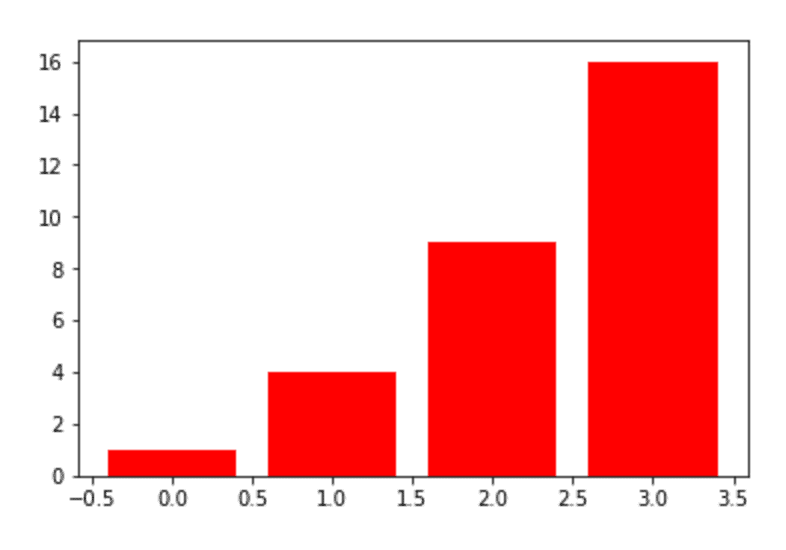
Admittedly, this chart doesn’t look that much better than the default, but it gives you a simple example of how to change the bar colors. This code is easy to learn and easy to practice (you should always start with relatively simple examples).
As you become more skilled with data visualization, you will be able to select other colors that look better for a particular data visualization task.
The point here is that you can change the color of the bars with the color parameter, and it’s relatively easy.
Change the width of the bars
Now, I’ll show you how to change the width of the bars.
To do this, you can use the width parameter.
plt.bar(bar_x_positions, bar_heights, width = .5)
And here’s the output:
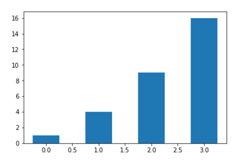
Here, we’ve set the bar widths to .5. In this case, I think that the default (.8) is better. However, there may be situations where the bars are spaced out at larger intervals. In those cases, you’ll need to make your bars wider. My recommendation is that you make the space between the bars about 20% of the width of the bars.
How to add labels to your bars
You might have noticed in the prior examples that there is a bit of a problem with the x-axis of our bar charts: they don’t have labels.
Let’s take a look by re-creating the simple bar chart from earlier in the tutorial:
# ADD X AXIS LABELS
plt.bar(bar_x_positions, bar_heights)
It produces the following bar chart:
Again, just take a look at the bar labels on the x axis. By default, they are just the x-axis positions of the bars. They are not the categories.
In most cases, this will not be okay.
In almost all cases, when you create a bar chart, the bars need to have labels. Typically, each bar is labeled with an appropriate category.
How do we do that?
When you use the plt.bar function from pyplot, you need to set those bar labels manually. As you’ve probably noticed, they are not included when you build a basic bar chart like the one we created earlier with the code plt.bar(bar_x_positions, bar_heights).
Here, I’ll show you how.
Add bar labels
To add labels to your bars, you need to use the plt.xticks function.
Specifically, you need to call plt.xticks(), and provide two arguments: you need to provide the x axis positions of your bars as well as the labels that correspond to those bars.
So in this example, we will call the function as follows: plt.xticks(bar_x_positions, bar_labels). The bar_x_positions variable contains the position of each bar, and the bar_labels variable contains the labels of each bar. (Remember that we defined both variables earlier in this tutorial.)
# ADD X AXIS LABELS
plt.bar(bar_x_positions, bar_heights)
plt.xticks(bar_x_positions, bar_labels)
And here is the result:
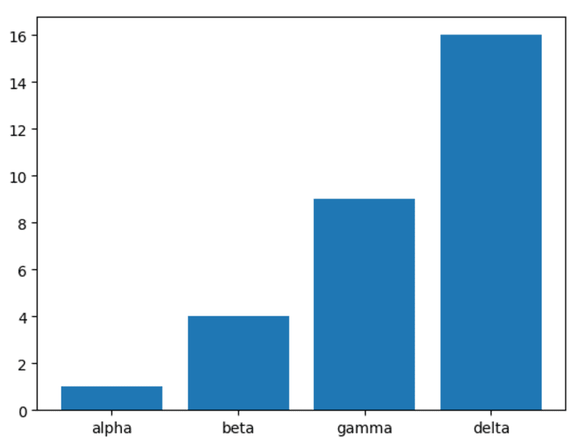
Notice that each bar now has a categorical label.
Improve the formatting of your pyplot bar chart
Ok, now I’ll show you a quick trick that will improve the appearance of your Python bar charts.
One of the major issues with standard matplotlib bar charts is that they don’t look all that great. The standard formatting from matplotlib is – to put it bluntly – ugly.
To be clear, the basic formatting is fine if you’re just doing some data exploration at your workstation. The basic formatting is okay if you’re creating charts for personal consumption.
But if you need to show your charts to anyone important, then the default formatting probably isn’t good enough. The default formatted charts look basic. They lack polish. They are a little unprofessional. You might not understand this, but you need to realize that the appearance of your charts matters when you present them to anyone important.
That being the case, you need to learn to format your charts properly.
The full details of how to format your charts is beyond the scope of this post, but here I’ll show you a quick way to dramatically improve the appearance of your pyplot charts.
Use seaborn formatting to improve your charts
We’re going to use a special function from the seaborn package to improve our charts.
Install seaborn
To use this function, you’ll need to install seaborn. You can do that with the following code:
# import seaborn module
import seaborn as sns
Use seaborn.set() to change default formatting
Once you have seaborn imported, you can use the seborn.set() function to set new plot defaults for your matplotlib charts. Because we imported seaborn as sns, we can call the function with sns.set().
#set plot defaults using seaborn formatting
sns.set()
This essentially changes many of the plot defaults like the background color, gridlines, and a few other things.
Let’s replot our bar chart so you can see what I mean.
#plot bar chart
plt.bar(bar_x_positions, bar_heights)
Here’s the plot:
I’ll be honest … I think this is dramatically better. Just using this one simple modification makes your matplotlib bar chart look much more professional.
Run this to remove seaborn formatting
One issue that you might run into though is that when you use the seaborn.set() function all of your charts have that formatting. That might not be what you want!
So how do you revert to the original matplotlib formatting?
You can do that by running the following code:
# REMOVE SEABORN FORMATTING
sns.reset_orig()
If you run this, it will reset the matplotlib formatting back to the original default values.
Putting the pieces together: an improved matplotlib bar chart
Let’s do one more example.
Here, we’ll use several techniques together to create a more complete and refined bar chart in Python.
We’ll set the bar positions and heights using the plt.bar function. Then we’ll add the bar labels using, the plt.xticks function. We’ll change the color using the color parameter. And we’ll improve the background formatting by using the sns.set() function from seaborn.
Let’s take a look:
# COMBINED EXAMPLE
import seaborn as sns

sns.set()
plt.bar(bar_x_positions, bar_heights, color = 'darkred')
plt.xticks(bar_x_positions, bar_labels)
And here is the output:
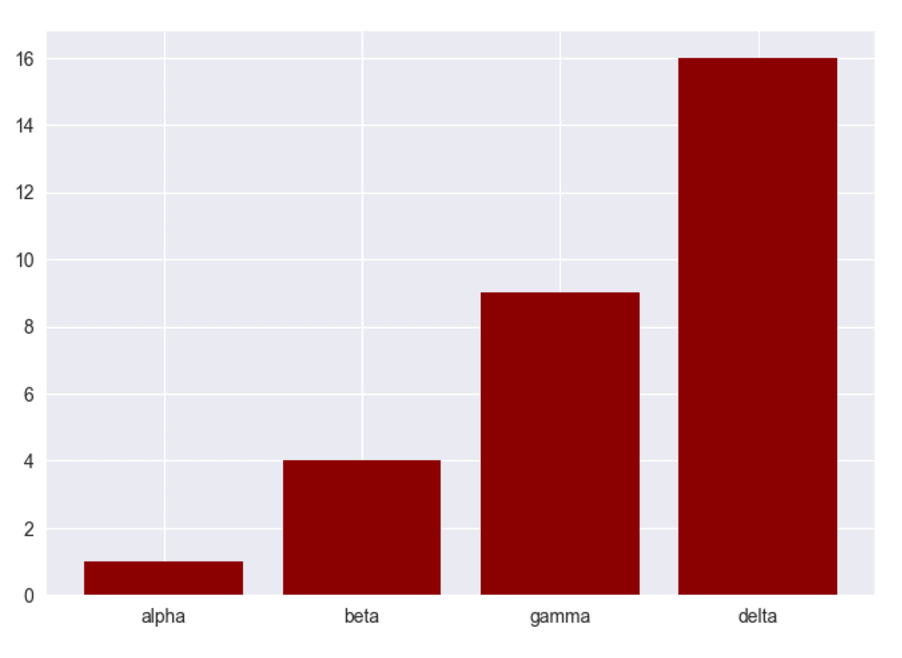
Let’s quickly break this down.
We used the plt.bar() function to create a simple bar chart. The bar locations have been defined with the bar_x_positions variable and the bar heights have been defined with the bar_heights variable. We set the color of the bars to ‘darkred’ by using the color parameter. We set the bar category labels by using the plt.xticks function. And we improved the overall plot formatting by using the sns.set() function.
There is certainly more that we could do to improve this chart. We could add a plot title, axis titles, and maybe change the fonts.
Having said that, this looks pretty damn good for a simple bar chart, and it’s only a few lines of code. In my opinion, it’s dramatically better than a simple default bar chart made with matplotlib.
Make sure to reset the matplotlib defaults!
And one last thing …
As I noted earlier, if you use the sns.set() function to use seaborn formatting for your plots, you may want to reset the defaults afterwards. To do that, run the following code:
# reset defaults
sns.reset_defaults()
This will return your matplotlib formatting back to the matplotlib defaults.
If you want to learn data science in Python, learn matplotlib
This tutorial should have given you a solid foundation for creating bar charts with matplotlib.
Having said that, there’s a lot more to learn. If you want to get the most out of matplotlib, you’ll need to learn more tools and more functions. You’ll need to learn more about matplotlib, but you’ll also need to learn more about NumPy and NumPy arrays. For example, you’ll often need to use techniques like NumPy linspace to set axis tick locations.
Overall, my point is that there’s more to learn. If you want to be great at data science in Python, you really need to know matplotlib.
So, this tutorial should be great for helping you learn some of the basics of the matplotlib bar chart, but if you’re really interested in data science, you’ll need to learn quite a bit more.
For more Python data science tutorials, sign up for our email list
If you want to learn more about matplotlib and data science in Python, sign up for our email list.
When you sign up, you’ll get our tutorials delivered directly to your inbox. Every week, we publish data science tutorials … members of our email list hear about them whenever they are published.
If you sign up, you’ll get free tutorials about:
- Matplotlib
- NumPy
- Pandas
- Base Python
- Scikit learn
- Machine learning
- Deep learning
- … and more.
Want to learn data science in Python? Sign up now.
Hi: Excellent and simple code.
BTW: These links are down:
How to make a scatterplot with matplotlib
How to make a line chart with matplotlib
Yeah, sorry about the links ….
Those tutorials are going to be published in a few weeks.
I added in the links pre-emptively … otherwise I’d never remember to come back and put them in after those tutorials are published.
great note