This tutorial will show you how to make a Seaborn barplot. The tutorial explains the syntax of sns.barplot, and shows step-by-step examples of how to create bar charts with Seaborn.
The tutorial is divided up into several sections. You can click on any of the following links to take you to the appropriate section (if you need something specific).
Table of Contents:
- Introduction to Seaborn
- A quick review of Bar Charts
- A quick introduction to the Seaborn Barplot
- The syntax of
sns.barplot() - Seaborn barplot examples
- Seaborn barplot FAQ
But if you’re new to Seaborn or new to data visualization in Python, you should probably read the full tutorial.
A quick review of bar plots
Let’s quickly review bar charts.
According to Wikipedia, bar charts (AKA, bar plots) are:
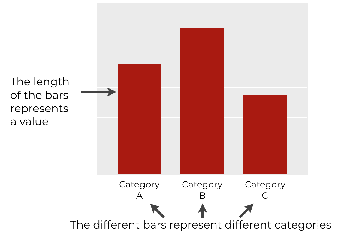
a chart or graph that presents categorical data with rectangular bars with heights or lengths proportional to the values that they represent.
So typically, the different bars represent different categories from a categorical variable. And the length of each bar represents some value of some metric for those categories.
When to use the bar chart
Typically, we use bar charts when we have at least one categorical variable and one numeric variable.
We use the bar chart to analyze the differences between the categories.
Bar charts are a simple yet powerful data visualization technique that we can use to analyze data.
But in spite of their relative simplicity, they are not entirely easy to create in Python.
Having said that, let’s talk about creating bar charts in Python, and in Seaborn.
A quick introduction Seaborn
Before we talk about bar charts in Seaborn, let me quickly introduce Seaborn.
If you’re not familiar with it, Seaborn is a data visualization package for the Python programing language.
It provides functions to create a variety of statistical data visualizations.
Seaborn is one of the best packages for data visualization
Python has a variety of data visualization packages. There are some old ones, like matplotlib. And there are some newer ones like Plotly, Bokeh, and others.
With all of the options, why use Seaborn?
The short answer is that it’s much easier to use than many of the other options.
Now, this sort of depends on what you’re trying to do. If you’re trying to create a highly unique, customized visualization, Seaborn is probably not the best choice.
But if you want to easily create beautiful looking statistical visualizations (like bar charts, line charts, etc), then Seaborn is currently the best option.
There are a few reasons for this.
Seaborn works well with DataFrames
Perhaps the biggest reasons to use Seaborn is that the syntax was largely designed to work well with Pandas DataFrames.
This is in contrast to many other Python data visualization packages, matplotlib in particular. Notably, matplotlib does not work well with DataFrames.
If you’re used to using DataFrames, and you “think about visualization” in terms of plotting columns in a DataFrame, then you’ll struggle with matplotlib.
Seaborn, on the other hand, works well with DataFrames, for the most part. It’s easy to specify that you want to plot columns in a particular DataFrame with fairly simple syntax. (In this regard, Seaborn is somewhat akin to ggplot2 in R.)
Seaborn is better for multivariate visualization
Seaborn is also better at creating multivariate data visualizations.
Again, this is in contrast to matplotlib.
For example, matplotlib has a function to create very simple bar charts. But if you want to use multiple categorical variables in your bar chart, things get substantially more complicated. For example, “dodged” bar charts are somewhat difficult to create with matplotlib.
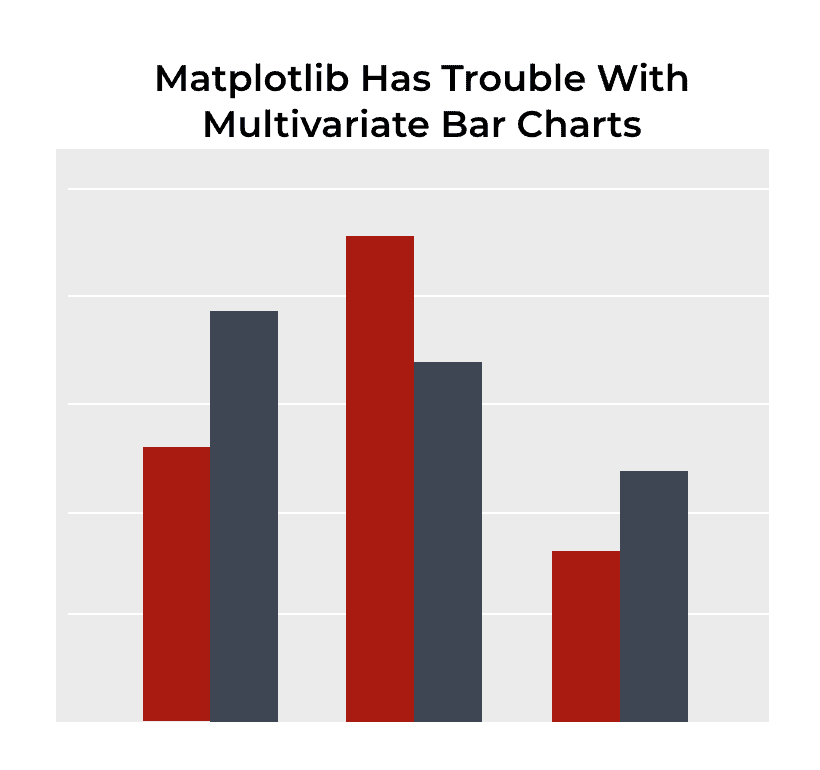
On the other hand, multivariate visualizations are easy to create with Seaborn. The syntax is simple and intuitive. Creating something like a “dodged” bar chart is fairly easy in Seaborn (I’ll show you how in example 6 of this tutorial).
An introduction to the Seaborn barplot
Seaborn makes it easy to create bar charts (AKA, bar plots) in Python.
The tool that you use to create bar plots with Seaborn is the sns.barplot() function.
To be clear, there is a a similar function in Seaborn called sns.countplot().
The main difference between sns.barplot and sns.countplot is that the countplot() function counts the records, and the length of each bar corresponds to the count of records for that particular category.
However, the sns.barplot function is different.
The sns.barplot function calculates the mean
The sns.barplot function calculates a summary statistic for each category. By default, it calculates the mean.
The length of each bar corresponds to the value of that statistic. So when you use sns.barplot, by default, the length of the bar corresponds to the mean of the data for that category.
Having said that, it is possible to change how sns.barplot summarizes the data by using the estimator parameter. Moreover, if you know how to wrangle your data using Pandas, you can calculate even more complicated statistics.
Now that you now a little about the sns.barplot function, let’s take a look at its syntax.
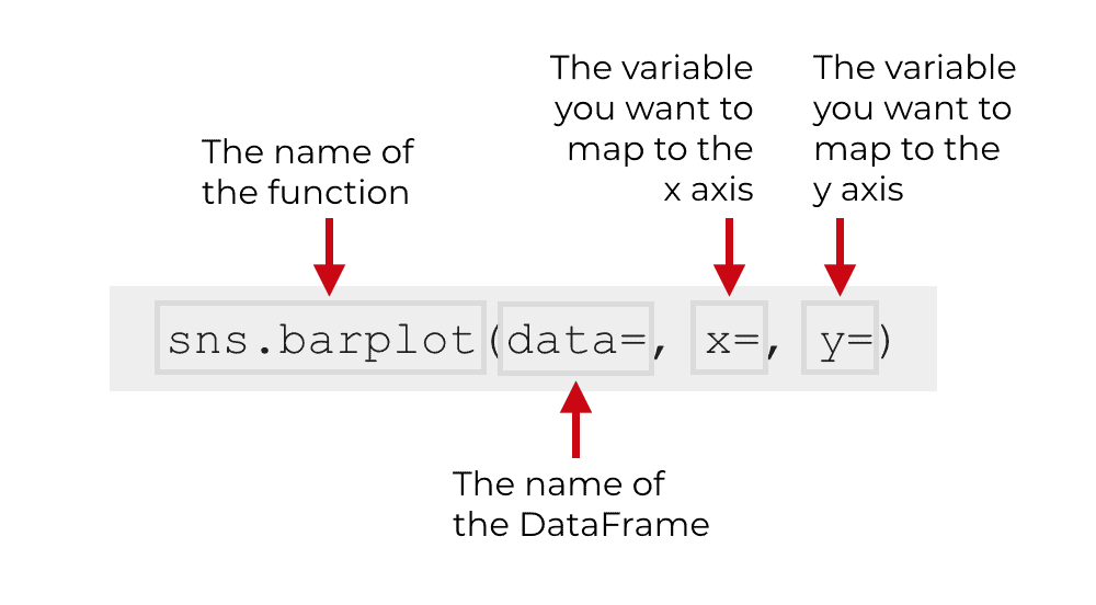
The syntax of sns.barplot
The syntax for sns.barplot() is fairly simple.
In the simplest case, you simply call the function as sns.barplot(). Then inside of the parenthesis, you can specify the DataFrame that you want to plot, as well as the variables that you want to put on the x and y axes.
That’s generally the type of syntax that you’ll use to create a simple bar chart (which I’ll show you in example 1).
However, the syntax can get more complicated if you use some of the optional parameters of sns.boxplot.
Let’s take a look at some of those parameters.
The parameters of sns.barplot
The sns.barplot function has well over a dozen parameters that you can use to control how the function works.
In the interest of brevity, however, we’ll only talk about a few of the most common:
dataxycolorhueciestimator
Let’s talk more specifically about each of these
data
The data parameter enables you to specify the DataFrame that holds the data that you want to plot.
Technically, this parameter will also recognize an array or a list of arrays, but it’s most common to pass a Pandas DataFrame as the argument to the data parameter.
x
The x parameter enables you to specify the variable that you want to map to the x axis.
If you’re creating a vertical bar chart, then you’ll typically pass a categorical variable to this parameter.
If you create a horizontal bar chart, it will be a numeric variable.
(I’ll show you examples of these in the examples section.)
y
The y parameter is similar to the x parameter.
The y parameter enables you to specify the variable that you want to map to the y axis.
The type of variable that you pass to y depends on what type of bar chart you want to create.
If you’re creating a vertical bar chart, then you’ll typically pass a numeric variable to this parameter.
If you create a horizontal bar chart, it will be a categorical variable.
(I’ll show you examples of these in the examples section.)
color
The color parameter enables you to specify the color of the bars.
If you don’t provide a value to this parameter, Seaborn will choose the color of the bars. By default, it will make each bar a different color.
I recommend that you not use the default.
Typically, you should change the color of the bars so they are all the same color.
To be clear: when you use the color parameter, all of the bars will have the same color.
hue
The hue parameter also changes the color of the bars, but it works differently than the color parameter.
Normally, you’ll map a categorical variable to the hue parameter.
When you do this, the sns.barplot function will create new bars for the categories of the variable you map to hue. Essentially, when you use the hue parameter, sns.barplot will create a “dodged” bar chart, where the color of the bars is set according to the hue variable.
I’ll show you an example of this in example 6 to help you understand.
ci
The ci parameter enables you to modify the error bars of the bar chart.
Error bars are very common in academic settings, but not as common in business settings.
By default, this is set to ci = 95, but you can change this to “sd”, in which case it will use the bars to denote the standard deviation of the data.
You can also set ci = None, in which case, the function will remove the error bars entirely.
estimator
The estimator enable you to specify what statistical function to use for calculating the length of the bars.
By default, this is set to “mean” … so sns.barplot will compute the mean for each category, and the length of the bar will correspond to the mean.
But, you can change this to other statistics, like “min”, “max”, “median”, etc.
Examples: How to make bar charts with Seaborn
Ok, now that you’ve learned about the syntax of sns.barplot, let’s take a look at some examples.
Examples:
- Create a simple bar chart
- Change the bar colors
- Remove the error bars
- Create a horizontal bar chart
- Calculate a different summary statistic
- Create a “dodged” bar chart
Run this code first
Before you run any of the examples, you’ll need to run some preliminary code first.
You’ll need to import some packages, set the formatting, and create the dataset we’re going to use.
Install packages
First, you need to import some Python packages. Specifically, you need to import Pandas, Numpy, and Seaborn.
You can do that with this code:
import pandas as pd
import numpy as np
import seaborn as sns
We’ll use Pandas and Numpy to create our dataset, and we’ll use Seaborn (obviously) to create our bar charts.
Set Seaborn formatting
Next, we’re going to set the formatting for our charts. By default, (depending on how your defaults are set up), your charts may be formatted like Matplotlib charts. Frankly, the matplotlib defaults are a little ugly, so we’re going to use Seaborn’s chart formatting.
To do this, we can use the sns.set() function:
sns.set()
Create data frame
Finally, we’re going to create a dataframe that contains some “dummy” data.
The final DataFrame will contain dummy test “scores” for a set of students. There will be three variables in the DataFrame: score, class, and gender.
To create this data, we’ll use the numpy.random.normal function to create normally distributed data. Those normally distributed datasets are named with the prefix score_array_ in the code below.
Those normally distributed arrays are then turned into DataFrames with the help of the pandas.DataFrame function. When we create those dataframes, we’re adding the variables “class” and “gender“, with the appropriate values.
In the last step, we concatenate everything together into one dataframe with the pd.concat function.
You can run the following code to create the data:
# set seed
np.random.seed(41)


#create three different normally distributed datasets
score_array_A_m = np.random.normal(size = 100, loc = 85, scale = 3)
score_array_A_f = np.random.normal(size = 100, loc = 90, scale = 2)
score_array_B_m = np.random.normal(size = 100, loc = 83, scale = 4)
score_array_B_f = np.random.normal(size = 100, loc = 80, scale = 7)
score_array_C_m = np.random.normal(size = 100, loc = 73, scale = 7)
score_array_C_f = np.random.normal(size = 100, loc = 80, scale = 2)


#turn normal datasets into dataframes
score_df_A_m = pd.DataFrame({'score':score_array_A_m,'class':'Class A', 'gender':'Male'})
score_df_A_f = pd.DataFrame({'score':score_array_A_f,'class':'Class A', 'gender':'Female'})
score_df_B_m = pd.DataFrame({'score':score_array_B_m,'class':'Class B', 'gender':'Male'})
score_df_B_f = pd.DataFrame({'score':score_array_B_f,'class':'Class B', 'gender':'Female'})
score_df_C_m = pd.DataFrame({'score':score_array_C_m,'class':'Class C', 'gender':'Male'})
score_df_C_f = pd.DataFrame({'score':score_array_C_f,'class':'Class C', 'gender':'Female'})


#concat dataframes together
score_data = pd.concat([score_df_A_m
                        ,score_df_A_f
                        ,score_df_B_m
                        ,score_df_B_f
                        ,score_df_C_m
                        ,score_df_C_f
                        ])
And let’s print out a few rows:
score_data.head()
OUT:
       score    class gender
0  84.187863  Class A   Male
1  85.314544  Class A   Male
2  85.751583  Class A   Male
3  82.224400  Class A   Male
4  86.701431  Class A   Male
So the score_data dataset has three variables with data about the class, gender, and score for a group of 600 students.
Now that we have our dataset, let’s make some bar charts.
EXAMPLE 1: Create a simple bar chart
First, we’ll create a simple bar chart.
To do this, we’ll call the sns.barplot function, and specify the data, as well as the x and y variables.
We’re specifying that we want to plot data in the score_data DataFrame with the code data = score_data.
We’re specifying that we want to put the 'class' variable on the x axis and the 'score' variable on the y axis.
Let’s run the code:
sns.barplot(data = score_data
            ,x = 'class'
            ,y = 'score'
            )
And here’s the output:
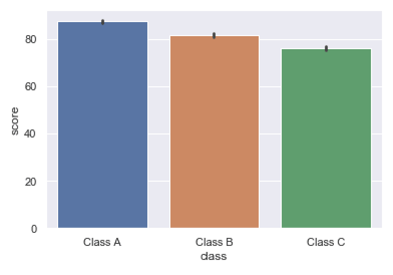
I’ll start off by saying that this works, but it’s a little imperfect.
Each different category of the class variable has it’s own bars. Those bars are placed at different positions on the x axis. That corresponds to the code x = 'class'.
The length of each bar corresponds to the mean score for each class. That corresponds to the code y = 'score'. (Remember, by default, the sns.boxplot function calculates the mean of each category.)
Again, this works, but there are imperfections. The bars are all different colors, which I think is bad design. The categories are already separated by position on the x axis, so they don’t need to be different colors. We’ll fix this in a later example.
Also, I don’t really like the error bars in this chart. Error bars are necessary for some tasks (e.g., academic papers) but we often don’t use them in business environments. I’ll show you how to remove them in example 3.
EXAMPLE 2: Change the bar colors
Next, we’ll change the bar colors.
As I mentioned in example 1, all of the bars are different color by default.
I don’t like this. I typically like my bars to all be the same color, unless we’re using color as a way to differentiate the bars. Keep in mind that the bars themselves are already differentiated by position so we don’t need to differentiate them by color.
Ok. To change the bar color, we’re going to use the color parameter.
Here, we’re going to set color = 'cyan'.
sns.barplot(data = score_data
            ,x = 'class'
            ,y = 'score'
            ,color = 'cyan'
            )
OUT:
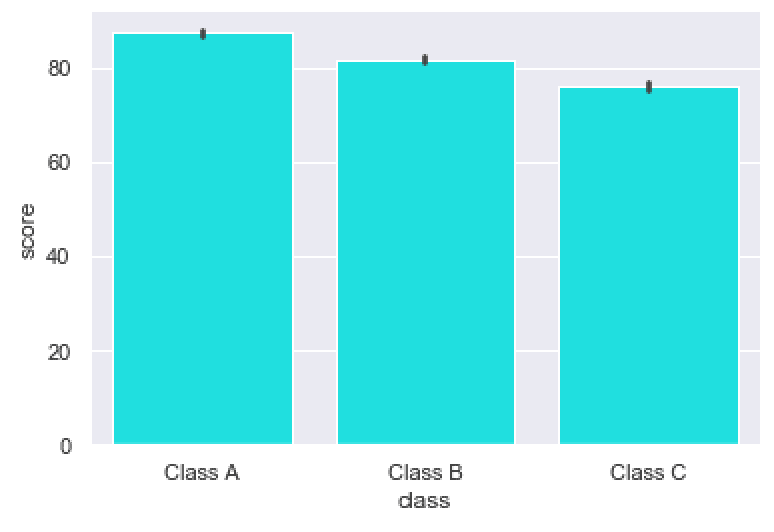
I think that cyan looks good, so I tend to use it for charts.
Having said that, Python understands a variety of color names, like ‘red’, ‘blue’, ‘darkred’, etc. Play around a little and find some colors you like.
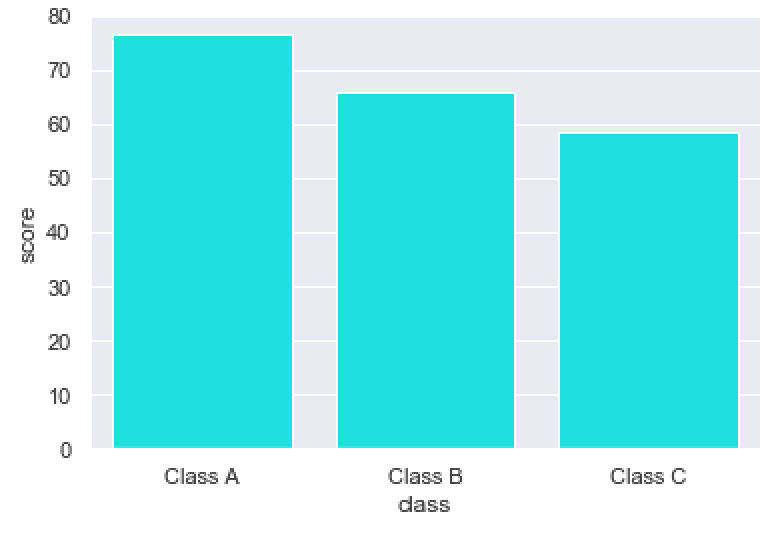
EXAMPLE 3: Remove the error bars
One thing I don’t like about the previous two charts is the error bars.
By default, Seaborn adds error bars to the bars.
If you want to remove them, you can set the ci parameter to ci = None.
sns.barplot(data = score_data
            ,x = 'class'
            ,y = 'score'
            ,color = 'cyan'
            ,ci = None
            )
OUT:
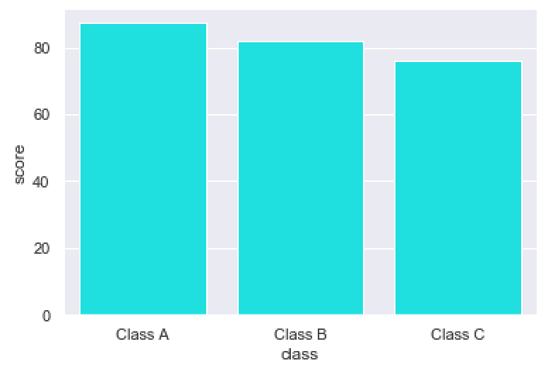
As you can see, by setting ci = None, the black error bars have been removed.
EXAMPLE 4: Create a horizontal bar chart
Next, we’ll “flip” the bar chart on its side and create a horizontal bar chart.
This is fairly easy to do.
All we need to do is change the variables we pass to the x and y parameters.
Here, we’ll map score to the x axis and class to the y axis. Not that this is a reversal of how we mapped those variables in the previous examples.
sns.barplot(data = score_data
            ,x = 'score'
            ,y = 'class'
            ,color = 'cyan'
            ,ci = None
            )
OUT:
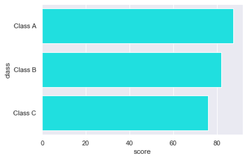
As you can see, the categories of the class variable are now arranged along the y axis (instead of the x axis, as before). And the mean score is being measured by the x axis.
EXAMPLE 5: Calculate a different summary statistic
Here, we’re going to calculate a different summary statistic.
By default, sns.barplot calculates the mean of the metric that we’re measuring. By default, the length of the bars corresponds to the means for those categories.
But, it is possible to have the barplot function compute different metrics. For example, you can have the length of the bars correspond to the minimum, instead of the mean.
Let’s do that.
Here, we’re going to set the estimator parameter to estimator = min.
from numpy import min

sns.barplot(data = score_data
            ,x = 'class'
            ,y = 'score'
            ,color = 'cyan'
            ,ci = None
            ,estimator = min
            )
OUT:
Take a close look. The length of the bars now corresponds to the minimum value of each category, instead of the mean.
(You can confirm this with a little data analysis on the DataFrame.)
EXAMPLE 6: Create a “dodged” bar chart
Finally, let’s create a “dodged” bar chart.
A dodged bar chart is a bar chart with multiple bars within each x-axis category (if we’re making a vertical bar chart).
It’s essentially a multi-variate bar chart.
Let’s take a look.
To do this, we’ll set the hue parameter to hue = 'gender'.
sns.barplot(data = score_data
            ,x = 'class'
            ,y = 'score'
            ,hue = 'gender'
            ,ci = None
            )
And here’s the chart:
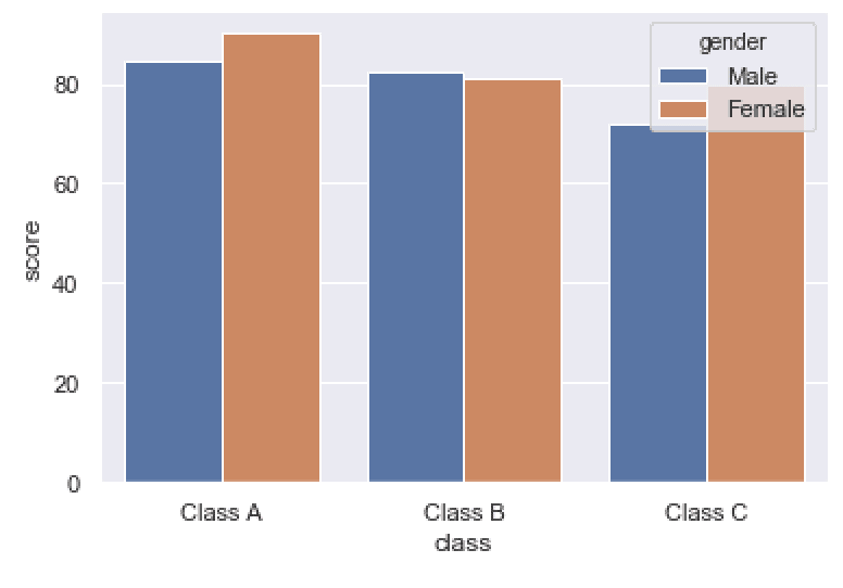
Notice the structure of the chart.
The different categories of the class variable are still arranged along the x axis.
But there are two bars within each category: one bar for Male and one bar for Female.
The bars for Male and Female have different colors. That’s because we set hue = 'gender'. The color of the bars (AKA, the hue) is being set according to the different unique values of the gender variable.
Dodged bar charts like this can be very useful for analyzing categories within categories, and comparing across complex multi-variate groups.
Leave your other questions in the comments below
Do you have questions about creating bar plots with Seaborn?
Is there something that we didn’t cover here that you need to understand?
Write your question in the comments section at the bottom of the page.
Join our course to learn more about Seaborn
The examples you’ve seen in this tutorial should be enough to get you started, but if you’re serious about learning Seaborn, you should enroll in our premium course called Seaborn Mastery.
There’s a lot more to learn about Seaborn, and Seaborn Mastery will teach you everything, including:
- How to create essential data visualizations in Python
- How to add titles and axis labels
- Techniques for formatting your charts
- How to create multi-variate visualizations
- How to think about data visualization in Python
- and more …
Moreover, it will help you completely master the syntax within a few weeks. You’ll discover how to become “fluent” in writing Seaborn code.
Find out more here:
is it display the count on the bar graph? how it is?
It’s not clear what you’re asking.
Hi! thanks for this tutorial, it’s very straight-forward. The removal of the error bar comes in handy for me!
Cheers!
Great to hear that it was useful to you.
If you like it, share it!
What a great tutorial!
Many thanks
Was very helpful to understand, Thankyou!
????
That’s great.
Way to go.
????????????