This tutorial will show you how to make a Seaborn scatter plot.
It will explain the syntax of the sns.scatterplot function, including some important parameters.
It will also show you clear, step-by-step examples of how to create a scatter plot in Seaborn.
If you need help with something specific, you can click on one of the links below. These links will take you to the appropriate section in the tutorial.
Table of Contents:
- An overview of Seaborn
- Introduction to scatterplots in Seaborn
- The syntax of the Seaborn scatterplot
- Seaborn scatter plot examples
- Seaborn scatter plot FAQ
But, if you’re new to Seaborn or new to data science in Python, it would be best if you read the whole tutorial.
Ok. Let’s get to it.
A quick overview of Seaborn
Just in case you’re new to Seaborn, I want to give you a quick overview.
(If you already know about Seaborn and data visualization in Python, you can skip this section and go to the Intro to the Seaborn scatter plot.)
Seaborn is a data visualization toolkit for Python
Seaborn is a package for the Python programming language.
Specifically, Seaborn is a data visualization toolkit for Python.
Python has a variety of data visualization packages, including Matplotlib, Matplotlib’s Pyplot, Bokeh, Altair, and many others.
Frankly, there’s almost too many Python visualization packages to keep track of.
Even among a variety of options, Seaborn is one of the best. I recommend it to most of my data science students.
Seaborn is one of the best options for data visualization in Python
Seaborn is probably the best option for statistical data visualization in Python, as of 2019.
To be fair, Seaborn is not quite as good as R’s ggplot2, but it’s still good.
Seaborn has a few advantages over other visualization toolkits. The most important, is that the syntax is relatively simple. It’s not perfect, but it’s fairly easy to learn and use.
In particular, Seaborn has easy-to-use functions for creating plots like scatterplots, line charts, bar charts, box plots, etc.
Second, Seaborn has been designed to work well with DataFrames. Many other data visualization options for Python – Matplotlib in particular – were designed before Pandas DataFrames became popular data structures in Python. Because of this, many of the other visualization tools in Python are hard to use with DataFrames. The syntax is often clumsy or complicated.
For the most part though, Seaborn was designed with Pandas DataFrames in mind. Considering that Pandas is almost essential for data science in Python today, it helps to have a toolkit that works well with Pandas and with DataFrame structures.
If you need to do data visualization in Python, particularly with Pandas DataFrames, I recommend Seaborn.
A quick introduction to the Seaborn scatter plot
As I mentioned earlier, Seaborn has tools that can create many essential data visualizations: bar charts, line charts, boxplots, heatmaps, etc.
But one of the most essential data visualizations is the scatter plot.
Arguably, scatter plots are one of the top 5 most important data visualizations. As a data scientist, you’re very likely to use them all the time. Any time you need to plot two numeric variables at the same time, a scatterplot is probably the right tool.
Creating scatterplots in Seaborn is easy.
To create a scatterplot in Seaborn, you can use the seaborn.scatterplot() function (AKA, sns.scatterplot) .
Let’s take a look at the syntax.
The syntax of sns.scatterplot
The syntax for creating a Seaborn scatterplot is fairly straightforward.
In the simplest case, you can call the function, provide the name of the DataFrame, and then the variables you want to put on the x and y axis. You can pass the DataFrame name to the data parameter, and pass the variables to the x parameter and y parameter. (I’ll show you a clear example of this in the examples section.)
Typically, when we call the function, we call it as sns.scatterplot(). This is because we typically import the Seaborn package with the import statement import seaborn as sns. This enables us to reference Seaborn with the alias sns. This is the common convention when using Seaborn, and it’s the convention that we’ll be using as we move forward in the tutorial.
As noted above, you can create a simple scatterplot with only 3 parameters. Having said that, the sns.scatterplot function has quite a few other parameters that you can use to modify the behavior of the function.
The parameters of sns.scatterplot
The sns.scatterplot() function has roughly two dozen parameters that you can use to carefully manipulate the output scatterplot.
In the interest of brevity, this tutorial won’t explain all of them. However, we will cover a few important parameters for sns.scatterplot:
dataxyedgecolorcoloralphahue
These are the most important parameters for creating basic scatterplots. Let’s take a look at each of them.
data (required)
The data parameter enables you to specify the Pandas DataFrame that contains the variables that you want to plot.
The data in your DataFrame should be in so-called “tidy” form. Tidy data is data organized such that each variable is in its own column and every record has its own row.
x
The x parameter enables you to specify the variable that will be mapped to the x axis.
This variable must be numeric.
You can specify a variable that is in the DataFrame being passed to the function via the data parameter. You can also specify a variable directly (independent of data).
y
The y parameter enables you to specify the variable that will be mapped to the y axis.
This variable must be numeric.
Similar to the x parameter, for the y parameter you can specify a variable that is in the DataFrame being passed to the function via the data parameter. You can also specify a variable directly (independent of data).
color
The color parameter specifies the color of the interior of the points.
By default, the color is a sort of medium blue, but you can change it to a wide variety of colors.
Keep in mind that this is not one of the parameters listed in the official Seaborn scatterplot documentation. That’s because this is a parameter from the Pyplot scatter function.
edgecolor
The edgecolor parameter enables you to specify the color of the edges of the points.
Like the color parameter, you won’t find the edgecolor parameter in the documentation for the Seaborn scatter plot. Again, that’s because this is a plt.scatter parameter that can be used within the Seaborn scatter plot function.
alpha
The alpha parameter enables you to modify the opacity of the points … how opaque they are.
The alpha opacity scale is from 0 to 1, with 1 being fully opaque and 0 being fully transparent. 1 is the default.
hue
The hue parameter will enable you to change the color of the points according to some variable.
Unlike the x and y parameters – which require a numeric – variable, the hue parameter is more flexible.
You can provide a categorical variable to the hue parameter, in which case, it will change the color of the points according to the different categories.
You can also pass a numeric variable to the hue parameter, in which case, it will vary the color of the points along a gradient according to numeric values of the hue variable.
Examples: how to make a a scatterplot in Seaborn
Ok. Now that you’ve learned about the syntax and parameters of sns.scatterplot function, let’s take a look at some examples of how to create a scatter plot with Seaborn.
Examples:
- Create a simple scatter plot
- Change the edge color of the points
- Change the interior color of all of the points
- Make the points more transparent to mitigate overplotting
- Change the color according to a categorical variable
- A few examples that combine multiple techniques
- Add a title to your scatterplot
Run this code first
Before you run any of the examples, you’ll need to run some preliminary code.
You’ll need to import the right packages and create the DataFrame that we’ll be plotting.
Import packages
First, we’ll import a few packages.
We’ll need Seaborn, obviously.
We’ll also need Pandas and Numpy to help create our DataFrame.
That being the case, run this code:
import pandas as pd
import seaborn as sns
import numpy as np
Create data
Now that we have our packages imported, we need to create a DataFrame.
This will be a fairly simple DataFrame with two normally distributed numeric variables and one categorical variable. For clarity and simplicity, I’ll call these variables x_var, y_var, and categorical_var.
np.random.seed(0)
x_var = np.random.normal(size = 6000)
y_var = np.random.normal(size = 6000)

norm_data = pd.DataFrame({'x_var':x_var
                  ,'y_var':y_var}
                  )

norm_data = norm_data.assign(category_var = np.where(x_var > 1, "Category A","Category B"))
To create x_var and y_var, we’ve used the Numpy random normal function. Notice that we also used Numpy random seed to set the seed for the random number generator. (If you don’t understand those functions yet, click on the links and read the tutorials.)
We used the pd.DataFrame function to create the DataFrame.
And finally, we added the category_var variable by using the Numpy where function inside of the Pandas assign method. The Pandas assign method enables us to add variables to a Pandas DataFrame.
Let’s quickly print out the first few rows of data and take a look:
norm_data.head()
OUT:
      x_var     y_var category_var
0  1.764052  2.042536   Category A
1  0.400157 -0.919461   Category B
2  0.978738  0.114670   Category B
3  2.240893 -0.137424   Category A
4  1.867558  1.365527   Category A
The DataFrame has 6000 rows of data, but the first 5 rows gives you a good idea of what the data looks like.
Set Seaborn formatting
Finally, one last quick thing.
You need to run the following formatting code:
sns.set()
This code will set the back ground formatting for our plots to make them look a little better compared to the matplotlib defaults.
Ok … now we’re ready for some examples.
EXAMPLE 1: Create a simple scatter plot
First, let’s just create a simple scatterplot.
To do this, we’ll call the sns.scatterplot() function.
Inside of the parenthesis, we’re providing arguments to three parameters: data, x, and y.
To the data parameter, we’re passing the name of the DataFrame, norm_data.
Then we’re passing the names of the variables x_var and y_var to the x parameter and y parameter respectively. This just tells sns.scatterplot to put x_var on the x-axis and y_var on the y-axis.
Let’s run the code and take a look at the plot:
sns.scatterplot(data = norm_data
                ,x = 'x_var'
                ,y = 'y_var'
                )
OUTPUT:
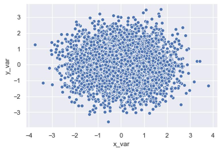
This is pretty simple.
The sns.scatterplot function put x_var on the x-axis and y_var on the y-axis.
The function drew a single point for every row of data at the locations specified by x_var and y_var.
That said, there are some problems with this chart.
There is a serious problem with overplotting; there are too many points overlapping each other.
Also, the white edges around the points are distracting.
We’ll fix some of those issues in the upcoming examples.
EXAMPLE 2: Change the edge color of the points
Here, we’ll change the edge color of the points.
As you saw in the last example, by default, the points have white edges. To be blunt, this doesn’t look very good. And, it causes visual issues when you have a lot of points.
To fix this, we’re going to remove the edges. To do this, we’ll set the edgecolor parameter to edgecolor = 'none'.
sns.scatterplot(data = norm_data
                ,x = 'x_var'
                ,y = 'y_var'
                ,edgecolor = 'none'
                )
OUT:
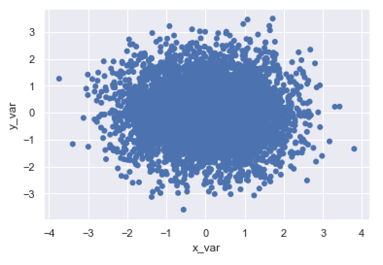
As you can see, by setting edgecolor = 'none', we’ve removed the edges of the points.
You could also set the edge color to a specific color (e.g., ‘red‘, ‘green‘, etc). Having said that, I actually recommend removing the edges. For the most part, giving your scatterplot points a different edge color than the interior is bad design. There are a few cases where it’s appropriate, but those are really more intermediate uses of the technique.
Again, typically, I recommend that you remove the edges.
(Note that the above scatterplot has a severe problem with overplotting. I’ll show you how to fix that in example 4.)
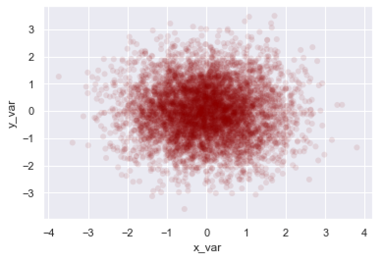
EXAMPLE 3: Change the interior color of all of the points
Next, let’s change the interior color of the points.
To do this, we’ll use the color parameter. Here, we’re going to set the color to the value 'darkred'. But you can use any “named color” that Python recognizes. You can also use hexidecimal colors, if you know how to use them.
Let’s take a look:
sns.scatterplot(data = norm_data
                ,x = 'x_var'
                ,y = 'y_var'
                ,color = 'darkred'
                )
OUT:
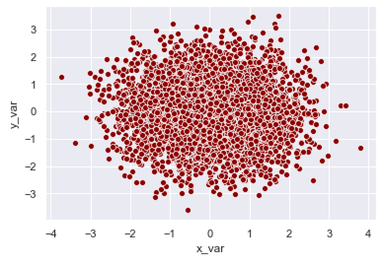
Here, we’ve changed the color of the points to the color "darkred".
Again, you can use any of the colors recognized by Python, as well as hexidecimal colors.
EXAMPLE 4: Make the points more transparent to mitigate overplotting
As you probably noticed, the scatter plots in the previous examples had serious problems with overplotting. There are almost too many points in the dataset, and when you plot them, they overlap.
This is problematic, because it can obscure or cover up important visual information that we might want to see.
One way to fix overplotting is by making the points more transparent.
In the Seaborn scatter plot function, you can modify the transparency/opacity of the points with the alpha parameter.
Here, we’re going to set alpha = .1.
Remember, the scale for alpha is between 0 and 1, with 1 being fully opaque and 0 being fully transparent.
By setting alpha = .1, we’re making the points only 10% of full opacity. At this setting, they’re almost transparent!
Let’s take a look:
sns.scatterplot(data = norm_data
                ,x = 'x_var'
                ,y = 'y_var'
                ,edgecolor = 'none'
                ,alpha = .1
                )
OUT:
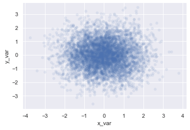
As you can see, the points are quite a bit more transparent.
This actually helps us see more of the structure of the data. The points are normally distributed. When we make the points more transparent like this, you can actually see how the points cluster near the center (i.e., the mean) of the distribution.
Modifying the alpha parameter is a very useful technique when you have a lot of data and have issues with overplotting.
EXAMPLE 5: Change the color according to a categorical variable
In this example, we’ll go back to modifying the color of the points.
Here, we’re going to modify the color of the points according to a categorical variable.
To do this, we’ll map our categorical variable, category_var, to the hue parameter.
This will change the color of the points to different colors depending on the different values of category_var.
Let’s take a look:
sns.scatterplot(data = norm_data
                ,x = 'x_var'
                ,y = 'y_var'
                ,hue = 'category_var'
                )
OUT:
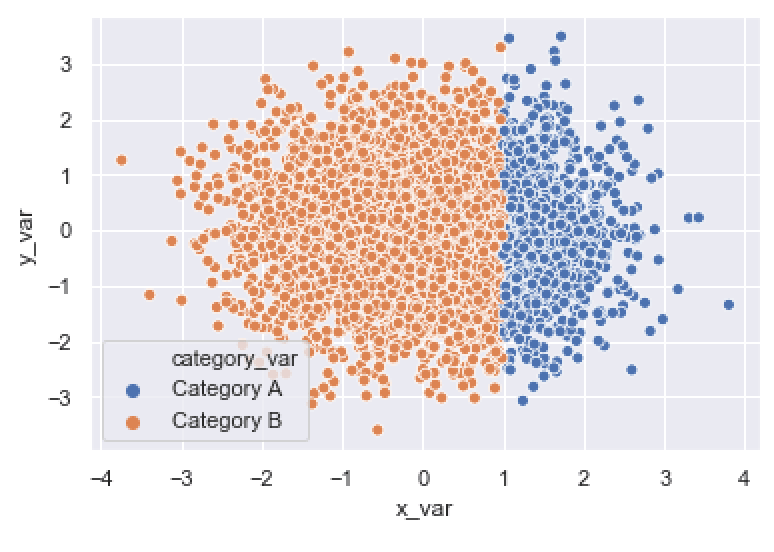
As you can see, the points that are in ‘Category A‘ are blue, and the points that are in ‘Category B‘ are orange.
Using the hue parameter is very useful when you have an additional categorical variable that you want to use to further analyze your scatterplot data.
EXAMPLE 6: A few examples that combine multiple techniques
Finally, here are some examples that combine several of the techniques from the previous examples.
Notice that we’re modifying the color, edgecolor, and opacity (i.e., alpha) all at the same time.
sns.scatterplot(data = norm_data
                ,x = 'x_var'
                ,y = 'y_var'
                ,alpha = .1
                ,edgecolor = 'none'
                ,color = 'darkred'
                )
OUT:
As you can see, we’ve changed the color to darkred, removed the edge color, and made the points more transparent. This chart is a lot better looking than the simple example from example 1 and also shows more of the structure in the data.
Let’s take a look at another:
sns.scatterplot(data = norm_data
                ,x = 'x_var'
                ,y = 'y_var'
                ,hue = 'category_var'
                ,edgecolor = 'none'
                ,alpha = .2
                )
OUT:
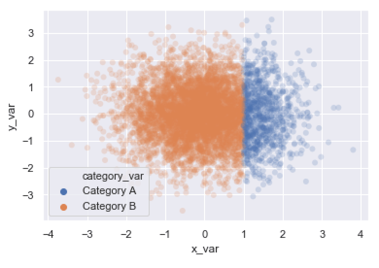
This final example shows the normal distribution of the data (which is easier to see because we made the points more transparent). You can also see the differences between different categories.
Of course, we’ve shown these examples using “dummy” data, but you can use these techniques to great effect when you analyze your own real-world data.
EXAMPLE 7: Add a title to your scatterplot
Let me show you one more thing.
Here, I’ll show you how to add a title to your plot.
To add a title to your plot, you can use the plt.title function from Matplotlib’s Pyplot submodule.
(Note that if you’re working in an IDE, you need to highlight and run sns.scatterplot and plt.title at the same time.)
import matplotlib.pyplot as plt

sns.scatterplot(data = norm_data
                ,x = 'x_var'
                ,y = 'y_var'
                ,alpha = .1
                ,edgecolor = 'none'
                ,color = 'darkred'
                )
plt.title('A scatterplot of x_var vs. y_var')
OUT:
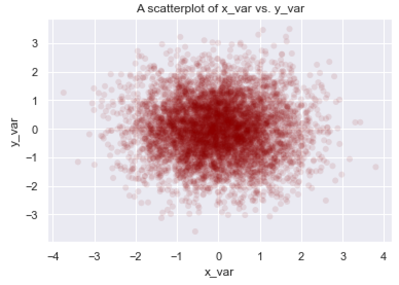
This final scatter plot has a title.
There’s definitely more that we could do here. There’s quite a bit more formatting and some other modifications that we could make, but this is pretty good for a straightforward scatter plot.
Leave your other questions in the comments below
Do you have questions about creating scatter plots with Seaborn?
Is there something that we didn’t cover here that you need to understand?
Write your question in the comments section at the bottom of the page.
Join our course to learn more about Seaborn
The examples you’ve seen in this tutorial should be enough to get you started, but if you’re serious about learning Seaborn, you should enroll in our premium course called Seaborn Mastery.
There’s a lot more to learn about Seaborn, and Seaborn Mastery will teach you everything, including:
- How to create essential data visualizations in Python
- How to add titles and axis labels
- Techniques for formatting your charts
- How to create multi-variate visualizations
- How to think about data visualization in Python
- and more …
Moreover, it will help you completely master the syntax within a few weeks. You’ll discover how to become “fluent” in writing Seaborn code.
Find out more here: