Obviously, AI taken off in the last year in ways that were hard for most people to predict.
AI went from being a somewhat niche technical subject that nerdy guys talked about on college campuses, to being so popular that Boomer parents and grandparents are saying that “AI will change everything.”
And although I think the sudden hype is a bit amusing, I also believe that it’s more than hype.
AI really will change everything, so it would be wise to master AI.
But to clarify: what I actually mean is that you should master machine learning, since machine learning dominates modern AI.
The question is, how?
My answer is somewhat simple: focus on data science foundations first, and then move into machine learning.
And one of those foundations that you need to master first is data visualization.
Data visualization is critical for almost every step of the machine learning process, from initial data exploration, to parameter tuning, to model selection.
You need data visualization for almost every part of machine learning.
But that begs the question: which machine learning packages?
Well, dear reader, as always, I’m here to help.
In this blog post, I’ll tell you the 3 toolkits I recommend for machine learning data visualization in Python.
What Data Visualizations Toolkits you need for ML
In the past, I’ve written about my favorite Python packages for data visualization.
And in those past blog posts, I’ve repeatedly noted that my favorite Python data visualization package is Seaborn.
Having said that, my answer to which data visualization package should you learn for machine learning is a bit more complicated.
You Need Multiple Toolkits
I wish that there was “One Data Visualization Package to Rule Them All,” but right now, there’s just not.
So the short answer is: for Python ML, I think that you’ll need multiple toolkits.
Until we have just one package, here is what I recommend:
- Seaborn (i.e., traditional Seaborn)
- Seaborn Objects
- Matplotlib (but just a little)
Let’s quickly discuss each of these.
Seaborn (Original Seaborn)
Let’s start with the core.
My favorite data visualization package for Python generally is Seaborn.
![]()
Now to be clear, an updated Seaborn toolkit was released in 2022, called Seaborn Objects. It’s excellent, and we’ll talk about it in a moment.
But here, I’m talking about traditional Seaborn.
Traditional Seaborn has Tools for All Basic Data Visualizations
No matter what sort of visualization you need to create, base Seaborn probably has an off-the-shelf function.
You can use Seaborn to create line charts, bar charts, boxplots, histograms, and most basic data visualizations. These basic data visualizations come in handy when doing initial exploratory data analysis, but you can also use them for other machine learning diagnostics like learning curves (i.e., use sns.lineplot for learning curves).
Seaborn also has functions for more advanced visualizations like pairplots, which are very useful for visualizing correlations between numeric variables (useful for feature elimination/selection); and tools for small multiples, which are useful for visualizing distributions of multiple variables (which we commonly do during EDA).
The original Seaborn package provides an off-the-shelf toolkit for many machine learning data visualizations, and it’s also easy to use.
I strongly recommend Seaborn for machine learning visualization.
Seaborn Objects
In addition to traditional Seaborn, I recommend learning and using the new Seaborn Objects toolkit.
If you haven’t read my past articles on it, let me quickly recap what it is.
Seaborn Objects is a relatively new data visualization toolkit that was released in late 2022.
It provides a new, easy-to-use syntax for creating data visualizations.
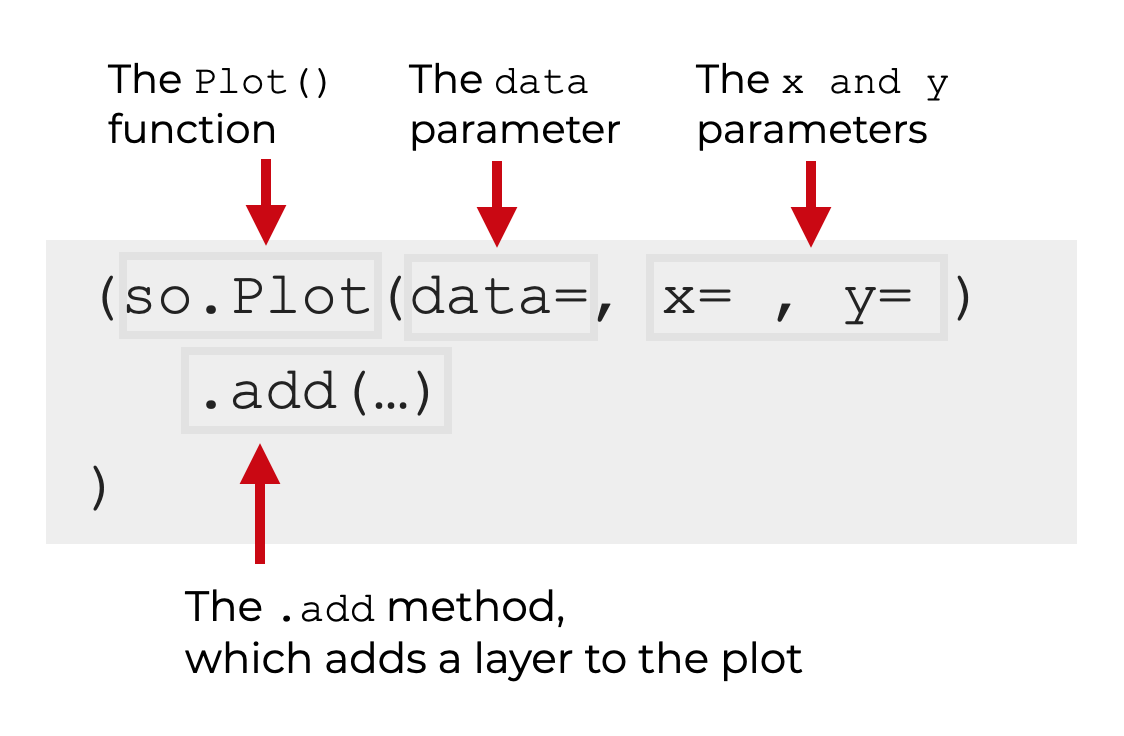
Importantly, the syntax is based on the Grammar of Graphics – a conceptual framework for creating data visualizations in a streamlined way.
If that doesn’t quite make sense, let me explain it differently.
Seaborn Objects provides a simple, user-friendly syntax for creating data visualizations.
I would argue that it’s much more flexible, and much more powerful than the original Seaborn package.
And to provide a point of reference: if you’ve used ggplot2 in R, it’s effectively like a ggplot2-style visualization toolkit for Python. (In fact, both ggplot2 and Seaborn Objects are based on the Grammar of Graphics framework, so they’re like cousins.)
Why does it matter for AI and machine learning?
Seaborn Objects makes it much easier to create intermediate-level visualizations and it gives you more control over the details of the visualizations.
For example, Seaborn Objects makes it much easier to generate small multiple plots (which are very useful for machine learning EDA and model evaluation).
Also, the syntax is just easier to use, once you understand how the system works.
The only problem that I have with Seaborn Objects right now is that it’s currently somewhat incomplete. The Seaborn team still needs to add some functionality. For example, the package lacks the ability to create boxplots.
Having said that, I’m already using Seaborn Objects for about 50 to 60% of my machine learning visualizations.
I also expect that as the Seaborn team adds more functionality, I’m going to increase how much I use Seaborn Objects vs traditional Seaborn.
Matplotlib for Miscellaneous Tasks
Ok.
Now, the dirty secret.
I still use Matplotlib.
![]()
Long time readers will know that I, to put it nicely, strongly dislike Matplotlib.
The syntax is complicated. The conceptual design is old fashioned (e.g. you sometimes need to use loops to create the visualization you need). Etcetera.
I really dislike Matplotlib.
But, for some things, I still use it.
For example, I was recently working on some lessons for my new machine learning course, and I wanted to visualized the decision boundary of some binary classifiers.
I thought that there would be a way to do it with traditional Seaborn or Seaborn Objects.
Nope.
I also tried to do it with Plotly, but the solution was complicated, which made it hard to teach to new ML students.
So what did I do?
I went back to Matplotlib.
Like it or not, Matplotlib provided the best and easiest way to visualize a decision boundary (using the plt.contourf function from Matplotlib’s Pyplot).
Again: I wanted to avoid Matplotlib at all costs, but for this particular task, Matplotlib was actually the best tool.
What I’m getting at is that it’s helpful to know at least a little Matplotlib if you want to do machine learning in Python.
You Also Need Data Wrangling
Now, the slightly harder pill to swallow.
Data visualization is critical for machine learning (and also data science more generally).
But by itself, data visualization is often insufficient.
Before you create almost any data visualization, you frequently need to aggregate, filter, or otherwise “wrangle” your data into the correct shape in order to make that visualization.
So although I recommend that you learn the packages that I mentioned above …
… I also strongly recommend that you learn Pandas and Numpy. If you’re doing data visualization in Python (either generally, or for machine learning), you almost always need a little Pandas or Numpy.
What are your Thoughts
What do you think? Do you agree with my package recommendations for Python data visualization?
Do you use other tools for ML data visualization in Python?
Or do you have questions?
I want to hear from you.
Leave your questions and comments in the comments section below.
Thought provoking article. I was making the switch to seaborn objects using your advice also but I guess its not fully ready to omit Matplotlib but to use it as little as possible is the key.
Thank you for your wonderful insight and direction . I am already in love with you.
Thanks?