Python Data Analysis: covid-19, part 4 [visual data exploration]

An image of a bar chart with the top 15 countries with the most covid-19 cases.

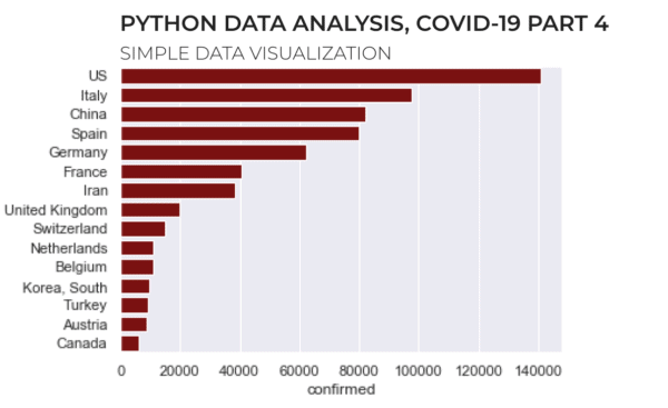
This tutorial is part of a series of tutorials analyzing covid-19 data. For parts 1, 2, and 3, see the following posts: https://www.sharpsightlabs.com/blog/python-data-analysis-covid19-part1/ https://www.sharpsightlabs.com/blog/python-data-analysis-covid19-part2/ https://www.sharpsightlabs.com/blog/analyzing-covid-19-with-python-part-3-eda/ Covid19 analysis, part 4: visual data exploration So far in this tutorial series, we’ve focused mostly on getting data, particularly in parts 1 and 2. Most recently, in part 3, … Read more

How to make a matplotlib bar chart

In this tutorial, you’ll learn how to create a matplotlib bar chart. Specifically, you’ll learn how to use the plt.bar function from pyplot to create bar charts in Python. Bar charts in Python are a little challenging I’ll be honest … creating bar charts in Python is harder than it should be. People who are … Read more

How to make a matplotlib histogram

This tutorial will explain how to make a matplotlib histogram. If you’re interested in data science and data visualization in Python, then read on. This post will explain how to make a histogram in Python using matplotlib. Here’s exactly what the tutorial will cover: A quick introduction to matplotlib The syntax for the matplotlib histogram … Read more