This tutorial will show you how to use the Scikit Learn roc_curve function.
It will explain the syntax of the function and show an example of how to use it.
The tutorial is organized into sections, so if you need something specific, you can click on any of the following links.
Table of Contents:
A Quick Review of ROC Curves
I’m going to show you how to use the Scikit-learn roc_curve function later in the tutorial (so you’re welcome to skip ahead to the syntax section).
But it might be helpful for you to understand some of the conceptual foundations of ROC curves first.
With that in mind, let’s quickly review ROC curves and where they fit into building and evaluating classification systems.
A Quick Review of Classification
Classifiers are supervised learning systems that input data and then output a categorical label. Said differently, classifiers are systems that predict categories.
In binary classification, which is arguably the most common type of classification, there are two possible outcomes for the outputs.
Having said that, we sometimes encode those binary outcomes in different ways depending on the problem.
Some examples of binary encodings are:
0and1TrueandFalseYesandNoPositiveandNegative
But whether you use 0 and 1, True and False, or any other binary representation, what’s crucial is the underlying concept that the predicted outputs of binary classifiers can only take 2 possible values.
It’s also important to realize that when a classifier makes a prediction, that prediction can be correct or incorrect.
Four Types of Correct and Incorrect Predictions
For a simple binary classification system, there are actually 4 possible correct and incorrect predictions.
To illustrate this, let’s assume that we’re working with a very general binary classifier that only outputs 2 predictions: positive and negative.
For example, if we were working with an email spam classifier, the classifier would output positive if it thought that a particular email was spam, and it would output negative if it though that the email was not spam.
In such a case, there are 4 types of correct and incorrect predictions, as follows:
- Correctly predict
positiveif the actual email is spam. - Correctly predict
negativeif the actual email is not spam. - Incorrectly predict
positiveif the actual email is not spam. - Incorrectly predict
negativeif the actual email is spam.
These different types of correct and incorrect predictions are important for understanding ROC curves, so let’s quickly discuss them.
True Positive, True Negative, False Positive, And False Negative
Each of these different correct and incorrect prediction types have names.
If we’re strictly using the generalized terminology of positive/negative, then the 4 prediction types described above can be described more generally as follows:
- True Positive: Correctly predict
positiveif the actual value is positive. - True Negative: Correctly predict
negativeif the actual value is negative. - False Positive: Incorrectly predict
positiveif the actual value is negative. - False Negative: Incorrectly predict
negativeif the actual value is positive.
These concepts of True Positive, True Negative, False Positive, and False Negative are important in binary classification.
They appear over and over in different concepts like Precision, Recall, Sensitivity and Specificity …
And ultimately, they’re important for understanding ROC curves.
What is An ROC Curve?
Now we’re finally ready to discuss ROC curves.
An ROC curve – which stands for Receiver Operating Characteristic is a visual diagnostic tool that we use to evaluate classifiers.
Originally used in signal detection during World War II, ROC curves are now very commonly used across machine learning.
An ROC curve visualizes the performance of a classification model for different values of classification threshold.
Remember: most classification models produce a probability score – sometimes known as a confidence score – that measures the confidence that the model has that a particular example should be labeled with the positive class.
When we use a classifier, we compare that confidence score against a threshold – a threshold that we can choose and we can optionally change – to decide if a particular example will be predicted as positive.
If the classifier’s confidence score is higher than the threshold for a particular example, then that classifier will get the positive label. If the confidence score is lower than the threshold, the example gets the negative label.(Note, what I just wrote applies to binary classification. Multiclass classification is a little more complicated.)
Importantly though, we get to choose the threshold.
And the model will have different True Positive Rate and False Positive rates for different thresholds.
An ROC Curve Plots True Positive Rate and False Positive Rate For Different Classification Thresholds
The ROC curve plots the True Positive Rate and False Positive Rate for all of those different classification thresholds.
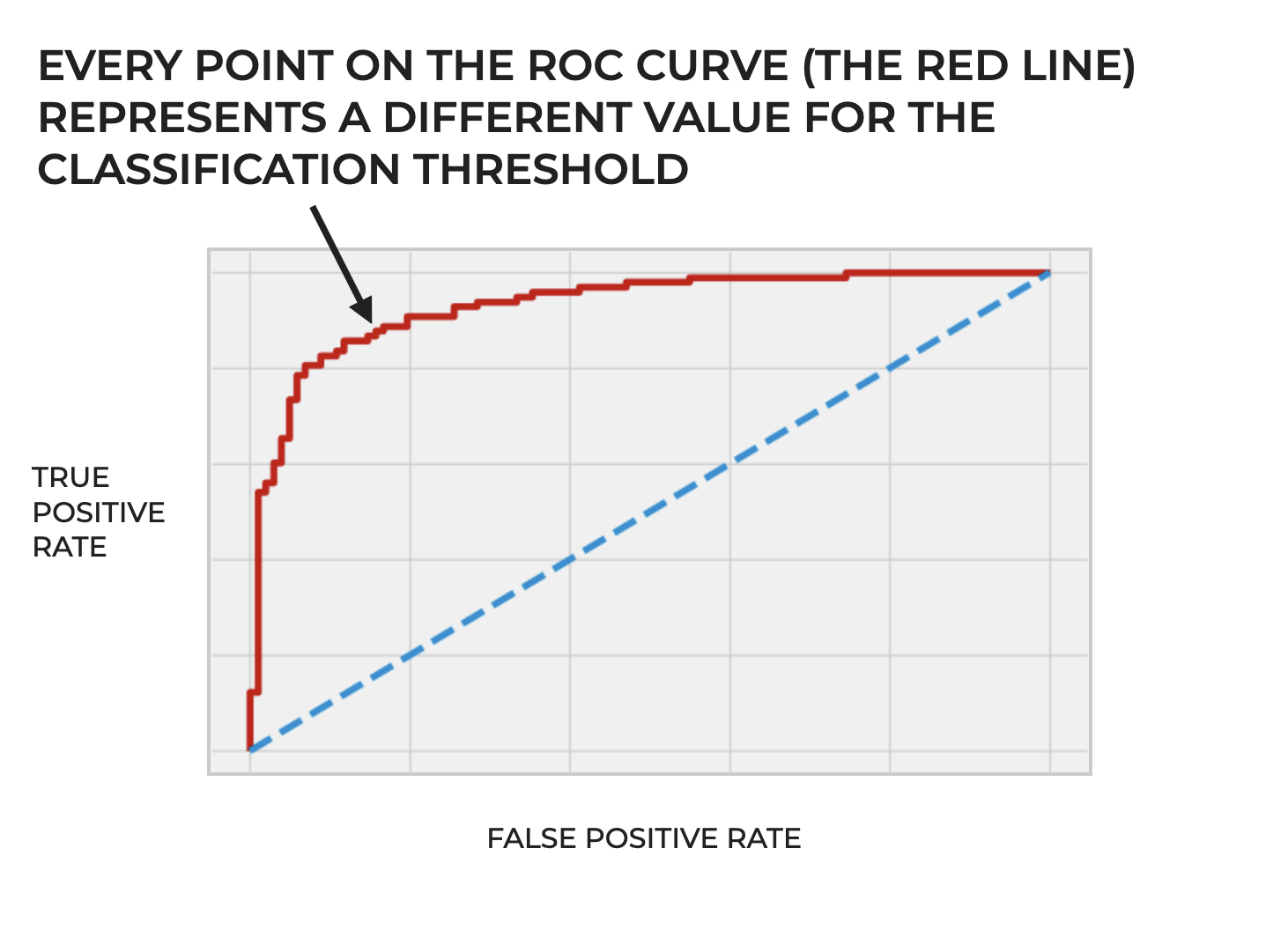
So the ROC curve gives us a visual representation of a classifier’s performance across different thresholds.
In turn this allows us to see the possible tradeoffs in choosing one classification threshold vs another, because increasing the threshold will decrease true positives (since fewer samples will meet the higher threshold) while also decreasing false positives (which can be a good thing). But decreasing the threshold will increase true positives while also increasing false positives.
There’s always a tradeoff when we choose a particular classification threshold, and the ROC curve helps us see and understand those tradeoffs for a particular classifier.
Plotting An ROC Curve
In order to plot an ROC curve, we need to:
- build a classification model
- make predictions with that model on the basis of input feature data
- compare the predictions vs the actual values (which we should have when we train the classifier)
- compute both the True Positive Rate and the False Positive Rate for a range of classification thresholds between 0 and 1
- plot the True Positive Rate vs False Positive Rate for those thresholds, with FPR on the x-axis and TPR on the y-axis
Perhaps the most critical step that’s specific to building an ROC curve is that fourth step.
We need a way to compute TPR and FPR for that range of thresholds.
How do we do that?
In Python, we can use the Scikit-learn roc_curve function.
Let’s take a look at how it works.
The Syntax of roc_curve
Here, we’ll cover the syntax of the Scikit Learn roc_curve function.
A quick note: import roc_curve
Before we look at the syntax, I want to remind you that in order to use the roc_curve function, you first need to import it.
To do that, you can use the following code:
from sklearn.metrics import roc_curve
Once you’ve imported it, you’ll be ready to use it.
roc_curve syntax
Assuming that you’ve imported the roc_curve function as described above, you use it as follows:
You call the function as roc_curve().
Inside the parenthesis, you need to provide a set of “y labels” as the first argument.
The second argument is a set of “y scores,” which can actually take a few different forms. I’ll explain that more soon.
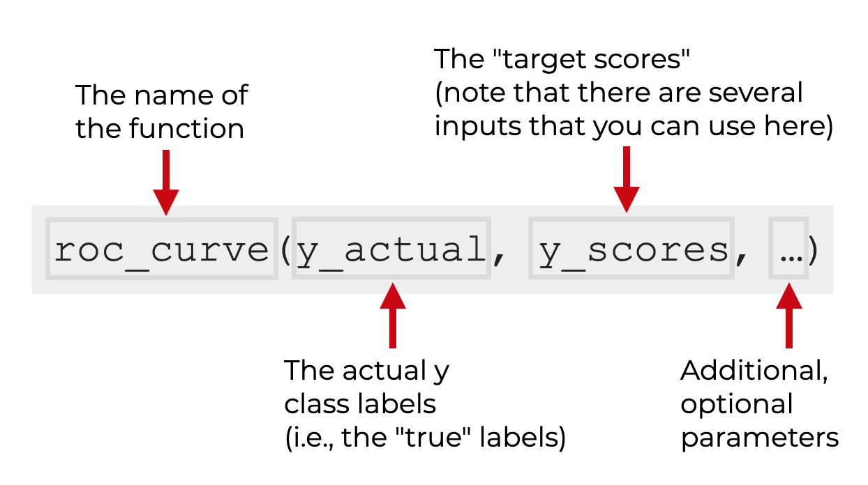
Then after the y labels and y scores, there are a few optional parameters.
To understand all of these arguments better, let’s look at each parameter and input individually.
The Parameters of roc_curve
There are 2 required arguments, and a few optional parameters for the Python roc_curve function:
y_actual(i.e., the y labels)y_scorespos_labelsample_weightdrop_intermediate
Let’s look at each one individually.
y_actual (required)
The y_actual argument is actual labels for the classification dataset that you’re using.
Typically, after you split your data into training and test datasets, the values that we use for y_actual will be the y labels for the test dataset.
In terms of the structure of this input, it should be a Numpy array with a length equal to the number of samples in your dataset.
y_scores (required)
The y_scores argument is a Numpy array that contains the “scores” produced by the model for each example.
Specifically though, these scores can be any of the following:
- probability estimates of the positive class
- confidence values for the predictions
- “decision scores”, which we can obtain by using the Scikit Learn decision_function
All of these will work, but which ones will be available to generate and use will depend on the exact classifier that you use.
Structurally, this will be a Numpy array with the same shape as y_actual.
pos_label
The pos_label parameter enables you to specify the label of the positive class.
By default, this is set to pos_label = None. In this case, if the possible y labels are {-1,1} or {0, 1}, the system will assume that 1 is the positive class.
sample_weight
The sample_weights parameter allows you to specify an array of sample weights.
Structurally, this will be a 1-dimensional Numpy array or array-like object with a length equal to the number of examples (i.e., one weight per example).
drop_intermediate
The drop_intermediate parameter allows you to specify whether or not to “drop suboptimal threshold” values from the ROC curve. This creates a “lighter” ROC curve.
By default, this parameter is set to drop_intermediate = True
The Output of roc_curve
Now, let’s look at the output of the Scikit Learn roc_curve function.
The roc_curve function outputs three Numpy arrays:
- an array of false positive rates
- an array of true positive rates
- an array of “thresholds
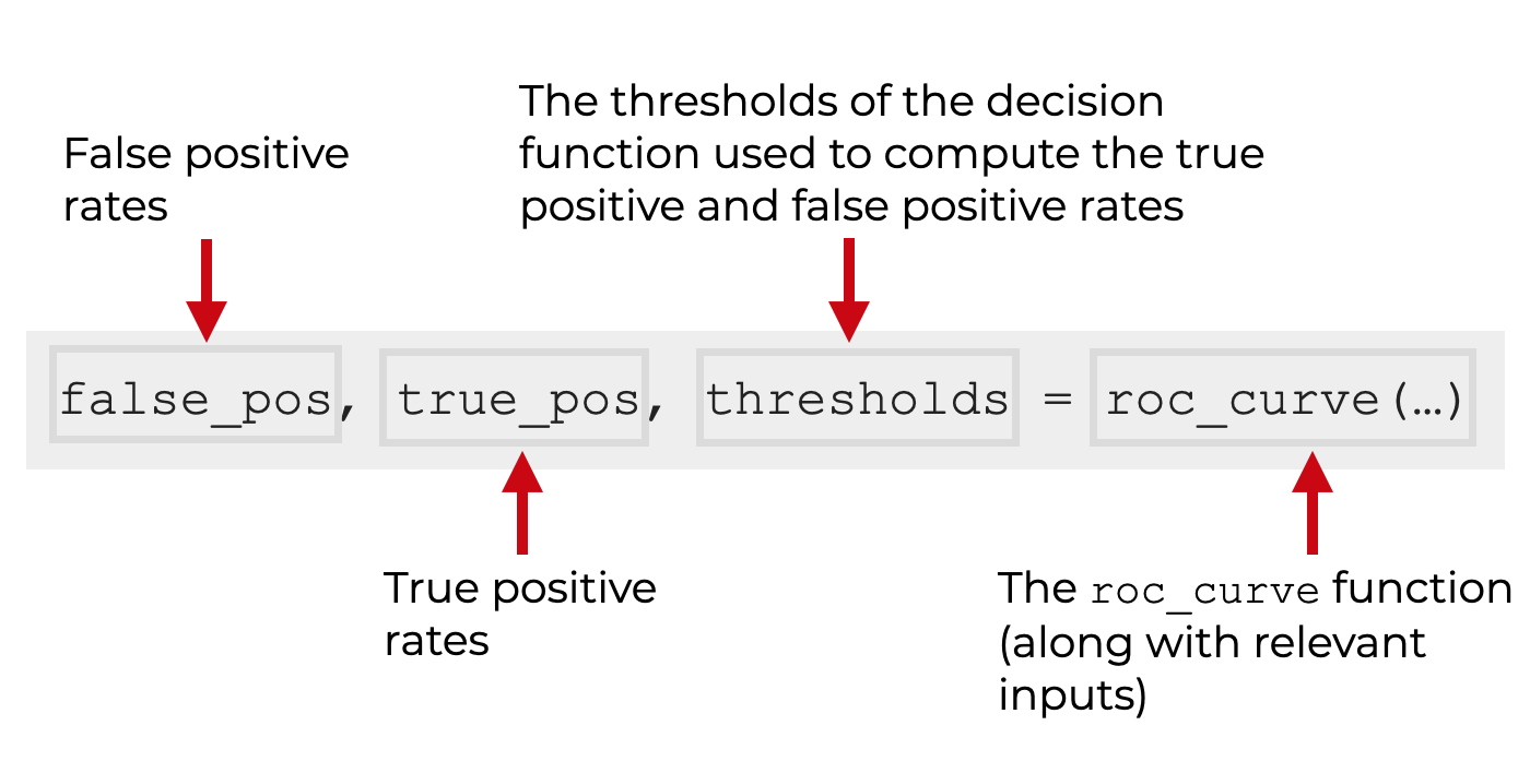
Let me quickly explain these with a little more detail
false positive rates
This array contains the false positive rates for the model.
These are organized in increasing order, such that the ith element is the false positive rate for predictions with a score greater than or equal to thresholds[i].
true positive rates
This array contains the true positive rates for the model.
These are organized in increasing order, such that the ith element is the true positive rate for predictions with a score greater than or equal to thresholds[i].
thresholds
This array contains the thresholds for the decision function that are used to compute the false positive and true positive rates.
As noted in the official documentation, “thresholds[0] represents no instances being predicted and is arbitrarily set to max(y_score) + 1.”
Examples of How to Generate ROC data with Sklearn roc_curve
Ok. Now that we’ve looked at the syntax, let’s take a look at an example or two of how to use the Scikit Learn roc_curve function
Examples:
Run this code first
Before you run the examples, make sure to import the Scikit Learn roc_curve as well as a few other tools from Scikit Learn.
We’ll also import Seaborn Objects, which we’ll use to plot the ROC curve later.
import numpy as np

from sklearn.datasets import make_classification
from sklearn.linear_model import LogisticRegression
from sklearn.model_selection import train_test_split
from sklearn.metrics import roc_curve

import seaborn.objects as so
Ok. Let’s look at the first example.
EXAMPLE 1: Create ROC Curve for a Binary Classifier
Here, we’re going to create the data for an ROC curve for a simple binary classifier.
To do this, we need to:
- create binary data
- build a binary classifier
- generate ROC curve data
We’ll also plot the ROC curve at the end.
Create Input Data for ROC Curve
First, we need to create the right inputs for the ROC curve function.
Ultimately, we’re going to use two inputs:
- target y values from a binary dataset
- probabilities for the positive class, as predicted by the model
So to get these, we’ll use make_classification to create a binary dataset.
We’ll use train_test_split to split the data into a training dataset and test dataset.
We’ll build a logistic regression model with the Scikit Learn LogisticRegression function.
And finally, we’ll predict the y-test values on the basis of the X_test dataset, using the Scikit Learn predict_proba method.
X, y = make_classification(n_samples=1000, n_classes=2, random_state=1)

# SPLIT DATA INTO TRAIN/TEST
X_train, X_test, y_train, y_test = train_test_split(X, y, test_size=0.2, random_state=2)

# FIT MODEL
my_logistic_reg = LogisticRegression()
my_logistic_reg.fit(X_train, y_train)

# predict probabilities
probabilities_logistic_reg = my_logistic_reg.predict_proba(X_test)

# keep probabilities for the positive outcome only
probabilities_logistic_posclass = probabilities_logistic_reg[:, 1]
Notice as well that at the end, we’re retrieving the probabilities for the positive class, and saving that information as probabilities_logistic_posclass.
We’ll use y_test and probabilities_logistic_posclass as the inputs to roc_curve().
Generate ROC Curve Data
Ok. Now we’re ready to use the roc_curve function.
Here, we’re going to call roc_curve() with y_test as the first input and probabilities_logistic_posclass as the second input.
# calculate roc curves
falseposrate_logistic, trueposrate_logistic, thresholds = roc_curve(y_test, probabilities_logistic_posclass)
After you run this, you can print out the contents of each.
Here is the “false positive rate” data:
print(falseposrate_logistic)
OUT:
[0.         0.         0.         0.00980392 0.00980392 0.01960784
 0.01960784 0.02941176 0.02941176 0.03921569 0.03921569 0.04901961
 0.04901961 0.05882353 0.05882353 0.06862745 0.06862745 0.08823529
 0.08823529 0.10784314 0.10784314 0.11764706 0.11764706 0.14705882
 0.14705882 0.15686275 0.15686275 0.16666667 0.16666667 0.19607843
 0.19607843 0.25490196 0.25490196 0.28431373 0.28431373 0.33333333
 0.33333333 0.35294118 0.35294118 0.41176471 0.41176471 0.47058824
 0.47058824 0.54901961 0.54901961 0.74509804 0.74509804 1.        ]
Here is the “true positive rate” data:
print(trueposrate_logistic)
OUT:
[0.         0.01020408 0.12244898 0.12244898 0.54081633 0.54081633
 0.56122449 0.56122449 0.60204082 0.60204082 0.65306122 0.65306122
 0.73469388 0.73469388 0.78571429 0.78571429 0.80612245 0.80612245
 0.82653061 0.82653061 0.83673469 0.83673469 0.85714286 0.85714286
 0.86734694 0.86734694 0.87755102 0.87755102 0.8877551  0.8877551
 0.90816327 0.90816327 0.92857143 0.92857143 0.93877551 0.93877551
 0.94897959 0.94897959 0.95918367 0.95918367 0.96938776 0.96938776
 0.97959184 0.97959184 0.98979592 0.98979592 1.         1.        ]
And here are the thresholds:
print(thresholds)
OUT:
[1.99964956e+00 9.99649562e-01 9.86415533e-01 9.83390398e-01
 8.28379599e-01 8.23926982e-01 8.19355139e-01 8.12369299e-01
 7.79849490e-01 7.78681360e-01 7.71944928e-01 7.66206961e-01
 7.18780178e-01 7.09873724e-01 6.70967955e-01 6.70494305e-01
 6.66172316e-01 6.56285301e-01 6.41352216e-01 5.92181152e-01
 5.75285294e-01 5.75054746e-01 5.39230851e-01 5.09710858e-01
 5.01901193e-01 4.97297508e-01 4.93186899e-01 4.88270938e-01
 4.84461196e-01 4.30846726e-01 4.08770519e-01 3.32864273e-01
 2.94230536e-01 2.78181353e-01 2.72658294e-01 2.09375260e-01
 1.98545115e-01 1.81150722e-01 1.74268176e-01 1.25650103e-01
 1.18436887e-01 1.00604193e-01 1.00381593e-01 6.96220743e-02
 6.82871100e-02 2.89057083e-02 2.81977537e-02 7.03528706e-04]
Printing them out might help familiarize you with the output, but in this form, the data probably doesn’t mean much.
So, let’s plot the data.
Plot the ROC Data
Here, we’ll plot the ROC data with Seaborn Objects:
(so.Plot()
   .add(so.Line(color = 'red'),x = falseposrate_logistic, y = trueposrate_logistic)
   .layout(size = (8,5))
)
OUT:
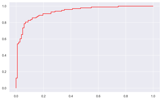
Effectively here, we’re plotting the “false positive rate” on the x-axis, and we’re plotting the “true positive rate” on the y-axis.
For more information on exactly how we’re plotting this data, check out our tutorial how to plot an ROC curve in Python, using Seaborn.
Frequently Asked Questions About Python ROC Curves
Do you have any other questions about Python ROC curves?
If so, leave your questions in the comments section at the bottom of the page.
For more Machine Learning tutorials, sign up for our email list
If you’re trying to upskill and learn machine learning, then ROC curves are a useful tool.
But, you’ll still need to learn a lot more.
So if you want to master machine learning, sign up for our email list.
When you sign up, you’ll get free tutorials on:
- Machine learning
- Deep learning
- Scikit learn
- NumPy
- Pandas
- … and more.
We publish free machine learning and data science tutorials every week, and when you sign up for our email list, we’ll deliver those free tutorials right to your inbox.