In this blog post, we’ll create a data visualization to analyze covid19 data and visualize successful vs. unsuccessful countries.
You’ll see exactly what I mean by that in a minute.
Our covid19 analysis series: a quick review
This tutorial is actually part of a series of tutorials that show how to analyze data with R.
Specifically, in this tutorial series, we’ve used R and the tidyverse to analyze covid19 data.
So far, here’s what we’ve done:
- In part1, we retrieved one of the covid19 datasets, just to figure out how to get and wrangle some of the data
- The tutorial for part 2 showed you how to create a process for retrieving the covid19 datasets, cleaning them, and merging them
- In part 3 and part 4, we explored the data with dplyr and visualization techniques from ggplot2
- Most recently, in part 5, I discussed a possible issue with our covid19 data
Now, in this tutorial (which is part 6) we’re going to create a new data visualization.
Visualizing covid19 success and failure
Specifically, we’ll create a visualization that – at a glance – shows countries that have been successful at combatting covid19, and those that have not.
The visualization that I’ll show you in this tutorial was inspired by a tutorial created by endcoronavirus.org.
The inspiration for this post
The endcoronavirus.org team created a small multiple chart of daily new covid19 cases.
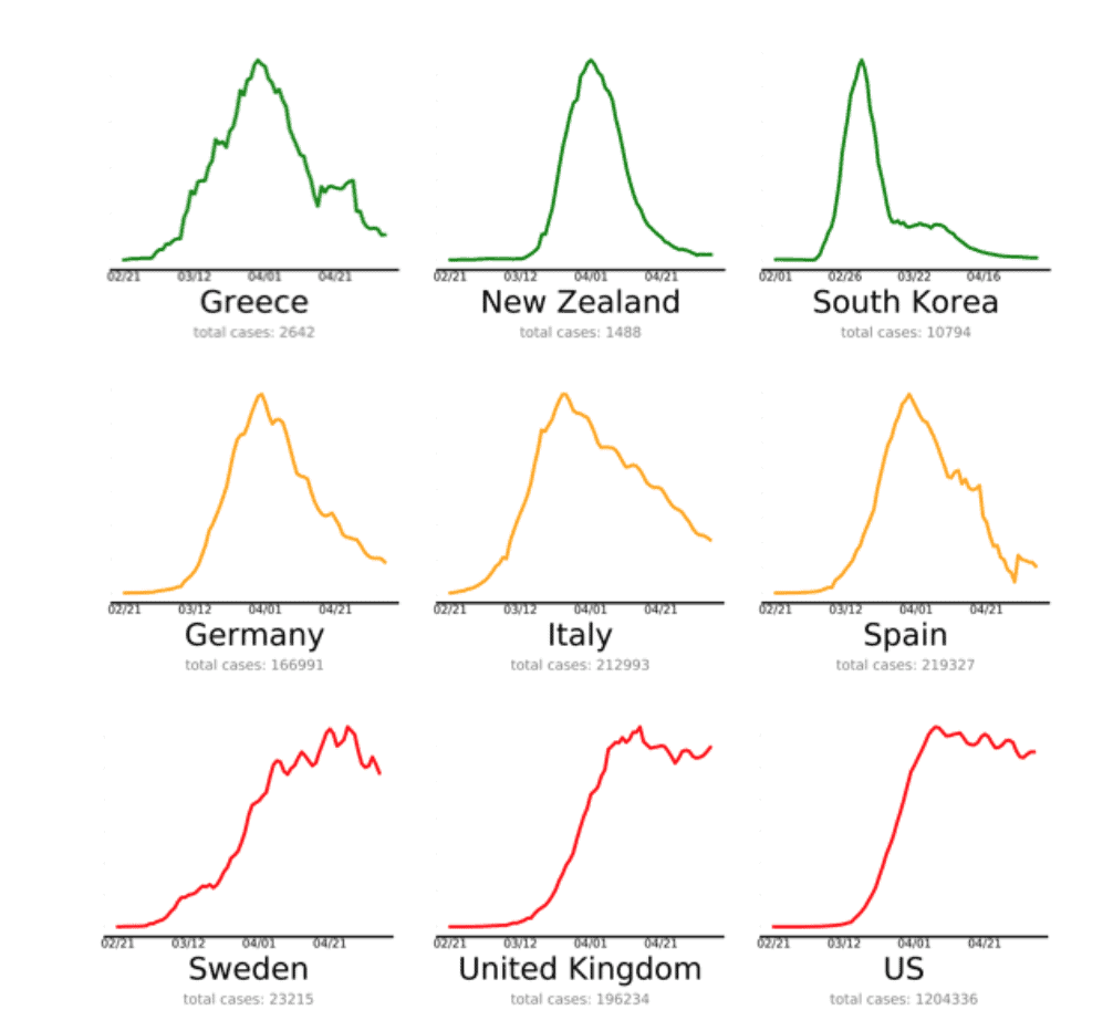
As you can see, each panel shows a line chart (the line is a 10 day moving average of new cases). And each line is color coded with green/yellow/red to specify if a particular country is “Winning”, “Almost there”, or “Needs work”. (You can see the full version with all countries at https://www.endcoronavirus.org/countries.)
Frankly, this is a really great visualization.
It conveys a lot of information.
But it’s also easy to understand.
Everyone sort of understands “red, yellow, green” as “bad, okay, good” … and most people will sort of understand that a line that is still trending up is bad, but a line that has already decreased is good.
Again, it’s easy to understand and it provides a lot of info.
You should aim for your visualizations to do the same.
We’re going to recreate that visualization with R
Here at the Sharp Sight blog, my goal is to help you learn data science and data visualization.
One great way to do that is to simply reproduce (i.e., copy) something that you’ve seen elsewhere.
Actually, the painter Vincent van Gogh did exactly that as he was practicing and becoming a master. Van Gogh repeatedly copied a few paintings by another master painter, Jean-François Millet.

As you can see in the above paintings, van Gogh copied the composition of Millet’s painting almost exactly. In van Gogh’s version of The Sower shown here, he only changed the color and brushstrokes in a way that was consistent with his mature style.
I’ll say it again, if you want to master your craft, copy other masters.
(Having said that, honor them by giving credit where credit is due.)
Again, I really admire the data visualization created by endcoronavirus.org, so I want to recreate it with R and show you how it’s done.
Using R to recreate the visualization
We’re going to use R to recreate this visualization.
Specifically, we’re going to use dplyr and ggplot2, although we’ll also use some tools from lubridate and zoo for a few small things.
Let’s get started.
Import packages
Here, we’ll import our packages.
#================
# IMPORT PACKAGES
#================
library(tidyverse)
library(lubridate)
library(zoo)
Import packages
Next, we’ll get our data.
To do this, we’ll use read_delim() from readr.
#=========
# GET DATA
#=========
file_path <- "https://www.sharpsightlabs.com/datasets/covid19/covid_data_2020-05-13.csv"
covid_data <- read_delim(file_path,delim = ";")
Identify top 16 countries
Now, we'll identify the top 16 countries with the most covid19 cases.
We're doing this because we're going to limit our small multiple chart to the top 16 countries, just for the sake of space. (If we plotted all countries, the visualization would be huge.)
#--------------------------
# IDENTIFY TOP 16 COUNTRIES
#--------------------------
covid_data %>%
  filter(date == as_date('2020-05-12')) %>%
  group_by(country) %>%
  summarise(confirmed = sum(confirmed)) %>%
  arrange(-confirmed) %>%
  top_n(16, confirmed) ->
  covid_top_16
Categorize countries
Next, we're going to create a function to categorize countries with "Winning", "Almost there", and "Needs work".
Obviously, these classifications will change over time.
Moreover, this is not the most elegant way to do it. There's probably a better way to do this programmatically, by calculating the growth of new cases, etc.
But for the time being, this is good enough.
Here, we're creating a function that we'll be able to use to create a new variable in our dataset.
covid_success <- function(input_value){
  result = case_when(input_value == 'Belgium' ~ 'Almost there'
                     ,input_value == 'Brazil' ~ 'Needs work'
                     ,input_value == 'Canada' ~ 'Needs work'
                     ,input_value == 'China' ~ 'Winning'
                     ,input_value == 'France' ~ 'Needs work'
                     ,input_value == 'Germany' ~ 'Needs work'
                     ,input_value == 'India' ~ 'Needs work'
                     ,input_value == 'Iran' ~ 'Needs work'
                     ,input_value == 'Italy' ~ 'Almost there'
                     ,input_value == 'Netherlands' ~ 'Almost there'
                     ,input_value == 'Peru' ~ 'Needs work'
                     ,input_value == 'Russia' ~ 'Needs work'
                     ,input_value == 'Spain' ~ 'Almost there'
                     ,input_value == 'Turkey' ~ 'Almost there'
                     ,input_value == 'United Kingdom' ~ 'Needs work'
                     ,input_value == 'US' ~ 'Needs work'
                     ,TRUE ~ 'other'
                     )
  return(result)
}
You can run this code to test the function:
covid_success('Belgium')
covid_success('Brazil')
covid_success('Canada')
covid_success('China')
Create small multiple chart
Here, we're going to wrangle our data and create the chart all in one go.
We need to filter our data down to the top 16 countries and then calculate the 10 day rolling average by country and date.
We're doing that by using filter(), groupby(), summarise(), and mutate().
After that, we're using ggplot() with geom_line() to create a line chart.
The facet_wrap() function turns this into a small multiple chart.
We're setting up the color so that the color changes according to the covid_success variable that we're creating. The exact red/yellow/green color scheme is being specified by the scale_color_manual() function.
And everything inside the theme() function is just formatting the chart (things like fonts, font sizes, background colors, legend colors, etc.).
covid_data %>%
  filter(country %in% covid_top_16$country) %>%
  group_by(country, date) %>%
  summarise(new_cases = sum(new_cases)) %>%
  mutate(new_case_rollmean_10 = rollmean(new_cases, k = 10, na.pad = TRUE, align = 'right')) %>%
  mutate(covid_success = covid_success(country)) %>%
  select(country, date, covid_success, new_cases, new_case_rollmean_10) %>%
  ggplot(aes(x = date, y = new_case_rollmean_10)) +
    geom_line(aes(color = covid_success)) +
    labs(color = 'Covid\nSuccess'
         ,title = 'Covid19 New Cases\n10 day rolling avg'
         ) +
    theme(axis.text.y = element_blank()
          ,axis.ticks.y = element_blank()
          ,panel.background = element_blank()
          ,text = element_text(family = 'Avenir')
          ,strip.background = element_blank()
          ,strip.text = element_text(size = 14)
          ,axis.line.x = element_line(color = '#333333')
          ,axis.title.y = element_blank()
          ,axis.title.x = element_blank()
          ,plot.title = element_text(size = 22, hjust = .5)
          ,legend.key = element_rect(fill = 'white')
          ) +
    facet_wrap(~country, scales = 'free') +
    scale_color_manual(values = c('Winning' = '#107F12'
                                  ,'Almost there' = '#FDA520'
                                  ,'Needs work' = '#FC101D'
                                  )
    )
And here's what it looks like:
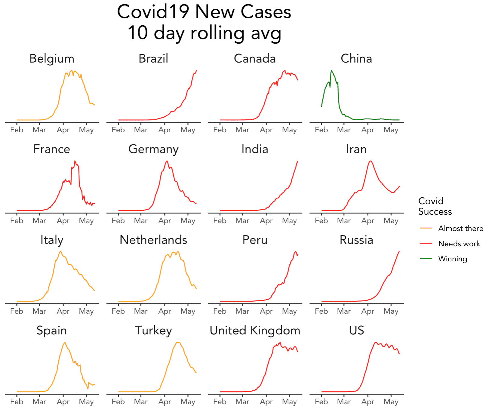
If you ask me, this is pretty damn close to the original (setting aside that we used a subset of countries).
And as I said earlier, I think it's a great chart: information dense and easy to understand.
To learn how to do this, master data visualization
This chart is not terribly hard to create, if you know ggplot2 and dplyr.
There are a few difficult aspects of this, but for the most part, it's just a matter of applying "the fundamentals" in very specific ways. You've probably heard me emphasize the importance of "mastering the fundamentals" and this is why. Once you do, creating a great visualization like this is fairly easy.
If you're ready to master ggplot2, dplyr, and the rest of the fundamentals of data science in R, you should join our course Starting Data Science with R. Starting Data Science is our premium course to help you master the essential tools of R data science as fast as possible.
We're reopening the course for enrollment on Monday May 18, and if you want to get the enrollment email, make sure to sign up for our email list.
Only people who are on our email list are notified when we open enrollment for our courses!
Thank´s for the tutorial (and code). I´ll try including my country. Excellent job.
Great to hear that you like it.
… if you like it, share it with your friends
Great work! I am wondering whether you can automate the category based on the new case (10-day moving average); so that users can create a long list of countries.
Yeah, definitely possible.
I thought about a few ways of doing it programatically, but went for the quick-and-dirty way of just hard coding it.
In the interest of time, I just wanted to get it working and decided that it’s good enough just like this for right now.
If I wanted to run and re-run this every day, I’d spend a little more time to improve the
covid_successclassification function.Hello,
Thank you very much for these 6 blog posts on Covid19. For your information, I have included it in my collection of top R resources on Coronavirus: https://www.statsandr.com/blog/top-r-resources-on-covid-19-coronavirus/
Don’t hesitate to let me know if there is any inconsistency or if you prefer that I don’t mention it.
Best regards,
Antoine Soetewey