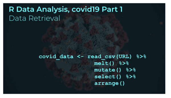
R Data Analysis: covid-19, part 2 [merge datasets]

This tutorial is part of a series of R tutorials analyzing covid-19 data. For part 1, see the following post: https://www.sharpsightlabs.com/blog/r-data-analysis-covid-19-part1-data-wrangling/ Covid19 analysis, part 2: merge datasets In this tutorial, we’re going to set up a process that will enable us to retrieve and wrangle some necessary covid19 datasets … data that we’ll need for … Read more

R Data Analysis: covid-19, part 1 [data wrangling]

An image of R data manipulation code, with an image of the covid19, sars-cov-2 virus in the background.

In this tutorial, we’re going to analyze covid19 data using R and the Tidyverse. Recently, we started a data analysis series, where we analyzed covid19 data. The first set of these tutorials was performed with Python. That tutorial series was well received, and many people commented that it was very helpful for seeing exactly how … Read more

How to use facet_grid in ggplot2

This tutorial will show you how to use facet_grid in ggplot2. Specifically, it will show you how to use facet_grid to create small multiple charts. facet_grid is fairly easy to understand, but it assumes some basic knowledge of ggplot2. ggplot2 is a data visualization package for the R programming language. If you don’t already know … Read more

A ggplot2 tutorial for beginners

This blog post is a fairly comprehensive ggplot2 tutorial for beginners. If you’re new to R and ggplot, this ggplot2 tutorial will cover a few things: What ggplot2 is The syntax of ggplot2 Examples of how to use ggplot2 If you’re new to ggplot, I recommend that you read the whole tutorial. But if you … Read more

How to use to facet_wrap in ggplot2

This tutorial will teach you how to use facet_wrap to create small multiple charts in ggplot2. The small multiple design is an incredibly powerful (and underused) data visualization technique. facet_wrap is great, because it enables you to create small multiple charts easily and effectively. It makes it easy to create small multiple charts. Having said … Read more

How to use geom_line in ggplot2

This tutorial will show you how to use geom_line to create line charts with ggplot2. Using geom_line is fairly straight forward if you know ggplot2. But if you’re a relative beginner to ggplot, it can be a little intimidating. That being said, I’m going to walk you through the syntax step by step. We’ll first … Read more

How to do linear regression in R

A visualization of an example linear regression in R, performed using ggplot2.

Linear regression. It’s a technique that almost every data scientist needs to know. Although machine learning and artificial intelligence have developed much more sophisticated techniques, linear regression is still a tried-and-true staple of data science ….

R vs Python … which to learn for data science

One of the most common questions I get from data science hopefuls is “which programming language should I learn?” My general advice is “it depends.” Or to clarify my response, I like to ask the question “who are you, and what are your goals?” The programming language you use depends on your background and your … Read more

How to rename columns in R

In this blog post, I’ll show you how to rename columns in R. This is pretty straightforward if you know how to do it properly, but there are also some little challenges in renaming variables. So very briefly, I’ll explain why renaming variables in a dataframe can be a little confusing in R. Then, I’ll … Read more