In this tutorial, I’ll show you how to plot a precision-recall curve in Python using Seaborn.
Specifically, I’ll show you how to use the new Seaborn Objects package to plot it.
The article is divided into several different sections to make it easier to navigate. So if you need something specific, just click on any of the links below.
Table of Contents:
- Quick Review of Precision-Recall Curves
- Setup
- Create Data
- Plot the Precision-Recall Curve with Seaborn Objects
- Why Use Seaborn for Precision-Recall Curves
- Frequently Asked Questions
I’ll show you the actual example further down in the tutorial, but we’ll start with a quick review of what a precision-recall curve is.
Let’s jump in.
A Quick Review of Precision-Recall Curves
In machine learning, one of the most important tasks is classification.
In classification, we categorize incoming data examples into one of several pre-defined groups, which are called “classes” or “labels.”
There are fairly simple classification systems, like binary classification, where there are only 2 classes. And there are more complicated forms of classification, like multi-class classification, where there are more than 2 classes.
But ultimately, classification is about predicting which class an example belongs to, from a pre-defined list of possible classes.
Classification Evaluation is Important When You Build a Classifier
Building a classifier can be somewhat challenging.
There are multiple steps, like getting your data, cleaning the data, analyzing the data, preprocessing the data, choosing the right classification algorithm (like logistic regression, decision trees, etc).
But once you have your classification system, you need to evaluate how it is performing.
Evaluation is critical.
You need to know how well your classifier is performing, and you need to be able to optimize it given the specific needs of your project.
That’s where the precision-recall curve comes in.
A Precision-Recall Curve is a Tool to Evaluate Classifiers
Precision-Recall curves are an important tool for classifier evaluation.
We typically use them to evaluate binary classifiers, although it’s possible to use precision-recall curves with multiclass classification too.
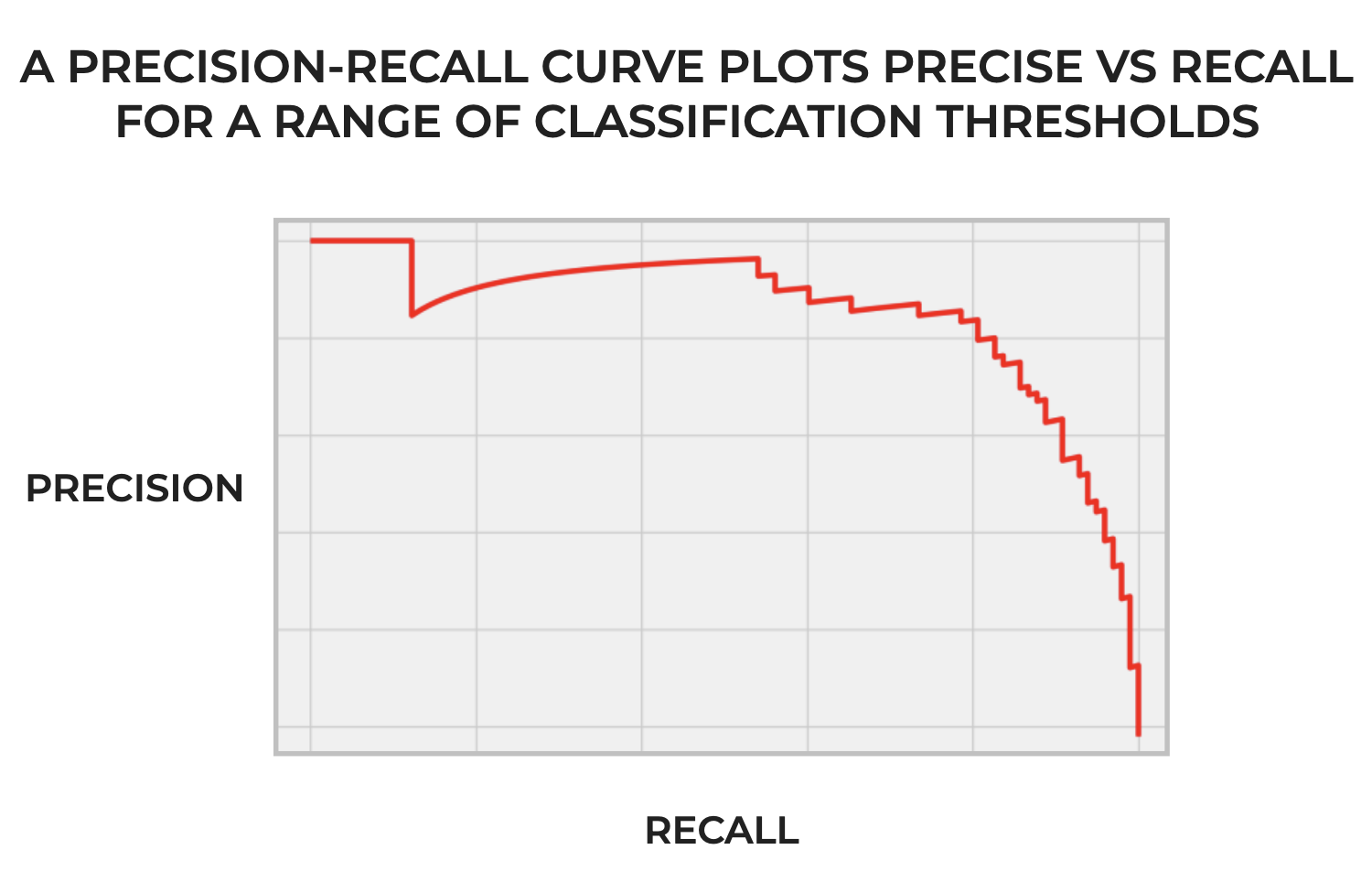
To explain them simply: precision-recall curves visualize the precision and recall for a classifier across a range of classification thresholds.
It’s important to emphasize the part about the “range of thresholds.”
You need to remember that many classification algorithms, and in particular, probabilistic classification algorithms, produce what’s called a “probability score.” The probability score measures the confidence that the classifier has that an incoming example belongs to the positive class.
In classification systems that produce such a score, the system compares the score to a “threshold” … a cutoff point for the score.
If the probability score is above the threshold, then the incoming example is predicted as positive.
If the probability score is below the threshold, then the incoming example is predicted as negative.
So the threshold acts like a cutoff point for the system to decide when an incoming example should be predicted to be positive or negative.
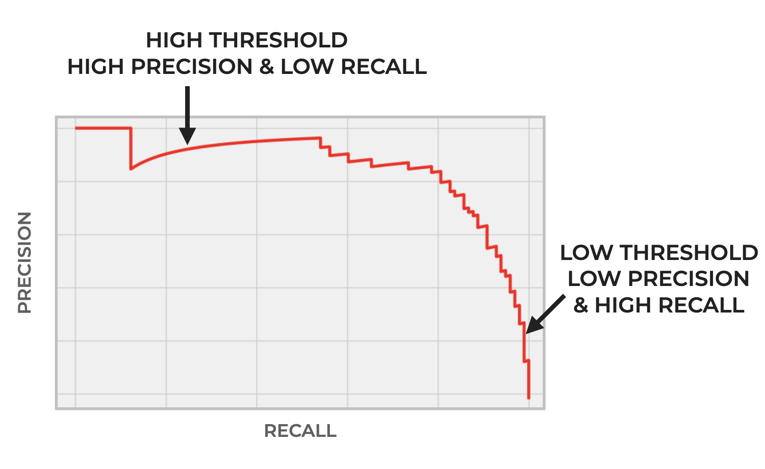
And importantly, the threshold is something we can change. We can increase the threshold (which causes the classifier to become more conservative in making a positive prediction). Or we can lower the threshold (which makes the classifier more liberal in making a positive prediction).
Moving the threshold has implications for the number of True Positives, True Negatives, False Positives, and False Negatives.
And in turn, moving the threshold can change both precision and recall.
A Quick Review of Precision and Recall
Precision and recall are themselves classification metrics. We use them to evaluate classifier performance.
Precision measures the proportion of positive predictions that are actually positive.
Recall measures the proportion of actual positive examples that are correctly predicted as positive.
Both of these metrics are useful for classification evaluation, but they tend to have strengths and weaknesses.
Moreover, there’s a tradeoff between them.
Generally, as precision increases, recall decreases, and vise versa.
So when we build a classifier, we often need to select the right value for the classification threshold.
But changing the threshold changes precision and recall.
So we need to make sure to choose the “best” threshold for a given task that optimizes the tradeoff between precision and recall.
That’s where the precision-recall curve comes in.
A Precision-Recall Curve Visualizes the Tradeoff Between Precision and Recall
To put it very simply then:
A precision recall curve visualizes the tradeoff between precision and recall for a classifier, as we change the threshold.
As we increase the threshold, precision generally increases and recall decreases.
Conversely, as we decrease the threshold, precision generally decreases and recall increases.
Again: there’s a tradeoff between precision and recall.
Furthermore, this tradeoff is important because if we optimize for precision, we’re likely to get more False Negatives, and when we optimize for recall, we’re likely to get more False Positives.
So, we often need to select the right threshold depending on the needs of the task, and also how many False Negatives or False Positives we’re willing to tolerate.
How do we choose the right threshold?
One good way to choose is by plotting the precision-recall curve.
The precision recall curve enables you to see the tradeoff between precision and recall, and therefore helps you decide exactly which threshold will be best, given the goals of your project.
With all that said, let me show you how to create a precision-recall curve in Python.
Plot a Precision-Recall Curve in Python using Seaborn Objects
In the rest of this tutorial, I’ll show you how to plot a precision-recall curve in Python.
Specifically, I’ll show you how to plot a precision-recall curve using the excellent Seaborn Objects data visualization package (which I love).
To do that though, we need to perform several steps.
We will need to:
- import the necessary packages
- create the data for the precision-recall curve
- plot the curve
We’ll do each of these one at a time.
(Note: if you already have some precision/recall data that you want to plot, then feel free to skip to the section where we plot the precision-recall curve with Seaborn.
Import Packages
First, we need to import the necessary packages.
Since we’re going to plot the curve with the Seaborn Objects package, we need to import Seaborn Objects.
But remember: we’ll also need to generate some data to plot. That means that we’ll need to:
- create a classification dataset
- split the data
- build a classification model (we’re going to build a logistic regression model)
- generate the precision/recall data for the curve itself
All that being the case, we will need to import make_classification, train_test_split, LogisticRegression, and precision_recall_curve from Scikit Learn in execute all of those steps.
# seaborn objects
import seaborn.objects as so

# scikit learn tools to create model and data
from sklearn.datasets import make_classification
from sklearn.linear_model import LogisticRegression
from sklearn.model_selection import train_test_split
from sklearn.metrics import precision_recall_curve
Make Data for the Precision-Recall Curve
Now that we have the right packages and tools, we’ll make the data for the precision recall curve.
Remember that when we plot a precision-recall curve, we’re essentially plotting the precision and recall over a range of classification thresholds for a particular model.
To get this data, we need to:
- create a dataset using sklearn make_classification with which we can build a classifier
- split the data using train_test_split from Scikit-learn
- build the classifier (we’ll create a Logistic Regression model)
- predict the output classes
- generate the precision/recall data with the Scikit-Learn precision_recall_curve function
Since I want to keep this brief, I’m going to move quickly through most of these data creation steps, although you can click on the links above to the related tutorials that will explain how each of these tools/functions work, if you want more details.
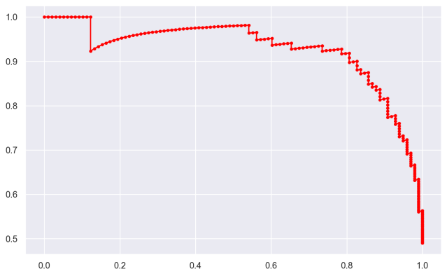
# GENERATE CLASSIFICATIONDATASET WITH 2 CLASSES
X, y = make_classification(n_samples=1000, n_classes=2, random_state=1)


# SPLIT DATA INTO TRAIN/TEST
X_train, X_test, y_train, y_test = train_test_split(X, y, test_size=0.2, random_state=2)


# BUILD & FIT CLASSIFICATION MODEL
my_logistic_reg = LogisticRegression()
my_logistic_reg.fit(X_train, y_train)


# PREDICT PROBABILITIES FOR TEST SET
probabilities_logistic_reg = my_logistic_reg.predict_proba(X_test)


# KEEP PROBABILITIES FOR ONLY THE POSITIVE OUTCOME
probabilities_logistic_posclass = probabilities_logistic_reg[:, 1]


# CALCULATE PRECISION AND RECALL FOR EACH THRESHOLD
precisions, recalls, thresholds = precision_recall_curve(y_test, probabilities_logistic_posclass)
After you run all of the data generation code above to get the precisions and recalls for the logistic regression model, you’ll be ready to plot the precision recall curve.
Plot the Precision-Recall Curve with Seaborn Objects
In this final step, we’re going to plot the precision-recall curve.
To do this, we’ll use the Seaborn Objects visualization package.
Let’s run the code, and then I’ll explain.
(so.Plot()
   .add(so.Path(color = 'red', marker = '.')
        ,x = recalls
        ,y = precisions
        )
   .layout(size = (8,5))
)
OUT:
Explanation
Here, we used Seaborn Objects to create our precision-recall curve.
But syntactically, what did we do?
We used the so.Plot() function to initiate the plot.
We used the .add() method to “add” a layer to the plot. Specifically, we added a “path” layer. This is like a line plot, but it keeps the data in the original order (as opposed to so.Line() which re-sorts the data).
As you can see, we also needed to specify to put the recalls on the x-axis and precisions on the y-axis. We also changed the color to ‘red’ and added a dot marker over the line with marker = '.'.
It’s fairly straight-forward.
Closing Note: Use Seaborn for ML Visualization
One final note before I finish the tutorial.
I recommend that you use Seaborn for your Python data visualization.
It’s great for reporting and analytics, but it’s also great for machine learning visualizations.
But beyond the traditional Seaborn package, I strongly recommend that you start using the new Seaborn Objects visualization system.
Why?
Seaborn Objects is simple, powerful, and easy to use. If you’re familiar with R, it’s like a ggplot2 or Python.
I’ve started to use Seaborn Objects for the vast majority of my Python visualizations.
And for machine learning, as you’ve seen here, you can use it for ML visualizations like precision recall curves, and also for ROC curves (which I show in this tutorial about making ROC curves with Seaborn Objects).
Leave your other questions in the comments below
Do you still have questions about how to make a precision-recall curve in Python?
Leave your questions in the comments section below.
For more machine learning tutorials, sign up for our email list
In this tutorial, I showed you how to make a precision-recall curve in Python with Seaborn.
But if you want to master machine learning in Python, there’s a lot more to learn.
If you want free tutorials about machine learning in Python, then sign up for our email list.
When you sign up, you’ll get free tutorials on:
- Scikit learn
- Machine learning
- Deep learning
- NumPy
- Pandas
- … and more.
So if you want to master machine learning, deep learning, and AI in Python, then sign up now.
Great post again!
Two remarks:
1)
You write:
“Precision measures the proportion of positive examples that are actually positive.”
Should it be:
“Precision measures the proportion of positive predictions that are actually positive.”
2)
I didn’t find the answer for the most important question:
How to choose the proper threshold based on the precision-recall curve?
In the previous posts you mentioned the F1-score that balances between these two metrics. Could it be somehow incorporated into the diagram? For example as a color argument?
I’m going to write more about how to choose the best threshold elsewhere.