How to Make a Seaborn Countplot
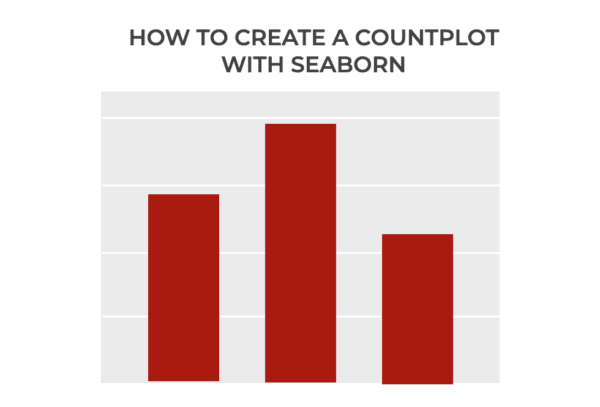
In this tutorial, I’ll show you how to use the sns.countplot function to create a Seaborn countplot. I’ll explain what this function does, how the syntax works, and I’ll show you some step-by-step examples. If you need something specific, you can click on any of the following links, and it will take you to the … Read more